|
|
||||||
|
|

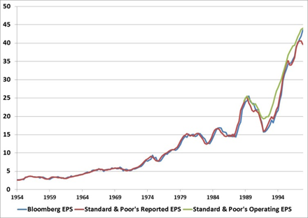
December 2013 Does the CAPE Still Work? It’s been a memorable few months for the CAPE (“cyclically-adjusted price/earnings”) ratio. Its developer – Robert Shiller – won a well-deserved Nobel Prize in economics back in October. The Nobel committee cited his early work showing that stock prices displayed “excess volatility:” the value obtained from discounting the cash flows provided to investors was more stable than the volatility of actual short-term price movements. This original work launched Shiller toward a career focused on asset valuation, investor behavior, and identifying bubbles. One tool that came out of that work was the Cyclically Adjusted P/E Ratio – the valuation ratio that compares the the S&P 500 Index to the 10-year average of inflation-adjusted earnings. Following this year’s accolades for its creator, an already well-known valuation metric has become even more widely known. More recently the ratio has undergone an attack from some widely-followed analysts, questioning its validity and offering up attempts to adjust the ratio. This may be a reaction to its new-found notoriety, but more likely it’s because the CAPE is suggesting that US stocks are significantly overvalued. All of the adjustments analysts have made so far imply that stocks are less overvalued than the traditional CAPE would suggest. We feel no particular obligation defend the CAPE ratio. It has a strong long-term relationship to subsequent 10-year market returns. And it’s only one of numerous valuation indicators that we use in our work – many which are considerably more reliable. All of these valuation indicators – particularly when record-high profit margins are accounted for – are sending the same message: The market is steeply overvalued, leaving investors with the prospect of low, single-digit long-term expected returns. But we decided to come to the aid of the CAPE ratio in this case because a few errors have slipped into the debate, and it’s important for investors who have previously relied on this ratio to understand these errors so they can judge the valuation metric fairly. Importantly, the primary error that is being made is not even the fault of those making the arguments against the CAPE ratio. The fault lies at the feet of a misleading data series. The Ingredients of the CAPE Ratio A quick review of the historical progression of earnings may help with this discussion. Reported earnings are profits that companies have historically reported, adhering to Generally Accepted Accounting Principles (GAAP). This is the longest data series available. Standard & Poor’s has reported earnings for the S&P 500 Index reaching back to 1936. Robert Shiller’s work has taken this data series back even further, to 1871. Operating earnings (sometimes referred to as Pro-Forma earnings) are a newer invention. Beginning in the 1980’s, companies and sell-side analysts began to report a Non-GAAP set of earnings – mostly adjusted for gains or losses that were extraordinary, or outside of a company’s operating business. Operating earnings became popular enough during this period that by 1988 Standard & Poor’s began to publish an “operating earnings” per share (EPS) series for the S&P 500. Today, each major data provider (for example, S&P, Bloomberg, and Factset) has a slightly different definition for operating earnings, resulting in a slightly different index level operating EPS for the S&P 500. Also, since operating earnings are not defined under Generally Accepted Accounting Principles, arbitrary changes the concept of operating earnings can occur over time, typically with each new boom in stock prices. (My favorite attempt this cycle was one company’s invention of “adjusted consolidated segment operating income”, which neglected to deduct the majority of its operating expenses from sales.) The earnings data – or close substitutes – are publicly available. For the long-term reported EPS data see Bob Shiller’s site, here. This data doesn’t match exactly the reported EPS data that Standard & Poor’s publishes, but it’s nearly identical. Data for operating earnings and reported earnings beginning in 1988 are available from the Standard & Poor’s website, here (click on Additional Info, then Index Earnings). While there are number of different arguments that are being attempted to invalidate the CAPE ratio, the primary one is that current reported earnings are no longer consistent with historical reported earnings, so the earnings series should be adjusted. The argument is that accounting rules have changed over time. One example of this is FASB 142, which was passed in 2001 and offers guidelines on adjusting the value of intangible assets, instead of keeping those investments on the books at cost and gradually amortizing the value over time. It’s argued that during the last couple of recessions this new accounting rule has caused companies to aggressively write down the value of their intangible assets, impacting earnings, therefore pushing profits lower, and biasing P/E ratios (like the CAPE) higher. A particularly thoughtful and well-argued essay that makes this case surfaced in recent weeks. Normally, we address research debates by allowing historical evidence to speak for itself without referring to specific analysts, but we have received a number of notes asking us about our view on this particular ‘The CAPE Ratio is Broken’ argument. In this case, the analyst suggests that the earnings per share of the S&P 500 should be adjusted to use a less volatile series in calculating the 10-year average of earnings. The adjustment suggested in this particular piece was to replace S&P’s reported earnings with an EPS series that is available on the Bloomberg terminal. This is where the error crept into the debate, so we will first focus on this EPS series from Bloomberg. We can’t call the Bloomberg EPS data series an operating EPS or a reported EPS because – spoiler alert – it’s actually a combination of the two. The series was created by combining an operating earnings series with a reported earnings series. This makes any comparisons of recent EPS data in this series incompatible with earlier data in the same series. In short, it would suggest that recent valuation levels are more attractive than they really are. If that explanation is sufficient, feel free to skip the next section, which delves into a single piece of data in far greater detail than any reader should ever be asked to consider. But, if the forensic analysis of data collection and integration are interesting to you, read on. The Splice Bloomberg provides an EPS series for the S&P 500 beginning in 1954. For Bloomberg users, field names ‘Trail_12M_EPS’ and ‘T12_EPS_AGGTE’ can be used interchangeably, as they pull the same data. On the description page of these field names, Bloomberg notes that prior to 1998 Standard & Poor’s provided the data for the EPS series. From this data source note we can draw some inferences. Standard & Poor’s computes reported EPS data beginning in 1936 and operating EPS data beginning in 1988. So the data prior to 1988 is clearly a reported EPS series – and the graph below confirms this. And the data from 1988 through 1998 could be either a reported EPS series or an operating EPS series from Standard & Poor’s. From 1998, Bloomberg discontinues Standard & Poor’s data and begins to provide their own operating EPS data. Let’s take a look at what this data looks like in the graphs below. It’s clear from the graph below that from 1954 through 1988 Bloomberg is using some form of reported earnings. It doesn’t match exactly the reported EPS series that Standard & Poor’s provided to us, but it’s clear that the two data series are tracking each almost perfectly. (Shiller’s data doesn’t perfectly match Standard & Poor’s data either, but like Bloomberg’s, it’s also very close.)
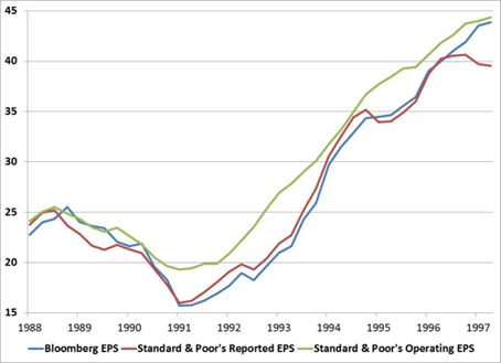
In 1988, Standard & Poor’s operating earnings series begins. Because operating earnings are profits prior to all GAAP-mandated charges, this series is typically higher than reported earnings. This is what we observe. The graph below highlights the period from 1988 through 1998. Here, per the description page, the Bloomberg data series is still using data from Standard & Poor’s. It’s clear that operating and reported earnings are close in value during the first few years following the creation of operating earnings. Company executives and analysts were just getting warmed up in allocating expenses below the operating profit line. But during the 1991 recession and throughout the period that followed the Standard & Poor’s operating EPS was persistently higher than the reported EPS. It’s also clear that during this time the Bloomberg EPS closely tracks the Standard & Poor’s reported data series. Based on these first two charts, we can determine that the Bloomberg EPS data series from 1954 through 1998 tracks the Standard & Poor’s reported EPS data series very closely.
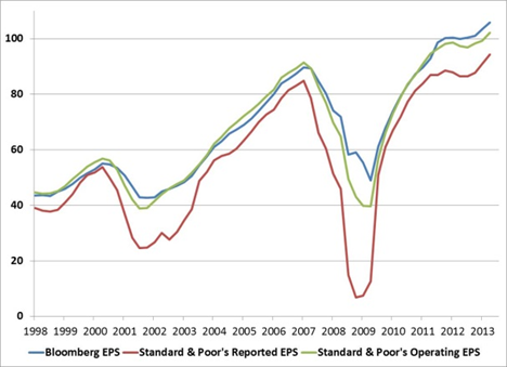
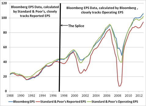
This next graph highlights the period from 1998 through today. The data during this period is provided by Bloomberg and is an operating EPS data series that they compile through their own data analysis. For confirmation, notice that the Bloomberg EPS series jumps to the green line, and closely tracks the Standard & Poor’s operating EPS data series during this period. ` Here’s one final graph on this topic. The graph shows the period from 1988 through today. We know that from 1954 through 1988 reported EPS was the only data available, and that the Bloomberg EPS tracks reported EPS closely. From 1988 through 1998 it’s clear that the Bloomberg EPS tracks the Standard & Poor’s reported EPS series. Since then, the Bloomberg EPS tracks the Standard & Poor’s operating EPS series. This graph makes the data splice clear. The Bloomberg EPS data series is a mixture: from 1954 through 1998, it’s a reported EPS series, which then morphs into an operating EPS series.
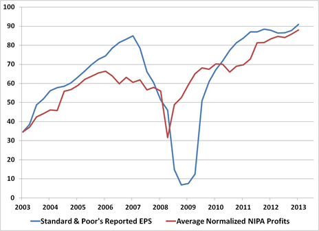
The splice in the data creates a subtle but important problem. Operating earnings are persistently above reported earnings (by an average of about 30 percent). So when you splice an operating earnings series onto a reported earnings series, more recent levels of valuation look more attractive relative to history. This is the case even if you average the earnings over a 10-year time period. That’s the actual reason that using a CAPE methodology on this melded EPS series makes current levels of valuation look more attractive today, compared with the history of the CAPE computed using exactly the same series. This is not the first time we are highlighting this error. In March of this year, after reading an article about how attractive stock market valuations were relative to history, we sent Bloomberg a note highlighting the EPS series. Our concern at the time was that if even a Bloomberg journalist could be misled by the data on the terminal, it wouldn’t be long before subscribers were. And if sharp analyst happened on the data, and then wrote a compelling essay, there was a potential for this error to reach a far wider audience. In this case, it seems our concerns were not misplaced. At the time, we suggested to Bloomberg that they supply two data series – an operating EPS series beginning in 1988 and a reported EPS series beginning in 1954. A second suggestion we made, albeit an inferior one, was to have a note on the description page alerting subscribers to the risks of using a melded EPS series. Hopefully, this article will suffice in the meantime. The Write-down Argument There are other critiques of the CAPE ratio in circulation. Let’s take a look at a couple of them. One widely-followed analyst argues that because companies have had large write-downs during the bursting of the tech bubble and again during the Great Recession, the reported EPS series used by Shiller’s CAPE ratio is no longer appropriate. The large losses and write-downs must be biasing the earnings data lower. The suggested fix to the CAPE ratio entails swapping Standard & Poor’s reported earnings in the CAPE ratio with national corporate profits. This is an odd suggestion on numerous levels. National Income and Product Accounts (NIPA) profits and the S&P 500 EPS series are vastly different data series. National profits are calculated from a pool of about 9,000 companies - small and large, profitable or not, from a broad set of businesses and industries. Importantly, NIPA calculations track profits from current production. So capital gains and losses from merger and acquisition activity are not including, nor are bad debts. Long-term comparisons don’t work either. NIPA corporate profits have grown at a much faster rate than the S&P 500 EPS has, partly because of the smaller companies that make up NIPA’s sample. Plus, there is an apples-and-oranges arithmetic to dividing a per-share price index of the largest 500 publicly traded companies by the aggregate dollar value of profits for 9,000 or so public and non-public companies. That said, there’s an important concept within this argument that’s worth considering. Should large losses and write downs be entirely ignored by investors? Here it makes sense to consider the full economic cycle – not just recessions. A write down in book equity typically occurs for two reasons. Profits already booked may have been overstated. Or executives invested the firm’s money poorly, or in some cases, too aggressively. There are also other factors that impact EPS levels favorably. Elevated profit margins are certainly pushing current EPS higher. These profit margins have been helped by large fiscal deficits that emerged in response to the crisis. And, of course, the crisis was the catalyst for the large write downs. It is inconsistent to discard what is having a negative impact on earnings without adjusting for those factors that are having a positive impact. As John Hussman has pointed out, the Shiller profit margin (the 10-year average of earnings as a percent of S&P 500 sales) is 23 percent above its long-term average, which actually makes the Shiller P/E less extreme today than it would be otherwise. While substituting NIPA profits for S&P EPS to calculate a P/E is inappropriate, we can use NIPA profits as a general proxy for economy-wide profits. In that way we can judge the volatility of corporate earnings among publicly traded companies. The graph below normalizes NIPA corporate profits to the beginning value of Standard & Poor’s Reported EPS series a decade ago. We would expect company profits to be more volatile than NIPA because of the different way the two profits are recorded. This is clearly supported by the data. Corporate profits at the company level are much more volatile – and importantly, in both directions. Company-level earnings grew more quickly during the 2002 – 2007 expansion, but the collapse of those earnings was more dramatic during the recession. The average company-level EPS during this period is $64. The average normalized NIPA Profit was $62.
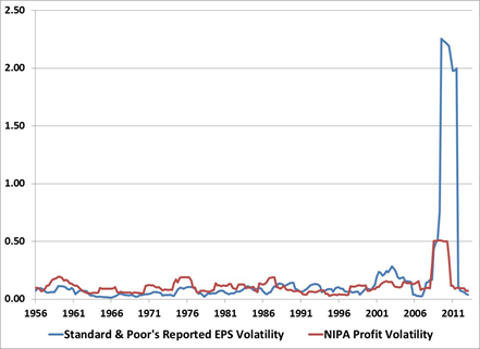
There’s another adjustment that some analysts have suggested should be made to the historical CAPE ratio series. It’s been argued that because companies have shifted from sending shareholders dividend checks to buying back shares, the valuation of stocks should be higher. On an individual stock basis, this may be the case, if investors are fooled by the faster earnings growth and they keep multiples at the same level or increase them. But at the index level, this can’t be the case. The divisor of the S&P 500 – the ever-changing number that allows the value of an index price to remain unchanged as stocks are swapped in and out of it – is adjusted for any change in individual share count at the company level. So index level earnings per share are already adjusted for company share repurchases. Just to be sure that this has always been the case, we checked in with David Blitzer, the index guru at Standard & Poor’s. This is what he passed along: “Buybacks will not bias the calculation of index earnings per share or the P/E ratio. When a company buys back its own stock, the number of shares of that company in the index will be reduced and the divisor will be adjusted accordingly.” Why Are Profits More Volatile? There is one part of the CAPE discussion that is unarguable, and that’s the fact that reported earnings have become much more volatile during the last two decades. Reported EPS volatility hit a post-war record in 2001, and then shot to the moon in 2008. Why have profits become so volatile?
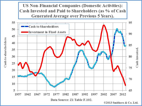
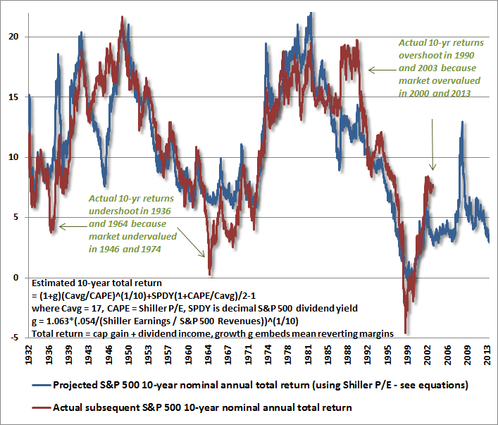
There’s clearly more than one answer. The depth of the 2008 economic recession was historic. It was a crisis centered on the banks, which made up about a third of the S&P 500’s profits. Profit margins were greatly impacted by huge swings in fiscal deficits and collapsing interest costs. All of these played a role in the spike in volatility in 2008, but less so in the early part of the 2000’s. So, might there be a secular explanation for the shift higher in corporate earnings volatility over the last decade? In an excellent new book, The Road to Recovery, Andrew Smithers argues that there is. Smithers argues that the change in executive compensation over the last two decades can help explain the volatility in profits. Moreover, it can also shed light on why the US economy refuses to pick up from its current funk, why productivity rates across the economy have been cut in half during this recovery, and why inflation is higher than what one would expect from the current large output gap between actual and “potential” GDP. Executive compensation arguments typically don’t get discussed in economic circles. The topic typically falls under the umbrella of fairness or equality. Smithers argues that it should be a topic that gets a much broader audience, including economists and policy makers. When you look at the research focused on executive pay, it is difficult believe this trend isn’t playing some role in the short-term management of earnings. During the 1950 and 1960’s stock-related compensation made up about 7% of the typical executive’s compensation. During the 1990’s that portion jumped to 47%. Through the middle of last decade, it jumped even higher, to 60%. So currently the majority of executive compensation is now tied to the mostly short-term operational performance and market value of the firms these executives manage. The Jensen-Murphy statistic – the dollar change in executive wealth for a $1,000 change in firm value – has jumped from 4 to nearly 21 at the 2007 peak. Smithers argues that with such a large portion of earnings tied to short-term performance, executives prefer volatile profits. Big gains lead to greater compensation. Big losses allow for the possibility of resetting strike prices lower. The trend also discourages investments made to increase long-term corporate value. Better to shrink the share count than invest in a project that won’t add value for years. The graph below (reprinted with permission) compares the cash invested by companies versus the cash paid to shareholders (both as a percent of cash generated over the prior 5 years). ` The drop in investment is dramatic – especially juxtaposed against the rising portion of cash that companies are returning to shareholders. This shouldn’t be the case when earnings and profit margins are at peak levels and the economy has been expanding for four years. And there is growing evidence that the way executives are paid is playing a role in their investment decisions. Research published this year from Alexander Ljungqvist, a research associate at the NBER, and two other colleagues, found that non-publicly traded companies have been investing at twice the rates of those of publicly traded companies. Private companies invest 6.8 percent of total assets while publicly traded companies invest just 3.7 percent. Also interesting, the researchers found that when a company goes public, they change their investment behavior, investing at a lower rate. That is, newly publicly traded companies slow the rate of their investments and begin to invest at the rate of the typical publicly traded company. As the recovery continues to age, the standard explanations for low corporate investment rates become less compelling. Investment hurdle rates aren’t very high with market rates so low. Record earnings and profit margins should have already kick-started an investment boom. That fact that it hasn’t should have investors asking questions about when that may change and what the long-term implications for such low corporate investment rates will mean for the long-term growth rate of stocks and the economy. Does the CAPE Still Work? Much of the discussion surrounding the CAPE recently has been whether it has now become ineffective because of the various critiques that have been leveled against it. And although we’ve discussed some of the weakness of those critiques above, we can't ignore the possibility that corporate earnings have changed in various ways over time. Some of these changes may have reduced some of the comparability of the data with prior decades. Certainly, accounting rules have changed over time. Executives may have become much more short-sighted in the management of their companies, preferring the new higher level of earnings volatility. Emergency deficit spending has pushed profit margins to levels that will not likely be sustained, temporarily boosting earnings. Tax rates have also changed over time. All of these changes are difficult to quantify over a century of data, especially when their impact on earnings is sometimes offsetting. Despite the various arguments and defenses surrounding the CAPE, the evidence is perfectly able to speak for itself. In the chart below that John Hussman created, we show the 10-yr forward return implied by the CAPE Ratio (in blue) alongside the actual subsequent 10-yr return of the S&P 500 (in red). This particular version of the model adjusts the growth rate of earnings based on the Shiller profit margin, improving its correlation with subsequent returns to over 90% in historical data. It’s worth noting both the general accuracy and the occasional errors. At points where actual subsequent 10-year returns deviated from the 10-year returns that were expected, the reason was that the market had reached very high levels or very low levels of ending valuation. As John notes in the graph, actual 10-year returns came in below the expected returns in 1936 and 1964 because of how undervalued the market became in 1946 and 1974. The same is true for 1990 and 2003 – except here the actual returns exceeded the forecasts because market valuations became so over-extended at the end of those periods.
One could argue that because the actual 10-year return of the S&P 500 over the past decade is above the return that would have been expected in 2003, the model can be discarded. But looking back at the other comparable divergences, they represent periods where it would have been a particularly bad time to consider the model broken. One might have overlooked strong return prospects in 1946 (which were followed by 19% annualized returns over the next decade) and 1974 (followed by returns in the high teens) and one might have ignored the market’s overvaluation in 2000 (just in time for the market to drop by half). The CAPE Ratio is doing exactly what it has always done, which is to help investors anticipate the investment returns they should expect over the next decade. Those returns will very likely be in the low, single digits. --- The foregoing comments represent the general investment analysis and economic views of the Advisor, and are provided solely for the purpose of information, instruction and discourse. Prospectuses for the Hussman Strategic Growth Fund, the Hussman Strategic Total Return Fund, the Hussman Strategic International Fund, and the Hussman Strategic Dividend Value Fund, as well as Fund reports and other information, are available by clicking "The Funds" menu button from any page of this website. |
|||||||||||||||||||||||||
|
For more information about investing in the Hussman Funds, please call us at
1-800-HUSSMAN (1-800-487-7626) 513-326-3551 outside the United States Site and site contents © copyright Hussman Funds. Brief quotations including attribution and a direct link to this site (www.hussmanfunds.com) are authorized. All other rights reserved and actively enforced. Extensive or unattributed reproduction of text or research findings are violations of copyright law. Site design by 1WebsiteDesigners. |