|
|
||||||
|
|

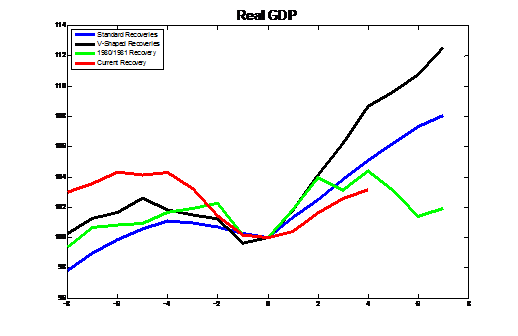
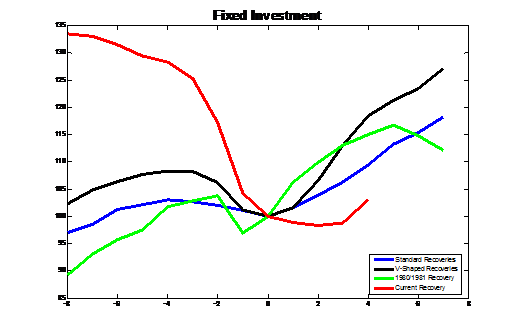
Subpar Recovery Gets Premium Market Valuation Bill Hester, CFA August 2010 All rights reserved and actively enforced. Reprint Policy Friday's GDP report offered up a slew of new data. We learned that the economy's rate of expansion in the second quarter decelerated again, to 2.4 percent at an annual rate. This is down from 3.7 percent growth in the first quarter and 5 percent growth during the fourth quarter of last year. The Commerce Department also released their annual revisions of the data, which broadly painted a picture of a recession that was deeper than originally thought and a recovery more shallow than first reported. The revisions in the data help explain why other measures of economic performance like wage gains and hiring have been so weak. GDP was revised lower for 7 of the 12 previous quarters and the economy contracted by 4.1 percent from its peak versus an originally assumed 3.7 percent, making it clearly the worst recession in post-war data. Consumer spending and corporate profits were also revised lower during the period. Likewise, the recovery has been even more anemic than originally thought. The economy grew at a 1.6 percent annual rate in the third quarter of 2009 and at a 5 percent rate in the fourth quarter, versus the 2.2 percent and 5.6 percent rates, respectively, that were originally reported. Given the arrival of this new data, and because we are now one year past Wall Street's assumed trough date of the recession, it is a good time to benchmark this recovery against prior recoveries. I've periodically shown the unevenness of the current recovery by looking at the four broad measures (income less transfer payments, trade sales, industrial production, and jobs) that the NBER uses to help determine recessionary periods. These are closely followed because they are released monthly. Benchmarking the GDP data adds another important perspective to the analysis, because it's the broadest measure of the health of the economy. In a recent statement, the NBER said: "The committee believes that the two most reliable comprehensive estimates of aggregate domestic production are normally the quarterly estimate of real Gross Domestic Product and the quarterly estimate of real Gross Domestic Income, both produced by the Bureau of Economic Analysis." So it's worth walking through the components of the GDP report to benchmark the current recovery against previous recoveries. Each of the graphs below plots 4 lines. The black line shows the average performance of each data series around the recessions ending in 1958 and 1982, because the two recoveries that followed are typically thought of as "V-Shaped." The green line plots the performance of each data series around the end of the recession that occurred in 1980. This is an example of a "double-dip," where the expansion in output lost its momentum and the economy turned down again into a recession beginning in 1981. The red line plots the current performance of each data series. Finally, the blue line is the average performance of each data series around the six other recessions since 1950 that don't fall into one of the above groups. This is our "standard" recovery benchmark. [A note about the construction of the graphs: Because the graphs use quarterly GDP data, I've used the quarterly recession dates provided by the NBER. This will create some variation in the data immediately around the end of recessions. The NBER assumes that the quarter in which the trough occurs is within the recession. So a recession ending in October in monthly data would end in December in quarterly data. These effects are limited when we focus on the full four years surrounding the end of recessions. ] The first graph plots real gross domestic product, the output of goods and services produced by labor and capital in the US. As this graph shows, and as most of the others also will also show, this is one of the slowest expansions in post-war data, and it has fallen far behind the average expansion. The current recovery even falls behind the 1980/1981 recovery, which lacked the internal momentum to develop into a sustainable recovery in the face of higher interest rates. This graph also offers perspective on the discussion regarding a "typical mid-expansion slowdown." This is a phrase that is gaining in popularity among investors, even if there's not much evidence to support it. Neither V-Shaped recoveries nor standard recoveries show any indication of a "typical" mid-expansion slowdown. The only mid-expansion slowdown that shows up in the data from this perspective is the 1980/1981 recovery. That mid-expansion slowdown quickly turned into a double-dip recession.
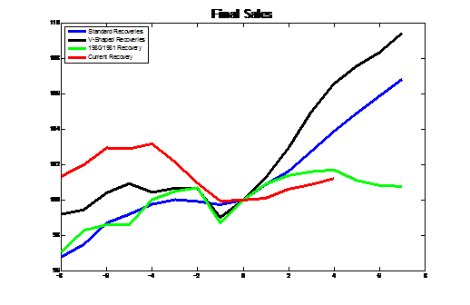
Final Sales is a measure of demand that excludes the effects of changes in inventory. This series will be important to watch as is looks like the inventory cycle might be winding down. Inventories rose by $76 billion last quarter, the biggest gain in 4 years. The second half of 2008 must still be fresh in purchasing managers' minds, when inventories relative to sales grew by 15 percent in 6 months. Overstocking is not likely in their plans (at least not intentional overstocking). Final Sales grew just 1.3 percent in the second quarter. This was similar to the first quarter's 1.1 percent expansion, and a clear downshift from the 2.1 percent rate of growth in last year's fourth quarter. The growth in Final Sales during this recovery has trailed the typical recession by a large amount. It's tracking more closely (but still trailing) the weak demand that was experienced during the 1980/1981 recovery.
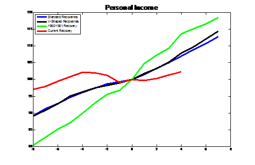
For the components of GDP, we'll focus the analysis on Consumption and Investment, because they are the largest components of GDP that are cyclical in nature. Toward that, the next two graphs show the changes in Personal Income and the changes in Personal Consumption. While Personal Income isn't a measure of demand, I've included it because it helps explain why consumption growth has been so anemic. Personal Consumption expanded at just 1.6 percent in the second quarter, continuing its subpar performance during this recovery. Its rebound since last June is less than half the typical contribution consumers typically make toward a recovery.
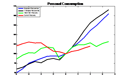
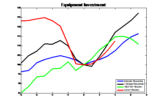
The next two graphs show two components of investment: Fixed Investment and Equipment and Software Investment. Fixed Investment, which includes residential investment, is tracking far below the typical recovery (even with residential activity gaining 28 percent in the second quarter fueled by the winding down of the home-buyer tax credit). Investment in equipment and software is the one ray of light in these series of graphs. The expansion in this type of investment is actually outpacing the standard recovery. But at only 7 percent of GDP, business investment's ability to continue to fuel GDP is limited. And as Bank of Tokyo's Ellen Zentner recently pointed out, because job growth has been so limited, these investments are very likely directed at replacing equipment and technology. Sustainable growth in business investment will likely depend on robust and persistent job creation.
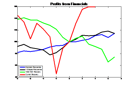
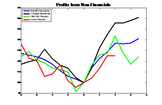
Although the first GDP report out after the end of each quarter does not include an estimate of corporate profits, benchmarking the profit recovery with the data through the first quarter highlights some interesting trends. The two graphs below shows how corporate profits from both financials and non-financial companies compare with earlier recoveries. The top graph shows the role that the large dislocations in the financial sector have caused on the profits for that group. The bottom graph may be the more interesting of the two. As measured by the GDP report, corporate profits for non-financial firms have trailed the typical recovery. These graphs highlight the incredible amount of volatility and lack of clarity the credit crisis created, and in the increased difficulty in estimating the earnings power of corporations. The implosion of financial sector earnings and the historic rebound in those earnings - fueled by the government's direct investments in those banks, the Fed-induced upward sloping yield curve, low borrowing costs, and the easing of asset valuation standards - are skewing overall rates of profit growth. Meanwhile, the earnings of private and publically traded non-financial companies are rebounding, but have lagged the gains of past recoveries.
Valuation For workers and job seekers, a slow-growing economy is better than one that is contracting. But the speed of job creation following a recession is partly a function of the internal momentum of the recovery. As Lakshman Achuthan of ECRI has observed, companies hire because they are scared of not being able to meet growing demand. Momentum helps economies build a pattern of activity which can protect them against an exogenous shock. The current US economic recovery has very little internal momentum, and what little momentum it has is waning. For investors, what's important is the extent to which expected growth in the economy and earnings is priced, or possibly overpriced, into the market. The current subpar recovery should probably warrant a below-average level of valuation compared with prior recoveries. Unfortunately, the opposite is true. To put the current level of valuation into perspective, the table below shows Robert Shiller's Cyclically Adjusted P/E Ratio (CAPE), which normalizes earnings by averaging the prior decade's results. The table shows that there have only been two other periods where the economy was recovering from a recession and the level of valuation was higher. One was in November 2002, a year following the end of the 2001 recession. The S&P 500 has achieved a total return of just 4.2% annually in the 8 years since then. The other instance was in February 1962, a year after the 1961 recession ended, when the CAPE was at 21.45 (the S&P 500 quickly lost a quarter of its value over the next few months). The average CAPE level for the periods shown is 16, versus the current level over 20.
Along similar lines, an article in this weekend's Barron's suggested that because the US economy has spent a quarter of the time over the prior decade in recession, investors should expect above-average returns going forward. The column noted that there have been only a few occurrences where the economy was in recession 25 percent of the prior decade: in 1955, 1958, 1975, and 1982. "The subsequent average annual stock-market returns over three, five and 10 years were all above average, between 14% and 16% for each period." I've mentioned this metric of economic uncertainty in prior research pieces, so it may be useful to add one more piece of color to the analysis. Following extended periods of time where the economy has slipped in and out of recession, valuation levels have typically been far lower. The periods mentioned in the Barron's article are good examples. In 1955 Professor Shiller's CAPE was 15. In 1958 it was 13. In 1975 it was 10. And in 1982 the CAPE was 7. Applying those multiples to today's real 10-year averaged earnings ($55) would imply an S&P 500 Index of 825, 715, 550, and 385, respectively. Clearly, from those levels the expected long-term returns of the market would be more attractive. Secular bear market bottoms have typically occurred when recessions were so frequent that they have knocked the last bit of optimism out of investors. One of the best measures of that remaining optimism is the P/E multiple on normalized earnings, which presently remains stubbornly high. Measured by most of the components of GDP this is one the weakest recoveries on record. GDP, Final Sales, Consumption and broad measures of Investment are all growing at rates far below the levels seen during standard recoveries, and even less than what proved to be an unsustainable recovery in 1981. To suggest that renewed weakness in the US economy is unlikely because it's a rare event leaves out another equally as important rarity: the anemic performance of the current economic recovery. --- The foregoing comments represent the general investment analysis and economic views of the Advisor, and are provided solely for the purpose of information, instruction and discourse. Prospectuses for the Hussman Strategic Growth Fund, the Hussman Strategic Total Return Fund, the Hussman Strategic International Fund, and the Hussman Strategic Dividend Value Fund, as well as Fund reports and other information, are available by clicking "The Funds" menu button from any page of this website. |
|||||||||||||||||||||||||||||||||||||||||||||||||
|
For more information about investing in the Hussman Funds, please call us at
1-800-HUSSMAN (1-800-487-7626) 513-326-3551 outside the United States Site and site contents © copyright Hussman Funds. Brief quotations including attribution and a direct link to this site (www.hussmanfunds.com) are authorized. All other rights reserved and actively enforced. Extensive or unattributed reproduction of text or research findings are violations of copyright law. Site design by 1WebsiteDesigners. |