|
|
||||||
|
|

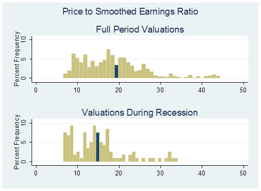
Market Valuations During U.S. Recessions William Hester, CFA March 2009 All rights reserved and actively enforced. Reprint Policy There's very little evidence that the contraction in the U.S. economy is slowing. The fourth quarter's GDP was revised downward, showing that the economy contracted at an annualized rate of 6.2 percent during the most recent quarter. Jobless claims breached 600 thousand again this week, the sixth consecutive week above that level. And the unemployment rate is at a 26-year high. This means that the current contraction will likely become the longest recession since the 1930's, outlasting the 1973-1975 and 1981-1982 recessions. Those are the kind of records that are better left unbroken. But knowing that the economy is currently in recession does have its benefits for those investors trying to gauge the valuation of the market. That's because it lets you collapse the data set of historical valuations, focusing on just those periods when the economy was contracting, while knowing in real-time that a recession is in effect. Because the last few U.S. recessions have been relatively brief in duration, this is actually a rare opportunity. The NBER declared the beginning of the 2001 recession the same month it ended. The confirmation of the 8-month long 1991 recession came after that recession ended. These shorter and shallower contractions didn't allow investors to - at least officially - know the economy was in recession and consider the range of valuations in similar circumstances. This may be just as well because the P/E ratio at the end of the 1991 recession fell only slightly below the average level typically seen during economic contractions, and the 2001 recession ended while valuation metrics were still far above typical levels. But as the current recession lengthens, and valuations improve, it may be worthwhile to put current multiples into a historical context. And it may prove worthwhile to collapse the data set of historical valuations to include just those periods of economic recession. The graphs below attempt to provide this context. Each of the charts has two histograms. A histogram shows the spread of data and its frequency at set intervals. We'll purposely avoid showing the traditional line graphs where the valuation metric is plotted against time. Because the markets were overvalued for such a long period of time and because of their recent dramatic declines, those charts can imply that the markets are cheaper than they actually are when compared with earlier data. In the charts below the top histogram displays the full range of the valuation metric for the period specified. The bottom histogram displays the range of valuations for the same time period, but only when the US economy was in recession. It's best to come at valuation analysis from a few different angles, especially when corporate performance is eroding as quickly as it is. As recent earnings have collapsed, the process of valuing the market on normalized earnings is showing its strengths. While we often use the price-to-peak earnings multiple to filter out temporary ups and downs in earnings, John Hussman has noted that the price-to-peak earnings multiple may be misleading during the current market cycle. Thanks to unusually high debt levels and unusually low labor compensation in recent years, the earnings peak in 2007 was based on profit margins that were about 50% above the historical average, and which have now collapsed. It would be dangerous to assume a quick return to those margins by taking 2007 peak-earnings as a measure of "normal" earnings. A different way to normalize earnings that is less affected by the unusually high profit margins of recent years is to use Robert Shiller's P/E ratio, which is based on the trailing 10-year average of real earnings. This ratio helps smooth out the variability in earnings, by averaging out swings due to late-cycle earnings as well as depressed earnings during profits recessions. This ratio was particularly helpful in identifying the extent to which stocks had become overvalued in 2007 (See: The growing gap between traditional P/E ratios and P/Es adjusted for the profits cycle ) The first set of histograms shows why comparing valuations to similar periods may prove useful. These graphs use Shiller's price to smoothed earnings ratio with monthly data beginning in 1950. P/E multiples are arranged along the horizontal axis, while the vertical axis shows the percentage of time each level of P/E multiple has occurred. The blue bin - an individual bar that represents a range of P/E multiples - contains the average valuation level for each data set during the period.
Although there are outliers in each data set, mostly as a result of the late 1990's, the bulk of the market's valuation multiples on smoothed (10-year) earnings sit between 7 and 25 (remember that the 10-year average is typically well below other measures of earnings such as peak-earnings, operating earnings and so on, so the price-to-smoothed earnings ratio has a higher norm than other P/E ratios). It's not surprising to see that the range of valuations is wider for the full data set, and it is shifted toward higher multiples. The economy has spent more time expanding during this period than contracting, and this data also includes most of the high-multiple periods near the end of each business cycle. The price to smoothed earnings ratio for the full data set has been about 19. The bottom histogram shows that the distribution of valuations during recessions is tighter and is shifted toward lower levels. The average multiple during recessions has been about 14.5 (most often closer to 12.5, but the average has been boosted by the 2001 recession, which took place as the bubble in stock market valuations was only beginning to deflate). The graph below shows the same histograms as above except that the blue bin signifies the current level of valuation. This will give a sense of where current valuations sit in relation to the historical range. Two items are important when looking at these histograms. One is the number of bins to the left of the current level of valuation. The second is the height of those bars. Together they represent how close - or how far - current valuations are to their historical lows. Fewer, shorter bars mean that the current multiple will be closer to their all-time lows of the data set.
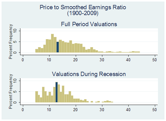
For the full data set, about 28 percent of months have had lower valuations than current levels based on the price to smoothed earnings ratio. About three-quarters of the time since 1950, the market has been more expensive based on this ratio. But the current valuation level is not nearly as compelling when you isolate the periods to where the economy was contracting. When you collapse the data set to include just those periods, then more than 40 percent of time markets have had lower valuations. Because the current contraction will likely surpass the duration of any post-war recession, it may be worth taking this analysis back further. The graph below shows histograms that plot the range of P/E multiples with each data set beginning in 1900. The top histogram plots the range of multiples during the full period. The histogram on the bottom plots the months where the economy was in recession.
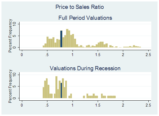
It's not surprising to see that current valuations are even further from their record lows when you include periods prior to 1950. For the full period, about 40 percent of months have had lower valuations. When you confine the analysis to periods of recession, the current multiple sits at the 50th percentile. While Shiller's price-to-smoothed earnings is useful in putting current valuations in perspective, it turns out that even the profit margins that companies reported early this decade were far above average, which boosts the averaged earnings figure. Overstating the earnings figure results in understating the ratio. Ben Graham recommended that investors normalize earnings because "it was thought to give a better idea of the company's earning power than the results of the latest year alone." But if profit margins over the past decade were pushed to unsustainable levels because of the wide-spread use of leverage and the above-average profitability of financial firms, then the current smoothed earnings figure will still overstate the earnings power for a broad range of stocks, and therefore the S&P 500. One way to sidestep the distorted message of normalized earnings is to move up the income statement. In particular, we can move all the way to the top, and look at the market's price to sales ratio (which is unaffected by profit margins). As before, the histograms below show the range and frequency of the price to sales ratio beginning in 1950 for the full data set and also for just the months that the economy was in recession.
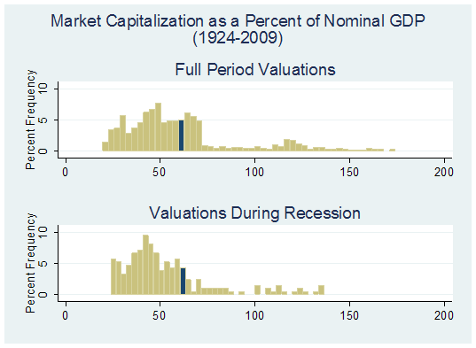
About 28 percent of price-to-sales ratios have been lower than the current level when looking at the full data set. The outlook again becomes even less compelling when you isolate the analysis to just periods of recession. The current level of the price to sales ratio sits right at the median of recession valuations. By this measure, stocks appear fairly valued, but are still far from deeply undervalued. Most data for the price to sales ratio begins in the mid 1950's, so if we want to take this analysis back further we'll need to use a proxy. One way to do this is to use the ratio of the market capitalization of the US stock market to nominal GDP, a method Jim Bianco has popularized. Although we're taking the value of publicly traded companies and comparing it to the economy's total output, the ratio can be thought of as a proxy for an economy-wide price to sales ratio. Not surprisingly, the changes in the S&P 500's price to sales ratio and the ratio of market capitalization to GDP have tracked each other well over time. The histograms below show the market capitalization to nominal GDP ratio since 1924. (This data was provided by Ned Davis Research , and it includes the NYSE's aggregate market value through 1970 and their estimate of total US market value since then.)
As in all of the charts I've shown, the 2001 recession distorts the range of valuations typically seen during recessions. In the bottom histogram, the 2001 recession is responsible for all of the data points that aren't clumped around 50 (generally those greater than 85). And from this perspective you can see that the bulk of periods where the economy was in recession, stock market capitalization has been lower relative to GDP than at present. Current valuations are at the 60 th percentile for the full period. For the recession subset, current valuations are at the 70 th percentile, meaning more than two-thirds of the time when the US economy was in recession, the market capitalization as a percent of GDP was lower than it is now. None of this is to say that the market will move lower, or ultimately plumb the lowest points of its historical range for any of the ratios mentioned. Each recession is different, and each bear market has its own primary catalyst that pushes prices lower. The periods that contained the lowest valuations in the post-war data generally had high inflation and rising interest rates. These pressures aren't currently a factor in this bear market (though a global debt crisis may prove worse). In any case, it's important to keep in mind that while current valuations have improved, they don't yet represent the worst levels that have occurred when the economy has been in recession. Isolating the data to just the post-war period, the ratio of price to smoothed earnings is at the 40th percentile level and the price to sales ratio is at the 50th percentile. Using data since 1900 for the price to smoothed earnings and data since 1924 for the market cap to nominal GDP ratio, current valuations are at the 50th percentile and 70th percentile, respectively. We can calculate the levels of the S&P where valuations would appear very compelling, even given an economy in recession. If the price to smoothed earnings ratio falls to the 25 th percentile (a Shiller P/E ratio of about 9.7), that implies the S&P at about a level of 560. If the ratio falls to its 10 th percentile, that implies the S&P at 450. If we run the same analysis by applying the level of the 25 th and 10 th percentile of the price to sales ratio to the current per share sales of the S&P, the implied S&P 500 levels are 520 and 470, respectively. If we treat each of these equally, it would imply a level of 500 for the S&P. At this level, the S&P would be generally in the lowest fifth of its range of valuations that typically occur during recessions, without relying on expectations of a quick recovery in profit margins to the levels of recent years. Again, it's uncertain whether investors will push valuation metrics down to the lowest points of their historical ranges. If investors come to expect that profit margins will recover quickly, they may be willing to use the earnings history of recent years as a valuation benchmark. The measures discussed above don't require optimistic assumptions about a quick recovery in profit margins. When assessing the risks it's important for investors to use the correct range of potential valuations. Knowing the economy is in recession gives investors an opportunity to compare current valuation levels to other periods when the economy was in recession. In contrast, comparing current valuation levels to historical averages may give investors a misleading sense about the "support" provided by valuations, because the majority of those historical periods featured a dramatically different back-drop. When you isolate the periods where the US economy was in recession, the analysis shows that the market's current valuation - while not rich - may not be extremely cheap either. --- The foregoing comments represent the general investment analysis and economic views of the Advisor, and are provided solely for the purpose of information, instruction and discourse. Prospectuses for the Hussman Strategic Growth Fund, the Hussman Strategic Total Return Fund, the Hussman Strategic International Fund, and the Hussman Strategic Dividend Value Fund, as well as Fund reports and other information, are available by clicking "The Funds" menu button from any page of this website. |
|||||||||||||||||||||||||
|
For more information about investing in the Hussman Funds, please call us at
1-800-HUSSMAN (1-800-487-7626) 513-326-3551 outside the United States Site and site contents © copyright Hussman Funds. Brief quotations including attribution and a direct link to this site (www.hussmanfunds.com) are authorized. All other rights reserved and actively enforced. Extensive or unattributed reproduction of text or research findings are violations of copyright law. Site design by 1WebsiteDesigners. |