|
|
||||||
|
|

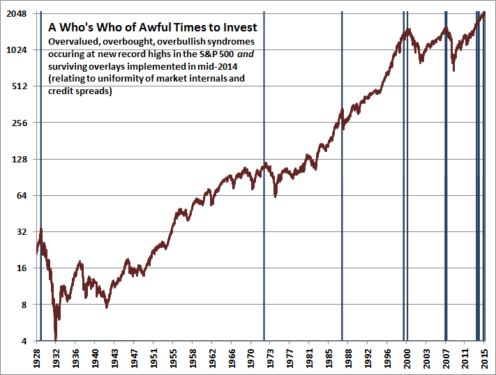
March 1, 2015 Plan to Exit Stocks Within the Next 8 Years? Exit Now Unless we observe a rather swift improvement in market internals and a further, material easing in credit spreads – neither which would relieve the present overvaluation of the market, but both which would defer our immediate concerns about downside risk – the present moment likely represents the best opportunity to reduce exposure to stock market risk that investors are likely to encounter in the coming 8 years. Last week, the cyclically-adjusted P/E of the S&P 500 Index surpassed 27, versus a historical norm of just 15 prior to the late-1990’s market bubble. The S&P 500 price/revenue ratio surpassed 1.8, versus a pre-bubble norm of just 0.8. On a wide range of historically reliable measures (having a nearly 90% correlation with actual subsequent S&P 500 total returns), we estimate current valuations to be fully 118% above levels associated with historically normal subsequent returns in stocks. Advisory bullishness (Investors Intelligence) shot to 59.5%, compared with only 14.1% bears – one of the most lopsided sentiment extremes on record. The S&P 500 registered a record high after an advancing half-cycle since 2009 that is historically long-in-the-tooth and already exceeds the valuation peaks set at every cyclical extreme in history but 2000 on the S&P 500 (across all stocks, current median price/earnings, price/revenue and enterprise value/EBITDA multiples already exceed the 2000 extreme). Equally important, our measures of market internals and credit spreads, despite moderate improvement in recent weeks, continue to suggest a shift toward risk-aversion among investors. An environment of compressed risk premiums coupled with increasing risk-aversion is without question the most hostile set of features one can identify in the historical record. Short term interest rates remain near zero, 10-year bond yields have declined below 2%, and our estimate of 10-year S&P 500 total returns has declined to just 1.4% (see Ockham’s Razor and the Market Cycle for the arithmetic behind these historically-reliable estimates). Recent weeks mark the first time in history that our estimates of prospective 10-year returns on all conventional asset classes have simultaneously declined below 2% annually. We don’t expect a portfolio mix of stocks, bonds and cash to achieve any meaningful return over the coming 8-year period. The fact that the financial markets feel wonderful right now is precisely because yield-seeking speculation and monetary distortions have raised security prices today to levels where they are likely to stand years from today – with steep roller-coaster rides in the interim. The statement that began with the word “Unless” in the first paragraph is enormously important – because that distinction captures the primary lesson of our own awkward transition from 2009 to mid-2014 in our methods of estimating market return/risk profiles (see A Most Important Distinction, and A Better Lesson than This Time is Different). It's important to recognize why the present syndrome of overvalued, overbought, overbullish conditions differs from other (though less extreme) syndromes that have emerged in recent years. The central distinction is the condition of investor risk preferences, as inferred from market internals and credit spreads. Even in the half-cycle since 2009, these considerations have correctly distinguished overvalued conditions that extended further from overvalued conditions that were quickly corrected (as we observed in 2010 and 2011). When investors are risk-seeking, they tend to be risk-seeking in everything, so one observes substantial uniformity in the breadth and leadership of market action across industries, sectors, capitalizations, quality, junk, and various security types. Divergence and dispersion in that market action is an important and leading signal of increasing risk aversion among investors, and it is in that context that overvaluation, overbought conditions, overbullish sentiment, and compressed risk premiums often suddenly matter with a vengeance, where they didn’t seem to matter at all before. Our concerns are not predicated on any particular near-term forecast. Even so, historical considerations that have been effective in market cycles across history (and that also would have captured the majority of the market advance since 2009) presently suggest considerable risk of what we’ve often called an “air pocket” – similar to what we observed last October – over the coming 10-12 weeks, with much more severe downside risk possible over the course of the next 18-24 months. A Who’s Who of Awful Times to Invest (at record highs, with overlays negative) The chart below shows historical instances where overvalued, overbought, overbullish conditions matched current extremes, and where bubble-tolerant overlays (based on measures of market internals and credit spreads) were also unfavorable, and where the S&P 500 had established an all-time high. On less stringent criteria, there would also be additional instances shown in 2010 and 2011. As I’ve noted before, if one thing was truly different about the yield-seeking speculation induced by QE in the recent half cycle, it is that QE reduced the overlap between overvalued, overbought, overbullish conditions and periods of deteriorating market internals. The current set of overextended conditions is the most severe variant that we define, and unlike several instances in the half-cycle since 2009, we do not have indications from market action and credit spreads that these extremes are likely to be tolerated for long. A material improvement in the uniformity of market internals would change that assessment, which is why our present concerns are conditional on the evidence as it stands.
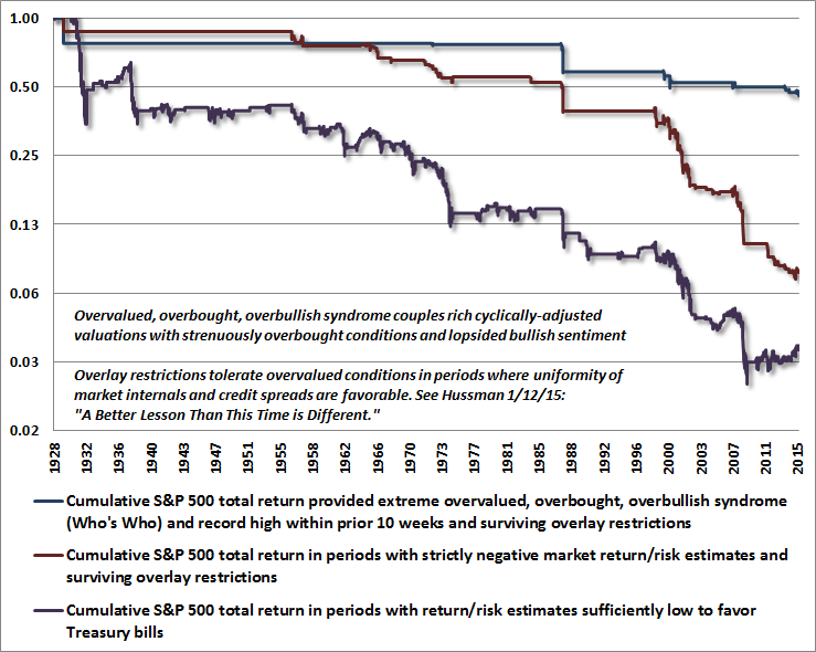
Extremes in observable conditions that we associate with some of the worst moments in history to invest include: Aug 1929 (with the October crash within 10 weeks of that instance), Aug-Oct 1972 (with an immediate retreat of less than 4%, followed a few months later by the start of a 50% bear market collapse), Aug 1987 (with the October crash within 10 weeks), July 1999 (associated with a quick 10% market plunge within 10 weeks), another signal in March 2000 (with a 10% loss within 10 weeks, a recovery into September of that year, and then a 50% market collapse), July-Oct 2007 (followed by an immediate plunge of about 10% in July, a recovery into October, and another signal that marked the market peak and the beginning of a 55% market loss), two earlier signals in the recent half-cycle, one in July-early Oct of 2013 and another in Nov 2013-Mar 2014, both associated with sideways market consolidations, and the present extreme. It’s notable that while these extremes sometimes occurred at the exact market high, other instances were only proximal to those highs, resulting in brief retreats and a final push higher. We don’t know whether the current instance will have consequences similar to the 1929, 1972, 1987, 2000 and 2007 ones, but suffice it to say that these conditions were more notable for their outcomes over the completion of the full market cycle than they were for their immediate outcomes. To provide some insight into why we consider present conditions so hostile, the chart below shows the cumulative total return of the S&P 500 under a variety of classifications of varying severity. Present conditions are captured within all of them. The chart is presented on log scale, so every horizontal line lower represents a 50% loss of value. The blue line shows the cumulative return of the S&P 500 restricted to only the 10-week period following the above signals, provided that our measures market internals or credit spreads were also hostile at the time. This handful of periods, amounting to just over 2% of market history, captures a cumulative market loss of over 50% (-30% annualized rate of loss). The red line shows conditions featuring strictly negative return/risk estimates that survive bubble-tolerant overlay restrictions relating to market internals and credit spreads. This larger set of periods, amounting to less than 8% of market history, captures a cumulative market loss of over 82% (-32% annualized rate of loss). The purple line is more inclusive, showing conditions featuring flat or negative return/risk estimates sufficient to prefer Treasury bills, on average, over equity risk. These periods, amounting to about 38% of market history, capture a cumulative market loss of over 96% (-10% annualized rate of loss), but are less consistent in the profile and severity of those losses. Notice that the remaining 62% of market history not captured in this graph contains not only the entire net gain of the equity market over history, but also contains an additional 25-fold advance required to erase the cumulative 96% market loss that investors would have sustained by ignoring these conditions.
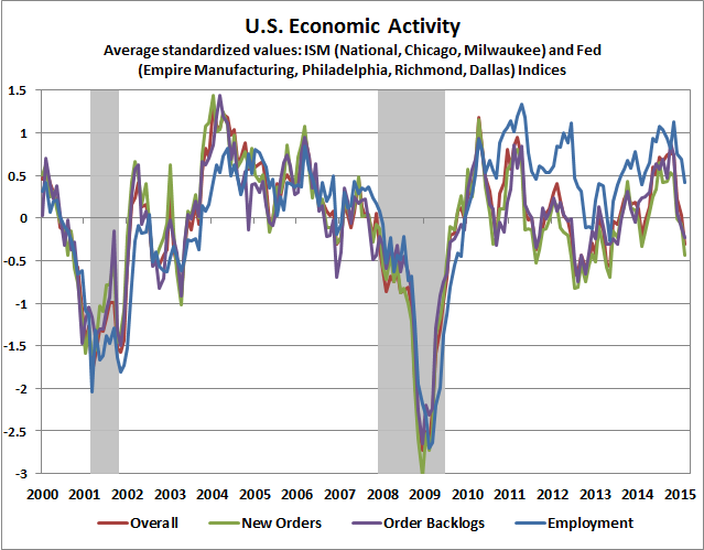
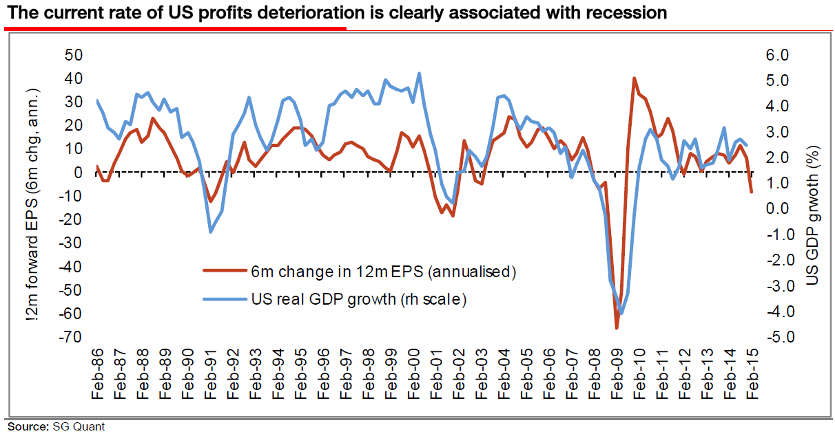
All of that said, it’s extremely important to observe that while the expected market return/risk profile is flat or negative in all of the conditions shown above, none of these conditions is associated with strictly negative actual market returns. All of them contain at least some periods of advance, which may seem negligible from the perspective of an 87-year chart, but these periodic advances can make it frustrating - even excruciating - to stay defensive if one doesn't maintain a full cycle perspective. I assure you this will make also me a target for incivilities should the present instance include any further market gains. That’s fine – my objective is, and always has been, to share our analysis with an emphasis on the complete market cycle. If we observe an improvement in market internals and credit spreads, we’ll be more tolerant of current extremes with a less defensive outlook (though there’s little chance that we would encourage an investment stance without a considerable safety net). For now, our concerns remain pointedly to the downside. In the above chart, notice also that while the blue line shows market action in the 10-week period of a “Who’s Who” extreme, further and later downside is typically captured by the red and purple conditions. Put differently, the blue line – capturing the most severe conditions we observe at present – certainly does not capture in a 10-week window the entire extent of losses that may unfold over a more extended period of time. We’re quite aware, and slightly entertained, by critics who offer me as a poster-child against evidence-based market analysis or markedly unconventional views – half-way into a market cycle, with prices at record highs, and with reliable valuation measures at obscene levels. These will be great fun to save for later, as they were in 2000 and 2007. It should be obvious that our challenges in this half-cycle began with my 2009 decision to stress-test our methods against Depression-era data, having correctly anticipated the tech crash, the financial crisis, both of the associated recessions, having moved to a constructive outlook early in the intervening bull market, and when the long-term benefits our discipline were rather indisputable. Given an incomplete half-cycle at speculative extremes, my sense is that assessments of our discipline will change considerably by the completion of this cycle. I suspect it will still somehow surprise investors how strongly I am inclined to encourage an aggressive or leveraged stance when market conditions justify it (as I did for years in the early 1990’s). Meanwhile, I’ve been my own harshest critic – particularly with regard to the unfortunate timing of my stress-testing decision in 2009 – and have been very open about the challenges that QE and yield-seeking speculation have posed for the methods that resulted: deferring market losses that resulted much more quickly following extremely overextended market conditions in prior historical cycles. Having completed our adaptation to those challenges in mid-2014, and extensively detailing the central lessons, we’re simply focused on executing that discipline. Our investment horizon is decidedly focused on the complete market cycle. If you are a committed, disciplined buy-and-hold investor with no sensitivity to cyclical market fluctuations (even those as large as the 50% losses of 2000-2002 and 2007-2009), and you fully recognize the depth of cyclical risks that regularly accompanies that strategy, I don’t encourage a deviation from that discipline based on my analysis of market risk. Rather, my only advice is to ensure that the duration of your portfolio is well-aligned with the horizon over which the funds will be spent. Think of it this way: equity market duration has increased dramatically since 2009, but your investment horizon has become several years shorter. Current market extremes provide an ideal point to realign your portfolio duration with your investment horizon. Specifically, the effective duration of the S&P 500 is presently about 50 years, with average bond market duration closer to 6 years, and of course zero duration for cash holdings. So we would estimate a 40-30-30% mix of stocks, bonds, and cash to have an overall portfolio duration of about 22 years here. In our view, an investor with a 20 year spending horizon should presently have no more than 40% of assets invested in the stock market. In any event, our view is that the 10-year nominal total return on such conventional asset allocations is likely to be less than 2% annually. The black box between data and market outcomes One of the things that casual observers often get wrong is that my outlook isn’t driven by some perma-bearish philosophy, but is instead a function of observable data – specifically, the historical relationship between observable data and subsequent outcomes in the financial markets and the economy. The massive and rather painful wrinkle in that story is that there is a black box that often stands in-between the data and the outcomes. Inside that black box is the mental state of investors, which can be rational, delusional, risk-averse, or risk-seeking at any given point in time. The central lesson from our challenging transition between my 2009 stress-testing decision and mid-2014 (when we completed that transition) is this: some observable data – specifically market internals, credit spreads, and other risk-sensitive measures – are informative about what is currently in that black box. So for example, we know that overvalued markets reliably result in poor long-term returns for investors, but during shorter periods within an individual market cycle, investor preferences toward risk (which we can infer from observable market action) distinguish whether an overvalued market is likely to become temporarily even more overvalued, or whether it is vulnerable to a crash. So our value-conscious, historically informed, risk-managed discipline is driven by data and exhaustive analysis, not by dedication to some bearish philosophy. Those who invest by the seat of their pants often project that same proclivity onto me and assume that I must be doing the same. I would think that the thousand graphs, equations, and historical analyses I’ve generated over the years would give pause to that assumption. Still, our stumble in the recent cycle, though far smaller than what the market itself experienced in 2000-2002 and 2007-2009, was quite awful in relative terms, as the speculation encouraged in this half-cycle by Fed-induced yield seeking has seen no equal outside of the run to the 1929 and 2000 peaks. On valuation measures most reliably correlated with actual subsequent market returns (a test that is never imposed on popular measures), current valuations now exceed 1929 levels. The fact is that since 2000, the S&P 500 has achieved an annual total return of 4.1% annually, and doing so has required a speculative push to valuations exceeding those of every other market cycle in history, including 1929. In the interim, we’ve seen two separate market collapses of 50% and 55%, and I suspect that a third is in the offing. But again, the financial markets feel wonderful here precisely because security prices today already stand at the same levels that are likely to be seen 8-10 years from today, with one or two exciting roller-coaster rides in-between. Groucho Marx once said “I wouldn’t join any club that would accept me as a member.” I sometimes feel that way about investment analysts and even economists, who often seem to base their arguments (whether bullish or bearish) on relationships that can’t actually be established in the data. I'm always dismayed, for example, by how confidently analyts and economists talk about the relationship between monetary policy and economic outcomes, when the fact is that the level of interest rates, changes in interest rates, and changes in the monetary base provide very little additional forecasting power for GDP, over and above forecasts based on lagged changes in GDP itself. Non-monetary variables such as purchasing manager's indices provide far more information than monetary variables do. Within the more desirable club of analysts that actually are historically informed, my friend Albert Edwards at SocGen surveys the landscape of valuations, global economic deterioration, weakening profit growth and accelerating earnings downgrades, and writes: “We are at that stage in the cycle where I begin to doubt my own sanity. I’ve been here before though and know full well how this story ends and it doesn’t involve me being detained in a mental health establishment (usually). The downturn in US profits is accelerating and it is not just an energy or US dollar phenomenon – a broad swathe of US economic data has disappointed in February. One of the positive surprises, payrolls, is a lagging indicator. The $64,000 question is not if, but rather when will investors realise what is going on?” Albert is exactly right on the sequence here. Generally speaking, joint market action in Treasury yields, credit spreads, commodities, and market internals provide the earliest signal of potential economic strains, followed by the new orders and production components of regional purchasing managers indices and Fed surveys, followed by real sales, followed by real production, followed by real income, followed by new claims for unemployment, and confirmed much later by payroll employment. The initial weakening in market internals we’ve highlighted for months has already flowed through to new orders and production. The chart below updates the current status of various regional purchasing managers indices and Fed surveys, where these components have already dropped below where they were at the start of the 2007-2009 recession, though not the 2000-2001 recession. There’s not enough deterioration to warn of a likely recession just yet, though significant further deterioration across purchasing managers indices, coupled with a retreat in stocks below their level 6 months ago (roughly the 2000 level on the S&P 500) would significantly intensify our concerns.
Albert shares the following chart of recent changes to forward (year-ahead) earnings expectations.
Finally, a few notes on monetary policy. When investor preferences are risk-seeking, overly loose monetary policy can have a disastrous effect by promoting reckless speculation and enhancing the ability of low-quality borrowers to issue debt to yield-starved investors. This encourages malinvestment and financial distortions that then collapse, as we saw following the tech and housing bubbles. Those seeds have now been sown for the third time in 15 years. All of this has been in pursuit of what is in fact a nearly nonexistent cause-effect relationship between monetary policy and economic activity [Geek's Note: You can prove this to yourself by observing the weak incremental power of monetary variables to forecast economic activity, over and above forecasts based on simple lagged changes in output, particularly compared with the information available from non-monetary variables]. Still, thinking from the Fed's perspective, we doubt that the Federal Reserve will be able to "justify" raising rates if recent economic deterioration continues. For fiscal and financial stability reasons, we’re adamant that the Fed should cease the reinvestment of principal as it rolls off the Fed’s balance sheet in any event. Keep in mind, however, that a decision by the Fed to defer raising rates would not necessarily be good for the stock market. Quantitative easing only “works” to the extent that default-free, low-interest liquidity is seen by investors as an inferior holding. Even if the Fed does raise rates, we agree with Albert’s colleague Kit Jukes that “the economic cycle will be brought down by asset bubbles bursting long before ‘tight’ policy has any effect. Lessons were learned from the Global Financial Crisis, but not that one.” So how should changes in Fed policy be interpreted? From our perspective, if we were to see an improvement in market internals and credit spreads suggesting a shift back to risk-seeking investor preferences, then yes – an extension of loose Fed policy could amplify that speculation. What we should all remember, however, is what happens when the Fed eases in an environment of risk-averse investor preferences: nothing. Recall that the Fed did not tighten in 1929, but instead began cutting interest rates on February 11, 1930 – nearly two and a half years before the market bottomed. The Fed cut rates on January 3, 2001 just as a two-year bear market collapse was starting, and kept cutting all the way down. The Fed cut the federal funds rate on September 18, 2007 – several weeks before the top of the market, and kept cutting all the way down. Understand that dynamic. The conflicting responses of the stock market to Fed easing can be resolved by remembering that monetary policy should always be examined through the lens of market internals.The foregoing comments represent the general investment analysis and economic views of the Advisor, and are provided solely for the purpose of information, instruction and discourse. Please see periodic remarks on the Fund Notes and Commentary page for discussion relating specifically to the Hussman Funds and the investment positions of the Funds. --- The foregoing comments represent the general investment analysis and economic views of the Advisor, and are provided solely for the purpose of information, instruction and discourse. Prospectuses for the Hussman Strategic Growth Fund, the Hussman Strategic Total Return Fund, the Hussman Strategic International Fund, and the Hussman Strategic Dividend Value Fund, as well as Fund reports and other information, are available by clicking "The Funds" menu button from any page of this website. |
|||||||||||||||||||||||||
|
For more information about investing in the Hussman Funds, please call us at
1-800-HUSSMAN (1-800-487-7626) 513-326-3551 outside the United States Site and site contents © copyright Hussman Funds. Brief quotations including attribution and a direct link to this site (www.hussmanfunds.com) are authorized. All other rights reserved and actively enforced. Extensive or unattributed reproduction of text or research findings are violations of copyright law. Site design by 1WebsiteDesigners. |