|
|
||||||
|
|

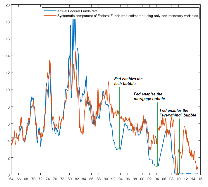
September 19, 2016 Support Drops Away Over the past few months, I’ve tempered our long-term outlook for near-zero S&P 500 total returns over the coming 10-12 year horizon, and our cyclical outlook for a 40-55% market loss over the completion of the current cycle, with a rather neutral near-term outlook. Specifically, despite wicked valuations coupled with mixed market internals, various trend-following components among those measures were constructive enough to hold us to a fairly flat near-term outlook. I’ve often described this kind of market return/risk classification with the phrase “unpleasant skew” - the most probable single outcome in any given week under these conditions is actually a small gain, but those incremental gains are typically offset by the small probability of steep, abrupt losses that can wipe out weeks or months of gains in one fell-swoop. As a result, the mode is positive, but the resulting average returns are quite negative overall (see the chart in Impermanence and Full-Cycle Thinking to see what this skewed distribution looks like in market data since 1940). Last week, the most reliable of those trend-following components deteriorated to a negative condition. That’s not a forecast of immediate market direction, particularly with a Fed statement on Wednesday, but it’s an indication that we presently estimate both razor-thin (and even negative) equity risk premiums from a valuation standpoint, and also a uniform, if subtle, shift toward increasing risk-aversion among investors. That, historically, is the most negative combination of conditions we identify. The equity market has been dancing sideways for months on a very thin floor supported strictly by trend-following considerations. That’s kept our near-term outlook rather neutral. Last week, on the most reliable measures we identify, that floor quietly dropped away. Importantly, we’re focused here on the joint signal we infer from market internals, not on some moving average or another. As I’ve frequently observed in a variety of “signal extraction” contexts, single indicators typically provide weak information because the true signal (whether about market conditions or economic prospects) is invariably confounded by random noise. Market action should always be analyzed in the context of multiple “sensors” that capture the behavior of a broad range of individual securities, industries, sectors, and security types. The information isn’t just in the obvious trends; it’s also in the less obvious divergences. When we’re asked “what are you looking at when you talk about market internals?” the answer is that we’re looking at the joint behavior of all of these sensors in combination. On the subject of Federal Reserve policy, I’ve regularly emphasized that much of the variation in output, employment, and inflation over time can be explained by prior values of those same non-monetary variables (output, employment, inflation) and that adding monetary variables provides virtually no useful additional information (see Failed Transmission - Evidence on the Futility of Activist Fed Policy). We can’t quite conclude that monetary policy is useless, but we can confidently say that any predictable impact on the real economy is wholly contained in the “systematic” component of monetary policy; the component that can itself be predicted by lagged output, employment and inflation. By contrast, “activist” deviations of monetary policy from those measured and statistically-defined responses to output, employment, and inflation have no correlation or beneficial effect at all on later economic outcomes, except to the extent that they contribute to speculative bubbles and crashes, which exert their effects over a longer horizon than the Fed seems to consider. The chart below shows the actual Federal Funds rate across history, along with the “systematic” component that could have been predicted using only data on output, employment and inflation that was available at each point in time. The difference between those two lines is what I’m calling “activist” Fed policy. Notice that the admirable thing about Paul Volcker’s tenure at the Fed in the late-1970’s and 1980’s was not his activism, but rather the courage to follow what actually reflected a disciplined rules-based policy (aside from very temporary deviations that probably exerted most of their effect on the financial markets). In my view, the massive activist deviations from rules-based policy by Greenspan, Bernanke, and Yellen have served only to enable a sequence of financial bubbles and collapses.
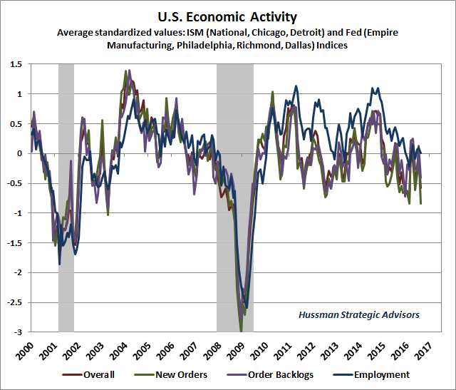
As for Wednesday’s decision, two things are clear from the chart above. One is that our own estimate of the appropriate Federal Funds rate here is certainly above 1% at present. But the other is that we’ve seen significant and progressive deterioration in underlying economic conditions recently, so it’s not clear that this is a pressing moment to normalize policy, except to rein in a financial bubble that already has “market crash” written all over it. Whatever policy error the Fed might make by raising, or not raising, interest rates here pales in comparison to what activist Fed policy has already baked in the cake. As I noted last year in Deja Vu: The Fed’s Real Policy Error Was to Provoke Years of Speculation, “when the Fed holds interest rates down for so long that investors begin reaching for yield by speculating in the financial markets and making low-quality loans, the entire financial system becomes dangerously prone to future crises.” So while I believe that the Fed should have normalized rates years ago, that the Fed should be systematically winding down the size of its balance sheet, and that the appropriate Fed Funds rate is well above current levels, I also believe that the economy is deteriorating to a much more significant extent than lagging variables, particularly employment, may suggest. The chart below shows our composite of regional Federal Reserve and purchasing managers surveys (measured in terms of standard deviations from the mean). We’re particularly attentive to the new orders component of these surveys, as the behavior of new orders and backlogs reliably leads changes in the headline and employment components. The most recent data have been notably weak in that regard.
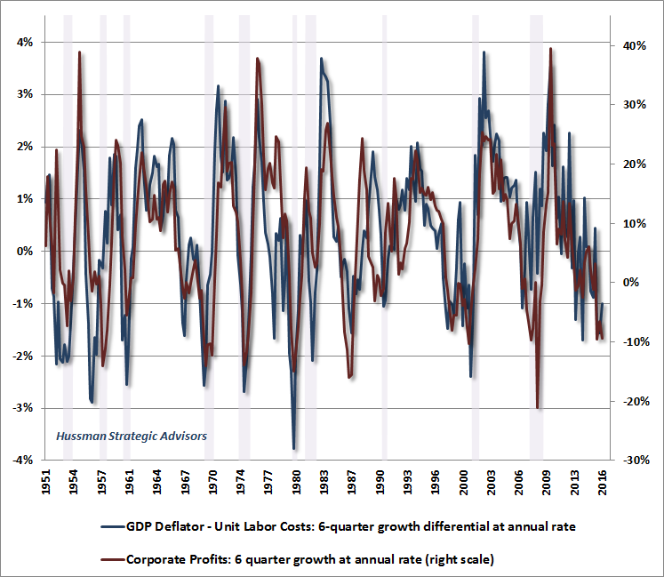
Meanwhile, year-over-year growth in real GDP growth has dropped to just 1.2%, which is actually lower than what is normally observed at the beginning of U.S. recessions. The same is true for the 1.9% growth rate of real final sales, not to mention U.S. industrial production, which has contracted year-over-year. On the lagging side, even year-over-year payroll employment growth is sputtering at just 1.7%, not far from the 1.4% threshold that is commonly observed at the beginning of recessions. Still, enough labor market slack has been taken up in recent years that we’re finally observing upward movement in wages. It was reported last week that the 2015 Census figure for real median household income grew by 5.2% from 2014. It’s a bit challenging to tie that figure out to Department of Labor figures showing that average weekly earnings for all employees grew by just 2.3% in 2015 (1.6% after inflation), since neither household size nor the labor force participation rate budged in 2015. Still, to the extent that employment growth has done anything in recent years, the main impact has been to make labor scarce enough that wages have increased faster than the general price level. That outcome, in fact, is the only legitimate implication of what A.W. Phillips wrote about in 1950, and is now known as the “Phillips Curve.” Wait. Wages? That’s not how they talked about the Phillips Curve in Economics 101, and it certainly isn’t how the Fed talks about the Phillips Curve. True. And it’s here that one has to make the distinction between data and dogma. See, Phillips studied a century of British wage data during a period when the U.K. was on the gold standard, when general prices were quite stable. So the wage inflation that Phillips observed during periods of low unemployment was actually real wage inflation. Perhaps not surprisingly, it turns out that the only Phillips Curve that one can actually demonstrate in empirical data is one that links unemployment to real wage inflation. When workers are relatively scarce, their wages increase relative to the general price level. In contrast, there’s utterly no evidence at all that central banks can somehow buy more employment by pursuing a higher level of general price inflation, no matter how adamant central bankers are in that pursuit. For more on this point, see Eating Our Seed Corn: The Causes Of U.S. Economic Stagnation, And The Way Forward. OK, so the leading economic data is showing weakness, but lagging employment data has been strong enough to push wage growth above the level of general price inflation. One would expect that greater household income will result in greater spending and higher corporate profits, no? Well, it depends. See, if wages were rising because workers were more productive, then we might expect a kind of “virtuous circle” where greater output generates greater incomes, which are then available to purchase the output, so that incomes and profits both rise together. But without productivity growth, the pie doesn’t expand; it simply gets divided differently. Unfortunately, one of the consequences of an economic system that has persistently encouraged and rewarded debt-financed consumption and speculative misallocation of capital is that the growth of U.S. real gross domestic investment has dropped since 2000 to just one-fifth of the growth it enjoyed in the preceding half-century. Indeed, real U.S. gross domestic investment is at the same level it was a decade ago. With that lack of productive investment, weak growth in U.S. productivity has followed. That’s a problem for corporate profits here. See, rising wages without productivity growth mean that “unit labor costs” - the cost of the labor used to produce one unit of output - are rising. Of course, labor costs represent by far the largest share of corporate costs. Now suppose that unit labor costs rise faster than the prices that companies can sell the output. One would naturally expect profit margins to be pressured lower. It turns out that this expectation is exactly right. In the chart below, a blue line below zero means that unit labor costs have increased faster than the GDP deflator over the preceding 6 quarters. The red line shows the growth of corporate profits over the same period. Clearly, the weakness we’ve observed in corporate profits is directly related to the fact that unit labor costs have been accelerating; partly because of less labor market slack, but also partly because of tepid productivity growth. The current situation doesn’t bring the phrase “virtuous circle” to mind.
We can also understand why corporate profits are under pressure from the standpoint of the savings-investment identity. In recent quarters, gross private investment has declined, household savings have increased, and both the current account and government spending deficits have been fairly unchanged (think of a current account deficit as being financed by the sale of U.S. securities to foreigners, so in terms of the savings-investment identity, a current account deficit represents an inflow of “foreign savings”). Investment must equal saving (household + corporate + government + foreign). Notice that if investment has declined, and household saving has increased, while government and foreign saving are unchanged, it must be that corporate saving (profits - payouts) has declined. From here, the worst outcome for corporate profits would involve some combination of falling domestic investment, greater household saving, a deteriorating trade deficit (greater “foreign saving”), or a narrower government deficit (greater “government saving”). The best outcome for corporate profits would involve some combination of rising domestic investment, reduced household saving, a narrower trade deficit (lower “foreign saving”), or a larger government deficit (less “government saving”). Taken together, the big picture is this. First, our evaluation of the expected return/risk profile in U.S. stocks shifted last week to a substantially more hostile classification, as a result of deterioration in market internals. Several trend-following components of those measures have held our near-term outlook to a fairly neutral view in recent months. Last week, that view shifted to the most negative outlook we define. That outlook will shift again, possibly in response to fresh improvement, possibly after substantial deterioration. We’ll take our evidence as it arrives. Meanwhile, with a Federal Reserve meeting this week, we have to allow for greater volatility and uncertainty than usual. My view is that a systematic, measured, statistically-defined response to current output, employment and inflation conditions would place the Federal Funds rate close to 1.5% here, but those same conditions have been deteriorating on balance, despite a relatively low unemployment rate. The best reason to take another step toward normalizing policy has nothing to do with the real economy, and has everything to do with the fact that the Fed has created the third financial bubble since 2000. Unfortunately, if the Fed hopes to reduce the risk of another financial crash, that ship has already sailed. My sense is that the Fed will realize, much too late, that its last opportunity to avoid yet another speculative episode came and left port years ago. As in prior market cycles, the consequences will come. Then again, so will fresh investment opportunities as the current cycle is completed.The foregoing comments represent the general investment analysis and economic views of the Advisor, and are provided solely for the purpose of information, instruction and discourse. Please see periodic remarks on the Fund Notes and Commentary page for discussion relating specifically to the Hussman Funds and the investment positions of the Funds. --- The foregoing comments represent the general investment analysis and economic views of the Advisor, and are provided solely for the purpose of information, instruction and discourse. Prospectuses for the Hussman Strategic Growth Fund, the Hussman Strategic Total Return Fund, the Hussman Strategic International Fund, and the Hussman Strategic Dividend Value Fund, as well as Fund reports and other information, are available by clicking "The Funds" menu button from any page of this website. |
|||||||||||||||||||||||||
|
For more information about investing in the Hussman Funds, please call us at
1-800-HUSSMAN (1-800-487-7626) 513-326-3551 outside the United States Site and site contents © copyright Hussman Funds. Brief quotations including attribution and a direct link to this site (www.hussmanfunds.com) are authorized. All other rights reserved and actively enforced. Extensive or unattributed reproduction of text or research findings are violations of copyright law. Site design by 1WebsiteDesigners. |