|
|
||||||
|
|

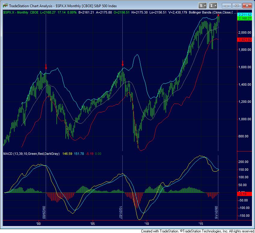
October 3, 2016 Sizing Up the Bubble “In the ruin of all collapsed booms is to be found the work of men who bought property at prices they knew perfectly well were fictitious, but who were willing to pay such prices simply because they knew that some still greater fool could be depended on to take the property off their hands and leave them with a profit.” Chicago Tribune, April 1890 Presently, the broad NYSE Composite Index is at a lower level than it set more than 2 years ago, in July 2014. Including dividends, the index has gained hardly 2%. Several indices dominated by large capitalization or speculative growth stocks, particularly the S&P 500, have performed better, but even here, the index is only a few percent above its December 2014 high. Over the past two years, the behavior of the stock market can be described less as an ongoing bull market than as the extended topping phase of what is now the third financial bubble since 2000. The chart below shows the current setup in the context of monthly bars since 1995. After the third longest bull market advance on record, fresh deterioration in key trend-following components within our measures of market internals (see Support Drops Away) recently joined this extended, overvalued, overbought, overbullish peak, even as the S&P 500 hovers at the top of its monthly Bollinger bands (two standard deviations above the 20-period average) and cyclical momentum rolls over from a 9-year high. Taken together with other data, we continue to classify present conditions within the most hostile expected market return/risk profile we identify.
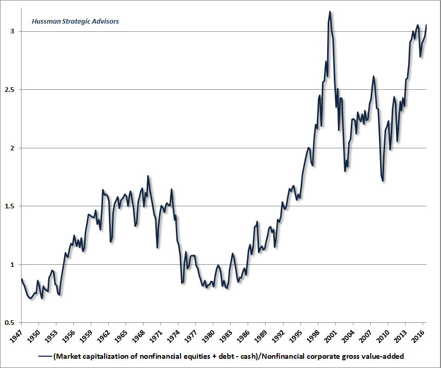
The great victory of the Federal Reserve in the half-cycle since 2009 was not ending the global financial crisis; the crisis actually ended in March 2009 with the stroke of a pen that changed accounting rule FAS157 and eliminated mark-to-market accounting for banks (instantly removing the specter of widespread insolvencies by allowing “significant judgment” in valuing distressed assets). The victory was not economic recovery; the trajectory of the economy since 2009 has been no different than the trajectory that could have been projected using wholly non-monetary variables. No, the great Pyrrhic victory of the Fed has been to enable the third most extreme financial bubble in history, on the basis of capitalization-weighted indices, and the single most extreme bubble in history from the standpoint of individual stocks. Greater fools Every financial bubble rests on the presumption that there is still some greater fool available to purchase overvalued assets, no matter how overvalued they might become. In the recent half cycle, central banks have intentionally extended this speculation by promising that they, themselves, could be relied upon to be those greater fools. Yet despite the most extreme version of these assurances in Japan, where the Bank of Japan has driven long-term interest rates to negative levels and has purchased stocks outright, the Nikkei 225 index is no higher than it was in November 2014. Indeed, the Nikkei is no higher than it was 30 years ago, having lost more than -60% of its value on three separate occasions, two of them in a period when interest rates were pegged at zero, and never rose above 1%. Investors have been lulled into believing that an endless horizon of weak growth, easy money, and zero interest rates is desirable, when it is actually a syndrome of flat-lining vital signs. What will drive the next crisis is not some rate hike by central banks (whose activist interventions have essentially zero correlation with subsequent real economic outcomes). Instead, the collapse will emerge both naturally and inevitably, as the progression of the economic cycle takes its course, and investor preferences shift from risk-seeking to risk-aversion. Virtually any commonplace shock is now capable of being a pin-wielding butterfly on this increasingly vulnerable financial bubble. Debt defaults, insolvencies, and pension crises are already unavoidable. Year-over year growth in real GDP, real gross domestic income, durable goods orders, real retail sales, industrial production and other measures are all down to levels typically observed at the beginning of recessions. We won’t pound the tables about imminent recession until we observe fresh weakness in the equity market (even a 7-8% market loss would sharply raise our probability estimates), but it’s important to recognize that financial risks are already fully developed, and as in other bubbles, one usually finds “catalysts” to blame for a collapse only well after the downturn is in full-swing. The impact of central bank intervention has already weakened progressively in recent years, because it relies on the ability of fools to constantly raise the ante. Pay 82 euros today for a bond that delivers 100 euros a decade from now, and you’ll make 2% annually on your money. Pay 100 euros today and you’ll get a return of zero. Immediately following the Brexit vote, central banks tried to extend that game as global economic conditions weakened. Pay 105 euros today for 100 euros a decade from now, and you’ll actually lose -0.5% annually, but investors will still accept a negative yield in the short-run if they’re convinced the central bank is willing to pay an even higher price that produces an even more negative yield. The problem is that the central bank has to keep following through, which effectively means buying assets at prices that ensure central bank balance-sheet losses - these would essentially be government expenditures of funds that could otherwise be used to benefit the public. At that moment, monetary policy ceases to be monetary policy and becomes fiscal policy. In the past few weeks, both the BOJ and the ECB have flinched in their willingness to cross that rubicon. Meanwhile, the Federal Reserve is legally restricted to buying only government and government agency securities, and even its $4 trillion balance sheet pales in comparison to $300 trillion of global equities and bonds, along with about $1.5 quadrillion in derivatives, that have evidently been bid up on the expectation that central banks are the greater fools willing and able to buy all of it. The impact of central bank asset purchases on the financial markets remains wholly dependent on investor psychology, particularly the willingness of investors to chase yield and to ignore any risk of capital loss. As I’ve previously demonstrated using both U.S. and Japanese data, monetary easing is only reliably supportive to the financial markets when investors are already inclined to embrace risk (when they aren’t, prices collapse despite aggressive and persistent easing, as they did in 2000-2002 and 2007-2009). The size of central bank intervention has been enormous in terms of the amount of base money that has been created since the global financial crisis, but is also distressingly small in terms of its ability to actually support prices in the absence of investor risk-seeking. The only reliable effect of asset purchases is to increase the amount of zero-interest base money that somebody in the economy has to hold until it is retired. As the 2000-2002 and 2007-2009 plunges demonstrated, when investors become risk-averse enough to prefer safe, low-interest liquidity to risky securities, all the intervention central banks can muster doesn’t do much to halt a collapse. Sizing up the bubble As I’ve frequently demonstrated, while earnings are essential to generate the long-term stream of cash flows that securities deliver to investors over time, they are poor “sufficient statistics” for that long-term stream because of variations in profit margins over the economic cycle. For that reason, the measures best correlated with actual subsequent market returns are those that are less subject to those cyclical variations. Among these, the ratio of nonfinancial market capitalization to corporate gross value-added has the strongest correlation (about -93%) with subsequent 12-year S&P 500 total returns. The correlation is negative because higher valuations imply weaker subsequent returns. Since corporations have to deliver cash flows both to stock holders and bondholders, the combined financial claims on a company are often measured using “enterprise value,” which includes the value of both. In order to respond to the “cash on the balance sheet” argument, I’ve subtracted out the amount of cash held by corporations, so the chart below includes market capitalization and net debt. Notably, the net debt of U.S. corporations, as a fraction of corporate gross-value added, is presently about 2.5 times the historical norm, which largely offsets the impact of low interest rates on the overall financial claims faced by corporations. As my friend Jesse Felder has observed, the ratio of enterprise value to corporate gross value-added is now nearly equal to the level observed at the 2000 market peak.
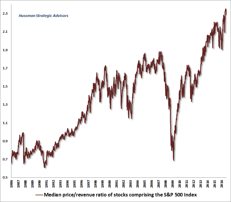
I’ve noted before that while the bubble peak in 2000 was the most extreme level of valuation in history on a capitalization-weighted basis, the recent speculative episode has actually exceeded that bubble from the standpoint of speculation in individual stocks. The most reliable measures of individual stock valuation we’ve found are based on formal discounted cash flow considerations, but among publicly-available measures we’ve evaluated, price/revenue ratios are better correlated with actual subsequent returns than price/earnings ratios (though normalized profit margins and other factors are obviously necessary to make cross-sectional comparisons). The chart below shows the median price/revenue ratio across all S&P 500 components, in data since 1986. I should note that from a long-term perspective, the valuation levels we observed in 1986 are actually close to very long-term historical norms over the past century, as the pre-bubble norm for the market price/revenue ratio is just 0.8 in data since 1940. With the exception of 1986, and the 1987, 1990 and 2009 lows, which were moderately but not severely below longer-term historical norms, every point in this chart is “above average” from the standpoint the longer historical record. Presently, the median stock in the S&P 500 is more overvalued than at any point in U.S. history, easily exceeding the overvaluation observed at the 2000 and 2007 pre-crash extremes.
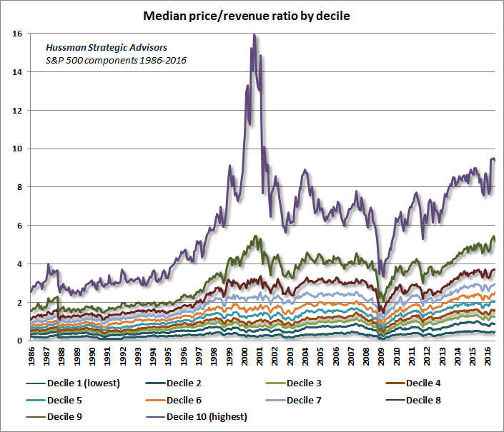
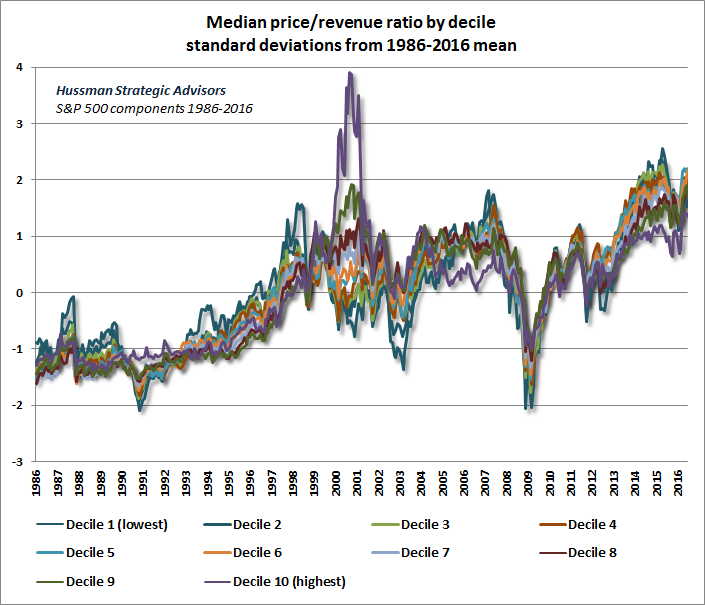
Given the extreme valuations observed in 2000, before the S&P 500 lost half of its value and the Nasdaq 100 lost 83% of its value, it may seem preposterous to think that current valuations are beyond that level for the vast majority of stocks. To show what’s going on, we broke the S&P 500 components into price/revenue deciles, presented in the chart below (thanks to our resident mathematician Russell Jackson for pulling the data together). You’ll notice that the overvaluation at the 2000 peak was really dominated by extreme valuation in the top decile of price/revenue ratios. But you should also notice that for the 80% of stocks outside of the two most expensive groups, recent extremes have gone well beyond the corresponding 2000 levels. Even within the two most richly-valued deciles, current valuations are higher than at any point in history outside of that 1999-2000 extreme.
The picture becomes clearer still if we normalize each decile. For each decile, we’ve subtracted the 1986-2016 average price/revenue ratio for that decile, dividing the result by the standard deviation of valuations in that decile (again from 1986-2016). That gives us a figure measured in standard deviations from the average. I’ll emphasize again that from a longer-term perspective, 1986 valuations were actually historically run-of-the-mill, so recognize that the valuations we presently observe are actually far beyond two standard deviations above the norm for U.S. stocks since 1940.
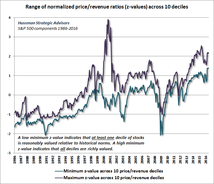
Put simply, the reason that the capitalization-weighted S&P 500 was more richly valued in 2000 is that its largest, highest price/revenue components were breathtakingly overvalued. Yet if investors didn’t want to invest in hypervalued tech stocks, they still had somewhere else to go. That’s not true today. The chart below shows the minimum and maximum standardized valuation across the 10 deciles of S&P 500 stocks. What’s notable here is that unlike 2000 and even 2007, when at least some of the valuation deciles were trading at somewhat reasonable valuations, we currently observe a situation where investors effectively have nowhere to go. Even the decile with the best relative valuation is at the most extreme level in history.
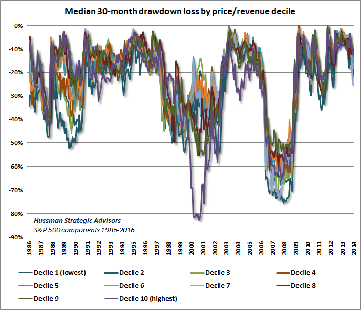
The chart below shows the median drawdown among stocks in each decile over the subsequent 30 months. Clearly, investors paid dearly for the overvaluation of that top decile in 2000, as the median loss in that group over the subsequent 30-month horizon was more than -80%, very similar to the loss experienced by the Nasdaq 100 index. From their 1999 levels, all of those deciles lost more than one-third of their value over the following 30-months, with the losses in most groups approaching -50%. The 2007-2009 decline was even worse for most groups, with no group losing less than -50%, and some experiencing median losses of -70% or more from their highs. One might think that the losses should segregate more across price/revenue groups, but such cross-sectional comparisons are more complex. For example, grocers almost always stay in the very low price/revenue deciles because they operate in a low-margin business, yet fluctuations in their price/revenue ratios over time are still very informative about subsequent returns. What you see below is that, especially during market declines that follow broad market overvaluation, losses tend to be unmerciful across-the-board.
We forget all of this so easily, don’t we? It’s important to remember how deep those losses were in the 2000-2002 and 2007-2009 periods (even among less overvalued groups that would recover over the longer-term), and that there are now even fewer places to hide. Given current valuation extremes, I doubt that the median loss for any decile of stocks will be less than -40% over the completion of the current market cycle, and I expect that losses will approach -60% more typically than not. At some point in the not-too-distant future, my impression is that the “pain” of earning near-zero interest rates in safe liquidity will be far less daunting to investors than the pain of losing the bulk of their capital. Again, when risk-aversion kicks in during the completion of a market cycle, central bank liquidity does not reliably support stocks, because safe liquidity is seen as a desirable asset rather than an inferior one. I started this comment with a 126 year-old quote to emphasize that every cycle in history warns investors against relying on speculative extremes to be permanent. I recognize that some of you are going to insist on re-learning this the hard way. We’ve certainly learned our own lessons about the ability of zero interest rate policy to postpone the kind of market collapses that reliably followed overvalued, overbought, overbullish syndromes in other cycles across history (see the “Box” in The Next Big Short for the full narrative). But that temporary suspension of consequences entirely depends on investors remaining inclined toward risk-seeking (which we measure from the behavior of market internals). Following a brief post-Brexit strengthening in a few trend-following components, market internals have deteriorated again. The danger is that investors seem to believe that easy money supports overvalued financial markets regardless of market internals or the attitude of investors toward risk. The failure of investors to grasp this critical subtlety is likely to be the source of a great deal of pain over the completion of this market cycle.The foregoing comments represent the general investment analysis and economic views of the Advisor, and are provided solely for the purpose of information, instruction and discourse. Please see periodic remarks on the Fund Notes and Commentary page for discussion relating specifically to the Hussman Funds and the investment positions of the Funds. --- The foregoing comments represent the general investment analysis and economic views of the Advisor, and are provided solely for the purpose of information, instruction and discourse. Prospectuses for the Hussman Strategic Growth Fund, the Hussman Strategic Total Return Fund, the Hussman Strategic International Fund, and the Hussman Strategic Dividend Value Fund, as well as Fund reports and other information, are available by clicking "The Funds" menu button from any page of this website. |
|||||||||||||||||||||||||
|
For more information about investing in the Hussman Funds, please call us at
1-800-HUSSMAN (1-800-487-7626) 513-326-3551 outside the United States Site and site contents © copyright Hussman Funds. Brief quotations including attribution and a direct link to this site (www.hussmanfunds.com) are authorized. All other rights reserved and actively enforced. Extensive or unattributed reproduction of text or research findings are violations of copyright law. Site design by 1WebsiteDesigners. |