

You Are Here


John P. Hussman, Ph.D.
President, Hussman Investment Trust
April 2019
There are three principal phases of a bull market: the first is represented by reviving confidence in the future of business; the second is the response of stock prices to the known improvement in corporate earnings, and the third is the period when speculation is rampant – a period when stocks are advanced on hopes and expectations. There are three principal phases of a bear market: the first represents the abandonment of the hopes upon which stocks were purchased at inflated prices; the second reflects selling due to decreased business and earnings, and the third is caused by distress selling of sound securities, regardless of their value, by those who must find a cash market for at least a portion of their assets.
– Robert Rhea, The Dow Theory, 1932
Charles Dow once wrote, “To know values is to know the meaning of the market.” That quote may surprise trend-followers and adherents of technical analysis, because Dow’s work is often squeezed into a caricature focusing on nothing more than confirmation and divergence across the Dow Jones Industrial and Transportation averages. But Dow’s actual views, best elaborated by writers like Robert Rhea and William Peter Hamilton, were actually about something much more fundamental: identifying the position of the market in its complete bull-bear cycle. That’s a concept that investors have forgotten, encouraged by the illusion that the Federal Reserve’s buying of Treasury bonds is capable of saving the world from any form of discomfort. That illusion is likely to prove costly.
Probably the most useful exercise we can do at present is to examine where the markets and the U.S. economy are in their respective cycles – with 19 charts and detailed analysis.
The recent bull market clocked in as the longest in history. Even if the September 20, 2018 peak in the S&P 500 was the final high, the preceding advance outlived the 1990-2000 bull market by nearly 8 weeks. Likewise, the current economic expansion is just 3 months shy of the record 10-year expansion that ended in early 2001, the unemployment rate is down to just 3.8%, the entire post-crisis gap between actual real GDP and the CBO estimate of potential real GDP has been eliminated, and the expansion has already outlived the previous runner-up, which ran from 1961 to the end of 1969.
Meanwhile, based on the valuation measures we find best-correlated with actual subsequent market returns across history, the current market extreme already matches or exceeds those of the 1929 and 2000 peaks. There’s little question that the market is long into what Rhea described as the final phase of the bull market; “the period when speculation is rampant – a period when stocks are advanced on hopes and expectations.”
As I’ll detail below, the economic expansion we’ve observed since the 2009 economic low has been a rather standard mean-reverting recovery, with a trajectory no different than could have been projected on the basis of wholly non-monetary variables. The primary effect of extraordinary monetary policy wasn’t to drive real economic gains, but instead to amplify speculation and contribute to wealth and income disparities. Wages and salaries as a share of GDP are clawing higher from the historic low set in 2011, but have only begun to erode the elevated profit margins on which Wall Street is basing its permanent hopes and expectations.
Aside from historic extremes in the valuation measures best correlated with actual subsequent market returns, one measure of these hopes and expectations is that in 2018, according to the Financial Times, 81% of U.S. companies that went public reported losses in the 12 months before their initial public offerings, matching the high-water mark set at the height of the dotcom bubble (h/t Hadi Taheri). It’s the same kind of spectacle that Rhea described nearly a century ago, when he wrote:
“Worthless equities were being sky-rocketed without regard for intrinsic worth or earning power. The whole country appeared insane on the subject of stock speculation. Veteran traders look back at those months and wonder how they could have become so inoculated with the ‘new era’ views as to have been caught in the inevitable crash. Bankers whose good sense might have saved the situation, had speculators listened to them, were shouted down as deconstructionists, while other bankers, whose names will go down in history as ‘racketeers,’ were praised as supermen.”
Still, while it was important to Dow, Rhea, and Hamilton to understand valuations, and to recognize the position of the market in the cycle, they were also carefully focused on the behavior of prices, particularly the uniformity of behavior between their primary indices of interest – the Dow Industrials and Transports. While our own measures of market internals focus on the uniformity of a much broader set of securities, it’s enormously instructive to consider several critical features of market behavior that they understood even a century ago.
First, market fluctuations exhibit cycles that move between periods of extreme optimism and periods of profound despair. Second, the extremes of each cycle are characterized by unusually elevated or depressed valuations, and these valuations comprise the true “meaning” of the market for investors. Third, the speculative pressure toward higher prices, and the downward pressure toward lower prices, can be largely gauged by the “uniformity” of behavior across various groups of securities. Fourth, it is enough to identify prevailing conditions and respond to them as they change, without any need to predict the extent or duration of a subsequent market movement.
Consider the situation in mid-1929, when, as the market pushed to obscenely rich valuations, Hamilton acknowledged the uniform behavior of the Dow averages, while also carefully placing the advance in a full-cycle context. That uniformity suggested that investors had taken the speculative bit in their teeth, despite the fact that the bull market, in hindsight, would reach its peak only a few weeks later.
“It goes without saying that the stock market, which has advanced with merely secondary reactions for five years and eight months, is almost necessarily in the third or last stage of such a movement, where stocks do not carry themselves on the dividend return, for the most part, and where sanguine expectations of the future exercise a greater influence than immediate results. All that the averages say when they give such a bull point as that of June 29 [when the Dow averages breached their previous May highs] is that stocks are due for a further advance. They do not predict the extent of that advance.”
The 1929 peak occurred on September 3rd of that year, followed immediately by a steep, waterfall decline. Hamilton’s confirmation of a “turn in the tide” was published the next month, on October 25, 1929, the Friday before Black Monday. By then, the Dow was already 20% off its high (that’s what safety nets and tail-risk hedges are for). The Dow would lose an additional 86% before setting its final low in 1932.
We presently have a financially disfigured economic expansion that’s three months shy of the longest in history, where the unemployment rate is down to 3.8%, and the most reliable measures of stock market valuation again rival the hypervalued extremes of 1929 and 2000. In this context, to call for an immediate 50 basis point rate cut and a resumption of quantitative easing from the Fed seems a frantic strategy to keep a hypervalued market and two-tiered economic “prosperity” in suspended animation.
In a hypervalued market, we do not need to embrace market risk as a result of speculative pressures, but we have to defer an overtly bearish investment outlook on immediate market direction. All of this effort to jam the speculative bit back into the horse’s teeth requires us to adopt a rather neutral outlook here, until we observe fresh deterioration in market internals. Given the late-stage condition of the financial markets and the economy, my sense is that, as in 1929, they may just run this poor horse straight up and over the cliff.
We’ll respond to shifts in valuations and market action as they emerge, so forecasts aren’t actually necessary. Still, full-cycle risks have a way of emerging in ways that investors wholly rule out at market peaks. Glorious half-cycle market advances leave investors vulnerable to catastrophe, because investors hold contempt for anyone who suggests there may be a cliff on the other side of the mountain.
Still, recall that I openly anticipated the 2000-2002 collapse (which wiped out the entire total return of the S&P 500 – over and above T-bill returns – all the way back to May 1996), estimated an -83% loss in tech stocks at their March 2000 peak (which rather improbably matched the actual loss of the tech-heavy Nasdaq 100), and, after a constructive shift in early 2003, projected the 2007-2009 collapse (which wiped out the entire total return of both preceding bubbles – over and above T-bill returns – all the way back to June 1995). The distressing thing is that, from a historical perspective, all of those losses were rather run-of-the-mill cycle completions.
Understanding potential downside risk at a market extreme has a way of concentrating the mind. If I were to offer a guess, I’d suggest that regardless of whether the S&P 500 registers fresh near-term highs, investors should allow for the S&P 500 to be perhaps -30% lower by the end of 2019, on the way to losing an additional -50% of its remaining value over the rest of the down-cycle. That, after all, is how a market loses -65% of its paper value. That’s not so much a forecast as a base case. A -65% loss, unfortunately, would presently represent a run-of-the-mill cycle completion from current valuation extremes. As I observed at the 2000 peak, “If you understand valuations and market history, you know we’re not joking.”
Value and uniformity
Across history, one of the central lessons of market cycles is that while valuations are enormously informative about long-term and full-cycle investment returns, they can often be useless in gauging investment prospects over shorter segments of the market cycle. What drives market outcomes over shorter segments of the cycle is the psychological inclination of investors toward speculation or risk aversion. When investors are inclined to speculate, they tend to be indiscriminate about it, so we pay a great deal of attention to the uniformity of market action across thousands of individual stocks, industries, sectors, and security types, including debt securities of varying creditworthiness. I typically refer to that uniformity using the word “internals.”
The importance of uniformity across multiple sets of securities was recognized even in the work of Dow, Rhea, and Hamilton a century ago. For example, Rhea emphasized “The movements of the averages should always be considered together. The movement of one price average must be confirmed by the other before reliable inferences may be drawn. Conclusions based upon the movement on one average, unconfirmed by the other, are almost certain to prove misleading.”
Hamilton’s writings reflect the same sort of respect for uniformity: “One of the shortest ways of going wrong is to accept an indication by one average which has not been clearly confirmed by the other… independent movements, on previous experience, are usually deceptive, but when both averages advance or decline together, the indication of a uniform market movement is good.”
It’s important to understand that both valuations and internals have performed beautifully in this cycle, as they have in prior cycles across history. What failed, and failed rather miserably, were “overvalued, overbought, overbullish” syndromes of market conditions, which historically provided reliably warnings that speculation had reached fairly well-defined limits. In prior cycles across history, one those syndromes emerged, one could respond pre-emptively by adopting a hard-negative market outlook, regardless of other conditions. In the face of quantitative easing and zero-interest rate policy by the Federal Reserve, those “limits” became useless, and responding to them became detrimental.
We abandoned the idea of speculative “limits” in late-2017, and placed priority on the condition of market internals. It’s notable that the entire total return of the S&P 500 from the 2000 peak to the present, and the 2007 peak to the present, has been captured by periods when our measures of market internals were favorable, while nearly all of the market losses of 2000-2002 and 2007-2009 occurred when they were not. That isn’t to say that the market can’t advance when internals are negative, or that it can’t decline when internals are favorable. But in complete market cycles, including the most recent one, market internals have remained enormously informative about the likely return/risk profile of the equity market.
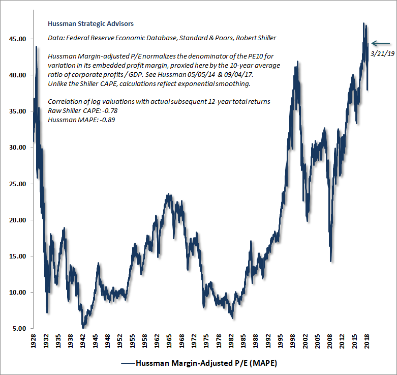
With regard to valuations, the chart below shows the Hussman margin-adjusted P/E. This measure behaves largely as a market-wide price/revenue ratio. In market cycles across history, it is better correlated with actual subsequent S&P 500 total returns than price/forward earnings, the Shiller CAPE, the Fed Model and numerous other popular valuation metrics. The section on profit margins and representative cash flows, later in this comment, details why this and similar measures are so much more reliable than popular earnings-based measures.
Even in recent cycles, valuations have provided a reliable guide to long-term and full-cycle market outcomes. Investors sometimes assume that if the market continues to advance despite rich valuations, then valuations must somehow be failing. That’s not how valuations work. If rich valuations were enough to reliably prevent further market advances, the market could never have reached the hypervalued extremes of 1929, 2000 and today.
Instead, valuations are important for their full-cycle and long-term implications. The extreme valuations of 2000, for example, correctly implied that the completion of that market cycle would likely involve a market loss on the order of -50% (and -83% for the tech-heavy Nasdaq 100, consistent with what I projected in real-time at the 2000 market peak).
The most reliable measures of valuation – those best correlated with actual subsequent market returns – have again approached or exceeded their levels of 1929 and 2000. Notably, it has taken one of the most extreme yield-seeking speculative bubbles in history to bring the 19-year total return of the S&P 500 to just 5.25% annually since the 2000 peak. Yet it would take only a run-of-the-mill retreat to historical valuation norms to wipe out every bit of that total return over the completion of this cycle.
Understanding potential downside risk at a market extreme has a way of concentrating the mind. If I were to offer a guess, I’d suggest that regardless of whether the S&P 500 registers fresh near-term highs, investors should allow for the S&P 500 to be perhaps -30% lower by the end of 2019, on the way to losing an additional -50% of its remaining value over the rest of the down-cycle. That, after all, is how a market loses -65% of its paper value.
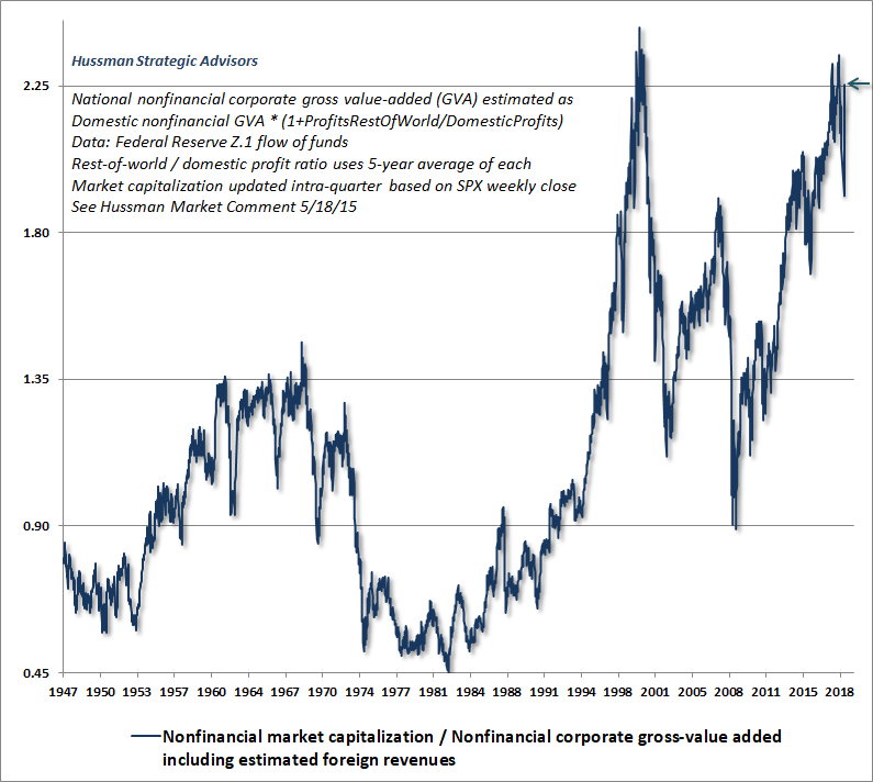
The next chart shows the ratio of nonfinancial market capitalization to corporate gross-value added, including estimated foreign revenues. This measure, which I introduced in 2015, is the single most reliable valuation measure we’ve identified.
The scatterplot below shows the relationship between MarketCap/GVA and subsequent 12-year S&P 500 total returns. At present, our best estimate is that investors are likely to enjoy zero nominal returns over the coming 12-year period.
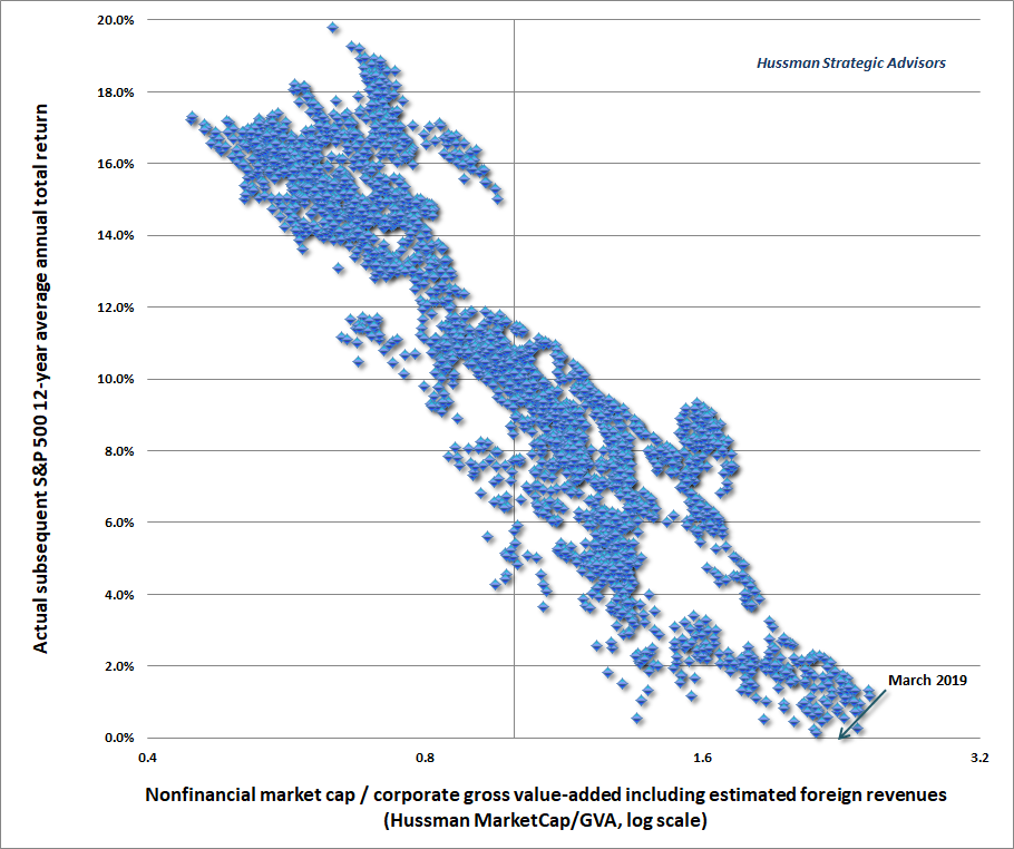
We continually have to allow for periods when investor psychology shifts to speculation, allowing the market to temporarily ignore valuations, however extreme. Still, from a long-term and full-cycle perspective, my impression is that the investment outlook is dire.
Recall that the 2000-2002 market collapse left valuations at the highest level observed at the completion of any market cycle in history (with the consequence that the subsequent 2009 market low easily breached the 2002 trough). Even a market retreat to valuation levels no lower than those of 2002 presently imply a market loss of -45% in the S&P 500, while a run-of-the-mill cycle completion would wipe out nearly two-thirds of the value of the S&P 500, without even breaching historical valuation norms.
On nearly all of the most reliable valuation measures we monitor, our estimates of 12-year S&P 500 total returns are at or below zero.
What about a permanently high plateau?
One of the most frequent questions I hear is whether it might be possible for valuations to normalize over time, not through a major loss in the market, but rather by a long period of relatively stable but elevated prices, during which time the growth of fundamentals “catches up” with prices.
I strongly doubt that we’ll observe this sort of “permanently high plateau” (a phrase I use advisedly, because it’s exactly the phrase that Irving Fisher used just before the Dow Jones Industrial average fell by -89.2% between 1929 and 1932). The main reason it’s unlikely is that it would require the absence of even a single period of severe risk-aversion among investors, for at least a decade or more. Another reason is that the question vastly underestimates the length of time that would be required for fundamentals to “catch up” with current valuations.
See, in recent decades, S&P 500 revenues have grown at a nominal rate of less than 4% annually, on average, and this includes the impact of share buybacks (which reduce the denominator of the index). While earnings have grown at a faster rate of close to 6% annually, a continuation of this would require already record profit margins to increase without limit.
Presently, as we’ll see below, the prospects for structural real GDP growth (underlying growth excluding the impact of cyclical changes in unemployment) are running at just 1.6% annually, so a continuation of sub-4% nominal growth appears fairly likely. And even if nominal growth accelerates because of inflation, the likely impact on valuation multiples would be decidedly negative.
Our most reliable valuation measures are 2.6 times (or more) above the historical norms that one would associate with normal expected market returns. How many years of 4% growth in revenues and nominal GDP does one require in order to restore historically run-of-the-mill valuations, assuming the S&P 500 is held constant at current levels? The answer is ln(2.6)/ln(1.04) = 24.4 years.
When I use the word “dire” in describing the long-term return prospects of U.S. equities at these valuations, I honestly don’t believe that it’s an exaggeration.
But what if “this time is different” and Congress was to rewrite Section 14 of the Federal Reserve Act to allow the Fed to purchase equities and nationalize the U.S. corporate sector? Well, even if that occurs, it’s likely that any sustained advance would feature constructive market internals anyway. So while I do expect major market losses over the completion of this cycle, nothing in our investment approach relies on that outcome. Instead, we’ll respond to valuations and market action as they evolve over time. Both of those features have remained remarkably useful in recent cycles, even in the period since 2009. Regardless of how reckless policy makers and speculators may become, it is only the notion that speculation has a “limit” that we have to abandon.
We’ve learned never to fight speculation unless internals are clearly negative. You can wave your arms around about valuations and full-cycle risks, you can point out how and why other bubbles collapsed, you can trot out a century of historical data, but if we’ve learned one thing about Wall Street, it’s that, As Ron White says, ‘you can’t fix stupid.’ You’ll only injure yourself trying.
– John P. Hussman, Ground Rules of Existence, March 2019
Jamming the bit back in their teeth
With regard to the immediate market prospects, recent market action reinforces a rather neutral near-term outlook, despite wicked overvaluation. The Federal Reserve’s striking reversal in the outlook for monetary policy normalization, and even the hope of a pre-emptive response to emerging fears of recession, have jammed the bit at least loosely back into the teeth of speculators.
We observed this dynamic last month as an improvement in our measures of market internals from “borderline” to a fairly uniform status. That’s not a “buy signal” by any means, but rather an indication that we have to refrain from fighting further speculation with a bearish investment outlook until we observe fresh deterioration in market internals. A neutral outlook is fine. Even a modestly constructive outlook, provided it is accompanied by a nearby safety net, is also fine. But neither aggressive nor overtly bearish investment stances are advisable, in my view.
This is a very mature advance in a very mature economic expansion. It’s not clear whether the S&P 500 will break above its September 2018 peak, but it’s possible. My impression is that such a move would be accompanied by relatively weak participation among the majority of stocks, and the kind of “non-confirmations” that regularly characterize late-stage advances. While internals are generally uniform, they’re also generally lagging the recent advance, which is suggestive of a market that’s grasping at straws, rather than one with enthusiastic sponsorship.
Yet even at extreme valuations, and even with spotty participation (for example, the majority of individual stocks are still below their own respective 200-day averages) we can’t insist that this speculation has a “limit.” Rather, it’s essential to respond to shifts in valuations and market internals as they occur. About 25% of shifts in our measures of market internals persist for 8 weeks or less. About 25% persist for 40 weeks or more. My guess is that the recent shift might be a whipsaw at an overbought extreme, but that’s an unknown.
So the best response is to refrain from adopting or amplifying a bearish outlook until we observe fresh deterioration in market internals. If, as I expect, the S&P 500 will lose nearly two-thirds of its value over the completion of this cycle, we’ll see that deterioration rather quickly as risk-aversion takes hold, and there will be plenty of downside remaining.
On profit margins and representative cash flows
I’ve often emphasized what I call the “Iron Law of Valuation” – an investment security is nothing more than a claim on some set of future cash flows that investors expect to be delivered into their hands over time. The higher the price an investor pays today for some amount of cash in the future, the lower the long-term return the investor can expect on that investment.
A common approach to stock market valuation is to rely directly on the ratio of stock prices to earnings. However, while corporate earnings are necessary to generate deliverable cash to shareholders, comparing prices to earnings is actually quite a poor way to estimate future investment returns. The reason is simple – most of the variation in earnings, particularly at the index level, is uninformative.
Stocks are not a claim to next year’s earnings, but to a very long-term stream of cash flows that will be delivered into the hands of investors over time. A valuation multiple is nothing but shorthand for a proper discounted cash flow analysis. Accordingly, the denominator of the multiple must be representative of decades of expected future cash flows.
Corporate earnings are more variable, historically, than stock prices themselves. Though “operating” earnings are less volatile, they are pro-cyclical; expanding during economic expansions, and retreating during recessions. As a result, to quote the legendary value investor Benjamin Graham, “The purchasers view the good current earnings as equivalent to ‘earning power’ and assume that prosperity is equivalent to safety.”
Because stocks are actually claims on decades and decades of future, deliverable cash flows, we find that the valuation measures having the strongest correlation with actual subsequent investment returns across history are less volatile than earnings, and serve as better “sufficient statistics” for the relevant long-term cash flows. In particular, measures that resemble price/revenue ratios are substantially better correlated with actual subsequent market returns than any earnings-based measure we have tested in historical data.
It doesn’t matter what fundamental you think is important to market valuation. Given any opportunity, the data will be begging – begging – to be converted into something that looks like a market-wide price/revenue ratio, because that’s what actually matters. The data don’t have to do that. They want to. Indeed, in order to have a purpose in life, they need to.
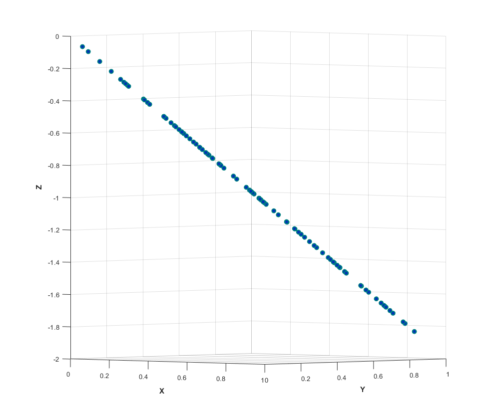
Here’s an interesting scatter plot. It shows the relationship between a variable X and a variable Z. As you can see, higher values of X are generally associated with lower values of Z, but the relationship is a little bit loose.
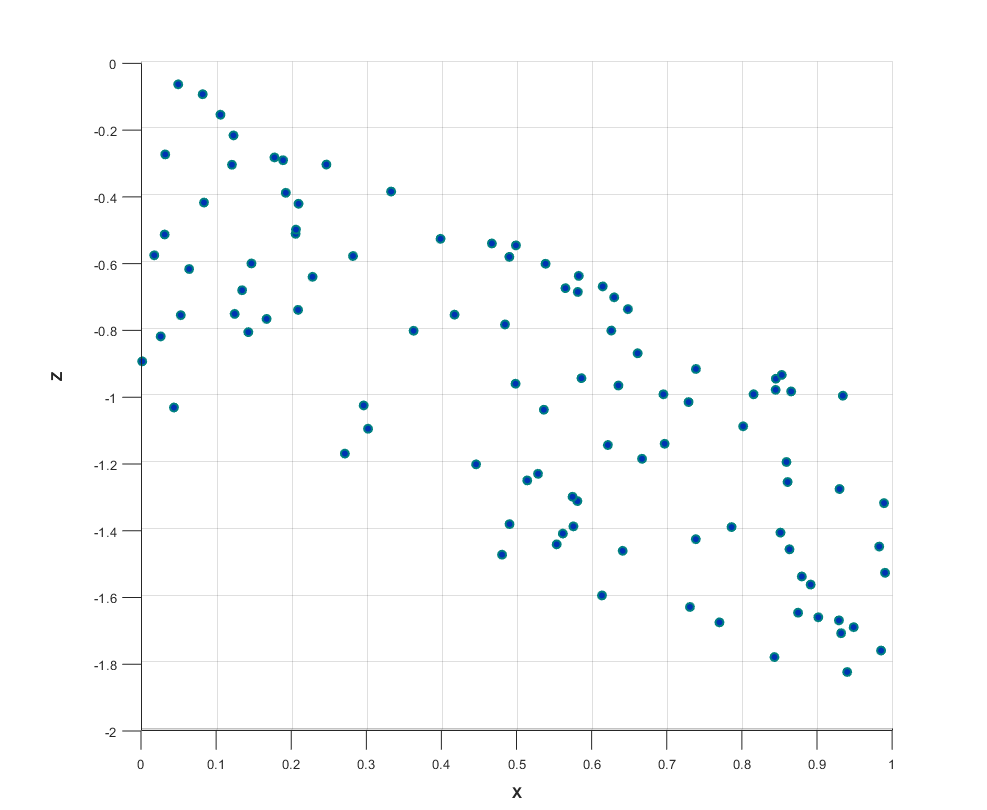
The reason the relationship is loose is that I’ve quietly left out the variable Y. See, the actual relationship in the data is that Z = –(X+Y). As it turns out, we can neatly capture this relationship in a 3-D graph, provided we look at it from the corner of the X-Y axis.
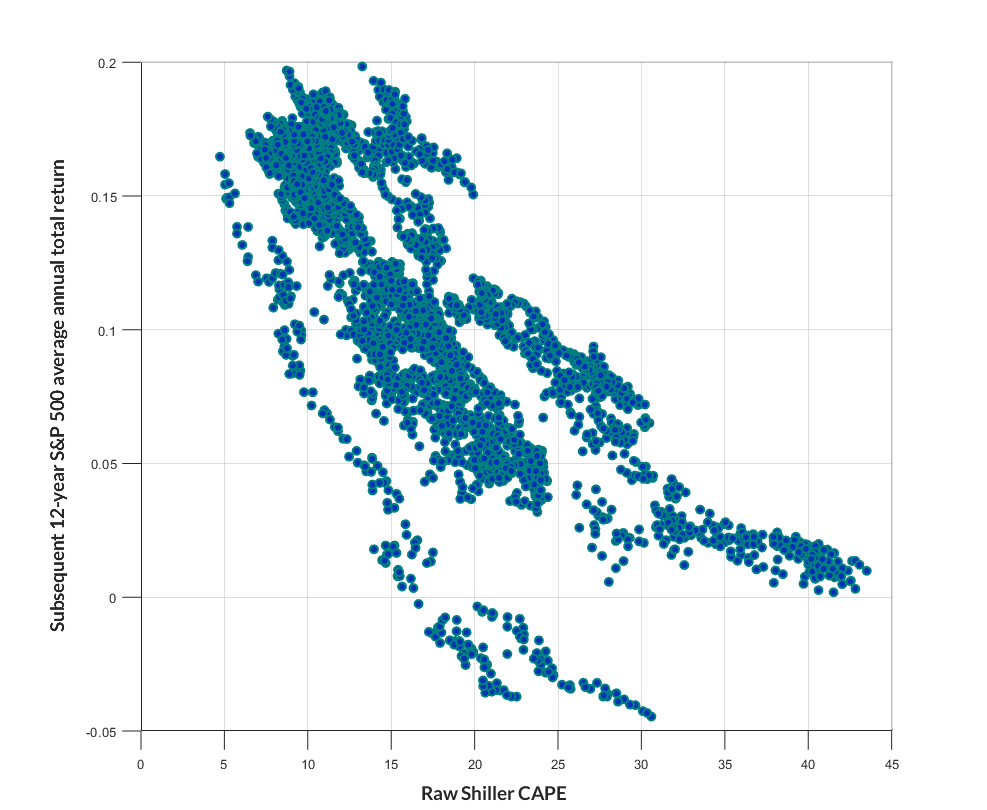
Well, the same is true when we examine the relationship between P/E ratios, profit margins, and subsequent market returns. The first chart below shows the relationship between 12-year S&P 500 total returns and the Shiller cyclically-adjusted P/E (which is the ratio of the S&P 500 to the 10-year average of inflation-adjusted earnings).
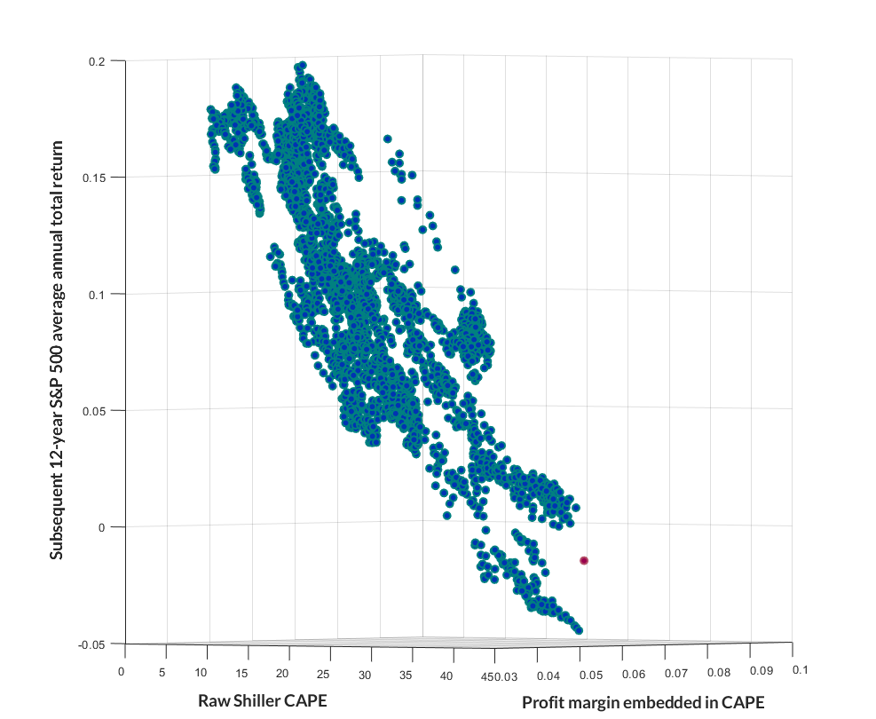
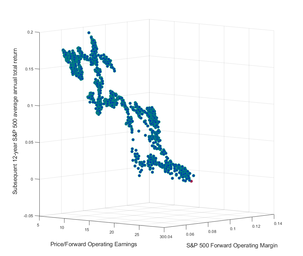
As it happens, though, we’ve left out a variable. The actual, highly reliable relationship is actually between the S&P 500 and the price/revenue ratio. Of course, the price/revenue ratio is simply the price/earnings ratio multiplied by the profit margin that’s “embedded” into that ratio. Because market returns are best explained by the combination of the P/E and the embedded margin, we can again neatly capture the relationship in a 3-D graph, looking from the corner of the X-Y axis.
What about the recent corporate tax cuts? Won’t they boost profit margins permanently? From a historical perspective, the answer is no. The reason is that corporations compete on the basis of after-tax profits, and the resulting profit margins have been far less variable than effective tax rates.
For example, back in the 1950’s, the effective tax rate of U.S. nonfinancial corporations (taxes actually paid as a percentage of pre-tax profits) averaged 47%, while their after-tax profit margins averaged 10%. By the 1970’s and 1980’s, effective corporate tax rates had declined to 35%, yet rather than soaring, after-tax profit margins actually eroded to just 7.6%. In the “bubble years” since the late-1990’s, effective corporate tax rates have averaged just 25%, while after-tax profit margins have averaged 9.3%.
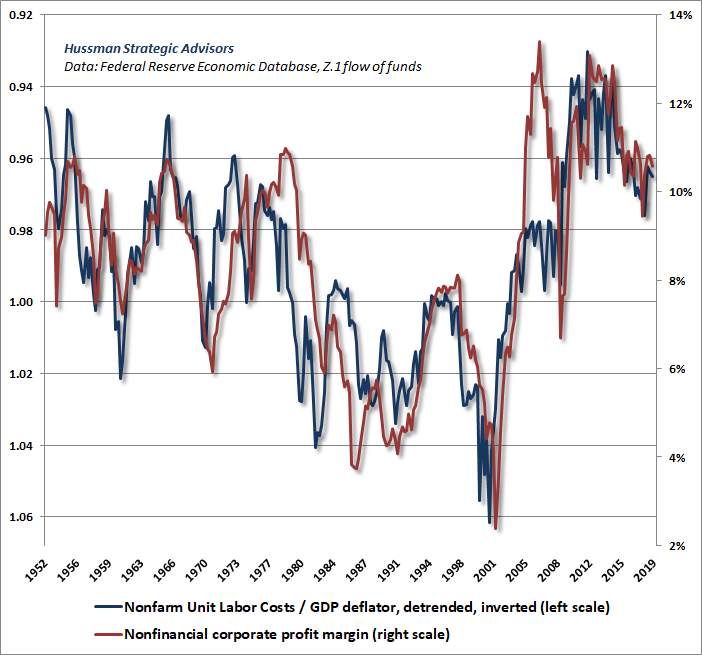
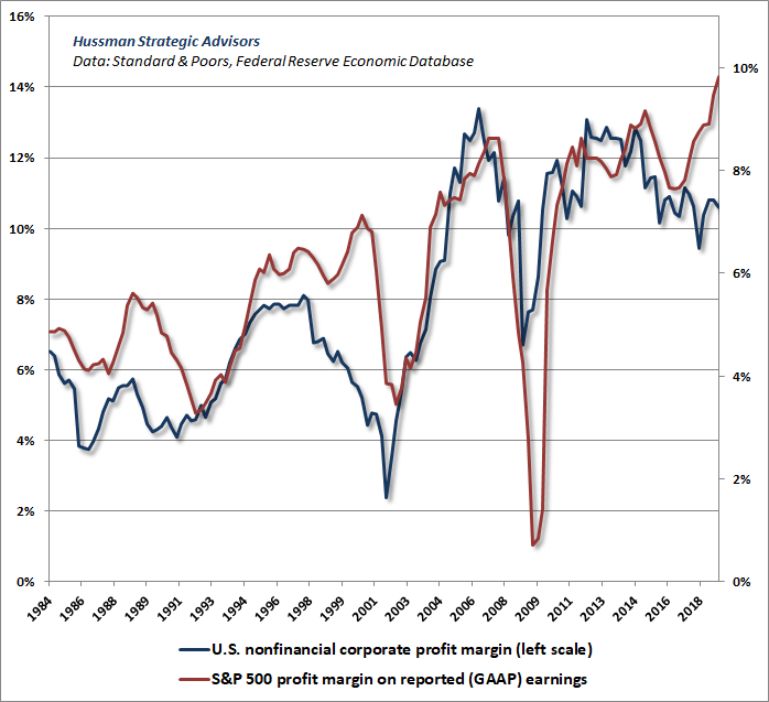
The primary cyclical driver of corporate profit margins is actually cyclical fluctuation in real unit labor costs. What investors seem to be ignoring here is that nonfinancial profit margins peaked at 13.1% in mid-2010, largely because of a collapse in wages and salaries as a share of GDP in the wake of 10% unemployment following the global financial crisis.
In recent years, U.S. corporate profit margins have been gradually eroding, despite cuts in corporate tax rates. As the labor market slack that held unit labor costs down for years after the global financial crisis has gradually been eliminated, unit labor costs have gradually increased, albeit in fits and starts, relative to the GDP deflator.
Notably, cyclical peaks in S&P 500 profit margins tend to occur somewhat later than peaks in the overall U.S. nonfinancial corporate sector. We observed this most dramatically at the 2000 bubble peak, and more conventionally at the 2007 peak. The fact that we observe yet another growing divergence here is less likely to prove a testament to the “new era” wonders of S&P 500 companies as it may to the wonders of economic lags and aggressive accounting.
Don’t take my word for it
Go ahead and try this at home. Choose any broad market valuation ratio with at least a few decades of history (say 1980 or earlier, so your data includes at least one complete fluctuation between a secular valuation low and a secular valuation peak). Suppose your valuation ratio is P/F, where P is the S&P 500, or market capitalization, and F is your chosen fundamental, say forward operating earnings. Use a simple linear regression to estimate the relationship between ln(P/F) and subsequent 10-12 year returns. I’ve detailed previously why one should use log valuations, but the intuitive idea is that a valuation ratio that’s half its historical norm has roughly the opposite implication for returns as a valuation that’s twice its historical norm.
So you’ve estimated the relationship of your valuation ratio and subsequent returns. Now do this, regardless of which fundamental F you selected, run an additional estimation that includes the variable ln(F/R), where R is the revenue figure corresponding to the P you picked. So if P is the S&P 500 Index, R is S&P 500 revenues. If P is market capitalization of nonfinancial companies, R is revenue (essentially gross value-added) of nonfinancial companies.
Here’s what you’ll find. First, the ability to explain fluctuations in market returns using both variables will be much better than using your valuation ratio alone. Equally important, the slope coefficients in your two-variable model will be almost identical.
For example, using P/F as the S&P 500 forward operating ratio and F/R as the S&P 500 forward operating margin, you’ll get coefficients of about -0.10 for both, and your scatter will look like this. Forward earnings are only available since the early 1980’s, so the points are a bit sparser than the ones above, but the same principle holds.
Why? Because it doesn’t matter what fundamental you think is important to market valuation. Given any opportunity, the data will be begging – begging – to be converted into something that looks like a market-wide price/revenue ratio, because that’s what actually matters. The data don’t have to do that. They want to. Indeed, in order to have a purpose in life, they need to.
Since P/R = P/F x F/R, and the log of a product is the sum of the logs, the regression will generate nearly the same coefficients for both variables. And even if you’ve picked a segment of the data where that equality doesn’t quite hold, you’ll find that a restricted regression that sets the coefficients equal does nearly as well as the unrestricted one.
On the economic cycle
With the unemployment rate now down to just 3.8%, it is reasonably clear that the scope for a further decline in that rate is rather limited. Yet it’s not clear at all that investors recognize the implications of a potentially flat unemployment rate, much less even a slight increase.
Two observations may be useful in that regard. First, we can partition GDP growth into a “structural” component, representing fairly smooth core drivers like demographics, population growth, and trend productivity growth, and a “cyclical” component, driven by changes in the unemployment rate.
Specifically, real GDP growth is equal to the sum of productivity growth (output/employed worker) + labor force growth + changes due to fluctuations in unemployment (1 – employed workers/labor force). The chart below shows this decomposition.
Notice something. Over the past 8 years, the decline in the rate of unemployment has made the largest contribution to real U.S. GDP growth ever observed in the post-war era as unemployment declined from 10% in 2009 to just 3.8% today.
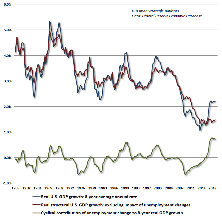
But notice something else. In the absence of further declines in the unemployment rate, we’re now looking at “structural” GDP growth of only about 1.6% annually. That’s the real GDP growth we’re likely to observe in the coming years even if the unemployment rate remains fixed at its current 3.8% level.
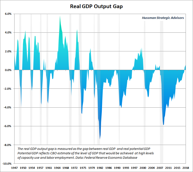
A second way to see what’s going on here is to compare actual real GDP to Congressional Budget Office estimates of what’s called “potential” GDP. Those potential GDP estimates represent the level of output that would be expected at a high level of employment and capacity use. Not surprisingly, the growth rate of potential GDP closely tracks the estimate that one would obtain by adding demographic labor force growth and trend productivity.
The interesting feature of potential GDP is that we can use it to roughly estimate the amount of slack in the economy. This “output gap” is defined as the difference between actual and potential GDP. Now, remember that potential GDP isn’t intended to indicate the maximum possible GDP that’s achievable, just a level that’s consistent with a high level of employment and capacity use. So occasionally, actual GDP can exceed potential GDP. Still, the output gap is a rather useful object, particularly, as we’ll see, when it comes to estimating the likely trajectory of economic recoveries.
Not surprisingly, both the CBO estimates of potential GDP growth and the central tendency of the Federal Reserve’s summary economic projections both imply structural growth of less than 2% annually over the coming years. It’s nice to imagine that productivity will jump enough to add to this, but we would have to see a near-tripling of trend productivity, to the highest level observed in the post-war era, to bring structural real GDP growth prospects to even 3% annually.
In the absence of further declines in the unemployment rate, we’re now looking at ‘structural’ GDP growth of only about 1.6% annually. That’s the real GDP growth we’re likely to observe in the coming years even if the unemployment rate remains fixed at its current 3.8% level.
The chart below shows real U.S. GDP, real potential U.S. GDP, and a set of little green lines specifically intended to stick it to the man. See, as an economist, one of the most absurd propositions I constantly hear from Wall Street is the notion that the Federal Reserve’s monetary easing somehow “saved the world” and was necessary for the recent economic expansion. This is nonsense.
As I’ve noted before, one can show using a variety of methods, including large-scale vector autoregressions, that the trajectory of real GDP in recent years has been little different than one could have projected using wholly non-monetary variables. Moreover, one can also show that the activist or “unsystematic” component of Fed policy – the part of Fed policy that isn’t predicted by current and past values of output, inflation, and employment – has no correlation at all with subsequent economic outcomes.
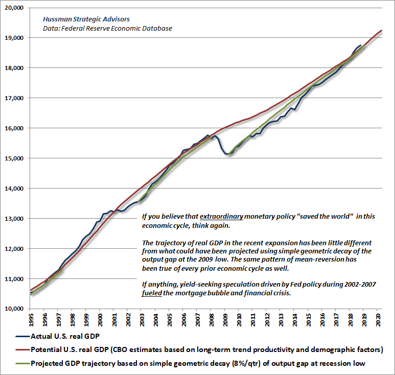
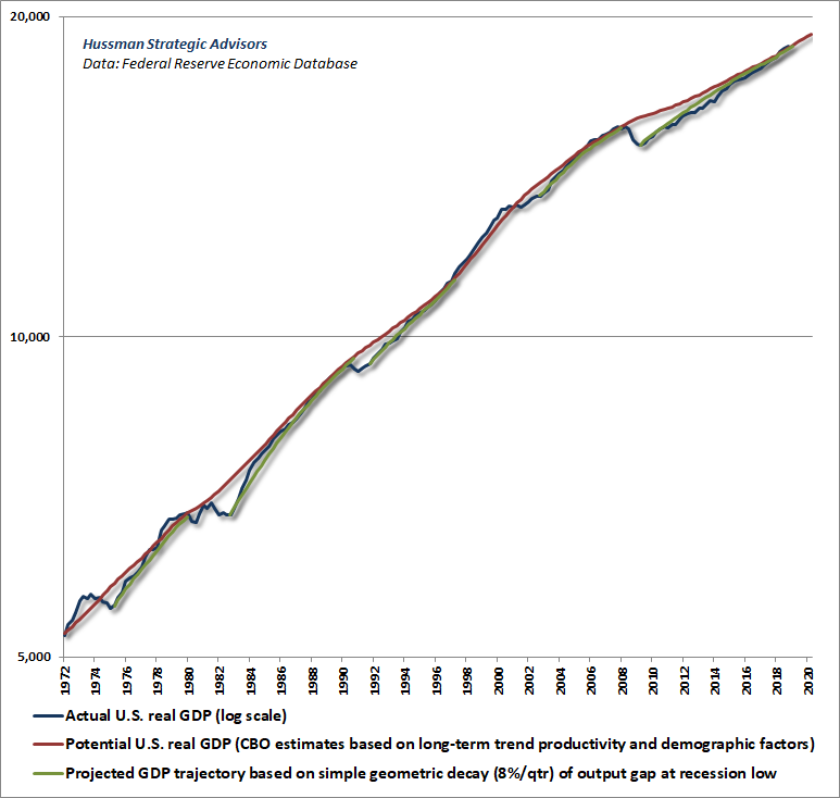
Look at those green lines. The fact is that the trajectory of real GDP over the past decade has been little different than one would have projected using simple geometric decay of the “output gap” that existed at the 2009 low. Here’s a longer-term chart. Economic recoveries are largely mean-reverting events, involving the gradual, geometric decay of the output gap that existed at the recession low. That trajectory can be predicted by non-monetary variables alone. Wildly activist deviations from systematic monetary policy responses don’t change the trajectory at all.
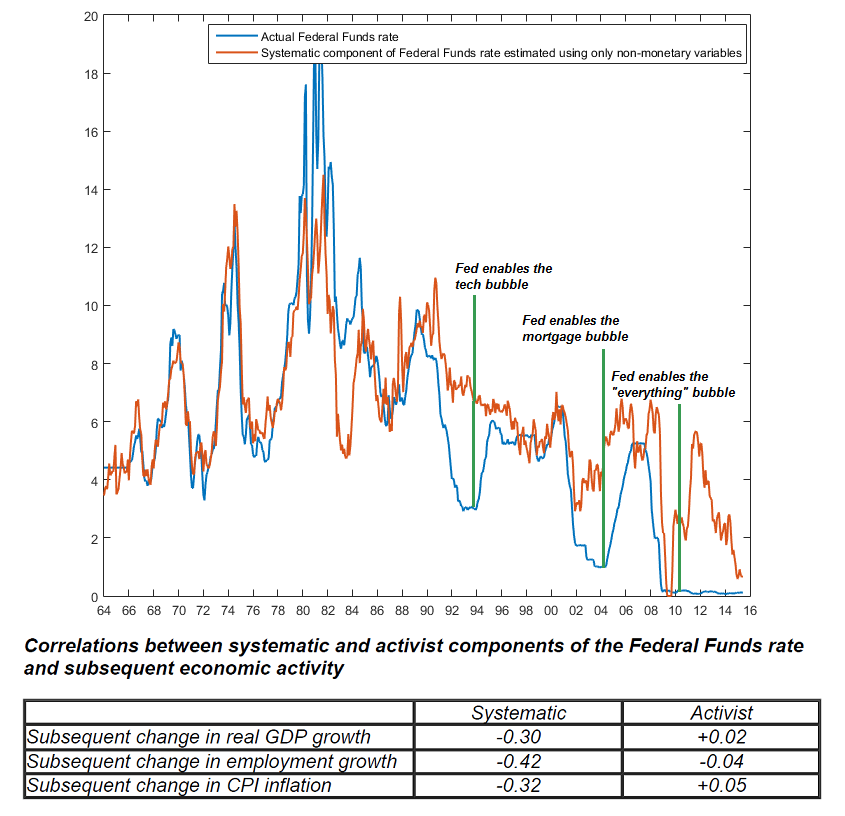
Does that mean that monetary policy has absolutely no effect? Not quite. See, the “systematic” component of monetary policy is the portion of the policy response that can be predicted using current and past output, employment, and inflation, and it’s possible that this component of the monetary response is both necessary and useful. What we can say, however, is that there’s no evidence that the wildly activist interventions like QE have any real effects on GDP or employment, other than to amplify the risk of future financial crises.
The chart below is from 2016, and provides a general idea of what systematic and unsystematic policy responses look like. Notably, my argument is not that the level of short-term interest rates should be materially different than it is at present. Rather, my view is that zero interest rate policy was a profound mistake, and a resumption of that course would do nothing for the real economy and everything to further amplify the risk of future financial crises.
I remember a little boy listening to a concert at a Fourth of July celebration one year. As the music played, the little boy waved his arms as if he was conducting the orchestra. Monetary authorities are a lot like that, except that everyone who watches these kids at play actually believes that they are, in fact, conducting the orchestra.
Come on now. Give the U.S. economy, its millions of workers, and its entrepreneurial spirit some credit. Yes, there are sometimes serious shocks to the economy. Some, like the global financial crisis, are the direct result of yield-seeking speculation fueled by misguided Federal Reserve policy. But the recoveries from those recessions have a highly systematic pattern. The output gap at the recession low decays geometrically, typically at a rate of about 8% per quarter (that is, each quarter, the prior output gap is multiplied by something on the order of 0.92).
Economic recoveries are largely mean-reverting events, involving the gradual, geometric decay of the output gap that existed at the recession low. That trajectory can be predicted by non-monetary variables alone. Wildly activist deviations from systematic monetary policy responses don’t change the trajectory at all.
Again, it’s possible that the systematic component of Fed policy – the part that represents a predictable, stable, calculable response to output, unemployment, and inflation – may actually be useful. It’s the activist, unsystematic, crackpot, deranged Bernanke-Yellen clown carnival stuff that’s utterly useless and predictably destructive over the complete course of the bubble-crash cycle.
As a side note, given the systematic tendency for recessionary shocks to revert back toward potential GDP, one might wonder (I did) whether one might improve on Warren Buffett’s suggested valuation measure, nonfinancial market capitalization/GDP (“probably the best single measure of where valuations stand at any given moment” – Fortune, 2001) by substituting potential GDP for nominal GDP. It’s not particularly surprising that the answer is yes. Indeed, it outperforms price/forward operating earnings, the Shiller CAPE, and the Fed Model, again because stocks are a claim on a very long-term stream of cash flows. The most reliable valuation measures mute out shorter-term noise in those cash flows.
The following chart shows nonfinancial market cap/nominal potential GDP on an inverted log scale (left), with actual subsequent 12-year S&P 500 total returns on the right scale. As usual, note that speculative bubbles always make it appear that valuations haven’t “worked” in the period immediately preceding the top, precisely because a substantial, if temporary, violation of historical norms is required to get to those extremes. As indicated by other reliable measures, investors are presently facing the likelihood of prospective nominal 12-year S&P 500 total returns averaging roughly zero.
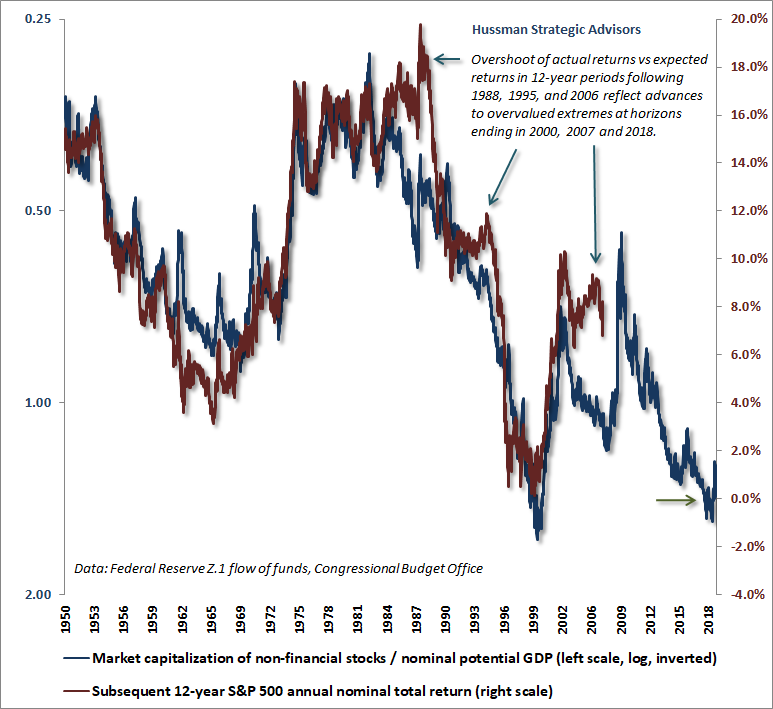
Aside from reinforcing that central point, there’s no need to proliferate very similar valuation measures. Our preferred valuation measure, MarketCap/GVA (nonfinancial market capitalization to gross value-added, including estimated foreign revenues) has an even stronger correlation with subsequent market returns, because it more closely approximates an apples-to-apples price/revenue ratio. Since Federal Reserve Z.1 flow-of-funds data isn’t available before 1947, we also use the Hussman Margin-Adjusted P/E (MAPE), which we can compute in available data back to the 1920’s.
Structural Growth and Okun’s Law
So we’ve come to a point in this economic expansion where 1) structural real GDP growth is only running at about 1.6% annually, and; 2) there’s limited scope for further declines in the unemployment rate. The result of those two propositions is that real GDP growth is likely to average only about 1.6% in the coming years, and only then if the rate of unemployment is held constant.
What, then, if the rate of unemployment increases? Well, as I’ve noted over the years, there’s a reasonably reliable relationship known as Okun’s law, which links changes in the rate of unemployment to changes in the output gap (real GDP versus potential GDP). Specifically, in data since 1947, every 1% increase in the rate of unemployment is related to a roughly 1.6% shortfall in real GDP versus potential GDP. The most useful time horizon to measure these changes is about 2 years, though the relationship also holds with a bit more noise over shorter horizons.
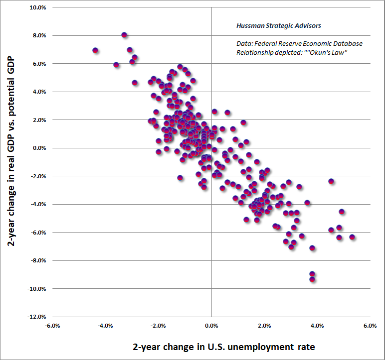
The upshot is that a 1% increase in unemployment over the course of a 12-month period would be sufficient to drive real GDP growth to zero over that same period. Likewise, a 0.5% increase in unemployment over a 6-month period would likely be enough to produce two quarters of flat real GDP. More than that, and the associated economic downturn would most likely be associated with an outright recession.
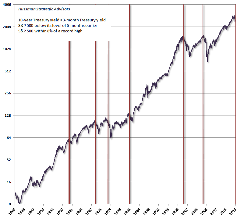
The current economic expansion is very long in the tooth, and we do see weakness in some of the leading indicators and international data. Still, it’s not enough to pound the table about imminent recession risk. Our immediate economic concerns would be greater if we were to observe a decline in the ISM purchasing managers index at least below 54, slowing in year-over-year employment growth from the current 1.7% to less than 1.4%, an increase in the unemployment rate above 4%, a decline in consumer confidence about 20 points below its 12-month average, along with fresh weakness that takes the S&P 500 more convincingly below its level of 6 months earlier.
A 1% increase in unemployment over the course of a 12-month period would be sufficient to drive real GDP growth to zero over that same period. Likewise, an increase in the rate of unemployment greater than 0.5% over a 6-month period would most likely be associated with an outright recession.
For now, an inverted yield curve is simply not enough to project an imminent recession, though I’ll offer that in the past, when we’ve seen an inverted yield curve with the S&P 500 below its level of 6-months earlier, with the S&P 500 still within 8% of a record high, stocks have typically already been in a bear market. The current data point would be more convincing to me if we were to observe a fresh, decisive breakdown in our measures of market internals. At present, the market’s enthusiasm about Jerome Powell’s successful spine removal has been enough to jam the speculative bit at least loosely back into Wall Street’s teeth.
Beware of relying on magic beans and pixie dust
Honestly. How have investors come to believe that the simple act of buying Treasury securities is enough to save the world from every negative economic consequence? What economic mechanism do investors imagine is at work when the Federal Reserve launches a program of quantitative easing?
Don’t misunderstand that question. There’s very clear evidence that quantitative easing is sufficient, in a non-inflationary environment, to drive Treasury bill yields lower, with a very strong likelihood of driving bond yields lower. There’s also no doubt that when investors are inclined to speculate in the stock market (which we infer from the condition of market internals), zero interest rates can dramatically amplify that impulse. Still, the ability of Fed easing to support the stock market is highly dependent on investor psychology toward speculation and risk aversion, and the effect on the real economy is, by all statistical evidence, zilch.
Extraordinary monetary policy has one function, and it is to amplify yield-seeking speculation when investors are inclined to speculate. One can use a variety of estimation methods to demonstrate that the trajectory of the real economy (output, employment) in recent years has been no different than one could have projected using wholly non-monetary variables.
I’ll say this again. Extraordinary monetary policy by the Federal Reserve did not “save the world,” in recent years. Nor did it end the global financial crisis. The global financial crisis was largely the outcome of years of yield-seeking speculation in mortgage securities, as investors sought relief from the low interest rates engineered by the Fed. The supply side of that bubble was serviced by poorly regulated and inadequately capitalized Wall Street institutions, who satisfied the demand of yield-starved investors for new “product” by lending to anyone with a pulse.
The global financial crisis unfolded as an 18-month market collapse during which the Fed eased aggressively the whole time. The global financial crisis ended, precisely, in the second week of March 2009 when, under Congressional pressure, the Financial Accounting Standards Board (FASB) suspended the mark-to-market accounting rule FAS 157. With the stroke of a pen, bank balance sheets became instantly opaque, and banks were allowed substantial discretion in their choice of how to value their distressed assets.
While it was appropriate for the Fed to expand the quantity of banking reserves to accommodate withdrawals by depositors, Bernanke went way, way beyond that, violating the Federal Reserve Act by creating the Maiden Lane shell companies to buy distressed private securities off-balance sheet. Congress later amended that law like it was a chapter out of a Dick & Jane Book: “See Spot Run. Run Spot, Run!”
The Federal Reserve has gradually restored the solvency of banks through an interest rate policy that has acted as a transfer of wealth from savers to borrowers and financial intermediaries. The Fed has also intentionally encouraged a yield-seeking bubble, and has enabled the issuance of trillions in low-grade securities including covenant-lite debt, leveraged loans, and earnings-free equity IPOs.
At current valuation extremes, it’s only the illusion of “paper wealth” that temporarily anesthetizes investors and pension funds to the fact that their actual basis of wealth – the likely future stream of cash flows that will be delivered into their hands over time – is the smallest amount, relative to those “paper prices” since the 1929 and 2000 extremes. That’s exactly what hypervaluation means.
Once a recession starts producing earnings weakness, credit strains, and defaults involving tens of trillions of dollars of bloated market capitalization in securities that the Fed cannot legally or even practically buy, what do investors imagine is going to happen? Do they think Congress will give the Fed authorization to nationalize the entire U.S. corporate sector without also getting involved in every aspect of corporate operations and governance? If so, do they actually hope for that outcome?
Look. From the standpoint of investment strategy, it will be enough for us to respond systematically to changes in valuations and market action, particularly our measures of internals. That combination has capably navigated even the bubbles and collapses of recent decades. It’s only “overvalued, overbought, overbullish” conditions that lost their usefulness. So we’ll be fine with whatever policies actually emerge.
Still, I’m utterly mesmerized by the credulity of investors who believe that the Federal Reserve is capable of saving them from every possible contingency, no matter how irresponsible their own speculative behavior might be.
I’ve discussed this point before, but it’s an essential one: investors should realize that the Federal Reserve’s policy of quantitative easing involves nothing more than buying interest-bearing Treasuries held by the public, and replacing them with zero-interest base money (currency and bank reserves) that must instead be held by the public, in the form of base money, until that base money is retired by the Fed. How does that operation save the world? Well, it doesn’t.
What QE does do, is to create a massive pile of zero-interest hot potatoes that somebody has to hold at every point in time, but that nobody wants to hold. So the first thing holders do is to chase the closest substitute – Treasury bills – and they do that until the prices of Treasury bills have been bid high enough, and the yields on Treasury bills have been driven low enough – to make investors indifferent between holding zero-interest reserves and near-zero interest Treasury bills.
Of course, if bond yields are still attractive, relative to Treasury bills, the next step is to chase bonds. Then – provided that investors are inclined to speculate – investors also chase stocks, junk debt, and anything else that has an attractive yield. The process stops when all risky assets are priced at such high valuations that nothing offers an expected return much greater than zero.
Notice the word “provided” above. It’s worth remembering that the Fed eased aggressively during the entire 2000-2002 and 2007-2009 collapses, with utterly no effect in halting market losses. Why? Because when investors are inclined toward risk-aversion, safe, low-interest liquidity is a desirable asset, not an inferior one. So creating more of the stuff does nothing to provoke speculation.
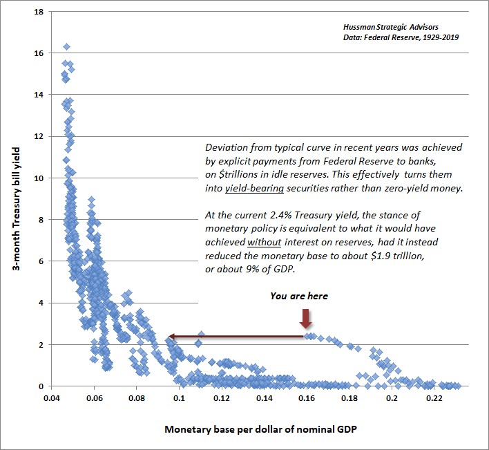
As a side-note, in recent years, rather than normalizing the size of this pile of hot potatoes, the Fed has instead explicitly paid interest on it, which is why T-bill yields are at 2.4% when they would otherwise still be about zero. In order for T-bill yields to be 2.4% without paying interest on reserves, the Fed would have to reduce its balance sheet by an additional 45%, to about 9% of nominal GDP.
The key point here is this. Extraordinary monetary policy has one function, and it is to amplify yield-seeking speculation when investors are inclined to speculate. This amplified speculation has extended to every corner of the financial markets, from equities, to low-grade debt, to private equity. That and that alone, is how quantitative easing has impacted the economy in recent years. One can use a variety of estimation methods to demonstrate that the trajectory of the real economy (output, employment) in recent years has been no different than one could have projected using wholly non-monetary variables.
Years of relentless yield-seeking speculation have created the potential for a financial collapse far more severe than the mortgage bubble, which was largely limited to a single class of securities. Unfortunately, the consequences may be far more difficult to stem than investors believe, because there is a vast difference between liquidity (marketable assets on the left side of the balance sheet) and solvency (capital on the right side of the balance sheet that stands as a buffer between financial distress and bankruptcy).
At current valuation extremes, it’s only the illusion of “paper wealth” that temporarily anesthetizes investors and pension funds to the fact that their actual basis of wealth – the likely future stream of cash flows that will be delivered into their hands over time – is the smallest amount, relative to those “paper prices” since the 1929 and 2000 extremes. That’s exactly what hypervaluation means.
The total equity market capitalization of U.S. nonfinancial and financial companies now stands at $40 trillion (Federal Reserve Z.1 flow of funds data), and the market for leveraged loans to already highly-indebted companies now exceeds the size of the entire U.S. junk bond market. Unfortunately, the outstanding amount of junk debt is also likely to increase dramatically in even a mild economic downturn, given a recent that half of all U.S. “investment grade” corporate debt, according to Moody’s, is now rated just one step above junk.
It’s not clear that investors are fully aware that Section 14 of the Federal Reserve Act (which was rewritten like a children’s book after the global financial crisis to remove all doubt) does not enable the Fed to buy stocks or corporate debt. So unless Congress was to explicitly sanction the nationalization of U.S. corporate sector, investors should ask themselves exactly how the Fed purchasing Treasury bonds should be expected to reliably prevent the collapse of tens of trillions of dollars of market capitalization in hypervalued corporate securities that are temporarily counted as paper “wealth.”
Still, we can never rule out desperate behavior from people who respond in alarm at even the smallest market correction, and appear frantic to keep a hypervalued bubble in play regardless of longer-term consequences. Faced with the constant specter of novel interventions from megalomanical policymakers, we as investors are left with the following task: identify as well as possible where the market is in the complete bull-bear cycle, but constantly monitor the extent to which investors are inclined toward speculation or risk-aversion.
Those distinctions are important, because when investors are inclined to speculate, Fed easing and similar interventions tend to amplify that speculation. In contrast, when investors are inclined toward risk-aversion, even persistent and aggressive Fed easing can be as ineffective as it was through the entire 2000-2002 and 2007-2009 collapses.
The most favorable environments for investment have historically featured a material retreat in valuations that is joined by improving market action, particularly internals. The most hostile environments have historically featured extreme valuations that are joined by deteriorating market action, particularly internals.
So the investors at greatest risk in the coming years will likely be those who take solace from Fed easing in environments where valuations are extreme yet investors are inclined toward risk-aversion. It will be necessary to refrain from too negative an outlook when overvaluation is joined by speculative psychology, and also to refrain from too aggressive an outlook when reasonable valuations are still joined by extreme risk-aversion. In any event, I expect that responding systematically to valuations and market action, particularly the condition of market internals, will be sufficient to navigate whatever policy makers throw at the markets.
Keep Me Informed
Please enter your email address to be notified of new content, including market commentary and special updates.
Thank you for your interest in the Hussman Funds.
100% Spam-free. No list sharing. No solicitations. Opt-out anytime with one click.
By submitting this form, you consent to receive news and commentary, at no cost, from Hussman Strategic Advisors, News & Commentary, Cincinnati OH, 45246. https://www.hussmanfunds.com. You can revoke your consent to receive emails at any time by clicking the unsubscribe link at the bottom of every email. Emails are serviced by Constant Contact.
The foregoing comments represent the general investment analysis and economic views of the Advisor, and are provided solely for the purpose of information, instruction and discourse.
Prospectuses for the Hussman Strategic Growth Fund, the Hussman Strategic Total Return Fund, the Hussman Strategic International Fund, and the Hussman Strategic Dividend Value Fund, as well as Fund reports and other information, are available by clicking “The Funds” menu button from any page of this website.
Estimates of prospective return and risk for equities, bonds, and other financial markets are forward-looking statements based the analysis and reasonable beliefs of Hussman Strategic Advisors. They are not a guarantee of future performance, and are not indicative of the prospective returns of any of the Hussman Funds. Actual returns may differ substantially from the estimates provided. Estimates of prospective long-term returns for the S&P 500 reflect our standard valuation methodology, focusing on the relationship between current market prices and earnings, dividends and other fundamentals, adjusted for variability over the economic cycle.