

A Striking Collection of Duck-Like Features


John P. Hussman, Ph.D.
President, Hussman Investment Trust
November 2019
When I see a bird that walks like a duck and swims like a duck and quacks like a duck, I call that bird a duck.
– James Whitcomb Riley
One of the pitfalls of identifying market conditions using labels like “bull market” and “bear market” is that the accuracy of those labels can only be verified in hindsight. Early technical analysts like Charles Dow, Robert Rhea, and William Peter Hamilton tried to address that uncertainty by requiring various “confirmations” before applying those labels. For example, a new bull market isn’t “confirmed” in Dow Theory until both industrial stocks and transportation stocks experience an initial advance from market lows, followed by a moderate pullback, followed by both indices breaking above the highs of that initial advance.
Uniformity across different types of stocks or assets is essential, because it signals a willingness of investors to embrace market risk. The strongest investment opportunities we identify have two essential features: 1) a material retreat in valuations, followed by 2) an identifiable shift to uniformly favorable market action across multiple sectors. It’s not the label of “bull market” or “bear market,” but those observable features that actually matter. The danger comes when investors say things like “this is a bull market” as if the label itself is informative about the future, ignoring changes in valuation and market internals, and forgetting that the most recent high might also have been the final high.
Likewise, the proper way to use the word “confirmation” is in the sense of “additional evidence.” For example, if at some point our Recession Warning Composite becomes active (and it has not yet done so here), we’ll look for subsequent “confirmation” of recession risk in slightly lagging events like a decline in aggregate hours worked from their level of 3 months earlier, a slowing in payroll growth to less than 1% year-over-year (or 0.5% over a 6-month period), and a decline in consumer confidence of 20 points or more from its 12-month average.
In contrast, the word “confirmation” becomes dangerous when investors use it the same way one would use the word “verified.” When we are talking about the future, the actual outcome is not – and cannot be – known with certainty.
Future-looking labels versus current, observable conditions
Are stocks in a bull market? Are stocks in a bear market? The answer isn’t actually observable in real-time. As I’ve noted for decades, bull markets and bear markets exist only in hindsight. When will the bull market end? It might have ended Friday. I kind of think it did. But that question is irrelevant to our investment outlook, because our outlook is a reflection of current, observable evidence.
We choose our actions based on the conditions we observe, and the range of outcomes that have historically followed. No future-looking labels are necessary. We also pay special attention to features that tend to emerge – usually as a collection – at the most extreme points of opportunity or risk.
The goal isn’t so much to forecast future conditions but instead to identify present ones: to gather observable evidence, to insist on knowing how that evidence has been associated with actual subsequent outcomes, and to align our investment stance with the “distribution” of likely opportunities or risks, understanding that the outcome in this particular instance is unknowable.
A key phrase in that last paragraph is “insist on knowing how that evidence has been associated with actual subsequent outcomes.” There are thousands of available data points that investors often quote, without having the faintest idea of how they are related to subsequent outcomes. Unfortunately, much of this data is noise (like the AAII bull/bear sentiment figures, the so-called Fed Model, and most estimates of the “equity risk premium”), or weakly correlated with subsequent outcomes (like the forward operating P/E for the S&P 500), or best used as contrary indicators (like consumer confidence and the unemployment rate), or entirely dependent on the prevailing condition of market internals (like monetary policy changes).
In our own discipline, the focus is on the range of outcomes that have historically been associated with various sets of observable conditions. Those outcomes, or “return/risk profiles” look similar to bell curves, but often with skewed, fat, or narrow shapes, and with differing average returns.
Again, the most favorable profile emerges when 1) a material retreat in valuations is joined by 2) uniformly improving market action. We gauge that “uniformity” across a broad range of individual stocks, industries, sectors, and security types, including debt securities of varying creditworthiness. Two decades ago, I referred to this as “trend uniformity.” Presently, I use the phrase “market internals.”
Despite my reputation as a “permabear” in recent years (a result of my bearish response to historically-reliable speculative “limits,” which proved detrimental in the face of zero interest rate policy, and which we abandoned and subordinated to market internals in late-2017), the fact is that I’ve adopted a constructive, unhedged, or even leveraged investment outlook after every bear market in over 30 years. I have little doubt we’ll observe such opportunities over the completion of this cycle.
Meanwhile, remember that combination: a material retreat in valuations, joined by an improvement in market internals. The general tone of the markets is typically fearful and even hopeless at those points, but that’s when investors should be most willing to embrace market risk. It’s also the precise opposite of what we observe today.
Current conditions
At present, our measures of valuations are breathtakingly extreme, and our measures of market internals are negative and divergent. Yet despite these market extremes, we always have to allow for the possibility that investors will take the speculative bit back in their teeth. An improvement in the uniformity market internals wouldn’t avoid the negative total returns that we project for the S&P 500 over the coming 10-12 years, nor would it reduce the 50-65% downside risk that I continue to view as likely over the completion of this market cycle, but it would defer our immediate near-term downside expectations for the market.
Here and now, we observe a combination of market conditions that has historically been permissive of “trap door” market losses. I use the word “permissive” because market losses are not a certainty. Rather, when we examine points of extreme market risk across history, they share many of the features we observe today.
Put it this way. If a high-risk market peak were a duck, observable market conditions presently include a striking collection of duck-like features, including unfavorable market internals on our measures, extremes in valuations, sentiment and price behavior, along with deteriorating leadership (e.g. new highs vs new lows), credit (e.g. corporate debt, high-yield bonds, leveraged loans), breadth (e.g. advancing vs. declining issues), and participation (e.g. the percentage of stocks in defined uptrends). In hindsight, these spikes in duck-like conditions have often proved to be market tops.
Still, we can’t know that it’s a duck, except in hindsight. The problem with that label is that it suggests that we know the future, and we actually only know what we see in the present moment. So instead, we simply respond to the current, observable duck-like features, based on our evaluation of the outcomes that have typically accompanied them.
Below is a version of a chart I shared last year. In hindsight, the large collection of duck-like features we observed the week of September 21, 2018 was immediately followed by a -19.8% swoon into year-end. As I observed at the time:
“The only time we’ve ever seen a confluence of risk factors anywhere close to those of today was the week of March 24, 2000, which marked the peak of the technology bubble. In my view, this sort of analysis is useful because it doesn’t rely on any single risk factor, and emphasizes that while these risk factors can emerge individually without consequence, a large and critical mass of them probably shouldn’t be dismissed. My impression is that this is as close as one gets to ringing a bell at the top.”
We observed an equivalent extreme last week (ended Friday, November 8, 2019). While this is again as close as one gets to a duck, we can’t know until later whether it’s actually a duck. All we can say with confidence is that current, observable market conditions present us with a striking collection of duck-like features.
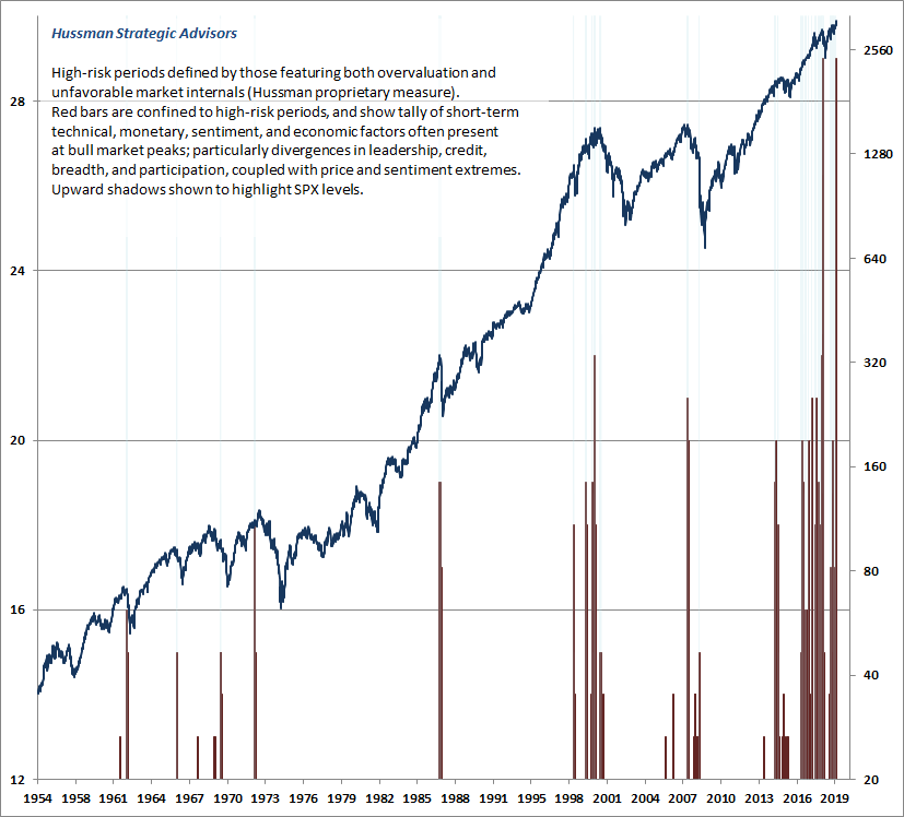
Beyond our own primary measures – extreme valuations coupled with unfavorable market internals – we observe a host of additional features that tend to cluster at market extremes. For example, Investors Intelligence reports lopsided advisory sentiment at at 57% bulls versus just 18% bears. And despite new highs in the major indices, with the S&P 500 pushing its upper Bollinger bands (2 standard deviations above the 20-period average) at daily, weekly, and even monthly resolutions, we’re seeing a diminishing number of individual stocks setting their own new highs. Indeed, only 3.5% of NYSE stocks joined the new high in the S&P 500 on Friday, November 8th, partly because of weakness in interest-sensitive sectors. Meanwhile, over 40% of all stocks are below their own respective 200-day averages. That’s a small sampling of the internal rollovers we’re observing.
The key idea here isn’t terribly complex. High-risk market conditions feature the simultaneous appearance of market extremes and market divergences; essentially an overextended market losing its engines.
Even very simple criteria can capture this idea. For example, it’s surprising how few times in history we’ve observed record market highs, while at the same time, our measures of market internals were unfavorable, fewer than 60% of individual stocks were above their respective 200-day averages, and the weekly total of individual stocks hitting 52-week highs had contracted by more than 30% from its 6-month peak.
In recent decades, those instances include (exhaustively): today, the September 2018 pre-correction peak (immediately followed by a nearly 20% decline during the fourth quarter), September 2017 (uneventful), July 2015 (followed by a 12% correction over the next 6 weeks), February 2015 (uneventful), October 2007 (the precise bull market peak, followed by a 55% market collapse), December 1999 (a few percent below the ultimate 2000 market peak, yet nevertheless followed by a 9% correction over the next 8 weeks before the market staged its final advance), and July 1998 (followed by a 19% correction over the next 6 weeks). To find another instance, one has to look as far back as November 1972 (about 4% below the January 1973 market high, and followed by a 50% market collapse).
If a high-risk market peak were a duck, observable market conditions presently include a striking collection of duck-like features. The key idea here isn’t terribly complex. High-risk market conditions feature the simultaneous appearance of market extremes and market divergences; essentially an overextended market losing its engines.
Again, our outlook reflects the average market return/risk profile that has historically followed present conditions, but we can’t be certain of the outcome in this specific instance. What we can say with reasonable confidence is that market conditions are currently permissive of steep and potentially abrupt market losses.
Meanwhile, we have to monitor the uniformity of market internals, with a willingness to defer a negative outlook if investors get the speculative bit back in their teeth. From a longer-term perspective, we can also say that current valuation extremes imply negative S&P 500 total returns over the coming 10-12 year horizon, with a likely market loss on the order of 50-65% over the completion of this cycle (a “complete market cycle” comprises the full trajectory from one bull market peak to the next, or one bear market trough to the next).
Valuation review
The combination of extreme stock market valuations and depressed interest rates continues to imply dismal estimated expected returns for passive investors. As of October, our estimate of the prospective 12-year average annual total return for a conventional asset mix (invested 60% in the S&P 500, 30% in Treasury bonds, and 10% in Treasury bills) has declined to the lowest level in history aside from the week of the 1929 market peak.
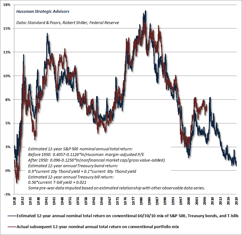
If you study this chart carefully, the good news is that over time, we periodically observe upward spikes in prospective investment returns, which create opportunities for investors to embrace market risk and allocate funds to the markets. The bad news is that the way these spikes emerge (as they did in 2000-2002 and 2007-2009, with a lesser spike late last year), is for prices to decline in the stock and/or bond markets. That’s why the highest market return/risk opportunities we identify are generally associated with a material retreat in market valuations, coupled with fresh improvements in market action.
The chart below shows the ratio of nonfinancial market capitalization to nonfinancial gross value-added, including estimated foreign revenues. I introduced MarketCap/GVA in 2015, and it remains the valuation measure we find most strongly correlated with actual subsequent market returns in market cycles across history.
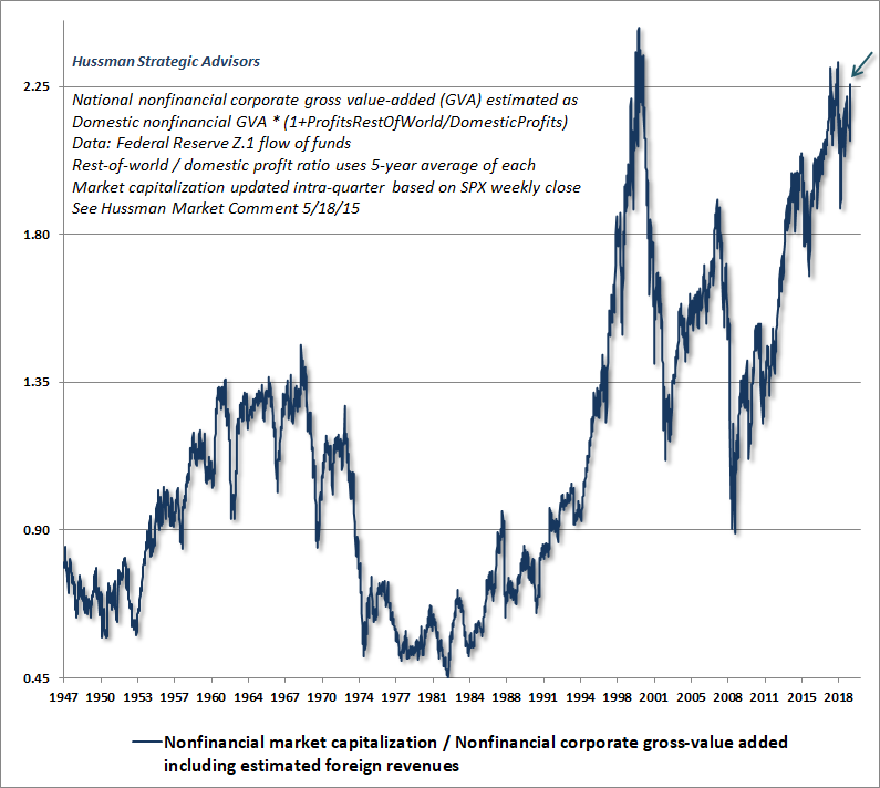
Since the Z.1 flow of funds data only goes back to about 1947, we often use the next best correlated alternative measure, our Margin-Adjusted P/E (MAPE), which behaves much like a market-wide, apples-to-apples price/revenue ratio.
It’s critical to understand that any valuation ratio is simply shorthand for a proper discounted cash flow analysis. What’s crucial, then, is for the chosen fundamental to behave as a “sufficient statistic” for the very long-term stream of cash flows that stocks will deliver into the hands of investors over time. On that front, the MAPE comes quite close to mirroring the valuation one would obtain from a proper discounted cash flow analysis.
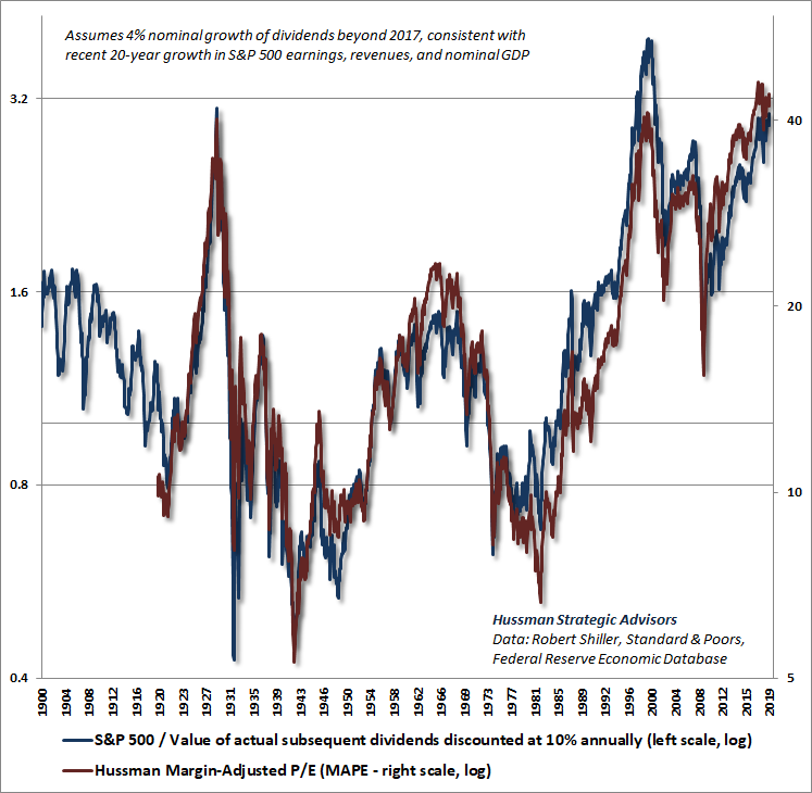
The way to think about this chart is essentially that, when valuations have been at historical norms, the S&P 500 has been priced at levels consistent with average returns of about 10% annually. On the left scale, this would correspond to a level of 1.0, where the actual level of the S&P 500 is equal to the value of actual subsequent dividends, discounted using a 10% rate of return. When the S&P 500 has traded at higher levels, the higher price has corresponded to expected long-term returns lower than 10% annually. When the S&P 500 has traded at lower levels, the lower price has corresponded to expected long-term returns higher than 10% annually.
Presently, the S&P 500 is trading at about three times the level at which investors should expect historically normal subsequent returns. Moreover, even if the completion of this cycle takes the S&P 500 only to 2002 levels – the highest valuation level ever observed at a bear market trough – the S&P 500 would still stand to lose roughly 50% of its value from current extremes. Even in that somewhat optimistic case, it’s important to remember that the October 2002 lows in both valuations and prices were broken during the subsequent 2007-2009 collapse.
Profits and margins
Unlike MarketCap/GVA and our Margin-Adjusted P/E, most popular earnings-based valuation measures come nowhere close to replicating a proper discounted cash flow analysis. The reason is that profit margins fluctuate substantially over the economic cycle, so the resulting P/E ratios are heavily affected by whether earnings happen to be at a cyclical peak or a cyclical trough. That’s why valuation measures like the S&P 500 price/earnings ratio, and even the price/forward operating earnings ratio, have a weaker correlation with actual subsequent market returns than measures that adjust for varying profit margins.
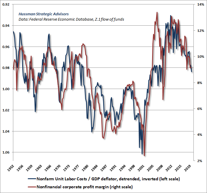
On the subject of profit margins, we continue to observe upward pressure on real unit labor costs. Think of unit labor costs as the amount that a company spends on labor to produce one “representative” unit of output. Think of the GDP deflator as the amount a company receives for one “representative” unit of output. The ratio of unit labor costs to the GDP deflator is basically a proxy for how much of the selling price of that output is dedicated to labor costs.
Most of the spike in profit margins after the global financial crisis was the result of high unemployment and muted labor cost inflation. In recent years, however, rising real unit labor costs (ULC/deflator) have been directly associated with contracting profit margins. As I’ve noted previously, erosion in economy-wide profit margins typically precedes erosion in S&P 500 profit margins by several quarters.
The chart below shows real nonfarm unit labor costs on an inverted scale, along with nonfinancial profit margins. Notice that upward pressure on real unit labor costs continued to exert downward pressure on profit margins in the third quarter.
On value-conscious stock selection
Having adapted our methods to abandon our reliance on speculative “limits” in late-2017, our investment discipline served us well during 2018. Yet disciplined, hedged-equity approaches have encountered a different kind of headwind this year. This reflects a substantial but, I expect, temporary divergence between the performance of the broad market – especially relatively undervalued sectors – and the major capitalization-weighted indices (which are typically used as hedging vehicles).
The fact is that value-conscious stock selection tends to lag at bull market peaks, because investors are often mesmerized by glamour stocks with enormous market capitalizations. Indeed, that kind of divergence is a negative signal for the market, and contributes to the unfavorable market internals that we presently observe. The same type of behavior has repeatedly characterized periods approaching bull market peaks, including the advances to the 2000 and 2007 bubble extremes. And it’s been true even for value investors like Warren Buffett.
To offer a sense of this divergence, it’s instructive that Buffett’s performance this year has lagged the S&P 500 by over 17%. So even though Berkshire has a beta of just over 1.0, a hedged equity position, long Buffett and hedged with the S&P 500, would be down by about 17% year-to-date.
In late-2006, during the final stages of the mortgage bubble, I wrote a comment titled When Value Mavens Lag, observing: “Repeatedly, Buffett’s investment performance was least impressive when the market was approaching a long period of dull and often negative returns.”
In recent weeks, we’ve seen a shift in market behavior toward a recovery in value-focused indices, relative to the large cap-weighted indices. It’s a bit early to know whether this shift will be durable, but I do expect that value-conscious stock selection will serve investors better than the passive capitalization-weighted indices in the coming years. Our view has always been that stocks are ultimately a claim on a future stream of cash flows that will be delivered to investors over time. While market action and speculative pressures can’t be ignored, we try to avoid substantial exposure to hypervalued sectors of the market, because investment returns are ultimately driven by the long-term stream of cash flows that investors receive, relative to the prices they pay.
“Repeatedly, Buffett’s investment performance was least impressive when the market was approaching a long period of dull and often negative returns.
– John P. Hussman, Ph.D.
When Value Mavens Lag, November 2006
As investors should recall from the 2000-2002 period, the most overvalued decile of the S&P 500 fell not by 50%, but by over 80%, while value-conscious strategies like our own generally flourished. The current profile of valuations isn’t quite as skewed as it was in 2000, but that also means that the current overvaluation of the market is much broader in scope than what we observed in 2000, and that makes careful stock selection essential.
So while a disciplined focus on value-conscious stock selection has been somewhat detrimental, rather than beneficial this year, I remain convinced that it will be an essential investment practice over the full course of this market cycle.
Canaries in the coalmine
While we attend to the duck-like features of current market conditions, it’s also worth monitoring the canaries. Among the most popular glamour stocks, we’ve started to observe trouble among some of the canaries in the coalmine, particularly among companies that have recently come to market, where over 80% of initial public offerings (IPOs) in the past year have featured companies with negative earnings – the highest proportion since the dot-com bubble.
On this front, it’s useful to remember that speculative bubbles tend to burst from the fringes. For example, the problems with sub-prime debt were the beginning, not the end of credit strains in the global financial crisis. Dot-com stocks experienced a profound collapse even before the 2000-2002 market collapse even started. The same is likely to be true here.
One of my favorite examples of this process is from July 2000, when the Wall Street Journal ran an article titled (in the print version) “What were we THINKING?” The article reflected on the “arrogance, greed, and optimism” that had already been followed by the collapse of dot-com stocks. My favorite line: “Now we know better. Why didn’t they see it coming?” Unfortunately, that article was published at a point where the Nasdaq still had an 80% loss (not a typo) ahead of it.
It’s useful to remember that speculative bubbles tend to burst from the fringes.
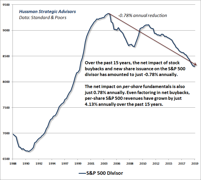
At present, the canaries in the coalmine go well beyond recent IPOs. Keep in mind that, just as we observed during the mortgage bubble, the recent “everything bubble” has encouraged an enormous amount of new issuance of low-grade securities, in order to feed the Fed-induced yield-seeking demand of investors. Indeed, as much as Wall Street chatters about stock buybacks “contracting the supply” of stocks available to investors, the fact is that a substantial portion of those buybacks have served to do nothing other than offset the dilution that would otherwise result from grants of stock to executives and employees.
Indeed, if you examine the S&P 500 divisor (which captures the full effect of buybacks and new stock issuance), you’ll find that it has declined by only -0.78% annually over the past 15 years. So much for significantly contracting the supply of outstanding stock. The fact is that the net effect of buybacks and new stock issuance on the per-share growth of S&P 500 earnings, revenues and other fundamentals has amounted to just 0.78% annually. Moreover, the slight net contraction in the number of shares outstanding has been wildly offset by higher valuations. Outstanding market capitalization of the S&P 500 now stands at a record $25.6 trillion dollars, while the total capitalization of financial and nonfinancial U.S. equities is approximately $43 trillion. Both rival the most extreme multiples of corporate revenues in history.
Even with the benefit of corporate stock buybacks, S&P 500 revenues have only grown at a nominal rate of 4.1% annually over the past 15 years. As I’ve noted previously, in the absence of sustained declines in the unemployment rate, structural real GDP growth is likely to average only about 1.6% annually over the coming decade. Add 2% inflation, and we’re likely to observe nominal growth of less than 4% annually – and that’s assuming that the rate of unemployment stays near current lows indefinitely. Meanwhile, without a material retreat in real unit labor costs to boost profit margins, there is no reason to expect that earnings growth will materially outpace that same 4% growth rate.
So do the arithmetic. Even if valuations normalize, not by 50-65% to historically run-of-the-mill levels, but only by 20%, and even if it takes 5 years to do so, the average annual change in the S&P 500 Index over that horizon would be 1.04*(0.8)^(1/5)-1 = -0.5%. Add a 2% dividend yield, and the S&P 500 would still do little better than T-bills. In my view, even this is a highly optimistic scenario.
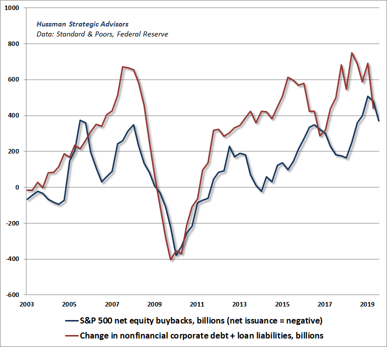
Understand that corporate stock buybacks have largely been financed through the issuance of new debt, which will ultimately amplify bankruptcy risk during the next recession, whenever it occurs. More than half of all “investment grade” corporate bonds are already rated just one notch above junk. While the chart below isn’t quite apples-to-apples, it illustrates the essential point: stock buybacks have been more than offset by expansion in corporate debt and borrowing, to easily the highest ratio of corporate revenues in history.
As I’ve noted, our Recession Warning Composite is not yet active here, but conditions are borderline, and even moderate deterioration in job growth, stock prices, and credit would be sufficient to substantially amplify recession risks. In the months ahead, investors should pay particular attention to lower-grade credit, including B- and C-rated bonds, leveraged loans (loans to already highly indebted borrowers), delinquency rates at smaller banks, and international fringes such as European banks and emerging market debt.
Keep Me Informed
Please enter your email address to be notified of new content, including market commentary and special updates.
Thank you for your interest in the Hussman Funds.
100% Spam-free. No list sharing. No solicitations. Opt-out anytime with one click.
By submitting this form, you consent to receive news and commentary, at no cost, from Hussman Strategic Advisors, News & Commentary, Cincinnati OH, 45246. https://www.hussmanfunds.com. You can revoke your consent to receive emails at any time by clicking the unsubscribe link at the bottom of every email. Emails are serviced by Constant Contact.
The foregoing comments represent the general investment analysis and economic views of the Advisor, and are provided solely for the purpose of information, instruction and discourse.
Prospectuses for the Hussman Strategic Growth Fund, the Hussman Strategic Total Return Fund, the Hussman Strategic International Fund, and the Hussman Strategic Dividend Value Fund, as well as Fund reports and other information, are available by clicking “The Funds” menu button from any page of this website.
Estimates of prospective return and risk for equities, bonds, and other financial markets are forward-looking statements based the analysis and reasonable beliefs of Hussman Strategic Advisors. They are not a guarantee of future performance, and are not indicative of the prospective returns of any of the Hussman Funds. Actual returns may differ substantially from the estimates provided. Estimates of prospective long-term returns for the S&P 500 reflect our standard valuation methodology, focusing on the relationship between current market prices and earnings, dividends and other fundamentals, adjusted for variability over the economic cycle.