

A Good Response to a Bad Situation


John P. Hussman, Ph.D.
President, Hussman Investment Trust
Late-December 2020
In traditional financial theory, interest rates are a key component of valuation models. When interest rates fall, the discount rate used in these models decreases and the price of the equity asset should appreciate, assuming all other model inputs stay constant. So, interest-rate cuts by central banks may be used to justify higher equity prices and CAPE ratios. Thus, the level of interest rates is an increasingly important element to consider when valuing equities. Many have been puzzled that the world’s stock markets haven’t collapsed in the face of the COVID-19 pandemic and the economic downturn it has wrought. But with interest rates low and likely to stay there, equities will continue to look attractive, particularly when compared to bonds.”
– Shiller, Black & Jivraj, Project Syndicate, November 30, 2020
The opening quote above seems almost obvious. That’s the problem. It’s actually a striking example of the insidious and exquisitely circular logic that I believe will prove disappointing and possibly even catastrophic for investors over the coming decade. What follows may help to clarify the situation.
Before going on, I should start by saying that I’ve got great admiration for Robert Shiller. Even three decades ago when I was completing my doctorate at Stanford, I avidly embraced his work, including his studies on excess volatility. He has originated an impressive range of useful tools, including the Case-Shiller housing price indices. As the tech bubble was peaking in 2000, I doubt that any 30-something in finance was more pleased to see Shiller become a widely-quoted figure in the financial markets. All of that is important to say, before I tear into this particular metric.
Frankly, I suspect Shiller lent his name to the Project Syndicate piece. His independent work is more careful, while his recent collaborations have increasingly read like apologetics for historically untenable valuations. I hope he will quickly call such loans due, lest they affect his otherwise remarkable reputation.
A security is nothing more than a claim to some future set of expected cash flows. The more you pay today for that stream of future cash flows, the lower return you will receive over time. Right now, bond market investors are paying just over $91 today in return for an expected $100 payment from the U.S. Treasury a decade from now. That works out to an annual return averaging nearly 0.9%.
Suppose you don’t like the idea of making less than 1% annually on your investment for a decade. Let me tell you something that’s absolutely true, and will make the investment in Treasury bonds seem vastly more attractive:
Yes, bond prices are high. But they’re fairly-valued relative to interest rates.
That statement might seem funny, if it wasn’t both a) the stupidest thing you’ve ever heard, and b) essentially the same argument that’s being made to justify the most extreme stock market valuations in U.S. history. Obviously, bonds are always “fairly-valued” if their own rate of return is used for comparison. But it’s such a circular argument that it lacks intrinsic meaning, and it’s certainly not what investors hear. What they hear, when someone says “fairly-valued,” is that investors can expect future returns to be somewhere in the range of historical norms, or at least historical experience. That’s not what’s being said at all.
What’s actually happening today is that investors are so uncomfortable with near-zero bond market valuations that they’ve priced nearly every other asset class at levels that can be expected to produce near-zero, or negative, 10-12 year returns as well.
So understand this. When people say that extreme stock market valuations are “justified” by interest rates, what they’re actually saying is that it’s “reasonable” for investors to price the stock market for long-term returns of nearly zero, because bonds are also priced for long-term returns of nearly zero. I know that’s not what you hear, but it’s precisely what’s being said.
Saying that low interest rates ‘justify’ extreme stock market valuations is like saying that poking yourself in the eye ‘justifies’ slamming your thumb with a hammer.
Suppose that I create a valuation measure by taking the yield on my bond, and “correcting it by for interest rates” by subtracting out bond yields. Now, that seems ridiculous, but it’s very close to what’s going on when people try to “adjust” stock market valuations for the level of interest rates and use phrases like “fairly valued” and “attractive.” When both assets are at extreme valuations, this comparison, at best, says only that the dismal expected return on one asset is expected to exceed the really dismal expected return on the other asset. Why not just compute the two implied rates of return and compare them directly?
Look. It’s certainly descriptive to say that low interest rates tend to go hand-in-hand with high stock market valuations, and that high interest rates tend to go hand-in-hand with low stock market valuations. The problem with “correcting” valuations for that regularity is that it implies that both obscenely elevated prices and wildly depressed prices are equivalent “fair value” situations. In the eye-poke, thumb-slam world, yes, there’s a certain truth to that. It’s just that in the high interest rate, low valuation situation, investors face outstanding prospects for long-term returns. In the low interest rate, high-valuation situation, investors face dismal prospects all around.
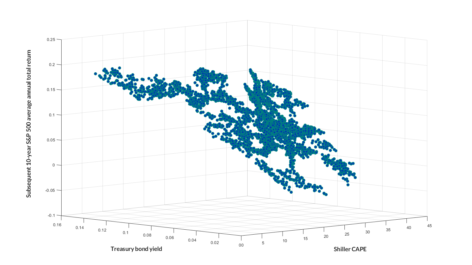
To illustrate this, the chart below shows a scatter plot of the Shiller P/E, the 10-year Treasury yield, and the subsequent 10-year average annual total return of the S&P 500. Yes, low rates and high CAPE multiples tend to go together. Unfortunately, low or negative stock market returns over the following decade are also an inescapable part of that 3-dimensional combination.
Historical evidence and systematic errors
To calculate the ECY, we simply invert the CAPE ratio to get a yield and then subtract the ten-year real interest rate. This measure is something like the equity market premium. Worldwide, equities are highly attractive relative to bonds right now.
– Shiller, Black & Jivrav
Shiller et al. are correct that their proposed excess CAPE yield (ECY) essentially acts as a projection of the “equity market premium” – the difference between the expected total return of the S&P 500 and the expected total return of Treasury bonds. Is it a great projection? That’s another question.
Even if one wants a single measure to project the “relative” return between stocks and bonds, the most reliable way to measure this expected “equity risk premium” is to use stock market valuations to directly project the embedded 10-12 year return, and then subtract the associated yield on Treasury bonds. This avoids the somewhat magical thinking that the “yield” derived from inverting a valuation multiple should somehow move one-for-one with interest rates, which is something I’ve been railing at ever since the “Fed Model” was proposed.
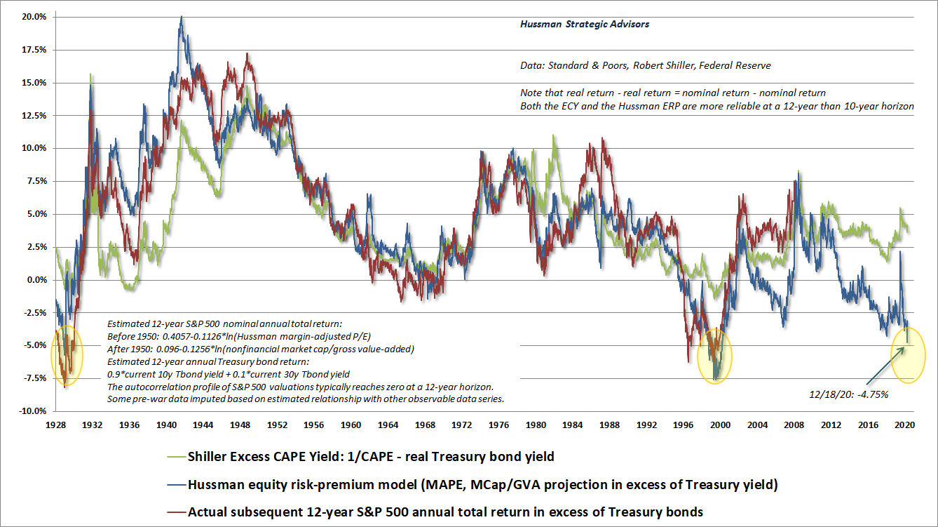
The chart below shows the excess CAPE yield (ECY), along with our own projection of the equity risk premium (the difference between expected S&P 500 returns and Treasury bond returns). We’ll call it the Hussman ERP. The chart also shows the actual difference between S&P 500 total returns and Treasury bond returns over the subsequent 12-year period. I use a 12-year horizon because that’s the point where the autocorrelation of S&P 500 valuation measures typically hits zero, meaning that mean-reversion tends to be most reliable on that horizon.
Both measures are better correlated with actual returns on a 12-year horizon than a 10-year one. For the Shiller measure, the correlation is about 0.80 for both. For our projection, it’s about 0.90. There are, however, some very large differences between the two models. Indeed, our own model projects that S&P 500 returns are likely to sharply lag even the lowly return on Treasury bonds over the coming 12-year period. We’ll examine those differences next.
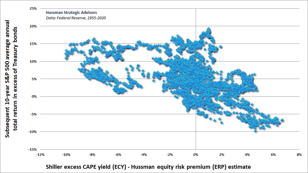
The chart below shows a scatter plot of the difference between the two models. The horizontal axis is the Shiller ECY minus the Hussman ECM. The vertical axis is the actual subsequent difference between S&P 500 total returns and Treasury bond returns over the subsequent 12-year period. Notice that the difference between the two models is systematically related to subsequent returns: The more optimistic the Shiller ECY is compared with our ECM, the worse the S&P 500 has subsequently performed relative to Treasury bonds. This is a problem, because the 8.4% gap between our two models has never been wider.
My impression is that part of the difference between our models reflects the implicit assumption in the Shiller et al. model of a one-to-one correspondence between the CAPE “yield” and real interest rates. Consider what this means. At the extremes, it implies that a 1% decline in Treasury yields relative to the trailing 10-year CPI inflation rate somehow “justifies” a move from a Shiller CAPE of 33 (a CAPE “yield” of 3%) to a Shiller CAPE of 50 (a CAPE “yield” of 2%). An additional 1% decline in the real Treasury yield would then “justify” a move in the Shiller CAPE from 50 to 100 (a CAPE “yield” of 1%). Anything short of this is counted as an “excess CAPE yield.”
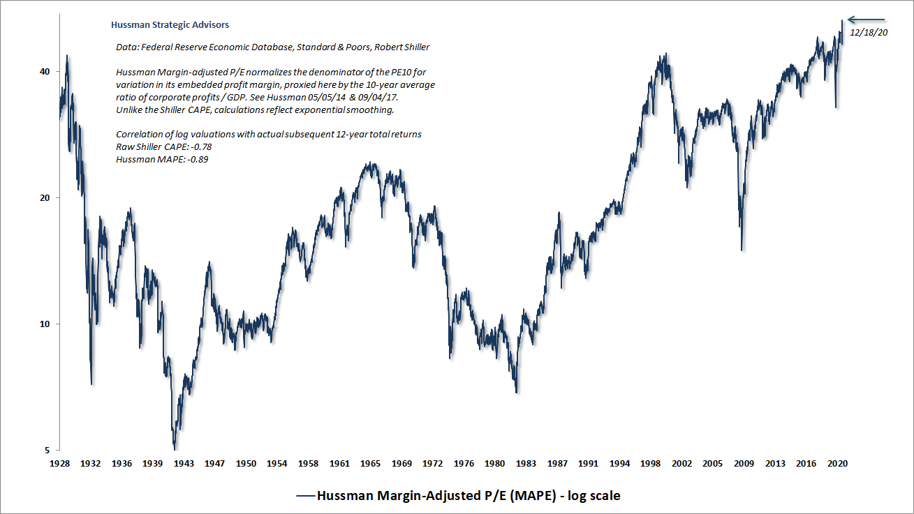
The most reliable valuation measures we’ve introduced over time (MarketCap/GVA and our MAPE) are better correlated with actual subsequent market returns than the CAPE, and a score of other valuation measures. That’s partly because they don’t assume that extreme profit margins are permanent, regardless of whether margins are high or low, and even if unusual margins are sustained for several years.
Our best valuation measures are singularly at the highest levels in history, exceeding both 1929 and 2000. In contrast, the CAPE is only in the top 3% of historical levels. That’s because the profit margin embedded into the CAPE (the denominator of the CAPE, divided by S&P 500 revenues) is easily at the highest level in history. Indeed, it’s over 40% above its historical median. We don’t need to assume anywhere near a full reversion to the median. Even a return to the highest embedded margin ever observed prior to 2015 would cut that difference roughly in half. So despite the fact that the CAPE is above 97% of all readings in history, one should consider even this reading to be understated – unless one is also willing to rely on the assumption that the profit margin embedded into the CAPE will remain at the most extreme level in history, forever.
Again, I can’t say this enough: I am a great admirer of Robert Shiller. But I am also deeply concerned by the fiction – increasingly bordering on propaganda – that depressed interest rates somehow “justify” what are now easily the most extreme stock market valuations in history, based on the measures that we find best correlated with actual subsequent market returns.
Growth and discount rates
All of that’s bad enough. Let’s make it worse.
One of the things you’ll notice in the opening quote is the phrase “assuming all other inputs in the model stay constant.” The problem is that everything is not, in fact, constant. In particular, if interest rates are low because growth rates are also low, then those low interest rates don’t justify any valuation premium at all.
Let’s take a moment to build some intuition. A useful but very simplistic workhorse of finance is something called the dividend discount model. Given a security that will pay an expected dividend D next year, with the annual dividend growing at rate g annually forever, and the payments discounted back to present value at the rate of return k, we can use the “geometric series” techniques we intentionally forgot from Algebra to come up with a simple pricing equation:
Price = D/(k-g)
Suppose that we lower the expected long-term rate of return of the security k, but mainly because we’ve also lowered the expected long-term growth rate g. What happens to the “justified” price? Nothing. What happens to “justified” valuations? Nothing. If interest rates are low because growth is low, valuations do not deserve any premium at all.
The preceding model is useful because it’s simple. It’s also wildly dangerous in unskilled hands, as the first thing Wall Street always wants to do is to make ad-hoc assumptions for both k and g, which can allow analysts to “justify” literally infinite prices if those two are close enough to each other. I vastly prefer to let valuations tell me what k is likely to be, assuming that valuations and growth remain unchanged forever:
k = D/P + g
For example, historically, the dividend yield on the S&P 500 has averaged just under 4% annually, while S&P 500 dividends, revenues, and earnings have averaged long-term growth rate of over 6% annually. So from a starting dividend yield of just under 4%, and assuming long-term growth of just over 6% annually, investors have historically been able to expect long-term S&P 500 total returns of about 4% + 6% = 10% annually.
But here’s the thing. At present, the S&P 500 dividend yield is just 1.6%. Meanwhile, in the past two decades, prior to (and ignoring) the recent pandemic losses, both U.S. GDP and S&P 500 revenues, even including the benefit of corporate buybacks, have enjoyed average nominal growth of less than 4% annually, compared to growth that actually ran close to 7% annually from 1947 to 2000.
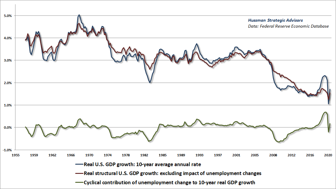
That’s not just due to lower inflation. We’ve observed the same deceleration in real, structural economic growth in recent decades, driven by a progressive slowing in both demographic labor force growth and productivity. The red line in the chart below shows that the real “structural” growth rate (economic growth excluding the impact of changes in the rate of unemployment), which has declined from a post-war average of 3-4% annually to an average rate of just 1.5% annually – well before the pandemic.
Even if we assume that an acceleration in both structural growth and inflation brings nominal growth up to 4% annually in the coming decade, that the elevated profit margins of 2019 are sustained indefinitely, and that valuations remain fixed at the most extreme levels in history, leaving the dividend yield fixed at just 1.6%, the resulting “permanently high plateau” would produce a 10-year S&P 500 total return of 5.6%.
Now, 5.6% might be fine if one could actually rely on all the required assumptions. But to give you an idea of how sensitive that projection is to the slightest shortfall, even if the dividend yield was to end the decade just 50 basis points higher, at just 2.1%, and all the other assumptions were to hold, the total return of the S&P 500 would be whittled down to just 2.8% annually. Remember also that the S&P 500 has lagged Treasury bills in periods when the CPI inflation rate has been higher than 2% and rising. As I detailed in my last comment, investors should not expect higher inflation to improve these projections unless the CPI more than triples.
The bottom line is that if interest rates are low because growth rates are also low, no premium is “justified” in stock market valuations at all. Shiller et al. are correct to include the caveat “assuming all of the other inputs in the model are held constant.” It’s just that they’re not. That’s not a bug. That’s a feature.
How to a navigate a bubble, even without requiring it to burst
The time had come, as in all periods of speculation, when men sought not to be persuaded of the reality of things but to find excuses for escaping into the new world of fantasy.
– John Kenneth Galbraith, The Great Crash, 1929
I completely understand the temptation to explain this bubble away as if current valuation extremes are somehow “justified.” It’s a temptation that has existed at every bubble peak in history.
There’s no question that valuations have been extreme for years now. That’s one of the defining features of a bubble: it’s impossible to establish the most obscene valuations in history without repeatedly advancing through lesser extremes.
The only choice is to find a good response to a bad situation.
In my view, the best response isn’t to capitulate to the idea that “this time is different,” but to instead:
- Recognize that financial bubbles have repeatedly occurred throughout history, and that extending the bubble only serves to magnify its eventual consequences;
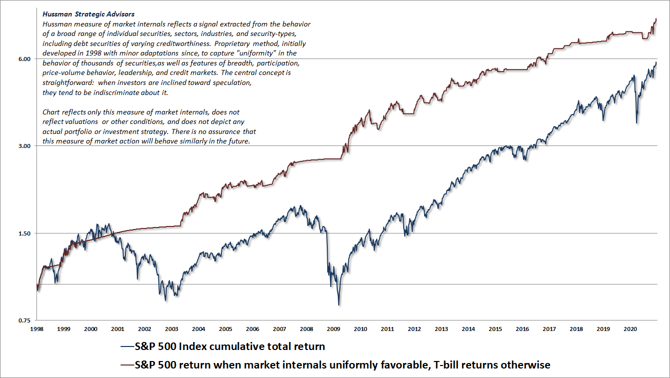
- Find some reliable measure to gauge whether investors are inclined toward speculative or risk-averse psychology. For us, the best gauge is the uniformity of market internals, because when investors are inclined to speculate, they tend to be indiscriminate about it;
- Be content with a neutral stance during periods when extreme valuations and overextended conditions are coupled with speculative psychology, be willing to adopt a constructive outlook (with a safety net) if short-term conditions are oversold and your gauges of speculation are still intact, and don’t adopt a bearish stance until market internals or similar gauges indicate growing risk-aversion among investors.
For us, that third rule is the central lesson from of the recent bubble. In every other market cycle in history, there were always well-defined “limits” to speculation. In this bubble, zero interest rate policies disabled that reliability. In late-2017, I threw up my hands, and finally abandoned my bearish response to “overvalued, overbought, overbullish” limits. So even here, for example, I’m content to have a neutral near-term outlook. Still, I think it’s an utterly awful idea to imagine that these valuation extremes are somehow “justified” by anything other than a desire to jump on the bandwagon.
I introduced our key measure of market internals back in 1998, and it has served us well ever since. Again, the thing that made this cycle “different” had nothing to do with valuations, and it had nothing to do with our gauge of market internals. The error was to believe that the recklessness of Wall Street still had a “limit,” as it had in prior cycles across history.
Given the most extreme valuations in history, it’s easy to focus strictly on my expectation of a 60-70% market loss over the completion of this cycle, while ignoring the fact that nothing in our investment discipline actually requires that outcome. I’ll say this again: we no longer respond to “overvalued, overbought, overbullish” extremes by adopting or amplifying a bearish outlook, unless our measures of market internals also indicate a shift in investor psychology toward risk-aversion. We are fully capable of navigating a world where market valuations never ever visit historical norms again. I just think it’s insane to rely on that idea.
The chart below presents the cumulative total return of the S&P 500 in periods where our measures of market internals have been favorable, accruing Treasury bill interest otherwise. The chart is historical, does not represent any investment portfolio, does not reflect valuations or other features of our investment approach, and is not an assurance of future outcomes.
The chart below shows our Margin-Adjusted P/E (MAPE) since 1928. It’s essential to monitor the uniformity of market internals, because investors still have the speculative bit in their teeth. The problem is that this has also often been true at the very peak of “V” tops like 1929 and 1987. That’s why sufficiently overextended conditions can hold us to a neutral stance even in some periods when our measures of market internals are constructive.
An increase in divergence or general weakness across individual stocks, industries, sectors, or security-types (including debt securities of varying creditworthiness) would shift market conditions to a combination of extreme valuations and unfavorable internals, and open up the sort of “trap door” situation that we observed in March. We’re prepared for that, but no forecasts are required. We’ve been very content this year just living into our value-conscious, historically-informed, full-cycle investment discipline.
My sense is that passive investors will end up holding the bag here. Every security that is issued has to be held by someone, at every moment in time, until that security is retired. Every dollar that comes “into” the market in the hands of a buyer gets taken out an instant later in the hands of a seller. It’s impossible, in aggregate, for investors to “get out” of the market. There’s no point in advocating it, except for those whose risk-tolerance and investment horizon could not tolerate 10-12 years of negative average total returns with an intervening market loss on the order of 60-70%. The inescapable fact is that every dollar of paper “wealth” that someone takes out of stocks here is just a transfer of wealth from some investor who gets in at these valuations.
I realize that the projection of a 60-70% market loss seems just as preposterous as my 2000 projection of an 83% loss in technology stocks. The problem is that investors don’t seem to understand what they have done by responding to zero interest rates as if there is no alternative but to embrace market risk, regardless of the price. This will likely end badly. We don’t require it to end badly, but I do believe it will.
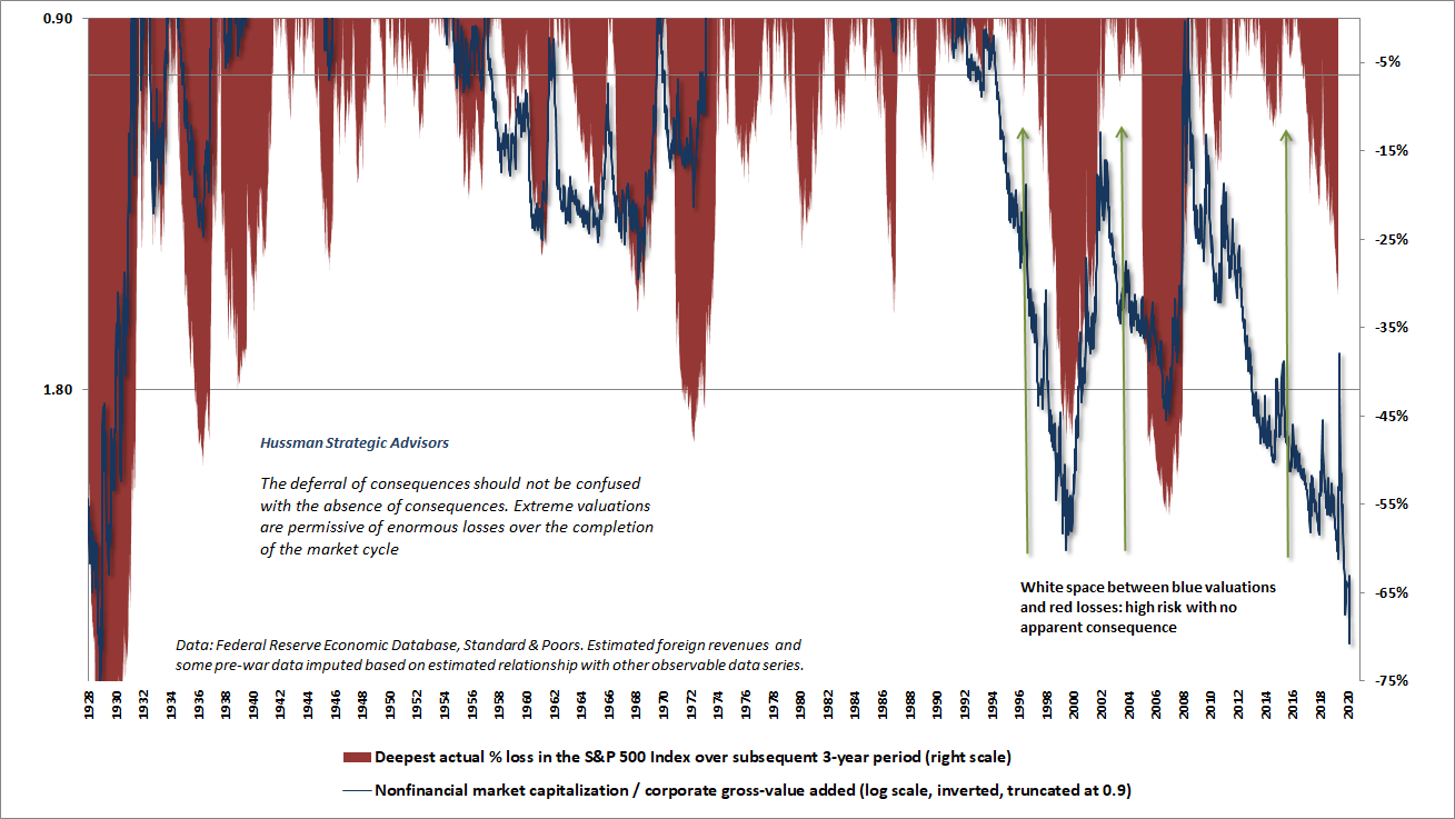
Market capitalization is nothing more than outstanding shares times the last price. The last price is determined by just two people: the most eager buyer and the most eager seller. Everyone else’s paper “wealth” is determined by those investors. Prices don’t move because money goes “into” or “out of” the market, but rather because the sellers were more eager than the buyers, or vice versa. If a dentist in Poughkeepsie decides to sell a single share of Apple just 10 cents below the previous market price, $1.7 billion in paper “wealth” suddenly vanishes. Nobody gets it. It just disappears.
For passive investors, the chart below shows our projection of expected 12-year average annual nominal total returns for a passive investment mix invested 60% in the S&P 500, 30% in Treasury bonds, and 10% in Treasury bills. This projection is now easily the lowest in U.S. history.
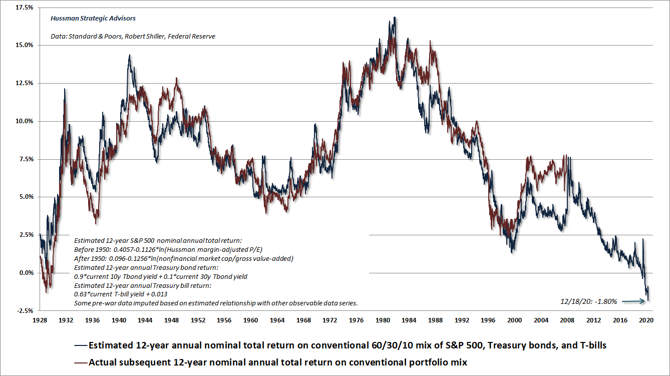
Even if the highest valuations in U.S. history and pre-pandemic margins were both sustained permanently, the expected 12-year return on this passive investment mix would be likely to average just 3.6% annually. That would generate an “error” between projected returns and actual returns similar to the “errors” of 1998 and 2008 in the chart. It’s important to understand that it is precisely the attainment of bubble valuations at the end of the subsequent 12-year periods that generated those errors. A similar error in the coming 12 years requires the same sort of bubble extremes to be in place at the end of the period. Nothing in our discipline requires us to rule out that scenario. But historically, it has only been possible to extend a bubble by worsening its consequences.
I don’t recall the date of the CNBC interview, but there’s one phrase that burned into my memory at the peak of the 2000 market bubble. It was spoken by Robert Shiller.
“It’s just an unfortunate situation.”
Public health note
We almost made it. Perhaps with less willingness to conflate every reasonable containment effort with “lockdown,” we might have made it. Neither President-elect Biden nor widespread vaccination will arrive soon enough to avoid it, if we fail to respond more strongly right now.
The best chance we have to avoid the trajectory of COVID-19 fatalities that we’re on is to immediately change our behavior. We don’t even have to change it by much. Avoiding indoor, unmasked close-range conversation (and other expelled air) in public or with guests would be enormously helpful. As noted below, there are also steps we can take relating to vaccine prioritization, dose-sparing, and repurposed therapeutics that could significantly blunt the current trajectory. As I detail below, the benefit of these is multiplicative, not additive, so a combination of all these actions will have the strongest effect.
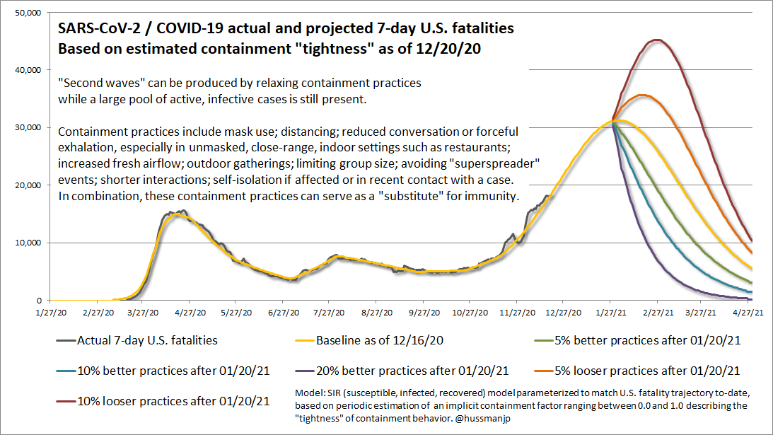
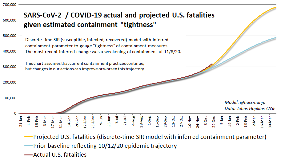
The chart below shows the trajectory we’re on. It peaks in the last week of January, at 30,000 U.S. fatalities per week, potentially with a cumulative 500,000 U.S. fatalities by early-February. If we can get a meaningful percentage of the population vaccinated during the first quarter, without materially loosening our containment practices until mid-year, we’ll be able to keep fatalities from rising above 700,000. While it’s quite true that most Americans will “survive” COVID-19, many of them will do so with diffuse inflammatory damage to lung tissue and blood vessel linings.
Some of the most distressing days in this pandemic have been days that the “containment” parameter of this adapted SIR model had to be changed, because the trajectory of fatalities had gone off-book. The last discrete shift in that containment parameter dates back to November 8. Unfortunately, as of December 20, the trajectory remains unbroken. My hope is that the trajectory established in the second week of November will stall. With Christmas and New Year celebrations approaching, that hope is matched by concern that the slope could intensify. Containment messaging is urgent. More on that below.
As part of my work with the Hussman Foundation, I’ve written about this pandemic since the beginning of February (when the U.S. had 5 cases and 0 fatalities), continuously projected the epidemic curve, consumed thousands of abstracts, complied hundreds of studied references, conferred with elected leaders on pandemic response, contributed peer reviews, published one paper on repurposed therapeutics, and another on clinical worsening (in review) has been circulated internally at the request of various public health agencies. The intensity of the effort has matched the urgency of the crisis.
Even if one’s only priority was to get the economy “open,” the dismissive attitude and politicization of this pandemic has not been helpful, and the human cost been breathtaking. We could be largely “open” by now, continuing only modest containment practices, if strong and early population-wide containment measures had been followed by a hand-off to local testing, tracing, and case isolation. That’s what has allowed successful “whack-a-mole” of isolated (but inevitable) minor outbreaks in several other countries. Instead, we’re going to lose more Americans to this than we’ve lost to every single foreign war in our history, possibly all of them combined. We’re on track to surpass the lives lost in the Civil War, and quite possibly even in the 1918-20 H1N1 pandemic, because of the endless buhwhataboutism at every turn; the misinformed rejection of every containment practice as if every one of them was equal to “lockdown”; the denial of the most basic principles of epidemiology and viral spread; and the willingness to give the same weight to a misinformed 20-minute YouTube rant as to decades of scientific reports and clinical findings.
This is what we’re presently up against.
On repurposed therapeutics
In the interim between now and the point where vaccination is widespread, broader use of safe, well-tolerated repurposed therapeutics could be beneficial at various stages of the disease course, both as prophylaxis, and at the point of confirmed infection, clinical worsening, and critical disease. Part of the reason there are so few in use is that the required clinical evidence often approaches that of a Phase III trial, less than 0.1% of CARES funding went to efforts like NCATS (National Center for Advancing Translational Sciences), CTAP (Coronavirus Treatment Acceleration Program), and non-vaccine development through ACTIV (Accelerating COVID-19 Therapeutic Interventions and Vaccines). Meanwhile, generics can’t hit the regulatory bar without someone funding those trials, and multiple studies have faced recruitment difficulties.
Given the number of people who have acquired COVID-19, and the number of therapeutics that are actively in use in the United States, it should have been possible even by April to compile basic but very highly powered 2×2 data comparing disease outcomes among those exposed or unexposed to various therapeutics. The resulting “odds ratios” could have been enormously informative (if not entirely adequate) in identifying therapeutics that could be prioritized for investigation as repurposed options. Believe me, I tried. I’ll continue to encourage public health initiatives that can quickly compile and disseminate this sort of data in response to this and future challenges.
Several therapeutic candidates with multiple, independent reports of benefit and very well-tolerated side-effect profiles are also medications that have pleiotropic effects, which means that they have multiple modes of action. Unfortunately, these candidates get pigeon-holed based on their most common use, as “arthritis drugs” (e.g. barcitinib, ruxolitinib, tocilizumab) or “anti-parasitics” (e.g. ivermectin) or “antibiotics” (e.g. doxycycline), so they seem ridiculous to consider as candidates against a viral pathogen unless you understand their molecular targets and their role in the maladaptive (to say the least) immune response to SARS-CoV-2 infection.
A central concept in noise-reduction is that one can often boost information by isolating the common signal from multiple independent sensors, even if each sensor may seem fairly weak individually. That concept is effective in finance, artificial intelligence, and in the genetic analysis of complex disease. I wish this concept was more popular in pharmacology, especially during this pandemic, because there are multiple well-tolerated, pathway-informed candidates that are supported by numerous independent clinical reports of benefit, even though none of those findings might be persuasive individually. I was encouraged that the FDA issued an EUA on barcitinib last month.
For those who have asked, my Frontiers paper has a paragraph on hydroxychloroquine – while it has enough pathway-related mechanisms that I never considered it “insane,” the clinical evidence has been quite mixed, and I don’t see it as well-tolerated either, given the potential risks of retinopathy and arrhythmia (long QT). Frankly, the political horseraces pitting one therapeutic against another have been bizarre.
I’ve posted a one-page PDF on the research tab of the Hussman Foundation website, that includes research studies and rationale to share and discuss with your physician, along with the paper I published in Frontiers in Pharmacology. None of this is medical advice, and though much of my published research focuses on the molecular pathways of complex disease, I’m not a clinician. Feel free to share this if you find it helpful.
On welcome vaccine designs
I couldn’t be more pleased with the two leading vaccine candidates that have received emergency use authorizations (Pfizer, Moderna). Both of these vaccines are based on mRNA, which is a sequence of genetic code that gets transcribed by our own cells into a protein – in this case, the spike protein of the SARS-CoV-2 virus. Importantly, the mRNA codes only for the spike, not the viral genome. The mRNA is safe, and degrades within 24 hours, but provokes a broad and effective antibody response. In my view, these vaccine designs are particularly welcome because they include a particular feature that I believe significantly improves both the safety and likely durability of the immune response.
The part of the spike that binds to our own cells is called the receptor binding domain (RBD). That puppy is very immunogenic, so when our bodies see it, it provokes a very strong antibody response, and these antibodies typically “neutralize” the virus by preventing interaction between the RBD and a protein called ACE2 that’s expressed at the surface of many of our cells. In a live infection, the antibodies arrive only after the virus has infected numerous cells, and it has reprogrammed the immune response of cells that ought to be protective (monocytes, macrophages, neutrophils) so that they instead become hyperinflammatory Tasmanian Devils. In my view, those little reprogrammed monsters are most likely responsible for the “long-COVID” that persist even after moderate cases, driven by inflammatory damage to blood vessel linings and respiratory cells.
There’s a robust research literature on vaccine development for other pathogenic respiratory coronaviruses like SARS and MERS. Here’s where things got a bit tricky during the attempt to develop vaccines against those viruses. Antibodies to the RBD can stabilize the spike protein in a way that allows the virus to fuse to our cells anyway, just via “Fc gamma” receptors that are expressed on immune cells, instead of ACE2. In studies of SARS and MERS vaccines, that interaction between antibody-bound viruses and Fc receptors resulted in concerns about “antibody-dependent enhancement” (ADE) of infection. Certain other pathogens like Dengue virus involve similar concerns. Another feature of the coronavirus RBD is that it has the capacity to mutate in ways that can escape existing antibodies, resulting in escape mutants that are favored by natural selection.
So the RBD is a “tasty” vaccine candidate because it’s immunodominant and reliably generates neutralizing antibodies, but it’s not without concerns about the potential for immune-enhanced disease and escape mutants. One of the things I’m excited about is that both the Pfizer and Moderna mRNA designs include a couple of substitutions in the genetic sequence, which ensure that when the spike is produced by our own cells, it comes out in a “pre-fusion” conformation that limits access and dependence on the RBD. The resulting stimulus to our immune system isn’t as highly immunogenic as designs that go straight for that tasty RBD, but the pre-fusion conformation does provide enough access to certain epitopes to produce neutralizing antibodies, along with antibodies directed at other “highly conserved” parts of the spike, like the S2 stalk, along with conserved and highly neutralizing epitopes on the periphery of the RBD (e.g. S309). The result is a broader antibody response that isn’t strictly dependent on the RBD, and is less susceptible to antibody-escape mutations.
As I noted in October, most viral mutations are “non-functional,” meaning that they don’t change infectivity, disease severity, or other features of the virus. But some mutations can contribute to gain-of-function. In particular, variations in the receptor-binding motif (RBM) – the part of the RBD that comes in direct contact with ACE2 – can be important in modifying the efficiency of infection and the virulence. As the virus encounters immune pressure from antibodies, mutations that escape those antibodies enjoy positive selection (survival of the fittest). In a September paper that appeared in Science, one of these mutations to the RBM (N501Y) was shown to increase the strength of binding to ACE2, and was associated with increased infectivity and replication (in mice): “Thus the increased virulence was likely attributed to the rapid emergence of N501Y substitution in the RBD.”
The main concern is that stronger ACE2 binding could increase the ease of viral transmission. That alone would imply a larger number of fatal cases. Mice infected by the mutated strain also showed more productive replication of the virus in the lower respiratory tract, resulting in more severe pneumonia. The reason that the United Kingdom just announced lockdown measures is because the N501Y mutation was identified in a circulating variant of SARS-CoV-2. Efforts are underway to confirm whether this variant has the same effect in humans as has been demonstrated in lab mice.
Given the pre-fusion designs for the two EUA-authorized mRNA vaccines, I would not expect the N501Y mutation to reduce or otherwise impact the protective benefit of these vaccines. It will take some lab work (elsewhere – our laboratories are only BSL-1) to verify that, but it’s not part of an epitope that I would expect these vaccine designs to present, much less rely upon, because the RBM is concealed in the closed conformation. As for RBD-based vaccine candidates and spike designs allowing “open” conformation, I’m not saying these candidates won’t be safe and effective too. It’s just that the standard of care is higher, in my view. For these candidates, it’s important to examine multiple aspects of the immune response, and I’m grateful that the FDA has been receptive to these considerations.
The bottom line is that I’m excited and more than a little bit relieved about these pre-fusion spike designs, and the fact that the mRNA candidates work. Minor side effects, like pain at the injection site, fatigue, and sometimes headache and muscle aches, are rather common. You’re going to hear rare anecdotal stories of more serious side-effects, but they are extremely unusual and temporary, and more common after the second dose than the first (my guess is because the second dose can be expected to provoke more immediate antibody-mediated effector functions that result in short-lived inflammation).
One side effect that’s provoked discussion is Bell’s palsy (temporary facial paralysis), which again, is extremely rare. I’ll bet dollars to doughnuts that these cases feature a high neutrophil-to-lymphocyte ratio (a central feature of both Bell’s and COVID-19), which could reflect an inflammatory response against the spike itself, and that I would expect to quickly resolve either on its own, or if necessary, with a brief course of corticosteroids coupled with an antiviral (which is how high NLR in Bell’s palsy is typically treated). I’ve added this level of detail because I don’t believe that anyone should avoid the vaccine out of concern for temporary or extremely rare side-effects.
On dose-sparing
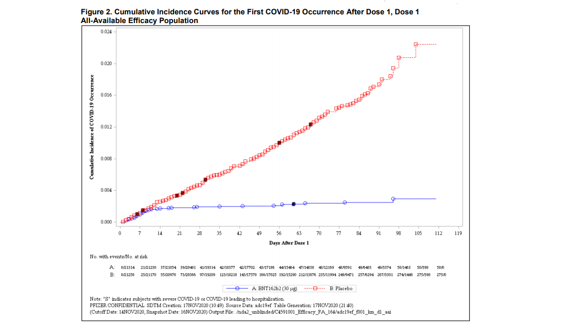
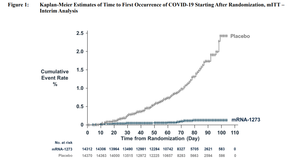
If you examine the data from vaccine trials, you’ll notice that the rate of infection is about the same for people who received the vaccine as the rate of infection for those who received placebo, for roughly 10 days after injection. At that point, the incidence of COVID-19 for vaccinated individuals effectively flat-lines.
The initial 10-day lag in immunity is likely attributable to the fact that it takes about that long for antibodies to be reliably induced by the vaccine (“seropositivity”). Indeed, nearly all of the cases of COVID-19 in the non-placebo vaccine arm, which reduce the “effectiveness” calculations applied to the first dose, occur in the initial 10 days after vaccination. Excluding those pre-seropositive cases, the estimated effectiveness of the first dose alone would be dramatically higher. Indeed the lines are flat as pancakes well before the 28-day point, which is when the Moderna second-dose occurs, and where the second dose of the Pfizer vaccine (at 21 days) might be expected to affect the incidence curve, if it wasn’t flat already.
Here’s the incidence curve for Pfizer’s mRNA vaccine
Here’s the incidence curve for Moderna’s mRNA vaccine
Given the current epidemic trajectory, it may be wise to vaccinate as many “at-risk” and “in contact with at-risk” people as possible, and defer the second dose until supply shortages are relieved. That would go against the orthodoxy of mirroring the actual administration of the vaccine to match the regimen in the clinical trial, but do we really believe that the protection clearly conferred by the first dose between days 10-28 somehow evaporates at a faster rate than the current epidemic trajectory is taking human lives? Even if one does believe this, the second-best option would be to immediately launch a rapid, moderately-sized, single-dose trial. The results could still be available in time to save lives. Call it the Eminem trial – “you only get one shot.”
Public health professionals are well aware of the temerity of a proposal like this. I would agree, if we weren’t also on course to literally double the number of U.S. COVID-19 fatalities in the span of less than 3 months – an eventuality that could be dramatically altered by maximizing first-dose vaccinations. In this case, opportunity comes once in a lifetime.
I also believe that repurposing of certain well-tolerated therapeutic candidates would be helpful, and even with a 2-dose regimen, I absolutely believe that we should exhaust every dose of available vaccine immediately, and allow fresh supply to provide the second dose, rather than effectively holding 3 weeks of vaccine supply unused in freezers in the interim. At this particular moment, immediately using 3 weeks of supply, rather than storing it, could be enormously valuable.
The math here is brutal. Until a meaningful percentage of the population is vaccinated, it’s absolutely essential to maintain containment behaviors. As noted in the next section, the equation that determines “expected fatalities” has both a direct term and an indirect term. You need to hit both of them, through containment practices, vaccination, and repurposed therapeutics. Again, containment should not be conflated with “lockdown.” There are so many reasonable behaviors that can bend the fatality curve now. Our estimate of the “tightness” of containment practices has progressively loosened since July, especially as the holidays have approached and colder weather has moved us indoors. It’s essential to maximize the lifelines provided by containment practices, vaccine dose-sparing and prioritization, and greater use of well-tolerated, pathway-informed repurposed therapeutics.
Pandemic arithmetic
Amid the cacophony of ill-informed noise and politicization of this pandemic, probably the most striking aspect of the epidemic curve is the brutally unforgiving and straightforward mathematics that it has obeyed. Every argument for various containment practices essentially comes down to some variable in that simple math.
Estimating the epidemic trajectory is typically done using simultaneous differential equations. You can do it that way, but the fact is that the most of the mechanics of these SIR (susceptible, infected, recovered) models can be replicated with basic arithmetic. I haven’t seen this derivation elsewhere, but it’s fairly intuitive, you can work it out on a napkin, and it mirrors more complex formulations (as well as the actual trajectory of this pandemic). I’ve included common variable names like R0 and Rt, but some of the symbols are my own.
Most importantly, the arithmetic provides well-specified relationships that tell us directly where to focus in order to reduce transmission and fatalities. That’s one of the things I love about math. The next few paragraphs will explain the key concepts.
At the very beginning of a pandemic, everybody is susceptible. Let’s assume that in normal day-to-day interactions, the probability of transmitting the virus from one person to another is p. If every newly infected person went on to interact with only one other person, each with probability p of being infected, the expected total number of people infected would be a simple “geometric series.”
1 + p + p^2 + p^3 + p^4 + p^5 + … = 1/(1-p)
As long as p is less than 1.0, this sum converges to 1/(1-p).
Now let’s scale this result up. Assuming that an infected person encounters an average of N people a day, and that the duration of the infective period is D days, each person infected by the virus will go on to infect, on average, N*D*p additional people. That’s what’s called the “base reproductive rate” or R0. If that number is greater than 1.0, the spread of the virus becomes exponential.
Base reproductive rate R0 = p*N*D
So for example, if the probability of infecting a contact is 10%, and an infected person comes in close contact with an average of 4 people a day, and remains infective for 7 days, each infected person will infect an average of R0 = 4*7*0.10 = 2.8 additional people. This is how cases explode early in the pandemic.
As more people get infected, resulting in immunity or fatality, the fraction of the population that’s susceptible declines. Suppose the susceptible fraction of the population is s at a given time t. Then instead of R0, each newly infected person will go on to infect s*R0 people. We’ll call that Rt. For example, if half of the population has already been infected, Rt will be half of R0.
We can calculate the point where each newly infected person will go on to infect just one other person –in other words, the point where Rt = 1. That requires s*R0 = 1, and it happens once s = 1/R0. At that point, the fraction of the population that has been infected will be 1-s. This is called the “herd immunity threshold” or HIT, and is just 1-1/R0. In our example, that’s 1-1/2.8 = 64% of the population.
Herd immunity threshold (HIT) = 1 – 1/R0
Emphatically, “herd immunity” is not the point where transmission stops. It’s just the point where transmission stops growing exponentially, and local containment efforts have a chance of stopping new outbreaks.
Fortunately, we can also alter our own behavior in a way that substitutes for immunity. Let’s use the symbol c to stand for the full range of containment behaviors that affect drivers of the pandemic:
- Reduce the probability of transmission, which involves mask use, distance, fresh airflow, outdoor settings, reduced indoor and close-range conversation, shorter interactions;
- Reduce the average number of contacts, which involves smaller groups, more stable groupings, and avoiding “super-spreader” and “hub” events that bring together lots of people from different locations, and;
- Reduce the duration of infectivity, which involves self-isolation of confirmed cases or those in recent contact with an infected person, as well as practices like testing and contact tracing.
The containment message is simple:
Who: Public, guests, and outside contacts
What: Close-range, extended, or unmasked conversation
Where: Everywhere, particularly indoor spaces with limited fresh airflow
When: From now until a meaningful fraction of the population is vaccinated
Why: To reduce the likelihood and number of person-to-person transmissions
We can define the combined “tightness” of those containment measures on a scale of 0 to 1, where c=1 means that everyone interacts as usual, and c=0 means that everyone is completely isolated from each other.
The more containment tightness can reduce c, the slower the pandemic spreads:
Rt with containment effort = p*N*D*s*c = R0*s*c
Put simply, we can lower the rate of transmission at any point in time in two ways: reduce the susceptible population s, or improve our containment behaviors c. That’s it. Moreover, those two strategies are synergistic (they’re multiplicative, not additive). One of the beautiful things about math is that it tells you exactly where to intervene, and what effect it will have. My estimate of Rt broke above 1.0 in mid-September and it has not looked back. Yet because the infective pool has become so large, the current Rt of roughly 1.2 is enough to maintain the terrible trajectory we’re on. We could easily pull that lower if we could summon a month or two of collective will, to overcome a year of understandable fatigue.
Now, technically speaking, Rt is a population-wide average. It’s certainly true that some people have more contacts than others, and interact with others in ways that increase the probability of spread (e.g. close-range conversations with a great deal of expelled air). So the actual number of transmissions will obviously vary from person to person.
The same is true for fatalities. For some contacts, the infection fatality rate (the probability of fatality if a person is infected) is quite high, and it’s much lower for others. If we call fj the fatality risk of person j, and fc as the average fatality rate of j’s direct and indirect contacts (with declining weights at greater degrees of separation), we end up with the expected number of fatalities if person j is infected. It’s just the direct risk of fatality for person j, plus the indirect risk of fatality due to people infected by person j.
Expected fatalities resulting from infection of person j = fj + fc*Rt
This tells that we can reduce the number of fatalities by:
- Vaccinating high-risk people with high fj first;
- Prioritizing vaccination for public-facing people who come into contact with lots of high-risk individuals, either directly or through their social networks, and;
- Keeping containment behaviors as tight as possible, to hold down Rt, until a substantial portion of the population is vaccinated.
Notice that the higher Rt is above 1.0 (as it is now), the more important it is to consider the “indirect” effects of vaccination, and to prioritize those who have contact and social networks with numerous at-risk people in their circle. In the interim, the use of well-tolerated repurposed therapeutic candidates may help to reduce fatality rates in active cases.
Amidst it all
One of my dearest friends works with the Hussman Foundation, facilitating dozens of our international projects for refugees displaced by conflict, children at risk of trafficking, education for children in impoverished rural schools, and every sort of challenging situation one can imagine. Yet in nearly every note over two decades, she has ended with a positive wish or an optimistic note, adding the words “amidst it all.”
My revered teacher and friend Thich Nhat Hanh says it this way: “All the conditions we need for happiness are available in the present moment. We don’t have to run to the future to get more. When we live with the spirit of gratitude, there will be happiness in our lives.”
So as unusual as the holidays may be this year, wishing you the happiness that comes from gratitude and simple awareness of even the smallest blessings around you, amidst it all.
Keep Me Informed
Please enter your email address to be notified of new content, including market commentary and special updates.
Thank you for your interest in the Hussman Funds.
100% Spam-free. No list sharing. No solicitations. Opt-out anytime with one click.
By submitting this form, you consent to receive news and commentary, at no cost, from Hussman Strategic Advisors, News & Commentary, Cincinnati OH, 45246. https://www.hussmanfunds.com. You can revoke your consent to receive emails at any time by clicking the unsubscribe link at the bottom of every email. Emails are serviced by Constant Contact.
The foregoing comments represent the general investment analysis and economic views of the Advisor, and are provided solely for the purpose of information, instruction and discourse.
Prospectuses for the Hussman Strategic Growth Fund, the Hussman Strategic Total Return Fund, the Hussman Strategic International Fund, and the Hussman Strategic Allocation Fund, as well as Fund reports and other information, are available by clicking “The Funds” menu button from any page of this website.
Estimates of prospective return and risk for equities, bonds, and other financial markets are forward-looking statements based the analysis and reasonable beliefs of Hussman Strategic Advisors. They are not a guarantee of future performance, and are not indicative of the prospective returns of any of the Hussman Funds. Actual returns may differ substantially from the estimates provided. Estimates of prospective long-term returns for the S&P 500 reflect our standard valuation methodology, focusing on the relationship between current market prices and earnings, dividends and other fundamentals, adjusted for variability over the economic cycle.