
Extrapolating Growth


John P. Hussman, Ph.D.
President, Hussman Investment Trust
August 2018
I’ve often described what I call the Iron Law of Valuation: the higher the price investors pay for a given set of expected future cash flows, the lower the long-term investment returns they should expect. As a result, it’s precisely when past investment returns look most glorious that future investment returns are likely to be most dismal, and vice-versa.
Market returns and economic growth have underlying drivers. At their core, extended periods of extraordinary growth and disappointing collapse reflect large moves in those drivers from one extreme to another. Extrapolation becomes a very bad idea once those extremes are reached.
For example, from 1982 to 2000, the S&P 500 enjoyed an extraordinary period of total returns averaging just over 20% annually. The primary driver of those gains wasn’t growth in revenue or earnings (though the combination of 4.6% average annual S&P 500 revenue growth and a high starting dividend yield certainly helped). No, the primary driver was expansion in the S&P 500 price/revenue ratio, which rose from a profound low of 0.3 in 1982, to an offensively extreme 2.2 by the 2000 peak.
Conversely, in the 9-year period from 2000 to 2009, the S&P 500 lost half of its value despite positive overall growth in revenue and earnings. The reason was that the S&P 500 price/revenue ratio collapsed from 2.2 to less than 0.7 over that period – a retreat that even 9 years of 4.7% annual revenue growth was wholly unable to offset.
From 2009 to 2018, the S&P 500 price revenue ratio advanced from less than 0.7 to a breathtaking multiple of 2.4 early this year – the highest level in the history of the U.S. stock market. Extrapolating the market gains of these past several years, as if they are somehow a birthright of passive investing, is likely to have brutal consequences for investors.
Market returns and economic growth have underlying drivers. At their core, long periods of extraordinary growth and disappointing collapse reflect large moves in those drivers from one extreme to another. Extrapolation becomes a very bad idea once those extremes are reached.
The upshot is this. Measured from their highs of early-2018, we presently estimate that the completion of the current cycle will result in market losses on the order of -64% for the S&P 500 Index, -57% for the Nasdaq 100 Index, -68% for the Russell 2000 Index, and nearly -69% for the Dow Jones Industrial Average.
These estimates undoubtedly seem preposterous, as was my March 2000 projection of an -83% plunge in technology stocks (the tech-heavy Nasdaq 100 lost an implausibly precise -83% in the subsequent 2000-2002 collapse), as was my projection in 2000 that the S&P 500 would likely suffer negative total returns over the following decade (it did), as was my April 2007 estimate that the S&P 500 could lose -40%, not to become deeply undervalued, but simply to reach valuations that were “standard, normal, commonplace” (the S&P 500 went on to lose -55% in the subsequent 2007-2009 collapse, though I emphasized in late-2008 – after the S&P 500 had indeed collapsed by more than -40% – that “The best way to begin this comment is to reiterate that U.S. stocks are now undervalued”).
Severity versus immediacy
Despite the severity of these estimated market losses, don’t confuse severity for immediacy. Let’s briefly review the considerations that distinguish long-term, full-cycle outcomes from immediate ones.
A moment’s thought should make it clear that valuation extremes like 1929, 2000, 2007 and today could never have emerged unless the market was able to entirely shrug off less extreme valuations along the way. When investors have the speculative bit in their teeth, as they did through the majority of the period between 2009 and 2017, valuations may exert very little effect on market outcomes, even for fairly extended segments of the market cycle. We gauge the inclination of investors toward speculation or risk-aversion from the uniformity or divergence of market internals – the behavior of thousands of individual securities, industries, sectors, and security types (including debt securities of varying creditworthiness). When investors are inclined to speculate, they tend to be indiscriminate about it.
As I’ve detailed in recent quarters, our own difficulty during the recent speculative half-cycle had nothing to do with either valuations or market internals, but instead my belief – based on a century of market cycles – that certain combinations of evidence (specifically, extreme combinations of “overvalued, overbought, overbullish” market conditions) provided a measurable limit to speculation. Historically, regardless of other market conditions, one could adopt a negative market outlook once those syndromes emerged. Not this time. Not in the face of zero interest rates. Not in the face of post-election enthusiasm. This time, there was no such thing as “too much” or “too extreme.” One had to wait for market internals to deteriorate explicitly before adopting a negative market outlook. Late last year, we adopted that requirement, with no exceptions.
The present combination of record valuations and divergent market internals, coming off of the most wicked ‘overvalued, overbought, overbullish’ extremes in history, creates a danger zone that will not be resolved until some combination of those factors – valuations, internals, and overextended conditions – shifts to a less dangerous mix.
Understand what I’m actually saying here. If our measures of market internals were to improve (having shifted to an unfavorable condition the week of February 2, 2018), our immediate outlook would become neutral or possibly even constructive – with a safety net – regardless of valuations that I view as obscene. If extreme valuations alone were enough to cause a market collapse, the market would have collapsed quite a long time ago. But valuations are not enough. It’s extreme valuation, coupled with deteriorating or divergent market internals (signaling a subtle shift toward risk-aversion among investors) that opens up a potential trap door.
It’s very true, and a valid criticism, that “overvalued, overbought, overbullish” warning signs were completely ineffective in recent years, and that my own reliance on the historical effectiveness of those warning signs was detrimental. But even in the period since 2009, once those warning signs have been joined by divergent market internals, the S&P 500 has lost value, on average.
At present, our measures of market internals remain unfavorable, partly because of deterioration in interest/credit sensitive sectors, as well as tepid participation (the number of individual stocks participating in various market advances), divergent leadership (for example, a large number of stocks simultaneously hitting 52-week highs and lows), and the divergences we observe in an array of other sectors.
We don’t make forecasts about when or whether market internals will shift, because sufficiently uniform market action can produce those shifts very quickly. So our outlook will shift as the evidence does. Given last year’s adaptations, those shifts will likely be more frequent because we’re no longer inclined to adopt a negative outlook in the face of extremely overextended syndromes alone.
The problem, again, is that market internals are presently suggesting a subtle shift toward risk-aversion among investors. In the face of extreme valuations, investors face enormous downside risks, as they did in 2000 and 2007. The present combination of record valuations and divergent market internals, coming off of the most wicked “overvalued, overbought, overbullish” extremes in history, creates a danger zone that will not be resolved until some combination of those factors – valuations, internals, and overextended conditions – shifts to a less dangerous mix.
As I did in 2000 and 2007, I mean these figures seriously – not as hyperbole, but based on outcomes that would be historically standard, normal, and commonplace given current valuation extremes. At present, we project market losses over the completion of this cycle on the order of -64% for the S&P 500 Index, -57% for the Nasdaq 100 Index, -68% for the Russell 2000 Index, and nearly -69% for the Dow Jones Industrial Average.
Valuation update
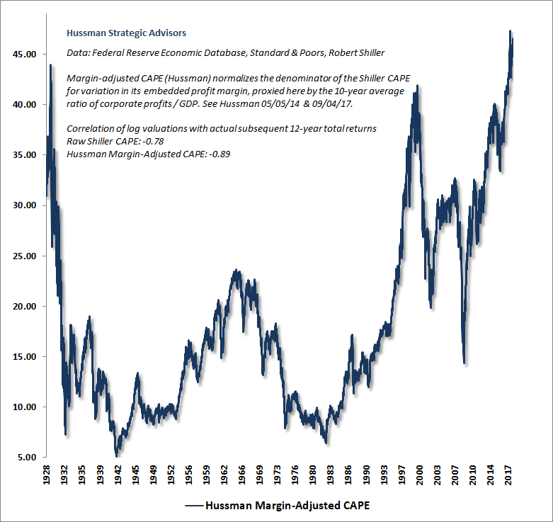
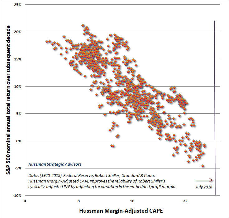
The charts below provide a quick update regarding current valuation extremes. The first is our Margin-Adjusted CAPE, which substantially improves the reliability of Robert Shiller’s cyclically-adjusted P/E ratio by adjusting the earnings figure for variations in the implied profit margin. As I’ve regularly noted, this measure is not vulnerable to the “dropoff” of earnings from the financial crisis, as is true for the raw Shiller P/E. Moreover, normalizing profit margins does not imply a requirement that profit margins will decline over the near term, or even during the coming economic cycle.
Remember, a valuation ratio is nothing more than shorthand for a proper discounted cash flow analysis. It’s important to recognize that stocks are a claim not to next year’s earnings, or the next few years of earnings, but to the very long-term stream of cash flows that will be delivered into the hands of investors for decades and decades to come. As I demonstrated back in January, our Margin-Adjusted CAPE is tightly correlated with the ratio of the S&P 500 to the actual discounted value of subsequent S&P 500 dividends, across more than a century of history.
As I did in 2000 and 2007, I mean these figures seriously – not as hyperbole, but based on outcomes that would be historically standard, normal, and commonplace given current valuation extremes. At present, we project market losses over the completion of this cycle on the order of -64% for the S&P 500 Index, -57% for the Nasdaq 100 Index, -68% for the Russell 2000 Index, and nearly -69% for the Dow Jones Industrial Average.
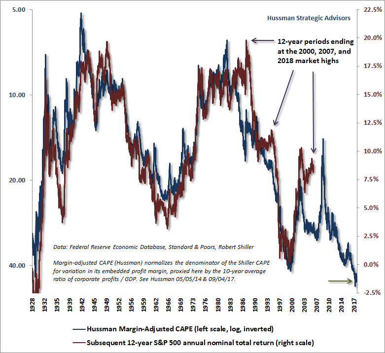
The next chart shows the relationship of our Margin-Adjusted CAPE (left scale, log, inverted) and actual subsequent S&P 500 total returns over the following 12-year period. Notice that market extremes like 2000, 2007 and today always induce an “error” between the two lines, because by definition, a move to extreme overvaluation means that recent returns have been better than one would have anticipated 10-12 years earlier based on valuations at the time. As it happens, those “errors” are strongly correlated with shorter-term cyclical variations in consumer confidence, which is another way of saying that investors often ignore valuations based on their psychological mood. That’s why it’s important to couple the analysis of valuations with measures of market internals that help to gauge investor attitudes toward speculation and risk-aversion.
While it’s true that interest rates are low, I’ve regularly emphasized that if interest rates are low because growth rates are also low, no valuation premium is actually “justified” by low interest rates at all – a fact that one can demonstrate using any discounted cash flow method. As a result, objects like the “Fed Model” actually have a very poor relationship with actual subsequent market outcomes, and aren’t even well-correlated with subsequent “equity risk premiums” (the difference between stock market returns and Treasury bond returns).
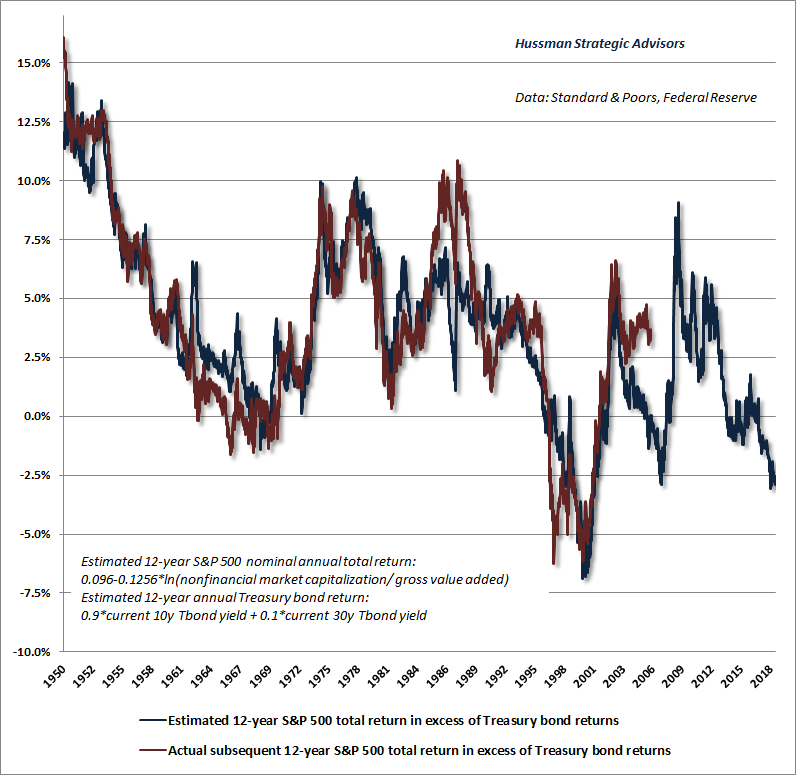
For our part, we’ve found that the most reliable way to estimate the equity risk premium is to use valuations to estimate probable market returns, and then to subtract bond yields from that estimate. These estimates are presented below, along with the actual subsequent market return in excess of Treasury bonds. Note in particular that even at today’s low level of interest rates, we estimate that the S&P 500 will underperform Treasury bonds by roughly 3% annually over the coming 12-year horizon.
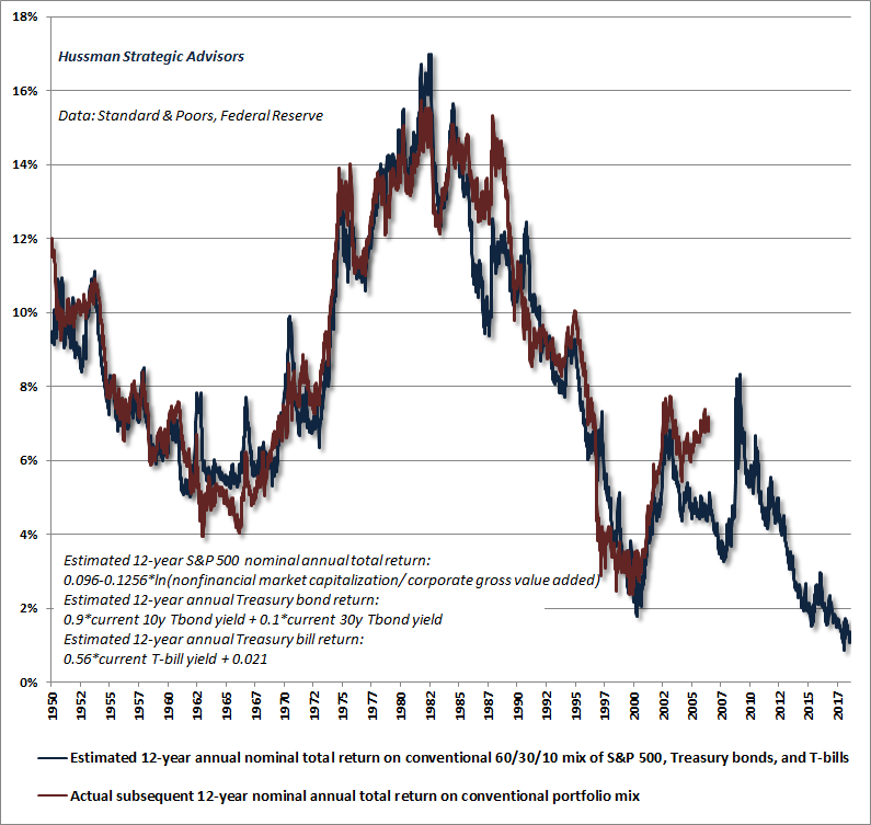
So the fact that interest rates are low doesn’t actually improve the outlook for investors. Rather, it adds insult to injury because security valuations are extreme across-the-board. The chart below shows our estimate of 12-year total returns on a conventional passive portfolio mix invested 60% in the S&P 500, 30% in Treasury bonds, and 10% in Treasury bills. The red line shows the actual subsequent 12-year total return of this asset mix. Presently, we expect a passive portfolio mix to underperform the return on risk-free Treasury bills over the coming 12-year period, mainly because the stock market component of passive returns is likely to be negative.
Real or nominal?
We’re sometimes asked why we use valuations to project nominal returns rather than real returns for the S&P 500. Probably the simplest way to address the question is to show that our valuation measures are effective for both. The chart below shows the relationship of our Margin-Adjusted CAPE and actual subsequent 12-year nominal S&P 500 total returns, in data since 1920.
The next chart shows the same valuation measure versus actual subsequent real, after-inflation, 12-year S&P 500 total returns.
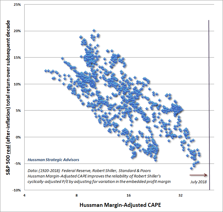
Notice that while reliable valuation measures are informative about subsequent market returns in both cases, the relationship is somewhat tighter for nominal returns than for real returns. This seems to upset some observers. Why get all upset over a fact?
The reason they get upset is because they believe in something called the “Fisher effect.” In theory, higher inflation should raise both the nominal growth rate of future cash flows, and the nominal rate that investors use to discount those cash flows back to present value. In theory, the effect of inflation changes on valuations should therefore be neutral. Inflation rates shouldn’t affect the level of valuations at all. As a result, valuations should be closely related to subsequent real returns, but not subsequent nominal ones. Likewise, higher inflation should result in higher subsequent nominal returns, but not higher subsequent real returns.
Unfortunately, that’s not how investors behave. If they did, they wouldn’t be driving valuation levels to record highs just because interest rates are low, particularly in an environment where the prospect for structural U.S. real GDP growth (the underlying growth of the economy that isn’t driven by fluctuations in the unemployment rate) has never been lower.
The following chart shows how investors do behave. The horizontal axis shows the average rate of CPI inflation over the prior decade. The vertical axis shows the average real, after-inflation total return of the S&P 500 over the subsequent decade. In theory, the past rate of inflation shoudn’t affect subsequent real, after-inflation market returns. In practice, the slope of the relationship is actually greater than 1.0. When inflation is high, investors overreact, driving valuations down far more than is justified, and setting the market up for glorious subsequent real returns. In contrast, when inflation is low, investors also overreact, driving valuations up far more than is justified, and setting the market up for dismal subsequent real returns. That’s exactly what they’ve done today.
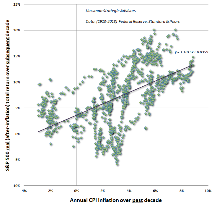
So yes, in theory, a perfect Fisher effect would create a situation where valuations are strongly associated with subsequent real returns, but not nominal ones. In practice, like it or not, investors respond to inflation by embedding it into valuations, and thereby into subsequent real returns. Investors ignore the fact that if interest rates are low because growth and inflation are also low, no valuation premium is “justified” at all. The end result of excessively embedding interest rates and inflation into market valuations is that good valuation measures are not just correlated with subsequent real returns – they are even more strongly correlated with subsequent nominal returns.
Distinguishing extraordinary climbs from long trips to nowhere
In my view, investors are setting themselves up for a very, very long period of zero or negative real returns in the stock market. In every market cycle, history has regularly offered better opportunities for long-term investors to embrace market risk.
One of the charts that has been making the rounds is a depiction of the cumulative S&P 500 real return, going back to 1871. The chart is usually accompanied by a diagonal trendline that gives the impression that long-term real returns are somehow fixed, that valuations can be ignored, and that passive investing always works out over time. Be careful, because the chart also makes the Great Depression look like a walk in the park, with the 1973-74, 2000-2002, and 2007-2009 collapses appearing as little bumps along the road. Very long periods of time also seem very short when they’re presented on a 147-year chart.
I’ve added some annotations to offer some context for investors with somewhat shorter horizons. The thin valuation line shows the ratio of the S&P 500 to the highest level of earnings achieved during the preceding decade. I would have preferred our Margin-Adjusted CAPE or an even more reliable measure, but it’s difficult to impute the required data prior to about 1920. Still, the price/peak-earnings multiple is sufficient to show what’s going on.
You’ll notice some red bars, for example, from the 1929 market top to the 1949 market low. The reason for the red bar, if you look at the valuation line, is that this was a period where valuations moved from elevated levels to depressed levels, with a rather long span of time in-between. Accordingly, even though the economy grew quite a bit in the intervening 20-year period, the real return on the S&P 500 was zero. The same thing happened between the early-1960’s and the early 1980’s.
Ditto for the period between 1996 and 2009 (and of course, even worse between the 2000 high and the 2009 low). Despite the long upward course for real S&P 500 total returns, the move from rich valuations to depressed valuations was accompanied by a 13-year period where the S&P 500 produced a real total return of zero.
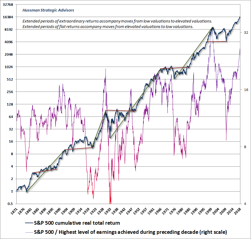
Put simply, despite long-term economic growth, the real return on stocks can be zero or negative for very extended periods of time when measured from a valuation extreme like today and a subsequent valuation trough years and years later.
Of course, there’s a positive flip-side to this story. Look at points between unusually depressed valuations and elevated ones. You’ll notice that the green lines connecting the corresponding market returns are fairly steep, as investors enjoyed strong real returns during those periods. When investors accumulate stocks at depressed valuations, they generally set themselves up to enjoy not only future growth in the economy and earnings, but prices that represent a rising multiple of those fundamentals.
It’s notable that even using price/record earnings – which is the most optimistic of all possible valuation measures and doesn’t make any downward adjustment at all for elevated profit margins – current valuation levels are higher than 1929, 1972, 2007, or any point in history except the very peak of the dot-com bubble. In my view, investors are setting themselves up for a very, very long period of zero or negative real returns in the stock market. In every market cycle, history has regularly offered better opportunities for long-term investors to embrace market risk.
Valuations and half-cycle returns
Back in March 2000, I wrote “Over time, price/revenue ratios come back in line. Currently that would require an 83% plunge in tech stocks (recall the 1969-70 tech massacre). The plunge may be muted to about 65% given several years of revenue growth. If you understand values and market history, you know we’re not joking.”
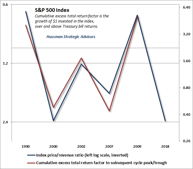
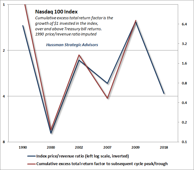
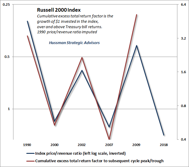
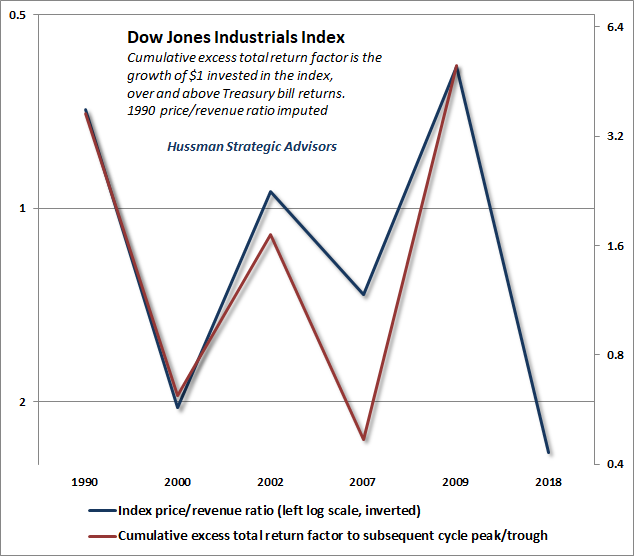
Given my tendency, at market extremes, to make preposterous projections that turn out rather well over the complete cycle, some insight into the relationship between price/revenue ratios and subsequent returns may be useful, particularly with respect to various market indices.
The next four charts all have the same structure. The blue line shows the price/revenue ratio of a given market index at cyclical peaks and troughs, specifically, the 1990 bear market low, the 2000 bull market high, the 2002 bear market low, the 2007 bull market high, the 2009 bear market low, and the recent 2018 market high. The blue line is shown on an inverted log scale, so higher levels represent undervaluation (and high expected future returns), while lower levels represent overvaluation (and low expected future returns).
The red lines (also on log scale) show the half-cycle return for each index, over and above Treasury bill returns. Specifically, these lines show the amount by which an initial dollar would have grown or contracted over the half-cycle that followed.
The first chart shows the S&P 500 Index. Based on the relationship between initial valuations and subsequent half-cycle returns, it should be reasonably easy to see, based on recent valuation extremes, why I expect a $1.00 investment in the S&P 500 to lose about two-thirds of its value over the completion of the current market cycle. The charts don’t exactly mirror our half-cycle estimates based on broader calculations, but they’re close enough to provide some sense of why our market loss projections over the completion of this cycle are so extreme.
Notes on exponential revenue growth
While we’re on the subject of extrapolation and speculative valuations, it may be useful to address the primary driver of market strength in recent weeks – the FAANG group comprised of Facebook, Apple, Amazon, Netflix, and Alphabet (renamed from Google). From a near-term perspective, this advance has many of the features of a “short-squeeze” – in particular, the advances tend to be “jump” advances on rather light volume, as sellers back away at the same time that short investors attempt to cover by chasing the stocks higher. Still, it’s the long-term perspective that’s particularly interesting here.
We’ve always emphasized that stocks are a claim on the very long-term stream of cash flows that they will deliver to investors over time. When companies are growing very quickly, investors tend to look backward, and as a result, they often apply very high rates of expected growth to already mature companies. When valuations are already elevated, this practice can be disastrous, as investors discovered in the 2000-2002 collapse that followed the tech bubble.
On this subject, it’s notable that Apple’s revenue growth rate has slowed to an average rate of less than 4% annually over the past three years. As I detailed a few years ago, “Despite great near-term prospects, within a small number of years, Apple will have to maintain an extraordinarily high rate of new adoption if replacement rates wane, simply to avoid becoming a no-growth company. That’s not a criticism of Apple, it’s just a standard feature of growth companies as their market share expands.”
The tendency for growth to slow as company size increases is sometimes called the “law of large numbers.” This is excruciating for anyone who knows statistics, because the law of large numbers actually describes the tendency of the sample average to approach the population average as sample size increases. What people really mean is “logistic growth” – which is the tendency of growth to slow as the size of a system approaches its mature “carrying capacity.” For any logistic process, the growth rate slows as size increases, steadily falling in proportion to the amount of remaining capacity in the system.
Leading companies in emerging industries can experience spectacular growth rates because of the compound effect of rising market share in a growing sector. Let an emerging industry start from a tiny base, and grow at 30% annually for a decade, while a leading company moves from a 10% market share to a 50% market share. The company will enjoy a 10-year growth rate of 52.7% annually. But as companies become dominant players in mature sectors, their growth slows enormously. Let that mature industry double over a decade, while the company’s market share slips from 50% to 40%, and the 10-year growth rate of the company slows to just 4.8% annually.
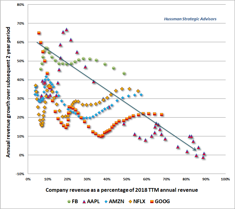
Investors should, but rarely do, anticipate the enormous growth deceleration that occurs once tiny companies in emerging industries become behemoths in mature industries. You can’t just look backward and extrapolate. In the coming years, investors should expect the revenue growth of the FAANG group to deteriorate toward a nominal growth rate of less than 10%, and gradually toward 4%.
The chart below shows the general process at work, reflecting the relationship between market saturation and subsequent revenue growth. Here, the points are plotted based on revenue at each date as a percentage of 2018 trailing 12-month revenues. The vertical axis shows annual revenue growth over the subsequent 2-year period. Clearly, Apple is the furthest along in terms of saturation.
Growth rates are always a declining function of market penetration.
Remember that the latest point on this chart for each company is two years ago. For all of these companies, current revenues represent the far right of the graph, and the corresponding value for subsequent growth will be available 2 years from now. Again, my expectation is that most of those growth rates will slow toward 10%, and gradually toward about 4% (which reflects the structural growth rate that can be expected for U.S. nominal GDP when one assumes a moderate pickup in productivity, inflation slightly over 2%, baked-in-the-cake demographics like population growth, and limited scope for a further cyclical decline in the rate of unemployment).
Below, I’ve embedded some analysis about the dynamics of growth from a few years ago. I expect that these considerations will become increasingly relevant for the entire FAANG group in the years ahead.
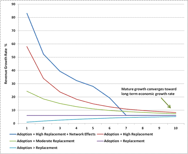
Consider a very large, untapped market for some product. We can model the growth process in terms of how quickly that product is adopted by new users, whether there are any “network” effects where new buyers are attracted to the product because other people already use it, how frequently existing users replace their products, whether late-adopters come in more slowly than early-adopters because of budget constraints, how quickly the untapped market grows, and a variety of other factors.
Whether you do this sort of modeling with a spreadsheet or with differential equations, you’ll get essentially the same results. Specifically, growth rates are always a declining function of market penetration. Most strikingly, the growth rates begin to come down hard even at the point that a company hits 20-30% market penetration. Network effects accelerate the early growth, but also cause growth to hit the wall more abruptly. Replacement helps to accelerate the early growth rates too, but ultimately has much more effect on the sustainable level of sales than it has on long-term growth. In fact, if the replacement rate (the percentage of existing users that replace their product each year) is less than the adoption rate (the percentage of untapped prospects that are converted to new users), it’s very hard to keep the growth rate of sales from falling below the rate of economic growth.
The chart below gives the general picture of various growth curves and the effect that different factors can exert. The paths are less important for their actual growth rates as they are for their general profiles (below, I’ve assumed that 15% of the untapped market adopts the product each period). It may seem odd that you could get a growth rate below the adoption rate. But notice that with an adoption rate of 15% and a total potential market of 1000 units, for example, you’ll sell 150 units the first year, but the next year’s sales will only be 15% of the 850 remaining untapped prospects, so growth will actually be negative unless you have other factors contributing, such as discovery, replacement, network effects, and so forth.
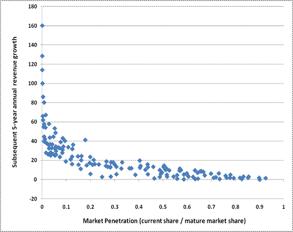
To see how all of this has played out in the actual data for past market darlings, let’s take a look at several extraordinary growth companies that can now reasonably be viewed as having reached their “mature” level of market penetration: Microsoft, Cisco, Intel, Oracle, IBM, Dell and Wal-Mart. The chart below presents the combined scatter of historical revenue growth and penetration data for these companies. Again, the key feature is that growth rates are a rapidly decreasing function of market penetration.
Investors should, but rarely do, anticipate the enormous growth deceleration that occurs once tiny companies in emerging industries become behemoths in mature industries. You can’t just look backward and extrapolate.
Several years ago, I observed “We’ve seen very rapid adoption rates, very high replacement, and very strong network effects in Apple’s products. All of this is an extraordinary achievement that reflects Steve Jobs’ genius. I suspect, however, that investors observe the rapid adoption and very high recent replacement rate of three very popular but semi-durable products, and don’t recognize how improbable it is to maintain these dynamics indefinitely. Despite great near-term prospects, within a small number of years, Apple will have to maintain an extraordinarily high rate of new adoption if replacement rates wane, simply to avoid becoming a no-growth company. That’s not a criticism of Apple, it’s just a standard feature of growth companies as their market share expands. It’s something that Cisco and Microsoft and every growth juggernaut encounters. Apple is now valued at 4% of U.S. GDP, but then, Cisco and Microsoft were each valued at 6% of GDP at the 2000 bubble peak. Not that things worked out well for investors who paid those valuations.”
Presently, Apple is valued at 5.1% of GDP, Amazon at 4.8%, Alphabet (Google) at 4.6%, Facebook at 3.3%, and Netflix at 0.8% of GDP. That’s a total market capitalization of nearly 20% of GDP across 5 stocks. It’s worth remembering that historically, the pre-bubble norm for market capitalization to GDP, adding up every nonfinancial company in the stock market, was only about 60%. At secular lows like 1974 and 1982, the ratio fell to 30% of GDP – for the entire market.
Despite these extremes, my impression is that the FAANG stocks are not overvalued nearly to the extent that the glamour tech stocks were in 2000, when I expected that group to lose -83% of their value. I expect the Nasdaq 100 to fall by only about -57% this time around. That’s actually a big difference, because an -83% loss requires a -57% loss followed by a loss of -60% of what’s left.
My expectation for a -57% loss in the Nasdaq is also somewhat less than I expect the S&P 500 (-64%), Russell 2000 (-68%) and Dow Jones Industrial Average (-69%) over the completion of this cycle. Then again, given the severity of our projections, and the likelihood that they’ll be far from precise, those are probably distinctions without a difference.
This movie has played so many times in the historical data that we’ve practically memorized the lines. Near the end of the tech bubble, I got myself a nice bit of scorn on CNBC after Alan Abelson of Barron’s Magazine published my projections for Cisco, EMC, Sun Microsystems and Oracle – all in the range of about 15-20% of the prices where they had recently changed hands. Those projections actually turned out to be slightly optimistic.
There’s always the hope that this time it’s different.
Inverted yield curves are effects, not causes
Finally, I’ve been asked to comment on the extent to which an “inverted yield curve” is necessary or sufficient to warn of an oncoming recession. As background, the yield curve is the difference between long-term and short-term interest rates. Normally, long-term interest rates are higher than short term rates, so the yield curve is typically upward-sloping. When short-term interest rates move above long-term rates, the yield curve is said to be “inverted.” Typically, market observers compare the 10-year Treasury bond yield with the 3-month Treasury bill yield, or alternatively, the 2-year Treasury bond yield.
With respect to the question of whether an inverted yield curve is necessary for a recession, the answer is no. Prior to 1970, recessions regularly occurred without any inversion in the yield curve. By contrast, since 1970, inverted yield curves have typically preceded recessions. That’s not cause and effect. It’s just a regularity that results from the relationship between economic slack and inflationary pressures.
See, as the economy gets close to full employment, and economic slack becomes limited, the prospects for long-term economic growth decline, but the pressures on short-term inflation increase. In an economy with little slack capacity, the Federal Reserve typically responds to the risk of inflation by raising interest rates. The idea is to reduce reducing demand growth that can no longer be met with new supply without also fanning inflation pressures.
Inverted yield curves are largely the result of tight economic conditions coupled with inflation pressures. When that combination emerges, short-term interest rates tend to rise faster than long-term interest rates, which produces a yield curve inversion. The inversion itself is just a symptom – an effect of tight capacity. When capacity is tight, the prospects for economic growth are already limited. A constrained economy, in turn, is more vulnerable to financial disruptions and mismatches between demand and supply. So while inverted yield curves have preceded recessions since 1970, they don’t cause the recessions.
With regard to Federal Reserve policy, I’ve shown elsewhere that even large “activist” components of Fed policy have no effect on subsequent output, employment, or inflation, beyond what could be predicted simply from past values of output, employment, and inflation themselves. Put another way, recoveries follow steep economic slack in a largely mean-reverting way, and recessions follow tight economic conditions in a similarly mean-reverting way. Ascribing recoveries and recessions to the Federal Reserve makes very little sense. Likewise, the idea that the Fed “risks” creating an inverted yield curve that will “cause” a recession is hogwash.
Inverted yield curves are largely the result of tight economic conditions coupled with inflation pressures. When that combination emerges, short-term interest rates tend to rise faster than long-term interest rates, which produces a yield curve inversion. The inversion itself is just a symptom – an effect of tight capacity.
The main risk of activist Fed policy is that holding short-term interest rates near zero can encourage speculators to seek higher yields in risky or low-quality assets, encouraging Wall Street to create new “product” to meet that demand, and vastly increasing systemic financial risk. That’s what the Fed did between 2003 and 2007, producing the mortgage bubble and collapse, and it’s what the Fed has done yet again in recent years.
The bottom line is that to the extent that inverted yield curves signal a combination of tight economic capacity (particularly in the labor market) coupled with upward pressures on inflation, they do provide useful information. But inverted yield curves aren’t necessary for recessions, nor are they sufficient to imply immediate risks. The yield curve is a useful symptom of economic conditions. It isn’t a cause.
The chart below shows what I view as a more valuable way to combine the information from labor market slack and yield curve conditions. The blue line combines the unemployment rate and the yield curve, where each is measured in standard deviations from its respective mean, allowing the two to be directly combined. High values reflect the combination of high unemployment and/or a steep yield curve – conditions that reflect substantial economic slack and likely economic growth. Low values reflect the combination of low unemployment and/or a flat or inverted yield curve – conditions that reflect tight economic conditions and likely economic weakness. On this measure, current conditions are already permissive of a recession, but most recessions have begun from more negative conditions.
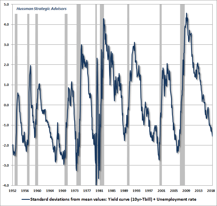
Presently, our own measures are not signaling an imminent recession, but we also disagree with those who completely rule out a recession until 2019 or 2020. Rather, we would continue to monitor the full set of measures that we find – in combination – to be well-correlated with oncoming economic weakness.
These indications would include a market loss that takes the S&P 500 below its level of 6 months earlier, a clear widening of credit spreads, further flattening or inversion in the yield curve, an increase in the unemployment rate of more than 0.4% from its 12-month low, year-over-year growth in non-farm payroll employment of less than about 1.3%, a drop in the ISM Purchasing Managers Index below about 54 (particularly if regional surveys are accompanied by a drop in order backlogs), a decline in aggregate hours worked below the level of 3-months prior, weakening growth in real disposable income, weakening growth in real personal consumption, and a steep drop in consumer confidence, particularly if the future expectations index declines more than the current conditions index.
Together these conditions offer a useful “gestalt” of recession risks – typically long before the consensus even recognizes a recession in progress. In prior economic cycles, our Recession Warning Composite has been very effective on its own, though in recent years we had a couple of false signals due to employment weakness that was subsequently revised away. While it’s preferable for the evidence to be as broad and robust as possible, we’d still consider our Recession Warning Composite to be a notable indication of oncoming economic trouble: 1) S&P 500 below 6-months prior, 2) yield curve flatter than 2.5%, 3) credit spreads wider than 6-months earlier, and 4) ISM below 50, or below 54 with either unemployment up 0.4% from its low or year-over-year payroll employment growth below 1.3%. If there’s a recession on the horizon, this set of measures should offer a reasonably early warning. Again though, more evidence and confirmation is always preferable.
Meanwhile, recognize that the current enthusiasm about the economy has built in an enormous amount of likely disappointment. Remember – growth has drivers, and once the drivers reach extremes, it becomes very dangerous to extrapolate past trends. Half of the economic growth we’ve observed since the global financial crisis has been driven by a declining unemployment rate, which recently reached a low of 3.8%. Take away the impact of a falling unemployment rate (which has little scope to continue), and the underlying structural growth rate of the economy – a combination of labor force growth and productivity growth – is only about 1.5% annually.
Allow for a doubling in the rate of productivity we’ve observed in recent years, and the prospect for sustained real U.S. economic growth is still only about 2%. Yes, we may have a quarter of very strong real GDP growth and there, but remember that the annual growth rates being quoted are simply quarterly growth multiplied by four, not sustained, longer-term growth rates. Even modest one-off factors (such as a spike in energy production in Q2) can drive impressive growth rates on the basis of annualized quarterly figures.
Presently, our own measures are not signaling an imminent recession, but we also disagree with those who completely rule out a recession until 2019 or 2020. Rather, we would continue to monitor the full set of measures that we find – in combination – to be well-correlated with oncoming economic weakness.
Just as the primary driver of market returns in recent years has been a cyclical move from depressed valuations to the most extreme valuation multiples in history, much of the growth in the U.S. economy since the global financial crisis has been driven by the largest cyclical increase in history in the ratio of civilian employment to the civilian labor force. That’s another way of saying that the growth has been largely driven by a decline in the unemployment rate from 10% to just 3.8%. With both valuations and unemployment at cyclical extremes, the likelihood is that the tailwinds that have driven the market returns and economic growth of recent years will turn into headwinds. As that happens, extrapolating growth, as if it is some sort of entitlement, will be a profound mistake.
Keep Me Informed
Please enter your email address to be notified of new content, including market commentary and special updates.
Thank you for your interest in the Hussman Funds.
100% Spam-free. No list sharing. No solicitations. Opt-out anytime with one click.
By submitting this form, you consent to receive news and commentary, at no cost, from Hussman Strategic Advisors, News & Commentary, Cincinnati OH, 45246. https://www.hussmanfunds.com. You can revoke your consent to receive emails at any time by clicking the unsubscribe link at the bottom of every email. Emails are serviced by Constant Contact.
The foregoing comments represent the general investment analysis and economic views of the Advisor, and are provided solely for the purpose of information, instruction and discourse.
Prospectuses for the Hussman Strategic Growth Fund, the Hussman Strategic Total Return Fund, the Hussman Strategic International Fund, and the Hussman Strategic Dividend Value Fund, as well as Fund reports and other information, are available by clicking “The Funds” menu button from any page of this website.
Estimates of prospective return and risk for equities, bonds, and other financial markets are forward-looking statements based the analysis and reasonable beliefs of Hussman Strategic Advisors. They are not a guarantee of future performance, and are not indicative of the prospective returns of any of the Hussman Funds. Actual returns may differ substantially from the estimates provided. Estimates of prospective long-term returns for the S&P 500 reflect our standard valuation methodology, focusing on the relationship between current market prices and earnings, dividends and other fundamentals, adjusted for variability over the economic cycle.