
Why a 60-65% Market Loss Would Be Run-Of-The-Mill

John P. Hussman, Ph.D.
President, Hussman Investment Trust
May 2019
In the summer of 1929 the surface of Wall Street was a mixture of placidity and mania – stock averages at record highs and still headed upward, the dissenters momentarily routed … Roger Babson said to an audience at a routine New England financial luncheon, ‘I repeat what I said at this time last year and the year before, that sooner or later a crash is coming.’ As Babson implied, his earlier warnings had been roundly ignored… When the crash finally came, it came with a kind of surrealistic slowness – so gradually that, on the one hand, it was possible to live through a good part of it without realizing it was happening, and, on the other hand, it was possible to believe that one had experienced and survived it when in fact it had no more than just begun.
– John Brooks, Once in Golconda, 1969
From September 3, 1929 to July 8, 1932, the Dow Jones Industrial Average fell by -89.2%, though certainly not in one fell-swoop. In fact, the decline known as the “1929 Crash” took the Dow down by an initial -47.9%, setting a trough on November 13, 1929. That initial decline was followed by a 48.0% recovery that peaked on April 17, 1930, leaving the Dow still -22.9% below its bull market high, because that’s how compounding works. By the 1932 low, the Dow had plunged -86.0% below its April 1930 peak, and -79.3% below even the “bottom” it set in November 1929 after losing nearly half of its value.
One might view the very comparison of present stock market conditions to 1929 market peak as exaggerated and preposterous, but then, one would be wrong. The fact is that on the valuation measures we find most strongly correlated with actual subsequent long-term and full-cycle market returns across history (and even in recent decades), current market valuations match or exceed those observed at the 1929 peak.
Likewise, valuations for nearly every decile of stocks presently exceed those observed at the 2000 market peak. As we’ll see below, the extreme valuation of capitalization-weighted indices like the S&P 500 at the 2000 peak was driven by single decile of stocks, largely represented by large-cap technology stocks that collapsed by -83% during the subsequent bear market. At present, every decile of stocks, without exception, is sufficiently overvalued to allow market losses on the order of -59% to -71%, without even breaching their respective valuation norms.
Still, as we’ll also discuss, the behavior of market internals continues to suggest that investors have a speculative bit in their teeth, though tenuously enough that it could drop out on even a few sessions of weak or divergent market action. Still, we try to align with prevailing internals rather than forecasting shifts, so despite the likelihood of absurdly steep market losses over the completion of this cycle, our very near-term outlook is rather neutral, and will remain so until we observe broader divergence and fresh deterioration in our measures of internals.
Why a 60-65% market loss would be run-of-the-mill
We begin with the Hussman Margin-Adjusted P/E (MAPE), which is among the most reliable valuation measures we’ve tested in market cycles across history, based on its correlation with full-cycle and 10-12 year market returns. The MAPE is second in reliability only to MarketCap/GVA – the ratio of nonfinancial market capitalization to nonfinancial corporate gross value-added (including estimated foreign revenues). Both measures essentially act as broad, apples-to-apples market price/revenue ratios, and significantly outperform popular earnings-based measures like price/forward operating earnings, the Fed Model, and the Shiller P/E. While both are at similar extremes, the MAPE has a longer data history, which allows direct comparison with 1929 valuation levels.
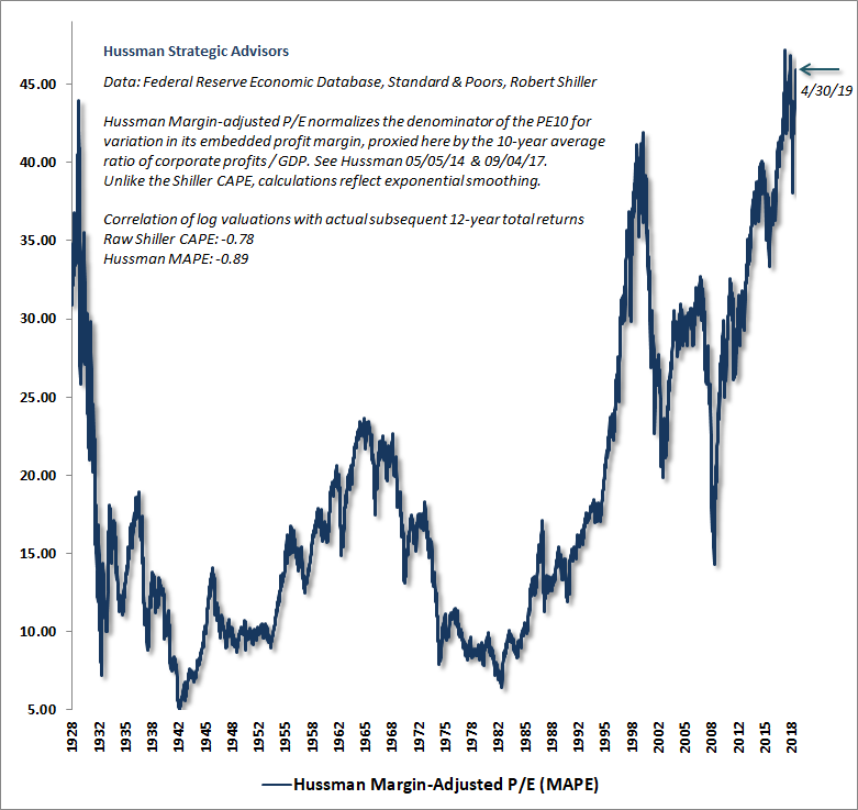
One might imagine that valuation levels might have simply “shifted higher” in recent decades, but that would miss the fact that associated subsequent returns have also “shifted lower” in recent decades, leaving the mapping between valuations and subsequent returns unaffected.
Of course, the historical record also includes a few temporary “errors,” because the only way to reach breathtaking overvaluation or undervaluation at the end of a market cycle is for actual returns to temporarily exceed or fall short of what valuations would have normally projected. These temporary “errors” are a hallmark of bubble peaks as well as secular valuation troughs. See, for example, expected 12-year returns versus actual subsequent 12-year returns in 1988 and 1995, corresponding to horizons ending in 2000 and 2007.
The potential for speculation or risk-aversion to produce temporary valuation extremes is exactly why we have to attend to market internals, in order to gauge the shorter-term inclinations of investors toward speculation or risk-aversion.
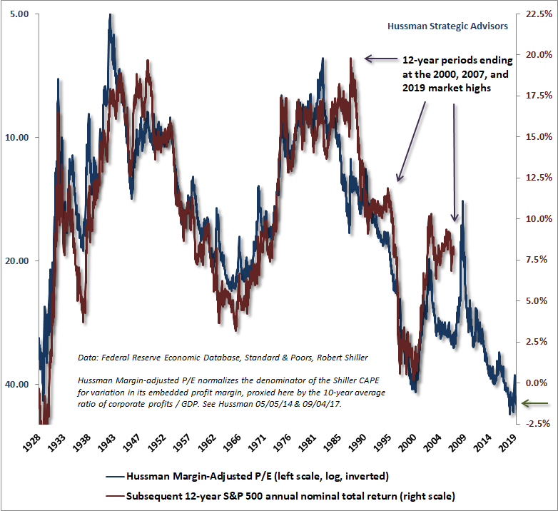
Notably, current market valuations exceed both the 1929 and 2000 extremes. Not surprisingly, we estimate negative returns for the S&P 500 Index over the coming 10-12 year period, as valuations suggested in 1929, and as we projected in real-time in 2000.
Meanwhile, given the depressed yields on long-term bonds, our estimate for 12-year total returns on a conventional asset mix (60% stocks, 30% Treasury bonds, 10% T-bills) has collapsed to just 0.8% annually. This is lower than any point in history except a 6-week period surrounding the 1929 market top, a 3-week period surrounding the January 2018 pre-correction market peak, and a 6-week period surrounding the September 2018 pre-correction market peak.
If there is any good news at all on the valuation front, it is that while the S&P 500 Index is about 2% above its January 26, 2018 high, the MAPE is presently about 2% below the level observed in early 2018, largely because underlying fundamentals have grown. Still, it would take well over two decades, holding the S&P 500 unchanged, for valuations to reach historically run-of-the-mill levels on the basis of growth in fundamentals alone. Sustaining that kind of “permanently high plateau” would require the absence of even a single episode of severe risk-aversion among investors during that time frame.
It’s worth remembering that except for the 2000-2002 bear market, which ended at valuations that were still about 25% above historical norms, every other bear market decline in history, including the 2007-2009 decline, has taken reliable valuation measures to historical norms that presently stand between -60% and -65% below present market levels.
Valuations and bear market losses
We can understand the 89% collapse of the stock market between 1929 and 1932 as the combination of two losses – one predictable, one cataclysmic – each representing a loss of two-thirds of the market’s value. The first loss was a rather standard, run-of-the-mill retreat in market valuations from the 1929 extremes to levels that have historically been observed by the end of nearly every market cycle in history. Yes, a two-thirds market loss seems severe, but in the context of 1929 valuation extremes, it was also fairly pedestrian. The first two-thirds loss merely brought valuations to ordinary historical norms.
The problem was that additional policy mistakes contributed to a Depression that wiped out yet another two-thirds of the market’s remaining value. The combination, of course, is how one gets an 89% market loss. Lose two thirds of your money, and then lose two thirds of what’s left. It’s that stepwise loss – one predictable, and one cataclysmic, that Edwin LeFevre described shortly after the collapse:
The reason why the stock market must necessarily remain the same is that speculators don’t change; they can’t. Shrewd business men who wouldn’t sell absurdly overpriced securities would not buy, two years later, underpriced stocks and bonds. The same blindness to actual values was there, only that while the heavy black bandage was greed in the bull market, it was fear in the bear market. Reckless fools lost first because they deserved to lose, and careful wise men lost later because a world-wide earthquake doesn’t ask for personal references. Everybody who looked for easy money in 1928 or 1929 lost both dreams and cash in 1929 or 1930. In 1931 nobody was spared.
– Edwin LeFevre, Vanished Billions
So while present valuations slightly exceed the 1929 extreme, we certainly don’t expect anywhere near the market loss that unfolded during the Depression. Rather, my expectation of a 60-65% market loss over the completion of this cycle assumes that reliable valuation measures will simply revisit their historical norms, rather than breaking below them as they have in most bear markets, including the 2007-2009 decline, and dramatically in the 1929-1932 period.
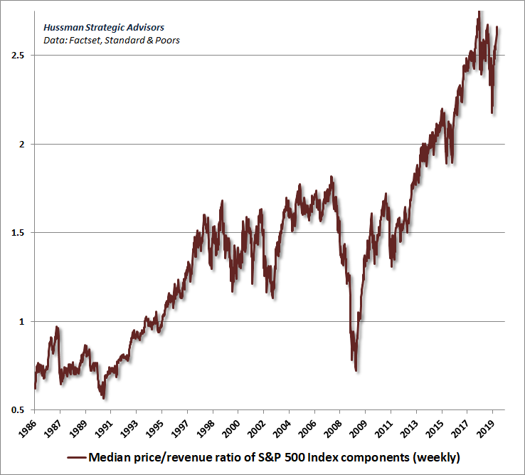
An important aspect of current valuation extremes is that they are far broader than what was observed even at the 2000 market peak. The chart below shows the median price/revenue ratio of S&P 500 component stocks, in data going back to 1986. Strikingly, the current multiple is far beyond what was observed at the 2000 peak.
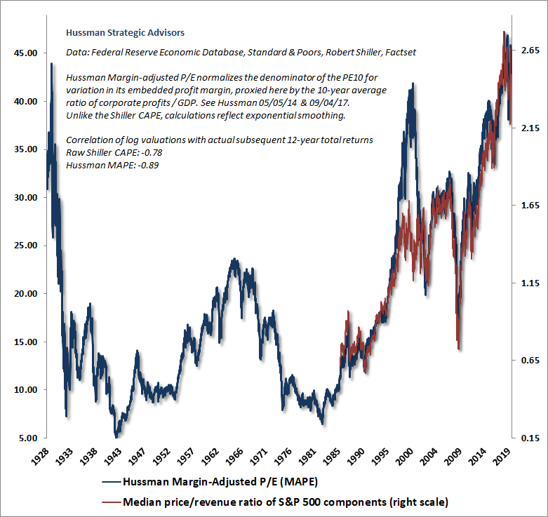
We can put this data since 1986 into a far broader historical perspective by overlaying the median price/revenue ratio on the Hussman Margin-Adjusted P/E. It is immediately apparent is that the 2000 bubble peak was unusual, in the sense that median valuations were far less extreme than the valuation of the overall S&P 500 index. Another feature that should be apparent is that median valuations today are just as extreme as the valuation of the overall index, representing the broadest equity market bubble in history.
To understand how current median valuations could presently be so much higher than those at the 2000 extreme, it’s important to recognize how skewed the composition of valuations became during the tech bubble. The chart below divides S&P 500 stocks into 10 deciles at each point in time, and shows the median price/revenue ratio of each decile – thanks to Russell Jackson, our resident math guru, for compiling this data. The extreme “market” valuations that investors observed at the 2000 bubble top were largely driven by just 10% of stocks, generally representing large-capitalization glamour technology stocks. Yet even at the top, valuations were only moderately elevated for about half of the stocks in the S&P 500.
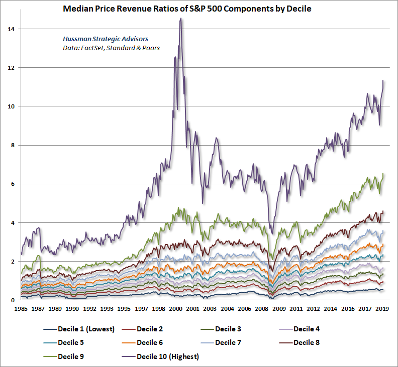
The next chart shows the same data on a log scale, so the relative valuation of each decile can be seen more clearly. Notice something. With the exception of stocks in the very highest valuation decile, every other decile is more overvalued today than it was at the 2000 market peak.
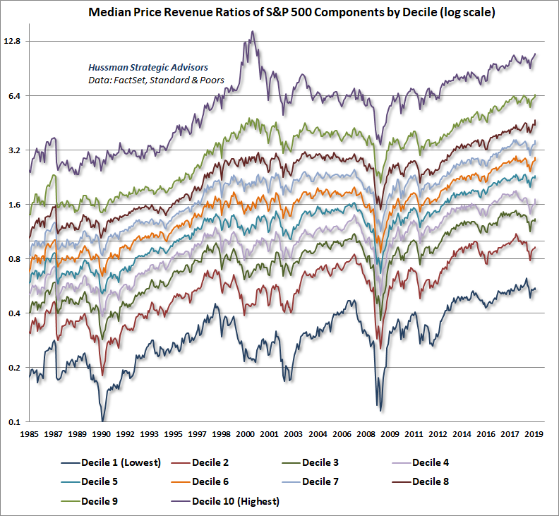
What’s equally notable is that just as the overall valuation level of the market provides a useful estimate of likely full-cycle market losses, the valuation level of each individual decile, relative to its own respective norm, provides a similarly useful estimate of prospective full-cycle losses in each group.
On March 7, 2000, I observed, “Over time, price/revenue ratios come back in line. Currently, that would require an 83% plunge in tech stocks (recall the 1969-70 tech massacre). The plunge may be muted to about 65% given several years of revenue growth. If you understand values and market history, you know we’re not joking.” As it happened, the tech-heavy Nasdaq 100 would go on to lose an improbably precise -83% by the October 2002 market low.
Yet even at the 2000 peak, the median valuations of other groups were nowhere near the extremes we observed in the tech sector. In fact, half of the valuation deciles were within 40% of their historical norms, implying full cycle losses of only about -30%. That’s important, because at present valuations, every one of these deciles would have to retreat by -59% and -71% simply to reach run-of-the-mill valuation norms.
For each decile, the chart below shows the median loss for stocks in each group over the subsequent 30-month period. Clearly, we won’t have complete data for the current point in time for another two and half years, but we should not be surprised if losses from today’s valuations look much like they looked following the 2007 peak. It’s also interesting to notice -83% plunge in that purple line in the 30 months that followed the 2000 peak. That’s what breathtaking valuations will do for you over the complete cycle.
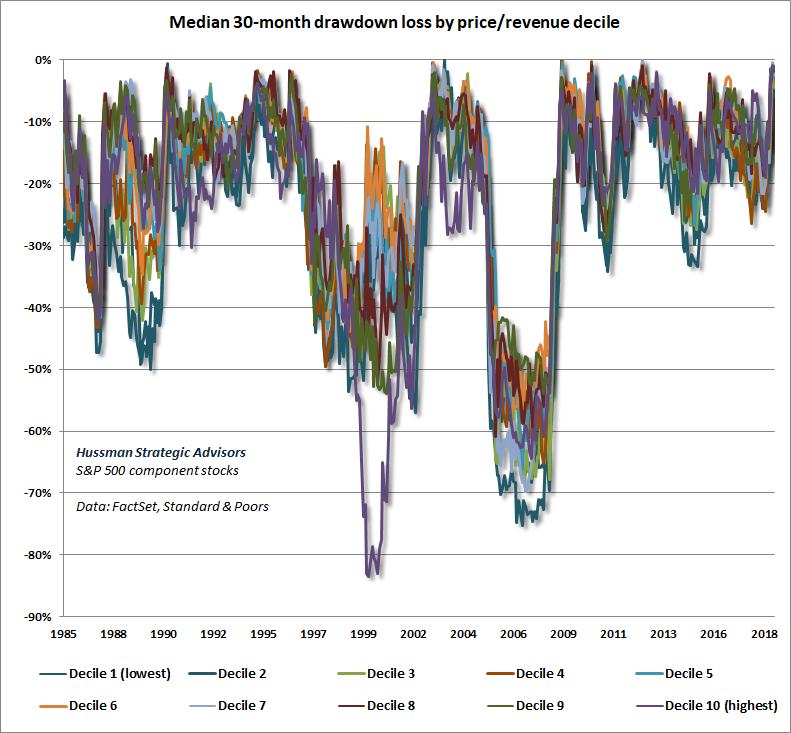
Except for the 2000-2002 bear market, which ended at valuations that were still about 25% above historical norms, every other bear market decline in history, including the 2007-2009 decline, has taken reliable valuation measures to historical norms that presently stand between -60% and -65% below present market levels. The primary importance of internals here is to discourage fighting the market with a hard-negative near-term outlook until speculative psychology again shifts toward risk-aversion.
As a final note on valuations, it’s important to understand that because corporate earnings are more volatile than stock prices themselves, the price/earnings ratio of the S&P 500 is dramatically affected by the position of the economy in the economic cycle. When earnings are depressed, even very high price/earnings ratios can actually be associated with very high expected market returns. On the other hand, investors are regularly misled at bull market peaks by the fact that P/E ratios are often “well below historical extremes” at those points. The error comes in applying an elevated P/E ratio to already elevated (sometimes record) earnings. Historically, this has been a recipe for disaster.
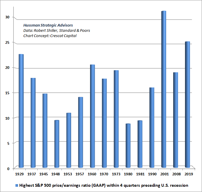
To illustrate what “extreme” P/E multiples typically look like once an economic expansion is already mature, the following chart shows the highest P/E ratio of the S&P 500 in the final 4 quarters of a U.S. economic expansion. The chart concept is from the brilliant team at Crescat Capital.
Notice something. Even on the basis of record reported GAAP earnings, the current P/E multiple of the S&P 500 exceeds the P/E observed at the 1929 peak, and at every other market extreme other than 2000 – including the 1987 peak, which was not associated with a subsequent recession. As we’ve seen, the 2000 peak was higher only because of hypervaluation in a single decile of stocks that went on to lose -83% of their value in the subsequent bear market.
Nibbling the speculative bit
Our near-term market outlook remains fairly neutral at the moment, rather than hard-negative. Given present valuation extremes, I continue to believe that a rather pedestrian, run-of-the-mill completion of the current market cycle would involve a loss in the S&P 500 of about two-thirds of the market’s value. Put another way, the S&P 500 is essentially a claim to a long-term stream of cash flows that investors can expect to be delivered into their hands over time. In order for those long-term cash flows to produce historically run-of-the-mill expected returns for investors, we presently estimate that the S&P 500 would have to trade at roughly the 1100 level, about -63% below its present extremes.
The singular reason for not pounding the table about immediate market losses is that, at the moment, our measures of market internals are sufficiently uniform to indicate an inclination of investors toward speculation (when investors are inclined toward speculation, they tend to be indiscriminate about it). We try to avoid forecasts of when those measures will shift, being instead content to align our views with prevailing conditions as they change over time.
Still, it’s important to observe that the “internal uniformity” we identify in day-to-day market action is as tenuous as it gets. Indeed, half of all individual U.S. stocks remain below their respective 200-day moving averages, and neither the NYSE Composite, the Russell 2000 Index, the Value Line Composite or even the S&P 500 equal-weighted indices confirmed the recent high in the S&P 500 by advancing beyond their September 2018 peaks. From that perspective, the current rally resembles similarly unconfirmed late-stage advances we observed in 2000, 2007, and that also characterized the 1929 peak:
The 1929 boom was, in fact, quite a narrow and selective one. It was a boom of the handful of stocks that figured in the daily calculation of the Down Jones and New York Times indices, and that was why those well-publicized indices were at record highs. It was also a boom of the most actively traded stocks bearing the names of the most celebrated companies, the stocks mentioned daily by the newspapers and millions of times daily by the board-room habitues – and that was why it was constantly talked about. But it was emphatically not a boom of dozens of secondary stocks in which perhaps as many investors were interested… The persistence of the idea that all stocks were going through the roof in the autumn of 1929 is a monument to the power of popular myth.
– John Brooks, Once in Golconda, 1969
Put simply, despite wildly negative full-cycle market prospects, our near-term outlook is neutral; not hard-negative, and not bullish. Tight and automatic safety nets such as out-of-the-money index put options can be useful both for investors who are inclined to hold stocks, and as a way to establish a “contingent” bearish stance that would kick in on market weakness. Whatever happens, a sudden market collapse would not leave us unprepared.
Again, it’s important to distinguish investment, which is concerned with valuation, from speculation, which is concerned with investor psychology. At present, valuations offer investors among the most offensive investment prospects in financial history. Yet we’ve also learned our lesson: one aspect of the financial markets has become truly “different” from history, and it’s that even brazenly “overvalued, overbought, overbullish” syndromes no longer place a reliable “limit” on the speculative recklessness of investors. At the moment, investors have the speculative bit in their teeth, however tenuously – a psychological disposition that we read out of the joint behavior of thousands of securities, industries, sectors, and security-types, including debt securities of varying creditworthiness.
Internals are important precisely because valuations aren’t a timing tool. If overvaluation was enough to drive stock prices immediately lower, it would be impossible for the market to establish obscene levels of overvaluation like 1929, 2000 and today. Rather, valuations are enormously informative about long-term and full-cycle investment prospects. Shorter-term outcomes are much more dependent on shifts in investor psychology. Internals effectively capture that psychology, because when investors are inclined toward speculation, they tend to be indiscriminate about it.
Notably, both valuations and market internals have done beautifully in recent market cycles. Indeed, our valuation measures effectively identified the full-cycle risk at the 2000 and 2007 peaks, as well as the far stronger investment prospects that existed at the 2002 and 2009 lows. Meanwhile, the entire total return of the S&P 500 in recent decades has occurred during periods where our measures of market internals were favorable, while the majority of steep losses like 2000-2002 and 2007-2009 occurred when they were not.
Again, the single factor that was “different” in the recent advancing half-cycle is that syndromes of “overvalued, overbought, overbullish” conditions became ineffective, and responding to those warning signs proved detrimental. In prior cycles, those syndromes reliably indicated that speculation had reached a “limit,” and they were regularly followed by air-pockets, panics and crashes. Investors abandoned those limits in the face of zero-interest rate policy.
Yet even during the advancing period since the 2009 low, the S&P 500 has lost value, on average, when overvalued, overbought, overbullish conditions have been joined by deteriorating market internals. As a result, in late-2007, we adapted our investment approach to rule out adopting a hard-negative market outlook except in periods where market internals have explicitly deteriorated.
Internals are important precisely because valuations aren’t a timing tool. If overvaluation was enough to drive stock prices immediately lower, it would be impossible for the market to establish obscene levels of overvaluation like 1929, 2000 and today. Rather, valuations are enormously informative about long-term and full-cycle investment prospects. Shorter-term outcomes are much more dependent on shifts in investor psychology. Internals effectively capture that psychology, because when investors are inclined toward speculation, they tend to be indiscriminate about it.
Emphatically, the present uniformity of market internals should not be treated as a “bullish forecast.” As current conditions stand, these measures could deteriorate with just a few sessions of ragged market action, but our approach is to align our views with internals rather than trying to forecast them. At current valuation extremes, safety nets are essential, and conditions are sufficiently extreme to warrant a neutral near-term view rather than a constructive one. The primary importance of internals here is to discourage fighting the market with a hard-negative near-term outlook until speculative psychology again shifts toward risk-aversion.
Cyclically excessive deficits
During the global financial crisis, the U.S. Federal deficit briefly exploded to over $1.5 trillion, peaking at just over 9% of GDP. Yet even with the unemployment rate down from 10% to just 3.6%, and even having completely eliminated the output gap between actual GDP and Congressional Budget Office estimates of potential GDP, the U.S. Federal deficit has exploded to $1.1 trillion. Over the next couple of years, we expect the Federal deficit to reach record levels. Indeed, even a mild recession is likely to drive the deficit, as a share of GDP, to levels that match or exceed the extremes seen in the global financial crisis.
To ask whether a deficit is “good” or “bad” is like asking whether debt is good or bad. The answer is that it depends enormously whether or not the funds are used productively. One of my sharpest objections to the notion that government spending can “stimulate” the economy is that this proposition often makes no distinction between productive and unproductive spending, and often doesn’t even give any consideration to the position of the economy relative to its capacity, or the labor force composition that would be required to make that spending productive without outsourcing it abroad.
“Infrastructure” is a case in point. Before talking about spending $2 trillion, or 10% of GDP, on infrastructure, it may help to remember that the U.S. unemployment rate is currently just 3.6%. Only 11% of U.S. workers are employed in “infrastructure.” Moreover, according to the Brookings Institution, 77% of them are employed in “operation” of that infrastructure (running facilities, moving supplies), with only about 15% of them involved in construction.
So unless one imagines that every unemployed individual is well-suited to construction, we’re talking about activities that would have to be implemented by just 1.65% of an already tight labor force. I don’t think it’s overly cynical to suggest that infrastructure may be attractive to the White House because of the potential to embed large benefits to private business interests in the small print. In any event, while various forms of government “stimulus” can potentially be useful, the nature and timing of those policies is critical.
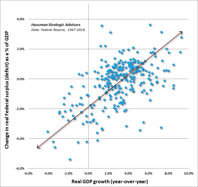
To offer some idea of why the U.S. Federal deficit is likely to explode in the coming years, it’s important to recognize that our current $1.1 trillion deficit is occurring not in the midst of a recession, but after the longest U.S. economic expansion in history. The chart below shows how the deficit typically responds to changes in economic growth. Notice that real GDP growth above about 3% annually typically results in a narrowing deficit (or increasing surplus), while real GDP growth short of 3% annually typically results in a widening deficit.
Notice also that even a year of zero GDP growth would likely increase the deficit by about 2% of GDP, or about $400 billion in current terms. So even without a material recession, even a year of flat economic growth would likely drive the U.S. Federal deficit from the current $1.1 trillion to the same record $1.5 trillion observed in the depths of the global financial crisis.
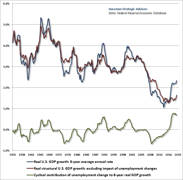
Much of the real GDP growth we’ve observed since the global financial crisis has been driven by a cyclical decline in the rate of unemployment, while the underlying “structural” drivers – labor force growth and productivity growth – have continued their sustained slowdown from historical norms. The chart below shows this breakdown, where actual GDP growth is shown in blue, the contribution of unemployment fluctuations is shown in green, and underlying “structural” GDP growth is shown in red. Holding the U.S. unemployment rate constant, trend U.S. real GDP growth would currently be running at just 1.6% annually. That amplifies the vulnerability to recession, because even a 0.8% increase in the unemployment rate, from the current 3.6% to just 4.4%, would likely be associated with negative GDP growth.
While the real GDP growth estimate for the first quarter of 2019 came in at 3.2%, fully 0.7% of that growth represented unsold inventories. Similarly, 0.5% of the 3.2% year-over-year GDP figure was also inventory accumulation. So real final sales are already sputtering, while the majority of output growth classified as “business investment” is actually inventory accumulation.
To offer a sense of how the Federal deficit is typically related to economic fluctuations, the chart below shows the U.S. Federal deficit as a percent of GDP versus changes in the “output gap” – the difference between actual real GDP and CBO estimates of “real potential GDP” reflecting the level of GDP that would be expected at a high level of capacity use, based on economic and demographic factors.
The output gap is shown by the blue line (left scale), with the Federal surplus or deficit as a share of GDP in red (right scale). Notice that the two fluctuate largely in tandem, reflecting a tendency for the deficit to expand during recessions and contract during expansions. But notice how the current situation deviates from that normal behavior. Given the current position of the U.S. economy, the Federal balance would typically be running at a deficit of only about 1% of GDP. Instead, the deficit is already at 5% of GDP (about $400 billion larger than expected).
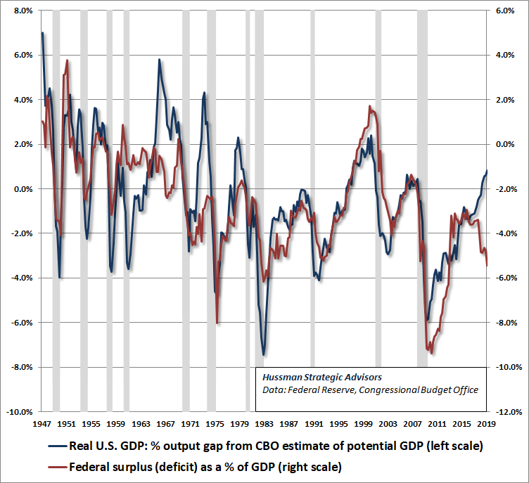
Note that there are a handful of instances – 1967, 1972 and 1979 – where the output gap pushed to positive levels (i.e. real GDP temporarily moved above CBO estimates of potential GDP) yet the Federal budget was already in a deficit position. These points are notable from the standpoint of economic history because they were exactly the points at which inflation expectations became most unstable, as the public abandoned its faith that fiscal policy was on a stable course.
The first episode reflected spending for the Vietnam War and Great Society programs enacted by the Johnson Administration. The U.S. inflation rate took off in 1967, breaking free from its prior 2-3% range, and pushing to 4% during the recession of 1970. At the time, the global economy operated on the Bretton Woods system, in which other countries pegged their own currencies against the dollar, and treated the U.S. dollar as the de-facto global reserve currency. As U.S. deficits persisted, foreign countries became offended by what they saw as the “exorbitant privilege” of financing U.S. deficits by forcing Treasury liabilities on the rest of the world. These governments began to demand gold in exchange for their Treasury bonds, and in response, Nixon closed the gold window in late-1971, which started the era of floating exchange rates.
The 1973 OPEC shock contributed further instability to an economic situation already strained by U.S. deficits, and inflation soared to nearly 12% during the recession of 1974. As economic slack narrowed during the next recovery, inflation soared again, and finally peaked above 14%. The inflationary episode was finally stopped by a “regime change” by which Fed Chair Paul Volcker effectively ended the expectation that the Federal Reserve would fund continuing deficits through money creation.
The rate of inflation plunged to just 2.4% by mid-1983. Observe that inflation wasn’t ended by actually moving the Federal balance to a surplus. It was enough to restore public expectations that movements in the deficit would not continue along an unsustainable trajectory – particularly, relative to the GDP output gap. Those expectations have remained intact for three decades, until recently. In particular, notice that the Federal deficit following the 1981-82 recession was much smaller than would have been expected based on the GDP output gap at the time.
Given the current position of the U.S. economy, the Federal balance would typically be running at a deficit of only about 1% of GDP. Instead, the deficit is already at 5% of GDP (about $400 billion larger than expected).
Why did the “cyclically excessive deficits” of the late-1960’s and 1970’s tend to be inflationary? Well, there are only two ways to finance a deficit: either Treasury bonds are sold to the public, or Treasury bonds are sold to the Federal Reserve, which effectively creates money to pay for them. In either case, there is an increase in the quantity of government liabilities that has to be held by the public. Treasury bonds and currency compete in the portfolios of investors, so not surprisingly, there’s a 70% correlation between Treasury yields (both long-term and short-term) and core inflation. When the issuance of government liabilities is excessive, all government liabilities tend to lose value simultaneously.
Be careful not to assume that there is some reliable linear relationship between government deficits and subsequent inflation. There isn’t. Inflation has an enormous psychological component. The central point is that there is far greater risk of destabilizing public expectations about the soundness of government liabilities when deficits move well beyond the level that would be appropriate, given the position of the economy in its cycle. That’s a risk that investors seem to be wholly ignoring here.
As Nobel economist (and my former dissertation advisor) Thomas Sargent wrote in the midst of the 1970’s inflation: “People expect high rates of inflation in the future precisely because the government’s current and future monetary and fiscal policies warrant those expectations… it is actually the long-term government policy of persistently running large deficits and creating money at high rates which imparts the momentum to the inflation rate.” Likewise, Sargent argues that stopping an inflation, once underway, requires “a change in the policy regime: there must be an abrupt change in continuing government policy, or strategy, for setting deficits now and in the future that is sufficiently binding as to be widely believed.” That’s what Volcker did.
Because inflation is so dependent on psychology – particularly destabilized expectations – it turns out that the best indicator of future inflation isn’t unemployment, money growth, or deficit spending, but the rate of inflation itself. Just like a Ponzi scheme, and just like a hypervalued market, nobody actually cares about what’s happening underneath until it’s too late. Instead, everyone is content with the pleasant outcomes they see on paper until the instant their common whistle-past-the-graveyard psychology is destabilized. Only then do they run for the exits.
When the issuance of government liabilities is excessive, all government liabilities tend to lose value simultaneously. There is far greater risk of destabilizing public expectations about the soundness of government liabilities when deficits move well beyond the level that would be appropriate, given the position of the economy in its cycle. That’s a risk that investors seem to be wholly ignoring here.
We can’t reliably project accelerating inflation in the years ahead – spend some time with historical data, and you’ll find that inflation just doesn’t have a clear linear relationship with any of the things that are usually used to explain it. What we can say is that the present “cyclically excessive deficit” creates a substantially increased risk of destabilized public expectations about fiscal discipline and monetary soundness in the coming years. Accordingly, it will remain important to attend to various inflation measures, including interest rate spreads, commodity prices, and inflation-sensitive securities.
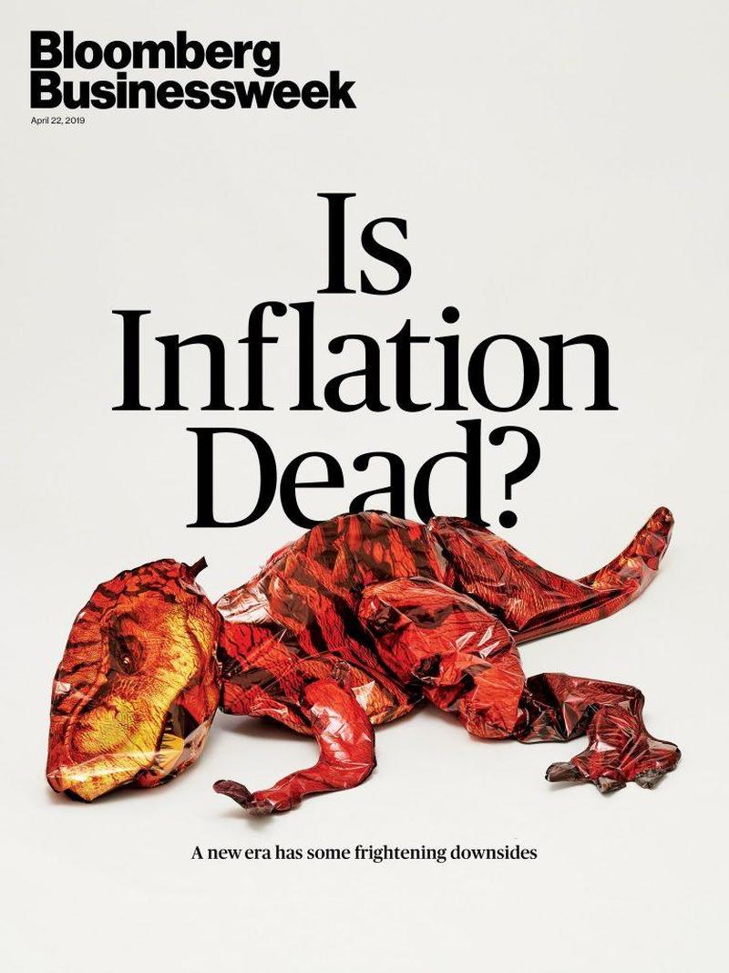
My impression is that this recent Business Week magazine cover about a New Era is much like the 1979 “Death of Equities” cover – more a reflection of confidence in a decade of past experience than an indication of future prospects.
Keep Me Informed
Please enter your email address to be notified of new content, including market commentary and special updates.
Thank you for your interest in the Hussman Funds.
100% Spam-free. No list sharing. No solicitations. Opt-out anytime with one click.
By submitting this form, you consent to receive news and commentary, at no cost, from Hussman Strategic Advisors, News & Commentary, Cincinnati OH, 45246. https://www.hussmanfunds.com. You can revoke your consent to receive emails at any time by clicking the unsubscribe link at the bottom of every email. Emails are serviced by Constant Contact.
The foregoing comments represent the general investment analysis and economic views of the Advisor, and are provided solely for the purpose of information, instruction and discourse.
Prospectuses for the Hussman Strategic Growth Fund, the Hussman Strategic Total Return Fund, the Hussman Strategic International Fund, and the Hussman Strategic Dividend Value Fund, as well as Fund reports and other information, are available by clicking “The Funds” menu button from any page of this website.
Estimates of prospective return and risk for equities, bonds, and other financial markets are forward-looking statements based the analysis and reasonable beliefs of Hussman Strategic Advisors. They are not a guarantee of future performance, and are not indicative of the prospective returns of any of the Hussman Funds. Actual returns may differ substantially from the estimates provided. Estimates of prospective long-term returns for the S&P 500 reflect our standard valuation methodology, focusing on the relationship between current market prices and earnings, dividends and other fundamentals, adjusted for variability over the economic cycle.

