

Yikes


John P. Hussman, Ph.D.
President, Hussman Investment Trust
September 2020
The most striking similarity between the 1920s and 1990s bull markets is the notion that traditional measures of stock valuation had become obsolete.
– Edward Chancellor, Devil Take The Hindmost
You know it’s a bubble when you have to edit the Y axis on all of your charts because valuations have broken above every historical peak, and estimated future market returns have fallen beyond the lowest points in history, including 1929.
One of the things to remember about investing is that the higher the price you pay today, for a given stream of future cash flows, the lower the long-term returns you can expect. It’s exactly when past returns are most glorious that future prospects are most dismal.
Still, it’s also clear that if overvaluation alone was enough to drive prices lower, the market could never reach the sort of extreme hypervaluation we saw in 1929 and 2000, nor the dismal long-term prospects those valuations created.
So we have to distinguish between long-term returns, which are driven by valuations, and returns over shorter segments of the market cycle, which are driven by investor psychology.
When investors are inclined toward speculation, they tend to be indiscriminate about it. In market cycles across history (including the most recent one), we’ve find that the most reliable gauge of whether investors are inclined toward “speculation” or “risk-aversion” is the uniformity of market internals across thousands of stocks, industries, sectors, and security-types, including debt securities of varying creditworthiness.
It’s worth repeating that the entire total return of the S&P 500 during the complete market cycle from 2007-2020 occurred during periods when our measures of market internals were uniformly favorable, with T-bills outpacing the S&P 500 with lower risk otherwise. As I’ve detailed extensively, the one thing that made the recent bull market “different” from prior market cycles was that historically-reliable “overvalued, overbought, overbullish” extremes did nothing to contain speculation amid the novelty of zero interest rate policy. In 2017, we abandoned our willingness to pre-emptively adopt a bearish outlook in response to these syndromes if our measures of internals are still favorable.
That’s not to say that the market always declines when internals are unfavorable. Rather, whatever gains the S&P 500 enjoys in excess of T-bills when internals are unfavorable, even during the late stages of a bubble, typically prove to be impermanent.
One of the things to remember about investing is that the higher the price you pay today, for a given stream of future cash flows, the lower the long-term returns you can expect. It’s exactly when past returns are most glorious that future prospects are most dismal.
There’s enormous value in understanding that market valuations are the main drivers of long-term investment returns and the extent of potential market losses over the complete market cycle, while investor psychology typically matters more over shorter segments of the market cycle. Sufficiently extreme conditions can still warrant a neutral outlook even in periods when internals are favorable, but in general, it’s best to avoid a hard-negative outlook when internals are favorable, and to avoid leveraged or fully-unhedged investment stances when they are unfavorable.
So we’re clear – psychology and internals matter, and we’ll discuss those more shortly.
But from a valuation standpoint …
Yikes
The most important observation about market valuations here is that while a decade of zero interest rate policy has encouraged yield-seeking speculation in stocks, the resulting extreme in stock market valuations has also driven likely 10-12 year S&P 500 nominal total returns below zero. The same outcome accompanied the decade following the 2000 market peak.
The chart below shows our estimate of average annual nominal total returns for a conventional passive portfolio mix invested 60% in the S&P 500, 30% in Treasury bonds, and 10% in Treasury bills. As of August 28, that estimated 12-year total return has declined to -0.95%, easily the lowest level in history, including the extreme low associated with the 1929 market peak. The red line shows actual realized total returns on this portfolio mix over the same 12-year periods.
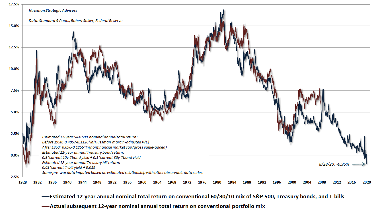
As I’ve regularly observed, 12-year periods that end at bubble extremes enjoy higher returns than one would have projected at the beginning of the period. That’s why you see an “error” in 1988 between projected return in blue, which reflects 1998 valuations, and the actual subsequent return in red, which reflects performance that benefited from an advance to extreme bubble valuations in 2000. That’s also why you also see an “error” between projections based on 2004-2008 valuations and actual subsequent 12-year returns – because valuations have climbed to increasing bubble extremes during the 2016-2020 period. From that, we can also infer that provided we rely on extreme bubble valuations 12 years from today, passive investors might enjoy a return of more than -0.95% between now and 2032.
How much higher? Well over the past two decades, S&P 500 revenues and U.S. nominal GDP have grown at an average annual rate of about 4%. Assuming that profit margins remain elevated and valuations remain at current extremes, prices would grow at that same 4% nominal rate. Add a 1.6% S&P 500 dividend yield, assume that dividends also grow over time, and I’d estimate that never-ending bubble valuations would imply average annual nominal total returns of about 5.6% for the S&P 500, assuming one actually wishes to rely – with the same confidence as Irving Fisher in 1929 – on a “permanently high plateau.”
Given T-bill yields of about 0.10% and Treasury bond yields of about 0.78% on a 12-year horizon, the optimistic, bubble-dependent expectation for a conventional, passive, 60/30/10 portfolio mix is then 0.6(5.6%) + 0.3(0.78%) + 0.1(0.10%) = 3.60%. That’s your optimistic projection.
Investors are not likely to find an alternative to hypervalued stocks and bonds in some undiscovered asset that they can passively hold instead. The alternative is patient, value-conscious discipline, flexible to changes in valuations, market internals, and other factors. Examine market history, and you’ll notice that the profile of expected returns is constantly changing, and occasionally spikes higher. Those upward spikes in projected returns are driven by downward spikes in valuations. The best opportunity to embrace market risk, in my view, is when a material retreat in valuations is joined by an early improvement in the uniformity of market internals.
The next few charts may help to reinforce your perspective of where valuations stand in a historical, full-cycle context. While these extremes don’t necessarily imply immediate market losses, there is strong reason to expect poor long-term market returns to unfold from these extremes, and as we’ll discuss below, there is also increasing reason to view even near-term market prospects with concern.
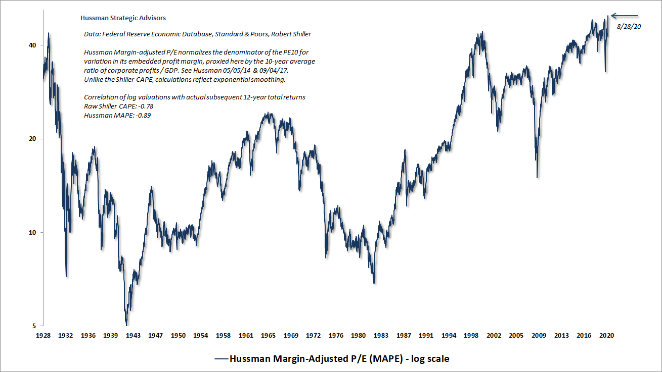
The chart below shows our Margin-Adjusted P/E (MAPE), which is among the valuation measures we find best-correlated with actual, subsequent S&P 500 total returns in market cycles across history. I had to change the Y axis on this chart, because the one I’ve used for years could no longer contain current extremes.
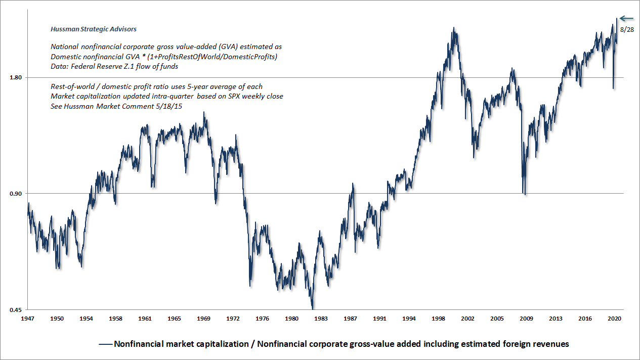
The next chart shows our measure of nonfinancial market capitalization to corporate gross value-added (including our estimate of foreign revenues). I introduced MarketCap/GVA in 2015, and it remains the most reliable valuation measure that we’ve studied across history. Again, I had to raise the Y axis because the current figure literally went off the chart.
The most important observation about market valuations here is that while a decade of zero interest rate policy has encouraged yield-seeking speculation in stocks, the resulting extreme in stock market valuations has also driven likely 10-12 year S&P 500 nominal total returns below zero.
To offer a sense of where the market is in the complete cycle, the next chart emphasizes the difference between “durable” and “transient” market returns across history. The red “stairstep” line on this chart shows levels of the S&P 500 that were never again breached to the downside. We don’t actually know where to draw the current red line with certainty, but history suggests that it’s roughly at the level of the green line, representing run-of-the-mill historical valuation norms.
Notice something. Over a century of market cycles, “durable” market gains typically represented advances that brought the S&P 500 (blue line) up toward historical valuation norms (green line). In contrast, “transient” market gains typically represented advances that took the S&P 500 far beyond historical valuation norms. Those excessive advances were regularly erased over the completion of the cycle, or even the following cycle, as was the case between 2000 and 2009.
It’s worth remembering that, despite two intervening speculative bubbles, the S&P 500 lagged Treasury bills for the overall period from May 1995 to March 2009. That’s what I mean by “transient” returns.
The difference between the current S&P 500 (blue line) and valuation norms (green line) has never been so extreme.
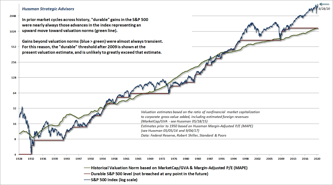
It should not be a surprise that I expect the S&P 500 to lose about two-thirds of its value over the completion of the current market cycle. Such a decline would simply bring valuations to run-of-the-mill historical norms. It would not bring valuations to the below-average levels that have typically characterized durable market lows. Still, while long-term market returns are likely to be quite disappointing from current extremes, there will be countless interesting detours during that long and very interesting trip to nowhere.
Valuations change. Market internals change. We need not predict the trajectory of the wind. We just need the willingness, discipline, and wisdom to adjust the sails.
It’s worth remembering that, despite two intervening speculative bubbles, the S&P 500 lagged Treasury bills for the overall period from May 1995 to March 2009. That’s what I mean by “transient” returns.
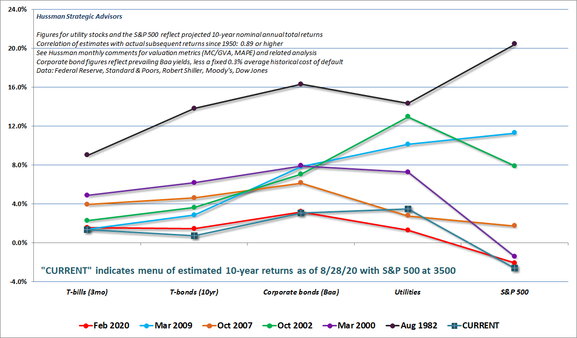
The chart below is a useful way to think about the relationship between interest rates and stock valuations. Each line corresponds to a particular date, and shows the prospective returns implied by prevailing valuations of various investment choices at those dates. While interest rates are certainly low, they have also helped to amplify speculation in stocks, to the point where our projection of 12-year returns for stocks is actually lower than the likely return on Treasury bonds.
All of the methods in the chart below have a correlation of 0.89 or greater with actual subsequent returns across history. The profile of likely returns across major asset classes is easily the worst in history. My impression is that utilities have lower valuations and higher estimated returns than in February largely because their enormous debt loads create heightened concerns about bankruptcy risk.
Investors are not likely to find an alternative to hypervalued stocks and bonds in some undiscovered asset that they can passively hold instead. The alternative is patient, value-conscious discipline, flexible to changes in valuations, market internals, and other factors.
Below the surface
One of the features of our measures of market internals is that they can be unfavorable even when the S&P 500 is hitting new highs, and can become positive even when the market seems quite weak. The critical thing to remember is that we need to look below the surface. That’s why they’re called internals.
Presently, one of the striking aspects of market behavior is the lack of confirmation that has accompanied recent market highs. While the S&P 500 and the Nasdaq Composite have pushed to record highs, neither the broad NYSE Composite, small-cap Russell 2000, Dow Industrials, Dow Utilities, or Value Line indices have breached their February peaks. Likewise, daily market action has increasingly featured divergences, with more declining stocks than advancing stocks even on days when the S&P 500 moves higher, with increasing implied volatility in stock index options even on market advances. Likewise, nearly half of all U.S. stocks remain below their respective 200-day moving averages.
There’s enormous value in understanding that market valuations are the main drivers of long-term investment returns and the extent of potential market losses over the complete market cycle, while investor psychology typically matters more over shorter segments of the market cycle. Sufficiently extreme conditions can still warrant a neutral outlook even in periods when internals are favorable. Still, in general, it’s best to avoid a hard-negative outlook when internals are favorable, and to avoid leveraged or fully-unhedged investment stances when they are unfavorable.
Meanwhile, we’re observing extremely lopsided bullishness, with Investors Intelligence reporting 60% bulls and just 16.2% bears among investment advisors – the widest spread since the January 2018 pre-correction peak. The National Association of Investment Managers reports that the average exposure of its members is presently 106.6%. While the most bearish exposure reported by NAAIM members is typically a short position with an average value of about -80%, the most bearish position currently reported among NAIAIM members is a 50% long position. Again, the only time we’ve observed similar bullishness was at the January 2018 pre-market peak.
In this context, it’s worth observing that the trajectory of the S&P 500 since January 2018 has taken the form of a huge “megaphone,” punctuated by multiple corrections that have regularly wiped out the market’s interim progress, as we saw in late-2018, May 2019, August 2019, and again early this year. Between January 26, 2018 and April 21, 2020, the total return of the S&P 500 index was negative. In my view, it’s primarily the blind faith of investors in a “Fed backstop” in recent months that has enabled an extension of market valuations to the most extreme levels ever observed in history.
In the options market, the 5-day equity put/call ratio on the Chicago Board Options Exchange has dropped to just 0.406, the lowest level in nearly 20 years, last seen briefly in January 2001, during the first bear market rally of the 2000-2002 market collapse. The lack of investor interest in put options reflects extreme confidence that the Fed has already given them a “put” in the form of a monetary “backstop.” The closest the put/call has come to this level in recent years was on April 15, 2010, immediately before a 16% correction. Extreme bullishness can and often does coincide with ragged internals, and the combination is often quite unfavorable, because it’s a sign that “surface” speculation rests on a weak foundation.
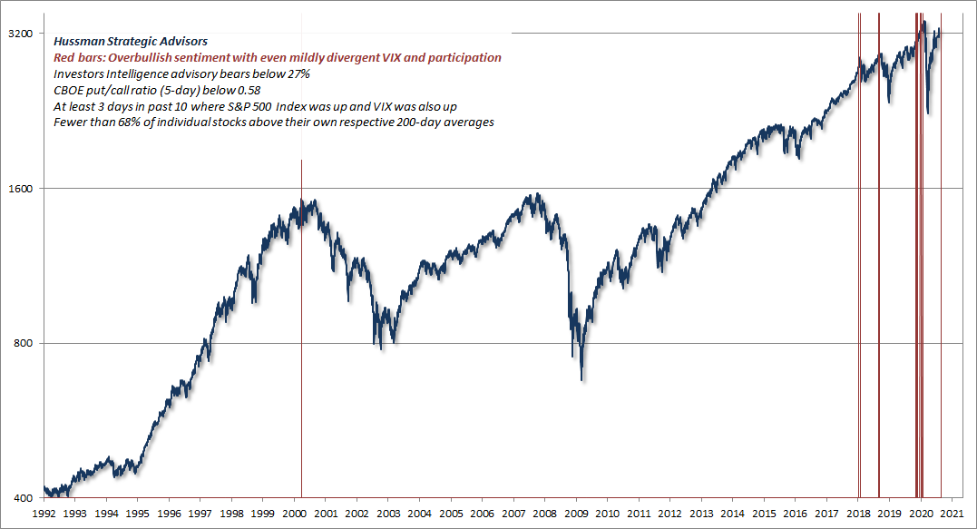
In recent weeks, we’ve also begun to observe various syndromes of conditions that we monitor in daily data, which have historically been vulnerable to abrupt “air pockets” or sustained declines. The chart below, for example, shows periods that join overbullish sentiment with even mildly divergent behavior in implied volatility and market participation. Specifically, the red bars identify instances when advisory bears were below 27%, the CBOE put/call ratio was below 0.58, at least 3 days in the past 10 combined an advance in the S&P 500 with an increase in the VIX, and fewer than 68% of individual stocks were above their own respective 200-day averages. Notably, every steep correction since January 2018 has been preceded by these conditions, not to mention the precise market top in March 2000.
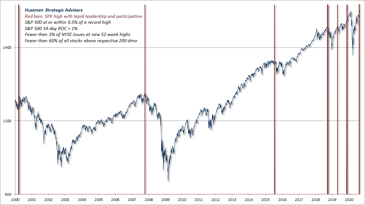
Another interesting combination features the S&P 500 within 0.5% of a 5-year high, a 14-day change in excess of 1%, with fewer than 3% of NYSE issues at new 52-week highs and fewer than 60% of individual stocks above their own 200-day averages. Again, while these conditions are quite simple, the combination of market highs and tepid internals is often a warning sign.
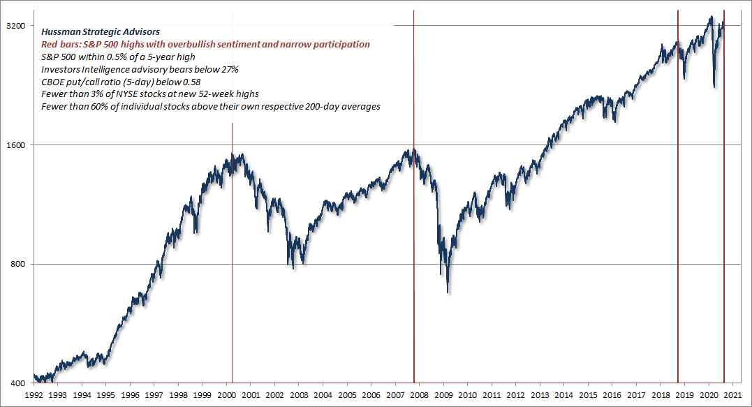
An even less frequent variant that we presently observe in daily data is the combination of S&P 500 highs and narrow participation, adding extremely lopsided sentiment. The chart below shows points when the S&P 500 was within 0.5% of a 5-year high, advisory bears were below 27%, the CBOE put/call ratio was below 0.58, fewer than 3% of NYSE stocks were at 52-week highs, and fewer than 60% of individual stocks were above their own 200-day averages. The instances here are quite limited and rather precise, occurring within days of the March 2000 peak, the October 2007 peak, the September 2018 pre-correction peak, and today.
None of these are forecasts, but they illustrate the confluence of negative factors and syndromes that we are presently observing. It should also be clear that none of this is new. They are just variants of risk factors that I’ve noted in real-time across decades of market cycles.
One of the best indications of the speculative willingness of investors is the ‘uniformity’ of positive market action across a broad range of internals. Probably the most important aspect of last week’s decline was the decisive negative shift in these measures… This is much like what happens when a substance goes through a ‘phase transition,’ for example, from a gas to a liquid or vice versa. Portions of the material begin to act distinctly, as if the particles are choosing between the two phases.
– John P. Hussman, Ph.D., July 30, 2007
The information contained in earnings, balance sheets, and economic releases is only a fraction of what is known by others. The action of prices and trading volume reveals other important information that traders are willing to back with real money. This is why trend uniformity is so crucial to our Market Climate approach. Historically, when trend uniformity has been positive, stocks have generally ignored overvaluation, no matter how extreme. When the market loses that uniformity, valuations often matter suddenly and with a vengeance. This is a lesson best learned before a crash rather than after one.
– John P. Hussman, Ph.D., October 3, 2000
Glamour stock FOMO
Overall, we have a hypervalued market that we associate with the worst prospective 10-12 year market returns in the history of the U.S. financial markets, along with extreme bullish sentiment, tepid participation, breadth, and leadership, as well as divergent implied volatility.
Despite all of this, I’ve refrained from aggressively “fighting” the recent market advance by amplifying an already bearish outlook. I certainly believe that hedges, safety nets, tail-risk positions and the like are essential, and would welcome a steep shift in valuations that would provide investors with more satisfactory long-term return prospects.
Valuations change. Market internals change. We need not predict the trajectory of the wind. We just need the willingness, discipline, and wisdom to adjust the sails.
Still, while broad uniformity remains tepidly borderline, speculators definitely have the bit in their teeth where large glamour stocks are concerned. The “fear of missing out” (FOMO) is palpable, with some stocks vaulting 25% in a single day. When this parabola breaks, I doubt that it will matter much if your hedges are out-of-the-money by 5% instead of 1%. In the interim, though, it’s been helpful not to bare the whole claw. Meanwhile, watch credit spreads. If they begin to widen materially, buckle up.
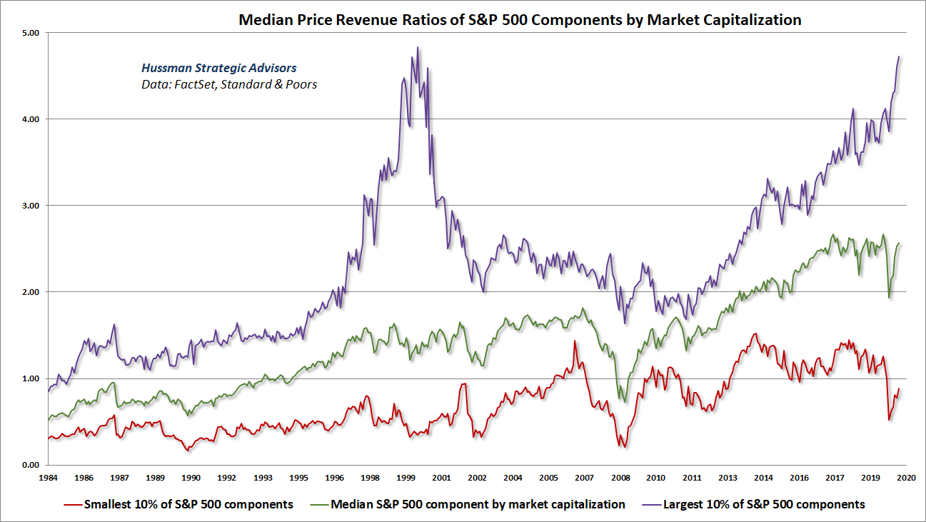
To offer a sense of the mania in overvalued, large-cap glamour stocks that’s driving the market here, the chart below shows the median price/revenue multiple of S&P 500 stocks by decile. Thanks to Russell Jackson, our resident math guru, for compiling the data here. Each line shows 10% of the S&P 500. Notably, the top 4 deciles, representing the most richly valued 40% of S&P 500 components, have exceeded their February highs, while the other 6 deciles have not. Among S&P 500 components as a whole, the median price/revenue ratio remains 50% above the 2000 extreme.
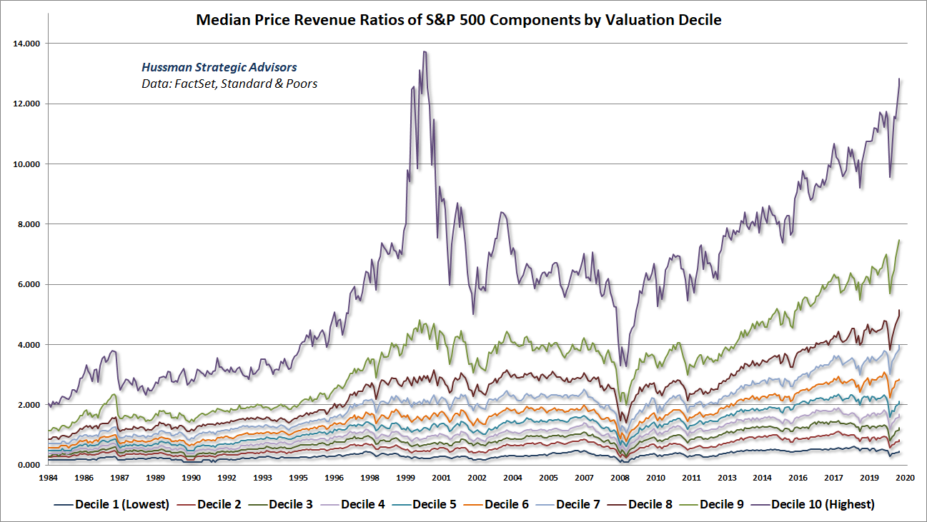
What’s notable is the rabid focus of investors on stocks with the largest market capitalizations. In my August comment, I discussed the effect of passive investment strategies, and what Benjamin Graham described as the “untold mischief” that they contributed in the 1929 market bubble. Everyone wants to treat the enthusiasm for passive strategies as something novel and durable, when a careful reading of market history, including the 1929 bubble, the Nifty Fifty bubble, and the 2000 tech bubble, would more accurately label a bubble in passive investments and glamour stocks as the terminal stage of performance-chasing pile-ins.
As Graham & Dodd lamented in the depths of the Great Depression, “The notion that the desirability of a common stock was entirely independent of its price seems incredibly absurd. Yet the new-era theory led directly to this thesis… An alluring corollary of this principle was that making money in the stock market was now the easiest thing in the world. It was only necessary to buy ‘good’ stocks, regardless of price, and then to let nature take her upward course. The results of such a doctrine could not fail to be tragic.”
Over the past 5 years, the revenues of S&P 500 technology companies have grown at a compound annual rate of 12%, while the corresponding stock prices have soared by 56% annually. Over time, price/revenue ratios come back in line. Currently, that would require an 83% plunge in tech stocks (recall the 1969-70 tech massacre). The plunge may be muted to about 65% given several years of revenue growth. If you understand values and market history, you know we’re not joking.
– John P. Hussman, Ph.D., March 7, 2000
The tech-heavy Nasdaq 100 would lose an implausibly precise 83% by October 2002.
A continuing incubation phase
The real amplification of downside risks is likely to accompany a sharp widening in credit spreads. In my view, even the Federal Reserve’s use of CARES funds to buy outstanding corporate bonds will not produce solvency across the mountain of commercial real estate, mortgage, consumer, municipal, and corporate debt that I believe is quietly deteriorating. No need to make predictions. We’ll continue to monitor the full range of securities and respond accordingly.
I’ll repeat, as a side note, that the Fed’s use of “leverage” to buy existing corporate securities from investors, beyond CARES funds specifically allocated by the Treasury for this purpose, without 13(3) collateral apart from the bonds themselves, and without limiting its support to companies that are “unable to secure adequate credit accommodations from other banking institutions” – are all in explicit violation of CARES 4003(c)(3)(B). When public funds can be used by bankers to bail out private losses, obeying the law has never been the Federal Reserve’s strong suit. That’s particularly true when Wall Street stands ready to hire you as a “consultant” as soon as you leave the Fed or the Treasury, and pay you $250,000 per “speech.” No surprise that such benefits have accrued to Bernanke and Geithner. Call me cynical.
Meanwhile, it’s not at all clear that investors recognize that federal deficit spending amounted to over 40% of second-quarter real GDP, yet the majority of this support has been terminated. I suspect that September will be the first month of rather widespread credit delinquencies, and that as during 2008, there is a quiet incubation of credit strains growing underneath the veneer of record highs and Fed stick-saves.
“We took the risk of a financial system collapse off the table.”
– Neel Kashkari, Federal Reserve, 8/14/20
The response of the Fed and the bailout of Bear Stearns, “from my perspective, takes the liquidity issue for the entire industry off the table.”
– Dick Fuld, Chairman, Lehman Brothers, 3/17/08
Last week, Fed Chair Jerome Powell announced a “commitment” to tolerate higher inflation, “averaging” but periodically exceeding 2%, without responding with higher rates. This essentially amounts to targeting negative real interest rates, which is likely to be supportive of precious metals and real assets more generally, provided that their valuations are not extreme. The problem with extreme valuations, as we observe in stocks, is that they are already priced at levels consistent with negative expected real returns for well over a decade.
From an economic standpoint, it’s almost laughable that the Federal Reserve has persisted in this sort of dogmatic, magical thinking, as if its actions exert any reliable control over unemployment and inflation; as if there is actually a Phillips Curve tradeoff that can be exploited to achieve its “dual mandate.” As I’ve noted before, every U.S. economic recovery has followed a nearly identical mean-reverting trajectory: the output gap, measured at the bottom of the recession, contracts by about 8% per quarter, regardless of the aggressiveness of monetary policy.
There’s no linear or reliable relationship between Fed policy variables and inflation. In fact, the best predictor of inflation is not money creation (largely a swap of an interest-bearing government liability for a different one that bears no interest), or GDP growth, or the output gap, or even unemployment. The best predictor of inflation is the rate of inflation itself. That’s because inflation has an enormous psychological component.
To the extent that anything affects inflationary psychology, inflation tends to emerge when government deficits become so “cyclically excessive,” relative to the position of the economy in its cycle, that investors develop revulsion toward government liabilities of all stripes. The shift in psychology tends to be particularly strong if large deficits occur in an economy where the supply of goods and services is constrained. Given the depth of this economic retreat, the belief that large deficits will be temporary, and the lack of clear supply shocks, it doesn’t appear that these conditions are in place yet, but the increasing interest in precious metals suggests that inflationary pressures may take on a life of their own at some point – independent of the particular stance of Fed policy.
It’s a nefarious delusion to believe that direct effects on inflation and unemployment are the sole considerations for monetary policy. As we saw in the global financial crisis, it’s the later, indirect effects of easy money that are most destructive to employment and economic stability. The Fed is like a guy who imagines that repeatedly pushing a button will control the economy, when the button is actually wired to the pleasure center in Davey Day Trader’s brain, along with millions of other speculators whose bubble-chasing behavior creates the setup for yet another financial collapse.
Nobody needs your promise to lay on that button, Jay. The only activities enabled by zero yields are those that can’t survive even a tiny hurdle rate. They’re activities where leveraged finance is the primary cost of doing business. That’s how an activist Fed has created a yield-seeking bubble and the issuance of a mountain of low-grade debt that puts 1929 to shame.
Capital needs to cost something for a dynamic economy to work.
– Sheila Bair, former FDIC Chair
Keep Me Informed
Please enter your email address to be notified of new content, including market commentary and special updates.
Thank you for your interest in the Hussman Funds.
100% Spam-free. No list sharing. No solicitations. Opt-out anytime with one click.
By submitting this form, you consent to receive news and commentary, at no cost, from Hussman Strategic Advisors, News & Commentary, Cincinnati OH, 45246. https://www.hussmanfunds.com. You can revoke your consent to receive emails at any time by clicking the unsubscribe link at the bottom of every email. Emails are serviced by Constant Contact.
The foregoing comments represent the general investment analysis and economic views of the Advisor, and are provided solely for the purpose of information, instruction and discourse.
Prospectuses for the Hussman Strategic Growth Fund, the Hussman Strategic Total Return Fund, the Hussman Strategic International Fund, and the Hussman Strategic Allocation Fund, as well as Fund reports and other information, are available by clicking “The Funds” menu button from any page of this website.
Estimates of prospective return and risk for equities, bonds, and other financial markets are forward-looking statements based the analysis and reasonable beliefs of Hussman Strategic Advisors. They are not a guarantee of future performance, and are not indicative of the prospective returns of any of the Hussman Funds. Actual returns may differ substantially from the estimates provided. Estimates of prospective long-term returns for the S&P 500 reflect our standard valuation methodology, focusing on the relationship between current market prices and earnings, dividends and other fundamentals, adjusted for variability over the economic cycle.