

Repricing a Market Priced for Zero


John P. Hussman, Ph.D.
President, Hussman Investment Trust
April 2022
Having experienced the damage that asset price bubbles can cause, we must be especially vigilant in ensuring that the recent experiences are not repeated.
– Ben Bernanke, Federal Reserve Chair, January 3, 2010
Buckle up, buttercup.
The most challenging financial event for investors in the coming decade will be the repricing of securities to valuations that imply adequate long-term returns, following more than a decade of reckless and intentional Fed-induced yield-seeking speculation.
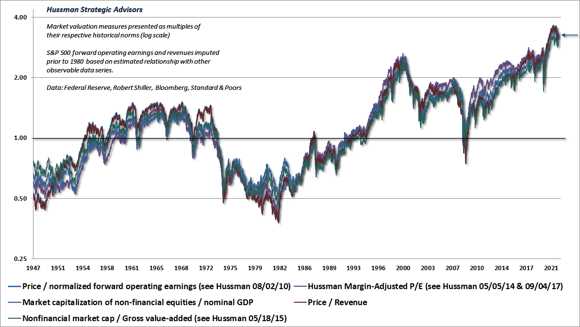
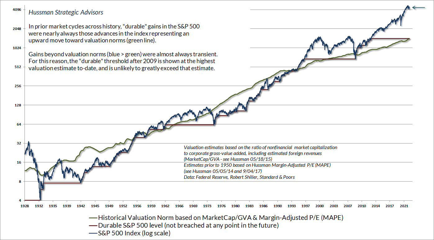
The chart below updates the status of our most reliable stock market valuation measures, based on their correlation with actual subsequent S&P 500 total returns in market cycles across history. Their historical profiles are largely indistinguishable. The arrow shows the current level of valuation, which remains above every valuation extreme observed prior to 2020. Indeed, our Margin-Adjusted P/E (MAPE), for which a century of data is available, remains beyond its 1929 peak.
Each measure is shown as a ratio to the historical norm associated with run-of-the-mill subsequent S&P 500 total returns of 10% annually. To say that recent market highs approached 3.6 times those historical norms is essentially to say that average S&P 500 total returns are likely to be nowhere near 10% annually during the coming 10-20 years.
Indeed, measured from the recent market peak, I expect S&P 500 total returns to be negative, on average, for well over a decade – an outcome I also projected at the 2000 market peak. That said, if a steep market decline was to front-load those losses, investors could also enjoy prospects for satisfactory long-term returns even a year or two from now. It’s current valuation extremes, and the dismal long-term returns they imply, that long-term investors may want to think twice about locking in.
Meanwhile, be careful not to interpret valuations as near-term market forecasts. That’s not how valuations work. The main thing that determines whether an overvalued market continues to advance, or drops like a rock instead, is whether investor psychology is inclined toward speculation or risk-aversion. When investors are inclined to speculate, they tend to be indiscriminate about it. When investors become risk-averse, they tend to be skittish and selective. For that reason, our most reliable gauge of speculation versus risk-aversion is the uniformity or divergence of market internals – across thousands of individual stocks, industries, sectors, and security types, including debt securities of varying creditworthiness.
As I wrote at the 2000 bubble peak, “When the market loses that uniformity, valuations often matter suddenly and with a vengeance. This is a lesson best learned before a crash rather than after one. Valuations, trend uniformity, and yield pressures are now uniformly unfavorable, and the market faces extreme risk in this environment.” That’s the same environment we face at present, but as those conditions change, so will our market outlook.
Put simply, the most severe market losses tend to emerge when elevated valuations are joined by deterioration and divergence in market internals, suggesting risk-aversion among investors. Conversely, the strongest opportunities tend to emerge when a material retreat in valuations is joined by broad uniformity in market internals, suggesting speculative psychology among investors.
In previous market cycles across history, there were limits to speculation – once market conditions featured a combination of extreme valuations, steeply overbought conditions, and lopsided bullish sentiment, those “overvalued, overbought, overbullish” syndromes typically signaled sharp downside risk even before the “uniformity” of market internals deteriorated. Amid the novelty of the Federal Reserve’s zero-interest rates policies, those historically reliable limits became painfully irrelevant. For our part, we ultimately adapted to deranged Fed policies by becoming content to gauge the presence or absence of speculative psychology – based on the uniformity or divergence of market internals – without assuming that either speculation or risk-aversion have reliable limits.
The most severe market losses tend to emerge when elevated valuations are joined by deterioration and divergence in market internals, suggesting risk-aversion among investors. Conversely, the strongest opportunities tend to emerge when a material retreat in valuations is joined by broad uniformity in market internals, suggesting speculative psychology among investors.
So yes, this time was different, but in a very dangerous way. Faced with a zero-interest rate world that combined “fear of missing out” with a belief that “there is no alternative” to yield-seeking speculation, investors unwittingly drove the most reliable stock market valuation measures to levels beyond the 1929 and 2000 extremes. Unfortunately, those valuations also imply dismal long-term returns in any world not permanently dominated by FOMO and TINA psychology. Measured from the recent bubble peak, the likely consequence will be a long, interesting, 10-20 year trip to nowhere for the S&P 500. There’s also a strong possibility of an interim loss in the S&P 500 in the range of 50-70% over the completion of this market cycle, or as we observed between 2000-2009, a sequence of cyclical lows punctuated by several extended recoveries.
Recall that the nominal total return of the S&P 500 lagged the return on Treasury bills from 1929-1947, 1966-1985, and 2000-2013. That’s 50 years out of an 84-year period – deflation, inflation, recession, expansion, war, peace – in the long-term only one thing mattered. It’s easy to understand these periods if you examine where market valuations stood at the beginning of each of those trips to nowhere. A “long, interesting trip to nowhere is nothing but an extended period of repricing, where the market begins at rich valuations and ends at normal or depressed valuations many years later.
The most challenging financial event for investors in the coming decade will be the repricing of securities to valuations that imply adequate long-term returns, following more than a decade of reckless and intentional Fed-induced yield-seeking speculation. Measured from the recent bubble peak, the likely consequence will be a long, interesting, 10-20 year trip to nowhere for the S&P 500. There’s also a strong possibility of an interim loss in the S&P 500 in the range of 50-70% over the completion of this market cycle, or as we observed between 2000-2009, a sequence of cyclical lows punctuated by several extended recoveries. I expect S&P 500 total returns to be negative, on average, for well over a decade – an outcome I also projected at the 2000 market peak.
Our most reliable market valuation measures stood near 3.6 times their historical norms at the beginning of 2022. If the possibility of a 70% market loss seems preposterous, punch 1/3.6-1 into your calculator. From the highs of the recent Fed-induced bubble, a 70% market loss would not even take the most reliable stock market valuation measures below their run-of-the-mill historical norms.
Likewise, if the possibility of a 10- to 20-year trip to nowhere for the S&P 500 Index seems preposterous, a bit of arithmetic may be useful. Over the past 10, 20, and 30 years, S&P 500 revenue growth has averaged less than 4% annually, including the impact of stock buybacks. Combining those two pieces of information, if the S&P 500 was simply to touch its historical valuation norms 20-years from today, without even breaking below those norms, the resulting average annual percentage change in the S&P 500 Index, measured from the recent bubble peak would be:
(1.04)(1/3.6)^(1/20)-1 = -2.45%
Adding expected dividend income would push that total return to roughly zero, but even 6% annual revenue growth would still leave the S&P 500 Index itself underwater. That basic arithmetic is why speculative bubbles have invariably been followed by long trips to nowhere.
Faced with a zero-interest rate world that combined “fear of missing out” with a belief that “there is no alternative” to yield-seeking speculation, investors unwittingly drove the most reliable stock market valuation measures to levels beyond the 1929 and 2000 extremes. Unfortunately, those valuations also imply dismal long-term returns in any world not permanently dominated by FOMO and TINA psychology. Measured from the recent bubble peak, the likely consequence will be a long, interesting, 10-20 year trip to nowhere for the S&P 500.
The chart below presents a self-contained lesson in the arithmetic that links valuations, growth in fundamentals, and subsequent returns, using the S&P 500 price/sales ratio as the relevant fundamental. The norms in the lower panel are charitable, and are based on median price/sales ratios over specific time-frames, rather than levels that correspond to historically normal returns. These figures imply that the price/sales ratio reached between 2.1 and 3.2 times its norms at the recent peak, although those particular norms are associated with somewhat below-average subsequent returns. In any event, the arithmetic doesn’t change much: 1/2.1-1 is -52.4%, and 1/3.2-1 is -68.8%. If you’ve got a calculator, and math doesn’t give you hives, working with this actual data will help to build your intuition about how long-term investment returns are determined.
But what about … ?
If your first reaction to extreme valuations begins with “but what about,” it will help to read my February market comment, Top Dollar For Top Dollar. It will help to clarify the relationships between valuations, interest rates, profit margins, Fed policy, market internals, and subsequent market returns. It’s true that low interest rates can encourage rich valuations; elevated profit margins can encourage investors to pay rich multiples on record earnings; and speculative psychology – best inferred from the uniformity of market internals – can encourage investors to rule out capital losses, and to chase stocks in the belief that safe liquidity is “inferior” regardless of the level of market valuations. Unfortunately, none of these factors mitigate the dismal long-term market returns implied by current valuation extremes, nor the likelihood of severe market losses over the completion of this cycle.
The chart below shows our most reliable valuation measure: the ratio of U.S. nonfinancial market capitalization to corporate gross-value added, including estimated foreign revenues (MarketCap/GVA), along with the yield on long-term Treasury bonds on the base axes. The vertical axis shows the actual subsequent average annual total return of the S&P 500 over the following 12-year period. Valuations and interest rates as of 12/31/21, along with the fitted 12-year return, are shown by the green dot.
Notice that while low interest rates can certainly encourage and accompany rich valuations, those rich valuations, in turn, are still associated with poor subsequent returns.
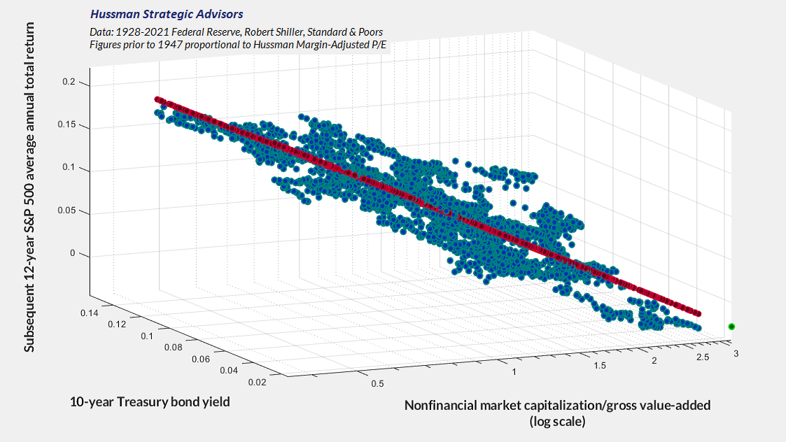
One of the common objections to our valuation work is to describe it as “curve-fitting” and “data-mining.” The difficulty with that objection is that the valuation measures here are really nothing but broad apples-to-apples price/revenue ratios, and the relationship between valuations and subsequent returns is linear. We do prefer a 12-year horizon to a standard 10-year one, because that’s where the “autocorrelation” between valuations at one point in time and another point in time typically reaches zero, but there’s nothing magical about that particular choice.
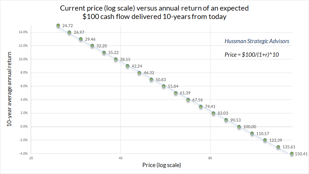
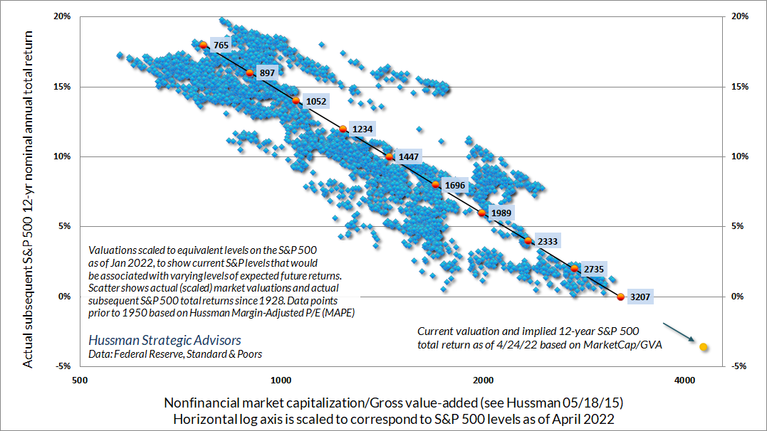
Consider our standard example of a security that will deliver a single $100 payment to its holder a decade from today. The chart below shows how the price of that security is related to its subsequent returns. Even for more general securities, the rule is simple: for any given set of expected future cash flows, a higher price implies a lower expected return. The prevailing level of interest rates can certainly affect the price that investors are willing to pay, but the moment the market price is actually observed, estimating the corresponding long-term return is just arithmetic.
The chart below shows the same principle in actual data since 1928. The horizontal axis is scaled to show the levels of the S&P 500 that would currently be associated with varying levels expected 12-year total returns. The implication here, which a century of evidence asks investors to take seriously, is that prospective S&P 500 total returns are negative at present, and it could take a decline to 3200 simply to bump prospective 12-year total returns up to zero.
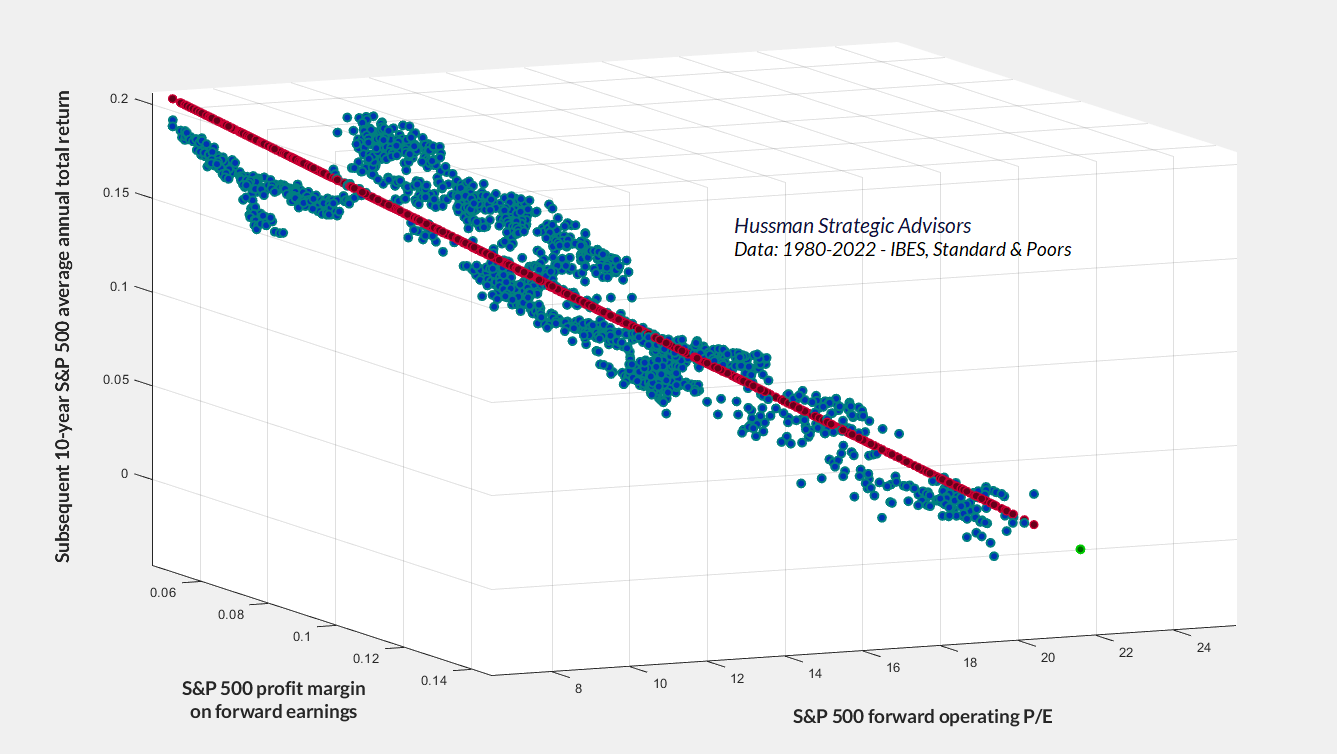
Keep in mind that stocks are not claims on a single year of earnings. They are claims on decades and decades of expected future cash flows that will be distributed to investors over time. Variations in profit margins, even elevated margins for several years, have surprisingly little effect on the present value of those cash flows. The moment you pay a high P/E multiple on earnings that embed a record profit margin, you require both the P/E and the margin to be sustained indefinitely. Otherwise, a retreat in either of them can entirely consume the benefit of long-term revenue growth. The chart below demonstrates this principle using the S&P 500 forward operating P/E and profit margin in data since 1980. The green dot shows the current fitted value.
Inside the bubble
The very nature of a bubble is that there’s an inside and an outside, an expanding reality-distortion field that assures people inside the bubble that they’re doing things that are rational and normal. But when the bubble bursts (and speculative bubbles always do), be prepared for reality to disagree.
– Seth Godin, March 18, 2022
Understandably, investors never actually believe, at the peak of a speculative bubble, that their behavior has been reckless at all. Every bubble progresses by recruiting a gleefully acrobatic squad of cheerleaders in the financial industry, readily available to offer “justification” for the speculative extremes. Describing the increasing use of margin debt to speculate in the runup to the 1929 bubble peak, for example, economist John Kenneth Galbraith observed that “much of the defense of the loans consisted in defending the levels of the market. It was not hard to persuade people that the market was sound; as always in such times they asked only that the disturbing voices of doubt be muted and that there be tolerably frequent expressions of confidence.”
At their extremes, bubbles invariably become dominated by glamourous stars and simplistic stories. The broad popularity of those glamour stocks contributes to eye-popping gains, fueled partly by legitimate growth in fundamentals, and vastly amplified by speculative expansion in the multiples that investors pay for those fundamentals.
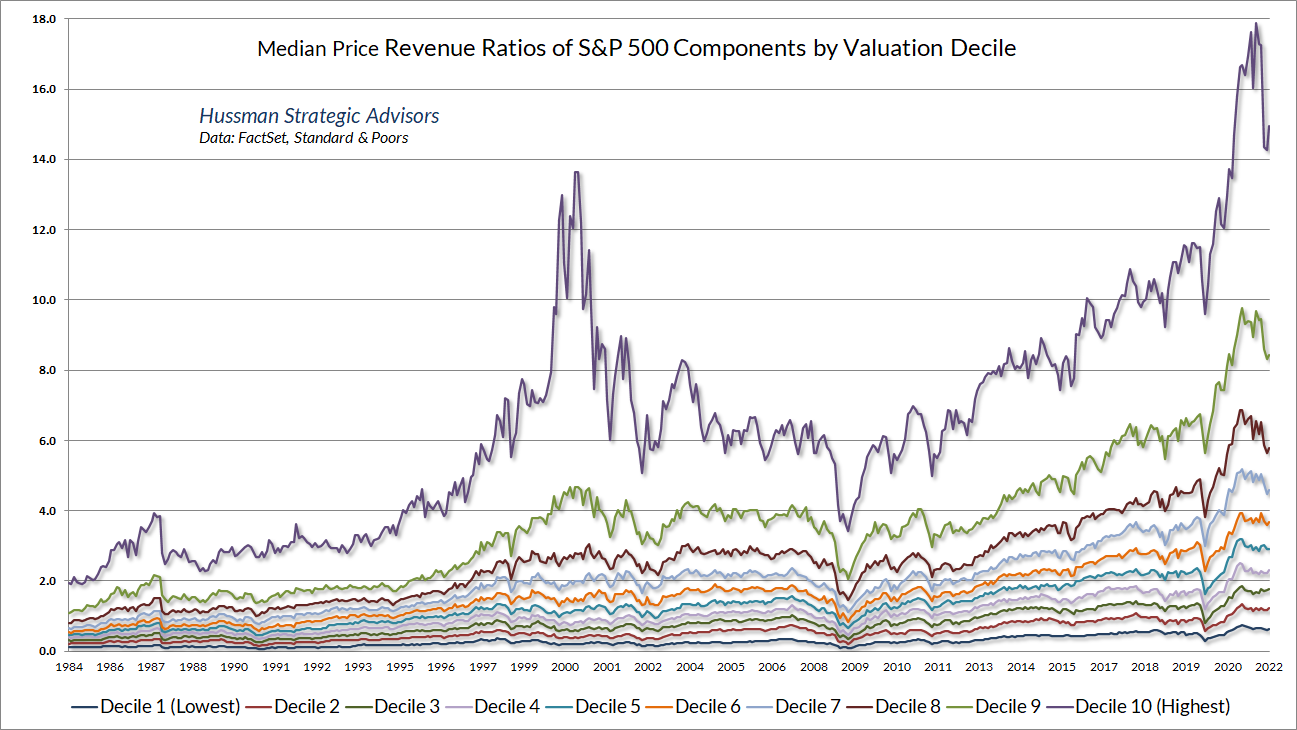
If investors imagine that the same thing has not occurred in recent years, they are mistaken. The only difference is that in the recent bubble, valuation multiples reached record extremes across every decile (10%) of stocks in the S&P 500, regardless of whether they were high multiple growth stocks, or low multiple retail and financial stocks. The chart below shows the median price/revenue ratio of S&P 500 components across each of these deciles.
Over the past 5 years, the revenues of S&P 500 technology companies have grown at a compound annual rate of 12%, while the corresponding stock prices have soared by 56% annually. Over time, price/revenue ratios come back in line. Currently, that would require an 83% plunge in tech stocks (recall the 1969-70 tech massacre). The plunge may be muted to about 65% given several years of revenue growth. If you understand values and market history, you know we’re not joking.
– John P. Hussman, Ph.D., March 7, 2000
Just before, well, an 83% plunge in the tech-heavy Nasdaq 100 Index
Among the 15 largest stocks in the Nasdaq 100 index at the 2000 peak, only four of them remain in the index: Microsoft, Cisco, Intel, and Qualcomm. The others either became defunct or were bought out after they collapsed. Of these four survivors, each of them had lost between 60% and 88% by the October 2002 market low. By March 2009, all were still down between 52% and 83% on a total return basis. It took until October 2015 for Microsoft to finally outperform Treasury bills from its March 2000 peak. It took until April 2019 for Qualcomm to do so. The others are still behind T-bills.
All of these were great companies, but for over 15 years, they were extremely disappointing investments, because investors imagined that their growth made their valuations irrelevant. As Benjamin Graham and David Dodd wrote after the collapse of the 1929 market bubble, “The notion that the desirability of a common stock was entirely independent of its price seems incredibly absurd. Yet the new-era theory led directly to this thesis. An alluring corollary to this principle was that making money in the stock market was the easiest thing in the world. It was only necessary to buy ‘good’ stocks, regardless of price, and then to let nature take her upward course. The results of such a doctrine could not fail to be tragic.”
During a speculative bubble, the appetite of investors to find “the next” – fill in the blank – releases a sewer of low-quality new issues by startup companies. As John Brooks observed of the late-1960’s “Go-Go” bubble, “In 1968-1969, what a promoter needed to launch a new stock, apart from a persuasive tongue and a resourceful accountant, was to have a ‘story’ – an easily grasped concept, preferably related to some current national fad or preoccupation, that sounded as if it would lead to profits. Such stories, like most stories, were best told quickly and concisely, and best of all within the name of the company itself.”
The greatest danger of speculative bubbles is that by their peak, they’ve taught investors all the wrong lessons. See, the only way valuations can reach extremes like 1929, and 2000, and today is by advancing above every lesser valuation, without consequence. In the process, investors “learn” that valuations are irrelevant; that stocks always recover; that the Fed or some other feature of the “new economy” can be relied on to drive prices ever higher. All of these “lessons” are dangerously incorrect. Unfortunately, they are only unlearned when the bubble collapses. Measured from the bubble peak, investors also typically experience a very long, interesting trip to nowhere for a decade or more. The correct lesson is this: market advances that steeply overshoot historical valuation norms generally prove to be transient over the complete market cycle.
Market crashes
One of the interesting features of long, interesting trips to nowhere is that much of the repricing can occur within a compressed period of time. For example, while the total return of the S&P 500 lagged Treasury bills between 2000-2013, a great deal of the damage was compressed into the 2000-2002 collapse, after which the market enjoyed a 5-year bull market before the global financial crisis emerged. So even though I frankly expect the S&P 500 to lag Treasury bills for a period between 10 and 20 years, I also expect very frequent periods of investment opportunity along the way. I would expect the best opportunities to emerge in periods when a material retreat in market valuations is joined by an improvement what I often describe as the “uniformity” of market internals.
A market crash is nothing but risk-aversion meeting a low risk-premium; upward yield pressure meeting an inadequate yield. Both features are necessary. Extreme valuations may set investors up for dismal long-term returns, and they may imply profound market losses over the complete market cycle – but so long as investors have the speculative bit in their teeth, extreme valuations can persist for a very long time before collapsing.
Once investor psychology shifts toward risk-aversion, everything changes. A trap door quietly opens, particularly if interest rates or other competing returns are rising. The collapse may not be immediate, but as the gap widens between the returns that investors demand, and the dismal returns that extreme valuations imply, a panic becomes increasingly likely, driven by investors simultaneously trying to lock in those extreme valuations. The problem is that every seller requires a buyer, and vertical price declines may be required to draw value-oriented investors to absorb the cascade of sell orders. Once a hypervalued market is joined by a shift toward risk-aversion (which we infer from deterioration in the uniformity of market internals), and other upward pressures on yields, it’s typically best to panic before everyone else does.
On Friday, September 1st, the S&P 500 rallied to a peak of 1520.77, capping a string of strong advances. Yet due to a deterioration of market action in a number of economically sensitive groups, our price trend model indicated that trend uniformity had shifted to an unfavorable condition, and we moved to defend our portfolios more fully against downside risk. On Friday September 15th, our yield trend model also shifted to a negative position, indicating that the overall trend of interest rates and other yields was upward and potentially hostile. The combination of all three factors – unfavorable valuation, unfavorable trend uniformity, and unfavorable yield trends – is what we identify as a Crash Warning. This does not mean that a crash is certain, but it does place the market in a condition which has historically occurred less than 3% of the time, and from which every major stock market crash has emerged.
– John P. Hussman, Ph.D., October 3, 2000
Interest rate repricing
In the bond market, the repricing of yields from their near-zero baseline is already underway. Since the beginning of the year, the yield on 2-year Treasury notes has surged from 0.5% to as high as 2.78%, briefly exceeding the yield on 10-year Treasury bonds and prompting concerns about an oncoming recession.
The chart below offers a sense of what the 2-year Treasury yield is “saying” about the federal funds rate. Historically, the 2-year yield has been a good indication of the likely average of the federal funds rate over the subsequent 9-month period. A 2.5% federal funds rate is what Fed governors mean when they talk about moving “above neutral.” There’s no assurance, of course, that the Fed will actually pursue this course and normalize policy. Fortunately, no forecasts are required. As usual, our own market outlook will be informed by the condition of valuations and market internals, and we’ll shift that outlook as the evidence shifts.
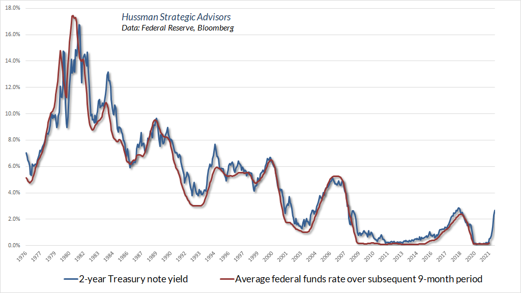
It’s a testament to the bald-faced recklessness of the Federal Reserve in recent years that the financial markets need to brace themselves in response to interest rates that are still among the lowest 20% of historical yields, and less than half the historical norm since 1970.
Unfortunately, investors have embedded near-zero yields into asset prices, as if rates would remain at those levels forever. Consider mortgage debt. The chart below shows the mortgage loan that a homeowner could obtain in return for a $1000 monthly payment, based on 30-year mortgage rates at each point in recent decades. While home affordability changes over time based on incomes and home prices, the steep plunge in the chart in recent months shows the impact of rising mortgage rates on the purchase amount that can be financed with a given payment. The same $1000 mortgage payment currently affords a loan 30% smaller than at the beginning of 2021.
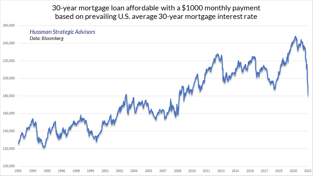
If one is a mortgage lender, the chart also shows the plunge in the market value of a 30-year mortgage loan over the past year. Because Treasury bonds include a face-value payment at maturity, the impact of rising rates has been even more severe for long-term bonds. Indeed, 30-year Treasury bonds have lost about one-third of their value since March 2020, which is striking given that the yield on 30-year Treasury bonds is still below 3%.
With regard to longer-term bonds, the historical fact is that, except during relatively weak economic conditions, the total return of 10-year Treasury bonds has historically lagged the return on T-bills when the bond yield has exceeded T-bill yields by less than about 2%. An example of “relatively weak economic conditions” might include year-over-year nominal GDP growth below the 10-year bond yield and an ISM Purchasing Managers Index near contraction levels. With the federal funds rate likely headed above 2% in a relatively short time, that rule-of-thumb implies that bonds are likely to be relatively undesirable until we see 10-year yields above 4%; alternatively, until relatively weak economic conditions emerge. At this point, neither is the case. Our broader bond market gauges are also fairly restrained at present.
On the precious metals front, gold-related stocks have historically performed much better during periods of falling interest rates (for example, a 10-year Treasury yield below its level of 6 months earlier) than rising ones. Favorable conditions for precious metals shares include inflation pressure, reasonable valuations, and very early indications of economic weakness. While the preliminary first quarter GDP report was negative, largely because of a steep drop in net exports, recession concerns would require deterioration in the labor market, which we don’t yet observe at this point. The current set of conditions suggests that this sector is a reasonable diversification, but a shift to falling rates, a weaker dollar, and a softer ISM Purchasing Managers Index would contribute to a more aggressive outlook, in my view.
As for more questionable “assets,” the loss of confidence in government liabilities has also contributed to some of the madness in cryptocurrencies in recent years. It’s certainly been fascinating to watch, but from the standpoint of valuation, “limited supply” is a meaningless attribute when anyone can costlessly introduce a new competing currency, and when these “digital assets” have neither aesthetic value, industrial use, collateral backing, nor fiat status to confer value. This makes the value of cryptocurrencies almost entirely dependent on psychological factors.
There will certainly be useful applications of blockchain in banking and payments. For example, “tokenized” dollars can already be used for instant payments. The tokens are just tokens. You buy them from an legitimate U.S. bank with dollars, transactions are validated using blockchain technology, you can convert them back to dollars, and their value doesn’t fluctuate. Perfectly legitimate payment mechanism. No need to waste the energy of a small country or be quietly fleeced by an oligarch.
Blockchain technology has numerous other applications that are distinct from speculating or “investing” in crypto. In my undoubtedly unpopular view, much of what’s occurring in cryptocurrencies is a form of wealth extraction, where people transfer their hard-earned savings to strangers in return for digital Pokémon that have no tether to value aside from speculative psychology. I suspect it will all ultimately prove to be like any other bubble: rewarding for the issuers – mostly the early “miners” who introduced the cryptocurrencies, and early speculators who can successfully locate a greater fool – and devastating for anyone who overstays the party.
Fed policy and the economy
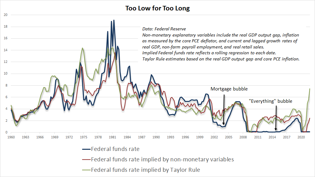
As I’ve detailed in prior market comments and Op-Ed articles, my views on Fed policy strongly lean toward more systematic conduct, where the policy tools of the Fed such as the fed funds rate maintain a reasonably stable and predictable relationship with observable economic data such as inflation, employment, and the “output gap” between real gross domestic product and its estimated full-employment potential.
Many observers are hyperventilating about the risks of normalizing Federal Reserve policy, but most of those consequences are unfortunately already baked in the cake after years of speculative recklessness. As I noted in The Fed policy error that should worry investors, the most profound “policy error” of the Fed is well behind it. That error was to abandon, for more than a decade, any systematic link between their policy variables and observable data.
I, you know I, honestly, didn’t know that was the case, or if someone talked to me about this before the thing was printed and sent up here, I don’t remember, that’s also a real possibility.
– Federal Reserve Chair Jerome Powell on why the section addressing systematic policy was omitted from the latest monetary policy report to Congress
It’s remarkable how strongly market participants overestimate the relationship between Fed policy variables and economic outcomes. The fact is that once you know current and past values of GDP growth, unemployment, inflation, and the output gap, adding information about Fed policy produces no material improvement at all in forecasts of subsequent economic outcomes.
That’s not to say that Fed policy is useless or irrelevant. Rather, whatever beneficial impact Fed policy may have is fully captured by the systematic, predictable component of policy that’s correlated with observable economic variables. Activist deviations beyond that predictable component have no beneficial impact, but can be profoundly detrimental by provoking speculative bubbles that subsequently collapse.
I can hear some of you screaming in defense of activist monetary intervention. But your screaming is evidence that you haven’t actually examined the data, and you’re instead relying on anecdotes – particularly the tendency for recessions to eventually follow periods of Fed tightening. What you’re missing here is the Fed typically tightens at the point where the capacity of the economy to expand supply has already become constrained. Even conceptually, the point of a Fed tightening isn’t to slow the economy. It’s to slow demand growth that has already run ahead of the economy’s capacity to produce new supply. The recessions that often follow are largely a reflection of imbalances and mismatches that were already underway by the time the Fed began tightening.
I’ll reiterate my view that recessions emerge not because of a general decline in the willingness to consume, but rather because a mismatch emerges between the mix of goods and services demanded in the economy, and the mix of goods and services that the economy has been supplying. Many industries experience continued growth during recessions (even if their stocks trade somewhat lower), while other industries experience profound demand shifts. In the late 1990’s, there was clear overinvestment in telecom and information technology, and these sectors suffered disproportionately during the recession that followed. In the current cycle, the overexpansion has been in housing, debt origination, and leveraged finance, so a much different group of stocks will probably be hung out to dry this time.
– John P. Hussman, Ph.D., Expecting a Recession, November 12, 2007
Conversely, the Fed typically eases fairly early into a recession, and continues to ease the whole way down. Much of that behavior is a systematic response to economic data, and may very well encourage an economic recovery. Recessions also typically encourage government deficits that do a great deal of heavy lifting. Still, the appropriate systematic component of monetary policy can be estimated using observable economic variables – and it’s easy to demonstrate that deviations of Fed policy variables from systematic responses have no beneficial relationship at all to subsequent economic outcomes. For more evidence on this point, see the section titled The destabilizing impact of activist Fed policy in my July 2021 comment What Triggered the Crash?
As a sidenote, based on average Treasury yields at the various points that the Fed has expanded its balance sheet, we estimate that the Federal Reserve’s $9 trillion balance sheet is now underwater. If the Fed was an actual bank, and if banks marked their assets to market value, the Fed would be insolvent. Of course, the Fed doesn’t mark to market, nor have banks done so since the early-2009 market low, when the Financial Accounting Standards Board relaxed FAS Rule 157 (which is actually what ended the global financial crisis – by making bank insolvency opaque). In effect, the Fed has created liabilities for which there is now no corresponding asset, and now finds itself wandering into fiscal policy, which is the sole domain of Congress. Needless to say, nobody cares.
Even without capital losses (which can be recovered by holding the bonds to maturity), the Fed will also go underwater if the interest it pays on reserve balances exceeds the interest it earns on the bonds it purchased. In this case, the Fed can be expected to book any loss as a “deferred asset.” As Ben Bernanke explained before Congress years ago, when the Fed books a loss as an asset, “it is an asset in the sense that embodies a future economic benefit that will be realized as a reduction of future cash outflows.”
What Bernanke meant with that hand-waving gibberish is this: Fed normally returns the interest received on its asset holdings back to the Treasury, for the benefit of the public. If the Fed’s bond purchases lose money, that interest will instead be used to cover losses. See, “it is an asset in the sense that it embodies a future economic benefit [to the Fed] that will be realized as a reduction of future cash outflows [to the public].” Yay.
The right and wrong lessons of quantitative easing
If you really want to understand how quantitative easing “works”, and why it has had such a dangerous impact on financial speculation, the central thing to recognize is this. Every security, once issued, must be held by someone, in that same form, at every moment in time, until that security is retired. This includes dollar bills.
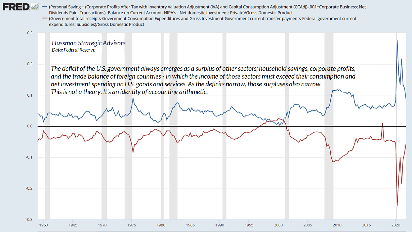
Every time the government runs a deficit, it creates a liability in the form of a Treasury bond. In order for the government to obtain access to goods and services, someone else in the economy must produce goods and services without consuming them (which we call “saving”). So every deficit of government is matched by a “surplus” in some other sector of the economy – households, corporations, or foreign countries, in which their income from producing goods and services exceeds their own consumption and net investment. Moreover, that “surplus” must take the form of financial assets. Where did the financial assets come from? The Treasury issued them to finance its deficit. Equilibrium is a beautiful thing.
Every deficit of government emerges as a “surplus” in some other sector of the economy. In aggregate, those surpluses must be held in the form of precisely the same securities the government issued in order to finance the deficit.
Here’s a reminder of what this looks like. The red line, typically, negative, shows government deficits. The blue line shows the combined surplus of households, corporations and foreign countries. Aside from some negligible items I’ve omitted for simplicity, the two are – and must be – exact mirror images. I’ll update this in a future comment once all the figures are available for the first quarter of 2022, but given that the U.S. trade balance collapsed (a surge in “foreign savings”) and government spending didn’t increase, we already know that unless there was a serious shortfall in tax revenues, household savings or corporate profits came under pressure last quarter.
Back to QE. When the Federal Reserve buys Treasury bonds, it pays for them by issuing its own “liability” in the form of base money – which takes the form of either bank reserves, or currency. That’s all quantitative easing really involves, buying interest-bearing Treasury securities from the public, and replacing them with zero interest hot potatoes, which someone in the economy must hold, at every moment in time, until those hot potatoes are retired by the Fed. In the interim, those zero-interest rate hot potatoes can wreak enormous speculative havoc, provided that investors are actually inclined to speculate.
Over the past decade, the Fed has replaced trillions of dollars of interest-bearing Treasury securities with trillions of dollars of zero-interest base money. Once those hot potatoes were created, someone had to hold them, either directly as currency or indirectly as bank reserves. That excruciating “zero” imposed psychological distress on each successive holder. It wasn’t enough to cause people to abandon their savings and retirement plans in favor of consumption, but it did encourage investors to seek out riskier assets that they imagined might provide an alternative to zero returns.
Of course, the moment some buyer would “get rid” of their cash by buying stocks, the seller of the stocks got every dollar of that cash, and the cycle would repeat. Hence “hot potatoes.” The base money created by the Fed can’t change into anything else. Cash never goes “into” the stock market – only through it – that’s why it’s called an “exchange.”
In the process, investors believe they have “learned” that the Fed can and will always support the stock market. The problem is that the ability of easy money to boost the stock market is entirely dependent on speculative psychology. When investors are inclined to speculate, they psychologically rule out the possibility of price losses. In that environment, zero or low-interest liquidity is an “inferior” asset that each holder tries to get rid of, successively driving riskier assets to more extreme valuations. That’s how Fed-induced yield-seeking speculation encouraged a mortgage bubble more than a decade ago.
The problem is that once investor psychology shifts toward risk-aversion, safe, low-interest liquidity becomes a desirable asset rather than an inferior one, so producing more of the stuff doesn’t provoke speculation. That’s how the market could collapse during 2000-2002 and 2007-2009 despite persistent and aggressive Fed easing the whole way down. Indeed, the collapse of the mortgage bubble produced what was then the deepest U.S. economic downturn since the Great Depression.
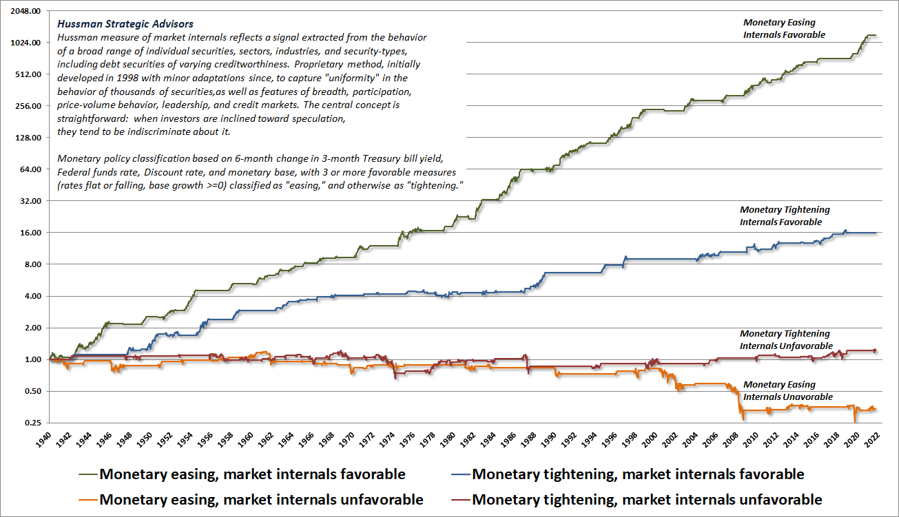
The chart below shows how monetary policy and speculative psychology interact. Each line shows the cumulative total return of the S&P 500 during periods featuring some specific combination of Fed policy and market internals (our most reliable gauge of speculative versus risk-averse psychology). The flat segments in each line are where a given combination was not active. Notice that easy money generally does not support stocks until and unless market internals are also favorable.
It’s best to learn the right lessons before a collapse rather than after one. Those lessons bear repeating:
Valuations are the most reliable indication of probable long-term investment returns, and the depth of potential market losses over the complete market cycle. Speculative psychology – best gauged by uniformity across market internals – can defer the consequences of rich valuations, but a trap door quietly opens when investor psychology shifts toward risk-aversion – best gauged by deterioration and divergence across market internals. Easy money can certainly amplify speculation, but easy money doesn’t support the stock market unless investors are also inclined – or can be readily provoked – to speculate.
I strongly believe that consequence of the recent speculative bubble will be a decade even two in which the S&P 500 takes a long, interesting trip to nowhere, measured from its recent peak. It’s also likely, though not certain, that the losses will be front-loaded in the form of a 50-70% collapse in the index, though such a loss would most likely be punctuated by several extended recoveries.
Regardless of whether we observe a market collapse or not, I expect that the coming 10-20 years will regularly provide reasonable conditions for investment. The strongest opportunities will likely emerge in periods where a material retreat in valuations is joined by an improvement in the uniformity of market internals. The more reasonable the valuations, the more constructive or aggressive the investment position can be in response.
What if the Fed reverses course? Fine. In recent years, we’ve adapted our discipline in ways that can easily tolerate the possibility of resumed quantitative easing, or even more aggressive monetary policies. As I discussed at length last September, we’re even willing to adopt a constructive outlook even if the market remains quite overvalued (though with safety nets and position limits), provided that our measures of market internals are constructive. The most severe danger is in periods when rich valuations are joined by ragged or deteriorating market internals. That’s when the trap door swings wide open.
A more recent adaptation has been to adopt a slightly more ‘permissive’ threshold in our gauge of market internals when interest rates are near zero and certain measures of risk-aversion are well-behaved. This does nothing to change our current investment outlook, but given that we use market internals to gauge speculative psychology, a more permissive threshold captures the idea that tossing deranged Fed policy into the mix boosts the implications of a given improvement in market internals. The main effect is to promote a more constructive shift following material market losses. Our research efforts in recent years have focused on adaptations that can allow us to better tolerate and even thrive in a world where valuations might never again retreat to their historical norms. We don’t actually expect that sort of world, but have allowed for it. These adaptations basically amount to criteria for accepting moderate amounts of market exposure – coupled with position limits or safety nets that constrain risk – even in conditions where valuations imply poor long-term returns. These criteria fall into what Graham would describe as ‘intelligent speculation’ – kept within minor limits.
– John P. Hussman, Ph.D., September 12, 2021
Pencils and ice cream cones
Why has inflation been surging, and how long will it persist? I’ve often noted that inflation is extraordinarily difficult to predict or even explain based on observable economic data such as output growth, employment, or money supply. Indeed, the best predictor of inflation has historically been the prevailing rate of inflation itself. The reason is that inflation is essentially driven by four elements, and two of them are wholly psychological.
Consider this question. How many pencils are you willing to trade for an ice cream cone? Well, the answer depends on four things. How much do you want another pencil? How scarce are pencils? How much do you want another ice cream cone? How scarce are ice cream cones? Two of those questions have to do with demand, which is psychological. The other two of those questions have to do with supply. If you don’t like using pencils, and you’ve got a stack of them already, you’ve got a very low “marginal utility” for pencils. If you’re hungry and have a sweet tooth, and ice cream is scarce, you’ve probably got a very high “marginal utility” for an ice cream cone. In this situation, you’ll trade away lots of pencils in return for an ice cream cone.
If an extra pencil gives you 2 happy faces of marginal utility, and an extra ice cream cone gives you 10 happy faces of marginal utility, the price you’ll pay for an ice cream cone, in terms of pencils, will be the ratio of marginal utilities: 10/2 or 5 pencils for an ice-cream cone.
The same basic principle holds for the price of goods and services in terms of money. See, every dollar created by the Federal Reserve provides a little stream of “services” – partly as a means of exchange, and partly as a store of value. Although people often imagine that dollars are simply “worthless pieces of paper,” this view overlooks the critical feature that gives base money value. By law (“fiat”), the base money created by the Fed is legal tender – it must be accepted as a form of payment – and it is also the required “substrate” of the entire banking system. Nearly every payment you make, even with a credit card, ultimately involves an exchange of base money between banks. Like any other asset, the little stream of services a dollar provides over time is what ultimately gives this “fiat money” value.
Recall that dollars come into existence when the Federal reserve buys interest-bearing Treasury securities from the public and pays for them with zero-interest base money. Essentially, U.S. dollars are “backed” by the Treasury debt, and the public expectation that the government will not allow that debt to expand at a rate dramatically greater than the size of the real economy. Likewise, in order to limit the ability of the Fed to finance government deficits too aggressively, the Federal Reserve Act includes this little chestnut:
The Board of Governors of the Federal Reserve System and the Federal Open Market Committee shall maintain long run growth of the monetary and credit aggregates commensurate with the economy’s long run potential to increase production, so as to promote effectively the goals of maximum employment, stable prices, and moderate long-term interest rates.
– Federal Reserve Act, Section 2A
While many observers seem to imagine that “Fed independence” should mean the independence to encourage speculative bubbles and collapses without accountability, the most important aspect of Fed independence is actually the responsibility to run a restrictive monetary policy when necessary: specifically, the Fed is “independent” primarily so it can avoid political pressure to monetize government debt and debase the currency.
Returning to prices and inflation, we can now ask the question: what’s the price of goods and services in terms of dollars? The answer depends on four things. Are goods and services in strong demand? Are goods and services scarce or plentiful? Is base money in strong demand due to risk-aversion and credit strains, or do people look at base money with revulsion because they distrust the commitment of the government to preserve its value? Is base money scarce or plentiful?
Again, the two “demand” factors are purely psychological, and the two “supply” factors depend on the relative scarcity of output versus money. These factors, including psychological ones, combine to drive the price level. That’s why inflation is so difficult to explain using purely economic variables.
Still, we can reasonably describe recent inflation pressures as being the combination of four factors. First, the government ran enormous deficits during the pandemic, and those deficits fueled a great deal of demand for goods and services. At the same time, there have been significant labor and supply disruptions in recent quarters, associated first with the pandemic and more recently with the war in Ukraine. Strong demand coupled with constrained supply has raised the “marginal utility” of goods and services.
On the monetary side, total U.S. public debt has soared in recent years to over 120% of GDP. It’s also important to note that nominal (dollar) liabilities have soared in recent years, relative to the output of real goods and services. That matters, because that’s the tradeoff that’s most relevant for a price level defined as the dollar price per unit of output. Combine an exploding Federal debt with a Federal Reserve that has clearly violated its section 2A mandate to “maintain long run growth of the monetary and credit aggregates commensurate with the economy’s long run potential to increase production,” and it’s not surprising that the public has begun to lose confidence in dollars. Weak demand coupled with excessive supply has reduced the “marginal utility” of base money.
Just like pencils and ice cream cones – what’s the price of goods in terms of money? It’s the ratio of the marginal utilities. In recent quarters, the marginal utility of goods and services has surged relative to the marginal utility of base money.
What will bring inflation down? Go through the list. The marginal utility of goods and services could be reduced either by slowing the demand for goods and services or easing of recent supply constraints. Meanwhile, the marginal utility of base money could be increased by restoring public confidence that government liabilities will grow in line with the real economy, by increasing demand for cash in undesirable ways like credit crisis, or by reducing the availability of base money by shrinking the Fed’s balance sheet and retiring some of the hot potatoes it has created.
Quantitative “tightening”
My own preference would be to shrink the Fed’s balance sheet as quickly as the existing assets mature. As I’ve detailed in prior comments, there is a clear historical relationship between the quantity of base money – as a percentage of nominal GDP – and the prevailing level of short-term interest rates. We can easily estimate the amount of base money that’s actually required to achieve a given target for the fed funds rate. Over the past decade, the Fed has expanded its balance sheet far beyond the level required to achieve even a zero federal funds rate. It’s easy to show statistically that this “excess” base money has no beneficial relationship at all to subsequent GDP growth, employment, or inflation. Rather, it serves only to amplify yield-seeking speculation. For a full analysis, see the section titled How QE doesn’t help in the February market comment.
But hold on. If the Fed allows the Treasury bonds on its balance sheet to mature without buying new ones, who will buy the newly issued Treasury bonds? If the Fed reduces the amount of base money in the economy, where will the money come from to buy the bonds?
From the standpoint of equilibrium, the answer is very simple. We know with certainty that someone in the economy must end up holding more Treasury securities, that someone in the economy must end up holding less base money, and that the Fed will hold fewer Treasuries and retire an equivalent amount of the base money that it has created.
In equilibrium, here is precisely how this can, and indeed must happen:
Treasury: Issues new interest-bearing Treasury securities to the public in return for base money that the public currently holds (mostly in the form of bank deposits). The Treasury then uses that base money to pay off the Treasury securities held by the Fed.
Fed: As existing Treasury bonds mature, the Fed will hold fewer bonds as assets. Because base money is a liability of the Fed (see the top line of a dollar bill), the base money received by the Fed when the bonds are paid off retires the Fed’s liability and reduces the amount of base money in the economy.
Public: Now holds less base money, and instead holds more Treasury bonds.
Does the public have to “de-risk” for this to occur? No – nobody needs to sell any risk-asset in order to buy the newly issued Treasury securities. In aggregate, someone is being relieved of a low-yielding bank deposit in return for an interest-bearing but higher-risk Treasury security. This exchange need not drive the level of interest rates higher. But let’s be clear – it will finally make someone happy with what they’re holding. And as the pile of zero-interest hot potatoes is reduced, so finally may the deranged level of yield-seeking speculation and reckless distortion that’s given us the most extreme financial bubble in history.
Keep Me Informed
Please enter your email address to be notified of new content, including market commentary and special updates.
Thank you for your interest in the Hussman Funds.
100% Spam-free. No list sharing. No solicitations. Opt-out anytime with one click.
By submitting this form, you consent to receive news and commentary, at no cost, from Hussman Strategic Advisors, News & Commentary, Cincinnati OH, 45246. https://www.hussmanfunds.com. You can revoke your consent to receive emails at any time by clicking the unsubscribe link at the bottom of every email. Emails are serviced by Constant Contact.
The foregoing comments represent the general investment analysis and economic views of the Advisor, and are provided solely for the purpose of information, instruction and discourse.
Prospectuses for the Hussman Strategic Growth Fund, the Hussman Strategic Total Return Fund, the Hussman Strategic International Fund, and the Hussman Strategic Allocation Fund, as well as Fund reports and other information, are available by clicking “The Funds” menu button from any page of this website.
Estimates of prospective return and risk for equities, bonds, and other financial markets are forward-looking statements based the analysis and reasonable beliefs of Hussman Strategic Advisors. They are not a guarantee of future performance, and are not indicative of the prospective returns of any of the Hussman Funds. Actual returns may differ substantially from the estimates provided. Estimates of prospective long-term returns for the S&P 500 reflect our standard valuation methodology, focusing on the relationship between current market prices and earnings, dividends and other fundamentals, adjusted for variability over the economic cycle.