

Making Friends with Bears Through Math


John P. Hussman, Ph.D.
President, Hussman Investment Trust
June 2022
Operations for profit should be based not on optimism but on arithmetic.
– Benjamin Graham
A fascinating aspect of the financial markets is that long-term returns are driven almost entirely by math, while short-term returns are driven almost entirely by psychology. It’s useful to consider both.
From a long-term perspective, a security is nothing but a claim to a future stream of cash flows that investors can expect to be delivered over time. Given a historically-reasonable estimate of future cash flows, knowing the current price is identical to knowing the expected long-term return. That part is arithmetic. From a short-term perspective, the price of a security is just the highest price the most willing buyer will pay and the lowest price the most willing seller will accept. That part is psychology.
If potential buyers become more eager to buy, and existing holders become more reluctant to sell, the price will rise. Conversely, if existing holders become more eager to sell, and potential buyers become more reluctant to absorb the shares, the price will drop. With every transaction, regardless of whether the price goes up or down, dollars that were held by the buyer are now held by the seller. Shares that were held by the seller are now held by the buyer. Not a single dollar has gone “into” or come “out of” the market. There’s just as much “cash on the sidelines” after the transaction as there was before – because every security created by an issuer (whether it’s a share of stock or a dollar of base money) has to be held by someone, at every point in time, until it’s retired. In the meantime, the stuff just changes hands.
In our own discipline, the “arithmetic” piece involves valuation methods that link prices, estimated future cash flows, and long-term expected returns. For any given set of expected future cash flows, the higher the price an investor pays, the lower the long-term rate of return the investor can expect. The lower the price an investor pays, the higher the long-term rate of return can expect.
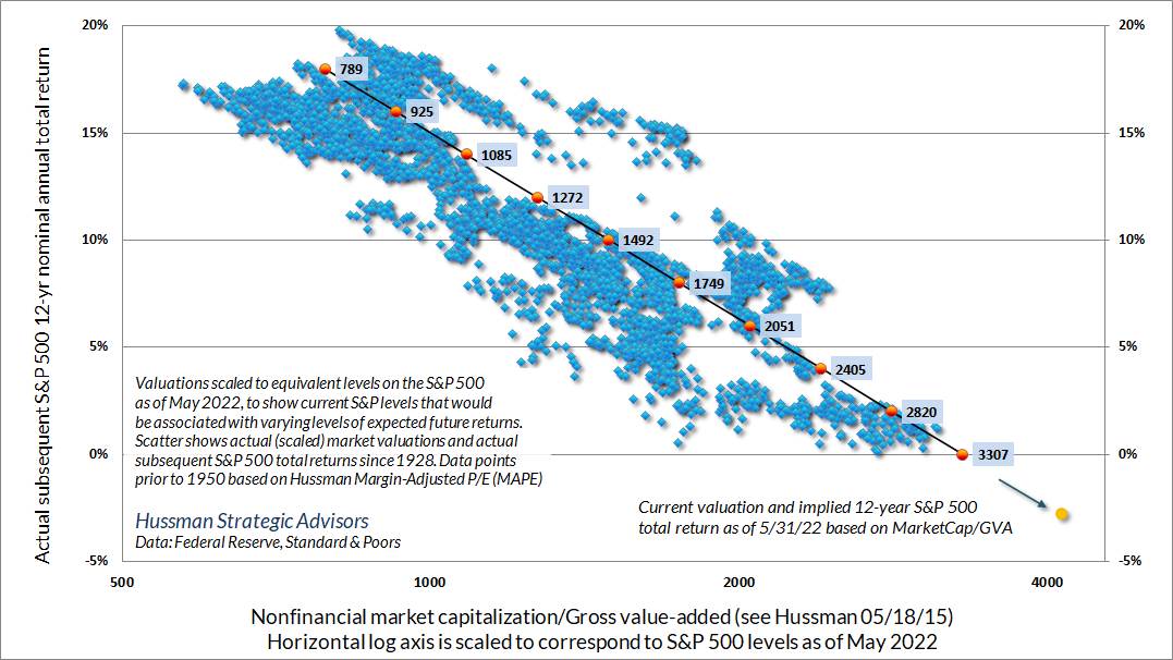
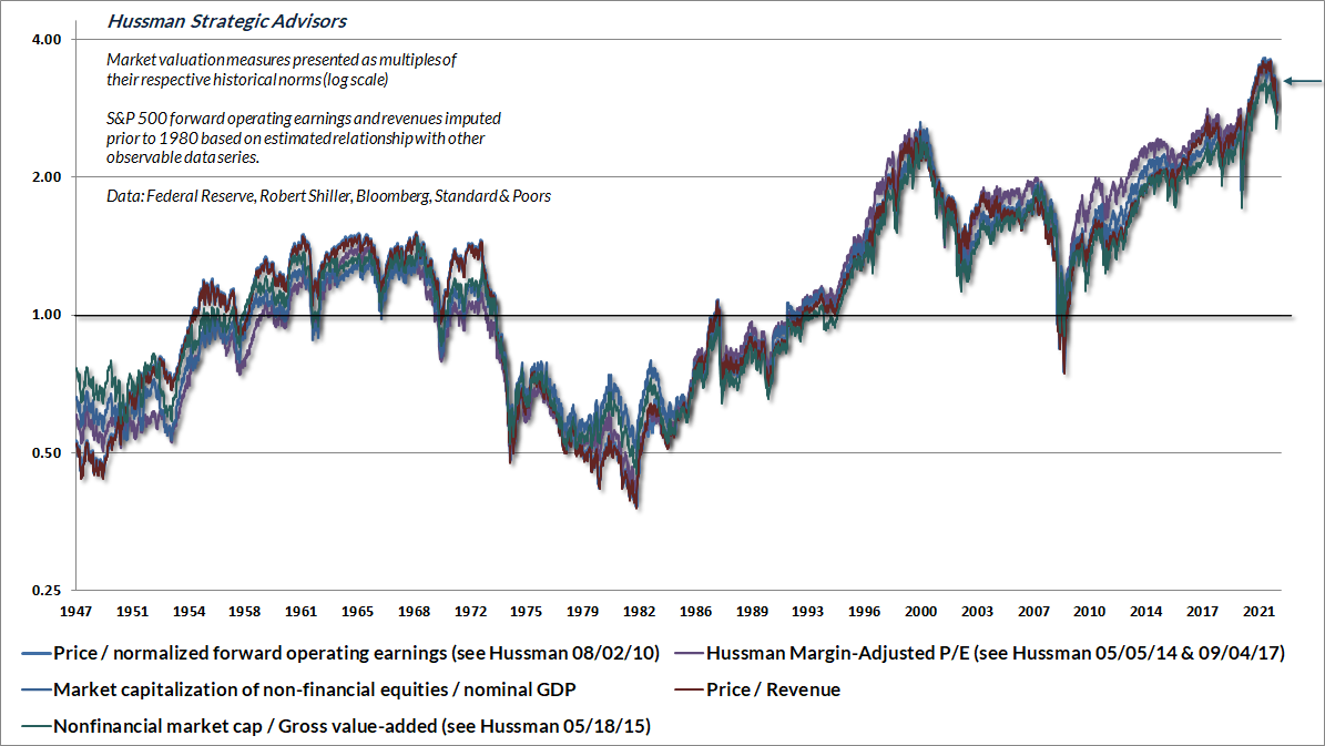
The main pitfall, as we’ll discuss below, is that anytime investors use a valuation ratio (for example, a price/earnings ratio), the denominator had better be representative and proportional to decades and decades of expected future cash flows. While earnings are necessary in order to produce deliverable cash flows, variations in profit margins can make a single year of earnings a very poor choice for a valuation benchmark. Having studied and introduced countless valuation measures over time, we find that the ratio of nonfinancial market capitalization to corporate gross value-added, including estimated foreign revenues (a measure I introduced in 2015) is best-correlated with actual subsequent market returns across decades of market cycles.
The chart below illustrates the relationship between MarketCap/GVA and actual subsequent S&P 500 market returns in data since 1928. I’ve scaled the horizontal axis to show approximate levels of the S&P 500 that would presently be associated with various levels of expected future return.
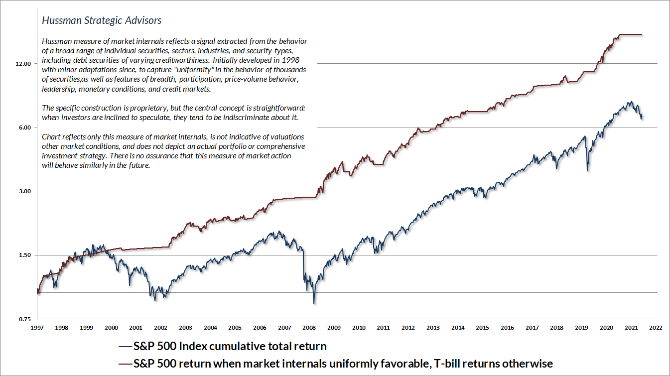
As for psychology, I’ve often observed that when investors are inclined to speculate, they tend to be indiscriminate about it. Also, divergences in market action between two securities will often tell you something about components that they do not share in common. For example, differences in the market behavior of Treasury bonds versus junk bonds tells you a great deal about credit risk. Our most reliable gauge of whether investors are inclined toward speculation or risk-aversion is the uniformity of market internals across thousands of individual stocks, industries, sectors, and security-types, including debt securities of varying creditworthiness. I introduced our primary gauge of market internals back in 1998.
The chart below presents the cumulative total return of the S&P 500 in periods where our measures of market internals have been favorable, accruing Treasury bill interest otherwise. The chart is historical, does not represent any investment portfolio, does not reflect valuations or other features of our investment approach, and is not an assurance of future outcomes. On average, our gauge of market internals shifts about twice a year, though about 25% of shifts persist for fewer than 6 weeks, and about 25% persist for 40 weeks or longer. We don’t attempt to forecast these shifts. We simply respond to them.
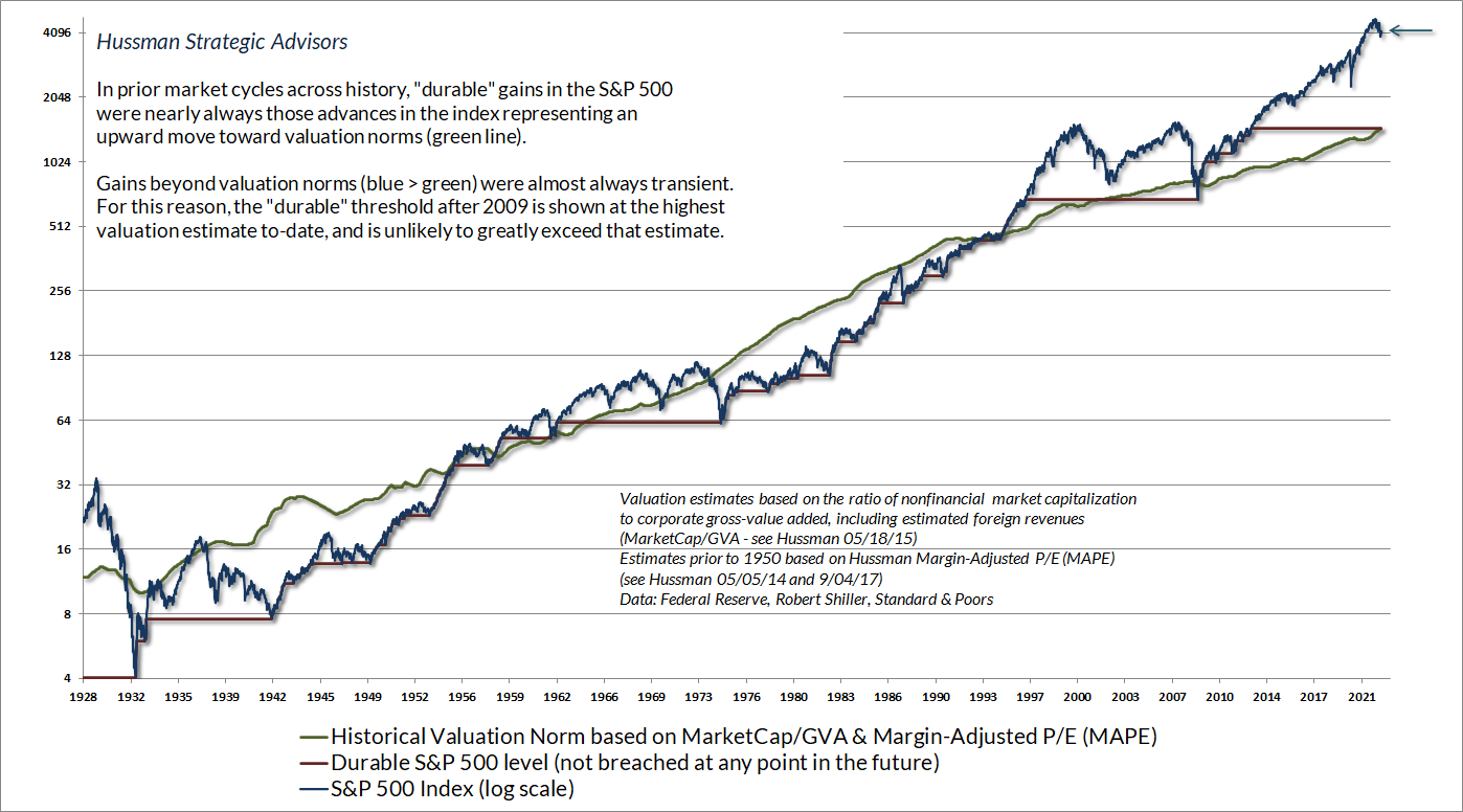
It’s useful to think about valuations and market internals jointly, rather than separately. Valuations clearly drive long-term investment returns, and the likely depth of market losses over any complete bull-bear market cycle. Still, the only way the market was able to reach the bubble valuations of 1929, 2000, and the bubble peak early this year (and I do believe that we’re on the bursting side) was to blow past every lesser valuation.
The market can continue to advance even in the face of extreme valuations, provided that investors have a speculative bit in their teeth (which we gauge through the uniformity of market internals). In contrast, extreme valuations can matter suddenly, and with a vengeance, once investor psychology shifts toward risk-aversion.
To say merely that valuations are elevated is emphatically not the same as saying that expected market returns are negative. The “norms” that we define for valuations are the historical norms associated with run-of-the-mill S&P 500 total returns averaging about 10% annually. If valuations are moderately above those norms, it’s reasonable to conclude that future market returns are likely to be less than 10% annually, but it doesn’t mean that stock prices have to decline, or that likely future returns will be negative. It’s bubble extremes like today that produce negative returns and long trips to nowhere.
Measured from what was likely the bubble peak in January, I expect negative S&P 500 total returns over the coming 10-12 year period, with an interim market loss on the order of 60-70%. Indeed, measured from the recent peak, it would not be surprising for the S&P 500 to lag Treasury bills for 20 years. All of this should be viewed as full-cycle context. Short- and intermediate-term market behavior will still be heavily affected by shifts between speculative and risk-averse psychology, which we infer from the uniformity or divergence of market internals. It’s in periods of risk-aversion that extreme valuations will suddenly matter most.
In the chart below, it’s clear that even after the market loss year-to-date, the S&P 500 (blue) is still wildly above its run-of-the-mill valuation norms (green). It’s also clear that market advances that extend well-beyond reliable valuation norms tend to be transient. At extreme points like this, it’s useful to remember that risk-management is generous. While market advances in hypervalued conditions can leave investors feeling as if they’re “missing out” on returns, those speculative returns are invariably wiped out over the complete market cycle. At extreme valuations, market risk can typically be avoided with no cost to long-term return.
Further details relating to MarketCap/GVA (the ratio of nonfinancial market capitalization to gross-value added, including estimated foreign revenues) and our Margin-Adjusted P/E (MAPE) can be found in the Market Comment Archive under the Knowledge Center tab of this website. MarketCap/GVA: Hussman 05/18/15. MAPE: Hussman 05/05/14, Hussman 09/04/17.
Notice that while the S&P 500 has generally been above its historical valuation norms since the early 1990’s, that doesn’t mean that the expected return of the S&P 500 has been negative for this entire period. It just means that expected long-term returns have generally been below 10% annually. Indeed, even with the benefit of the recent bubble, the average annual total return of the S&P 500 since 1991 has been less than 10% annually. Investors might think it’s been higher, but that’s because they tend to measure diagonally from the undervalued low of 2009 to what is now the most extreme level of overvaluation in history. The problem is that every once in a while, the market does approach or breach its run-of-the-mill valuation norms. At current extremes, investors are relying on that to never happen again.
It’s the distance from valuation norms that gauges the extent of the shortfall in expected returns. Unfortunately, if investors imagine that likely 10- 12-year S&P 500 total returns are anything but negative today, they’re likely to be quite disappointed.
In market cycles across history, speculative peaks followed a fairly reliable sequence. Extreme valuations were gradually accompanied by steep overextension in short- and intermediate-term market action, along with lopsided bullish sentiment. These “overvalued, overbought, overbullish” syndromes were generally followed by abrupt market weakness, in some cases, even before broad deterioration in market internals was evident. Once internals broke, more extended market losses would typically follow. Amid the novelty of quantitative easing by the Fed, and the intolerance of investors for zero returns, investors continued to speculate long after those overextended syndromes emerged, and responding to those “limits” became detrimental. In late-2017, we abandoned our bearish response to those syndromes in periods when market internals were still constructive. As I discussed last September, we’ve also adopted more “tactical” criteria for accepting moderate amounts of market exposure – coupled with position limits or safety nets that constrain risk – even in conditions where valuations imply poor long-term returns. These criteria fall into what Graham would describe as ‘intelligent speculation’ – kept within minor limits.
With valuations still extreme, market internals still ragged and divergent, and recent oversold conditions reasonably cleared, there’s little room for constructive exposure here. That will change as market conditions do. Emphatically, no forecasts are required. Our outlook will move primarily with valuations and market internals, and to a minor extent, with shorter-term tactical conditions. Even in recent months we’ve seen modest opportunities to respond in a limited way to compressed and overextended conditions. As always, however, the best opportunities to embrace market exposure will emerge when a material retreat in valuations is joined by an improvement in our measures of market internals.
Unreliable denominators make unreliable valuation ratios
A reliable valuation ratio is nothing more than shorthand for a proper discounted cash flow analysis. You’re saying “The fundamental in the denominator is representative and proportional to decades and decades of expected future cash flows that will be delivered to me over time.”
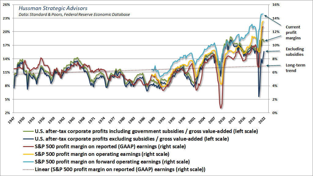
That basic observation will save you a great deal of pain in the next few years, if you let it. See, one of the very dangerous things that investors are focused on here is the “forward operating P/E” – the ratio of the S&P 500 Index to analyst estimates of year-ahead operating earnings (sometimes called “earnings without the bad stuff”). The problem here is that anytime you use a valuation ratio, what you need most is for the denominator to be representative and proportional to decades and decades of future expected cash flows. If you simply take the current earnings figure at face value, but that earnings figure is distorted by massive pandemic subsidies and depressed labor costs (especially when inflation and tight labor conditions are pushing labor costs higher), you’re making a longshot bet that the temporarily extreme profit margin will be sustained forever.
The chart below offers a sense of how these distortions are built into current S&P 500 forward margins. Prior to 2020, the S&P 500 operating margin never materially exceeded 11%, and the profit margin on GAAP earnings never exceeded 10%. Do investors really want to use today’s bloated forward earnings estimates as their “sufficient statistic” for decades and decades of future cash flows?
The chart below illustrates the longer-term problem with taking the forward operating P/E at face value. The base axes show the S&P 500 forward P/E and forward profit margin in data since 1980. The vertical axis shows the actual S&P 500 average annual total return over the subsequent 10-year period. You’ll notice that the very worst returns are associated with instances that combined a rich (or relatively elevated) forward P/E with a high forward profit margin. The moment investors pay top dollar for top dollar, they require both the P/E and the margin to be sustained indefinitely.
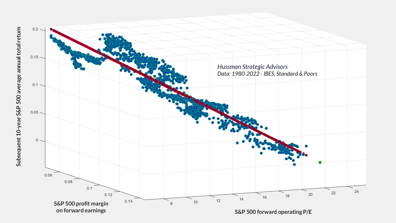
Investors tend to treat profit margins as if they’re fixed, rather than cyclical and driven by factors like unit labor costs and subsidies. So bubble valuations can reach levels that are breathtaking on a margin-adjusted basis. Unfortunately, we’re still at levels never seen before August 2020.
Going into bubbles breaking, profit margins are always at a peak. Bubbles don’t peak for no reason. They peak because economic conditions are nearly perfect. The first thing to go is the profit margin.
– Jeremy Grantham, CNBC, May 18, 2022
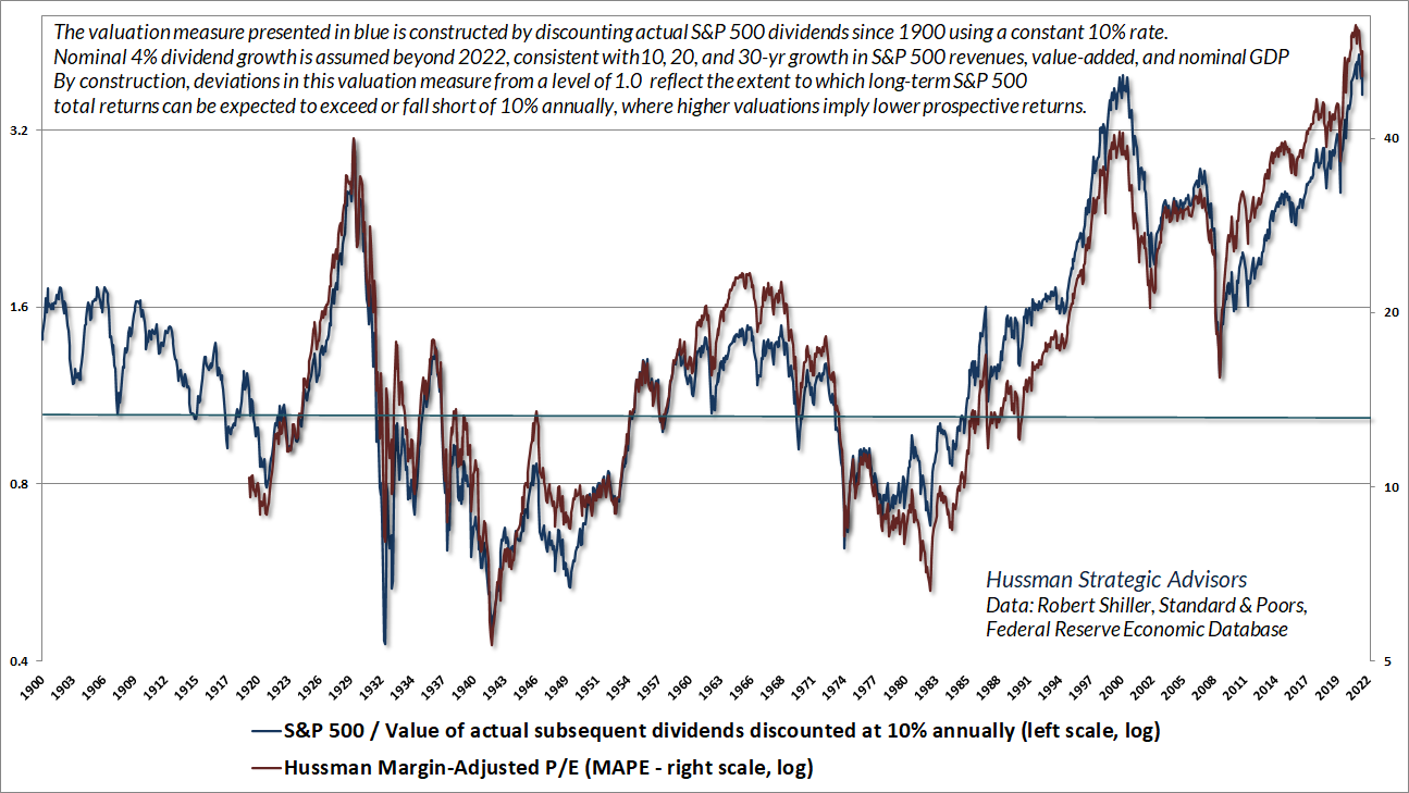
One way or another, every reliable valuation measure mutes the distortion caused by varying profit margins. The chart below shows our Margin-Adjusted P/E (MAPE). A good way to test whether a valuation measure is doing its job is to compare it with a proper discounted cash flow analysis. The blue line in the chart is based on actual S&P 500 dividends since 1900. Each point is obtained by taking the actual index dividends of the S&P 500 from that point forward, and discounting them to present value at a fixed 10% rate of return. The simple interpretation is that when the S&P 500 / discounted dividend ratio has been at 1.0 on the left scale, the S&P 500 been priced at a level consistent with long-term returns of 10% annually.
It’s worth noting that index dividends for the S&P 500 include the impact of stock buybacks. Also, given that S&P 500 revenue growth for the past 10, 20 and 30 years has averaged just 4% annually, and current S&P 500 dividends aren’t at all depressed relative to revenues, the chart reflects a growth estimate of 4% annually for future dividends. Not surprisingly, as a reliable gauge of market valuations, the MAPE tells a nearly identical story as discounted cash flows do.
Making friends with bears through math
Price = Price
That wasn’t too hard.
Price = Price/Sales x Sales
So far, so good.
Price_today = PSR_today x Sales_today
Price_future = PSR_future x Sales_future
OK Hussman, what are we doing here?
Price_future/Price_today = (PSR_future/PSR_today) x (Sales_future/Sales_today)
Ah, you’re linking valuations to returns. So, what if we’re looking at T years, and the growth rate of sales is “g”?
Price_future/Price_today = (PSR_future/PSR_today) x (1+g)^T
Can we annualize all this?
Sure. Just raise everything to the 1/T
1 + annual capital gain = (PSR_future/PSR_today)^(1/T) x (1+g)
Can we rearrange a bit and add dividends to get an annual total return?
Average annual total return = (1+g) x (PSR_future/PSR_today)^(1/T) – 1 + average dividend yield
Is there something special about using revenues rather than another fundamental?
Well, three things are essential: first, the fundamental you use should be essentially proportional – in a long-term sense – to the very long-term stream of cash flows that stocks will deliver over time; second, the fundamental you use shouldn’t fluctuate a great deal over the economic cycle, as earnings unfortunately do; and third, always look for the proof in the pudding – the valuation ratio you use (technically its logarithm) should be tightly correlated with actual subsequent market returns, particularly over a horizon of 10-12 years. It’s also preferable for the numerator and the denominator to be apples-to-apples. So S&P 500 index to S&P 500 revenues, or nonfinancial market cap to nonfinancial gross value-added, are somewhat more reliable than say, nonfinancial market cap to nominal GDP.
Does math like this also explain past returns? For example, why the S&P 500 enjoyed an average annual total return of 19.4% annually from 1990 to the March 2000 bubble peak?
Sure. Starting PSR 0.7. Ending PSR 2.4. Revenue growth rate 3.8%. Average yield 2.4%. T 10.25 years.
Average total return 1990-2000: (1.038)*(2.4/0.7)^(1/10.25)-1+.024 = 19.45%
I get it. Now, during the 9-year period from the March 2000 peak to the March 2009 low, the S&P 500 price/revenue ratio dropped from 2.4 to just 0.7, even below its historical norm of about 1.0. The average dividend yield was just 1.7%, but revenue growth was about 4.7% annually. Weren’t 9 years of revenue growth, plus dividends, enough to offset the valuation headwinds?
Nope. Average total return 2000-2009: (1.047)*(0.7/2.4)^(1/9)-1+.017 = -7.0%
Wait, are you telling me that the S&P 500 lost 7% annually, including dividends, between 2000 and 2009?
Yes.
Wow. I forgot about that.
Yep. Start at a rich valuation, end at low or even moderate valuations, and the change in valuations can consume the benefit of both growth and dividends. That’s why the S&P 500 has often gone “nowhere in an interesting way,” lagging the return on Treasury bills from 1929-1947, 1966-1985, and 2000-2013.
Ouch. That’s 50 years out of 84. But given the collapse we’ve seen in the market over the past few months, we’re clearly not at 2000 valuations, correct?
Correct. Unfortunately, we’re even higher.
The current price/revenue multiple is 2.6. Though it’s down from 3.2 at the January peak, it’s also at a level that was never seen in history prior to August 2020. Meanwhile, market internals remain ragged and divergent, suggesting risk-aversion among investors. That combination creates what I’ve often described as a “trap door” situation. The S&P 500 dividend yield is presently less than 1.6%, and the growth rate of revenues even since the 2009 market low is less than 3.8% annually. Even if we assume that valuations and profit margins will be 50% higher than their historical norms forever, that would still put the valuation norm at 1.5 x revenues, more than 40% below current levels.
What if it takes a decade to touch that level, without ever breaking 1.5 x revenues?
Average annual total return: (1.038)*(1.5/2.6)^(1/10)-1+.016 = 0%
That’s from here? Even after the market selloff we’ve had this year?
Yes. From here. Assuming the market stays at least 50% above its historical valuation norms.
But wait. Hasn’t the S&P 500 enjoyed good returns even since the 2000 peak?
Yes. Starting multiple 2.4. Ending multiple 2.6. Average dividend yield 2%. Revenue growth 4%. 22.2 years. Let’s do the math.
Average annual total return = (1.04)*(2.6/2.4)^(1/22.2)-1+.02 = 6.4% annually
Hmm. I would have thought it was closer to 10%. So, you’re saying that even the moderate total return of the market since the 2000 peak has relied on 2000 bubble valuations being not only restored but exceeded?
Yes.
Which would suggest that even moderate returns over the coming 10-20 years would also rely on bubble valuations being restored or exceeded at the end of that investment horizon?
Exactly.
Well, let’s be optimistic and ignore historical norms altogether. Let’s assume that the price/revenue multiple never drops below the average level of 1.8 we’ve seen during the bull market advance since 2009, and also assume that revenue growth averages 6% annually. Given the current 1.6% dividend yield, where does that leave a 10-year total return estimate?
Average annual total return = (1.06)*(1.8/2.4)^(1/10)-1+.016 = 4.6% annually.
Wait. I thought we were being optimistic.
We are being optimistic. But remember, even a market that virtually goes nowhere for a decade can go nowhere in an interesting way. There will certainly be periods when market internals improve, and even rich valuations may be associated with reasonable opportunities to embrace market risk, within limits. The lower valuations get, the more aggressive the investment response can be. Both the 2002 and 2009 lows produced reasonable valuations within two years of market extremes. The problem is locking in dismal long-term returns near bubble highs.
Despite the year-to-date decline in the S&P 500, the most reliable valuation measures we monitor remain at levels never observed in market history prior to August 2020. Meanwhile, market internals remain ragged and divergent, suggesting risk-aversion among investors. That combination creates what I’ve often described as a “trap door” situation.
I get that it’s just arithmetic, but the implications are downright scary – particularly if we’re still at valuations that were never observed prior to August 2020. Why would you ever call this section “Making friends with bears through math?”
You make friends with bears by understanding them, and by avoiding behavior that will get you eaten.
Waiting for “the” capitulation
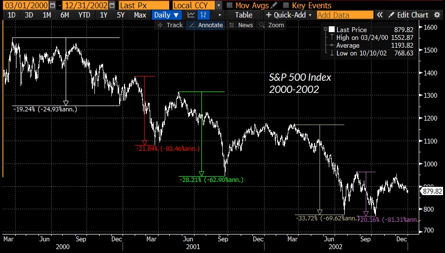
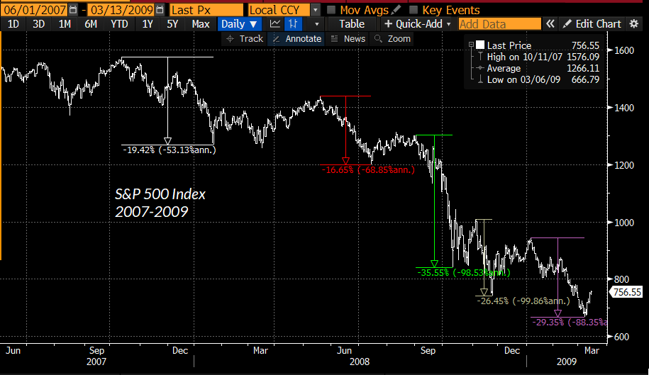
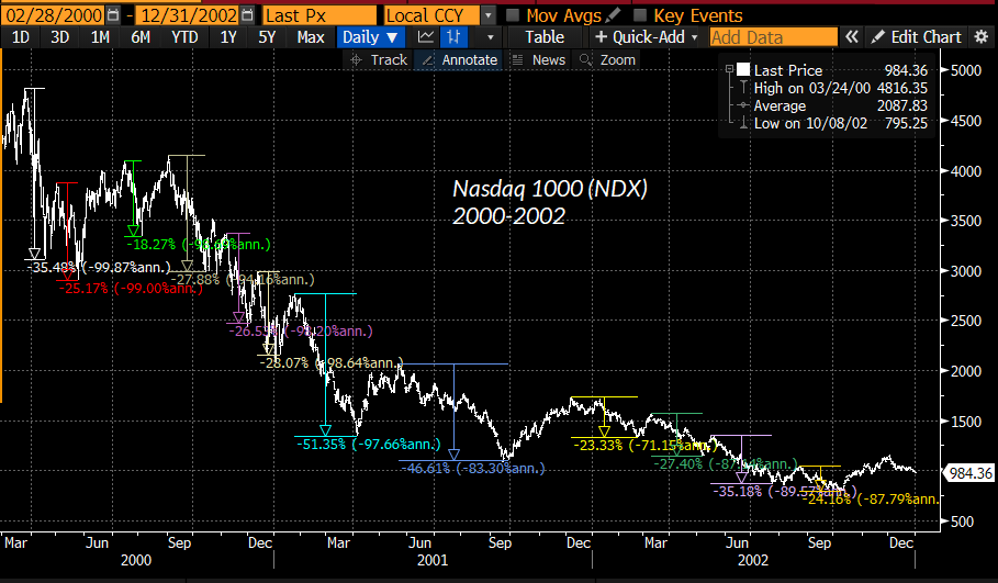
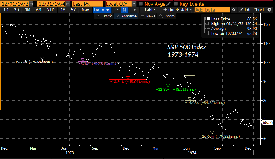
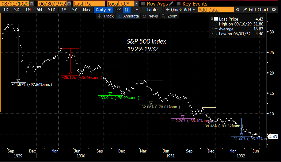
Aside from ignoring valuations and market internals, one of the behaviors that will get you eaten in a bear market is placing too much confidence in any single “capitulation.” Speculative episodes typically unwind in waves. The steeper the starting valuations, the more waves one typically observes.
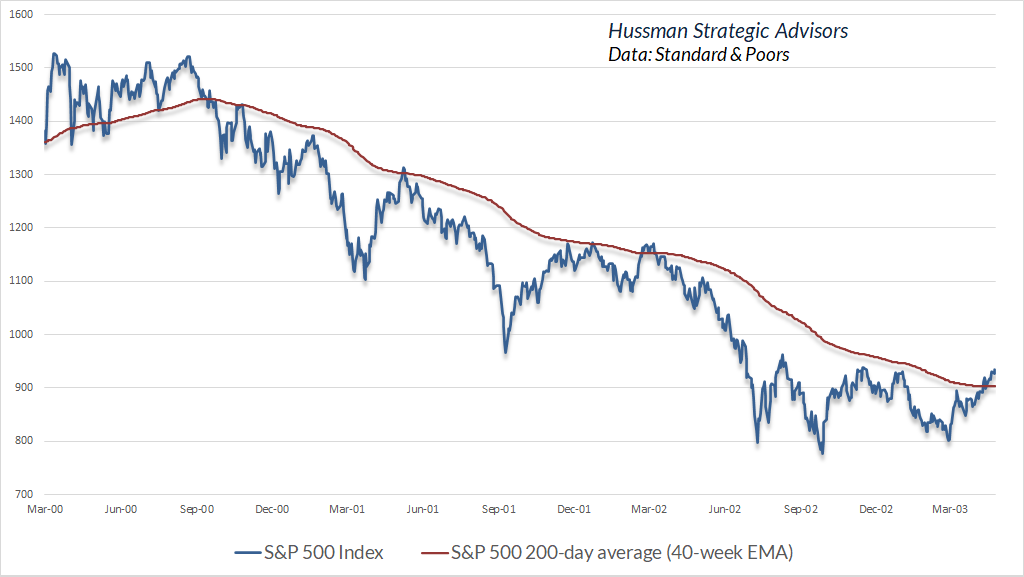
S&P 500 2000-2002:
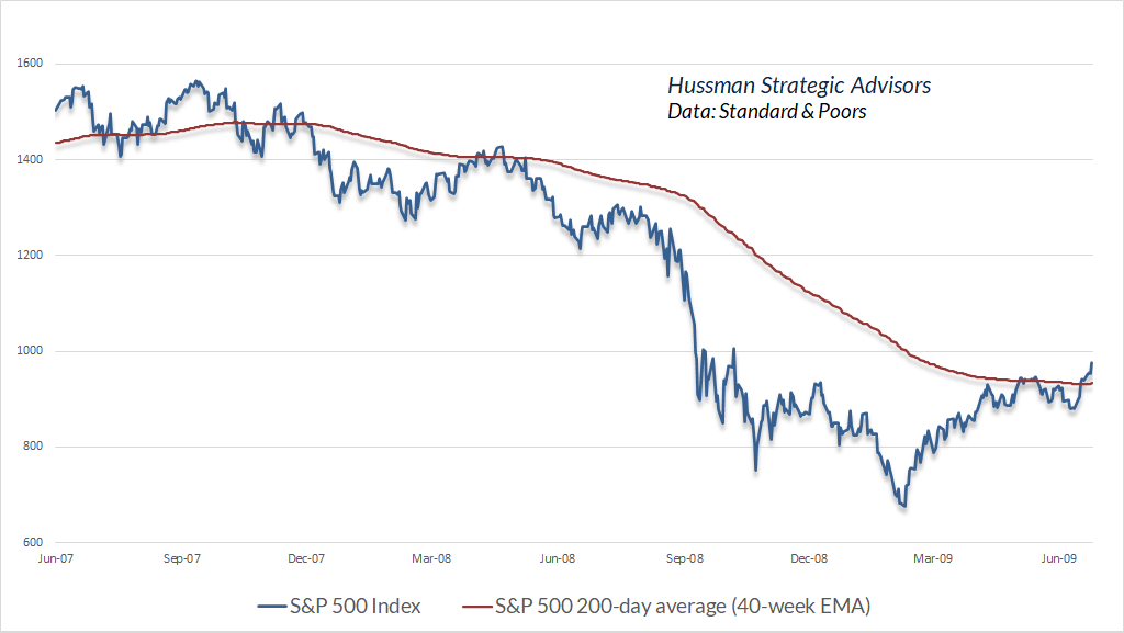
S&P 500 2007-2009:
Nasdaq 100 2000-2002
S&P 500 1973-1974
S&P 500 1929-1932
You make friends with bears by understanding them, and by avoiding behavior that will get you eaten.
Though I vastly prefer our broad gauge of market internals to simple moving averages, even a basic 200-day (40-week) moving average can be helpful in providing some intermediate-term context during bear markets. Collapses from speculative extremes tend to unfold as a sequence of capitulations followed by furious recoveries that can extend for weeks or even months. Bull markets train investors to think in terms of single, V-shaped selloffs followed by advances to fresh highs. In bear markets, it’s best to quickly abandon that thinking, preferably until market internals improve. Once market internals shift to a uniformly favorable condition, the 200-day average typically begins to act as support rather than resistance.
S&P 500 2000-2002:
S&P 500 2007-2009:
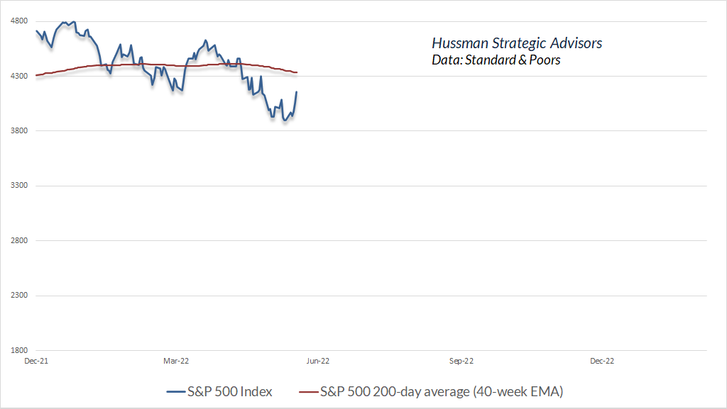
Here’s where the S&P 500 stands relative to its 200-day average at present. I’ve intentionally left a good deal of room below the chart. We may need more, but no forecasts are actually required – we’ll respond to changes in market conditions as they emerge. Again, we prefer our gauge of market internals to simple moving averages, but even the behavior of the S&P 500 relative to its 200-day average can be useful to monitor as a bear market unfolds.
Bubbles collapse from the fringes
I’ve often observed that bubbles tend to collapse from the fringes. Back in July 2000, I discussed what has become my favorite example of this process: the Wall Street Journal ran an article titled (in the print version) “What were we THINKING?” The article reflected on the “arrogance, greed, and optimism” that had already been followed by the collapse of dot-com stocks. My favorite line: “Now we know better. Why didn’t they see it coming?” Unfortunately, that article was published at a point where the Nasdaq still had an 80% loss (not a typo) ahead of it.
We see the same process unfolding today, with numerous glamour growth, meme-linked, and “innovation” stocks already down 70-80% from their highs. We’re also not the only historically-informed investors who see it.
This is the real McCoy. It seems to be playing out pretty close to 2000. The four great bubbles, are characterized by nearly hysterical behavior – accelerated price moves on the upside, and by a weird deviation, on the upside, between the blue chips going up and the risky stocks going down, and that is rare as hen’s teeth – it happened in 1929 and it happened during the year 2000 again, in spades, with the S&P ex-growth continuing to go up until September of 2000, and the growth stocks basically going down 50%, and the internet stocks dropping maybe 60-70% by then. So that was spectacular, and we saw a very handsome deviation between the S&P rising last year and the Russell dropping quite handsomely. I’ll tell you what it describes. It describes Mr. Prince’s ‘I’ve got to keep dancing, because the music is still playing.’ And we understand that completely, the enormous commercial imperative of the industry to play up to, and over the edge… That’s the phenomenon that causes this very rare indicator of impending doom. Impending doom – in other words now. We’re in it. I believe the declines will be very substantial.
– Jeremy Grantham, May 19, 2022
Meanwhile, there’s no need to speculate over countless scenarios and “what if” questions about Fed policy, the economy, inflation, or other unknowns. Our investment discipline is to respond to measurable, observable changes in historically-reliable gauges of market conditions – primarily valuations and market internals. That’s how we admirably navigated decades of market cycles prior to QE, and it’s how we’ve resumed that profile even amid the volatility and extension of this bubble since 2019.
As for our multi-year difficulty with QE, we’ve long abandoned our bearish response to overextended “limits” when market internals suggest that investors still have the speculative bit in their teeth. We’ve even established criteria – coupled with position limits and safety nets that constrain risk – that I expect will allow us to tolerate and even prosper even if market valuations never approach their historical norms again. We don’t expect that sort of world, but we’ve allowed for it.
As usual, our outlook will change as market conditions do. No forecasts are required.
Keep Me Informed
Please enter your email address to be notified of new content, including market commentary and special updates.
Thank you for your interest in the Hussman Funds.
100% Spam-free. No list sharing. No solicitations. Opt-out anytime with one click.
By submitting this form, you consent to receive news and commentary, at no cost, from Hussman Strategic Advisors, News & Commentary, Cincinnati OH, 45246. https://www.hussmanfunds.com. You can revoke your consent to receive emails at any time by clicking the unsubscribe link at the bottom of every email. Emails are serviced by Constant Contact.
The foregoing comments represent the general investment analysis and economic views of the Advisor, and are provided solely for the purpose of information, instruction and discourse.
Prospectuses for the Hussman Strategic Growth Fund, the Hussman Strategic Total Return Fund, the Hussman Strategic International Fund, and the Hussman Strategic Allocation Fund, as well as Fund reports and other information, are available by clicking “The Funds” menu button from any page of this website.
Estimates of prospective return and risk for equities, bonds, and other financial markets are forward-looking statements based the analysis and reasonable beliefs of Hussman Strategic Advisors. They are not a guarantee of future performance, and are not indicative of the prospective returns of any of the Hussman Funds. Actual returns may differ substantially from the estimates provided. Estimates of prospective long-term returns for the S&P 500 reflect our standard valuation methodology, focusing on the relationship between current market prices and earnings, dividends and other fundamentals, adjusted for variability over the economic cycle.