

Now Comes the Hard Part


John P. Hussman, Ph.D.
President, Hussman Investment Trust
September 2022
Given the damage already wrought on the Nasdaq, there is a natural inclination to buy the dip. We believe that there is little merit in doing so. The current market climate is characterized by extremely unfavorable valuations, unfavorable trend uniformity, and hostile yield trends. This combination is what we define as a Crash Warning, and this climate has historically occurred in less than 4% of market history. That 4% of market history includes the 1929 crash and the 1987 crash, as well as a number of less memorable crashes and panics. We prefer to hedge until there is a rational prospect for market gains. When valuations are favorable, stocks are attractive from the standpoint of ‘investment’ – meaning that stock prices are attractive compared to the conservatively discounted value of cash flows which will be thrown off in the future. When trend uniformity is favorable, stocks are attractive from the standpoint of ‘speculation’ – meaning that regardless of valuation, investors are displaying an increased tolerance for risk which favors a further advance in prices.”
– John P. Hussman, Ph.D., Hussman Investment Research & Insight, November 15, 2000
Surveying the current condition of the financial markets, we presently observe a combination of still historically-extreme valuations, rising yet still only normalizing interest rates, measurably inadequate risk-premiums in both equities and bonds, and ragged, unfavorable market internals, suggesting continued risk-aversion among investors. In this context, it’s worth repeating what I’ve noted across decades of market cycles – a market collapse is nothing but risk-aversion meeting an inadequate risk-premium; rising yield pressure meeting an inadequate yield.
Emphatically, short-term oversold conditions can be followed anytime by fast, furious advances to clear those conditions. As I discuss in more detail below, we also pay ongoing attention to the uniformity or divergence of market internals (what I used to call “trend uniformity”). The above quote from 2000 explains why. “When trend uniformity is favorable, stocks are attractive from the standpoint of ‘speculation’ – meaning that regardless of valuation, investors are displaying an increased tolerance for risk, which favors a further advance in prices.” In that context, the only thing a decade of zero-interest policy did was to remove any reliable upper “limit” to valuations or risk-taking. Even we’ve adapted our discipline to reflect that reality. The danger comes when investors continue to ignore extreme valuations even after investor psychology has shifted to risk-aversion.
The opening quote is from November 15, 2000. From its March 24, 2000 bull market peak of 4816.35, the technology-heavy Nasdaq 100 index had already plunged by -36%. Yet from that lower level, it would go on to lose another -68% by October 2002. That outcome should not have been a surprise. On March 7, 2000, I observed, “Over time, price/revenue ratios come back in line. Currently, that would require an 83% plunge in tech stocks (recall the 1969-70 tech massacre). The plunge may be muted to about 65% given several years of revenue growth. If you understand values and market history, you know we’re not joking.”
At the 2000 market peak, a broad range of reliable valuations implied negative estimated S&P 500 total returns for over a decade, as they did in 1929, and as they unfortunately do today. This is what a decade of zero interest rate policy has set up for investors.
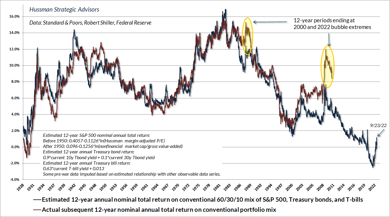
The chart below shows our best estimate of the expected 12-year total return for a conventional passive investment portfolio invested 60% in the S&P 500, 30% in Treasury bonds, and 10% in Treasury bills. Notice that recent market losses have markedly improved prospective returns for a passive investment allocation, yet only to a level of about 1% annually. Indeed, the expected return of the S&P 500 component is still negative.
A decade of deranged Federal Reserve zero-interest rate policy has exerted what former FDIC chair Sheila Bair recently described as a “corrosive” effect on the financial markets and the economy. Faced with zero interest rates, investors became convinced that they had no alternative but to speculate. As speculation drove valuations far beyond their historical norms, investors embraced the idea that valuations simply did not matter. Advancing prices in the rear-view mirror seemed to provide evidence that zero-interest rate cash was an unacceptable alternative to passively investing in stocks, regardless of price.
In 1934, following an 89% market collapse during the Great Depression, Benjamin Graham and David Dodd detailed the beliefs that investors had adopted during the speculative runup to the 1929 peak. They are identical to what we’ve observed in recent years. First, “that the records of the past were proving an undependable guide to investment”; second, “that the rewards offered by the future had become irresistibly alluring”; and third, “a companion theory that common stocks represented the most profitable and therefore the most desirable media for long-term investment.” Taken together, these beliefs ultimately contributed to “the notion that the desirability of a common stock was entirely independent of its price.” Surveying the rubble, Graham and Dodd observed, “The results of such a doctrine could not fail to be tragic.”
Encouraged by the same beliefs, investors drove S&P 500 valuations to levels even beyond the 1929 and 2000 extremes – levels that we associate with over a decade of negative expected returns even from current levels. At present, the stock and bond markets have declined enough to restore positive expected returns for a diversified portfolio that includes both stocks and bonds, but just barely.
Keep in mind that periods of hypervaluation are not resolved in one fell swoop. To imagine otherwise is to minimize the discomfort, uncertainty, and alternation between fear and hope that the collapse of a bubble entails. The way that bubbles unfold into preposterous losses – 89%, 82%, 50%, 55%, and I expect this time between 50-70% – is through multiple periods of decline and even free-fall, punctuated by fast, furious “clearing rallies” that offer hope all the way down. By the time investors experience the second or third free-fall – and we’ve hardly experienced the first one yet – the psychology of investors is not “this is the bottom” – but rather, “there is no bottom.”
Aside from ignoring valuations and market internals, one of the behaviors that will get you eaten in a bear market is placing too much confidence in any single ‘capitulation.’ Speculative episodes typically unwind in waves. The steeper the starting valuations, the more waves one typically observes.
– John P. Hussman, Ph.D., Making Friends with Bears Through Math, June 1, 2022
Very little confidence in the equity market has been shaken – yet. Consider the surveys from the American Association of Individual Investors (AAII). Sentiment – talk – is lopsided at 60.9% bearish and just 17.7% bullish. Portfolio allocations – actions – are an entirely different story, with an above-average 64.5% allocation to equities, nowhere close to the 40% equity allocations that AAII respondents reported at the 1990, 2002, and 2009 market lows. Put simply, investors are clearly becoming uncomfortable, but in practice, they continue to defend the hill of extreme valuations, in the apparent belief that whatever risk remains must be short-term in nature. “After all,” investors have been trained to repeat, “it always comes back.” It’s easy to forget that the speculative valuations can be followed by S&P 500 returns below T-bills, and even below zero, for more than a decade.
A market collapse is nothing but risk-aversion meeting an inadequate risk-premium; rising yield pressure meeting an inadequate yield.
As I emphasized during the 2000-2002 and 2007-2009 collapses, value is not measured by how far prices have declined, but by the relationship between prices and properly discounted cash flows. The market does not care how speculative investors have been. It only cares that every seller finds a buyer, and every buyer finds a seller. Equilibrium can be a brutal constraint in a hypervalued market that has shifted toward risk-aversion. When price-insensitive buyers and speculators want “out,” it can a long way down for prices until value- and yield-conscious investors want “in.” There’s your collapse.
Valuations are testable
Every security is a claim some set of future cash flows that investors expect to be delivered over time. The higher the price an investor pays for those cash flows, the lower the long-term return they can expect. The lower the price an investor pays for those cash flows, the higher the long-term return they can expect. Holding the future cash flows constant, the only way to drive the expected long-term return higher is to move the current price lower.
Numerous alternative valuation measures are available for the financial markets, but the wonderful thing is that they are all testable, both against historical data, and against the basics of finance. See, a reliable valuation ratio is nothing but shorthand for a proper discounted cash flow analysis. So if you’re going to measure valuations based on the ratio of price to “X,” where “X” is the current level of some underlying fundamental, your first job is to consider whether your choice of X is representative of – and reasonably proportional to – the very, very long-term stream of future cash flows that stocks can be expected to deliver over time. Both reported (GAAP) and year ahead “forward” earnings estimates are too volatile unless one adjusts for that cyclicality. Not surprisingly, the most reliable valuation measures – those best correlated with actual subsequent market returns – have an “X” that’s very smooth, and is also relatively proportional or “cointegrated” with long-term cash flows.
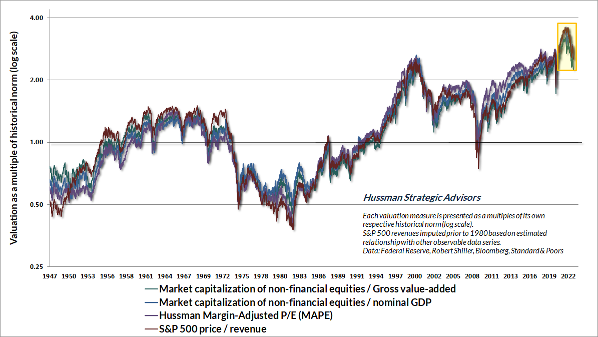
The chart below shows several measures we find best-correlated with actual subsequent market returns across history. Notably, recent market losses have brought these measures from the most speculative extremes in history back to levels roughly matching their 2000 highs – still about 2.3 to 2.5 times the historical norms that we associate with run-of-the-mill S&P 500 total returns of about 10% annually. Nothing requires valuations to revisit their historical norms, but investors should understand that long-term return prospects will remain well-below historically normal levels unless they do.
The chart below shows our most reliable valuation measure: nonfinancial market capitalization to gross value-added (MarketCap/GVA), and its relationship to actual subsequent market returns, in data since 1928. Based on current valuations, we estimate that average annual S&P 500 total returns are likely to be negative on a 12-year horizon.
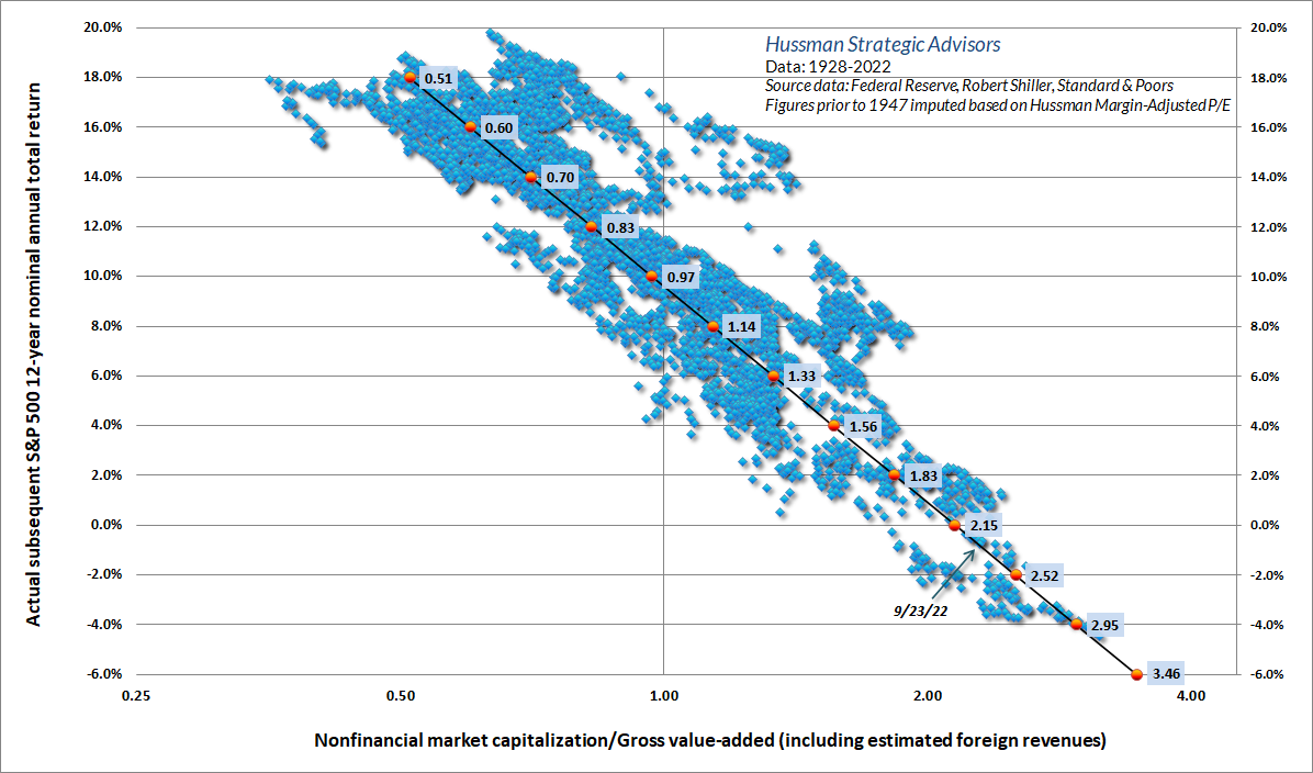
Importantly, the relationship shown above is not materially improved by including information about interest rates or profit margins. That doesn’t mean that low interest rates and high profit margins don’t encourage investors to pay high valuation multiples – they do. But those high valuation multiples are still followed by below average returns. In other words, neither profit margins nor interest rates change the mapping between the level of MarketCap/GVA and the level of subsequent 10-12 year S&P 500 total returns.
Think of it this way. If an IOU promises a single $100 payment 12 years from today, and you want to earn 8% annually, you’re going to pay $100/(1.08)^12 = $39.71 for that IOU. Once you know the price is $39.71, you also know that the expected 12-year return is ($100/$39.71)^(1/12)-1 = 8%. Did you need to know the level of interest rates to do those calculations? No – no, you did not. Given any set of expected cash flows, knowing the price is equivalent to knowing the expected return. Lots of factors can affect the price you’re willing to pay, and the expected return you’re willing to accept, but the mapping between valuations and expected returns is just arithmetic.
My advice for those who insist that profit margins are inexorably rising over time is simple: quantify it. Even if one runs an upward-sloping trendline through S&P 500 profit margins, one can only justify valuations 20-30% above historical norms, not 2.3-2.5 times those norms. For those that go further and insist that S&P 500 reported profit margins will remain at permanent record highs above 12%, despite a historical average of less than 7%, never exceeding 10% except amid trillions of dollars in pandemic subsidies since 2020, I can’t really help much, because these investors have already decided that history doesn’t matter.
In any event, it’s worth considering that most of the variation in corporate profit margins is driven by fluctuations in real unit labor costs. Most of the expansion in profit margins we observed following the global financial crisis was driven by very depressed growth in these costs. As I’ve detailed in recent market comments, that profile has shifted, and rising unit labor costs suggest challenging headwinds for profit margins ahead.
On a related note, I’ll add without additional comment that the practice of running an upward-sloping trendline through valuations is equivalent to running a downward-sloping trendline through future expected returns. It reveals a lack of reflection about what one is measuring.
As for taxes, it’s useful to remember that corporations compete on the basis of after-tax margins. So even if taxes decline as a share of profits, they don’t necessarily decline as a share of revenues (which is how taxes affect margins). Indeed, Federal taxes paid by nonfinancial U.S. corporations – as a fraction of revenues – have averaged 2.9% since 1980, 2.9% since 1990, 2.7% since 2000, 2.6% since 2010, and 2.6% over the past year. It’s depressed real unit labor costs and depressed interest costs that have boosted profits in the past decade. During the past two years, the direct and indirect effects of record pandemic-related deficits have placed a massive cherry on top, as the deficit of government must emerge as a surplus to other sectors (where their income must, in equilibrium, exceed their consumption and net investment). All these factors have now turned.
Trap doors
Remember that periods of speculative investor psychology can drive valuations from their norms for extended segments of the market cycle, so the uniformity of market internals is important to monitor. As I wrote in October 2000, “when the market loses that uniformity, valuations often matter suddenly and with a vengeance. This is a lesson best learned before a crash than after one. Valuations, trend uniformity, and yield pressures are now uniformly unfavorable, and the market faces extreme risk in this environment.”
For my part, the most challenging aspect of zero-interest rate policy was that it forced me to abandon my detrimental belief that there were still reliable “limits” to speculation. Still, valuations and market internals continue to matter enormously. The greatest downside risk emerges when both conditions are unfavorable. That’s been true even over the past decade, and it’s a combination that I describe as a “trap door” situation. While the market can certainly enjoy temporary “clearing rallies” that follow on the heels of oversold declines, it’s important to remember that market collapses are nothing but inadequate risk-premiums being pressed higher. An overvalued market with unfavorable internals is an inherently unstable condition.
The chart below presents the cumulative total return of the S&P 500 in periods where our measures of market internals have been favorable, accruing Treasury bill interest otherwise. The chart is historical, does not represent any investment portfolio, does not reflect valuations or other features of our investment approach, and is not an assurance of future outcomes. On average, our gauge of market internals shifts about twice a year, though about 25% of shifts persist for fewer than 6 weeks, and about 25% persist for 40 weeks or longer.
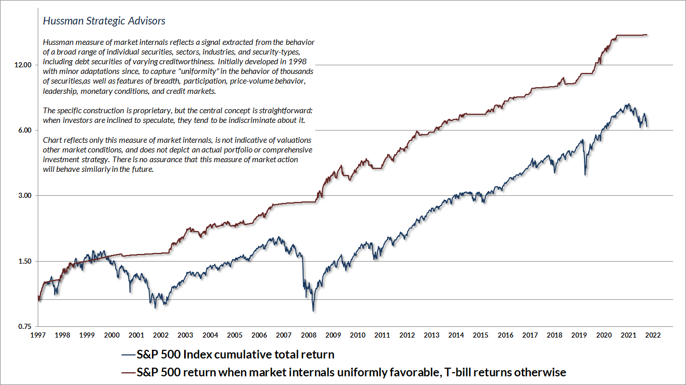
We don’t attempt to forecast or predict when investor psychology will shift from risk-aversion back toward speculation. It’s enough to gauge the uniformity or divergence of market internals, and to align our outlook with observable shifts when they occur. Even at current valuation extremes, an improvement in our measures of market internals would likely justify a constructive investment stance (though certainly with position limits and safety nets). At more moderate levels of valuation, improved internals could encourage an unhedged or even aggressive market outlook.
The strongest market return/risk profiles we identify emerge when a material retreat in valuations is joined by an improvement in the uniformity of market internals. For now, our most reliable valuation measures remain among the most extreme 5% of historical observations. I don’t view the current level of valuations as anything close to a durable low, but investors should certainly expect any extended market decline to be punctuated by fast, furious “clearing rallies” similar to the advance we observed between June and mid-August.
Risk-premiums remain inadequate
The scatter below shows our estimates of the S&P 500 “equity risk-premium” – the expected 10-year return of the S&P 500 over and above the yield on 10-year Treasury bonds – in data since 1928. These estimates are plotted against actual subsequent returns. Our approach is very simple: estimate S&P 500 total returns based on MarketCap/GVA, using the simple linear relationship shown earlier in this comment, and then subtract the yield on the 10-year Treasury bond. This estimate is more reliable than a broad variety of alternatives we’ve tested over time, including the “Fed Model” (forward operating earnings yield – 10-year Treasury yield) and the Shiller-Black-Jirav “excess CAPE yield.”
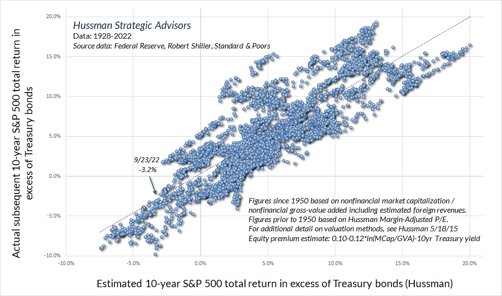
It’s notable the historical norm for the equity risk-premium has been about 5% annually, measured by the total return of the S&P 500 over-and-above 10-year Treasury bond returns. Yet it should be clear from the above scatter plot that the risk-premium is nowhere close to being constant over time. In fact, if market valuations are sufficiently elevated, the expected risk-premium for stocks can even be negative. That’s been true on several occasions over the past century, including 1929, 1969, 2000, 2007, and today.
If you plot any historically-reliable valuation measure against subsequent 10-12 year S&P 500 total returns, you’ll find that the historical norm for that valuation measure is typically followed by subsequent market returns averaging about 10% annually. It’s not an accident that run-of-the-mill valuations are associated with run-of-the-mill returns, but it does provide a convenient way to talk about valuation “norms.” For our part, the norm we use for any given valuation measure is the level associated with run-of-the-mill 10% subsequent returns. Saying that valuations are above their historical norms is equivalent to saying that we expect 10-12 year market returns below 10%. The distance of valuations from their historical norms defines the extent of that expected shortfall.
As for bonds, it’s worth noting that the entire total return of long-term Treasury bonds, over-and-above T-bill returns, has occurred in periods when either a) the long-term bond yield was at least 2% above Treasury bill yields, or b) the long-term bond yield was above the year-over-year growth rate of nominal GDP. That’s not to say that bonds can’t enjoy periods of favorable returns otherwise. Indeed, bonds do seem oversold enough to enjoy a “fast, furious” bounce to clear that condition. It’s just that, on average, bonds have lagged T-bills when neither of those conditions have been in place. The combination of inadequate yields and upward yield pressures typically doesn’t work out well.
This next chart is fun. As regular readers of these comments know, I often present a long-term chart of the S&P 500 versus the level that we associate with run-of-the-mill historical norms, because, as it happens, significant deviations above those norms have typically been followed by “long, interesting trips to nowhere” for the S&P 500 that can persist for a decade or more.
Suppose that instead of simply showing the run-of-the-mill historical norm (the level associated with expected returns of 10% annually), we add two additional lines: 1) the level of the S&P 500 that we estimate would provide a historically normal 5% risk-premium above prevailing 10-year Treasury bond yields, and 2) the level of the S&P 500 that we estimate would provide a zero risk-premium above prevailing 10-year Treasury bond yields. That’s what I’ve done in the chart below.
The dark blue line in the chart below shows the S&P 500 Index since 1928. The dotted black line is the one many of you are familiar with – it shows the level of the S&P 500 that we associate with historically run-of-the-mill valuations (and expected returns of about 10% annually). It’s currently near the 1600 level, about 57% down from here. The green line (closest to that dotted black line) is the level of the S&P 500 that we estimate would be associated with expected returns 5% above Treasury bond yields. It’s currently near the 1900 level, about 49% lower from here. The red line is the level of the S&P 500 that we estimate would be associated with a zero risk-premium – that is, market returns no greater than 10-year Treasury bond yields. It’s currently near the 2900 level, implying that a further market decline of over 20% would be required simply to restore a positive risk-premium for the S&P 500, relative to bonds.
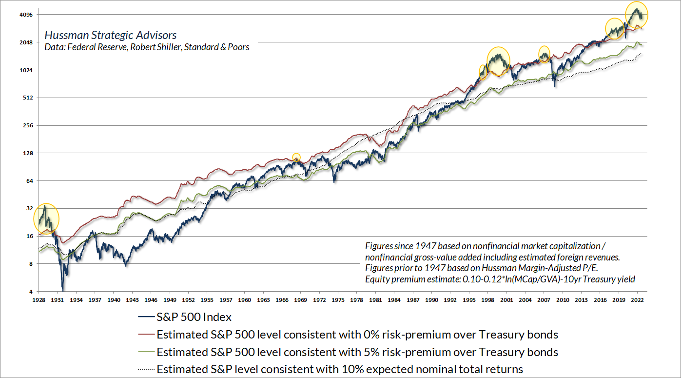
The difference between the green line and the dotted black line is particularly fun. The green line shows the estimated level of the S&P 500 that would be consistent with a run-of-the-mill 5% risk-premium over-and-above prevailing Treasury bond yields. The dotted black line shows the estimated level of the S&P 500 that would be consistent with a run-of-the-mill total return fixed at 10% annually. The difference between these two lines illustrates the impact of changing interest rates.
While the level of interest rates doesn’t change the mapping between market valuations and subsequent returns, the recent period of low interest rates has certainly encouraged investors to accept higher valuations and lower expected returns than normal. As a result, the green line has been above the dotted black line. Conversely, high interest rates can encourage investors to drive stocks to lower valuations and higher expected returns than normal. For example, notice that the green line plunged far below the dotted black line in 1982, as 10-year bond yields reached 15%. What’s remarkable is that the S&P 500 actually plunged to meet that line – a valuation low that was, in fact, followed by well over a decade of 20% average annual total returns for the S&P 500.
At present, the S&P 500 remains above every one of these benchmarks. In particular, the S&P 500 Index is at levels that we estimate will be followed by S&P 500 total returns below Treasury yields for more than a decade. As I’ve highlighted with yellow bubbles, this situation has occurred before. Indeed, it’s precisely the situation that typically produces very long, interesting trips to nowhere for the S&P 500, even relative to T-bill returns.
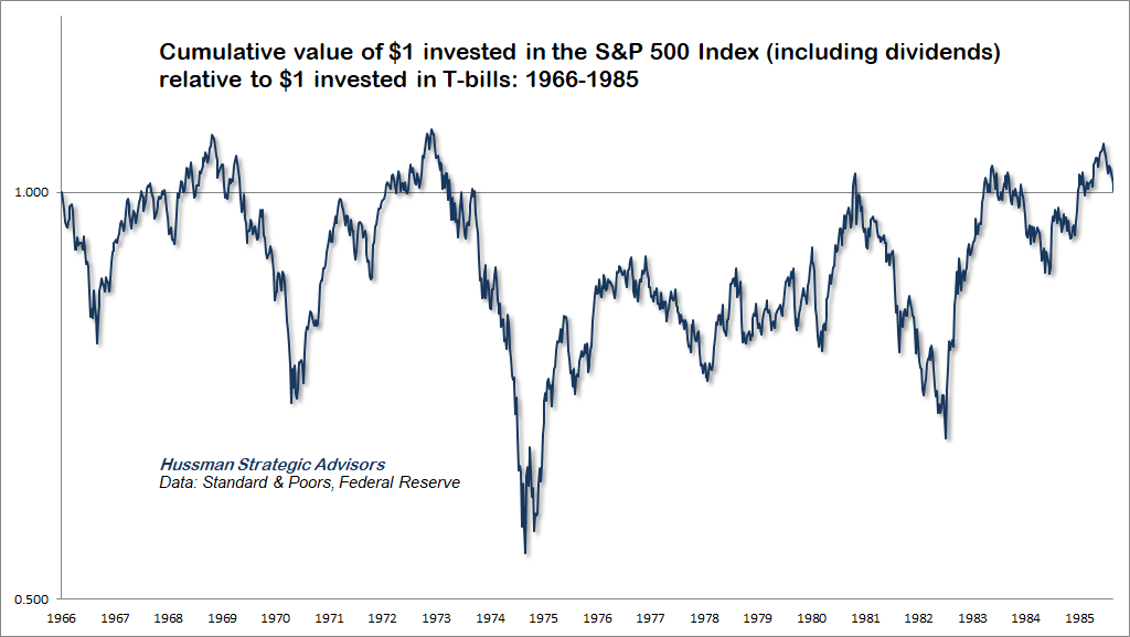
The chart below shows the cumulative value of $1 invested in the S&P 500, including dividend income, relative to $1 invested in Treasury bills. The S&P 500 lagged T-bills from 1929 to 1947. The reason is simple: the S&P 500 began that period at valuations that provided an inadequate risk-premium relative to interest rates.
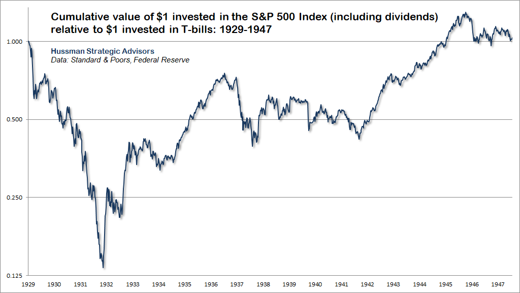
It should not be a surprise that the same outcome occurred from 1966 to 1985.
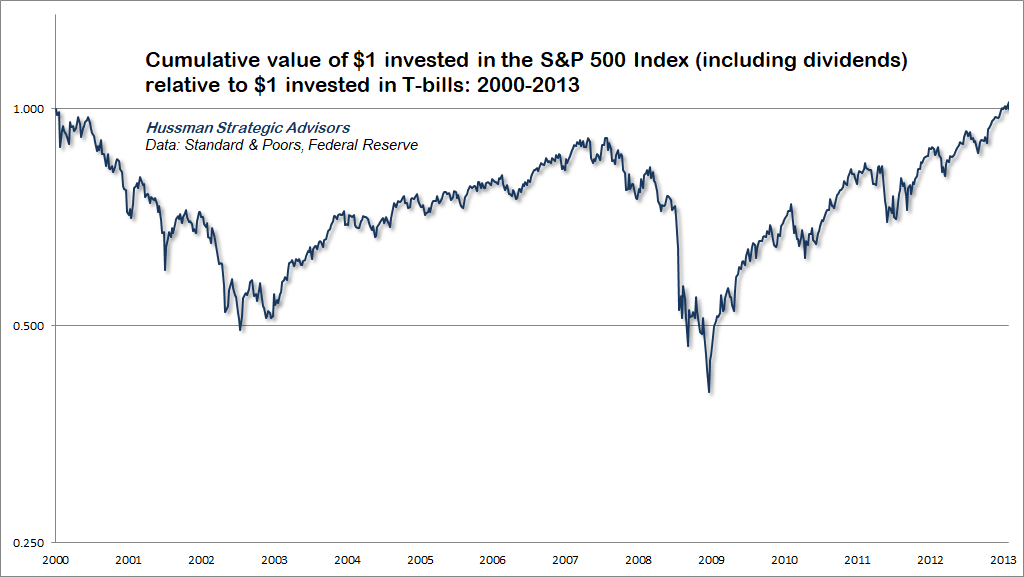
Ditto for the 13-year period following the 2000 market peak.
I call periods “interesting” trips to nowhere for several reasons. First, the dismal returns are measured from the valuation highs. Fortunately, much of the damage is tends to occur within two or three years following valuation extremes, after which the market can actually provide a long period of reasonable returns as it recovers those losses. Moreover, all of these episodes have included good opportunities to embrace market exposure. Periods of recovery during the bear market periods can extend for weeks or months. Improvements in market internals can support even more constructive investment exposure, and even complete bull markets embedded within the broad “secular” retreat in valuations. That’s certainly what I expect in this instance, and I expect we’ll enjoy regular opportunities to adopt a positive market outlook.
There’s no question that Fed-induced speculation encouraged investors to chase extreme valuations, and to accept low returns on every class of investments. Unfortunately, Fed policy does not change the arithmetic that links valuations with subsequent returns. By our estimates, the S&P 500 is likely to lag Treasury bonds, and even Treasury bills, for more than a decade. Now comes the hard part.
The essential thing to recognize is that all of this is quantifiable. It’s not enough to say “low interest rates justify high valuations” as if no valuation is too extreme. It’s not enough to believe that it’s “only necessary to buy ‘good’ stocks, regardless of price, and then to let nature take her upward course.” I suspect that’s exactly what many investors have done, encouraged by a combination of verbal arguments, backward-looking returns, and “risk-premium” models that aren’t actually correlated with subsequent market returns.
To be clear, when valuations are elevated, the uniformity or divergence of market action across a broad range of internals can help to distinguish “intelligent” speculation from “unintelligent” speculation. But once the trap door of extreme valuations and divergent internals swings open, short-lived “clearing rallies” are typically the best investors can expect.
As I lamented in August 2007, just before the S&P 500 plunged by 55% in the global financial crisis, “Is our profession really so lazy that we would advise people to risk their financial security based on tinker-toy models and pretty pictures that we don’t even have the rigor to test historically? Investors appear eager to ‘scoop up’ so-called ‘bargains’ on the belief that stocks are ‘cheap relative to bonds.’ All of this is predicated on the belief that profit margins will remain at record highs, that the Fed Model is correct, and that P/E ratios based on extremely elevated measures of earnings should be evaluated based on norms for much more restrained measures of earnings.”
There’s no question that Fed-induced speculation encouraged investors to chase extreme valuations, and to accept low returns on every class of investments. Unfortunately, Fed policy does not change the arithmetic that links valuations with subsequent returns. By our estimates, the S&P 500 is likely to lag Treasury bonds, and even Treasury bills, for more than a decade. Now comes the hard part.
Diary of a deranged “ample reserves regime”
We are embarked on shrinking the balance sheet, and the test will be back to levels that satisfy the public’s demand for our liabilities – that’s currency, and reserves, and things like that – but also with reserves maintained at a level that is consistent with our ‘ample reserves regime.’ So the balance sheet is substantially larger now, obviously, and consequently the runoff process is designed to be substantially faster than the last cycle; on the tune of a trillion dollars of runoff per year, once it’s up to full speed. As far as returning to a scarce reserves regime, I guess I would say that I think our current operating framework is a better one, and I don’t see a case for returning to scarce reserves.
And why is that? So, the world has really changed as a result of the global financial crisis and the pandemic. The scarce reserves framework would be challenged to work in a world where there’s very high and sometimes volatile demand for safe and liquid assets, central banks may have to rely on large-scale asset purchases from time to time in response to severe shocks, and remember that the large financial institutions hold very large quantities of safe assets now as a liquidity buffer, and that includes a lot of reserves. So the bottom line is that the quantity of reserves is just so much higher that it would seem to be impractical to try to manage scarcity, and demand will be volatile too. We think the current system works well and it provides a lot of liquidity, so it’s kind of a net gain.”
– Fed Chairman Jerome Powell, Cato Institute Monetary Conference, September 8, 2022
Let’s take a closer look at the atrocity the Fed is defending as its “ample reserves regime.” The chart below shows total Federal Reserve liabilities as a fraction of nominal GDP, along with the 3-month Treasury bill yield over-and-above the interest rate that the Fed (now) pays to banks and other financial institutions that hold these liabilities. The chart is our version of what economists know as the “liquidity preference” curve. I’ll explain it in greater detail after you catch your breath, but it’s worth noting at the outset that in the entire history of U.S., Fed liabilities never materially exceeded 16% of GDP (0.16 on the horizontal axis) until 2010, when the Fed went full-tilt loony tunes with quantitative easing. The discontinuous leap to a balance sheet greater than 25% of GDP occurred when Powell doubled down, literally, in 2020.
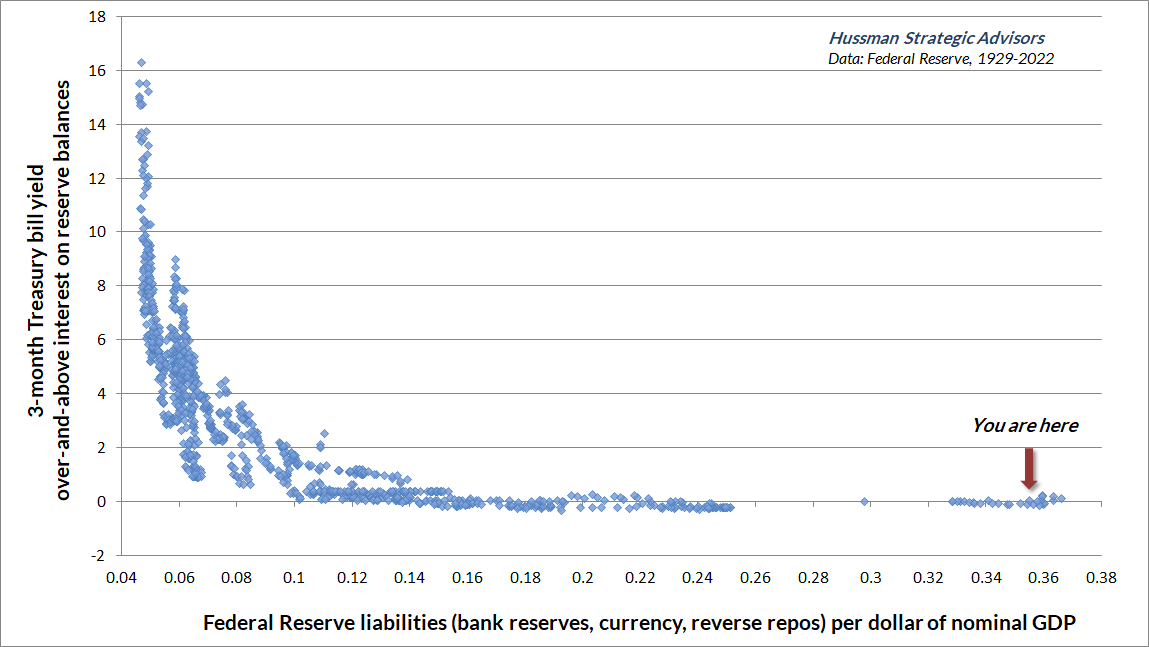
What Powell describes as a “scarce reserves regime” is actually the policy environment that operated under during the entire existence of the Federal Reserve prior to 2010. It worked like this: in order to influence short-term interest rates and the money supply, the Federal Reserve would go into the open market and purchase Treasury securities, gold (mostly prior to 1970), or other government-backed assets. In return, the Fed would create “Federal Reserve liabilities” – currency and bank reserves – to pay for them. You can see what a Federal Reserve liability looks like by reading the top line of a dollar bill. The terms “Fed balance sheet,” “Fed assets” and “Fed liabilities” are often used interchangeably, because they’re different sides of the same coin.
Historically (until QE) Fed liabilities did not earn any interest. Banks and individuals were still willing to hold them because they provided immediate liquidity. Equally important, varying the “scarcity” of these zero-interest liabilities was precisely how the Fed set short-term interest rates. As the quantity of currency and bank reserves (base money) becomes more plentiful, investors become uncomfortable with all that zero-interest liquidity, and begin seeking alternatives that might offer a greater return. Their closest alternative is Treasury bills. So as the quantity of base money increases, Treasury bill prices are bid higher, and their yields are bid lower. This process continues until investors are indifferent between holding zero-interest base money or low-yielding Treasury bills.
Put simply, when the Fed floods the system with reserves, the public tries to get rid of the excess, and will accept dismally low T-bill yields to get a “pickup” over whatever reserves are paying (historically, zero). When reserves are scarce, the public is hesitant to get rid of them, and holders need the incentive of high T-bill interest in order to part with them. That, in a nutshell, is how Federal Reserve operations impact short-term interest rates.
A critical feature of this process is that once a dollar of base money has been created, someone in the economy has to hold it, at every moment, until it’s retired. It can pass from one holder to another, from the buyer of T-bills to the seller of T-bills, from the buyer of stocks to the seller of stocks, but there’s no way to get “out” of zero-interest base money in aggregate. Until the base money is retired by the Fed, somebody has to hold it, even if nobody wants it. It’s a hot potato.
You can see in the chart precisely how Paul Volcker crushed inflation in the early-1980’s. Volcker cut the Federal Reserve’s balance sheet to less than 5% of GDP. That scarcity of Fed liabilities did two things. First, investors and banks who needed immediate liquidity became willing to sell Treasury bills at lower prices in order to obtain base money, and holders of base money became very reluctant to give up their liquidity unless they were compensated by a very high interest rate. As a result, Treasury bill yields briefly shot above 15%. More importantly, however, Volcker’s restriction of the money supply convinced the public that the Federal Reserve would not passively finance government deficits, restoring confidence in fiscal stability and stable prices that was lost a decade earlier when the U.S. abandoned the gold standard, closed the gold window, and ushered in floating exchange rates.
As Nobel economist Thomas J. Sargent has observed about severe inflationary episodes, “once it became widely understood that the government would not rely on the central bank for its finances, the inflation terminated and the exchanges stabilized.” Sargent also observes that severe inflations have been driven not simply by the quantity of central bank liabilities, but instead by “the growth of liabilities that are unbacked, or backed only by government debt, for which there was never a prospect to retire.” Governments can typically expand their debt in line with the growth of the economy itself, without inflationary consequences, provided that the overall debt-to-GDP ratio is serviceable. But once the public loses confidence in government restraint, because of unrestrained government deficits, overly accommodative monetary policy, or both, inflationary expectations can become embedded. That’s particularly true if the economy also faces supply shocks. It’s also why Section 2A of the Federal Reserve Act mandates that the Fed “shall maintain long run growth of the monetary and credit aggregates commensurate with the economy’s long run potential to increase production.”
In the Federal Reserve’s arrogant defense of an “ample reserves regime” and dismissive regard for the so-called “scarce reserves regime” that has defined monetary policy for a century, the Fed is telling the public that it has no interest in restraint.
As investors, we’ve already addressed this prospect by abandoning our reliance on previously reliable “limits” to speculation – becoming content to align ourselves with prevailing market conditions, particularly valuations and market internals. But our concern is also for the public interest, and I remain convinced that the Federal Reserve is willfully ignorant of the consequences of its actions, both on yield seeking speculation and on the public confidence in government liabilities.
Recall how we got a mortgage bubble in the first place. Following the 2000-2002 market collapse, Alan Greenspan cut short-term interest rates to just 1%, driving investors to search for alternatives that might offer a higher return. They found that alternative in mortgage securities, which provided a “pickup” in yield over and above T-bills, as well as perceived safety, given that U.S. housing prices had never collapsed. With demand for mortgage securities driven by yield-seeking speculation, and supply driven by Wall Street’s eagerness to sell new “product,” the result was an explosion in the volume of mortgage securities. But in order to create a mortgage security, you have to make a mortgage loan. Enter no-doc mortgages, zero-down interest-only payment structures, and a resulting bubble in housing prices. Then came the hard part. The Fed did not save the economy from the global financial crisis. The Fed caused it.
Indeed, the thing that finally ended the global financial crisis wasn’t Fed heroism, distressed asset purchases, or quantitative easing. It was a change in accounting rule FAS-157 by the Financial Accounting Standards Board in March 2009, which eased “mark to market” standards for banks, eliminating the prospect of widespread bank insolvency by making insolvency opaque. The decade of zero interest rates that followed simply helped banks to recapitalize their balance sheets, funded by paying depositors zero.
The same dynamic that created the mortgage bubble – yield-seeking speculation driven by a pile of zero interest monetary hot-potatoes – is precisely what has now given us the broadest speculative episode in U.S. history. The speculation has been broader and more sustained because the Federal Reserve’s profligacy has been greater. At the beginning of this year, U.S. investors were being forced to choke down a stunning 36% of GDP in zero-interest monetary hot potatoes, most of which they held indirectly through bank deposits earning nothing. Somebody had to hold it, and nobody wanted to.
Forcing that much zero-interest cash onto investors who didn’t want to hold it, and couldn’t – in aggregate – get rid of it, contributed to a ridiculous array of financial speculation. That’s how the Fed helped to drive valuations beyond their 1929 and 2000 extremes, setting up pension funds, retirees, charities, and every type of passive investor for negative expected returns, by our estimates, for more than a decade. Breathtaking amounts of “market capitalization” emerged, temporarily, in even the sketchiest alternatives. In my view, Fed-induced speculation was also at the root of the bubbles in meme stocks and cryptocurrencies, which have proliferated like digital Pokémon, because nothing animates a speculative herd more than a parabolic advance in an “asset” unconstrained by any standard of value. You won’t be surprised that I expect the unwinding to end in tears. Still, having adapted to deranged Fed policy years ago, nothing in our discipline relies on that outcome.
When the collapse comes, and I believe it will, my hope is that the blame goes to the right place. It will not be because the Fed was forced to tighten, but rather because the Fed adhered to its “ample reserves regime” for so long.
At the beginning of this year, U.S. investors were being forced to choke down a stunning 36% of GDP in zero-interest monetary hot potatoes, most of which they held indirectly through bank deposits earning nothing. Somebody had to hold it, and nobody wanted to. Forcing that much zero-interest cash onto investors who didn’t want to hold it, and couldn’t – in aggregate – get rid of it, contributed to a ridiculous array of financial speculation. That’s how the Fed helped to drive valuations beyond their 1929 and 2000 extremes, setting up pension funds, retirees, charities, and every type of passive investor for negative expected returns, by our estimates, for more than a decade.
So now that the Fed is being forced to raise interest rates, how is the Fed able to engineer a fed funds rate of more than 3% when Fed liabilities are near the highest fraction of GDP in history? Simple. The Fed is paying banks and other financial institutions 3.15% to hold those liabilities. See, if the Fed wasn’t drowning in its own dogma, it would pay nothing on its liabilities, but it would also have a balance sheet of only about 7% of GDP. That level of zero-interest base money would give us 3% short-term interest rates, without massive economic and financial market distortions.
Once the balance sheet gets past about 16% of GDP, the liquidity preference curve hits zero. At that point, the only way you can lift interest rates above zero is by paying banks billions of dollars on their reserves, so they have no incentive to lend money at a lower rate. In effect, the Federal Reserve is currently creating “synthetic” interest-bearing securities for financial institutions by paying them interest on liabilities created by the Fed, because somehow the Fed insists on holding the actual government securities on its own balance sheet. It’s as insane as it sounds.
When Jerome Powell tells you that “the large financial institutions hold very large quantities of safe assets now as a liquidity buffer, and that includes a lot of reserves,” it’s worth remembering that the “safe assets” are Fed liabilities, and financial institutions are holding them because the Fed has jammed them down everybody’s throats. The reserves created by the Fed can certainly move from bank to bank in the form of payments, loans, and other transactions, but they must remain locked in the banking system unless depositors withdraw their funds and hold them as physical currency.
Of course, banks have to hold capital against their bloated deposits, which can push them against regulatory constraints. Meanwhile, to the extent investors prefer to hold liquidity in money market funds rather than bank deposits, the Fed is also forced to execute trillions of dollars in “reverse repurchases” that essentially absorb funds from money market funds every night, in return for T-bills that the Fed buys back a tiny bit higher the next day, so the money market earns implicit “interest” on the transaction. Taken together, the Fed has created a situation where capital is flowing in all directions based on small differences in the interest rate the Fed pays to banks, the interest rate the Fed pays on reverse repos, the interest rate on Treasury bills, and efforts to arbitrage expected overnight rates against 1-month and 3-month T-bill rates. Any mismatch can quickly result in spiking repo rates in the overnight markets and failure-to-deliver events in the Treasury bill market. That’s your “very high and sometimes volatile demand for safe and liquid assets.” The ample reserves regime doesn’t solve this. It causes it.
There will be other costs, aside from the economic dislocations that I expect will accompany the unwinding of this bubble. Specifically, I estimate that the assets on the Fed’s balance sheet were bought a weighted-average yield of only about 2.5%, which means that the Federal Reserve’s balance sheet losses are likely approaching the better part of a trillion dollars. The Fed is also paying out more interest than it takes in, booking the difference as a “deferred asset.” As Bernanke cryptically explained to a glassy-eyed Congressional panel years ago, “it’s an asset in the sense that it embodies a future economic benefit [to the Fed] which will be realized as a reduction in future cash outflows [of interest back to the Treasury, on behalf of the public].” Ample reserves regime indeed.
By the time the federal funds rate moves above 4%, which appears likely, the Fed will be paying well over $300 billion in annual interest to banks, easily $100 billion more than it receives on the assets it holds on its balance sheet.
Given that the U.S. Constitution vests spending authority solely in Congress, it’s not clear that incurring massive balance sheet losses and spending more than the Fed receives in interest is actually Constitutional. I doubt that this is what Congress intended by “independence.” I do know that Section 2A of the Federal Reserve Act requires that the Fed “shall maintain long run growth of the monetary and credit aggregates commensurate with the economy’s long run potential to increase production.” That places the current “ample reserves regime” in gross violation of the Fed’s legal mandate, because the Fed appears intent on preserving a balance sheet that’s nowhere near the ratio of GDP that has prevailed for a century, prior to the boozy revelry of recent years.
Useful central bank independence is gauged by the capacity to refrain from financing unrestrained deficits, and the wisdom to refrain from actions that amplify malinvestment and speculative distortion. In contrast, the “independence” of the current Federal Reserve is simply not worth defending. That said, I’d be content simply with a return to reasonably systematic policy and ordinary open market operations.
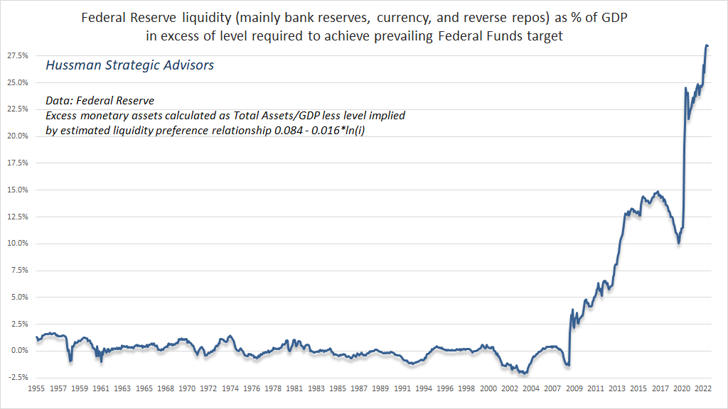
Given the well-behaved relationship between base money (as a fraction of nominal GDP) and interest rates, we can easily estimate the amount of liabilities the Fed has created over-and-above the level required to achieve its prevailing federal funds target. The chart below shows the current situation. What’s really striking here is that these “ample reserves” have no reliable or economically meaningful correlation with subsequent output or employment growth, although there’s a modest positive correlation with inflation.
Useless, reckless, corrosive, deranged, but ample.
Keep Me Informed
Please enter your email address to be notified of new content, including market commentary and special updates.
Thank you for your interest in the Hussman Funds.
100% Spam-free. No list sharing. No solicitations. Opt-out anytime with one click.
By submitting this form, you consent to receive news and commentary, at no cost, from Hussman Strategic Advisors, News & Commentary, Cincinnati OH, 45246. https://www.hussmanfunds.com. You can revoke your consent to receive emails at any time by clicking the unsubscribe link at the bottom of every email. Emails are serviced by Constant Contact.
The foregoing comments represent the general investment analysis and economic views of the Advisor, and are provided solely for the purpose of information, instruction and discourse.
Prospectuses for the Hussman Strategic Growth Fund, the Hussman Strategic Total Return Fund, the Hussman Strategic International Fund, and the Hussman Strategic Allocation Fund, as well as Fund reports and other information, are available by clicking “The Funds” menu button from any page of this website.
Estimates of prospective return and risk for equities, bonds, and other financial markets are forward-looking statements based the analysis and reasonable beliefs of Hussman Strategic Advisors. They are not a guarantee of future performance, and are not indicative of the prospective returns of any of the Hussman Funds. Actual returns may differ substantially from the estimates provided. Estimates of prospective long-term returns for the S&P 500 reflect our standard valuation methodology, focusing on the relationship between current market prices and earnings, dividends and other fundamentals, adjusted for variability over the economic cycle. Further details relating to MarketCap/GVA (the ratio of nonfinancial market capitalization to gross-value added, including estimated foreign revenues) and our Margin-Adjusted P/E (MAPE) can be found in the Market Comment Archive under the Knowledge Center tab of this website. MarketCap/GVA: Hussman 05/18/15. MAPE: Hussman 05/05/14, Hussman 09/04/17.