

Universal Capitulation and No Margin of Safety


John P. Hussman, Ph.D.
President, Hussman Investment Trust
March 2024
The 1929 boom was, in fact, quite a narrow and selective one. It was a boom of the handful of stocks that figured in the daily calculation of the Dow Jones and New York Times indices, and that was why those well-publicized indexes were at record highs. It was also a boom of the most actively traded stocks bearing the names of the most celebrated companies, the stocks mentioned daily by the newspapers and millions of times by the board room habitués – and that was why it was constantly talked about. But it was emphatically not a boom of secondary stocks in which perhaps as many investors were interested.
– John Brooks, Once in Golconda, 1969
The Nifty Fifty appeared to rise up from the ocean; it was as though all of the U.S. but Nebraska had sunk into the sea. The two-tier market really consisted of one tier and a lot of rubble down below. What held the Nifty Fifty up? The same thing that held up tulip-bulb prices long ago in Holland – popular delusions and the madness of crowds. The delusion was that these companies were so good that it didn’t matter what you paid for them; their inexorable growth would bail you out.
– Forbes Magazine, 1977, The Nifty Fifty Revisited
The market is in a two-tier frenzy between the ‘new economy’ stocks and the ‘old economy’ stocks. Anyone who has studied the concept-stock mania of 1968-69, or the ‘Nifty Fifty’ mania of 1972 has to be getting chills here. We’ve seen two-tiered markets before: most prominently in 1929, 1968-69, and 1972. The inconvenient fact is that valuation ultimately matters. That has led to the rather peculiar risk projections that have appeared in this letter in recent months. Trend uniformity helps to postpone that reality, but in the end, there it is. Given current conditions, it is increasingly likely that valuations will begin to matter with a vengeance.
– John P. Hussman, Ph.D., March 7, 2000
Based on the valuation measures we find best-correlated with actual subsequent S&P 500 total returns across a century of market cycles, the stock market presently stands at valuation extremes matched only twice in U.S. financial history: the week ended December 31, 2021 (the 2022 peak occurred the next trading day) and the bubble peak in the week ended August 26, 1929. While our investment discipline is to align our outlook with prevailing, observable market conditions, my impression is that investors are presently enjoying the double-top of the most extreme speculative bubble in U.S. financial history.
Present valuation extremes might only be a long-term concern if our measures of market internals were not also divergent and unfavorable here. It seems popular to imagine that “this time is different” – that the economy has entered a new era of permanently high profit margins and credit expansion; that a narrow, selective, two-tier frenzy among large capitalization glamour stocks is enough to carry the market ever higher. History is not friendly to these ideas, but no forecasts are required. Our outlook will change as observable conditions change.
This month’s comment offers an expansive and data-rich dive into profit margins and market composition. The objective is not to argue, or convince, or urge investors to do anything. We share our research, and we ask nothing in return. Still, if there is one suggestion that might be useful to investors here, it is simply to allow the possibility that market conditions will change. Whether your outlook is bullish or bearish, the notion that the current situation is permanent is exactly what will make you suffer.
This is the longest period of practically uninterrupted rise in security prices in our history… The psychological illusion upon which it is based, though not essentially new, has been stronger and more widespread than has ever been the case in this country in the past. This illusion is summed up in the phrase ‘the new era.’ The phrase itself is not new. Every period of speculation rediscovers it… During every preceding period of stock speculation and subsequent collapse business conditions have been discussed in the same unrealistic fashion as in recent years. There has been the same widespread idea that in some miraculous way, endlessly elaborated but never actually defined, the fundamental conditions and requirements of progress and prosperity have changed, that old economic principles have been abrogated… that business profits are destined to grow faster and without limit, and that the expansion of credit can have no end.
– The Business Week, November 2, 1929
Current market conditions
I think we can all agree on two propositions.
First, if enough speculators believe that stock market gains are driven by a tap-dancing squirrel monkey named Bobo, and Bobo starts tap-dancing, well, the stock market is going up, at least in the short run. Neither truth nor logic have anything to do with it.
Second, because stocks are ultimately a claim on future cash flows that must be delivered over time, higher starting valuations still mean lower long-term returns, which is why no speculative episode in history has ever ended well.
Both of these propositions can be true at the same time.
When investors are inclined to speculate, they tend to be indiscriminate about it. When speculation becomes highly selective, it’s typically an indication of subtle or emerging risk-aversion. For that reason, we gauge investor psychology toward speculation and risk-aversion based on the uniformity and divergence of market action across thousands of individual stocks, industries, sectors, and security-types, including debt securities of varying creditworthiness.
I introduced our main gauge of “market internals” to our discipline in 1998, during the most speculative portion of the tech bubble, with minor adaptations since. As I noted in 2021, for example, we adopted a slightly more “permissive” threshold in our gauge of market internals when interest rates are near zero and certain measures of risk-aversion are well-behaved. Given that we use market internals to gauge speculative psychology, a more permissive threshold captures the idea that tossing deranged Fed policy into the mix boosts the implications of a given improvement in market internals.
The chart below presents the cumulative total return of the S&P 500 in periods where our main gauge of market internals has been favorable, accruing Treasury bill interest otherwise. The chart is historical, does not represent any investment portfolio, does not reflect valuations or other features of our investment approach, and is not an assurance of future outcomes.
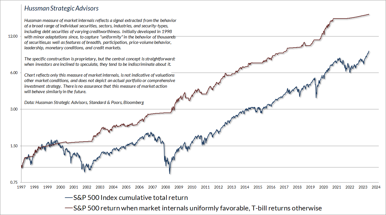
Clearly, investor psychology, gauged by the uniformity and divergence of market action, is an essential consideration – particularly over periods shorter than a complete market cycle. This brings us to the second proposition, which is that long-term returns move opposite to starting valuations. That’s because every security is a claim to some future expected stream of cash flows that will be delivered over time. The higher the price investors pay for those cash flows, the lower the investment return they will enjoy. But this is a long-term, not a short-term proposition.
Investors increasingly question and ultimately abandon valuations during speculative episodes, imagining that rich valuations should be followed by market losses. That’s not how valuations work. The only way valuations can possibly reach extremes like 1929, 2000, 2022, and today is by advancing through lesser valuation extremes again and again. The oversized past returns and extreme valuations at a bubble peak can convince investors that the relationship between valuations and subsequent returns has been broken, when in fact, the oversized past returns are precisely the result of those extreme bubble valuations.
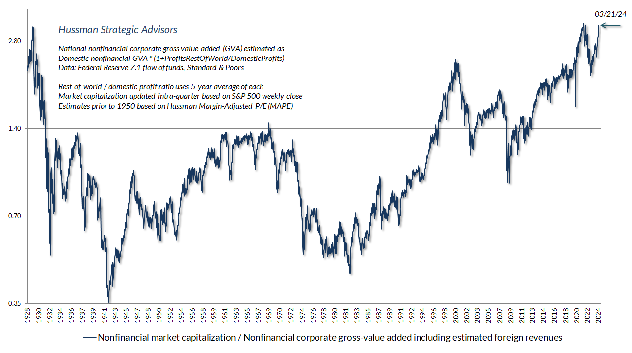
The chart below shows our most reliable valuation measure, the ratio of nonfinancial market capitalization to gross value-added, including estimated foreign revenues (see the chart text for calculation details). We’ve observed greater extremes only twice in U.S. financial history: the week ended December 31, 2021, and the week ended August 26, 1929.
Presently, the central elements of our investment discipline – market internals, valuations, and overextended conditions – uniformly hold us to a defensive outlook. I realize that some are waiting on a favorable shift in internals with increasing impatience, on the idea that the shift might provide justification to speculate. While the S&P 500 is only a few percent ahead of Treasury bills since its January 2022 peak, it has recovered more significantly from its lows, yet internals remain divergent. Never mind that valuations now match those observed at the two greatest extremes in history – 1929 and 2022. Nothing prevents valuations from exceeding those extremes, particularly in the short run. A defensive position can feel excruciating, and investors can experience enormous psychological pressure to “get in” on the rally in order to obtain a feeling of relief.
Our approach to that impatience has been to test literally hundreds of modifications that might “force” a favorable shift here, without degrading the reliability of internals over the recent cycle and across history. We haven’t found even one that would do so. That’s probably because it’s ill-advised to force a constructive position amid market extremes and divergent internals, but there’s no harm in re-examining the data. Likewise, even if we were to apply a more permissive threshold here, with rates still well above zero, it would not shift our gauge of internals from its unfavorable status at present.
The market can certainly advance during periods of unfavorable internals, particularly over the short run. Still, these periodic advances tend to lag T-bills on average, and the gains are often abruptly surrendered. Accepting market risk during periods of unfavorable market internals always comes with elevated risk, and that risk becomes steeper when extreme valuations and overextended market action are present, as they are today. Put simply, I trust the guidance we have from valuations and internals, and our defensiveness here is both uncomfortable and intentional.
If you can’t stand “missing out” on any market advance, and speculative exuberance tempts you to abandon your discipline, you might benefit from some passive investment exposure – not because we think it will do well, but to relieve your psychological discomfort. That’s a personal decision, and we need not be involved. For our part, our outlook will change as observable conditions change.
This is what produces bull market tops. Obviously no one rationally would want to buy at the top, and yet enough people do to produce a top. It is really quite amazing how time horizons and money goals can change when there are stocks around that are going up 100 percent in six months.”
– Adam Smith (GJW Goodman), The Money Game, 1967
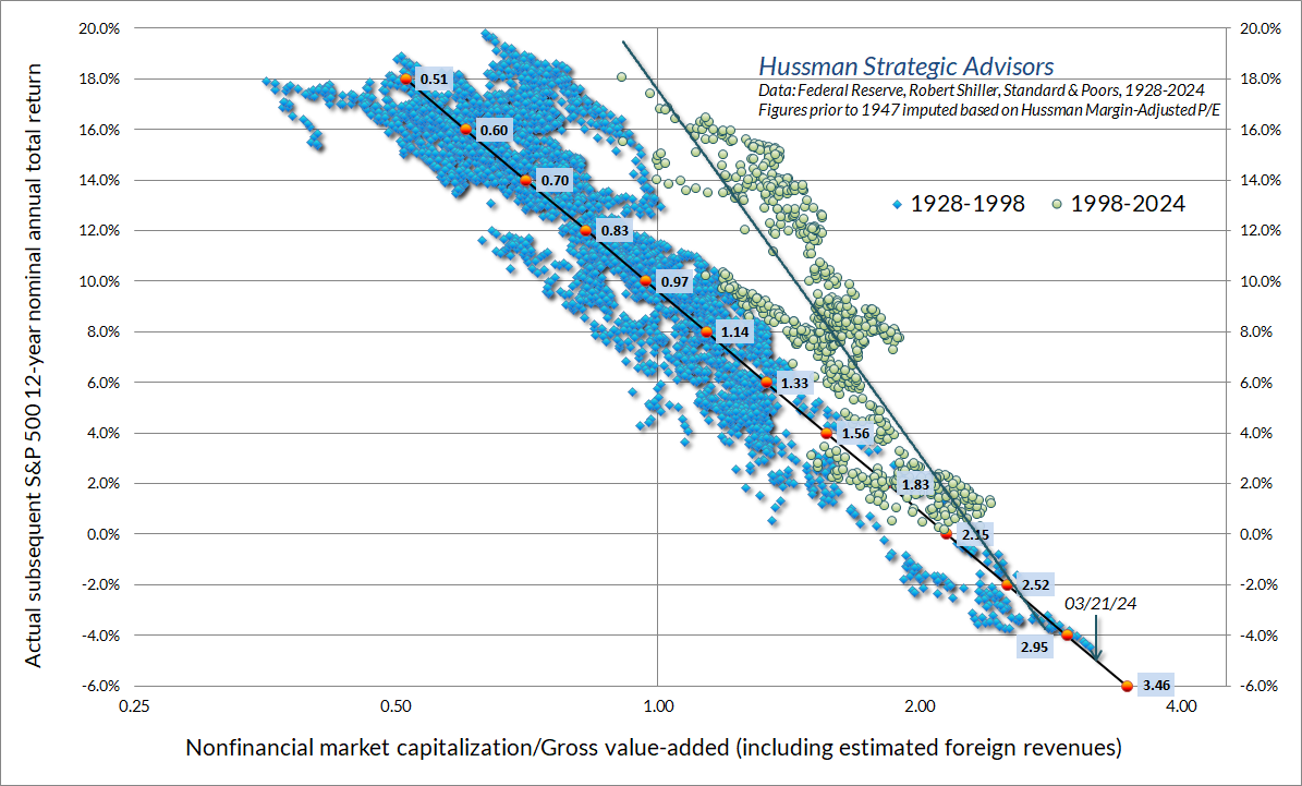
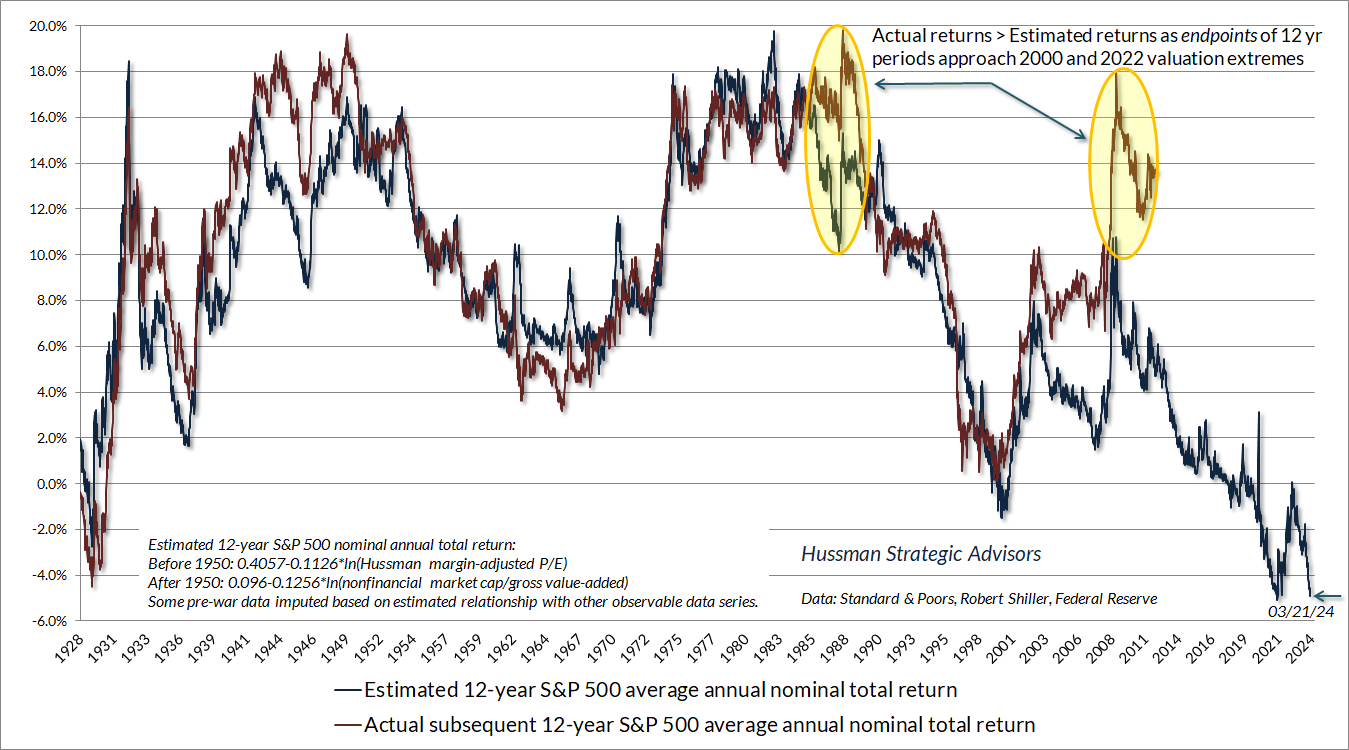
The scatter plot below shows the relationship between starting valuations and subsequent 12-year S&P 500 average annual total returns. I’ve broken the chart into two subsets, not because I actually believe the long-term relationship has changed, but to isolate the effect of repeated speculative episodes since 1998. As I detailed more fully in The Structural Drivers of Investment Returns (see the section titled “You may not like this part”), the apparent “shift” in the relationship between valuations and returns is a reflection of speculative bubbles that front-load returns, and then resolve with negative returns, as usual.
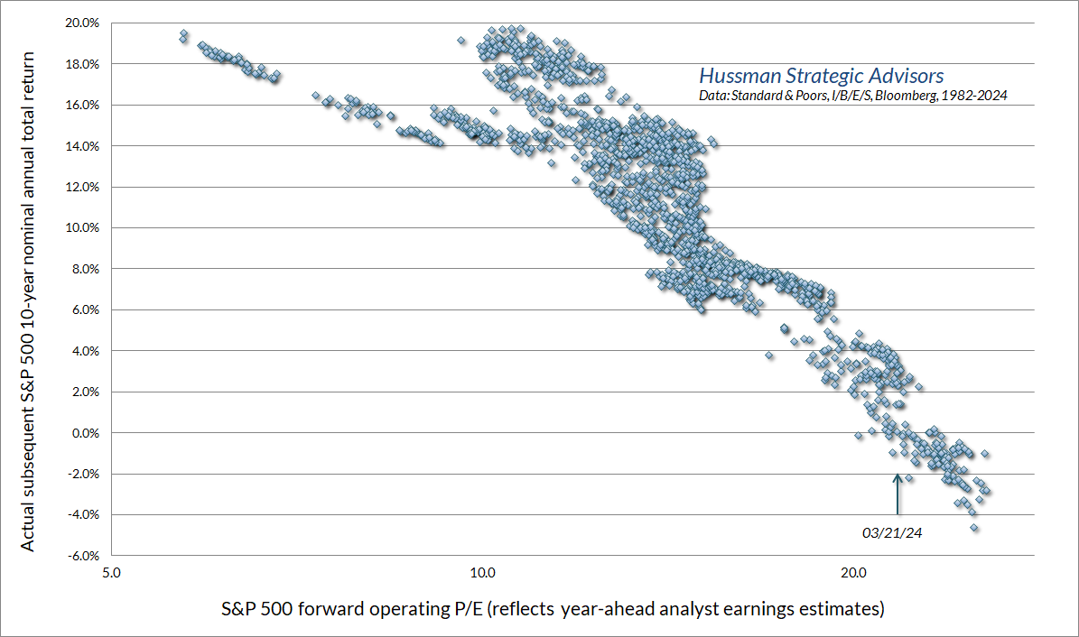
It’s worth noting that even on the basis of optimistic year-ahead earnings estimates, the ratio of the S&P 500 to forward operating earnings is at levels, based on data since the 1980’s, associated with average subsequent 10-year S&P 500 total returns close to zero. Our valuation concerns are certainly not limited to the measures we find most reliable.
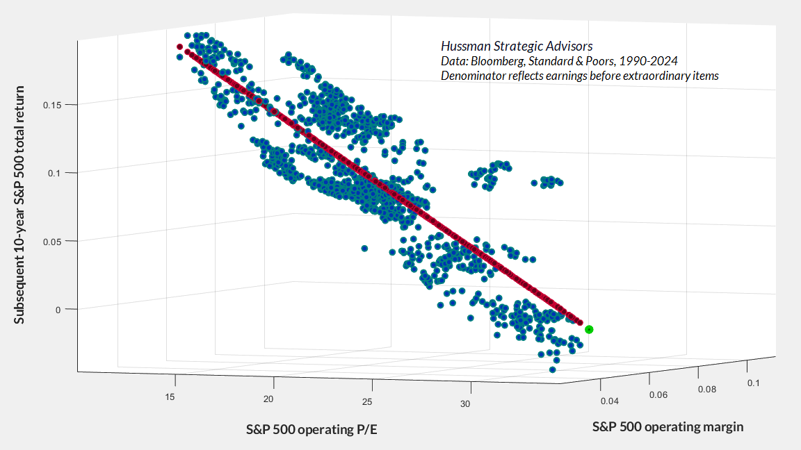
That said, we do find P/E ratios to be fraught with risky and unobserved assumptions. As Jeremy Grantham reminded investors last week, “if margins and multiples are both at record levels at the same time, it really is double counting and double jeopardy – for waiting somewhere in the future is another July 1982 or March 2009 with simultaneous record low multiples and badly depressed margins.”
The 3D scatterplot below illustrates this point. The current S&P 500 operating P/E, operating margin, and associated 10-year return estimate are shown in bright green.
The chart below places current extremes in a historical perspective, and also illustrates how bubbles can “front load” returns. Specifically, the effect of a bubble is to temporarily raise the level of valuations at the end of a given holding period. As a result, returns during that holding period are driven well above the returns one would have estimated based on valuations at the beginning of the holding period. For example, measured from 1988, the subsequent 12-year total return of the S&P 500 was much higher than one would have projected based on valuations at the time. Why? Because the end of that 12-year period happened to be the 2000 bubble peak. The same has been true in recent years. Why? Because valuations are again at levels observed only near previous bubble peaks.
As I’ve noted regularly, there’s one element of our discipline that gave us enormous difficulty during the speculative bubble of recent years. It was not internals. It was not even valuations. Rather, in prior market cycles, there were generally reliable “limits” to speculation – once certain combinations of overvaluation, overextended price action, and overbullish sentiment emerged, the market would quickly encounter an air-pocket, panic or even crash in fairly short-order. Amid the yield-seeking speculation encouraged by zero-interest rate policies (and the need for investors, in aggregate, to hold 18-36% of GDP in zero-interest liquidity created by the Fed), those “limits” proved unreliable, and bearish positions were detrimental.
In 2017, we adapted our discipline to avoid adopting or amplifying a bearish investment outlook, even amid speculative extremes, in periods when our measures of market internals were favorable. Still, avoiding a bearish outlook is not the same as adopting a constructive one. In 2021, we further adapted our discipline to encourage a constructive outlook – regardless of the level of valuation – in periods when our measures of market internals are favorable. Those adaptations come with sufficient safety nets and position limits to qualify as what Benjamin Graham might describe as “intelligent speculation.”
Presently, we observe neither favorable valuations, nor favorable market internals, while our syndromes of overextension remain consistent with the risk of an abrupt air-pocket, panic, or crash. Even with the adaptations we’ve made in this cycle, present observable conditions encourage a strongly defensive stance here. Nothing in our discipline relies on a forecast, a collapse, or even a retreat to historically normal valuations, but we do take prevailing conditions seriously.
Universal capitulation
The ‘new era’ commencing in 1927 involved at bottom the abandonment of the analytical approach; and while emphasis was still seemingly placed on facts and figures, these were manipulated by a sort of pseudo-analysis to support the delusions of the period. The ‘new-era’ doctrine – that ‘good’ stocks (or ‘blue chips’) were sound investments regardless of how high the price paid for them – was at bottom only a means for rationalizing under the title of ‘investment’ the well-nigh universal capitulation to the gambling fever.
– Benjamin Graham & David L. Dodd, Security Analysis, 1934
As we’ve discussed, every security is a claim on some set of cash flows that will be delivered to investors over time. Yet at any given moment, the only two things that determine the price of a stock are a) the highest price the most eager buyer is willing to pay, and b) the lowest price that the most eager seller is willing to accept. If enough buyers are eager and enough sellers are hesitant, the price will advance. If enough sellers are eager and enough buyers are hesitant, the price will decline. It doesn’t matter why.
In recent years, investor psychology has easily dominated valuations and overextended conditions. As the Federal Reserve gradually created 36% of GDP in zero-interest liabilities, someone had to hold them at every moment in time. Every dollar a buyer put “into” the market came right back “out” in the hands of the seller. Every dollar of “cash on the sidelines” stays “on the sidelines” because there are no “sidelines” in the first place. Every single dollar of base money (currency and bank reserves) created by the Fed has to be held by someone, passing from one holder to the next, until the Fed shrinks its balance sheet. For now, at least those liabilities earn 5.4% interest, so they no longer provoke speculation as they did when rates were zero.
While we’ve increasingly prioritized the condition of market internals in our discipline, valuations still matter. It’s just that they matter for long-term returns and have less reliable effects on short-term outcomes. Particularly with the adaptations we implemented in 2017 and 2021, the main effect of valuations in our discipline is to guide the size of our market exposure and the structure of any safety nets. Yet regardless of the level of valuations, in the majority of periods when internals are favorable, we expect our investment outlook to be constructive as well (though neutral in unusually extreme conditions). Internals will not remain divergent forever, and there will be enough investment opportunities that do not require chasing valuations that match the 1929 and 2022 highs.
I’ve become increasingly hesitant to discuss valuations, growth rates, profit margins, mega cap glamour stocks and the like. In our own investment discipline, we’ve done as much as we possibly can to minimize the impact of valuations and speculative “limits” on our outlook when market internals are favorable – while still respecting the very real potential for poor market returns profound full-cycle losses when market internals are divergent. Discussing valuations seems to lead investors to misinterpret our discipline and to imagine that our investment outlook depends sensitively on the particular valuation measures we use. The reality is that our outlook depends most on the combination of market internals and the general range of market valuations.
Meanwhile, as Graham and Dodd observed about the advance leading to the 1929 market peak, investors seem to have abandoned an analytical approach, except to the extent that it reinforces the idea that “good” stocks are sound investments regardless of how high their prices may be. Any discussion of valuations, except one that’s favorable to the idea that no price is too high, is readily dismissed. Forget that these valuations match the most speculative extremes in history. Universal capitulation and fear of missing out produces conformity of opinion, like a perfect row of ducks.
Yet despite the universal capitulation to passive investing at any price, the former finance professor in me still finds an analytical approach both useful and interesting. So, with the request that readers please keep in mind that our own investment discipline relies on none of it, let’s talk about profit margins and mega cap stocks.
No margin of safety
Several facts seem to be taken as common knowledge among investors. They include the belief that earnings are the proper fundamental to use when valuing stocks; that the increase in profit margins over recent decades is owed primarily to improvements in technology that provide a permanent basis for elevated profitability; and that surging profit margins among mega-cap stocks, particularly technology companies, have been a central driver of these trends.
All of these propositions are incorrect.
Consider valuations. A reliable valuation ratio is nothing more than shorthand for a proper discounted cash flow analysis. You are saying “The fundamental in the denominator is representative and proportional to decades and decades of expected future cash flows that will be delivered to me over time.”
What you need most is for the denominator to be representative and proportional to decades and decades of future expected cash flows. If you simply take the current earnings figure at face value, but that earnings figure is distorted by recession, temporary government subsidies, unusually elevated or depressed interest rates, or temporarily depressed labor costs (especially when inflation and tight labor conditions are pushing labor costs higher), you’re making a longshot bet that the temporarily extreme profit margin will be sustained forever.
That’s why we find, across a century of cycles in the U.S. financial markets, that valuation ratios based on revenues and gross-value added, not prevailing earnings, are best-correlated with actual subsequent S&P 500 total returns. When you use a price/earnings ratio, you are quietly making the assumption that whatever profit margin happens to prevail at that time will also be sustained permanently.
The chart below offers a sense of the profit margins that investors quietly assume to be the permanent basis for decades and decades of future cash flows.
Profit margins (earnings as a percentage of revenue or gross value-added) scale a bit differently in the national income accounts than they do in S&P 500 company earnings reports because of the way that inventory valuation, capital consumption, and extraordinary charges are handled. Still, these profitability ratios move largely in tandem. That’s not a surprise given that the profits and revenues of S&P 500 components make up the bulk of the economy-wide figures. In the analysis that follows, we’ll use both measures, depending on whether we’re examining economy-wide drivers of profit margins, or profit margins among particular subsets of S&P 500 components.
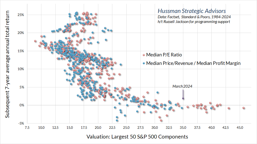
It’s tempting for analysts to claim that S&P 500 valuations – particularly high price-to-revenue ratios – are justified by high profit margins. Yet as we’ve seen, S&P 500 price/earnings ratios are sky-high as well. Nor do high profit margins explain away the valuations of the largest S&P 500 components. The chart below shows the median operating P/E of the largest 50 S&P 500 components in monthly data from 1984 to the present, along with the subsequent 7-year total return of a portfolio comprised of the largest 50 S&P 500 components. The blue dots show the same analysis using a “pseudo” P/E computed by dividing the median price/revenue ratio of the largest 50 S&P 500 components by their median profit margin. Either way, valuations as of March 2024 are at levels consistent with zero total returns over the coming 7-year period.
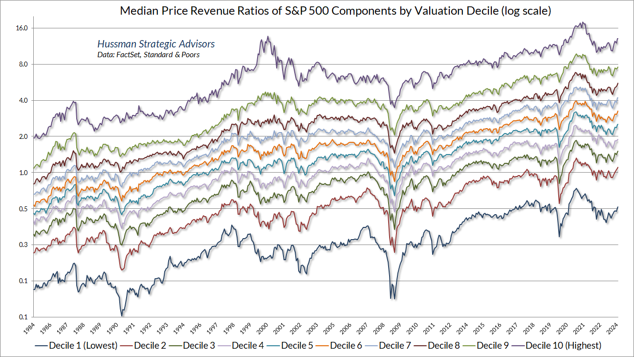
The chart below shows the median price/revenue ratio of S&P 500, from the 10% of components with the highest multiples to the 10% with the lowest multiples. Thanks to our resident math guru, Russell Jackson, for an enormous amount of programming to compile the data in these charts. Except for the most richly-valued 10% of S&P 500 components, every group stands at multiples beyond the 2000 and 2007 peaks.
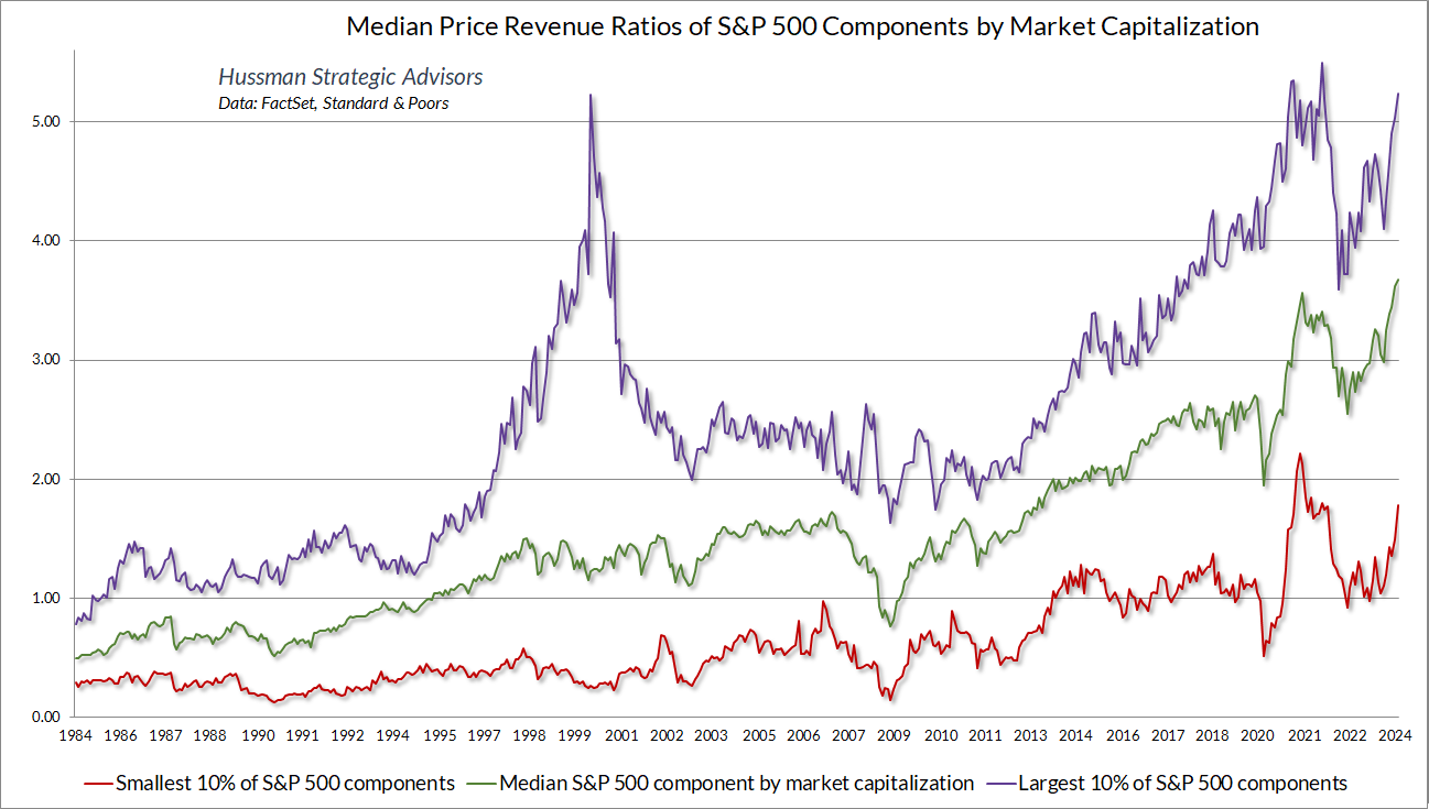
The chart below offers a similar perspective, showing the price/revenue ratios of the largest 10%, smallest 10%, and median S&P 500 components, sorted by market capitalization.
It seems to be an article of faith among investors that profit margins among the very largest capitalization S&P 500 companies have improved disproportionately in recent decades, but that’s just not true. The chart below shows the median profit margin of the largest S&P 500 components representing 20% and 40% of total index capitalization, as a ratio to the median profit margin of all S&P 500 components. There’s certainly variation over time, but there’s no decisive trend.
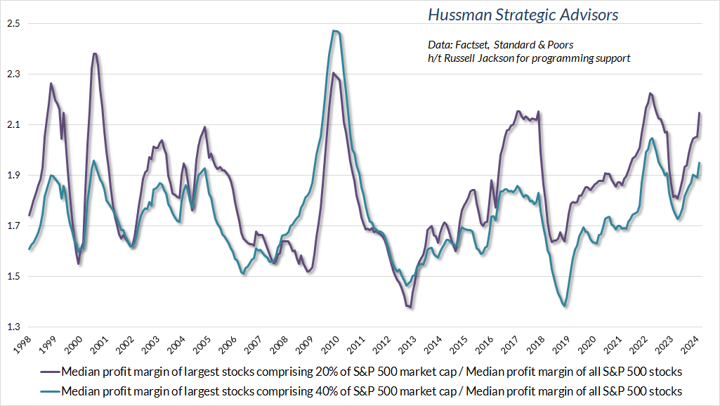
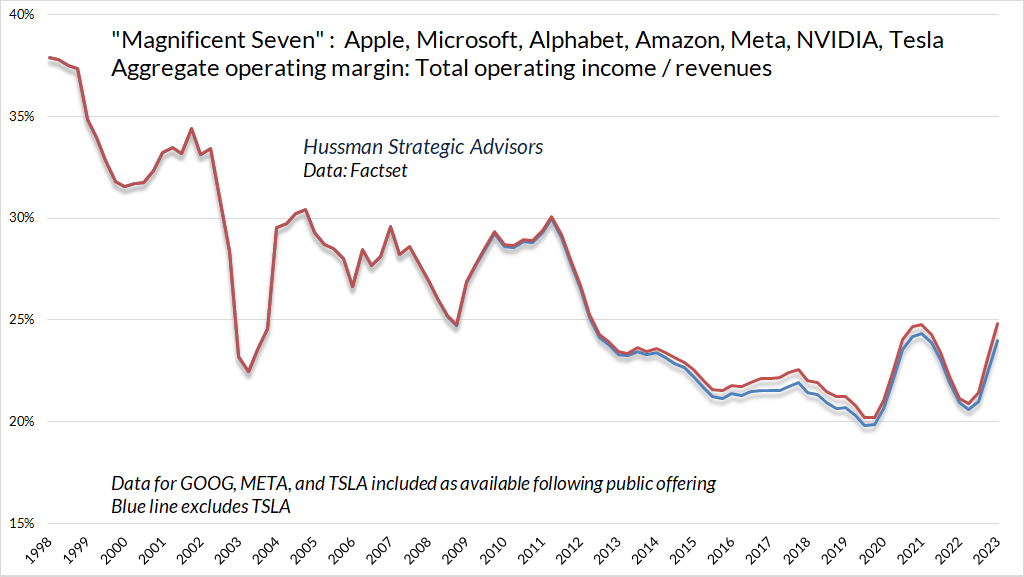
Stated another way, S&P 500 profit margins have not been higher in recent years because mega cap glamour technology companies have skewed those profit margins disproportionately higher. Rather, profit margins have advanced across-the-board, and as it turns out, for reasons that are ordinary, unglamourous, and most likely temporary.
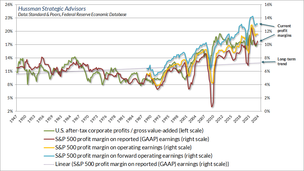
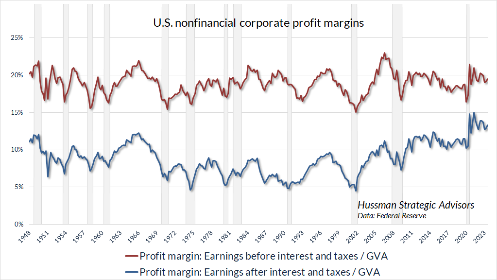
The chart below shows the profit margins of U.S. nonfinancial companies in data since 1948. The top line shows corporate profit margins before deducting interest and taxes, and the bottom line shows profit margins after those deductions.
Notice something. Despite all the bluster about technological improvements driving durable increases in corporate profitability over time, the fact is that corporate profit margins before interest and taxes have hovered around the same level for 75 years.
Should investors rely on permanently elevated profit margins? Well, tax reductions have helped to boost margins, but the largest impact of corporate tax cuts on profit margins actually occurred by the early-1980’s; depressed labor costs following the global financial crisis boosted profits for several years after, but labor costs mainly drive cyclical fluctuations in profit margins and been normalizing in recent years; massive government subsidies and household dissaving provided a temporary boost to corporate profit margins following the pandemic, but these are being phased out; and progressively falling interest costs – the strongest driver of progressively rising profit margins – have already reversed, but margins don’t yet reflect that because corporations locked in record low rates during 2020-2021.
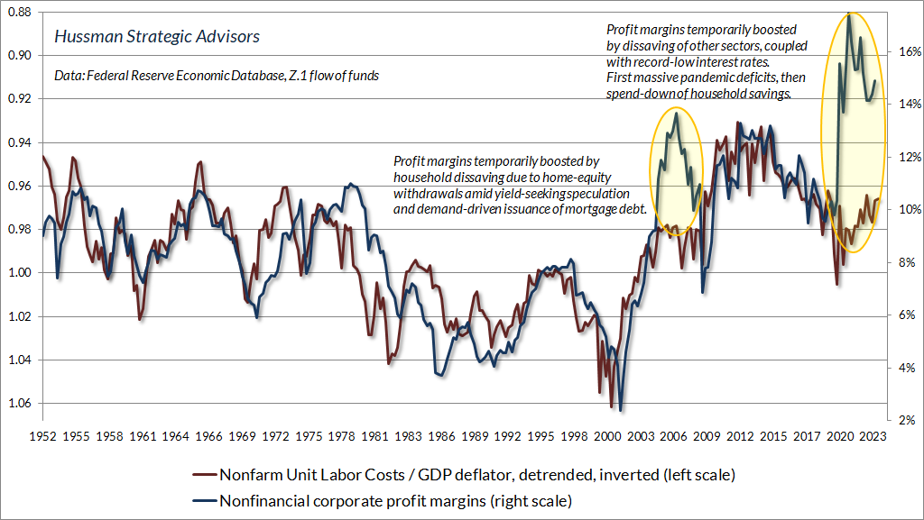
Let’s go through these points one-by-one. First, the chart below shows U.S. nonfinancial profit margins versus the (inverted) ratio of unit labor costs to the GDP deflator. Here’s how this works. Imagine selling a widget. You get the price of the widget as revenue for that unit, and you pay for the labor used to produce that unit (the “unit labor cost”). From an economy-wide perspective, the ratio of the unit labor cost to the price is the share of revenue that you spent on labor to produce that unit. Of course, profit margins will move in the opposite direction.
Notice that profit margins since the pandemic have been clear outliers from the perspective of labor costs, as they were just before the global financial crisis. In both cases, corporate profits were driven by household spending in excess of household income. As I’ve noted before, it’s an accounting identity that when one economic sector runs a deficit (consumption and net investment in excess of income), some other sector must run a surplus. Corporations also benefited directly from massive government subsidies (in this case, the government also expanded its spending well above its income).
The next chart shows nonfinancial corporate taxes as a share of revenues. What’s striking here is that the largest impact of tax reductions on corporate profit margins had already occurred by the early-1980’s. Despite various changes in statutory tax rates, the actual amount of taxes paid as a share of corporate revenues hasn’t changed in 40 years.
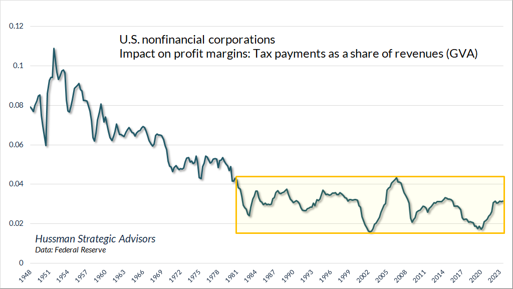
[Geek’s Note: If one assumes that current corporate tax rates are permanent, one could reasonably adjust current and historical price/revenue ratios to reflect the lower level of taxes as a share of revenues since the early-1980’s. Doing so would reduce the adjusted price/revenue multiple by about 30% relative to pre-1980’s levels, but still leaves the adjusted multiple dramatically above historical norms, beyond the 2000 peak, leaves projected 10-12 S&P 500 total returns at negative levels, and produces only minimal improvement in the historical correlation between valuations and subsequent returns].
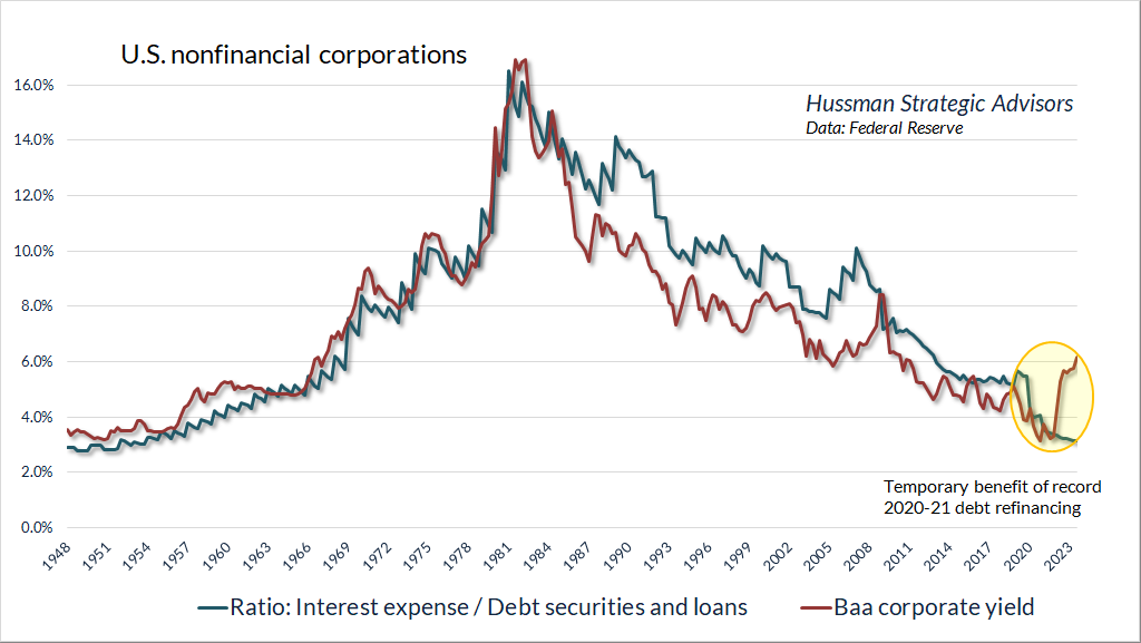
Now consider interest costs. The red line in the chart below (right scale) shows nonfinancial corporate debt as a fraction of corporate revenues. Notice that nonfinancial corporate debt has progressively increased in recent decades, to the point where debt at roughly the same level as annual revenues (so a 1% increase in the cost of debt now impacts profit margins by that same 1%, though slightly less for companies in the S&P 500).
Notice also that after peaking in 1990, interest costs as a share of corporate revenues have declined progressively, even though debt as a fraction of revenues has increased. It’s this progressive decline in interest costs that has driven much of the improvement in corporate profit margins in recent decades.
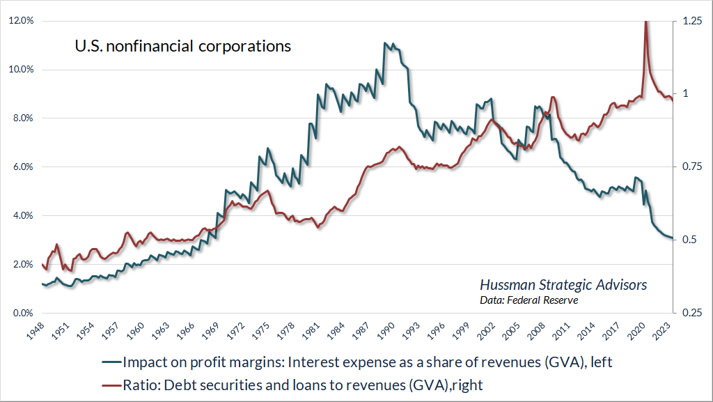
The chart below shows nonfinancial corporate interest costs as a fraction of total debt and loan obligations. Not surprisingly, the cost of debt service closely tracks corporate bond yields over time. With one exception. As interest rates hit record lows during the pandemic, corporations launched a record bout of debt refinancing. As a result, the higher interest rates of the past two years have not yet hit corporate interest costs or profit margins. Corporations will face an increasing wall of maturing debt and leveraged loans between 2024 and 2028, but those are just beginning.
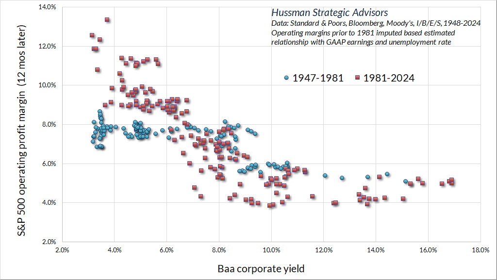
The chart below shows the relationship between the Baa corporate yield and S&P 500 operating profit margins. Notice that the slope of this line was flatter in the blue data prior to 1981 and the red segment with interest rates above 10% (pre-1990) because the ratio of debt to revenue was much lower than it is today.
As a side-note, several very large capitalization companies in the S&P 500 presently have not only significant amounts of debt, but also significant holdings of cash and cash equivalents. Having locked in lower rates on their debt, these companies have been particular beneficiaries of elevated short-term rates. For these companies, the current inversion of the yield curve is particularly helpful. As debt is gradually refinanced at higher rates, and short-term rates presumably move lower over time, much of this benefit is likely to dissipate.
The stock market presently stands at valuation extremes matched only twice in U.S. financial history: the week ended December 31, 2021, and the week ended August 26, 1929. Meanwhile, despite all the bluster about technological improvements driving durable increases in corporate profitability over time, the fact is that corporate profit margins before interest and taxes have hovered around the same level for 75 years. The largest impact of corporate tax cuts on profit margins actually occurred by the early-1980’s. Progressively falling interest costs – the strongest driver of progressively rising profit margins – have already reversed, but margins don’t yet reflect that because corporations locked in record low rates during 2020-2021.
Mega-cap stocks and the S&P 500
It has always perplexed me that every generation of investors seems to believe that the innovations occurring in their lifetime are the first and most important innovations in history. Imagine a world without automobiles, television, radio, aviation, pharmaceuticals, computing. All of these were new ideas and industries at earlier points in U.S. history. All of them sparked the imagination of investors. All of them provoked episodes of speculation. We can participate in them, and invest in companies involving them – indeed, some of our largest holdings at present are AI related – but it is worth remembering that extreme speculation in “new economy” stocks typically ends badly if one becomes immune to valuations.
The chart below is from a study of the 1926-1933 period by Wuthisatian et al 2014, which includes an analysis of the rise and collapse of what they refer to as “innovative companies” of the time. At the time, these innovations included things we take very much for granted, such as cars, and radio, and chemicals, but which were enormously profitable at the time because of their novelty and scarcity. As the authors note, “the criteria by which they were chosen are that all of them have introduced qualitatively radical innovations, by means of technologies that allowed for the production of new goods that led to the creation of completely new economic sectors. The criteria amount to complying with a technological ‘displacement’ (Minsky, 1982).”
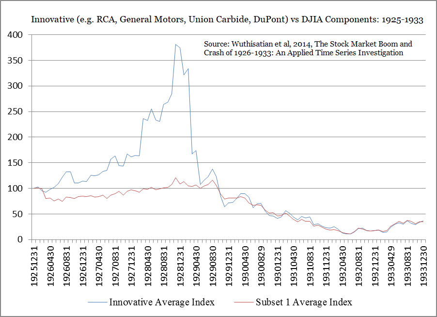
It’s notable that much of the loss from the speculative highs in these companies came before the Great Depression took hold. Other glamour-stock bubbles have had a similar pattern. An important risk to investors as a bubble bursts is that previous high-fliers can look enormously attractive after they are down 20-30% from their highs. The apparent bargain can prove costly if, as often happens, the stock is headed for a 60-80% loss.
For example, in March 2000, I projected an 83% loss in tech stocks over the completion of that market cycle. The tech-heavy Nasdaq 100 lost more than 35% over the next two months, which made tech stocks look “cheap” compared with their recent highs. By October 2002, the index had lost another 73% of its value, for an overall loss, as it happened, of 83%. The point is that valuations matter, and the collapse of speculative valuations can be utterly punitive, particularly when market internals are unfavorable as was true during the 2000-2002 period.
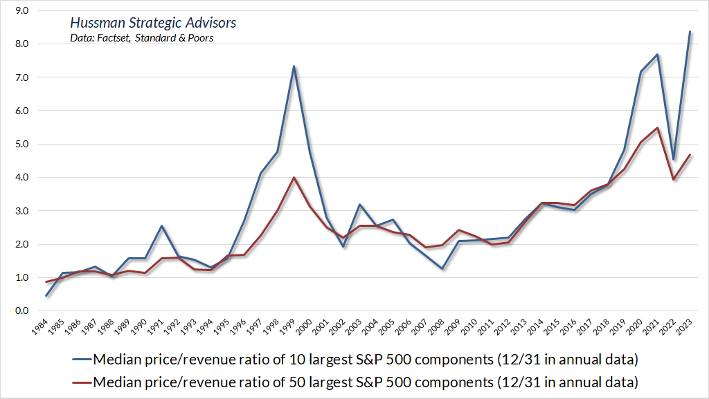
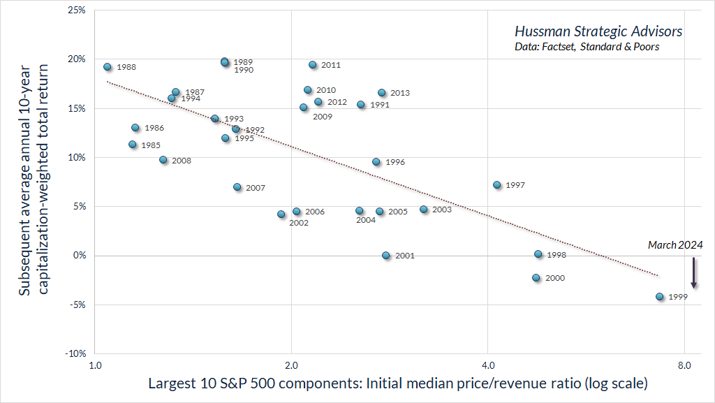
The chart below shows the median price/revenue ratio of the largest 10 and 50 S&P 500 components, as of December 31 of each year. Suffice it to say that the multiples have become even more extreme in recent weeks.
While investors often believe that mega-cap glamour stocks are somehow “above the law” and operate differently than the broad market, they put their pants on one leg at a time like every other stock. The chart below shows the 10 S&P 500 components with the largest market capitalizations each year since 1984, along with the subsequent 10-year capitalization-weighted total return for each cohort of stocks. Not surprisingly, rich valuations tend to produce poor subsequent returns.
It should not be surprising that the growth rate of a company should slow as its size increases. If that were not the case, companies would quickly swallow the entire economy. Yet extrapolation is easy, and becomes even easier when the promise a new technology sparks the imagination of investors. For that reason, it’s worth noting that companies that join the 10 largest capitalization members of the S&P 500 tend to deliver progressively slower growth in the years that follow. Not in every instance, but the regularity is very clear.
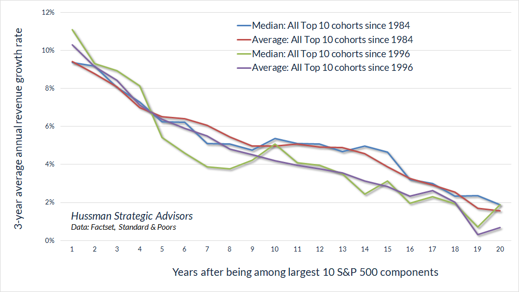
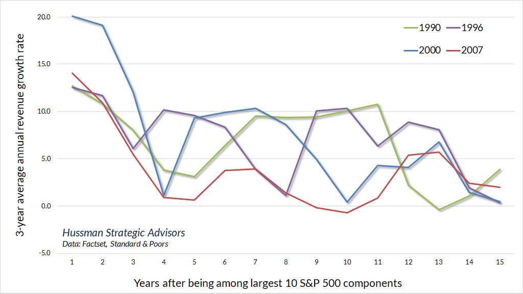
The chart below shows what this looks like for several high-growth cohorts in recent decades.
Of course, growth doesn’t just slow once a company joins the largest 10 S&P 500 components. In most cases, these large stocks grew into their notoriety from much smaller levels, and growth rates had already been on a downward trajectory for years.
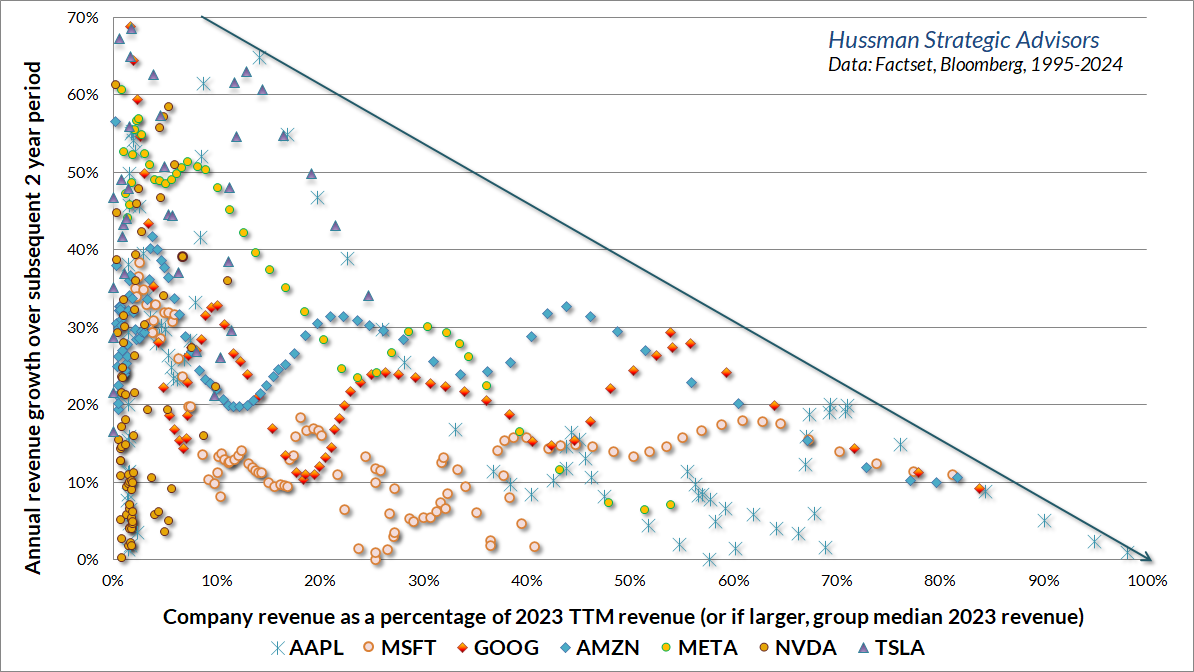
Consider the “Magnificent Seven.” In the following chart, the horizontal axis is a measure of “market saturation.” Specifically, it gauges the ratio of 12-month trailing revenues to 2023 revenues. The chart illustrates the progressive slowing of 2-year growth rates as these companies have approached maturity. That’s not to say that these companies cannot grow further. Rather, the point is that growth rates are best viewed as trajectories rather than as fixed numbers.
One of the frequently parroted phrases on CNBC that makes me long for a better educational system is “These stocks have been getting cheaper as earnings have grown.” This sort of comment reflects a distressingly naïve understanding of how valuation multiples work.
Suppose for example that a company earned $1 last year and is expected to earn $2 in the coming year, at which point it will stop growing and pay out a $2 annual dividend forever. If investors expect a 10% long-term return from the stock, they’ll pay a price of $20 today, and the price will maintain that level forever. That gives investors a $2 dividend starting next year, a $20 price, and a 10% total return.
In the coming year, earnings will double from $1 to $2, and the P/E ratio will drop from 20 to 10. The stock will have gotten “cheaper” as earnings have grown. That is as it should be. The reason multiples are high for rapidly growing companies is that high valuation multiples already reflect expected growth. If the stock is correctly valued, the multiple should contract anytime fundamentals grow faster than the long-term return (capital gain) expected by investors.
Just like growth rates, profit margins are best viewed as trajectories, not as fixed numbers. Novel technologies and innovations typically enjoy the pleasant combination of very high demand and very high scarcity. New orders and order backlogs are high, and competition may still be a few years away. In that environment, profit margins may be very wide. The danger for investors is in assuming that the profit margins and growth rates are permanent, and pricing stocks on that basis. That’s how you get 80-90% losses in glamour stocks.
A useful way to understand growth stocks, particularly large-capitalization glamour stocks, is to remember that economic growth is driven not just by innovation, not just by profits, but ultimately by the destruction of profits.
As I discussed in Alice’s Adventures in Equilibrium, when we examine economic history, it’s clear that the long-term expansion in living standards isn’t simply the result of a continuous increase in the production of some single “representative good.” Instead, growth emerges by the progressive introduction of new inventions, technologies, and products that satisfy previously unmet needs.
In his work on economic development, Joseph Schumpeter described the critical role of entrepreneurs in advancing economic growth. When Schumpeter wrote about “creative destruction,” he was referring to temporary profit opportunities that provide incentives to invent, innovate, and satisfy unmet needs. But he also observed that those profit opportunities would encourage a “swarm-like” activity of other entrepreneurs. As production expands, the unusually high profits that encouraged the new production and competition gradually self-destruct. Competition and gradually increasing production drives economic growth, but at the same time, it reduces scarcities and erodes excessive profits.
As the rise and decay of industrial fortunes is the essential fact about the social structure of capitalist society, both the emergence of what is, in any single instance, an essentially temporary gain, and the elimination of it through the working of the competitive mechanism, obviously are more than ‘frictional’ phenomena, as is the process of underselling by which industrial progress comes about in a capitalist society and by which its achievements result in higher incomes all around.
– Joseph Schumpeter, The Instability of Capitalism (1928)
In the short run, there’s no question that strong demand for new, scarce products, such as AI chips, can enable a company to enjoy extremely high profit margins. Still, it’s dangerous for investors to treat these high profit margins as permanent, and to value stocks as if those profit margins will be sustained indefinitely.
Put simply, the combination of a high growth rate and a high profit margin has never proved to be permanent. The current crop of “glamour stocks” increasingly relies on both here.
No forecasts are required
For the sake of clarity, I’ll emphasize again that while we certainly prefer some valuation measures to others, our overall market view is not highly sensitive to our choice of valuation metrics. Instead, our investment discipline is to align our outlook with observable market conditions, primarily the uniformity or divergence of market internals, and the general range of market valuations.
It’s notable that our most reliable valuation gauge matches extremes seen only at the 1929 and 2022 market peaks. Personally, I believe that these extremes should be of great concern to long-term investors, but that doesn’t prevent valuations from breaching those extremes in the short run. We do believe that 10-12 year S&P 500 total returns are likely to be negative, and we do estimate that the S&P 500 is likely to lose something on the order of 50-70% from current highs over the completion of this market cycle. In short, we do have long-term views, it’s just that nothing in our investment discipline relies on those outcomes.
Again, if you can’t stand “missing out” on any market advance, and speculative exuberance tempts you to abandon your discipline, you might benefit from some passive investment exposure – not because we think it will do well, but to relieve your psychological discomfort. That’s a personal decision, and we need not be involved. For our part, our outlook will change as observable conditions change.
Keep Me Informed
Please enter your email address to be notified of new content, including market commentary and special updates.
Thank you for your interest in the Hussman Funds.
100% Spam-free. No list sharing. No solicitations. Opt-out anytime with one click.
By submitting this form, you consent to receive news and commentary, at no cost, from Hussman Strategic Advisors, News & Commentary, Cincinnati OH, 45246. https://www.hussmanfunds.com. You can revoke your consent to receive emails at any time by clicking the unsubscribe link at the bottom of every email. Emails are serviced by Constant Contact.
The foregoing comments represent the general investment analysis and economic views of the Advisor, and are provided solely for the purpose of information, instruction and discourse.
Prospectuses for the Hussman Strategic Growth Fund, the Hussman Strategic Total Return Fund, and the Hussman Strategic Allocation Fund, as well as Fund reports and other information, are available by clicking “The Funds” menu button from any page of this website.
Estimates of prospective return and risk for equities, bonds, and other financial markets are forward-looking statements based the analysis and reasonable beliefs of Hussman Strategic Advisors. They are not a guarantee of future performance, and are not indicative of the prospective returns of any of the Hussman Funds. Actual returns may differ substantially from the estimates provided. Estimates of prospective long-term returns for the S&P 500 reflect our standard valuation methodology, focusing on the relationship between current market prices and earnings, dividends and other fundamentals, adjusted for variability over the economic cycle. Further details relating to MarketCap/GVA (the ratio of nonfinancial market capitalization to gross-value added, including estimated foreign revenues) and our Margin-Adjusted P/E (MAPE) can be found in the Market Comment Archive under the Knowledge Center tab of this website. MarketCap/GVA: Hussman 05/18/15. MAPE: Hussman 05/05/14, Hussman 09/04/17.