

Seven Considerations for Global Stock Market Investors


William Hester, CFA
Senior Research Analyst
Hussman Strategic Advisors
July 2020
In the fall of 2007, the relative performance of international stock markets was so impressive that it was hard to imagine it ever ending. Over the prior six years, the annualized return of a global stock market index without U.S. exposure was more than twice that of an investment in a U.S. index. Eight of the nine best performing sector indexes were comprised of international companies. Valuations for the majority of sectors were higher for global stocks than for U.S. stocks. And added to all of this good fortune, the euro had rallied more than 60 percent versus the U.S. dollar.
No one should expect that confluence of ideal characteristics to fall at the feet of global benchmarks again over the next decade. But it’s a good reminder that sentiment, preferences, relative valuations, currency levels, and trends change. Seven years prior to 2007, it was the U.S. stock market that looked like the most obvious investment to overweight, just prior to its dramatic underperformance versus international markets.
Estimating near-term relative performance between index returns is always a challenge, and especially so during a global recession. The discussion that follows is certainly not a short-term projection. Rather, the goal is to highlight specific drivers that will determine the longer-term spread between U.S. and global markets; to discuss the current state of those drivers; and to suggest what the changes in these components of total return may look like over the next decade or so. Here are seven considerations for global stock market investors.
1. The convergence in valuations between U.S. and international markets will likely generate the bulk of any difference in relative performance during the next market cycle.
The current spread between the valuation multiples of U.S. and international markets has drawn a great deal of attention from investors, and rightfully so. Even after this year’s market correction, most metrics point to the same conclusion – the difference between U.S. and international valuations is at near-record levels. Using smoothed fundamentals, the last time the divergence in valuation levels was this wide was near the stock market peak of 2000. From that point, it took up to a full cycle and a half, depending on the metric used, for those relative valuations to revert back to prior levels.
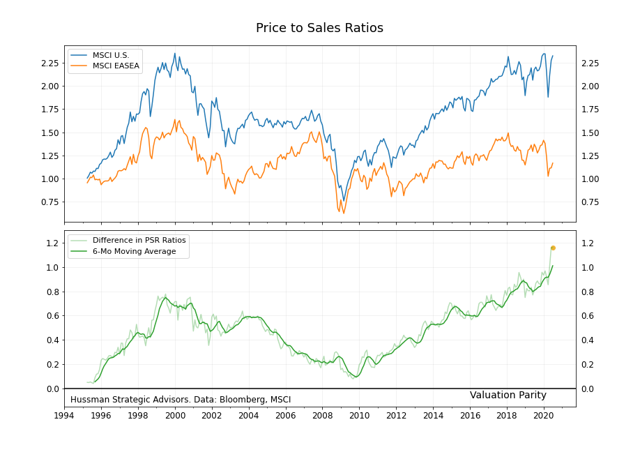
The graph below shows the price-to-sales ratio for both the MSCI U.S. and MSCI EASEA indexes, beginning in 1995 when this data series became available. (The EASEA Index tracks the EAFE ex-Japan, and I explain further down in the text why it is shown here in preference to the EAFE Index.) Relative valuations started at near parity in the mid-1990’s, widened out during the late 1990’s, and then returned to near parity by 2009. The spread has since widened out again to record levels. The top graph shows the price-to-sales ratio for each index ,and the bottom graph shows the spread between the two (with the darker green line representing the 6-month moving average of the spread).
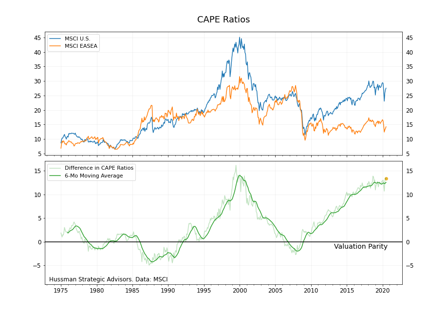
Relative CAPE ratios, which have a longer history, show the same pattern. For the first 25 years of MSCI data, from the mid 1970’s through the mid 1990’s, the U.S. and EASEA indexes traded within a range around valuation parity. The late 1990’s bull market changed that. The EASEA index did become rich relative to its own historical CAPE ratio level, but the valuation of U.S. stocks exploded in comparison.1
On this measure, it took a full cycle to return to valuation parity. Between the peak in the market in 2000 through the top of the market in 2007, the spread between CAPE ratios closed, and then would go negative for a short time during the Financial Crisis.
This pattern of relative valuations – near parity in the mid-1990’s, widening out during the tech bubble, narrowing through the 2000’s, and then widening again – can be seen in a host of valuation measures. These include the price-to-sales ratio, price-to-book value ratio, the CAPE ratio, and the “Total Return” CAPE ratio, Robert Shiller’s alternative calculation methodology that attempts to account for the growing preference by companies for share buybacks.
If both indexes were to revert to longer-term average CAPE ratio levels over the next decade, while holding all other components of total return constant, global stocks would outperform U.S. stocks by about 5 percentage points annually. This suggests that valuation mean reversion would likely make up the bulk of any relative outperformance by global stocks.
2. International benchmarks have a reputation for exposing investors to too much sector risk. This time, U.S. benchmarks have more.
An important and open question is whether a reversion to valuation parity will happen again, or whether the current divergence in multiples is now a permanent feature of these benchmarks. The primary argument for the latter focuses on differences in sector exposures between U.S. and international benchmarks. Global benchmarks have larger exposures to financial and industrial stocks, which tend to have lower price multiples. The MSCI U.S. index has a larger exposure toward consumer discretionary and technology stocks, which tend to have higher price multiples.
These differences in sector weights certainly help to explain part of the underperformance of international benchmarks in recent years. The index that tracks the EASEA financial sector, which in 2007 made up a third of the index, is still trading at a third of its peak, thirteen years later. And the U.S. technology and consumer discretionary sectors, whose combined weight within the U.S. index peaked at more than forty percent, have been the best-performing sectors within both benchmarks.
Not surprisingly, following large relative moves, the sector weights within each index have tended to shift. To help visualize this, the grid below plots six of the most important sectors to both the U.S. and EASEA indexes. The six indexes shown account for roughly three quarters of each index.2
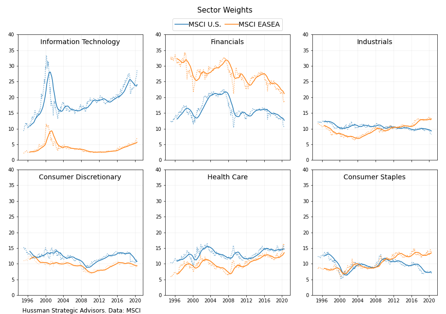
The outsized sector exposures within these indexes – technology stocks for the U.S. and financial stocks for the EASEA index – are immediately apparent. But it is often overlooked that outsized sector exposures have rarely been a permanent characteristic of stock market benchmarks. It’s clear that the shifting weight of technology stocks – more than any other sector – is pro-cyclical. During the bull market that ended in February, the weight of the technology sector in the U.S. moved from 15 percent in 2008 to 27 percent at its peak in this cycle. It followed a similar path during the late 1990’s.
The wide divergences in performance have shifted sector risks. As the technology sector was becoming more than a quarter of the U.S. index in the current expansion, the weight of the financial sector in the EASEA index has fallen from about a third of the index to 18 percent. As a share of the EAFE index it’s even lower, at 16 percent. And the weight of banks – the stocks that have done the most harm to financial sector performance – has fallen to just 9 percent of EASEA’s market cap.
Another favorable trend for international benchmarks is that sectors that have higher profitability and less cyclicality (and therefore tend to trade at higher price multiples) – like health care and consumer staples – are becoming a larger part of global benchmarks. These two sectors now make up almost 30 percent of the EASEA index, up from 15 percent in 2007. These trends in sector weights have increased the alignment of sector exposures in global and U.S. benchmarks.
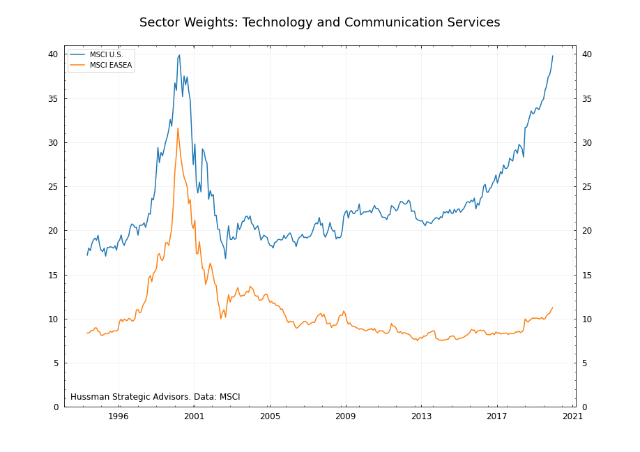
Global benchmarks have developed a reputation for too much exposure to certain sectors. That’s partly a result of the large exposure to the financial and energy sectors at the 2007 market top. Both sectors went on to experience a lost decade, with continued difficulty in 2020. But sector exposure risks have shifted over time. Now that technology and communication services have grown to nearly forty percent of the U.S. index, and trade at large valuation premiums relative to history, the unbalanced sector risk has shifted to the U.S. market. Here’s a long-term look at the share of technology and communication services companies in both the MSCI U.S. and EASEA indexes.
3. There may be a boost in international returns from foreign currency appreciation over the next few years, but these gains seem unlikely to be as strong as during prior periods of international market outperformance.
During the last four decades there have been two major multi-year periods where a broad basket of foreign currencies strongly appreciated against the U.S. dollar. The first was during the late-1980’s. Earlier in that decade, as inflation began to moderate, U.S. interest rates stayed elevated as investors weren’t yet convinced that the battle against rising prices was won. In response to those high real yields, the U.S. dollar more than doubled during the first part of the decade.
In response, U.S. export companies lobbied for protectionist policies, looking for help as they were priced out of foreign markets. In September 1985, the G-5 agreed to the Plaza Accord. This agreement resulted in coordinated efforts to depreciate the dollar. The dollar gave back all of its gains over the next three years.
The second period of sustained appreciation in foreign currencies relative to the U.S. dollar, especially for the euro, came between 2002 and 2008. After the euro’s introduction in 1999, followed by the release of the physical currency in 2002, the future looked bright. News stories projected that the euro and the dollar would one day hold equal prominence in the world’s currency markets. The euro gained 65 percent relative to the dollar over that 6-year period.
Both of these periods corresponded with strong returns for U.S. investors holding international equities, and the currency component was an important part of those returns. During the late 1980’s, appreciating foreign currencies accounted for nearly the entire difference between the U.S. dollar returns of global stock markets and U.S. stock returns. During the bull market from 2003 to 2007, appreciating foreign currency was responsible for about half of the difference.
Both of these multi-year periods of dollar weakness and foreign currency strength can be better understood by looking at the relative valuations of currencies at the beginning of each period. For example, focusing on the euro, both periods began from levels of deep under valuation of the common currency (and an index constructed to track its predecessor currencies prior to 1999) relative to the U.S. dollar based on a Purchasing Power Parity basis (PPP), which estimates exchange rates based on the difference between the prices of baskets of similar goods.
PPP has a weak correlation with short-term currency moves. But it does a better job of indicating potential currency changes five or six years out. The chart below shows the extent to which the euro has been under- or over-valued relative to the U.S. dollar, along with the subsequent six-year change in the value of the common currency (blending both consumer and producer prices to estimate PPP valuations). The chart shows the wide swings in currency valuations that have occurred over the last 40 years – from the euro being more than 50 percent undervalued around the time of the Plaza Accord to more than 25 percent overvalued in 2008. The euro is currently about 9 percent undervalued on the basis of PPP. The British Pound, the currency with the second largest weight within the EASEA Index, is about 16 percent undervalued.
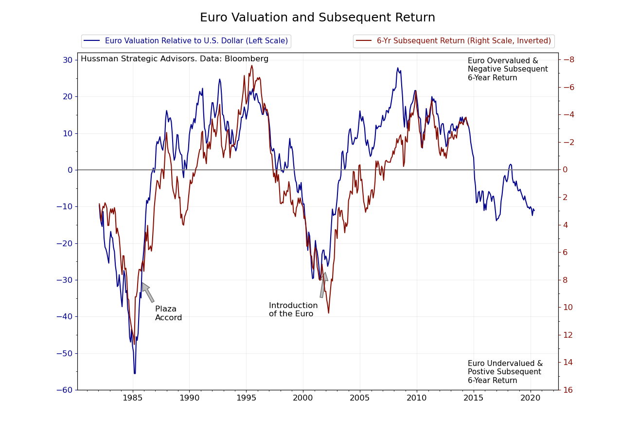
The most important takeaway from this estimate of currency valuation is that if a new period of outperformance by international markets were to begin soon, the currency component would likely add less to relative total returns than it has during prior periods. But that tailwind wouldn’t be immaterial. Based on this particular historical relationship, foreign currency returns could add about 2 percent annually, although the potential variation around this estimate is significant.
4. There’s no precedent for international markets to outperform the U.S. during a bear market. But there’s somewhat more potential in this one.
Global markets may fall by less than U.S. markets in the current bear market, or the next one, but it’s not a conviction that investors should hold strongly. That’s because over the last 50 years, there is really no precedent for global stocks falling materially less than U.S. stocks in big bear markets. International markets typically fall by as much as U.S. markets, or more.
Take the bear markets beginning in 1973, 2000, and 2007. At the 1973 bull market peak, the EASEA Index topped out in June, about 6 months after the U.S. market. But both indexes fell a nearly identical amount – by about 45 percent (in monthly data) by September of 1974. In the 2000-2003 bear market, each index would collapse by about 50 percent. International indexes reached the 2007 bull market top with a perfect storm of negative characteristics, including higher starting levels of valuation, a greater weight in financial stocks, and currencies that would weaken against the dollar as the bear market progressed. The U.S. market fell 55 percent and the EASEA index fell 63 percent.
Even during the market plunge between February 19 and March 23 of this year, the EASEA lost over 35 percent while the S&P 500 lost 34 percent, despite the fact that international valuations appeared more reasonable in February.
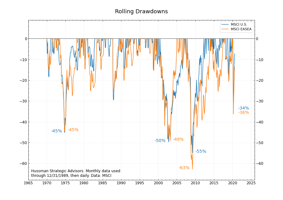
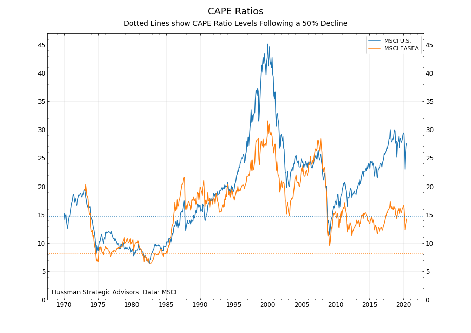
Still, there’s a case to be made that in a type of bear market that grinds valuations lower over time, international markets may prove more resilient relative to U.S. markets. Consider a 50 percent decline in global equity markets from their peak levels. Assuming no change in the underlying smoothed earnings, that type of decline would bring the U.S. CAPE to about 15, slightly below its long-term average, but still three points above the level reached at the 2009 market low. The same decline in the EASEA index would take its CAPE ratio to 8. That would be 1.5 points below its 2009 market low, to a level last seen in the early 1980’s.
Although there’s no precedent for it in modern data, at some point during the move from peak to more normalized valuations in the U.S., the relative performance between the U.S. and global markets may begin to diverge, with global markets potentially holding up better. If not, the excess return during the subsequent bull market would likely be that much higher.
5. Japan could boost the returns of international benchmarks over the next decade. But fortunately, it’s not an all-or-nothing bet again.
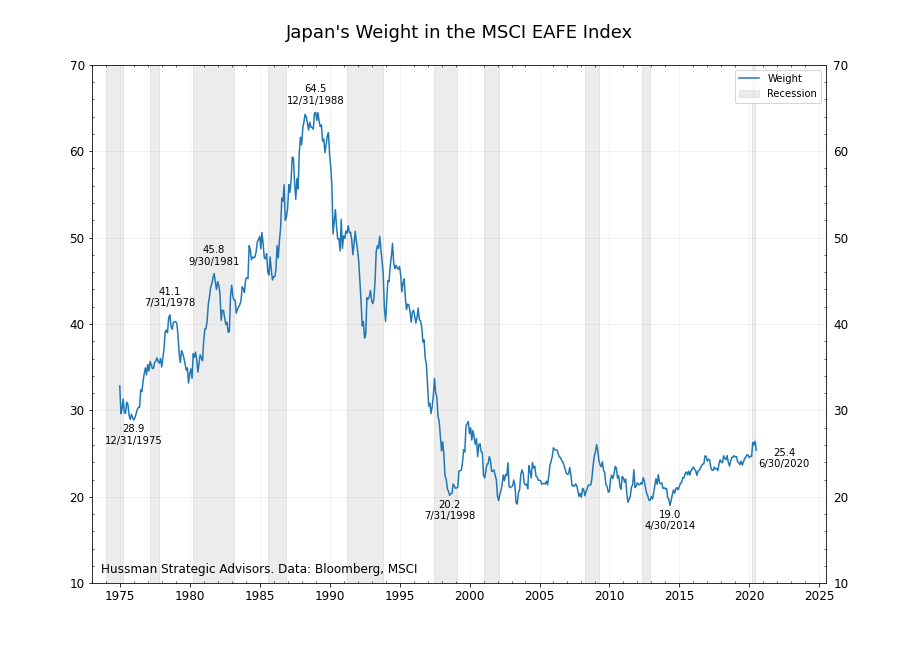
In many of the graphs above I’ve used the EASEA index, which tracks the EAFE ex-Japan, to represent the historical performance of global markets. The primary reason for this is because the late 1980’s Japanese stock market bubble was unlike any other in modern history. There were three characteristics that made it unique: it reached levels of valuation that we may never see again (a CAPE ratio of nearly 80, for example), the market grew to be the majority of the EAFE index (see graph below), and its stand-alone bull market was not representative of the levels of valuation in other markets (the CAPE ratio of the EASEA index was around 17 at the time). So when studying historical data, I tend to isolate Japan from other global markets, as is common with the U.S. index, and look at it separately.
But looking forward, the inclusion of Japan in the EAFE index may turn out to be a positive characteristic of the benchmark. There’s a long list of reasons to be bearish on Japan, including demographic challenges, large government deficits and debt loads, and a tendency to be hit by natural disasters. But those bearish arguments are well known, widely agreed upon, and don’t tie directly to stock prices. What’s less discussed are two more favorable characteristics of Japan that are more closely linked to stock returns – valuations and corporate fundamentals.
It has been 30 years since the peak in Japan’s stock market, and the valuation of the primary index is finally coming in line with other developed markets. For the 20 years through 2007, Japan’s CAPE ratio averaged 30 points above EASEA’s ratio. Between 2007 and 2017, Japan’s CAPE ratio averaged 12 points above the EASEA’s. It’s currently 3 points above it. On expected earnings, Japan’s P/E ratio is two points below EASEA’s P/E ratio.
These better-aligned levels of valuation are partly the result of faster earnings growth. This earnings growth has been fueled by higher profit margins, which at their peak last year were more than double their long-term average. This new focus on profitability and earnings growth is partly the result of Prime Minister Shinzo Abe’s “Three Arrow” strategy, first introduced back in 2012. The first two arrows – monetary easing and fiscal stimulus – were initially celebrated by investors because they were able to be put into place quickly. But it’s the third arrow – structural reforms aimed at reviving Japan’s competitiveness – that may turn out to have the most favorable long-term impacts.
The most interesting aspect of these trends is that they’ve gone mostly unnoticed, and certainly unrewarded. Japan’s index returns over the last 5 years have been middling relative to its corporate fundamental performance, as the graph below shows. The horizontal axis shows the average change in both profit margins and earnings per share relative to their long-term averages. The vertical axis shows the 5-year annualized return.
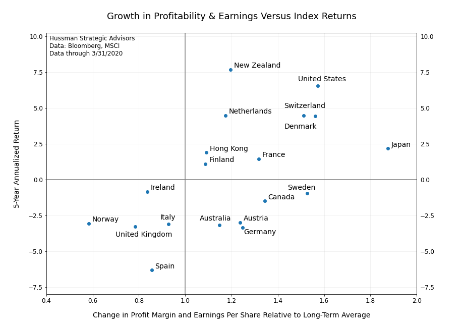
Japan currently makes up 25 percent of the EAFE index. That may sound like an unfortunately high exposure to a country that has frequently underperformed the broader benchmark over the years. But if investors come around to recognizing the improvements that have already taken place in Japan’s corporate performance, its future relative performance may look better. Fortunately, even if that’s not the case, at least Japan no longer makes up two-thirds of the benchmark.
6. Recessions and market dislocations are typically catalysts for a change in the relative performance between U.S. and international markets.
Projections about international markets outperforming U.S. markets have been made frequently during the last few years. It’s easy to see why. Global markets have trailed U.S. markets 10 of the last 13 years. And the persistence of the outperformance by the U.S. market is something that’s unmatched in at least 50 years.
But this expectation for outperformance was missing an important ingredient: a catalyst. That’s changed. When you look at the ratio of the U.S. to the EASEA Index historically, an interesting pattern emerges. Over the last 50 years, recessions and market dislocations have typically occurred at the beginning of each shift in relative outperformance.
The graph below shows the total return ratio of these two indexes. U.S. recessions are shaded in gray and extended bear markets are shaded in red. Arrows show the major reversals in the performance ratio, and also periods where clear relative outperformance had ended.
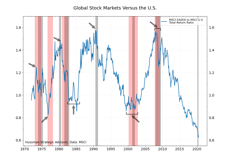
Moving right to left on the graph, it’s clear that bear markets and recessions have turned the tide during the three most recent regime changes. The bear markets beginning in 2007 and in 2000 were the turning points for the most recent shifts in relative outperformance. Prior to those, the 1990 recession and the more moderate bear market associated with it, ended a period of EASEA outperformance through the late 1980’s. During the 1970’s and early 1980’s – a period that consisted of multiple economic recessions and bear markets – a change in relative performance leadership occurred four times, but always near or within a U.S. bear market or recession.
These regime changes tend to occur around recessions and bear markets because one or more components of total return is typically thrown out of alignment from the prior period. In the 1980’s, the relative performance between global and U.S. stocks was driven predominately by large changes in currency values. During the last 25 years, relative performance has mostly been driven by a divergence or convergence of price multiples. The current cycle has also been helped by differences in the relative growth in corporate fundamentals.
The recent economic and financial disruptions don’t guarantee a shift in the relative outperformance between global and U.S. markets. But it’s the largest potential catalyst in more than a decade for this transition to take place.
7. It doesn’t take aggressive assumptions to expect international markets to outperform U.S. markets by five or six percent a year over the next decade.
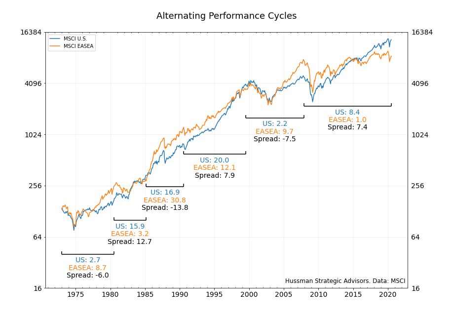
There’s an interesting quirk in the historical pattern of relative outperformance between the U.S. and EASEA indexes that’s worth mentioning. One period of outperformance has been typically followed by a period of underperformance of a roughly equal magnitude – at least on an annualized total return basis. The chart below is annotated to show these periods. Each regime represents a period of persistent outperformance by one index relative to the other (chosen by shifts in the ratio of the total returns of the two indexes).
Notice the last three regimes of relative outperformance. During the period from the end of 1990 through the middle of 1999, the MSCI U.S. Index returned 20 percent a year. The EASEA Index returned 12.1 percent a year. On an annualized basis, the spread was 7.9 percent. From 1999 through the top of the market in 2007, the EASEA index returned 9.7 percent a year, while the U.S. market delivered 2.2 percent, or a spread of 7.5 percent. The annualized outperformance by the U.S. since 2007 through June has been 7.4 percent a year. Looking further back, the spreads during the two periods in the 1980’s were wider because of larger currency impacts. But again, they were oddly similar in magnitude.
Is a similar spread between returns likely during the next performance regime? As noted above, the spread between expected returns by simply assuming a reversion to the mean in CAPE ratios is about 5 percent. But we can also estimate the expected spread in returns in less orthodox ways. One approach is to focus on the relative valuations between the two indexes. It’s clear from history that there are two characteristics that are the primary drivers of relative returns – the spread between levels of valuation and the prospect for strengthening or weakening foreign currencies. If we standardize the range of valuations for both indexes (and also include foreign currency valuation into the calculation), we can then compare the difference in these standardized values to subsequent relative returns.
This is what the graph below does. The orange line is the difference in standardized values (using CAPE ratios for both indexes, and including currency values) between the two benchmarks. The blue line is the difference in subsequent 10-year annualized total returns at each date. The last value shows that the EASEA has underperformed the U.S. by nearly 8 percent annually during the ten years beginning June of 2010. (This line has turned down sharply the last few months as the initial rally off of the March 2009 low has fallen out the most recent calculation period. This stretch in 2009 and early 2010 was one of the rare periods since the Financial Crisis where international markets strongly outperformed U.S. markets.)
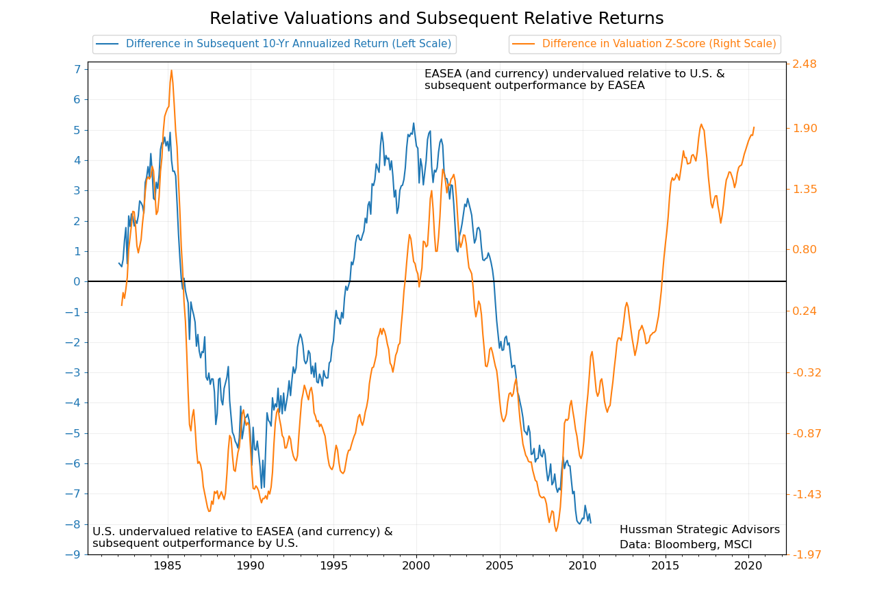
If you’re looking for a conceptual framework for thinking about the relative performance between global markets, this is not a bad place to start. When international markets are cheap relative to U.S. markets and foreign currencies are cheap relative to the dollar, strong relative returns tend to follow.
In the mid-1980’s, the valuation levels of the two stock indexes were similar, but foreign currencies were deeply undervalued. That led to a period of outperformance by international benchmarks for the rest of the decade, driven mostly by appreciating foreign currency. At that point, the EASEA was more highly valued than the U.S. market and foreign currencies had become overvalued relative to the dollar. This would lead to strong relative performance of U.S. stocks in the 1990’s (and helped, of course, by the large weighting in technology stocks). The last two cycles have been driven by either the convergence or divergence of U.S. multiples. If the historical pattern in the graph above holds, it suggests that the EASEA index could outperform the U.S. index by about 5 percent annually over the next decade.
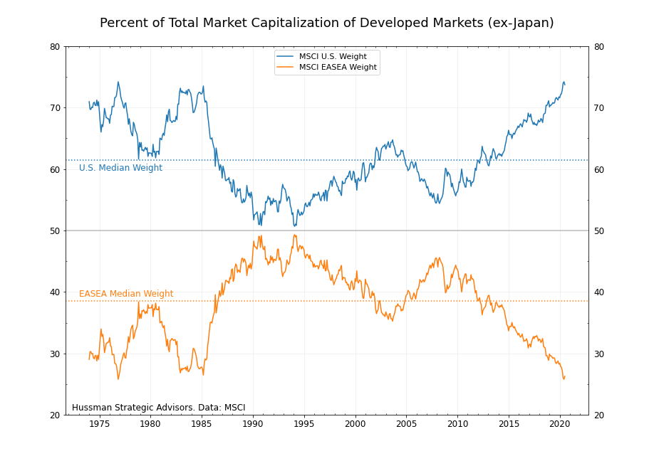
One final way to estimate relative returns is by looking at the relative market capitalization weights of each index. Since we’ve isolated our discussion to just two broad benchmark indexes, we can ask what would occur if global markets regain some part of the portion of market cap that they’ve lost over the last decade. For example, the weight of international developed markets (ex-Japan) has fallen to just 25 percent of the total developed market cap, the lowest share of equity value since the early 1980’s.
There’s no reason international markets need to recapture a specific percentage of the total equity value. But it would be surprising for these countries to continue to hold such a small share of global market cap indefinitely. For example, the sales generated by the companies in the EASEA index make up 46 percent of the total sales of these two indexes.
Now, because of adjustments in company share counts (from, for example, new issuance or buybacks), changes in the total market capitalization of an index are not necessarily equal to investor returns. But the relative weights of market values have become so skewed that it’s worth estimating what relative returns would be for any potential shifts in market value. Even with modest shifts, the results are surprising. For example, if total market cap was to grow by 3 percent a year over a ten-year period and global markets were to recapture just 39 percent of total market cap (its median historical share), international stocks would return about 6 percent more than U.S. stocks.
Three different estimates – assuming common price ratios return to their medians, assuming relative valuations between these indexes normalize, and assuming that the shares of global market cap reverse and return to longer-term levels – all generate roughly the same spread. Each of these suggest that international stocks could outperform U.S. stocks by about 5 or 6 percent annually over the next decade. None of these estimates rely on aggressive assumptions, just that levels of valuation normalize, along with possible modest U.S. dollar weakness.
Investor expectations for international markets to outperform the U.S. market have not been validated in recent years. Given that international stocks rarely outperform U.S. stocks during bear market periods, it may still take time for relative performance to clearly reverse. But the current recession and recent stock market decline provide a potential catalyst for the long-awaited role reversal. There are several features that could contribute to relative strength in long-term returns for international stocks, in comparison to U.S. stocks, including valuation normalization, individual country performance, and potential foreign currency appreciation.
End notes
1 The CAPE ratios shown during the 1970’s and early 1980’s are based on the available earnings per share data at each date. Earnings data begins in 1970 for the U.S. Index and in 1972 for the EASEA Index. All data and calculations are derived using MSCI’s Standard Indexes, which have the longest histories. CAPE ratio calculations use price and earnings data in U.S. dollars. Typically, CAPE ratios that are calculated in either local currency or U.S. dollars are similar. But if the foreign currency has strengthened materially during the 10-year time frame, then the CAPE ratio in dollars will be higher than in the local currency. Because both relative stock market valuations and currency values have mean-reverting tendencies to them, using price and earnings converted into U.S. dollars can improve the information content of the CAPE ratio.
2 A close look at the weightings of the technology and consumer discretionary sectors in the U.S. index show an abrupt drop in late 2018. This is primarily the result of a reclassification of a group of stocks at that time by Standard & Poor’s and MSCI. The changes boosted the weight of the newly-named Communication Services group with companies like Facebook and Alphabet (previously assigned to the technology index) and Netflix (previously assigned to the consumer discretionary index). There were no changes to the composition of the market indexes, so the recategorizations don’t impact this discussion materially. Also, Real Estate, a newer group, is excluded from all sector weight calculations. All data is through 6/30/2020, unless otherwise noted.
Keep Me Informed
Please enter your email address to be notified of new content, including market commentary and special updates.
Thank you for your interest in the Hussman Funds.
100% Spam-free. No list sharing. No solicitations. Opt-out anytime with one click.
By submitting this form, you consent to receive news and commentary, at no cost, from Hussman Strategic Advisors, News & Commentary, Cincinnati OH, 45246. https://www.hussmanfunds.com. You can revoke your consent to receive emails at any time by clicking the unsubscribe link at the bottom of every email. Emails are serviced by Constant Contact.
The foregoing comments represent the general investment analysis and economic views of the Advisor, and are provided solely for the purpose of information, instruction and discourse.
Prospectuses for the Hussman Strategic Growth Fund, the Hussman Strategic Total Return Fund, the Hussman Strategic International Fund, and the Hussman Strategic Allocation Fund, as well as Fund reports and other information, are available by clicking “The Funds” menu button from any page of this website.
Estimates of prospective return and risk for equities, bonds, and other financial markets are forward-looking statements based the analysis and reasonable beliefs of Hussman Strategic Advisors. They are not a guarantee of future performance, and are not indicative of the prospective returns of any of the Hussman Funds. Actual returns may differ substantially from the estimates provided. Estimates of prospective long-term returns for the S&P 500 reflect our standard valuation methodology, focusing on the relationship between current market prices and earnings, dividends and other fundamentals, adjusted for variability over the economic cycle.