

The Impression of Invincibility


John P. Hussman, Ph.D.
President, Hussman Investment Trust
July 20, 2025
When desire disagrees with judgment, there is a disease of the mind: and to make a man forget the past, and blind him to the future, is as easy as making him drunk. The impression of invincibility is disaster itself. The stronger the illusion, the greater the fall.”
– Barbara Tuchman, The March of Folly
With our most reliable stock market valuation measures at the highest extremes in U.S. history, record negative readings on our most reliable “equity risk premium” gauge (estimated S&P 500 total returns vs. Treasury yields), and the narrowest junk bond risk premiums in history, it’s useful for investors to remember that a market crash is nothing but risk-aversion meeting a market that is not priced to tolerate risk.
Emphatically, nothing in our investment discipline relies on a market collapse, or even a reversion of valuations to levels anywhere near historical norms. Particularly with the hedging implementation we introduced last September, I expect it will be enough simply for the market to fluctuate.
By definition, diagonal advances amid record valuation extremes – as we’ve seen in recent weeks – don’t provide much fluctuation. Still, we’ve been able to vary the intensity of our bearishness enough to be comfortable even if the market advances further from current extremes.
As I emphasized last month, all the adaptations we’ve made in this bubble have served one objective: to restore our strategic flexibility even amid market conditions that rivaled the most extreme instances in history. The reason for my irrepressible enthusiasm about last September’s hedging implementation was that it cleanly added a fresh degree of freedom – allowing us to systematically vary the intensity of our hedge positions even in the most extreme market conditions.
That enthusiasm has continued to be well-placed – not only since last September, but even during the roughly 3% advance in the S&P 500 since its mid-February high. For more on that hedging implementation, see Asking a Better Question, Subsets and Sensibility, and the section titled “The Martian” in The Turtle and the Pendulum.
The core of our discipline remains straightforward: to align our investment stance with prevailing, measurable, observable market conditions, and to change our investment stance as those conditions change. No forecasts or scenarios are required.
Valuation Review
You can’t possibly call a bubble or a bust to the right day, except once every several lifetimes. What you can do, though, is to identify bubbles that eventually burst. That turns out, in the past to have been intellectually pretty straightforward. You can measure them, and all of them eventually go back to trend. And that movement from very high back to trend has always made cash look very much better for quite a few years. These are not insignificantly long periods of time. They add up to half of all the time.
In terms of a historian, I put a lot of weight on 1929, I think it’s a wonderful example. Japan of course, the mother of all of them. It would be highly unlikely for this one to not be similar, and at or around several years in the future, 5, 10, even 15, it’s highly likely – from a historical point of view – you’ll reach a point where you would have rather been in cash.”
– Jeremy Grantham, GMO, The Master Investor with Wilfred Frost, July 10, 2025
The chart below shows our most reliable gauge of market valuations in data since 1928: the ratio of nonfinancial market capitalization to gross value-added (MarketCap/GVA). Gross value-added is the sum of corporate revenues generated incrementally at each stage of production, so MarketCap/GVA might be reasonably be viewed as an economy-wide, apples-to-apples price/revenue multiple for U.S. nonfinancial corporations.
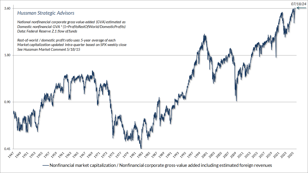
When I say “reliable” in the context of valuation measures, risk-premium gauges, and so forth, I’m referring to their correlation with actual, subsequent market outcomes across history. Valuation gauges and risk-premium measures are a dime-a-dozen on Wall Street. What matters is whether they’re coherent from the standpoint of the underlying discounted cash flow relationships, and most important, whether they’re strongly correlated with subsequent outcomes. It’s distressing how many measures fail miserably on that basis (including the very common practice of equating the equity risk premium with the S&P 500 forward earnings yield minus the 10-year Treasury yield).
We typically use both 10-year and 12-year returns in our valuation work – the 10-year horizon is a common convention, but the 12-year horizon our preference, since statistically, that’s the point where valuations at one period tend to become uncorrelated with valuations at a later date (mathematically, it’s the point where the autocorrelation profile hits zero). So “mean-reversion” tends to have its most reliable impact on a 12-year horizon. That’s another way of saying that valuations aren’t a short-term timing tool. They have profound implications for long-term returns, but over shorter horizons, other factors, particularly investor psychology, are more important. That’s why the uniformity or divergence of market internals – unfavorable at present – is also essential to monitor.
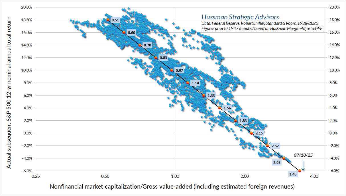
The scatter below shows the relationship between MarketCap/GVA and actual subsequent 12-year S&P 500 average annual total returns, in data since 1928. There are certainly “outliers” where actual returns were up and away from the tighter scatter. Those “outliers” typically reflect 12-year horizons when the endpoint of the horizon occurred at speculative valuation levels like 2000 and today. Still, even a very large positive outlier in the coming years would imply weak expected returns from these levels. There’s no 12-year return associated with the current instance, because across a century of market cycles, valuations have never been this extreme.
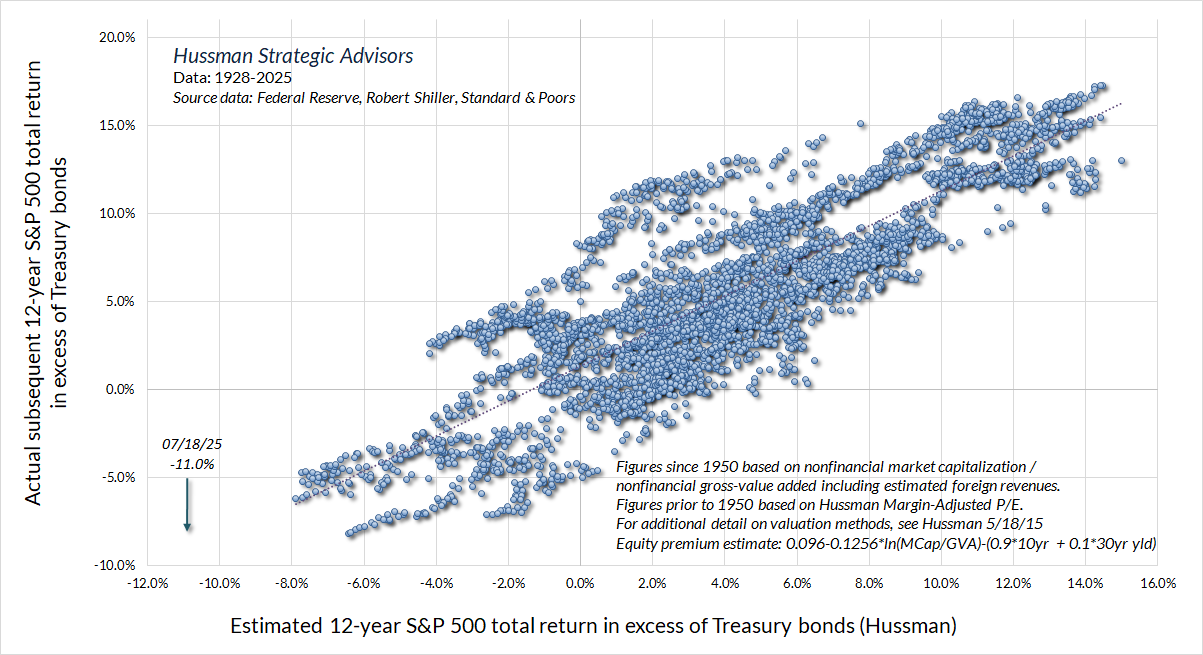
To put the current valuation extreme in perspective, the chart below shows our estimate of 12-year S&P 500 total returns over-and-above Treasury yields. This is the most reliable estimate of the “equity risk premium” that we have examined or developed, and is better correlated with actual subsequent outcomes than the “Fed Model” (S&P 500 operating earnings yield – the Treasury yield), the “Excess CAPE Yield” of Shiller, Black, and Jirav, and annual estimates produced by Aswath Damodaran, all whose work I admire even when I might disagree.
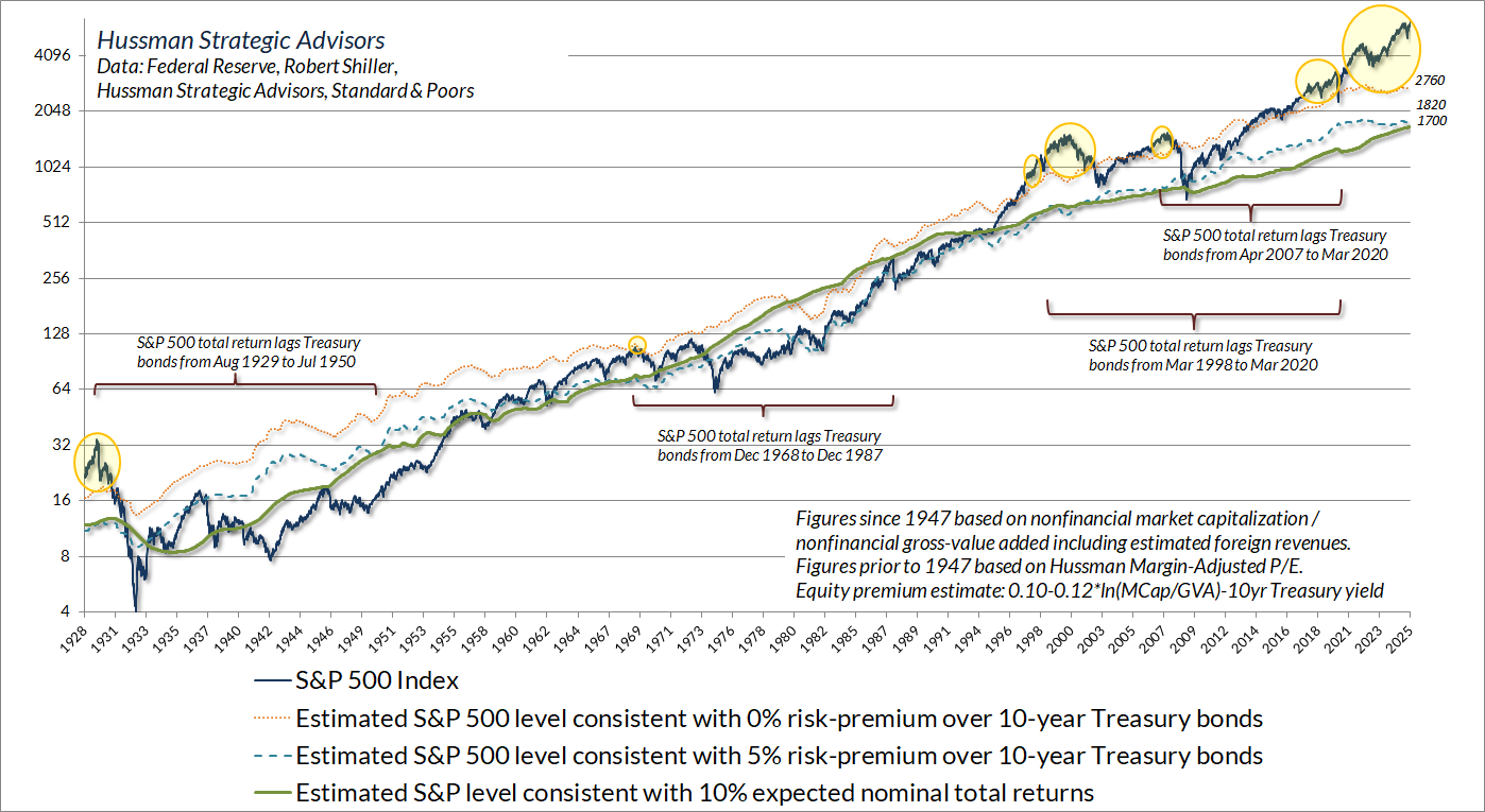
The chart below shows the level of the S&P 500 that we associate with varying levels of the equity risk premium. The yellow bubbles show points when our estimate of the likely 10-year equity risk-premium has been negative (that is, expected S&P 500 nominal total returns less than 10-year Treasury yields).
Notice the brackets below prior instances when the estimated risk premium was negative. Perhaps not surprisingly, the total return of the S&P 500 lagged Treasury bonds from 1929-1950, 1968-1987, and the 22-year stretch from 1998 to 2020 (3/23/98-3/23/20: 5.27% vs 5.32% annually), among other sub-periods. That’s 62 years of the 96-year period since 1929 – nearly two-thirds of history. That’s even worse than the “half of all the time” that Grantham mentioned, because in this case we’re looking at periods where stocks simply lagged Treasury bonds, not where S&P 500 total returns fell short of an even lower bar such as T-bills, inflation, or zero.
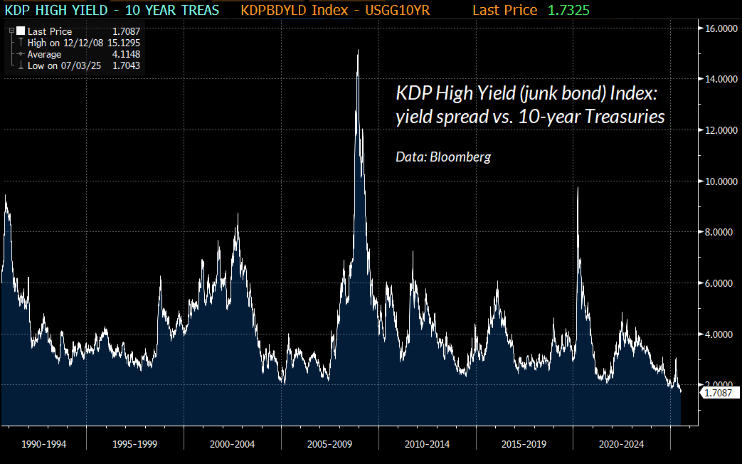
The mindset of investors here seems to be that “risk is a construct” rather than something that’s ever actually realized as deep and durable losses. You can see this mindset at play in the spread between junk bond yields and Treasury yields, which is at record lows.
Some part of the spread may be owed to concerns about the U.S. fiscal situation as well, so we can’t draw a pure signal, but when you’ve got equity valuations at record highs and junk spreads at record lows, the joint inference is that investors are pricing securities with little concern for risk. That’s particularly dangerous, given that our key gauge of market internals continues to suggest underlying vulnerability in investor psychology toward speculation versus risk-aversion.
The thin, volatile blue line in the chart below essentially gauges how closely the present “cluster” of market conditions matches those observed at intermediate and major peaks and troughs in the S&P 500 across history. Both our cluster correlation and cluster proximity scores can range from -1 to 1. Perfect correlation with peaks (+1) and perfect negative correlation with troughs (-1) gives a maximum differential of 1- (-1) = 2. So the sum of these two measures ranges from -4 to +4. The red line is the S&P 500 (right scale, log), and the thin yellow line is MarketCap/GVA (log) scaled from -4 to +4. It’s at that +4 level here.
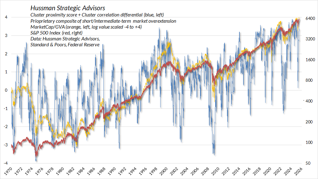
You’ll notice a very brief downward spike in the differential during April. The hedging implementation we introduced last September gave us a nice opportunity there, even though market conditions came nowhere close to what one would typically see at an intermediate/cyclical bottom. Presently, we’re again just shy of the most extreme levels in history.
Any widening in dispersion across breadth (advances vs declines) or leadership (new highs vs new lows) would likely push the differential to an even more extreme level. Among the things to monitor in daily data include sessions when a) the S&P 500 index is up but breadth is down, b) when both highs and lows account for more than about 2.5% of issues traded, or c) when a leadership reversal occurs, with more daily new lows than new highs.
Given the extremes that are already in place, that sort of increasing dispersion would typically be followed by a quick air-pocket on the order of a 6-12% market decline over a handful of days. The first line down tends to be vertical. Not a forecast, just an observation.
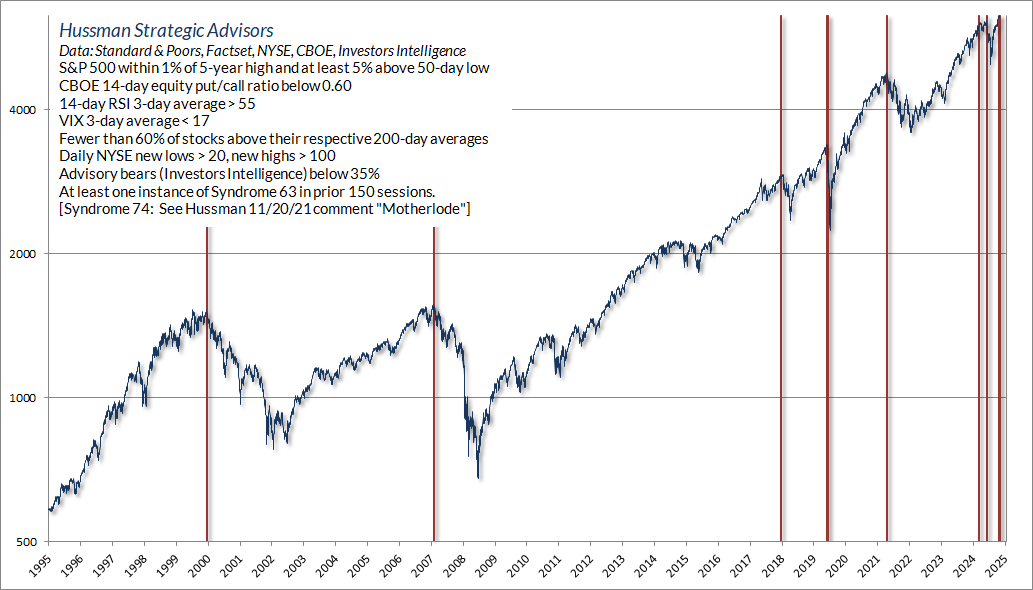
In our daily tally of warning flags, Friday generated one of my favorites – “Syndrome 74” which I discussed at length in the February comment The Government Deficits Land in the Deepest Pockets. As it happened, the February 18th instance was the day before the mid-February high. While the S&P 500 now stands about 3% above that peak, we’ve clearly been satisfied with our own discipline since then.
As usual, I view this type of syndrome as a “weak sensor” – best used in composites that include scores of them. We’ve certainly got lots of these active here, so we’re again at one of those “Motherlode” moments. Not a forecast, none required.
Presuming profits promise permanent prosperity
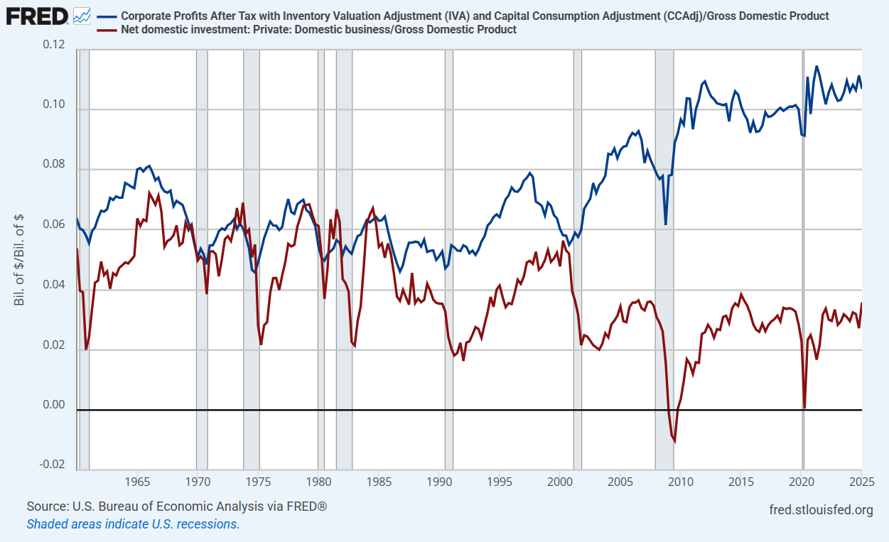
My impression is that the exuberance of the moment is too strong for investors to care about history. As is true in every bubble, investors are undoubtedly convinced that we’re in a new era to which history doesn’t apply. Simply observe corporate profit margins, for example, and the fact that they haven’t eroded in years, and it’s natural to imagine that they’ve simply established permanent highs beyond all historical experience.
Nothing in our investment discipline relies on mean reversion in profit margins or valuations, but the fact is that U.S. productivity growth since 2000 has been slower, not faster, than during the previous century. Investors have conflated elevated profits with technology, innovation, and hand-wavy features of a “new era.” Yet the reality is that record U.S. corporate profits and free cash flows over the past two decades have directly relied on the distortions created by “free money” policies.
Those “free money” policies include not only fiscal deficits, but monetary policy that – for much of the past decade – funded those deficits by flooding the economy with zero-interest cash, which also significantly reduced corporate interest costs. That’s where the record profits have come from. It’s not a theory. It’s an accounting identity.
The expansion in corporate free cash flow (profits minus net investment) in recent decades is the mirror image of expanding deficits in other sectors – mainly larger deficits of government, and deficits among working families who find it difficult to save as labor compensation has increasingly lagged labor productivity. That’s how the accounting works. When we look at record corporate profits, we have to remember that the “deficit” of one sector (consumption and net investment in excess of income) always emerges as the “surplus” of another.
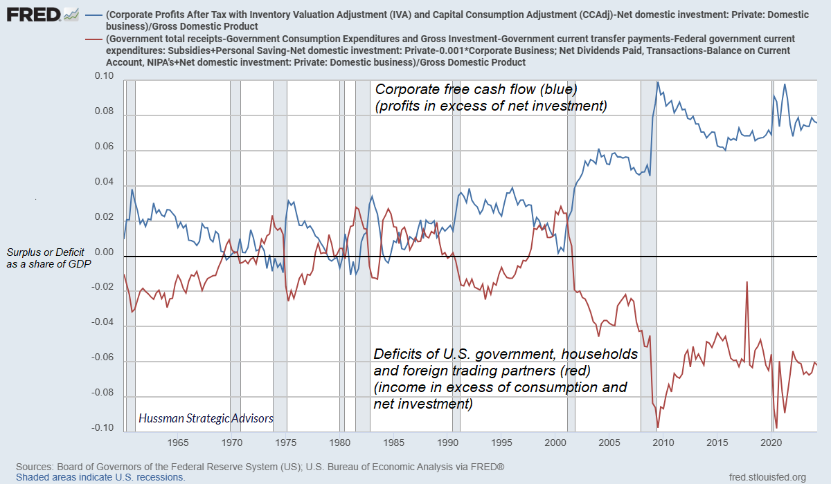
Likewise, as I observed last month (see the section titled “The deficits of one sector emerge as the surplus of another”) the main drivers of the record U.S. federal debt/GDP ratio haven’t been Medicaid, or supplementary nutrition programs, or aid to the most vulnerable among us. No – the debt has advanced in clear, discrete spikes, driven by repeated “one off” government crisis responses and fiscal free-for-alls.
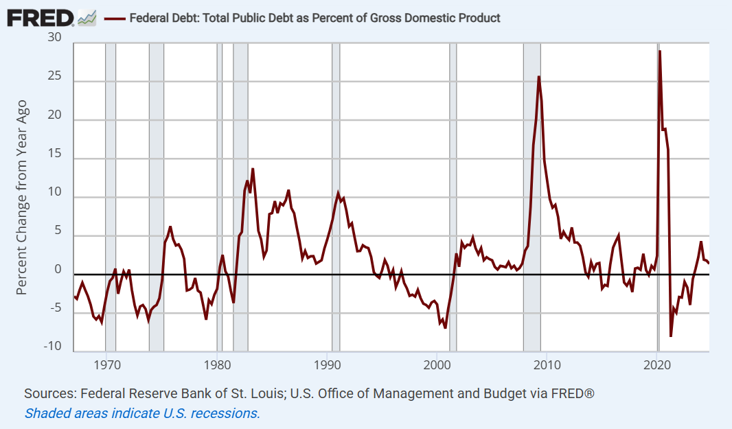
Notice that despite growing corporate profits as a share of GDP, net domestic business investment has been progressively shrinking as a share of GDP. At best, we’ve seen a nice little pop in net investment over the past few years. It’s not earth-shaking, but it’s not nothing. Investment in AI, chips, and related infrastructure has been running about 1% of GDP annually – roughly $300 billion annually in recent years. When you hear about the frenzy of investment driven by AI, that’s roughly the scale. It’s important, but corporate investment is still far smaller as a share of GDP than historical norms.
It’s true that a disproportionate share of U.S. corporate profits currently benefit a handful of large companies, but the entire history of U.S. economic growth is made of no other substance than the constant introduction of “new eras.” For more on this point, see The Turtle and the Pendulum.
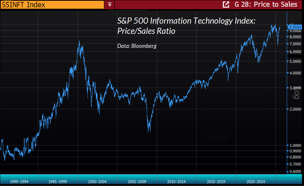
Remember also that despite the emergence of the internet, smart phones, networking, cloud computing, and countless other technological breakthroughs in recent decades, S&P 500 revenues, corporate profits, and GDP have grown slower, not faster, than in the decades prior to 2000. We forget. In the exuberance of this moment, the S&P 500 information technology index is priced at valuations that embed, and now require, a permanently high plateau in profit margins and growth rates.
Yet even for market leaders, the boom in AI investment will have consequences that will likely disappoint the extrapolation of profits that investors seem to rely on. As Grantham recently observed, “The spending programs of the seven great companies – each company is like a medium sized country. AI has sucked all seven in, and that means competition. The history of the Mag-7 is divided into two halves. The half up until now where basically they each individually owned an area, and the half going forward, where they increasingly fight it out tooth and nail to see who is the biggest and best in AI. Their paths will not be as smooth as they were in the past.”
Investors have conflated elevated profits with technology, innovation, and hand-wavy features of a ‘new era.’ Yet the reality is that record U.S. corporate profits and free cash flows over the past two decades have directly relied on the distortions created by ‘free money’ policies.
Those ‘free money’ policies include not only fiscal deficits, but monetary policy that – for much of the past decade – funded those deficits by flooding the economy with zero-interest cash, which also significantly reduced corporate interest costs. That’s where the record profits have come from. It’s not a theory. It’s an accounting identity.
From an economic perspective, neither the extension of low corporate tax rates, nor a redistribution of wealth favoring the highest 10% of income earners is likely to do much for U.S. economic growth prospects. The reason is simple – they don’t relieve any constraint that was previously binding. Even as corporate profit margins have pushed to record levels, corporations have devoted progressively less of those earnings to net capital formation, aside from the recent, fairly modest AI-related pop.
As I’ve often noted over the years, the best economic policies act to ease some binding constraint on productive economic activity, address coordination failures, or create incentives or disincentives toward activities that have positive or negative spillovers for the nation as a whole. Otherwise, the policy effect is purely distributional – someone benefits at a loss to someone else.
The same argument holds for deregulation: if it reduces binding constraints, and enhances competition and reduces deadweight losses, there can be clear benefits. In contrast, if deregulation simply removes protections in a way that allows individuals or companies to engage in activities that have negative spillovers on others without bearing the cost – the impact of deregulation is purely distributional. Since monopolies create deadweight losses except when the monopolies can price-discriminate between consumers (in which case the monopoly gets all the surplus) or are regulated to “simulate” competitive outcomes, deregulation that encourages monopoly is net negative – any benefits are distributional.
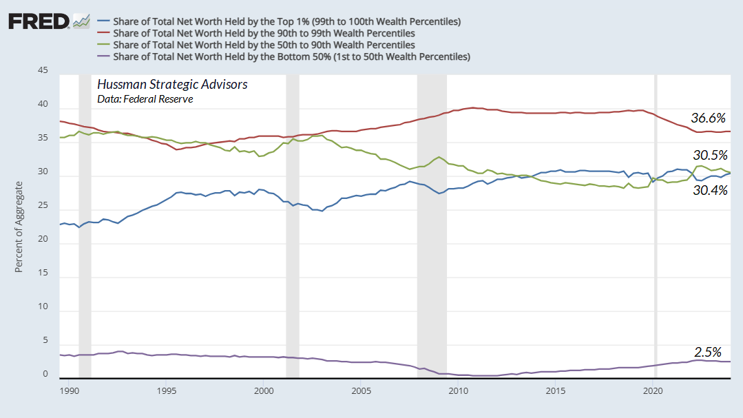
Equally important, the effect of a one-dollar shift in the wealth distribution isn’t actually one-for-one. Since the incremental benefit of an extra dollar to a very wealthy individual is far smaller than the incremental benefit of an extra dollar to someone who has very little, a redistribution toward those who are well-off imposes a pure loss to the aggregate well-being of the country. The wider the distribution of wealth was originally, the larger that aggregate loss will be.
That’s not an argument for policies that target income equality, but it’s certainly a consideration when the redistribution worsens the condition of the working poor and those who already bear the greatest burdens of our shared humanity.
The budget legislation passed in recent weeks is scored by the nonpartisan Congressional Budget Office as providing $3.1 trillion in tax cuts and refundable credits over the coming decade, partially funded by $1 trillion in cuts to Medicaid, SNAP (supplementary nutrition assistance for the poor) and related programs. About $1.4 trillion of that net $2.1 trillion benefits the wealthiest 10% of households, while the bottom 10% will lose about $187 billion over the coming decade (each group about 13 million households).
The provision in recent legislation that’s most friendly to net capital formation is the expansion of bonus depreciation, scored by the Congressional Budget Office with an expected cost of $184.5 billion over the coming decade. As always, I tend to be very supportive of provisions that encourage net capital formation, because it has important spillover benefits for the economy. But relative to the overall impact, it’s a minor feature of the recent bill.
Overall, our economic outlook is largely unchanged. Our most reliable economic measures continue to hover at levels that have historically defined the threshold of recession. That’s not a forecast, and nothing in our discipline relies on an economic downturn, but we can’t clearly rule that out even during 2025.
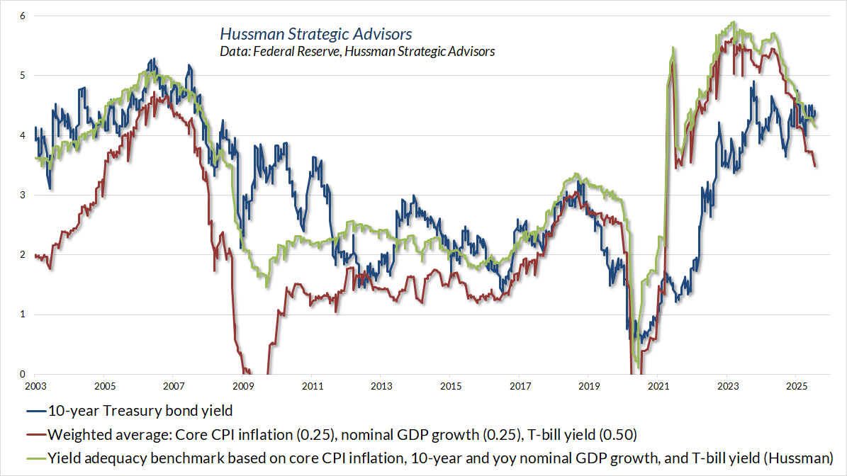
Brief update – Treasury bonds and precious metals
In my view, Treasury bond yields continue to be adequate relative to even simple benchmarks that have historically been useful in identifying periods when Treasury bonds have outperformed T-bills over time, on average.
Likewise, our view regarding precious metals stocks continues to be relatively positive, though we would be more aggressive if the relatively tepid condition of the economy was coupled with explicitly falling Treasury yields (even, say, on a 6-month lookback). Meanwhile, remember that precious metals shares tend to have significant short-term volatility. We use them largely as a complement to Treasury securities, as a limited share of our bond-focused investment discipline. That’s served us quite well for decades.
Overall, then, the stock market stands at the highest level of valuations in U.S. history, easily eclipsing the extremes of 1929 and 2000. Investors have clearly placed a great deal of confidence in these elevated valuations as a result of elevated corporate profits (a historically disastrous form of double-counting). Yet from the standpoint of economic accounting, these profits inherently reflect the impact of two decades of “free money,” largely driven by crisis-related spending free-for-alls that produced discrete spikes in the debt/GDP ratio.
It’s tempting to paraphrase Herbert Stein – “things that are unsustainable tend not to be sustained.” Then again, I suspect many of us thought this dumpster fire was unsustainable a long time ago.
As usual, we don’t need to rely on any directional forecast at all. It’s enough to observe that the likely return investors can expect for taking risk, both in stocks and low-grade bonds, stands at the lowest level in history – based on measures that we find best correlated with returns across a century of market cycles.
A market crash is nothing but risk-aversion meeting a market that’s not priced to tolerate risk. Still, we don’t need that sort of outcome. For our part, I expect that our investment discipline will be perfectly content simply for the market to fluctuate over time.
Keep Me Informed
Please enter your email address to be notified of new content, including market commentary and special updates.
Thank you for your interest in the Hussman Funds.
100% Spam-free. No list sharing. No solicitations. Opt-out anytime with one click.
By submitting this form, you consent to receive news and commentary, at no cost, from Hussman Strategic Advisors, News & Commentary, Cincinnati OH, 45246. https://www.hussmanfunds.com. You can revoke your consent to receive emails at any time by clicking the unsubscribe link at the bottom of every email. Emails are serviced by Constant Contact.
The foregoing comments represent the general investment analysis and economic views of the Advisor, and are provided solely for the purpose of information, instruction and discourse.
Prospectuses for the Hussman Strategic Market Cycle Fund, the Hussman Strategic Total Return Fund, and the Hussman Strategic Allocation Fund, as well as Fund reports and other information, are available by clicking Prospectus & Reports under “The Funds” menu button on any page of this website.
The S&P 500 Index is a commonly recognized, capitalization-weighted index of 500 widely-held equity securities, designed to measure broad U.S. equity performance. The Bloomberg U.S. Aggregate Bond Index is made up of the Bloomberg U.S. Government/Corporate Bond Index, Mortgage-Backed Securities Index, and Asset-Backed Securities Index, including securities that are of investment grade quality or better, have at least one year to maturity, and have an outstanding par value of at least $100 million. The Bloomberg US EQ:FI 60:40 Index is designed to measure cross-asset market performance in the U.S. The index rebalances monthly to 60% equities and 40% fixed income. The equity and fixed income allocation is represented by Bloomberg U.S. Large Cap Index and Bloomberg U.S. Aggregate Index. You cannot invest directly in an index.
Estimates of prospective return and risk for equities, bonds, and other financial markets are forward-looking statements based the analysis and reasonable beliefs of Hussman Strategic Advisors. They are not a guarantee of future performance, and are not indicative of the prospective returns of any of the Hussman Funds. Actual returns may differ substantially from the estimates provided. Estimates of prospective long-term returns for the S&P 500 reflect our standard valuation methodology, focusing on the relationship between current market prices and earnings, dividends and other fundamentals, adjusted for variability over the economic cycle. Further details relating to MarketCap/GVA (the ratio of nonfinancial market capitalization to gross-value added, including estimated foreign revenues) and our Margin-Adjusted P/E (MAPE) can be found in the Market Comment Archive under the Knowledge Center tab of this website. MarketCap/GVA: Hussman 05/18/15. MAPE: Hussman 05/05/14, Hussman 09/04/17.