

One Tier and Rubble Down Below


John P. Hussman, Ph.D.
President, Hussman Investment Trust
January 2020
The Nifty Fifty appeared to rise up from the ocean; it was as though all of the U.S. but Nebraska had sunk into the sea. The two-tier market really consisted of one tier and a lot of rubble down below. What held the Nifty Fifty up? The same thing that held up tulip-bulb prices long ago in Holland – popular delusions and the madness of crowds. The delusion was that these companies were so good that it didn’t matter what you paid for them; their inexorable growth would bail you out.
– Forbes Magazine, 1977, The Nifty Fifty Revisited
Blue Chip Performance: 1973-1974
Du Pont -58.4%
Eastman Kodak -62.1%
Exxon -46.9%
Ford Motor -64.8%
General Electric -60.5%
General Motors -71.2%
Goodyear -63.0%
IBM -58.8%
McDonalds -72.4%
Mobil -59.8%
Motorola -54.3%
PepsiCo -67.0%
Philip Morris -50.3%
Polaroid -90.2%
Sears -66.2%
Sony -80.9%
Westinghouse -83.1%
We forget.
One of the striking things about bull markets is that they often end in confident exuberance, while simultaneously deteriorating from the inside. We’ve certainly observed this sort of selectivity during the past year. The market advance in 2019 fully recovered the market losses of late-2018, fueled by a wholesale reversal of Fed policy, hopes for a “phase one” trade deal, and as noted below, a bit of confusion about what actually constitutes “quantitative easing.”
Yet for all the bullish exuberance, speculative enthusiasm, and fear-of-missing-out (FOMO) we’ve observed among investors in recent weeks, and indeed, in the past two years, the fact is that a pullback of just 11% in the S&P 500 would place the total return of the S&P 500 Index behind the return on Treasury bills since the January 26, 2018 market high. Given current overextended extremes, the entire gain of the S&P 500 since early-2018 could be given up in a handful of trading sessions.
Recall, for example, that the S&P 500 lost 11% in the 15 sessions following the March 2000 peak, 12.5% in the 30 sessions following the September 2000 correction high, and over 10% in the month following the October 2007 market peak. Initial losses from overextended peaks are almost designed to provide limited opportunity for exit. That kind of initial decline is often followed by a “fast, furious and prone to failure” rally to clear short-term oversold conditions, followed by repeated declines to dramatically lower levels.
From our perspective, probably the most striking feature of the period since the January 2018 high is that except for a few brief whipsaws, market internals have failed to recruit the sort of “internal uniformity” that typically defines robust speculation. Instead, we continue to observe the sort of tepid participation and internal divergence that was characteristic of the final advances of the 2000 tech bubble and the 2007 mortgage bubble.
The fact is that a pullback of just 11% in the S&P 500 would place the total return of the S&P 500 Index behind the return on Treasury bills since the January 26, 2018 market high. Given current overextended extremes, the entire gain of the S&P 500 since early-2018 could be given up in a handful of trading sessions.
The chart below shows the median price/revenue ratio of S&P 500 components on log scale, where the components of the S&P 500 are divided into 10 deciles, ranked from the lowest to the highest price/revenue ratios.
As I’ve noted before, individual price/revenue ratios aren’t clear indications of value in and of themselves. Typically, low ratio stocks include retail, grocery, and banking companies, while high ratio stocks include technology and emerging growth companies. What’s more important is the comparison of each group with its own norms, as well as dispersion across the behavior of different groups.
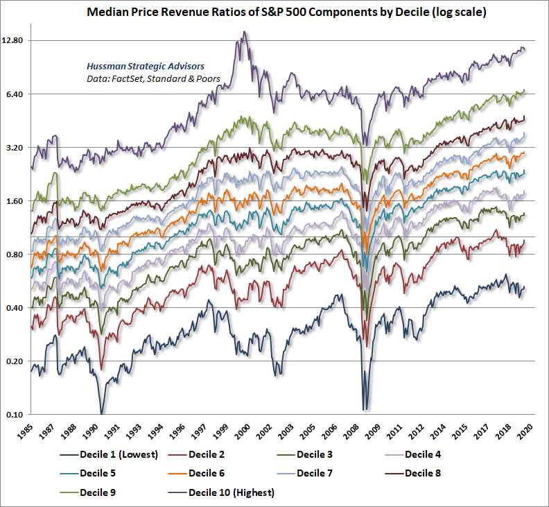
Presently, it’s clear that except for the most expensive 10% of stocks, every other decile is at valuations 10-50% more extreme than those observed at the 2000 market peak.
Blue Chip Performance: 2000-2002
Cisco Systems -89.3%
Microsoft -65.2%
JP Morgan -76.5%
Intel -82.3%
McDonalds -74.4%
EMC -96.2%
Disney -68.4%
Oracle -84.2%
Merck -58.8%
Boeing -58.6%
IBM -58.8%
Amgen -66.9%
Apple -81.1%
We forget.
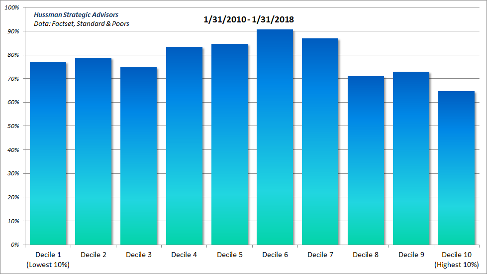
Equally notable is the dispersion that we’ve observed across various deciles since early 2018 (credit goes to Bill Hester for the chart analysis below, and to Russell Jackson for compiling the data here).
The first chart below shows the percentage change in the median price/revenue ratio of each decile between January 2010 and January 2018. Notice the uniform gains across various deciles. As I’ve often observed, when investors are inclined to speculate, they tend to be indiscriminate about it.
When speculation is uniform, even an overvalued market can easily be driven to further overvaluation. This sort of uniformity is a hallmark of robust bull market periods, and was observed during much of the technology and mortgage bubbles. Indeed, the lower valuation deciles often enjoy particularly strong performance during the early phase of bull markets.
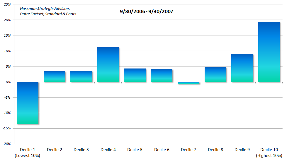
The next chart shows the percentage change in median price/revenue ratios since January 2018. Notice the striking loss of uniformity here. What we see here is essentially a “Nifty Fifty” type of environment, where the most richly valued deciles have accounted for a disproportionate share of the gains while more value-oriented sectors have stagnated or even lost value. This is the hallmark of a market that is losing its engines, yet at the same time maintaining the face of speculation.
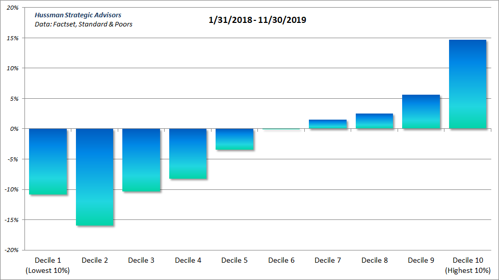
We’ve observed precisely the same pattern in the late stages of previous bubbles. Indeed, during much of the tech bubble and the mortgage bubble, value-oriented stocks outperformed other deciles through the bulk of the advance. However, that pattern shifted profoundly as the market approached its peak, with investors increasingly chasing high-valuation “glamour” stocks while the broader market gradually lost its sponsorship.
The chart below shows the percentage change in the median price/revenue ratio of S&P 500 components, by decile, in the year leading up to the March 2000 bull market peak.
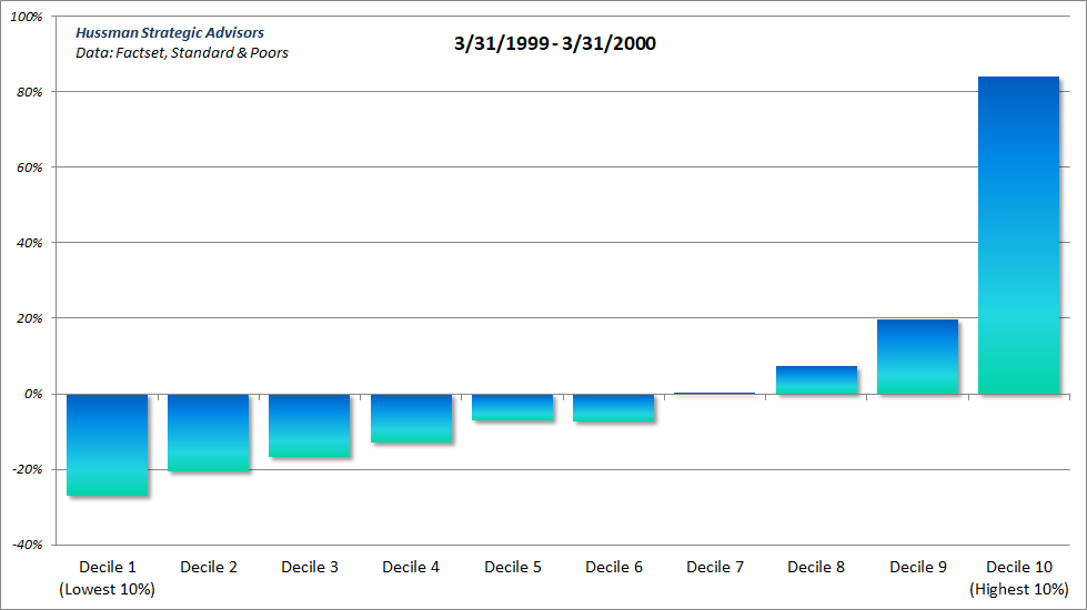
Not surprisingly, the same sort of internal dispersion emerged during the final stages of the mortgage bubble, just before the onset of the global financial crisis.
Blue Chip Performance: 2007-2009
Google -65.3%
Bank of America -94.0%
Microsoft -50.3%
Merck -65.5%
Coca Cola -42.3%
JP Morgan -68.5%
Intel -56.8%
AT&T -49.3%
Cisco Systems -60.0%
Boeing -72.6%
Apple -60.9%
Citigroup -98.1%
We forget.
There’s no denying that internal dispersion has been enormously challenging for hedged-equity strategies over the past year. Unless one has been blindly invested in the most overvalued glamour stocks, it has been unrewarding to hold a broadly diversified portfolio of carefully selected stocks, while hedging their market risk with offsetting short positions in the major indices.
Still, I believe that pursuing a disciplined hedged-equity strategy is the correct response to present financial conditions: hedging the market risk of a diversified, value-conscious stock portfolio when valuations and market internals are hostile, coupled with a willingness to remove those hedges when a material retreat in valuations is joined by an improvement in the uniformity of market internals.
Three times the norm
Investors should keep in mind that market valuations stand nearly three times the historically run-of-the-mill valuation levels from which stocks have historically generated run-of-the-mill long-term returns. In fact, the highest level of valuation ever observed at the end of any market cycle in history was in October 2002, and even that level is less than half of present valuation extremes.
So how do you get to historically run-of-the-mill valuation norms? The answer is simple: Wait nearly 30 years, allowing both the U.S. economy and U.S. corporate revenues to grow at the same rate as the past two decades, while stock prices remain unchanged, with no intervening periods of recession or investor risk-aversion, or alternatively (and far more likely), watch the S&P 500 lose two-thirds of its value over the completion of this market cycle.
Market valuations stand nearly three times the historically run-of-the-mill valuation levels from which stocks have historically generated run-of-the-mill long-term returns.
Think about what a two-thirds market loss actually means. It means a loss of 30% in the S&P 500, then another 30% of that, and then 30% of what’s left. Frankly, my view is that the first 30% market loss from recent highs will be the beginning, not the end of the bear market ahead. If history is any guide, the initial phase of the next bear market will occur without any consensus at all about recession risk. Indeed, most initial bear market declines are accompanied with versions of Herbert Hoover’s 1929 statement that “the fundamental business of the country is on a sound and prosperous basis.”
The second 30% market loss is more likely to occur in the context of clearly deteriorating economic activity, though punctuated by interim rallies in response to the normal ebb-and-flow of economic data. Two 30% market losses wipe out about half of the market’s value. Once that low is broken, it’s the third 30% market loss that would draw market valuations to historically run-of-the-mill norms, and ideally establish a low for the cycle without breaking into the bottom half of historical valuation levels that would be considered “undervalued.” To be clear, a two-thirds market decline would not even drive the most historically reliable valuation measures below their historical norms.
For investors focused on the “outlook” for 2020 and beyond, this 1932 passage from Robert Rhea provides enormous insight, not only regarding the current speculative mania, but also about the expectations that investors should have, in advance of what’s likely to be a profoundly disruptive completion to this cycle:
There are three principal phases of a bull market: the first is represented by reviving confidence in the future of business; the second is the response of stock prices to the known improvement in corporate earnings, and the third is the period when speculation is rampant – a period when stocks are advanced on hopes and expectations. There are three principal phases of a bear market: the first represents the abandonment of the hopes upon which stocks were purchased at inflated prices; the second reflects selling due to decreased business and earnings, and the third is caused by distress selling of sound securities, regardless of their value, by those who must find a cash market for at least a portion of their assets.
– Robert Rhea, The Dow Theory, 1932
Emphatically, the market retreat that we anticipate neither presumes nor requires a global financial crisis (though we can’t rule it out, particularly because of record levels of low-grade corporate debt relative to corporate revenues). It would not require a deep recession, or even a move to historically undervalued levels.
Given present valuation extremes, a two-thirds market loss would represent a wholly run-of-the-mill completion to this market cycle, ending at pedestrian valuation levels that have been observed or breached by the completion of nearly every market cycle in history (including the most recent one). The fact that such a steep market loss would be necessary to reach ordinary valuation levels isn’t a statement about future economic disruption; it’s a statement about current speculative extremes.
Again, given current hypervalued extremes, even a minor correction of 11% would wipe out the entire total return of the S&P 500, over-and-above T-bill returns, since the January 2018 high. In the context of far deeper potential market losses over the completion of this market cycle, such an initial decline would be an almost negligible event.
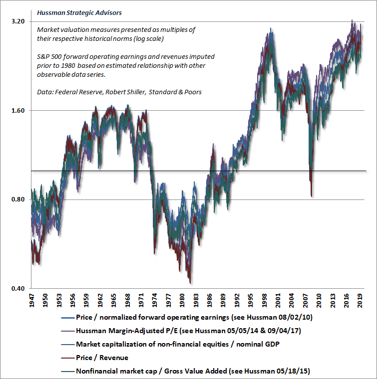
The chart below shows the most reliable valuation measures we’ve tested or introduced over time, based on their correlation with actual subsequent total returns in market cycles across history. Each is displayed as a multiple of its own historical norm. Presently, all of them range between 2.5 and 3.2 times those norms.
You can think of historical norms as the valuation levels that have generally been followed by ordinary market returns (historically averaging about 4% above nominal long-term economic growth). Put another way, when market valuations have been historically normal, investors could reasonably expect long-term S&P 500 total returns averaging about 10% annually. Given the gradual decline in structural GDP growth in recent decades (a combination of slower demographic labor force growth and trend productivity), normal valuations would presently be associated with expected returns averaging about 8% annually. Again, the S&P 500 is currently about three times the valuation levels that could reasonably be expected to provide such long-term returns.
Now hold on. That argument suggests that the last time the S&P 500 was valued at its historical norms was in 2009, and before that, not since September 1992. Isn’t that just a little bit preposterous? Well, as it turns out, the nominal total return of the S&P 500 over the 27 years since September 1992 has averaged 9.97% annually, and because structural economic growth (detailed below) has declined progressively during this period, it’s taken one of the most extreme bubbles in history to achieve even that outcome.
Present valuation extremes are inconsistent with future expected market returns anywhere near 10% annually. For example, if we examine the period between the March 2000 peak and today – both points of historically extreme valuation – the nominal total return of the S&P 500 during these 19 intervening years has averaged 5.9% annually. Yet, it’s taken one of the most extreme bubbles in history to generate even that return. In order to expect future S&P 500 nominal total returns to match even the 5.9% average of the past 19 years, investors must rely on market valuations remaining at current extremes at the end of their chosen investment horizon.
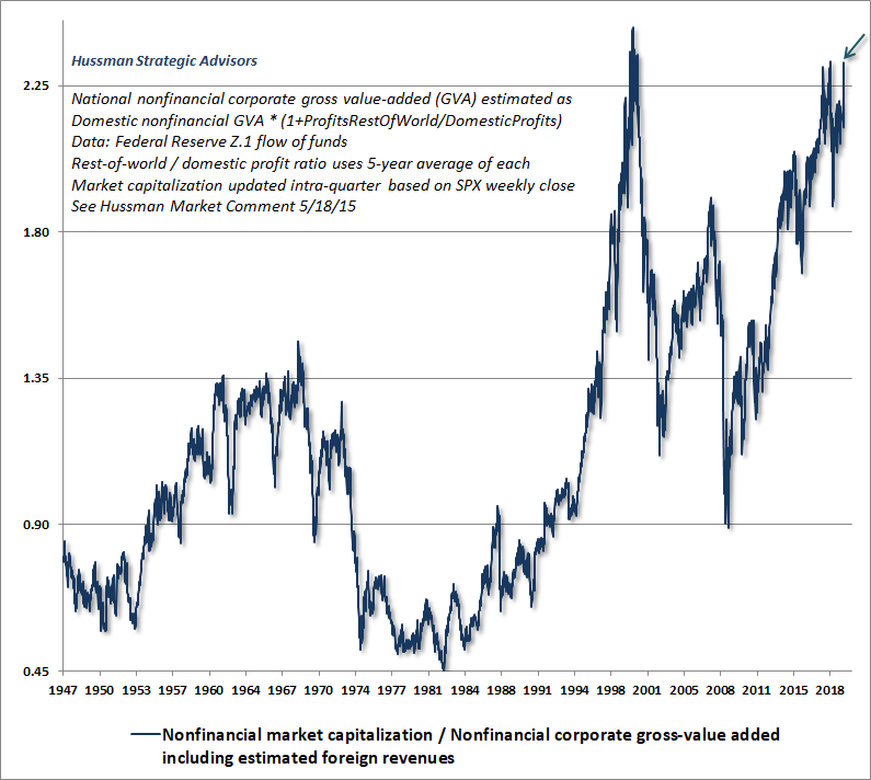
The chart below shows the valuation measure we find best correlated with actual subsequent market returns across history, even considering alternatives such as price/forward operating earnings, the Shiller CAPE, the Fed Model, and others. Notice that the October 2002 low represented the most overvalued bear market trough in history, and for that reason, it was easily breached by a more typical valuation low in March 2009. Given current valuation extremes, the S&P 500 would have to lose between 50-62% simply to reach similar levels at the completion of this market cycle.
In order to expect future S&P 500 nominal total returns to match even the 5.9% average of the past 19 years, investors must rely on market valuations remaining at current extremes at the end of their chosen investment horizon.
Please, do yourself a great favor, pick up a calculator, and understand what’s likely to happen even if nominal GDP growth and corporate revenues continue to grow at the roughly 4% annual rate of recent decades, and valuations move from 3 times their historical norms to even 2 times their historical norms, a full 10 years from now. The arithmetic is fairly simple. The annual gain in the S&P 500 over those 10 years would average (1.04)*(2.0/3.0)^(1/10)-1 = -0.1% annually. That means that the S&P 500 Index is likely to be no higher than it is today, even if market valuations a decade from now still stand at twice their historical norms.
The same calculation, assuming valuations merely touch their historical norms a decade from now, would be (1.04)*(1.0/3.0)^(1/10)-1=-6.8% annually. A dividend yield of 2% annually will not be nearly enough to prevent a decade of negative S&P 500 total returns.
For a discussion of profit margins, which is typically how investors become convinced to over-rely on price/earnings multiples at the peak of every economic cycle, see the section titled “Wait. What?!? Over a decade of S&P 500 returns no better than T-bill returns?” in my September 2019 comment, Going Nowhere In An Interesting Way.
Stock market valuations and interest rates
One of the most common justifications for elevated stock market valuations here is the idea that “high stock market valuations are justified by low interest rates.” To some extent, that’s true, but it’s true in an interesting way. See, for any given set of future expected cash flows, a higher security price – that is, a higher valuation relative to those cash flows – implies a lower long-term rate of return.
So, yes. One can argue that low interest rates “justify” higher stock market valuations, but that’s really equivalent to saying that “low prospective returns in the bond market justify low prospective returns in the stock market.” Emphatically, nothing about that argument changes the fact that elevated stock market valuations imply lower future investment returns.
We also have to ask how much of a valuation premium is actually “justified” by low interest rates. It’s there that investors have inadvertently created a world of future pain for themselves.
To understand these points, several observations may be useful:
1) The combination of low interest rates and elevated stock valuations implies low prospective future returns on the entire portfolio mix.
2) When recent, backward-looking market returns are higher than one would have expected, given past valuation levels, it is almost always because current valuations are extreme, and are likely to be followed by disappointing future returns.
3) The uniformity or divergence of market internals is a useful gauge of whether investors are inclined toward speculation or risk-aversion, and can defer the consequences of overvaluation or undervaluation over shorter segments of the market cycle.
4) If interest rates are low because the growth rate of nominal GDP and corporate cash flows is also low, those depressed interest rates don’t “justify” any valuation premium at all. Stock returns will be comparably low anyway, by virtue of the lower growth rate.
5) Direct comparison of stock valuations and bond valuations provides information about the likely difference between stock market and bond market returns – the so-called “equity risk premium” or ERP.
Let’s cover these points in sequence.
A passive stock-bond portfolio mix currently faces the lowest prospective returns in history
First, investors should understand that the present combination of low interest rates and elevated stock market valuations implies low prospective returns on the entire portfolio mix.
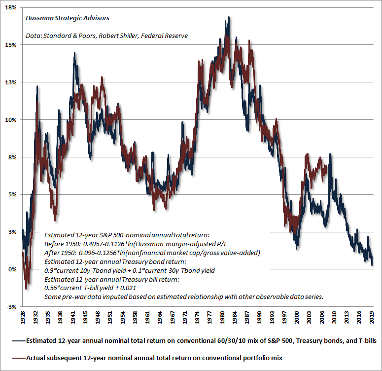
Last week, our estimate of prospective 12-year nominal total returns on a conventional portfolio mix (60% S&P 500, 30% Treasury bonds, 10% Treasury bills) fell to just 0.3% annually, the lowest level in history, breaching even the dismal prospects observed at the August 1929 pre-crash peak.
One can argue that low interest rates ‘justify’ higher stock market valuations, but that’s really equivalent to saying that ‘low prospective returns in the bond market justify low prospective returns in the stock market.’ Emphatically, nothing about that argument changes the fact that elevated stock market valuations imply lower future investment returns. We also have to ask how much of a valuation premium is actually ‘justified’ by low interest rates. It’s there that investors have inadvertently created a world of future pain for themselves.
Backward-looking “errors” imply opposite future outcomes
One of the popular objections to our analysis of valuations and subsequent market returns is that we observe a few periods where actual market returns were higher than those that one would have projected based on valuations 12 years earlier. Notice, for example, that actual returns on a conventional portfolio in the 12 years following 1988 were higher than those one would have projected at the time. The same has been true for the most recent 12-year period, where actual market returns since 2007 have been higher than those one would have projected at the time.
A moment’s thought should clarify that the reason for these “errors” is that the 12-year periods following 1988 and 2007 ended at very unique points: 2000 and 2019, when stock market valuations had pushed to the highest levels in history. It should not be surprising that when investors are standing at a bubble peak, the recent returns they observe, looking backward, will appear glorious. The problem is that the future outcomes that follow are typically dismal.
As I’ve regularly emphasized, though valuations are enormously informative about long-term returns and full-cycle risks, outcomes over shorter segments of the market cycle are driven largely by whether investors are inclined toward speculation or risk-aversion. Those inclinations are impermanent and cyclical. As a result, the “errors” that periodically emerge between actual market returns and those implied by valuations are also impermanent and cyclical.
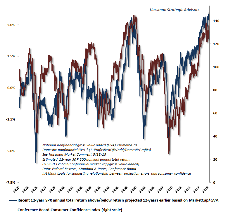
The chart below offers insight into how all of this works. The blue line in the chart below (left scale) shows the difference between actual 12-year S&P 500 total returns and the returns that one would have projected 12 years earlier on the basis of valuations. The red line shows the Conference Board index of consumer confidence (right scale).
What’s going on here is that extreme levels of confidence at bubble peaks like 2000, 2007 and today are precisely why actual returns over the preceding 12-year periods exceeded those implied by valuations. This doesn’t mean that valuations have “stopped working.” It means that speculative psychology plays an important role over shorter segments of the market cycle, and that investors place themselves in grave danger if they assume, at points of extreme confidence, that valuations can be ignored.
Market internals affect outcomes over shorter segments of the cycle
While it’s useful to monitor trends in consumer confidence, and extreme consumer confidence (both high and low) tends to be an excellent contrary indicator, the best measure we’ve found to gauge shorter-term pressures toward speculation or risk-aversion is the uniformity or divergence of market internals across thousands of individual stocks, industries, sectors, and security-types, including debt securities of varying creditworthiness.
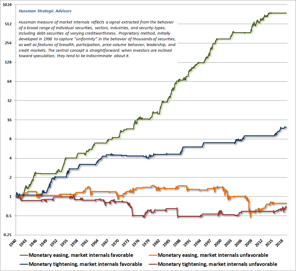
I introduced our concept of market internals (what I used to call “trend uniformity”) in 1998. At present, these measures remain negative, as they have for nearly the entire period since the January 2018 market peak. It’s worth reiterating that this was also when the bull market in most global stock markets ended. Indeed, as noted earlier, it would take a relatively mild correction to put the total return of the S&P 500 behind Treasury bills since January 2018.
The chart below shows the cumulative total return of the S&P 500 since 1998 (blue), along with the cumulative total return of the S&P 500 restricted only to those periods where market internals were favorable on our measures (accumulating Treasury bill returns otherwise). The chart is historical, does not reflect the performance of any portfolio, and there is no assurance that future market returns will be similarly related to these measures.
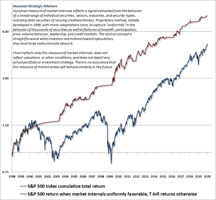
It’s notable that the entire net gain of the S&P 500 over the past 20 years has occurred in periods featuring uniformity in our broad measures of market internals.
So yes, episodes of speculation and risk-aversion can certainly affect market outcomes over shorter segments of the market cycle. Those episodes can produce extremes in valuation that lead investors to believe in “new eras” and to argue that “old valuation measures just don’t work anymore.” This is how market collapses take investors off-guard.
As I always detail openly, my key error during the recent advancing half-cycle hinged on one specific feature of our investment discipline. Though I noted in late-October 2008 that the S&P 500 had become undervalued, the speed of the subsequent rebound put market valuations at levels consistent with sub-4% 10-year total returns as early as April 2010. I responded pre-emptively to “overvalued, overbought, overbullish” syndromes that had generally signaled a “limit” to speculation in prior market cycles across history. Because of their reliability, we had prioritized those syndromes following our 2009-2010 stress-testing exercise against Depression-era data.
In hindsight, amid the novelty of quantitative easing and zero-interest rate policy, our pre-emptive response to those syndromes turned out to be detrimental. In late-2017, we abandoned the notion that it was still possible to define any “limit” to speculation. Since then, our requirement has been straightforward: regardless of how extreme valuations or other conditions might become, we will defer adopting or amplifying a “bearish” investment outlook unless our measures of internals have explicitly deteriorated. Some conditions may be extreme enough to justify a neutral outlook, but a bearish outlook requires deterioration in internals, signaling a subtle shift toward risk-aversion among investors.
Both valuations and internals performed beautifully in the recent market cycle. It was my reliance on historically-reliable overvalued, overbought, overbullish “limits” that proved detrimental. We addressed that issue in late-2017. The main headwind since then has been internal dispersion, but as noted above, that tends to be a regular feature of late-stage advances, and tends to be followed rather violent cycle completions.
My concern is that, rather than distinguishing between short-term speculative pressures and the longer-term implications of valuations, investors have instead come to the conclusion that valuations simply don’t matter and that there is now some sort of “floor” under the market. This conclusion is likely to prove costly. There’s no question that as investors have driven valuations much higher than usual, they have also driven future return prospects much lower than usual. The problem for investors is that those low future returns still arrive.
Last week, our estimate of prospective 12-year nominal total returns on a conventional portfolio mix (60% S&P 500, 30% Treasury bonds, 10% Treasury bills) fell to just 0.3% annually, the lowest level in history, breaching even the dismal prospects observed at the August 1929 pre-crash peak.
The risks that investors face don’t care whether their investment horizon is 10 years, or 12 years, or 20 years. The problem is that at present valuation extremes, passive investors are locking in dismal future return prospects regardless of their investment horizon.
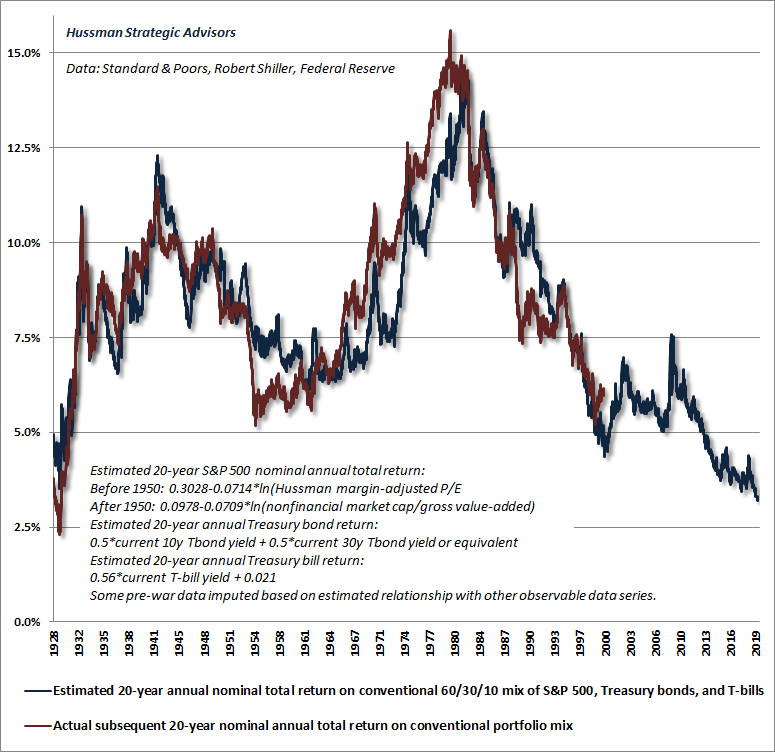
Extending the return horizon simply doesn’t help much. It just amortizes the impact of extreme valuations over a longer period, and thereby gives long-term economic growth more time to soften the blow. The chart below is based on a 20-year investment horizon, using the same mix of 60% stocks, 30% bonds, and 10% T-bills. Even on a 20-year horizon, we estimate that investors can expect average annual total returns of only about 3% annually on a conventional “passive investment strategy” like this.
If interest rates are low because growth is low, no valuation premium is “justified”
Continuing our analysis, it’s worth emphasizing that if interest rates are low because growth rates are low, no valuation premium is “justified” by those low interest rates at all. This is something that you can prove to yourself using any discounted cash flow model, and it’s a fact that investors seem to be completely ignoring here.
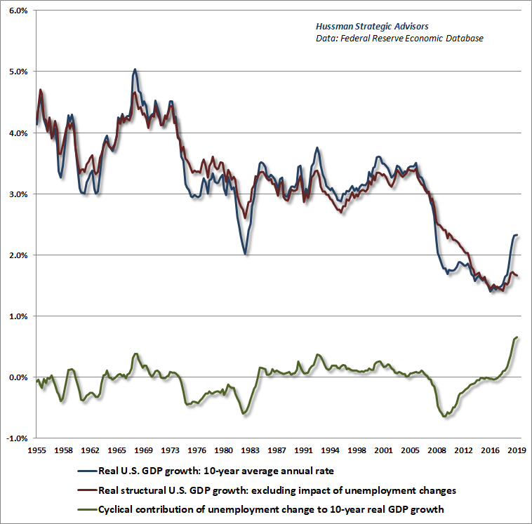
The chart below shows the 10-year growth of real U.S. GDP (blue), along with two additional lines. The red line shows real “structural” U.S. GDP growth, which is the growth rate of GDP excluding the impact of fluctuations in the unemployment rate. The green line shows the contribution of changes in the unemployment rate to observed 10-year U.S. real GDP growth.
Two things should be immediately evident. First, structural real U.S. GDP growth has progressively slowed since the late-1960’s as our economy has matured, and is currently running at only 1.6% annually. That’s the growth rate that we would (and will) actually observe if the rate of unemployment was simply held constant. The other thing to observe is that the decline in the rate of unemployment from 10% during the global financial crisis to just 3.5% today has contributed dramatically to observed real GDP growth, with limited scope for future contributions from here.
It’s true that interest rates are low, but that’s largely because prospective growth rates are also low. In this environment, low interest rates don’t ‘justify’ any valuation premium at all.
Meanwhile, the enormous level of labor market slack and its gradual uptake over the past 10 years has substantially muted both inflation pressures and labor costs. This has encouraged investors to believe not only that government deficits and money creation can be pursued indefinitely without inflationary consequences, and that corporate profit margins (which move inversely with real unit labor costs) have somehow established a permanently high plateau. In the coming years, investors are likely to be wildly disabused of both of these misguided beliefs.
Over the past decade, everything investors have come to believe about financial markets has been conditioned on the 10% unemployment rate, economic slack, and market undervaluation forged during the global financial crisis. They are wholly unprepared for the consequences of a 3.5% unemployment rate, trillion dollar government deficits, a 1.6% real structural GDP growth rate, and market valuations that now stand at fully three times their historical norms.
To offer a sense of this dismal preparation, recall that historically reliable valuation measures presently imply 12-year total returns of only about 0.3% annually on a passive, conventional portfolio mix invested 60% in the S&P 500, 30% in Treasury bonds, and 10% in Treasury bills. Even on a 20-year horizon, that estimated return barely exceeds 3% annually.
Now consider this. According to estimates from the Boston College Center for Retirement Research, U.S. state and local pensions presently are less than 73% funded. Moreover, that estimated funding level is based on expected portfolio return assumptions of 7.4% per year (h/t Spencer Jakab). While pension return assumptions have come down a bit recently, those assumptions are nowhere near the expected returns that we estimate for conventional portfolios.
As a specific example (but by no means unique), the California Public Employee Retirement System (CalPERS) reports its funded status at about 70%, but that status is based on a long-term discount rate of 7.5%, a blend of short-horizon and long-horizon projections. The return assumptions used by CalPERS include expected portfolio returns of 6.1% annually over the coming 10 years. The troubling thing is this. CalPERS also estimates that each 1% reduction in their discount rate (expected return) translates to an 8-9% reduction in its funding level.
Investors are looking in the rear-view mirror, at an advance to the most extreme valuations (and lowest prospective future returns) in history, yet they are assuming that those past returns are some sort of entitlement, independent of valuations themselves. This is a mistake, and the disappointment engendered by this mistake is likely to define the experience of investors in the decade to come.
Over the past decade, everything investors have come to believe about financial markets has been conditioned on the 10% unemployment rate, economic slack, and market undervaluation forged during the global financial crisis. They are wholly unprepared for the consequences of a 3.5% unemployment rate, trillion dollar government deficits, a 1.6% real structural GDP growth rate, and market valuations that now stand at fully three times their historical norms.
Stock and bond market valuations imply a negative “equity risk premium”
Finally, it’s useful to consider the relationship between the expected return on stocks and the expected return on bonds; a difference that’s often called the “equity risk premium” or ERP. Because interest rates are observable, it’s easy for investors to recognize that paying a higher price for a bond is identical to accepting a lower yield-to-maturity on that bond. Yet investors seem to entirely ignore this same principle when it comes to stocks. Instead, if interest rates are low, they assume that stocks must automatically be a better investment, regardless of the price.
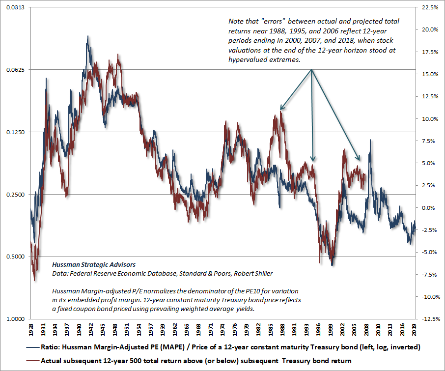
The fact is that we can obtain very useful estimates of the “equity risk premium” simply using the log ratio of stock valuations to bond valuations, provided that our valuation measures are fairly reliable. The chart below is an example. The blue line shows the ratio of our Margin-Adjusted P/E (MAPE) to the price of a 12-year constant-maturity Treasury bond, presented on an inverted log scale (left). The red line shows the actual S&P 500 nominal total return in excess of Treasury bond returns over the following 12-year period.
As usual for this sort of calculation, you’ll notice some “errors” in the 12-year periods that ended at the 2000, 2007 and current valuation extremes. These “errors” are not an indication that valuations have somehow stopped working, but rather that valuations at the end of those periods were temporarily extreme. Of course, the 2000 and 2007 instances were followed by profound market losses over the completion of those market cycles. It will come as no surprise that we expect the same in the current instance.
Presently, we estimate that S&P 500 total returns will fall short of Treasury bond returns by about 2.5% annually over the coming 12-year period, which is equivalent to saying that we estimate negative total returns for the S&P 500 itself over that horizon.
Still, while we should be fully braced for profound market losses over the completion of this cycle, it will remain essential to monitor the uniformity or divergence of market internals, which remains the most important driver of market outcomes over shorter segments of the market cycle. As I’ve regularly demonstrated, the condition of market internals modifies not only the near-term outcome of overvaluation and undervaluation, but also the impact of monetary policy on the financial markets.
The strongest expected market return/risk profiles we identify generally emerge when a material retreat in valuations is joined by improvement in the uniformity of market internals. That sort of investment opportunity doesn’t require valuations to be anywhere near their historical norms. So even though we should fully allow for a two-thirds market loss, we don’t require anything close to that sort of loss in order to embrace market risk. It’s just that at present, the combination of hypervaluation and internal divergences (despite the advance in the major indices) that remains permissive of steep and abrupt stock market losses.
What alternative is there?
I’m often asked, given the broad extremes we observe in market valuations, “What alternatives do investors have?” The answer is inherent in the periodic spikes we have always observed in prospective returns over time. Look again at the chart of estimated prospective 12-year total returns on a conventional portfolio mix. The upward spikes in expected returns, including 2002, 2009, and even late-2018, were all produced by price collapses of various magnitudes. One need not require a spike to historically normal levels, but investors should understand the risk of embracing a passive investment strategy at current extremes.
Nothing demands that investors “lock in” the lowest investment prospects in U.S. history. The alternative that investors have is flexibility. The alternative they have is the capacity to imagine a complete market cycle. The alternative investors have is discipline – the willingness to lean away from risk when it is richly valued and unsupported by uniformly favorable internals, and to lean toward risk when a material retreat in valuations is joined by an improvement in the uniformity of market internals. I have every expectation that we’ll observe such opportunities over the completion of this cycle.
Why recent Fed repos are not, in fact, QE
Several months ago, there was a bit of disruption in the market for short-term bank liquidity. Normally, banks in need of additional reserves go to the “interbank market” and borrow excess reserves from other banks, at an interest rate known as the Federal Funds rate. Alternatively, banks in need of reserves can pledge securities, such as Treasury bills, to another bank in return for overnight money, promising to buy or “repurchase” those same Treasury bills at a slightly higher price the next day. This produces a bit of income to the bank that lends the money, known as the “overnight repo rate.”
There’s good reason to believe that the brief spikes in demand for reserves were related to seasonal cash demands (tax payments, Treasury auctions), along with bank “liquidity coverage ratio” (LCR) requirements. LCR rules require major banks to hold enough high-quality liquid assets (HQLA) to finance 30-days of expected cash outflows. Notably, any spikes in cash outflows, even wholly predictable ones, immediately lower the liquidity ratio and lead to a compensating spike in reserve demand.
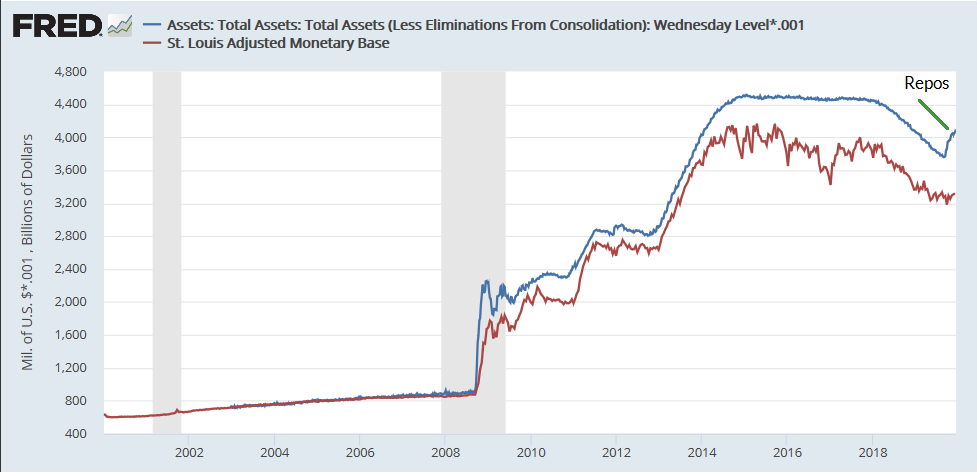
In response to a few daily spikes in the overnight repo rate last summer, in one case as high as 7% (~ 3 basis points on an overnight loan), the Federal Reserve created both an overnight and a “term” repo facility. These facilities offer to buy Treasury bills from banks, in return for short-term liquidity. The Fed has also purchased Treasury bills outright for the same purpose. The objective is to ease brief liquidity strains in the banking system. At any given time, these activities have made as much as $400 billion of reserve liquidity available since August.
You can see all this activity below as the little spike in Fed assets in recent months (representing Treasury bills purchased outright, or on an overnight or short-term basis from banks). That’s why that line has diverged from the “official” monetary base, which is comprised of currency and bank reserves more durably created by the Fed.
There’s a broad misunderstanding that the Fed’s recent repo operations somehow represent “quantitative easing in disguise.”
Not quite.
See, under the Federal Reserve’s policy of quantitative easing (QE) pursued under Ben Bernanke and Janet Yellen, the Fed went into the open market and purchased long-term, interest-bearing Treasury bonds, and paid for them by creating bank reserves that earned zero interest. In doing so, the Fed created a massive pile of zero-interest money that somebody had to hold at every moment in time, either as bank reserves or currency, until that base money was retired. That zero-interest money behaved as a mountain of “hot potatoes,” whereby each holder tried to get rid of it by purchasing some other asset – first Treasury bills, then bonds, then stocks.
But see, when investors holding “cash” go to buy riskier securities like stocks or bonds, they simply pass the zero-interest money to a seller, who gives up the stocks or bonds, and becomes the new holder of that same cash. Understand that. There’s never such a thing as “money on the sidelines going into” stocks, or bonds, or anything else. Every security that has been issued, including base money, has to be held at every moment in time until that security is retired. Outstanding securities simply change ownership.
So QE didn’t “pump money into the financial markets.” It just replaced interest-bearing Treasury bonds that investors were holding with zero-interest cash that investors still had to hold at every moment in time. What QE actually did was to amplify yield-seeking speculation: in the attempt of each successive holder to get rid of their zero-interest hot potatoes, the valuations of stocks and bonds were progressively bid up until everything – all of it – is now priced at levels that promise near-zero future long-term returns. That’s exactly where we are today.
The essential feature of QE was that the Fed purchased interest-bearing Treasury bonds, replaced them with zero-interest base money, and created such a massive pile of zero-interest hot potatoes that investors went absolutely out of their minds to seek alternatives, resulting in a multi-year bender of yield-seeking speculation. The repo facilities replace interest-bearing Treasury bills with bank reserves that are eligible for the same rate of interest. This swap does nothing to promote yield-seeking speculation.
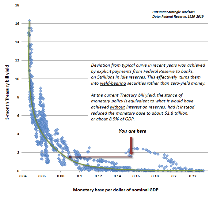
Since currency and bank reserves have economic usefulness for transactions and liquidity, reasonable amounts of the stuff can be created without provoking a great deal of yield-seeking speculation. Still, creating increasing amounts of zero-interest money does provoke holders to chase interest-bearing alternatives. As the ratio of base money (currency and bank reserves) to nominal GDP rises, investors chase Treasury bills more aggressively. As a result, there’s a very well-defined relationship between monetary base/GDP and the prevailing level of short-term interest rates.
What QE did was to drive this relationship wildly outside of its normal historical range (which is why I typically describe that policy as “deranged”). At the height of QE, the Fed had driven the monetary base to fully 24% of GDP, nearly twice the level that would have been sufficient to induce zero interest rates.
In recent years, the Fed has done two things to normalize policy. First, it has gradually allowed the monetary base to shrink to just under 16% of GDP. Second, it began several years ago to pay interest on the excess reserves held by banks, which has the effect of turning zero-interest base money to interest-bearing base money. That’s important, because when base money earns the same interest rate as T-bills do, that base money simply acts as a substitute for T-bills, rather than provoking fresh yield-seeking.
As illustrated in the chart below, that combination of policies (a slightly reduced monetary base coupled with interest on excess reserves) has produced the same level of interest rates as if the Fed had reduced the amount of zero-interest base money to about 8.5% of GDP.
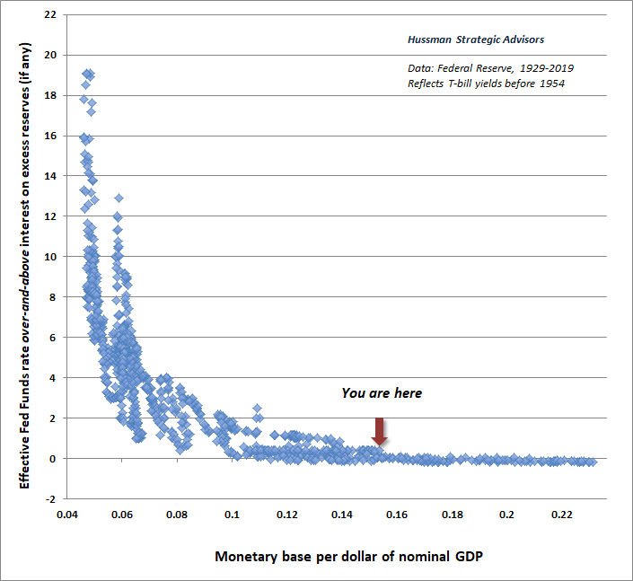
In our version of the “liquidity preference curve” above, the scatter of points that deviate from the historical curve are the result of paying interest on reserves in recent years. We can put all of these points on an apples-to-apples basis by changing the left hand axis of the graph, so that it shows the level of market interest rates minus the level of interest on excess reserves.
The result is a very clear and simple description of how the Federal Reserve affects short-term interest rates. If base money earns no interest, changes in the ratio of base money/nominal GDP translate directly into changes in the level of the Federal Funds rate. If base money does earn interest, changes in the ratio of base money/nominal GDP translate directly into changes in the level of the Federal Funds rate over and above the interest rate on excess reserves. It’s clear that in the absence of IOER, the prevailing level of short-term interest rates, including the Federal Funds rate, would still be only a few basis points above zero.
With that understanding, it should be clear why the Federal Reserve’s recent repo facilities do not, in fact, represent a fresh round of QE. The difference is that the repo facilities replace interest-bearing Treasury bills with bank reserves that are eligible for the same rate of interest. This swap does nothing to promote yield-seeking speculation. Now, the psychology around these repos has certainly been good for a burst of investor enthusiasm and a nice little can-kick. But that enthusiasm isn’t driven by actual yield differentials – as QE was – it rests wholly on the misconception that these repos themselves represent fresh QE.
The consequences of yield-seeking bubbles are inevitable
Meanwhile, one thing is clear: the Federal Reserve seems to have little grasp of the non-linearities involved in managing such a deranged balance sheet. Nor is it clear that the Fed understands how various changes in IOER can substitute for creation or removal of zero-interest QE (particularly near zero rates).
Again, the essential feature of QE was that the Fed purchased interest-bearing Treasury bonds, replaced them with zero-interest base money, and created such a massive pile of zero-interest hot potatoes that investors went absolutely out of their minds to seek alternatives, resulting in a multi-year bender of yield-seeking speculation.
Unless all potential for future risk-aversion has been erased from the human psyche, the ultimate collapse of this “everything bubble” is baked in the cake, because unfortunately, as investors should have learned during the 2000-2002 and 2007-2009 collapses, even persistent and aggressive Fed easing does nothing to encourage speculation in periods where investors are inclined toward risk-aversion (which we infer from the uniformity or divergence of market internals).
As a reminder of how this works, the chart below shows the cumulative total return of the S&P 500 over time, partitioned by both the stance of monetary policy and the condition of internals. Before it’s too late, understand that Fed easing is not sufficient to support stocks unless investors are also inclined toward speculation, as conveyed by favorable uniformity across market internals.
Future generations, seeing the collapse of this bubble in hindsight, will marvel that today’s speculative extremes were ever possible; that they were ever invited and embraced by investors. They will look back on the entire episode, just as we look at the aftermath 1929, and 2000, and 2007, shaking their heads at the utter madness of it all. They will believe that they have actually learned something from history. And then, they will do exactly the same thing themselves, because they will imagine that this time, their time, is somehow different.
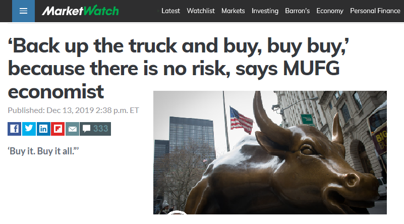
This recent headline will serve as a useful timestamp for those future generations:
I’ll say this again. Amid all the fear-of-missing-out and extreme valuations of the present moment, investors do in fact have an alternative.
Nothing demands that investors “lock in” the lowest investment prospects in U.S. history. The alternative that investors have is flexibility. The alternative they have is the capacity to imagine a complete market cycle. The alternative investors have is discipline – the willingness to lean away from risk when it is richly valued and unsupported by uniformly favorable internals, and to lean toward risk when a material retreat in valuations is joined by an improvement in the uniformity of market internals. I have every expectation that we’ll observe such opportunities over the completion of this cycle.
Keep Me Informed
Please enter your email address to be notified of new content, including market commentary and special updates.
Thank you for your interest in the Hussman Funds.
100% Spam-free. No list sharing. No solicitations. Opt-out anytime with one click.
By submitting this form, you consent to receive news and commentary, at no cost, from Hussman Strategic Advisors, News & Commentary, Cincinnati OH, 45246. https://www.hussmanfunds.com. You can revoke your consent to receive emails at any time by clicking the unsubscribe link at the bottom of every email. Emails are serviced by Constant Contact.
The foregoing comments represent the general investment analysis and economic views of the Advisor, and are provided solely for the purpose of information, instruction and discourse.
Prospectuses for the Hussman Strategic Growth Fund, the Hussman Strategic Total Return Fund, the Hussman Strategic International Fund, and the Hussman Strategic Allocation Fund, as well as Fund reports and other information, are available by clicking “The Funds” menu button from any page of this website.
Estimates of prospective return and risk for equities, bonds, and other financial markets are forward-looking statements based the analysis and reasonable beliefs of Hussman Strategic Advisors. They are not a guarantee of future performance, and are not indicative of the prospective returns of any of the Hussman Funds. Actual returns may differ substantially from the estimates provided. Estimates of prospective long-term returns for the S&P 500 reflect our standard valuation methodology, focusing on the relationship between current market prices and earnings, dividends and other fundamentals, adjusted for variability over the economic cycle.