
Money, Banking, and Markets – Connecting the Dots


John P. Hussman, Ph.D.
President, Hussman Investment Trust
May 2023
The basic thesis of gestalt theory might be formulated thus: there are contexts in which what is happening in the whole cannot be deduced from the characteristics of the separate pieces.
– Max Wertheimer
Most of us spent moments of our childhood, crayon in hand, connecting numbered dots that gradually revealed a picture that we couldn’t deduce simply by looking at the separate dots. With experience, we got better at looking at those isolated dots and mentally connecting them into a coherent “gestalt.”
The problem is that when we were kids looking at dots, we knew they were supposed to be connected, so we understood that there was a complete picture behind them. As investors, unfortunately, we forget. We see the Federal Reserve pursuing a deranged monetary policy to one side, an emerging banking crisis to the other, a potential recession on the horizon, massive Federal debt over yonder mountain, market valuations still piercing the clouds, an ocean of market cap that we count as a pool of “wealth,” record corporate profits paving the street of gold behind us, and rising labor costs underfoot, yet we may look at each of these as separate pieces, not realizing that they’re all connected parts of a single, coherent picture.
Worse, without an understanding of how each dot is connected, we may fall prey to tortured theories and verbal arguments that transform the actual picture into a distorted and incoherent mess, where fuzzy logic and superstition connects the dots, rather than clear lines of thought and evidence.
For example, investors are often told that the trillions of dollars of quantitative easing “supported” the economy by encouraging bank lending. They might be surprised to learn that despite the most aggressive monetary policy in U.S. history, commercial bank lending since 2008 has grown at just 3.4% annually, easily the slowest rate in data since 1947.
Investors are often told that there is an enormous amount of “money on the sidelines” just waiting to go “into” the stock market. Yet they don’t seem to recognize that all that money is there because the Fed put it there (by buying government debt securities and paying for them by creating dollars). Nor do they seem to recognize that the instant a buyer puts a dollar “into” the stock market, a seller takes that dollar right back “out”; that every dollar, once created by the Federal Reserve, must be held by someone, as a dollar, and as nothing other than a dollar, until the Federal Reserve retires it.
Even members of the Federal Reserve itself don’t seem to understand that the reason the banking system is bloated with $8 trillion in uninsured deposits is because the Federal Reserve put those deposits there. They don’t seem to connect the dots between a decade of zero interest rate policy and the yield-seeking speculation that encouraged banks to reach for Treasury securities to get a “pickup” in yield, just as investors did with mortgage securities prior to the global financial crisis. They don’t seem to realize that we’ve got an emerging banking crisis coupled with preposterous stock market valuations and downside risk – not because there is too little Fed liquidity, but because there is too much.
The objective of this month’s comment is to connect the dots. We’re going to stare at some charts, together, examining the dots underneath, and the connections between them. By the end of this comment, if I’ve done my job, you’ll have a much deeper appreciation for the big picture.
Building a bank
The primary assets of a bank are loans, securities, and cash reserves.
The primary liabilities of a bank are deposits and borrowings (debt).
If you take the assets and subtract the liabilities, what’s left is “equity capital,” which belongs to the shareholders.
Let’s build a bank from the ground up. First, we’ll get some startup capital from investors. In return, we’ll issue some stock shares. Next, we’ll borrow some money by issuing bonds (debt). Finally, we’ll open our doors and take deposits from customers. The cash we’ve received from investors, bondholders, and depositors goes on the asset side of our balance sheet. On the other side, we have “deposit liabilities” because we owe our depositors money, we have “debt liabilities” because we owe our bondholders money, and what’s left is “equity,” which is owned by our stockholders.
Now we’ve got to figure out how to use our assets. If we lend some of our cash to Charlie, a borrower who wants to build a house, our bank now owns an IOU from Charlie (in this case a mortgage), and the cash goes to Charlie’s bank. Some of our customer deposits are now backed by a new mortgage loan rather than cash, and the cash has gone to Charlie’s bank. Charlie’s bank now holds that cash as an “asset,” and owes a new “deposit liability” to Charlie. In the banking system as a whole, loans have increased (Charlie’s mortgage), and deposits have increased by the same amount (Charlie’s deposit).
Across history, deposits and loans in the banking system grew hand-in-hand, until the Fed launched quantitative easing in 2008.
Since we insist on counting deposits as “money,” it can be said, in the most trivial sense, that our bank has just “created money,” seemingly “out of thin air.” It’s more accurate to say our bank has intermediated savings. There’s no more cash than there was before, and while Charlie has a new deposit, that deposit is matched by Charlie’s new debt obligation. Describing this as “intermediating savings” rather than “creating money” reminds us that no new “wealth” has been created, and will not be until some economic activity occurs that produces output that’s more valuable than the inputs.
Our bank could also use the money on the asset side of our balance sheet to buy some securities, like Treasury bonds. These will fluctuate in value, of course, so we’d better be sure that we’ve got enough capital to absorb losses, while still honoring our liabilities to depositors and bondholders. Banks are subject to capital requirements for exactly that reason.
How does Federal Reserve’s policy of quantitative easing affect the banking system? The mechanics are very straightforward. The Federal Reserve buys interest-bearing government securities – mainly Treasury and mortgage bonds – that were previously held by the public, and it pays for those bonds by creating its own liabilities called “reserves.” Those reserves are credited to the bank account of the seller. So, every time the Fed “expands its balance sheet” by purchasing a bond, someone ends up with a fresh bank deposit, backed by newly created reserves.
Taken together, what we’ve just described for one bank is also true for the banking system as a whole. The chart below contains an enormous amount of information, but it’s really just what’s described above. My hope is that the chart helps to understand how various parts of the banking system are related. The assets are mainly loans, securities, and cash reserves. The liabilities are mainly deposits (owed to depositors), borrowings (owed to the Fed), and debt (owed to bondholders).
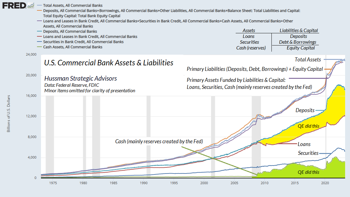
Notice what’s happened to the U.S. banking system since 2008. The total size of the banking system has more than doubled. But look at the composition. Deposit liabilities of banks have exploded, not because of new lending, but instead because of an explosion of cash, mainly reserves created by the Fed.
Before 2008, the amount of deposits in the banking system grew hand-in-hand with the amount of loans made by the banking system. Not anymore. The primary achievement of quantitative easing has been to force trillions of deposits into the banking system, backed not by loans, but by Fed-created cash reserves.
For most of the period since 2008, those reserves earned zero interest. As investors attempted to get rid of their zero-interest deposits, they chased every kind of speculative asset in a frantic attempt to earn something more than zero. But the iron law of equilibrium is that every security, including Fed-created liquidity, must be held by someone at every moment in time, from the moment it is issued until the moment it is retired. With every speculative transaction, each dollar of Fed liquidity – derided by Wall Street as “money on the sidelines” – would feel its heart skip a beat, imagining that this time, it might finally be transformed into a more desirable asset. Yet every night, it would look in the mirror, and realize that it was still itself, only in some strange new investor’s home.
How the Fed balance sheet works
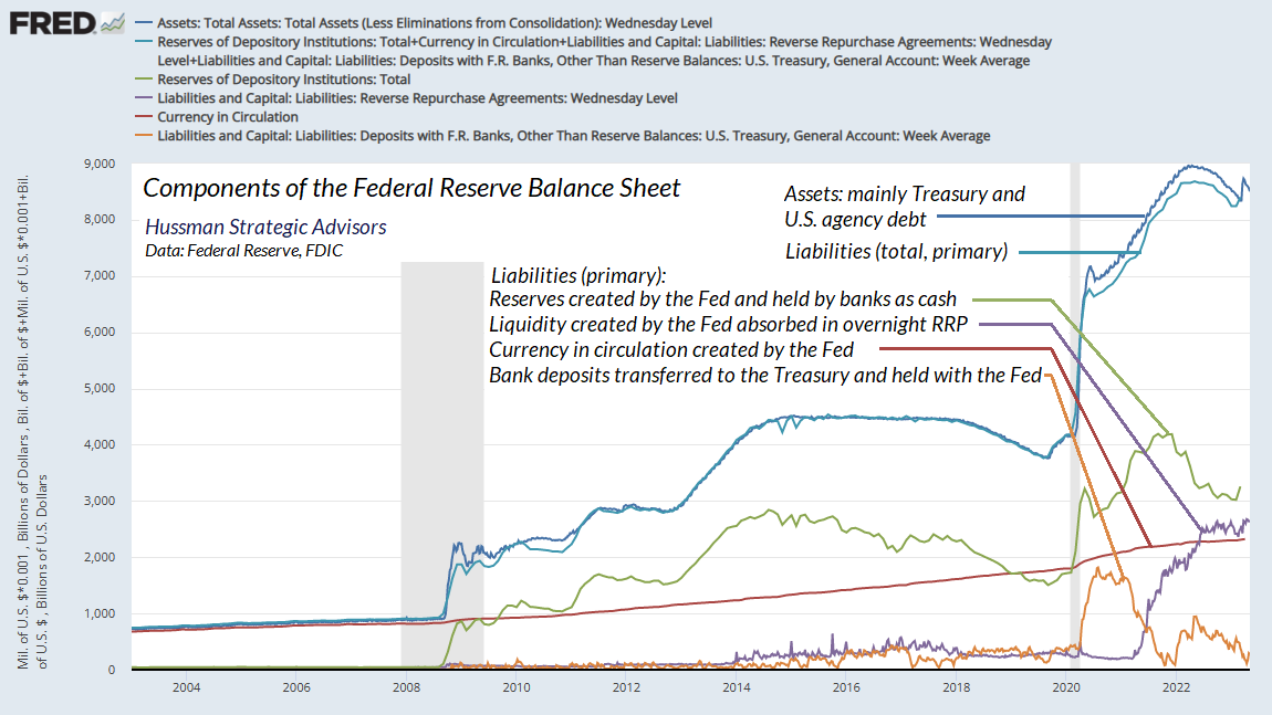
Now let’s look at the picture from the Federal Reserve’s point of view. The asset side of the Fed’s balance sheet consists mainly of Treasury securities and U.S. agency debt, such as government-backed mortgage bonds. Prior to 2008, the liabilities of the Federal Reserve were almost entirely comprised of currency in circulation (see the top line of any dollar bill in your wallet), plus a relatively small quantity of reserves that were created by the Fed and held by banks. In 2008, total bank reserves amounted to less than $40 billion. In 2021, thanks to QE, total bank reserves peaked at over $4 trillion. Meanwhile, the amount of currency in circulation has more than doubled.
The Fed is also the “bank” of the U.S. Treasury, so when people pay taxes and buy newly issued government bonds, the proceeds are held in the “Treasury General Account” (an asset of the Treasury, and a deposit liability of the Fed). When you pay your taxes, your bank transfers reserves to the Treasury General Account. Bank reserves go down, and the TGA goes up.
Since 2008, quantitative easing has turned this rather simple balance sheet into a deranged spectacle, requiring newly invented special “facilities” to hold it together. For example, because reserves are cash (technically, they’re mainly electronic cash, passing from bank to bank without any movement of physical currency), they historically have not earned any interest. As I detailed in last month’s comment, Fabricated Fairy Tales and Section 2A, there is a well-defined relationship between Fed liabilities (as a share of GDP) and the level of short-term interest rates. Once the Federal Reserve’s balance sheet (reserves, currency, and other monetary liabilities) reaches about 16% of GDP, it’s simply more cash than the economy needs. People frantically try to get rid of it, which reliably drives interest rates to zero. As a result, the only way the Fed has been able to set an interest rate target above zero in the past two years has been to explicitly pay interest to banks, currently 5.1% annually, on those reserves.
That, in turn, requires another special “facility.” See, if banks are being paid interest on their cash without passing it on to their depositors, people tend to move the deposits to money market funds. The money market funds aren’t banks, so unless they hold the funds as bank deposits, they’ll chase yield in short-term securities like Treasury bills, driving market interest rates below the Federal Reserve’s target. As a result, the Fed can’t maintain its interest rate target without somehow stopping that yield-seeking behavior. Since the Fed can’t legally pay interest to money market funds, and refuses to manage interest rates by changing the size of its balance sheet (as it did for all of history prior to 2008), it has created a new “overnight reverse repurchase facility,” where the Fed sells one of its own securities overnight to the money market fund, and takes the cash overnight from the money market fund, and then buys the security back the next morning at a slightly higher price, resulting in a little gain to the money market fund. This way, the Fed can keep holding the securities instead of investors and money market funds holding them. It’s as ridiculous and contorted as it sounds.
The chart below puts all of this together. On the asset side, the Fed holds mainly Treasury and U.S. government agency debt. On the liability side, the Fed’s primary obligations are: a) reserves created by the Fed and held by banks as cash; b) liquidity created by the Fed and held in money market funds, on which the Fed pays interest using overnight “reverse repurchase” transactions; c) currency in circulation created by the Fed; and d) the Treasury general account, comprising bank deposits transferred to the Treasury by taxpayers and bond buyers, and held on account with the Fed.
You’ll notice that there’s a slight difference between the assets of the Fed and the primary liabilities I’ve described above. That difference, as I simultaneously hold back laughter and tears, is what the Fed reports as “capital.” But see, the Fed books the securities it holds at “amortized cost” – which gradually moves their prices toward face value as the securities mature, regardless of the actual market value of those securities. If the Fed was to value its assets at actual market value, its balance sheet would be deeply insolvent.
The chart below presents what we estimate the Federal Reserve’s cumulative position would look like if the securities held by the Fed were booked at market value – even giving the Fed the benefit of every dollar of interest that it has returned to the Treasury since QE began in 2008. In practice, since that interest has already been paid over to the Treasury, the Fed’s actual balance sheet is roughly $1.5 trillion in the hole. All the Federal Reserve’s short-lived capital gains have been wiped out, along with all of the interest income since 2008. The overall position is slightly better than a few months ago, thanks to a modest retreat in long-term interest rates.
When you consider the exploding amount of securities held on bank balance sheets as “held to maturity” (which basically stands for “marked-to-model” or “valued at amortized cost”), and realize that those securities are behaving much the same as the chart below, you get a sense of what the Fed has quietly done to the financial system through a decade of Fed-induced yield-seeking speculation, followed by rate hikes in response to inflationary pressures.
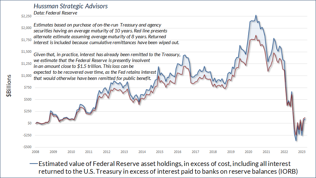
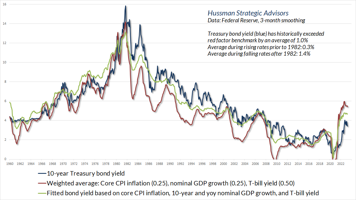
Notice the slight stabilization in recent months, as Treasury bond yields have retreated from their highs. My impression is that the recent stabilization of banking strains reflects, and is dependent on, the same retreat in long-term yields.
The risk, of course, is that long-term interest rates turn higher again. On that note, it’s worth observing that the yield curve is steeply inverted here, with long-term yields well below short-term yields. Historically, the weighted average of core inflation, nominal GDP growth, and T-bill yields has acted as something of a lower bound for long-term bond yields. Indeed, in market cycles across history, the entire total return of Treasury bonds – over-and-above T-bill returns – has accrued when bond yields were above the red benchmark in the chart below. The takeaway here is that depressed long-term bond yields already assume and rely on the expectation that inflation and nominal GDP growth will quickly subside, and that the Fed will be cutting rates in no time. Any surprise in this trajectory could be troublesome.
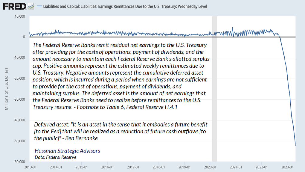
While the Fed is able to obscure its capital losses by valuing its assets at cost, there’s one item the Fed isn’t able to completely bury in its balance sheet accounting. That’s the deficit that it has been running by paying interest of 5.1% to banks and money market funds on liquidity it created when it bought bonds yielding an average of only 2.5%. Normally, when the Fed receives interest on the bonds it holds, it transfers that interest back to the Treasury for public benefit (though with the arrogance to call them “profits”). Now that the Fed is paying banks more interest than it receives – another cost the public bears for the Fed’s luxuriously deranged balance sheet – the Fed is essentially creating money (a liability to the Fed) without any backing by a corresponding asset.
The resulting deficit will be recovered by the Fed over time, by retaining interest that it receives on its government bond holdings, rather than transferring it to the Treasury for public benefit. In the meantime, having created government liabilities with no corresponding asset in hand, the Fed has invented a phantom accounting entry on its balance sheet called a “deferred asset.” As Ben Bernanke cryptically explained to Congress years ago [brackets mine]: “It is an asset in the sense that it embodies a future benefit [to the Fed] that will be realized as a reduction of future cash outflows [to the public]”
Create it here, it shows up there
Now let’s examine how the Federal Reserve’s balance sheet interacts with commercial bank balance sheets. This part may look a bit like magic, but it’s the consequence of equilibrium – the fact that every security that is created also must be held by someone at every point in time.
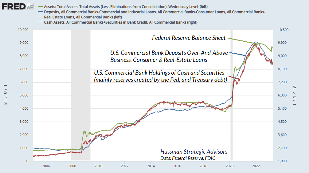
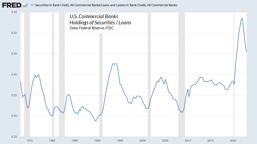
As we’ve seen, most of the explosion in U.S. commercial bank deposits since 2008 is not the result of loan growth, but instead the result of cash reserves forced into the banking system by the Federal Reserve. The chart below illustrates what’s going on. The green line shows the Fed balance sheet (total assets). The blue line shows total deposits in U.S. commercial banks over-and-above the amount of loans made by those banks – what I call “excess” deposits. In what form do banks hold those excess deposits? Look at the red line. Those deposits are primarily held as cash (reserves created by the Fed), and a smaller amount as securities (mainly Treasury debt). Look at those lines prior to 2008, and the reckless explosion of excess deposits forced into the banking system by the Fed – backed not by new bank loans, but instead by unnecessary cash reserves and security holdings. If this policy doesn’t deserve to be characterized as “deranged,” I don’t know what does.
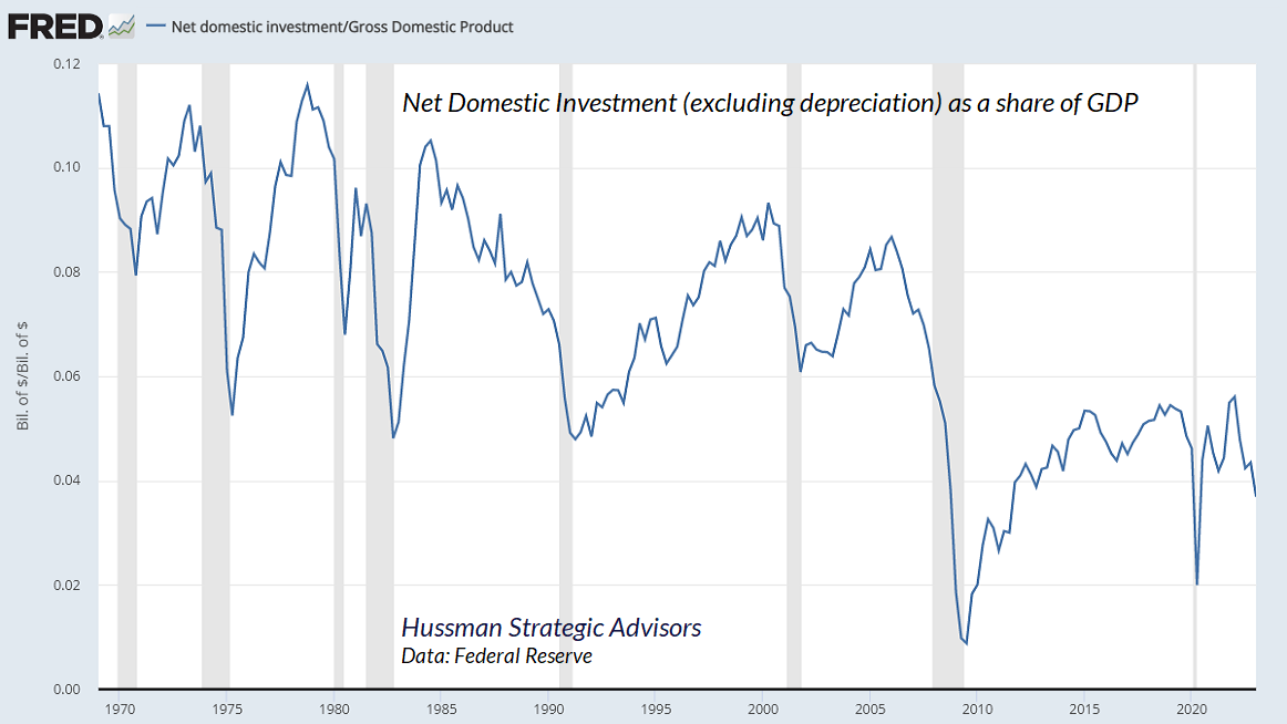
One might imagine that even though bank lending since 2008 has grown at the slowest rate in history, at least the unprecedented policy of zero interest rates engineered by the Fed must have “stimulated” unusually strong investment in factories, equipment, housing, and other productive economic activities; that it must have done something other than to fuel yield-seeking financial speculation.
One would be wrong. Even at the peak of the recent cycle, net domestic investment as a share of GDP stood at levels that marked the lows of previous economic cycles.
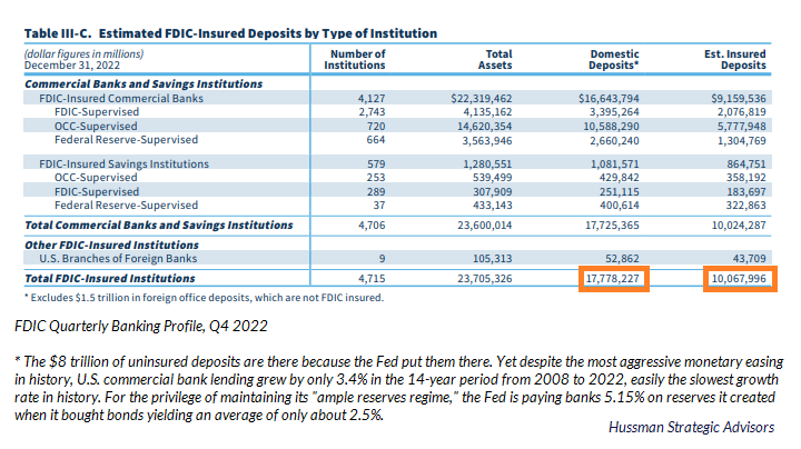
One might imagine that at least these excess deposits must be insured by the FDIC, which would reduce the risk of bank runs. Again, one would be wrong. The table below is from the Quarterly Banking Profile of the FDIC. Notice that in the fourth quarter of 2022, the U.S. banking system had domestic deposits of nearly $18 trillion. Yet only about $10 trillion of those deposits were insured. The excess deposits are there because the Fed put trillions of dollars of needless reserves there. Those excess deposits are so far beyond the amount needed for bank lending, and so far beyond normal cash holdings of the public, that they wildly exceed FDIC insurance limits. They’re also captive in the banking system unless they are withdrawn as currency or transferred to money market funds on reverse-repo with the Fed.
When all those reserves were earning zero, banks were encouraged to reach for yield by extending their maturities in hope of getting some amount of return in presumably “safe” Treasury securities, with the extra benefit that Treasuries are assigned zero weight when computing risk-based capital requirements. Quantitative easing didn’t encourage greater bank lending. It encouraged greater bank speculation in securities.
If anyone is surprised that uninsured bank depositors are now making runs on banks that have significant amounts of exposure to Treasury securities, they’re not connecting the dots.
Before the bubble bursts
The information contained in earnings, balance sheets, and economic releases is only a fraction of what is known by others. The action of prices and trading volume reveals other important information that traders are willing to back with real money. This is why trend uniformity is so crucial to our Market Climate approach. Historically, when trend uniformity has been positive, stocks have generally ignored overvaluation, no matter how extreme. When the market loses that uniformity, valuations often matter suddenly and with a vengeance. This is a lesson best learned before a crash rather than after one.
– John P. Hussman, Ph.D., October 3, 2000
One of the best indications of the speculative willingness of investors is the ‘uniformity’ of positive market action across a broad range of internals. Probably the most important aspect of last week’s decline was the decisive negative shift in these measures. Since early October of last year, I have at least generally been able to say in these weekly comments that “market action is favorable on the basis of price trends and other market internals.” Now, it also happens that once the market reaches overvalued, overbought and overbullish conditions, stocks have historically lagged Treasury bills, on average, even when those internals have been positive (a fact which kept us hedged). Still, the favorable market internals did tell us that investors were still willing to speculate, however abruptly that willingness might end. Evidently, it just ended, and the reversal is broad-based.
– John P. Hussman, Ph.D., July 30, 2007
I’ve opened this section with quotes from the 2000 and 2007 market peaks to emphasize three essential points.
First, it’s critical for investors to distinguish between extreme valuations and immediate consequences. If rich valuations alone were sufficient to drive the equity market lower, it would have been impossible for valuations to reach speculative extremes like 1929, 2000, 2007, and 2022, because prices would have collapsed from much lesser valuations. While valuations hold enormous sway over long-term returns and the extent of market losses over the complete market cycle, investor psychology – speculation versus risk-aversion – holds enormous sway over outcomes during shorter segments of the market cycle.
Second, our most reliable gauge of speculation versus risk-aversion is the uniformity of market internals across thousands of individual stocks, industries, sectors, and security-types, including debt securities of varying creditworthiness. The chart below presents the cumulative total return of the S&P 500 in periods where our measures of market internals have been favorable, accruing Treasury bill interest otherwise. The chart is historical, does not represent any investment portfolio, does not reflect valuations or other features of our investment approach, and is not an assurance of future outcomes.
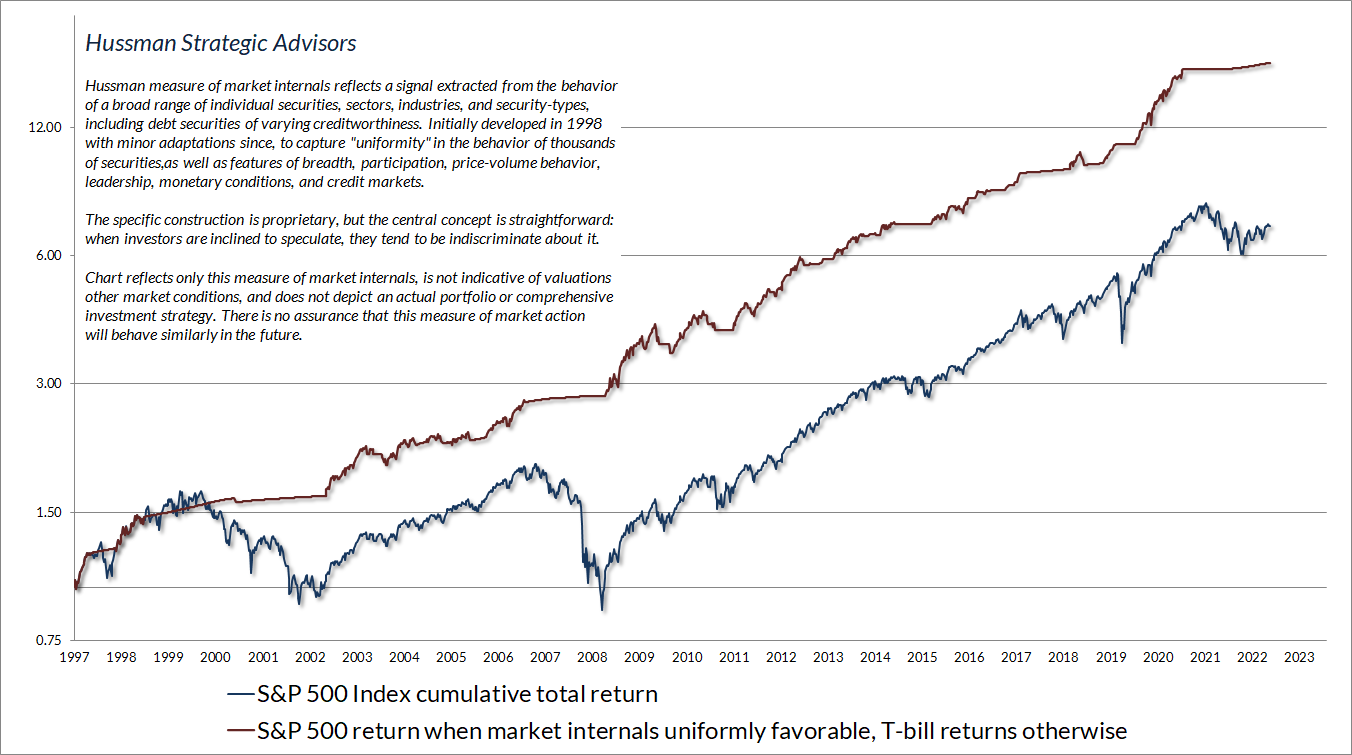
Third, it’s important to recall that the Federal Reserve eased interest rates persistently and aggressively the whole way through the 2000-2002 and 2007-2009 collapses. It is constantly repeated on CNBC and elsewhere that investors should be aggressively positioned in stocks, in advance of a “pivot” by the Fed to lower interest rates. It seems to escape investors that while the Fed “pivot” on January 3, 2001 was greeted by investors with a 5% advance in the S&P 500, the market would extend that advance by less than 2% over the next few weeks, followed by a 43% plunge. Likewise, the “pivot” on September 18, 2007 was greeted with an advance of nearly 3% in the S&P 500, but again, after extending that advance by less than 3% over the next few weeks, the S&P 500 plunged by 55%, with the Fed easing the whole time. See, when investors are risk-averse, they treat safe liquidity as a desirable asset rather than an inferior one, so creating more of the stuff doesn’t support speculation or stock prices. Easy money only reliably supports stocks when Fed easing is joined by favorable internals.
At the 2007 peak, I noted the presence of “overvalued, overbought, overbullish” conditions. Historically, these syndromes acted as a reliable signal that speculation had reached its limits. In my view, the most dramatic way that quantitative easing changed market behavior was to destroy those “limits.” In the face of the relentless monetary activism and zero-interest rate policies of the Federal Reserve, investors were bombarded by one message: “There is no alternative” (TINA) but to speculate, regardless of extreme valuations. As a result, our bearish response to historically reliable “limits” became useless and even detrimental. In 2017, we abandoned our bearish response to those limits in periods when our measures of market internals remain favorable. As I’ve noted previously, we’ve made additional adaptations, particularly in late 2021, that restore the strategic flexibility that we enjoyed in decades of market cycles prior to the Fed’s deranged experiment since 2008.
Regardless of the level of valuations, an improvement in the uniformity of market internals would defer our presently bearish outlook. For now, without that sort of improvement, I continue to view stock market conditions as a “trap door” situation. The increasingly ragged behavior of market internals is most clearly evident in the recent performance gap between the broad market and very large capitalization glamour stocks. For example, the Russell 2000 Index is nearly unchanged year-to-date, as is the index of equal-weighted S&P 500 components. While the capitalization-weighted S&P 500 has advanced, the year-to-date gain is attributable to the very largest components.
It’s tempting to observe the market advance since October and imagine that neither valuations nor internals matter. But look carefully at the 2000-2002 and 2007-2009 collapses. Both included several extended bear market rallies (which is how I would characterize the advance since October) with no sustained improvement in our gauge of internals. When extreme valuations are joined by ragged internals, the collapses come seemingly out of nowhere – the phrase “trap door” is intentional.
The upshot here is that valuations have enormous impact over long-term and full cycle outcomes, while internals matter over shorter segments of the market cycle. When unfavorable valuations are joined by unfavorable internals, Fed easing doesn’t reliably support the market. Conversely, the strongest return/risk profiles for the market typically emerge when reasonable valuations are joined by favorable market internals, particularly amid Fed easing. We’re nowhere close to that point, but I expect we will be over the completion of this cycle.
Valuations, representative fundamentals, and profit margins
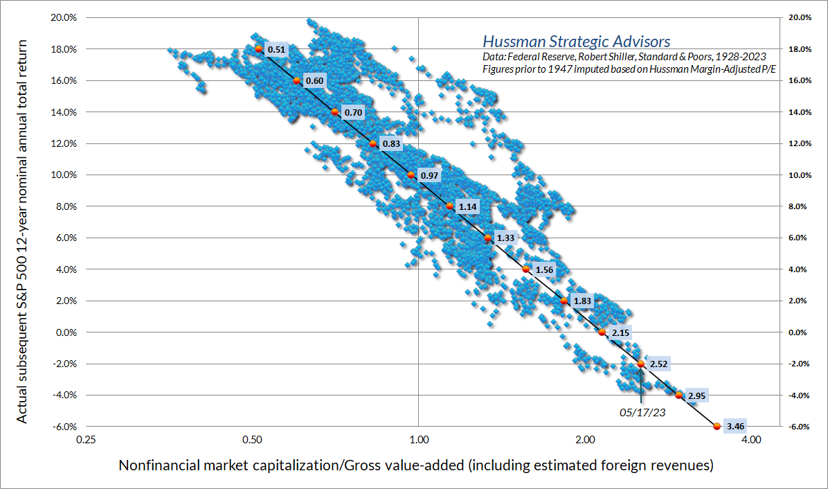
The chart below updates the valuation measure that we find best correlated with actual subsequent market returns in complete cycles across history. It shows the market capitalization of nonfinancial companies divided by their gross value-added, including our estimate of foreign revenues. In effect, MarketCap/GVA acts as a broad, apples-to-apples price/revenue ratio for nonfinancial corporations. At present, this measure is higher than at any point in history prior to October 2020, except for a few months surrounding the 1929 market peak, and two weeks in April 1930 that marked the peak of the post-crash rebound.
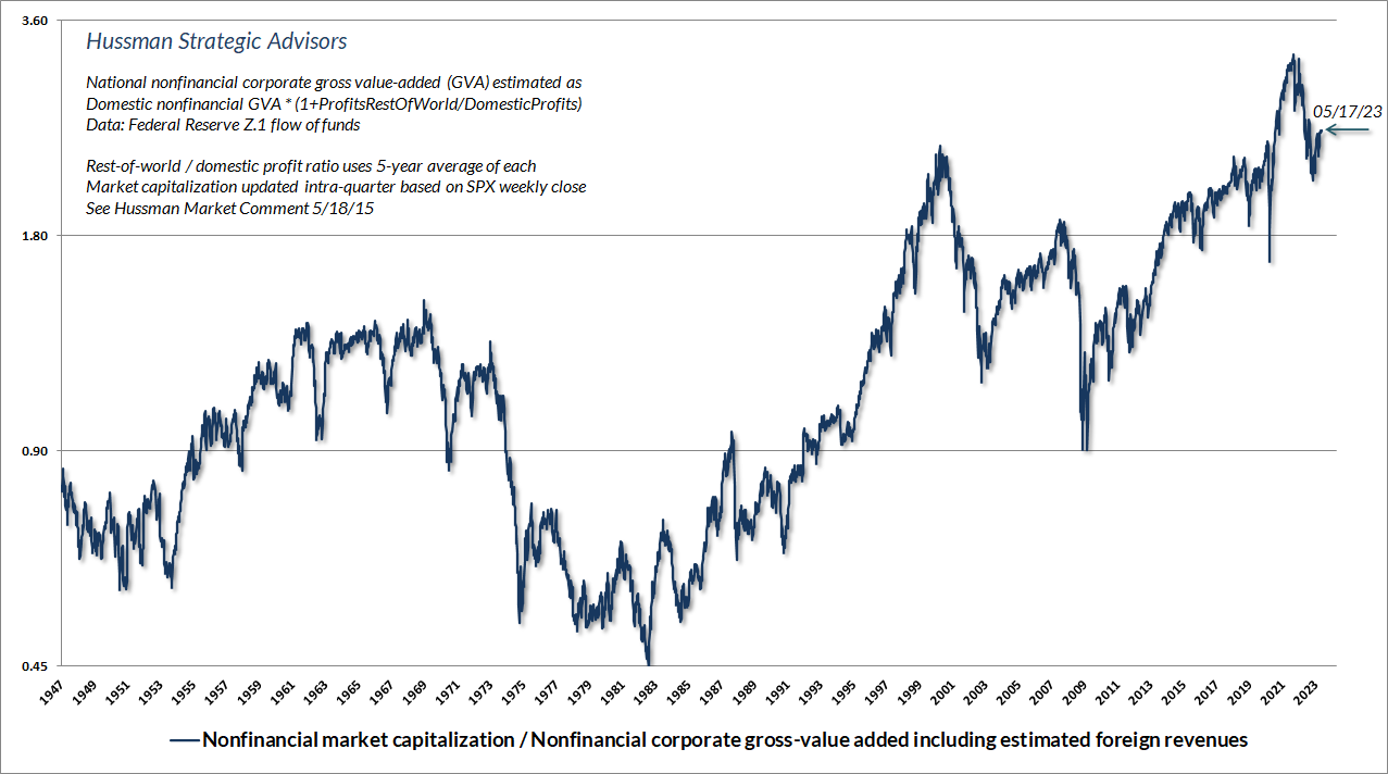
The scatter below shows MarketCap/GVA versus actual subsequent 12-year S&P 500 average annual nominal total returns, in data since 1928. We associate the current level of valuations with likely S&P 500 total returns averaging about -2% annually over the coming 12 years. As I showed last month, we also associate current valuations with a potential market loss on the order of -60% over the completion of this cycle. I know that seems preposterous, but that’s a reflection of preposterous speculation generated by more than a decade of preposterous monetary policy.
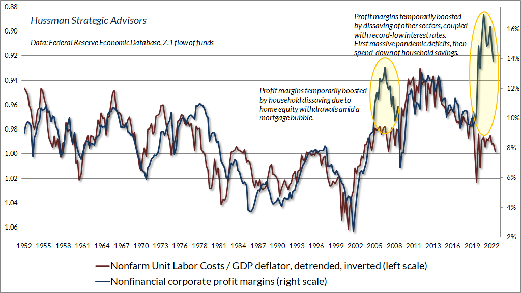
Keep in mind that a valuation ratio is nothing more than shorthand for a proper discounted cash flow analysis. If investors want anything from the denominator, it is for that denominator to be representative and proportional to decades and decades of future cash flows that can be expected from stocks over time. It is a very bad habit of Wall Street to value stocks on the basis of a single year of earnings, without considering how variable corporate profit margins are over time. The main drivers of corporate profit margins, even in recent years, are not mysterious. As I detailed in Headed for the Tail, two of the factors best correlated with profit margins are unit labor costs as a share of output prices, and Baa corporate bond yields. Neither of these are permanent, and both have become increasingly hostile to earnings in recent quarters.
The chart below shows unit labor costs as a share of output prices (ULC/GDP deflator) on an inverted scale, along with nonfinancial corporate profit margins. Notice that there are two enormous outliers in the data. One preceded the global financial crisis, and was driven by spending by consumers – not out of labor income, but out of equity cashed out of their mortgages amid a Fed-induced housing bubble. The recent outlier was driven by trillions of dollars in pandemic deficits, which boosted corporate profits first directly through PPP subsidies, and later indirectly as households spent down their own surpluses.
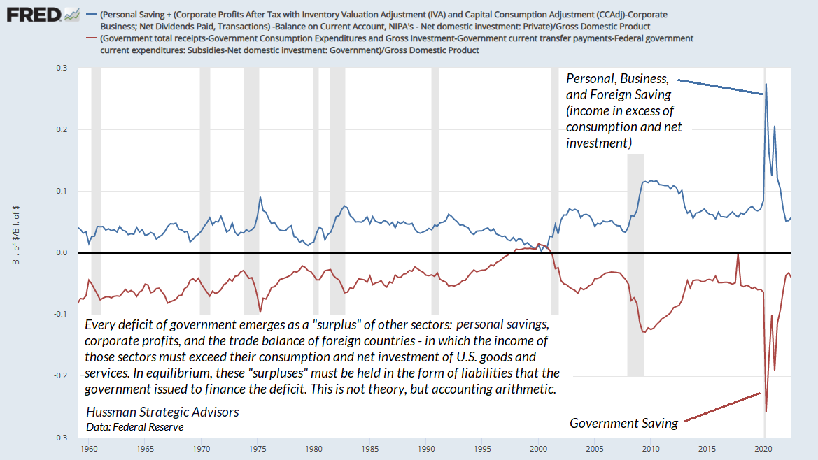
A quick note on how government deficits are related to corporate profits (more dots connecting). Every deficit of government results in a mirror image surplus in other sectors – households, businesses, and foreign trading partners – where their income exceeds their consumption and net investment in U.S. goods and services. Moreover, those surpluses (“savings”) must, in equilibrium, be held in the form of whatever liabilities that the government issued in order to finance the deficit. This isn’t a theory – it’s an accounting identity. Saying that the government ran massive pandemic deficits is identical to saying that the private sector accumulated massive surpluses, and now holds those surpluses in the form of government liabilities: either new Treasury securities, or (if the Fed buys those Treasury securities) bank deposits backed by Fed-created reserves.
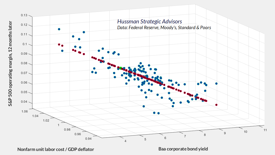
The chart below shows the combined impact of real unit labor costs and Baa bond yields on S&P 500 operating profit margins. Given that pandemic deficits are behind us, there is a strong likelihood that profit margins will gradually (or perhaps suddenly) align with the much more normal levels now suggested by these factors. In the chart below, current data correspond to an S&P 500 operating profit margin of about 8.7% in the coming year (though margins often fall well below the red fitted line during recessions). Instead, investors are currently pricing stocks based on the expectation that today’s operating margin of 11.3% will increase to about 12.5% a year from now. That would push the S&P 500 operating margin just shy of the highest extreme in history, exceeded only by the margins observed at the early-2022 market peak. We’ll take the under.
Take those conventional beliefs with a side of data
It ain’t what you don’t know that gets you in trouble. It’s what you know for sure that just ain’t so.
– Josh Billings (with variants attributed to Artemus Ward, Mark Twain, and Will Rogers)
As a follow-up to last month’s market comment, Fabricated Fairy Tales and Section 2A, the charts below come from the category “Things the Fed and Wall Street believe that aren’t true” – joining other topics discussed in that comment, such as the misconstrued “Phillips Curve” and the questionable “stimulative” impact of quantitative easing.
While it seems to be “common knowledge” that rate hikes cause recessions, and recessions cause inflation to collapse, the relationships between interest rates hikes, unemployment, and general price inflation are remarkably weak and unreliable – certainly not enough to form an operational toolkit.
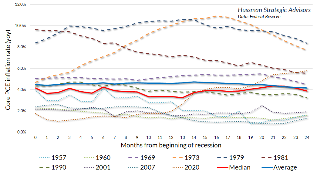
A few charts may encourage you to request an extra side of data before you swallow conventional beliefs whole. The chart below shows inflation in the Federal Reserve’s preferred inflation measure, reflecting the core personal consumption expenditure (PCE) price index, excluding inflation in food and energy prices. The horizontal axis is the number of months from the beginning of each recession since 1957. The bright red line shows the median trajectory of core inflation, and the bright blue line shows the average trajectory. Notice how flat these lines are during the two years following the start of a recession. It’s simply not true that recessions, on average, bring about a collapse in the rate of core inflation.
Given that the current year-over-year rate of core PCE inflation is 5.5%, it’s notable that the only recessions that brought core PCE inflation below 5% within 24 months were also recessions that started with core PCE inflation below 5%. Of course, this instance may be different, particularly given that the Fed has done a great deal to contribute to a likely banking and financial crisis (and those do tend to reduce inflation by increasing the demand for safe liquidity). Still, the relationship between recessions and declining core inflation is surprisingly weak.
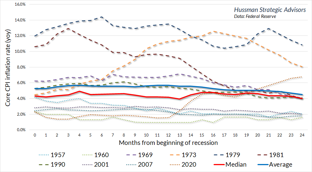
The chart below shows a similar profile for the core consumer price index (CPI).
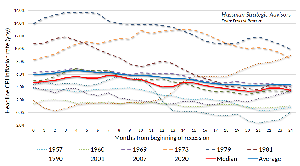
My impression is that much of the belief regarding recessions and inflation is driven by the behavior of headline inflation, including food and energy. It’s true that recessions tend to hold down increases in food and energy prices (though even that wasn’t true in the 1973-74 recession). But it should be clear that a handful of instances are responsible for the common belief that recessions crush inflation: specifically, the global financial crisis, and the twin recessions in 1979 and 1981 that emerged after Paul Volcker reduced the Fed’s balance sheet to the lowest share of GDP in U.S. history.
In my view, inflation isn’t brought under control by throwing the economy into recession, but by restoring monetary credibility. Credibility, in turn, is created by following systematic policy, and most importantly, by ensuring that financial quantities are kept in line with real economic quantities.
Think about it. When the Federal Reserve follows deranged and unsystematic policies, what happens? The quantity of monetary liabilities becomes misaligned with the quantity of real output. The quantity of deposits in the banking system becomes misaligned with the quantity of bank lending, as we saw earlier. Speculation causes the quantity of market capitalization – the blotches of ink and pixels on computer screens that people count as “wealth” – to become misaligned with the cash flows available to service that market capitalization.
Once unsystematic policy causes a misalignment of financial quantities and real economic quantities, how are they realigned? It’s not a surprise: inflation, bond losses, bank failures, pension crises, stock market collapse, debt default, dismal long-term returns. Too much money chasing too few goods. Too much market capitalization with too few cash flows to service it. One way or another, the two are brought back into alignment. Why? Because the economic quantities can’t properly service the bloated and misaligned financial quantities. It happens every time. It’s happened throughout financial history. This shouldn’t be so hard to understand. After more than a decade of deranged policy, the idea that more of these outcomes lie ahead shouldn’t be surprising.
Systematic monetary policy means a framework where tools such as the level of the Fed funds rate and the size of the Federal Reserve’s balance sheet maintain a reasonably stable and predictable relationship with observable economic data such as output, inflation, employment, and the ‘gap’ between real gross domestic product and its estimated full-employment potential. Departures from systematic monetary policy distort behavior in ways that cause misalignments between financial quantities and real economic quantities, and as a result, they invariably produce damage as the two are ultimately realigned.
Systematic policy recognizes that the ‘Phillips Curve’ is an observation about the relationship between unemployment and real wages, not a ‘tradeoff’ that can be manipulated. It recognizes that suppressing interest rates and drowning banks in liquidity has weak and unreliable effects on real economic activity and employment, but massive effects on financial speculation and resulting instability. Systematic policy is content to align monetary aggregates with output aggregates. Systematic policy is content to set interest rate targets based on reasonable policy benchmarks informed by observable economic variables. Systematic policy is content to achieve those targets by modestly changing the ratio of base money to GDP.
– John P. Hussman, Ph.D., April 2023, Fabricated Fairy Tales and Section 2A
The only way to obtain a clear picture of the economy and the financial markets is to connect the dots that link them together – to understand that if you create it here, it shows up there. Every financial security that is issued has to be held by someone until it is retired, and the returns on that asset will ultimately be determined by the cash flows available to service that security. Every dollar of Fed liquidity that is created has to be held by someone, in that form, until it is retired. The deficits of government show up in the portfolios of investors, either as Treasury securities or (if the Fed purchases those securities and creates reserves) bank deposits and money market balances. The “cash on the sidelines” that analysts constantly gurgle about is there because the Fed put it there, and it will stay there, in that form, until the Fed shrinks its balance sheet. At least the Fed is paying 5.1% interest on it, at public expense. Whether your bank passes that on to you is another story.
The greater the misalignment between financial quantities and economic quantities, the more distorted and grotesque the whole picture becomes, particularly if nobody carefully connects the dots. Unfortunately, investors and policy makers repeatedly insist on learning that the hard way.
Once unsystematic policy causes a misalignment of financial quantities and real economic quantities, how are they realigned? It’s not a surprise: inflation, bond losses, bank failures, pension crises, stock market collapse, debt default, dismal long-term returns. Too much money chasing too few goods. Too much market capitalization with too few cash flows to service it. One way or another, the two are brought back into alignment. Why? Because the real economic quantities can’t properly service the bloated and misaligned financial quantities. It happens every time. It’s happened throughout financial history. This shouldn’t be so hard to understand. After more than a decade of deranged policy, the idea that more of these outcomes lie ahead shouldn’t be surprising.
Finally, a quick plug for our free, spam-free mailing list (you can subscribe at the bottom of this comment). Particularly in “compressed” market conditions where prospective return or risk have changed significantly, I sometimes issue interim comments. We use our mailing list to quickly share information, like this comment, white papers, and special updates. Given the value that I place on keeping our loyal followers informed, I’d prefer you didn’t miss those.
Keep Me Informed
Please enter your email address to be notified of new content, including market commentary and special updates.
Thank you for your interest in the Hussman Funds.
100% Spam-free. No list sharing. No solicitations. Opt-out anytime with one click.
By submitting this form, you consent to receive news and commentary, at no cost, from Hussman Strategic Advisors, News & Commentary, Cincinnati OH, 45246. https://www.hussmanfunds.com. You can revoke your consent to receive emails at any time by clicking the unsubscribe link at the bottom of every email. Emails are serviced by Constant Contact.
The foregoing comments represent the general investment analysis and economic views of the Advisor, and are provided solely for the purpose of information, instruction and discourse.
Prospectuses for the Hussman Strategic Growth Fund, the Hussman Strategic Total Return Fund, the Hussman Strategic International Fund, and the Hussman Strategic Allocation Fund, as well as Fund reports and other information, are available by clicking “The Funds” menu button from any page of this website.
Estimates of prospective return and risk for equities, bonds, and other financial markets are forward-looking statements based the analysis and reasonable beliefs of Hussman Strategic Advisors. They are not a guarantee of future performance, and are not indicative of the prospective returns of any of the Hussman Funds. Actual returns may differ substantially from the estimates provided. Estimates of prospective long-term returns for the S&P 500 reflect our standard valuation methodology, focusing on the relationship between current market prices and earnings, dividends and other fundamentals, adjusted for variability over the economic cycle. Further details relating to MarketCap/GVA (the ratio of nonfinancial market capitalization to gross-value added, including estimated foreign revenues) and our Margin-Adjusted P/E (MAPE) can be found in the Market Comment Archive under the Knowledge Center tab of this website. MarketCap/GVA: Hussman 05/18/15. MAPE: Hussman 05/05/14, Hussman 09/04/17.