

When the Bough Breaks


John P. Hussman, Ph.D.
President, Hussman Investment Trust
October 2023
The great bubbles take their time. Quite a few years going up. Quite a few years coming down, and the market suffers from attention deficit disorder, so it always thinks every rally is the beginning of the next great bull market. My guess is that we will have a recession, I don’t know if it will be fairly mild or fairly serious, but it will probably go deep into next year. Every bubble has been greeted with a chorus of ‘soft landing,’ and there’s never been one. Each cycle is different, so each cycle, something else happens. It’s always a surprise, but you always have a surprise, so the very idea of a surprise is unsurprising.
I would argue you have to be brave buying when prices are extended and high, because you’re much more likely to lose money. The real bravery to buy when the market is smashed down to a bargain seems to me to be very little. That is not now. If you look at the most predictive measures, and Mr. Hussman does the best of those – very detailed historical record of which ones actually do the best – those measures are about as high as they’ve ever been, today. They’re in the top 2 or 3 percent of all time. There’s a spike in 2000 and a spike in 2021, and this is above 2000 but below the spike in 2021, but we are right up there.
In order to get the market down to where it would typically outperform the long bond by 5%, which you could argue it should, the market, just sheer arithmetic would have to drop by more than 50%. This is not my forecast. I have a very genteel forecast where anything below 3000 would make me think it was reasonable, and if everything works out badly, which it sometimes does, I would not be amazed if it went to 2000 on the S&P, but that would require a couple of wheels to fall off. And wheels tend to fall off when the great bubbles unravel, but it doesn’t mean they have to. It would be unlikely not to get to something close to 3000 on the S&P. You can’t get blood out of a stone. Sooner or later, the simple arithmetic suggests that you’ll either have a dismal return forever, or you’ll have a nice bear market and then a normal return, and the nice bear market will hopefully be less than 50%.
– Jeremy Grantham, GMO, Bloomberg UK (abridged), October 5, 2023
Value-conscious, historically-informed, full-cycle investors place a great deal of emphasis on the relationship between the price an investor pays today and the cash flows they can expect to receive in the future. The reason is simple. For any given stream of future cash flows, the higher the price you pay today, the lower the long-term return you can expect, and the greater your downside risk. The lower the price you pay today, the greater the long-term return you can expect, and the smaller your downside risk.
It seems counterintuitive, but it’s true – lower expected market returns go hand-in-hand with higher risk of loss; higher expected market returns go hand-in-hand with lower risk of loss. That proposition seems to run counter to what’s taught in finance, but speaking as a former finance professor, that’s because the concept of “inefficient risk” isn’t discussed carefully enough. As I wrote in Return-Free Risk at the January 2022 market peak:
“Investors are familiar with the idea of a ‘tradeoff’ between return and risk, which is typically stated as a proposition that investors must accept higher risk if they seek higher expected returns. What investors are typically not taught is that this proposition applies only to ‘efficient’ risks. For example, if a portfolio is poorly diversified, one can typically find another portfolio that can target a higher level of expected return for the same amount of risk, or a lower level of risk for the same expected return. Likewise, in a wildly overvalued market, investors should expect not only poor returns but also higher prospective risk. Put simply, investors are not somehow rewarded for accepting higher levels of what Ben Graham described as ‘unintelligent” risk.’”
The relationship between valuations and subsequent market returns tends to be fairly tight even over horizons on the order of 10-12 years, but it’s not perfect, particularly if the end of that 10-12 year investment horizon happens to be the valuation extreme of a bubble.
To update the current valuation picture for stocks, the chart below shows the relationship between our most reliable valuation measure, the ratio of nonfinancial market capitalization to nonfinancial corporate gross value-added, including estimated foreign revenues (MarketCap/GVA) and actual subsequent 12-year average annual S&P 500 total returns, in data since 1928.
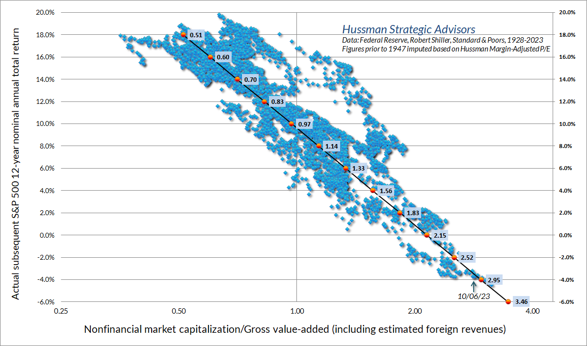
Bubble extremes lead investors to forget history. Investors look back on the advance of the preceding years, and see only that high valuations were followed by even higher valuations; that every setback was followed by a resumption of glorious returns. They conclude that valuations are worthless. They imagine that the returns they enjoyed from the point of rich valuations to the point of extreme valuations are actually returns that they will keep over the complete cycle. Worse, like economist Irving Fisher catastrophically proposed in 1929, many investors insist that market cycles no longer exist, and that valuations will maintain a “permanently high plateau.”
Buckle up.
The red line in the chart below shows our Margin-Adjusted P/E (MAPE), which is not quite as reliable as MarketCap/GVA but outperforms the Shiller cyclically-adjusted P/E (CAPE) in market cycles across history. To underscore that every good valuation measure is just shorthand for a proper discounted cash flow analysis, the blue line is based on actual S&P 500 dividends across history. Each point is obtained by taking the actual index dividends of the S&P 500 from that point forward, and discounting them to present value at a fixed 10% rate of return. It’s worth noting that “per share” index earnings, revenues and dividends for the S&P 500 include the impact of stock buybacks through adjustments in the divisor. Over the past 20 years, the S&P 500 divisor has contracted at an average annual rate of -0.50%, adding half of one percent to the annual growth rate of per-share S&P 500 fundamentals. Given that S&P 500 revenue growth for the 10, 20 and 30 years through 2020 averaged just 4% annually, and current S&P 500 dividends aren’t at all depressed relative to revenues, the chart reflects a growth estimate of 4% annually for future dividends.
The simple interpretation here is that when the S&P 500 / discounted dividend ratio has been at 1.0 on the left scale, the S&P 500 been priced at a level consistent with sustainable long-term returns of 10% annually. The larger the departure from 1.0, the larger departure of long-term returns from that 10% run-of-the-mill norm.
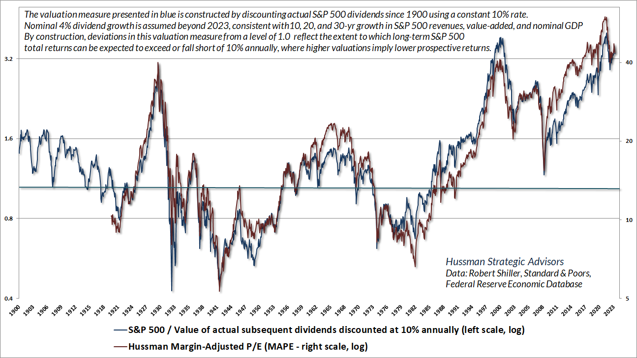
Not surprisingly, as a reliable gauge of market valuations, our Margin-Adjusted P/E tells a nearly identical story as discounted dividends. Current market valuations, even after the retreat since the beginning of 2022, rival the 1929 and 2000 bubble peaks. One need not take various estimates as “forecasts,” nor specific levels as “price targets” to recognize that market valuations stand at one of the three great bubble extremes in U.S. history.
Valuations above that solid horizonal line do not necessarily mean the market is “overvalued and likely to fall” – they only suggest that long-term returns are likely to be less than 10% annually. Despite current valuation extremes, the average annual nominal total return of the S&P 500 since March 1987 has indeed been less than 10%. Average annual returns have been well-above 10% annually as measured from most points since October 2008, when I observed “today, we can comfortably expect 8-10% total returns even without assuming any material increase in price-to-normalized-earnings multiples. Given a modest expansion in multiples, a passive investment in the S&P 500 can be expected to achieve total returns well in excess of 10% annually.” The problem is that the expansion in multiples was so extreme in the advancing phase of this bubble that likely 10-12 year S&P 500 total returns, by our estimates, are now negative.
It’s tempting to assume an arbitrarily high growth rate for future S&P 500 fundamentals in an attempt to justify current index levels. The challenge is that in recent decades, structural U.S. real GDP growth, the combination of demographic labor force growth and productivity growth, has progressively slowed from over 4% annually in the 1970’s to less than 2% annually today. Nominal GDP growth has averaged closer to 4% in recent decades. Boosting nominal growth in S&P 500 fundamentals beyond that level requires one to assume either persistently elevated inflation or permanently rising profit margins. Even then, a 5% assumption for future dividend growth would raise the value of discounted dividends by only 20%. A 6% growth assumption would still leave that value below the 2000 level on the S&P 500. Of course, Treasury yields since 1950 have a correlation of close to 0.8 with 10-year trailing nominal GDP growth, so higher growth would likely come with higher interest rates.
One need not take various estimates as ‘forecasts,’ nor specific levels as ‘price targets’ to recognize that market valuations stand at one of the three great bubble extremes in U.S. history.
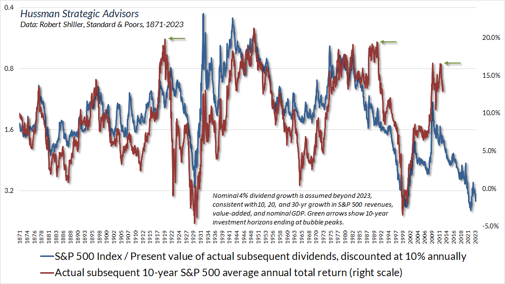
The blue line in the chart below, in data since 1871, is the dividend discount model described above on an inverted log scale. The red line shows actual subsequent 10-year S&P 500 total returns. As is true for most valuation approaches, you’ll notice that 10-year horizons ending at bubble extremes (1929, 2000, and 2022) enjoyed returns much higher than what valuations projected at the beginning of these periods (1919, 1990, and 2012). The 10-year total returns leading up to these three great bubble peaks are denoted by green arrows. Of course, the opposite is true of the 10-year horizons beginning in 1922 and 1964, because these periods ended at the extreme valuation lows of 1932 and 1974.
As Benjamin Graham lamented about the 1929 bubble peak, investors abandoned their concern about valuations at the worst possible time, because years of strong returns, in the face of increasingly rich valuations, led investors to believe “that the records of the past were proving an undependable guide to investment.” The unwinding was disastrous. The same was true of the 2000 bubble. I suspect the current bubble will unwind the same way.
For data and discussion of common justifications for current valuation extremes, including profit margins, S&P 500 composition, large cap glamour stocks, technology, growth rates, and interest rates, and how these excuses fall short, see the sections titled “False Justifications” and “Rear-view Growth” in the February comment, Headed for the Tail. There, you’ll find that the profit margins of the largest stocks today, relative to the median stock, are no higher than they’ve been historically. Meanwhile, the growth rates of the largest glamour companies have slowed progressively as their market shares have increased – something that’s been true for leading companies throughout history.
What is true is that the general level of profit margins has been higher, across the board, than in 2000, even without the massive temporary bump from pandemic subsidies. Yet as I noted in February, careful examination demonstrates that “the behavior of S&P 500 profit margins is not driven by hand-wavy ‘new economy’ dynamics, as much as the talking heads may wax rhapsodic with bafflegab about ‘mass collaboration and cross-functional mindshare enabled by extensible technology and global meta-service networks.’ No. The drivers are wholly pedestrian, macroeconomic factors – primarily labor and interest costs. Both have been depressed over the past decade, and they are no longer at such extremes.”
On the linear relationship between valuations and subsequent returns
A useful insight of value investing is that the relationship between valuations and subsequent long-term investment returns is roughly linear – technically log-linear. Suppose, for example, that a security promises a single payment of $100 a decade from today. The chart below shows the relationship between the price paid today for that future $100 and the average annual return the investor can expect over the 10-year investment period. The horizontal axis is shown on logarithmic scale. Notice that this chart looks a great deal like our chart of MarketCap/GVA versus actual subsequent S&P 500 total returns. The higher the price you pay for a given set of future cash flows, the lower the long-term return you can expect. This is what I mean when I say that the relationship between valuations and subsequent returns is log-linear.
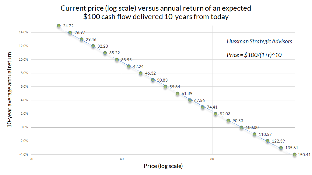
Geek’s Note: Why log-linear? Because present value involves exponentiation. Here, P = C/(1+r)^T, which we can rearrange as P/C = (1+r)^(-T). It follows that ln(P/C) = -T ln(1+r), which we can rearrange as ln(1+r)= -(1/T) ln(P/C). Our expected return has an inverse and linear relationship with log valuations. On the left side, ln(1+r) is log gross return. For small r, it turns out that ln(1+r) and r are about equal, for example, ln(1.10) = 0.0953. For large r, working with log gross returns can be useful because they help to properly deal with compounding. They’re additive. For example, a 100% gain contributes ln(2.0)=0.693. That gain is wiped out by a -50% loss, which contributes ln(0.5)=-0.693.
One of the often-overlooked features of reliable valuation measures is that they are highly informative not only about long-term returns, but also about the likely depth of market losses over the completion of a given market cycle. Emphatically, these losses do not necessarily emerge immediately. Rich valuations don’t imply immediate market losses. I can’t repeat that often enough. If they did, we would never observe bubble valuations. The only way that valuations were able to reach the extremes of 1929, 2000 and today was by plowing through every lesser extreme, undaunted.
Unfortunately, the deferral of consequences should not be confused with the absence of consequences. The completion of nearly every market cycle across history has brought projected S&P 500 total returns to the higher of a) their historically run-of-the-mill 10% norm or b) 2% above prevailing Treasury bond yields. At present, that would require a market loss on the order of -63% in the S&P 500. That’s not a forecast, but it certainly is a historically-consistent estimate of the potential downside risk created by more than a decade of Fed-induced yield-seeking speculation.
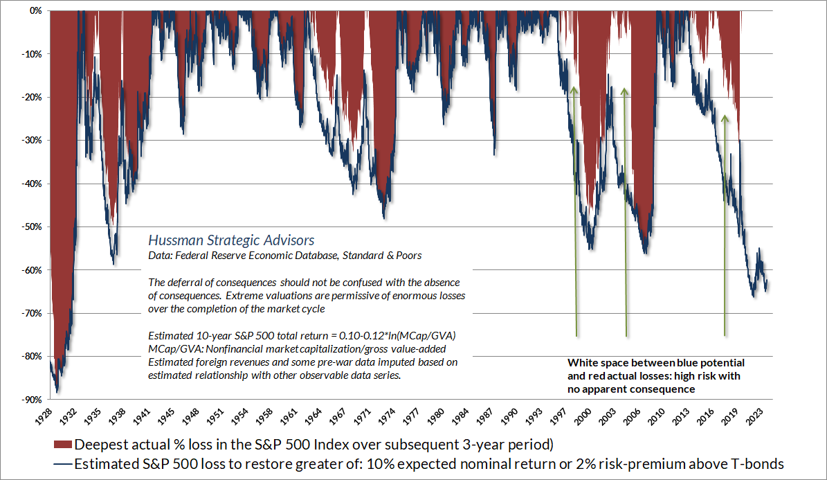
I’ll note here, as usual, that nothing in our discipline requires or “forecasts” a 63% loss in the S&P 500. The estimate above is a statement about valuations and the outcomes that have typically followed over the completion of market cycles across history.
The strongest expected return/risk profiles for the market emerge when a material retreat in valuations is joined by an improvement in our measures of market action. The depth of the retreat would certainly affect our views about the strength of the opportunity, but Grantham’s “genteel forecast” of 3000 on the S&P 500 would be a fine opportunity, once joined by favorable market internals. I doubt that level would be a durable low, so we might have safety nets where others might not. Still, as always, our discipline is to align our outlook with prevailing conditions, and under normal conditions, we expect those conditions to shift meaningfully at least once or twice a year.
Complex systems aren’t linear
Everything must be at rest which has no force to impel it; but as the least straw breaks the horse’s back, or a single sand will turn the beam of scales which hold weights as heavy as the world; so, without doubt, minute causes may determine the actions of men, of which neither others, nor they themselves are sensible.
– John Trenchard, Cato’s Letters, 1723
Despite the satisfying proportional relationship between starting valuations and long-term, full-cycle investment outcomes, market fluctuations over shorter segments of the cycle are driven by investor psychology, which can shift abruptly between speculation and risk-aversion. The interactions between investors can create feedback loops and extrapolate price trends just as easily as they can create abrupt reversals and mean-reversion. None of this is linear.
Complex systems are defined by interactions between various components that produce outputs that may not be proportional to the inputs. Adaptive systems involve components that learn and change their behavior based on previous experience. In the financial markets, for example, investors constantly adjust their behavior based on price movements that they themselves produce. Market participants also have a tendency to overweight recent experience and forget history – what Galbraith described as “the extreme brevity of the financial memory.”
In the short run, nothing forces expected returns based on extrapolating recent price trends to be consistent with expected returns based on valuations and future cash flows. Yet in the long run, a security is nothing but a claim on those future cash flows. If investors drive prices to extreme multiples of future cash flows, their hopes are bound to be dashed. Hence Grantham’s comment, “you can’t get blood out of a stone.”
Feedback loops can produce speculative bubbles. Rather than discouraging investors from chasing stocks, rising valuations can – for a while – encourage additional speculation and even steeper valuations. As Nobel economist Franco Modigliani warned near the 2000 peak, “the bubble is rational in a certain sense. The expectation of growth produces the growth, which confirms the expectation; people will buy it because it went up. But once you are convinced that it is not growing anymore, nobody wants to hold a stock because it is overvalued. Everybody wants to get out and it collapses, beyond the fundamentals.”
Despite the satisfying proportional relationship between starting valuations and long-term, full-cycle investment outcomes, market fluctuations over shorter segments of the cycle are almost entirely driven by investor psychology, which isn’t linear at all. Instead, the financial markets are a ‘complex adaptive system,’ and shifts in that system can be abrupt.
The recent “everything bubble” has taken its dear sweet time to collapse. Even though the S&P 500 remains down from its early 2022 peak, and 30-year Treasury bonds have lost over half their value since early 2020, the market has maintained the appearance of “resilience.” To a linear thinker, convinced that market behavior at any given time is a proportional reflection of underlying conditions, it would be easy to conclude that everything is just fine. After all, one might think, if something was actually wrong, prices would have declined in equal proportion.
That’s a tempting idea, but it’s not how financial markets work.
The failure of the general market to decline during the past year despite its obvious vulnerability, as well as the emergence of new investment characteristics, has caused investors to believe that the U.S. has entered a new investment era to which the old guidelines no longer apply. Many have now come to believe that market risk is no longer a realistic consideration, while the risk of being underinvested or in cash and missing opportunities exceeds any other.
– Barron’s Magazine, February 3, 1969
As it happened, the S&P 500 had already quietly started a bear market that would take stocks down by more than one-third over the next 18 months, and would leave the S&P 500 below its 1968 peak even 14 years later.
The upshot here is that the behavior of a complex system is not a simple, proportional reflection of its underlying state.
This is the longest period of practically uninterrupted rise in security prices in our history… The psychological illusion upon which it is based, though not essentially new, has been stronger and more widespread than has ever been the case in this country in the past. This illusion is summed up in the phrase ‘the new era.’ The phrase itself is not new. Every period of speculation rediscovers it… During every preceding period of stock speculation and subsequent collapse business conditions have been discussed in the same unrealistic fashion as in recent years. There has been the same widespread idea that in some miraculous way, endlessly elaborated but never actually defined, the fundamental conditions and requirements of progress and prosperity have changed, that old economic principles have been abrogated… that business profits are destined to grow faster and without limit, and that the expansion of credit can have no end.
– The Business Week, November 2, 1929
Gauging the state of the system
Rock-a-bye baby on the treetop
When the wind blows the cradle will rock
When the bough breaks the cradle will fall
And down will come baby, cradle and all
I’ve never quite understood how this is a comforting song. Singing it to a child seems passive-aggressive at best. I grew up in Chicago, where Harry Schmerler, your singing Ford dealer, would open his commercials crooning “rock-a-bye your baby” in a Vaudeville melody, but that’s another story. For our purposes, what’s useful about this song is that it distinguishes the potential state of a system from its kinetic state. Let’s abstract from the idea that there’s a kid in there.
Imagine a cradle, on the treetop. For a cradle of any given weight, the “potential” energy in the thing is proportional to its distance from the ground. The same is true of the potential energy stored in a rubber band – it’s proportional to how far you stretch it. In the financial markets, valuations are the same way. There’s a nice linear relationship between the height of the thing and the distance it typically retreats over the complete cycle. But notice that even large amounts of potential energy need not be released until something gives way – converting all that potential energy into motion, collapse, and for the markets, financial crisis.
To describe the “state” of a complex system, it helps to include measures that gauge the interactions between components. In systems that are vulnerable to catastrophic shifts, such as landslides or structural failures, it’s also useful to have measures that gauge when the system is coming under particularly severe stress or approaching a “critical point.” For landslides, the gradient or “steepness” relative to the ground is important; for building foundations, the level of soil moisture matters; for other systems, temperature gradients, population density, or load weight matters, and even a small change beyond a certain threshold can trigger a catastrophe.
In the financial markets, valuations are emphatically not enough to gauge the state of the system. In addition, we need measures to gauge the adaptive aspect: whether the current state of investor psychology leans toward speculation – extrapolation of upward price trends; or risk-aversion – concern about potential losses, defaults, and cash flows. For us, these measures involve aspects of price, volume, and investor sentiment that we capture with concepts like uniformity, divergence, spread, participation, breadth, leadership, exhaustion, compression, and overextension.
In our own discipline, we pay particular attention to whether investors are inclined toward speculation or risk-aversion. When investors are inclined to speculate, they tend to be indiscriminate about it, so our most useful measure is the uniformity or divergence of market action across a broad range of individual stocks, industries, sectors, and security-types, including debt securities of varying creditworthiness. The chart below presents the cumulative total return of the S&P 500 in periods where our main gauge of market internals has been favorable, accruing Treasury bill interest otherwise. The chart is historical, does not represent any investment portfolio, does not reflect valuations or other features of our investment approach, and is not an assurance of future outcomes.
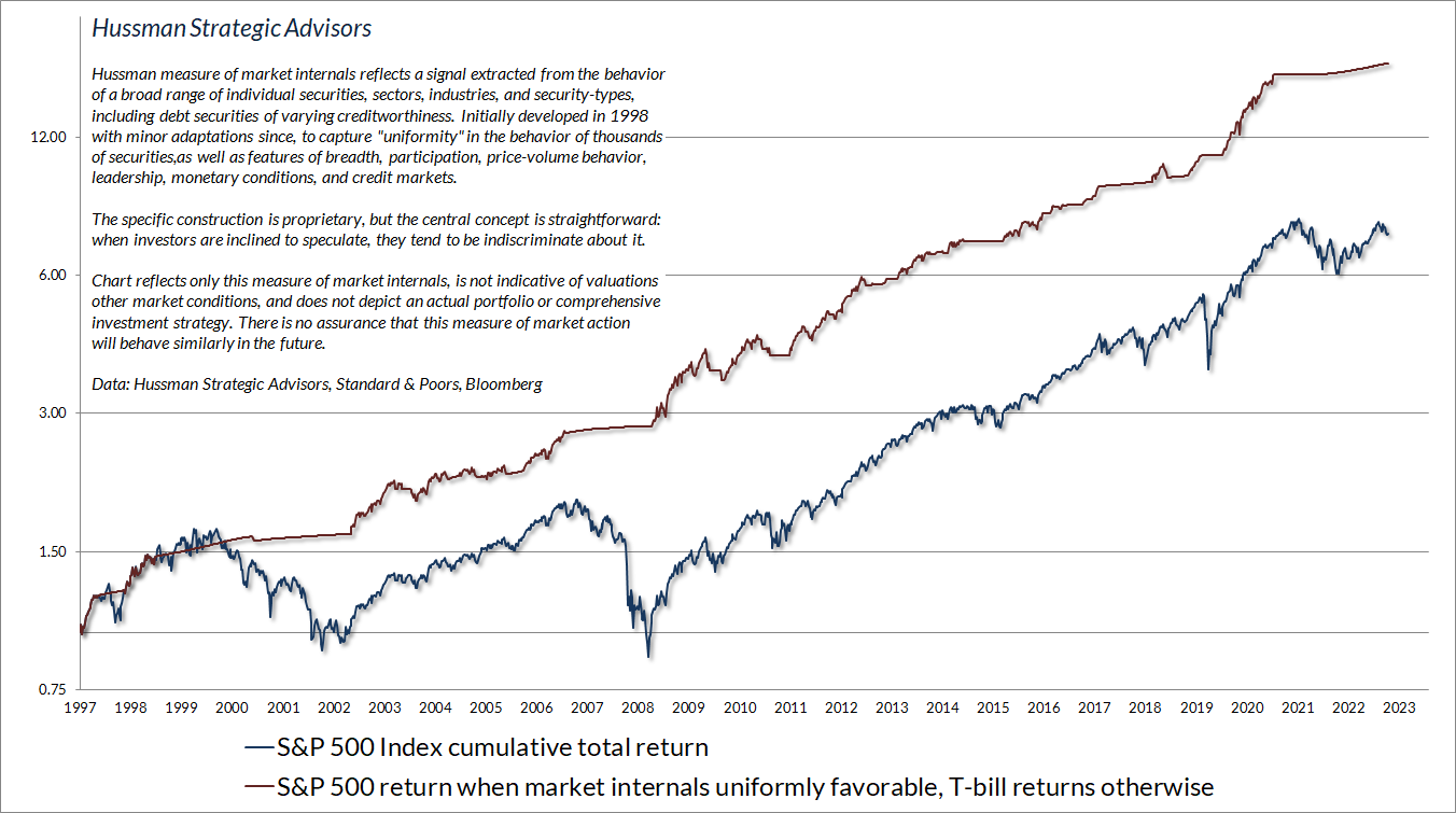
Having admirably navigated decades of complete market cycles prior to this one, including the tech and housing bubbles and collapses, it’s important to note our difficulty during the recent half-cycle zero-interest rate bubble. In previous market cycles across history, extreme “overvalued, overbought, overbullish” conditions were regularly followed by abrupt air-pockets, panics, or crashes. Our measures of “overextension” are distinct from our gauge of market internals, and regularly helped us to identify when the markets had reached a critical point. Unfortunately, once the Fed flooded the financial system with 18-36% of GDP in zero-interest liquidity – which someone had to hold, as zero-interest liquidity, at every moment in time – the resulting yield-seeking speculation blew through all of those historically-reliable limits.
Be careful to learn the right lesson: Provided that investors are inclined to speculate, as gauged by favorable market internals, there’s no reliable “limit” to the level of speculation that deranged Fed policy can encourage. In that situation, one has to be content to gauge the presence of speculative lemmings without assuming that their appetite for Molly, uppers and coke has a “limit.” The painful consequences emerge as risk-aversion sets in, as gauged by ragged and divergent market internals.
We introduced adaptations in 2017 and 2021 that restore the strategic flexibility that we enjoyed for decades prior to quantitative easing. These adaptations will be particularly helpful in the event the Federal Reserve resumes zero interest rate policies. For now, suffice it to say that even amid current valuation extremes, there are well-defined conditions in which our outlook would be not just neutral but constructive – albeit with position limits and safety nets. For details on our response to zero interest rate policies and quantitative easing, see the section titled Adapting to experimental monetary policy in the July comment.
While zero-interest rate policy did lift the “limits” to reckless speculation, be careful not to imagine that Fed easing overrides the combination of unfavorable valuations and risk-aversion. It does not. Fed easing “works” to support the financial markets only when investors view low-interest liquidity as an inferior asset. When investors become risk-averse, which we gauge based on unfavorable market internals, they treat low-interest liquidity as a desirable asset. In that situation, creating more of the stuff does not provoke speculation, and it does not support the market.
Be careful to learn the right lesson: Provided that investors are inclined to speculate, as gauged by favorable market internals, there’s no reliable “limit” to the level of speculation that deranged Fed policy can encourage. In that situation, one has to be content to gauge the presence of speculative lemmings without assuming that their appetite for Molly, uppers and coke has a “limit.” The painful consequences emerge as risk-aversion sets in, as gauged by ragged and divergent market internals.
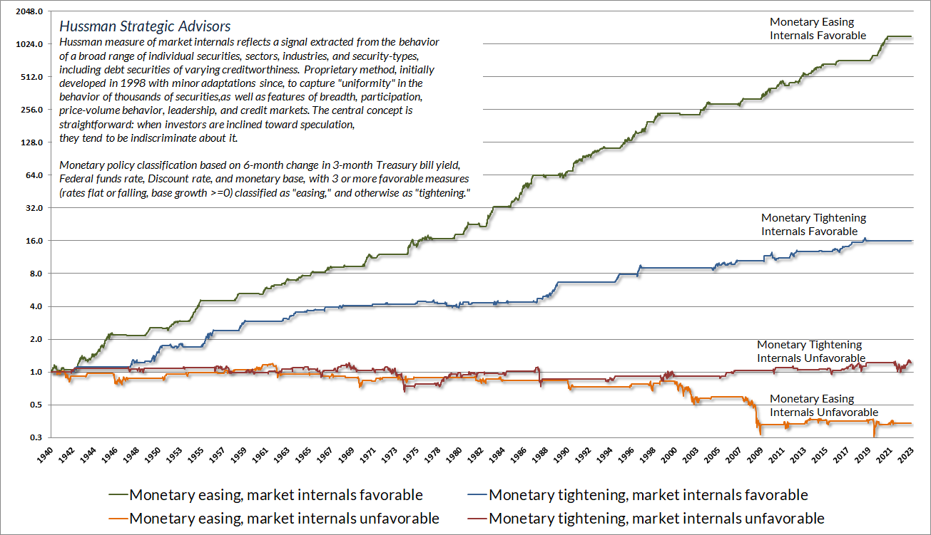
The chart below shows the cumulative total return of the S&P 500 across history, partitioned into four mutually exclusive conditions. The flat portions of each line are points when that particular condition was inactive. Notice that the worst combination emerges when risk-aversion (unfavorable market internals) is joined by monetary easing. That typically occurs during crashes and crises. The Fed eased aggressively and persistently throughout the 2000-2002 and 2007-2009 collapses. It’s improvement in market internals, not easing by the Fed, that reliably defines an improvement in the market outlook.
The worst market losses typically occur when valuations are extreme but the speculative herd has lost its uniformity. The quotes below may help to pull the concepts of valuation, market internals, and overextension together – though as I’ve noted, we’ve adapted our response to overextended “limits,” particularly when market internals and monetary pressures remain favorable.
The information contained in earnings, balance sheets, and economic releases is only a fraction of what is known by others. The action of prices and trading volume reveals other important information that traders are willing to back with real money. This is why trend uniformity is so crucial to our Market Climate approach. Historically, when trend uniformity has been positive, stocks have generally ignored overvaluation, no matter how extreme. When the market loses that uniformity, valuations often matter suddenly and with a vengeance. This is a lesson best learned before a crash rather than after one.
– John P. Hussman, Ph.D., October 3, 2000
One of the best indications of the speculative willingness of investors is the ‘uniformity’ of positive market action across a broad range of internals. Probably the most important aspect of last week’s decline was the decisive negative shift in these measures. Since early October of last year, I have at least generally been able to say in these weekly comments that “market action is favorable on the basis of price trends and other market internals.” Now, it also happens that once the market reaches overvalued, overbought and overbullish conditions, stocks have historically lagged Treasury bills, on average, even when those internals have been positive (a fact which kept us hedged). Still, the favorable market internals did tell us that investors were still willing to speculate, however abruptly that willingness might end. Evidently, it just ended, and the reversal is broad-based.
– John P. Hussman, Ph.D., July 30, 2007
Confidence bubbles, phase transitions, and catastrophes
Financial markets are particularly sensitive to interactions between participants because every share bought by one investor must simultaneously be sold by another investor. Likewise, every single share that’s sold must also be bought. Every dollar a buyer puts “in” is a dollar a seller takes “out.” Prices change depending on which participant – the buyer or the seller – is more eager.
Needless to say, the notion of “cash on the sidelines waiting to get invested” drives me nuts. Every dollar of liquidity created by the Fed must be held by some investor until the Fed retires it by shrinking its balance sheet. That liquidity can be held in only three forms: currency in your wallet, bank reserves that you hold indirectly as a bank deposit, or funds on “reverse repo” with the Fed that you hold indirectly as a money market fund deposit. It can’t turn into anything else. The cash is already “home.” You can’t put it “into” the stock market without a seller taking it right back “out.” Someone has to hold it. That’s how zero-interest rate policy created a bubble. Someone had to hold the stuff, and nobody wanted it. That’s over. Except for physical currency, all that liquidity is now earning 5.4%.
When investors begin to act as a herd, prices can move a great deal because it becomes more difficult to satisfy the herd’s collective attempts to buy, or to sell. So in addition to valuations, market internals, compression, and overextension, we also use various measures of price/volume behavior to gauge when groups of investors begin “choosing sides” – shifting from a bullish herd to a bearish herd.
I’ve noted over the years that substantial market declines are often preceded by a combination of internal dispersion, where the market simultaneously registers a relatively large number of new highs and new lows among individual stocks, and a leadership reversal, where the statistics shift from a majority of new highs to a majority of new lows within a small number of trading sessions.
This is much like what happens when a substance goes through a ‘phase transition,’ for example, from a gas to a liquid or vice versa. Portions of the material begin to act distinctly, as if the particles are choosing between the two phases, and as the transition approaches its ‘critical point,’ you start to observe larger clusters as one phase takes precedence and the particles that have ‘made a choice’ affect their neighbors. You also observe fast oscillations between order and disorder in the remaining particles. So a phase transition features internal dispersion followed by leadership reversal. My impression is that this analogy also extends to the market’s tendency to experience increasing volatility at 5-10 minute intervals prior to major declines.
– John P. Hussman, Ph.D., Market Internals Go Negative, July 30, 2007
The reason we align our investment outlook with prevailing, observable market conditions like valuations and internals is that shifts in herd behavior are essentially impossible to predict. “It is in the nature of a speculative boom,” wrote Galbraith, “that almost anything can collapse it. Any serious shock to confidence can cause sales by those speculators who have always hoped to get out before the final collapse, but after all possible gains from rising prices have been reaped. Their pessimism will infect those simpler souls who had thought the market might go up forever but who now will change their minds and sell. Soon there will be margin calls, and still others will be forced to sell. So the bubble breaks.”
My friend John Mauldin has often used a “sandpile” analogy to describe the non-linear behavior of catastrophes. In 2021, he shared a quote from author Mark Buchanan, describing the concept of “self-organized criticality” proposed by three physicists, Per Bak, Chao Tang, and Kurt Wiesenfeld of the Brookhaven National Lab:
Imagine peering down on the pile from above and coloring it in according to its steepness. Where it is relatively flat and stable, color it green; where steep and, in avalanche terms, ‘ready to go,’ color it red. What do you see? They found that at the outset, the pile looked mostly green, but that, as the pile grew, the green became infiltrated with ever more red. With more grains, the scattering of red danger spots grew until a dense skeleton of instability ran through the pile. Here then was a clue to its peculiar behavior: a grain falling on a red spot can, by domino-like action, cause sliding at other nearby red spots.
If the red network was sparse, and all trouble spots were well isolated one from the other, then a single grain could have only limited repercussions. But when the red spots come to riddle the pile, the consequences of the next grain become fiendishly unpredictable. It might trigger only a few tumblings, or it might instead set off a cataclysmic chain reaction involving millions. The sandpile seemed to have configured itself into a hypersensitive and peculiarly unstable condition in which the next falling grain could trigger a response of any size whatsoever.
Mark Buchanan, Ubiquity: Why Catastrophies Happen (h/t John Mauldin)
Historically, the combination of extreme valuations and unfavorable market action has created a “trap door” situation for the market. That doesn’t mean that the market always collapses in short order. Rather, the steepest market losses have generally emerged from that combination of market conditions, and these losses tend to emerge abruptly, without additional warning.
Balance sheet losses and debt burdens
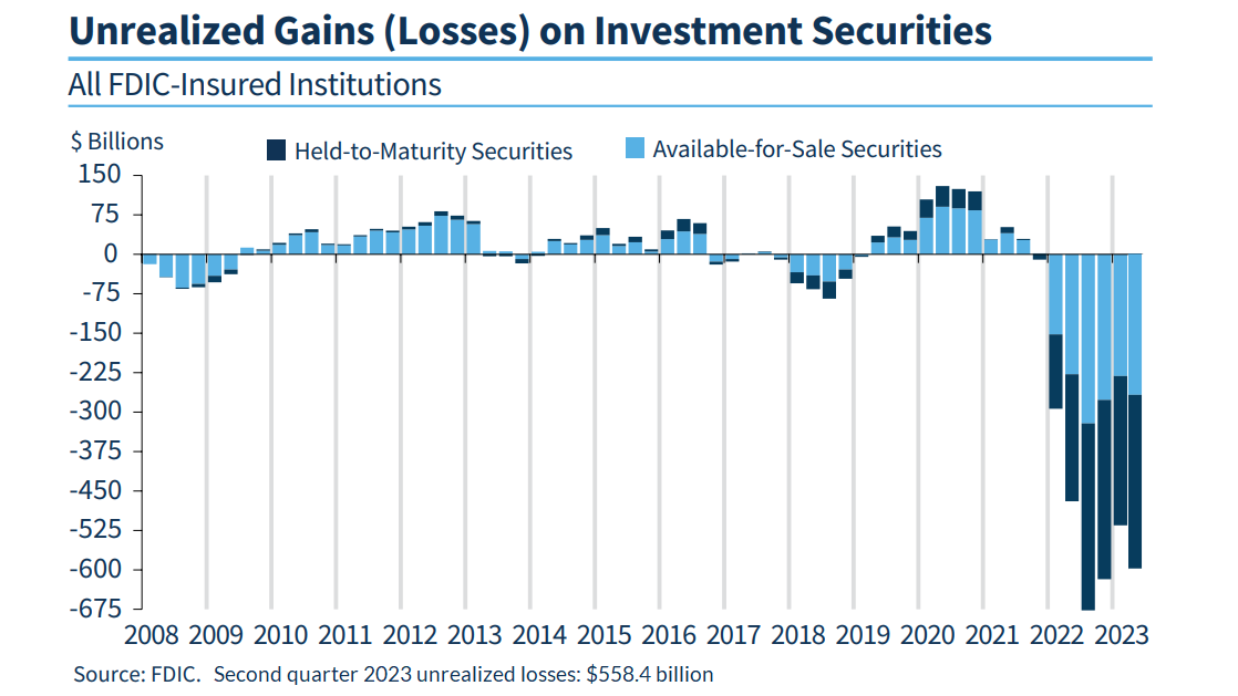
Adding to the “skeleton of instability” created by rich valuations and unfavorable market internals, the chart below shows unrealized losses in the U.S. banking system as of the second quarter of 2023. Notably, 10-year Treasury yields have increased from 3.8% to 4.7% since then, so this profile has undoubtedly worsened in recent months. According to the latest FDIC quarterly banking profile, over 40% of U.S. commercial bank deposits are uninsured – a consequence of a Federal Reserve policy that forced trillions of dollars of reserves into the banking system.
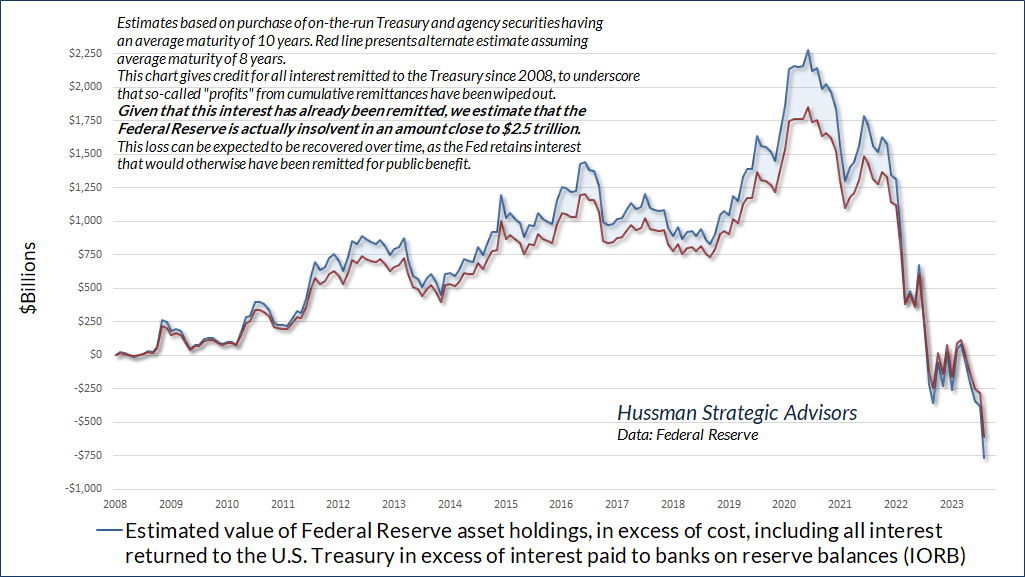
Meanwhile, things are not going well inside the Federal Reserve’s balance sheet. By our estimates, even giving the Fed credit for all the interest it has returned to the U.S. Treasury since it launched quantitative easing in 2008, the Fed has lost nearly $750 billion dollars, at public expense. Excluding interest that the Fed has remitted to the Treasury, the actual hole in the Federal Reserve’s balance sheet – liabilities in excess of assets – is close to $2.5 trillion. In effect, the Fed has created government liabilities that are no longer backed by corresponding assets, as the Federal Reserve Act intended.
There is no immediate legal or regulatory consequence to this, but the public should understand that this hole will be filled by the Fed over time, by retaining interest that would otherwise have been returned to the Treasury for public use. For a full discussion of the difference between illiquidity and insolvency (the Fed is not illiquid, but it is most certainly insolvent), see the September comment, Central Bankers Wandering in the Woods.
In addition to steep losses in the bond market, the banking system, and the Federal Reserve’s own balance sheet following years of Fed-induced speculation, zero-interest rate policy encouraged a massive expansion of the Federal debt, by making that debt seem temporarily costless. The problem here is not so much that the debt needs to be repaid – in practice, maturing debt is refinanced by issuing new debt – but rather that we’ve assumed that future investors will be willing to sacrifice their own consumption to refinance that debt, no matter how large the debt might be, without any change in the tradeoff between consumption and government liabilities. In plain language, changes in that tradeoff are known as “inflation” and “sustained high interest rates.”
Why do people buy bonds? Because they’re willing to put off current consumption to provide for their future consumption. Since 2005, as the U.S. population has aged, the share of consumption spending by those aged 65 and over has grown from less than 14% to nearly 22%. An increasing cohort of Americans has entered the consumption phase of life, while the share of individuals in the produce-and-accumulate phase has declined. Yet we’re all just betting that this debt will be automatically refinanced on the shoulders of future buyers, standing on a turtle, standing on another turtle, and that it’s turtles all the way down.
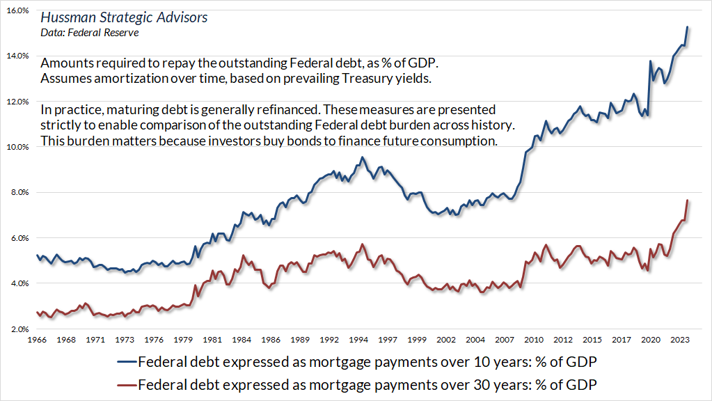
From this perspective, it’s useful to consider how much of the country’s production would have to be paid over to bondholders in order to actually honor the debt over time. This is undoubtedly a hypothetical exercise, since the debt is expected to be refinanced. Still, we can’t simply assume that the tradeoff between government liabilities and future consumption will be unaffected by the amount of those liabilities. A worsened tradeoff, by definition, would mean inflation, elevated interest rates, or both.
The chart below expresses the Federal debt as if it was paid down like a mortgage over 10 years and 30 years. It takes account of both the size of the debt and the level of interest rates. You might not want to hear this, but even if interest rates were to fall by half, the burden would still be higher than at any point in history prior to 2020.
Remember, financial markets aren’t linear. It’s impossible to explain the inflation of the 1970’s as a linear function of observable variables (unless one of the variables is inflation itself). The value that investors place on paper currency and government debt is a function of confidence in long-term fiscal and monetary restraint. As economist Peter Bernholz has noted: “There has never occurred a hyperinflation in history which was not caused by a huge budget deficit of the state… In all cases of hyperinflation, deficits amounting to more than 20 per cent of public expenditures are present.” We’ve exceeded that level in each of the past five years – even in 2019, before the pandemic – but that in itself provides no information about whether or when we might observe a break in confidence.
The sandpile can tolerate a persistent trickle of expanding debt, loose policy, extreme overvaluation, and banking losses for quite some time. Ponzi schemes can go on for years. All we might observe for a while are a few localized “tumblings” like Silicon Valley Bank, or a temporary spike in inflation, and we might imagine that everything is contained. Meanwhile, risk quietly extends across the whole system as a “skeleton of instability.” When a confidence bubble finally breaks, it tends to break abruptly. The unwelcome consequences can further undermine confidence and amplify the crisis, as they did with inflation in the 1970’s, tech stocks in 2000-2002, and the global financial system in 2007-2009.
On bond yields and recession
In the bond market, the level of long-term interest rates has returned to a range that we view as “adequate,” though it has taken a 50% loss in 30-year Treasury bonds and a 25% loss in 10-year bonds to do so. Indeed, the total return of 30-year Treasury bonds since the beginning of quantitative easing in 2008 has been wiped out to zero. Still, we’re finally inclined to nibble on longer maturity debt in response to upward spikes in rates, with about half of that exposure in inflation-protected securities.
It’s worth repeating that the entire historical total return of Treasury bonds, over-and-above T-bill returns, has accrued when the 10-year Treasury yield has been above these benchmarks – ideally above both. We don’t view the present level of yields as unusually generous or attractive, so “adequate” remains our preferred description. As usual, our outlook will change as measurable, observable conditions change. For bonds, the slope of the yield curve, inflation pressures, and nominal GDP growth are particularly important.
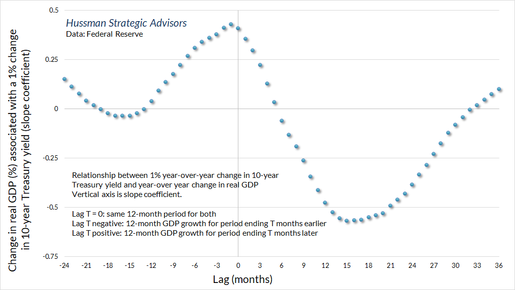
I’ve noted before that nearly all of the fluctuations in real GDP growth, employment, and even inflation that one can predict using monetary variables can be predicted using non-monetary variables alone – see the section on “Granger Causality” in Central Bankers Wandering in the Woods. Given that fact, one has to be careful when discussing the relationship between interest rates and subsequent economic outcomes, because investors and even policy makers often wildly overestimate the extent to which economic outcomes can be manipulated. That said, purely from the standpoint of correlation, it’s helpful to recognize that economic changes tend to significantly lag changes in long-term interest rates.
The chart below shows the year-over-year percentage change in real GDP associated with a 1% year-over-year change in the 10-year Treasury yield. On the horizontal axis, a lag of 0 months means that we’re looking at the same 12-month period for both. Notice that on average, if Treasury bond yields have increased over the past year, real GDP has typically also increased over that same period. It’s only after about 15-18 months that an increase in Treasury bond yields is associated with a decline in real GDP. You won’t be surprised, then, that I agree with Grantham’s assessment: “My guess is that we will have a recession, I don’t know if it will be fairly mild or fairly serious, but it will probably go deep into next year.”
To be clear, our recession warning measures are not on high confidence yet. On the positive front, regional Fed and purchasing managers surveys have enjoyed a modest though noisy bounce in recent months. On the negative front, we’ve already seen a year-over-year contraction in real retail sales and temporary employment, while Gross Domestic Income has been markedly weaker than Gross Domestic Product, even though they measure the same activity in different ways. Historically, the worst period for the stock market runs from roughly two months before a recession to four months before it ends. One shouldn’t expect stocks to provide much notice in advance of a recession, yet stocks can be down a great deal by the time an ongoing recession is well-recognized. My impression is that, combined with the components that are already in place, a decline in the S&P 500 below about 4100 would be the last straw.
If we do see a recession, don’t blame the Fed for the downturn. Blame the Fed for more than a decade of yield-seeking speculation, and resulting financial distortions – extreme valuations, speculative losses, leveraged loans, uninsured deposits, and light covenants – that will undoubtedly complicate that downturn.
I’ll say this again. The next recession will not be “because” the Fed raised rates – indeed, the Fed funds rate remains slightly below the level that has historically been consistent with prevailing unemployment, inflation, and economic slack. As I noted last month, as an economic expansion progresses, slack in labor markets and productive capacity is gradually taken up, price pressures accelerate, real GDP expands beyond its sustainable potential, and mismatches emerge between demand and supply. Yet even without Fed action, this is already a situation where recession is more likely. Rising long-term interest rates and Fed tightening of short-term interest rates do precede recessions, but those recessions – precisely because of tight capacity and mismatches between the mix of goods and services supplied and demanded – were already more likely than not.
Meanwhile, investors should be careful about the idea that the economy has been “resilient” in the face of rising long-term interest rates. It’s not unusual for the economy to appear resilient as rates are rising.
Yet another long but volatile trip to nowhere
Finally, among the greatest risk factors for investors here is that while bond valuations have normalized, stock market valuations remain near historic extremes. By our estimates, the gap in expected returns between equities and bonds has joined the worst levels in history, matched only by extremes in mid-1929 and early-2000. We realize that you have lots of “equity risk premium” models to choose from, so thank you for flying with ours, because the most popular ones are runway garbage, and you can prove that to yourself by comparing their implications against actual subsequent market returns. Wall Street doesn’t do this, because it’s much easier to subtract the 10-year Treasury yield from the forward earnings yield of the S&P 500, without all that extra work of research and testing.
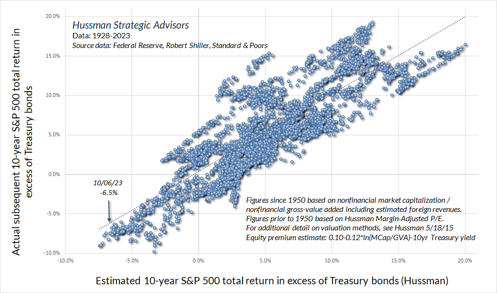
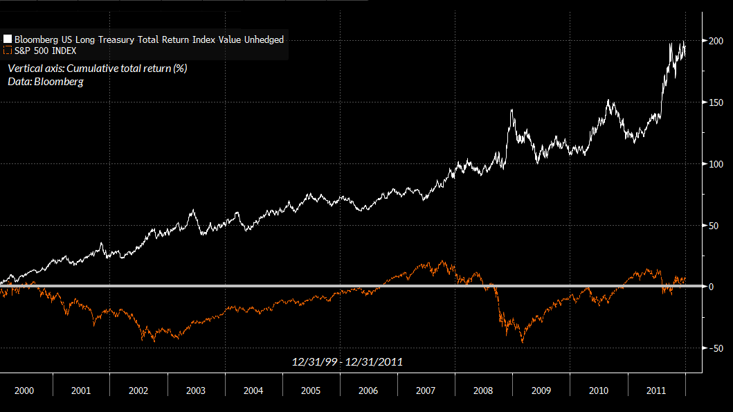
Over the coming decade, from current valuations, we expect the total return of the S&P 500 to lag Treasury bond returns by about -6.5% annually. Our 12-year estimate is even worse, at -7.5% annually. That may seem preposterous. It’s easy to forget that we observed a similar outcome in the years following the 2000 extreme. During the 12-year period from 12/31/1999 through 12/31/2011, the total return of the S&P 500 lagged the total return of Treasury bonds by -8.9%. It’s equally easy to forget that the total return of the S&P 500 lagged Treasury bonds from August 1929 to July 1950, and more recently, from March 1998 to March 2020. Bubbles have consequences.
Probably the worst part of being a value-conscious investor, particularly when valuations are elevated, is that your views about valuations can be interpreted as near-term market forecasts. I rarely write a market comment without noting, emphatically, that this is not the case. Our investment discipline is to align ourselves with prevailing, measurable, observable market conditions – particularly the combination of valuations market internals – and to change our outlook as those conditions change. Our investment discipline certainly benefits from variation in market conditions, but nothing in that discipline requires valuations to retreat to levels anywhere near their historical norms. The problem is that current conditions are so extreme, and the outcomes from similar extremes have been so dismal, that nuance is almost impossible.
Given that valuations remain extreme, and our measures of market internals remain firmly unfavorable, I’m less concerned than usual about our risk-estimates being misinterpreted as forecasts. My main concern is that the instability of the complex system that we call the “financial market” features growing stress on a broad range of interconnected components, particularly across credit, debt, equity, and banking measures. In Buchanan’s words, these interconnected components create a “skeleton of instability.” There need not be a proportional relationship between the size of the last grain of sand, the length of the last straw, or the weight of the landing butterfly, and the extent of the catastrophe they provoke. When the bough breaks, my sense is that it may break abruptly.
Keep Me Informed
Please enter your email address to be notified of new content, including market commentary and special updates.
Thank you for your interest in the Hussman Funds.
100% Spam-free. No list sharing. No solicitations. Opt-out anytime with one click.
By submitting this form, you consent to receive news and commentary, at no cost, from Hussman Strategic Advisors, News & Commentary, Cincinnati OH, 45246. https://www.hussmanfunds.com. You can revoke your consent to receive emails at any time by clicking the unsubscribe link at the bottom of every email. Emails are serviced by Constant Contact.
The foregoing comments represent the general investment analysis and economic views of the Advisor, and are provided solely for the purpose of information, instruction and discourse.
Prospectuses for the Hussman Strategic Growth Fund, the Hussman Strategic Total Return Fund, the Hussman Strategic International Fund, and the Hussman Strategic Allocation Fund, as well as Fund reports and other information, are available by clicking “The Funds” menu button from any page of this website.
Estimates of prospective return and risk for equities, bonds, and other financial markets are forward-looking statements based the analysis and reasonable beliefs of Hussman Strategic Advisors. They are not a guarantee of future performance, and are not indicative of the prospective returns of any of the Hussman Funds. Actual returns may differ substantially from the estimates provided. Estimates of prospective long-term returns for the S&P 500 reflect our standard valuation methodology, focusing on the relationship between current market prices and earnings, dividends and other fundamentals, adjusted for variability over the economic cycle. Further details relating to MarketCap/GVA (the ratio of nonfinancial market capitalization to gross-value added, including estimated foreign revenues) and our Margin-Adjusted P/E (MAPE) can be found in the Market Comment Archive under the Knowledge Center tab of this website. MarketCap/GVA: Hussman 05/18/15. MAPE: Hussman 05/05/14, Hussman 09/04/17.