

Seven Reminders While on Recession Watch


William Hester, CFA
Senior Research Analyst
Hussman Strategic Advisors
October 2023
In recent months, the consensus of economists has become less certain about the outlook for a recession in the U.S. economy. A recent survey asking economists about the probability of recession next quarter shows a retreat in expectations from a high of 47 percent at the end of 2022 to just 34 percent, according to the Philadelphia Federal Reserve.
It’s not hard to see why recession expectations have changed. The typical follow-through from leading indicators to coincident indicators has not happened. Coincident data is slowing generally, but not as quickly as leading data would have suggested. For example, when the 6-month annualized change in the Conference Board’s Leading Economic Index (LEI) has fallen below -5 percent for the first time, it has typically taken coincident data – like employment and income – between six and seven months to turn negative, on average. It’s been 13 months since the LEI has breached those levels, and the rate of change in coincident data is still mostly positive.
Because of this, it remains too early to confidently forecast a recession. But with stock market valuations still extended, recession remains one of the biggest risks stock investors face. So, as we all remain on recession watch, here are some ideas to consider on the topics of recessions, stock market performance around economic contractions, indicators to watch, and risks to consider.
1) A recession would bring three horsemen to the stock market’s front door
In his new book on longevity, Peter Attia outlines a framework for extending one’s lifespan. He suggests that the most effective approach is to establish early-life habits that can help prevent or delay the onset of the conditions he refers to as the “Four Horsemen.” His Four Horsemen are: heart disease, cancer, neurodegenerative disease, and type 2 diabetes. This line of thinking about longevity can be applied when considering which risks most frequently bring bull markets to their end.
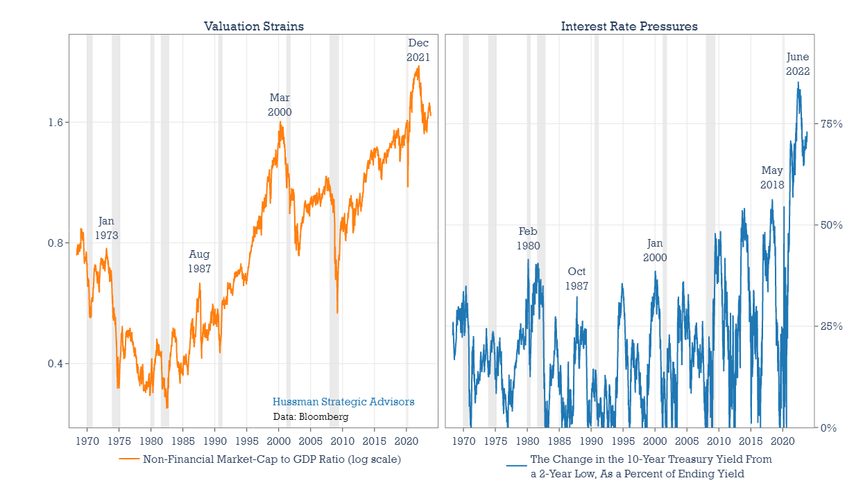
Here are my suggestions of the stock market’s Four Horsemen: extended valuations, interest rate pressures, recessions, and sudden, destabilizing events (like a global pandemic). We already have two in place. A recession would join with extended valuations and the recent steep rise in interest rates. This collection of three of the four Horsemen would likely topple the extended rebound from last October’s low.
How do the two Horsemen already in place look today, relative to history? Valuation Strains, in the left panel below, are illustrated by the ratio of non-financial market-capitalization to GDP, made popular by Warren Buffett. While valuations are lower than their peak levels of last year, they remain elevated when compared with history. The right panel, in blue, shows a measure of interest rate pressures. The 10-year interest rate is up more than 360 basis points over the past two years. That’s the largest increase in 40 years. Moreover, rates have advanced from extremely low levels. To capture this, the blue line measures the advance in rates from the prior two-year low, as a fraction of the ending yield. Using this method, interest rate pressures are just shy of the record surge last year.
The table below applies this framework to each 20 percent decline in the S&P 500 since 1950. The goal is to place the current pressures on the market into a historical context. While previous market declines such as 2000-2002 and 1929-1931 included bear market rallies in excess of 20%, the table lists the decline from January-October 2022 as a separate entry, without judging whether the advance from the October 2022 low has been a bear market rally. In the Valuation Strains column, any value between 0.77 and 1.5 is shaded in light red. The long-term average of MarketCap/GDP has been 0.77. Values above 1.5 are shaded in dark red. In the Rate Pressures column, values between .3 and .6 are shaded light red. These correspond to the steep interest rates increases of 1980, 1987, and 2000. Any value above .6 is shaded dark red. These values place the interest rate pressures since early 2022 into historical context.
The Recession Induced column indicates whether a recession occurred within or around the stock market decline. Finally, the Event Driven column – necessarily subjective – highlights when a major decline was associated with a sudden, destabilizing event. The COVID selloff in early-2020 is the most obvious and recent example of this type of catalyst.
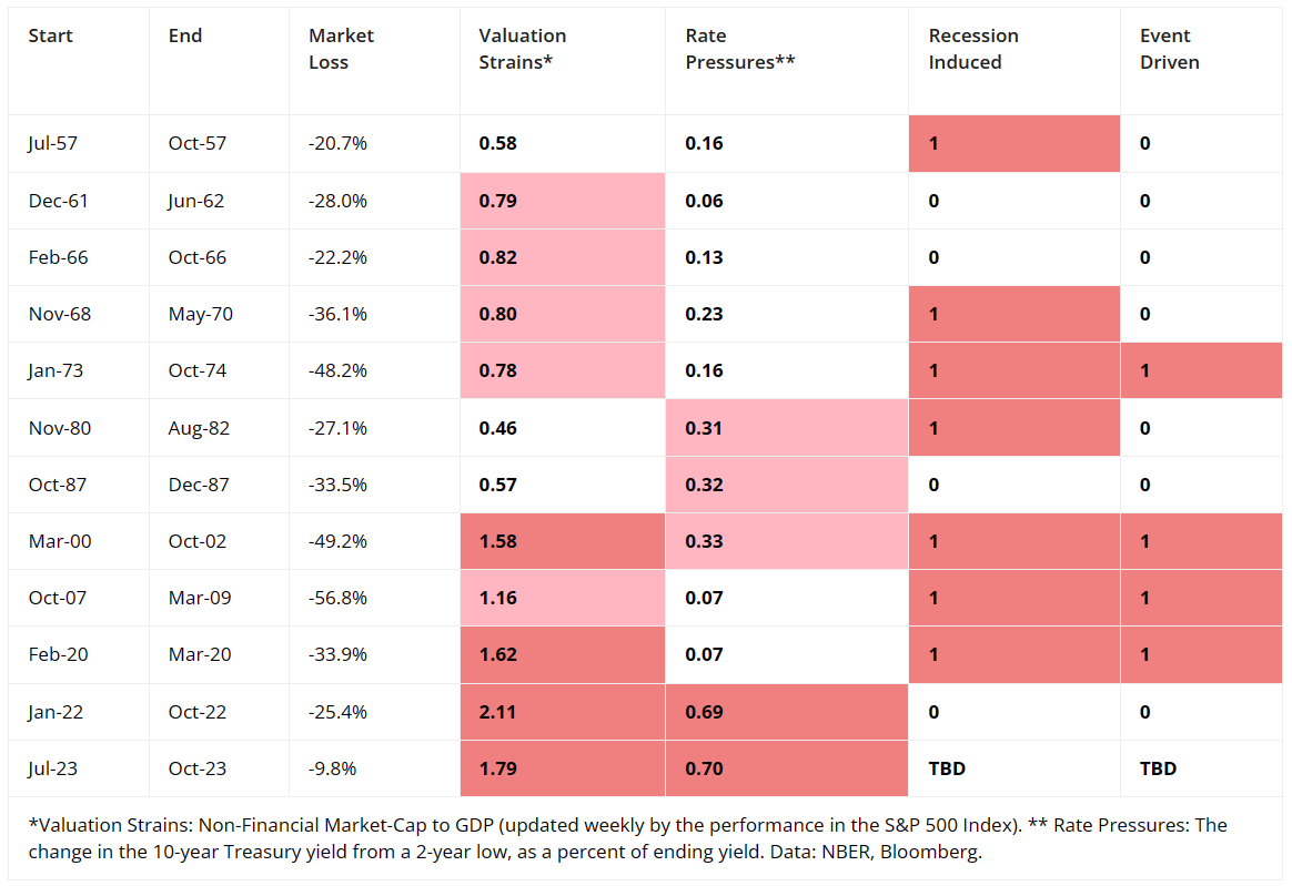
Every bear market has its own unique characteristics. But there are a few points worth highlighting from the table. First, the biggest stock market declines have tended to start from the steepest levels of valuation. All of the bear markets since 2000, have begun from elevated levels of valuations. These include the two deepest declines (beginning in 2000 and 2007) of any bear market since the 1930’s.
Secondly, a sharp increase in interest rates can play an adverse role in nearly any type of market. A steep rise in rates can help to provoke bear markets in undervalued markets, as in 1980. It can contribute to stock market crashes, as in 1987. Or it can help to pop a stock market bubble, as rising rates did in 2000.
Lastly, stock markets that buckle under the weight of rich valuations are typically provoked by rising rates, but not always. In the first part of 1962, the modestly overvalued S&P 500 Index fell 28%. But most of the selling came over just 45 trading days. The intensity of that bear market ranks behind only the 1987 and 2020 crashes. Interest rates didn’t seem to play a role in this decline.
Valuations are currently extended and interest rate pressures are at near record levels, particularly taking the initial level of rates into consideration. Adding recession to these two already present Horsemen would create a combination of negative pressures that has been rare among historical precedents.
2) The U.S. economy experiences Election Cycle patterns too. The lucky months are over
Investors could be forgiven for being tempted to invest solely based on the calendar. That’s because the “Election Cycle” pattern has repeated over time. The average annualized return of the S&P 500 from October of the second year of an election cycle through April of the third year (October 2022 through April 2023 in the most recent instance) has been six times the average market return during the remainder of the cycle. Jeremy Grantham of GMO noted this pattern in his January 2023 comment – After a Timeout, Back to the Meat Grinder! – suggesting that “this positive influence may help to support the market for a few more months.”
It’s helpful to consider the two characteristics that have regularly provided a supportive backdrop for these excess returns. Saying that these characteristics explain excess Election Cycle returns goes too far, because it’s not easy to quantitatively explain why the pattern keeps re-occurring. But the supportive backdrop can certainly help us understand past Election Cycle returns.
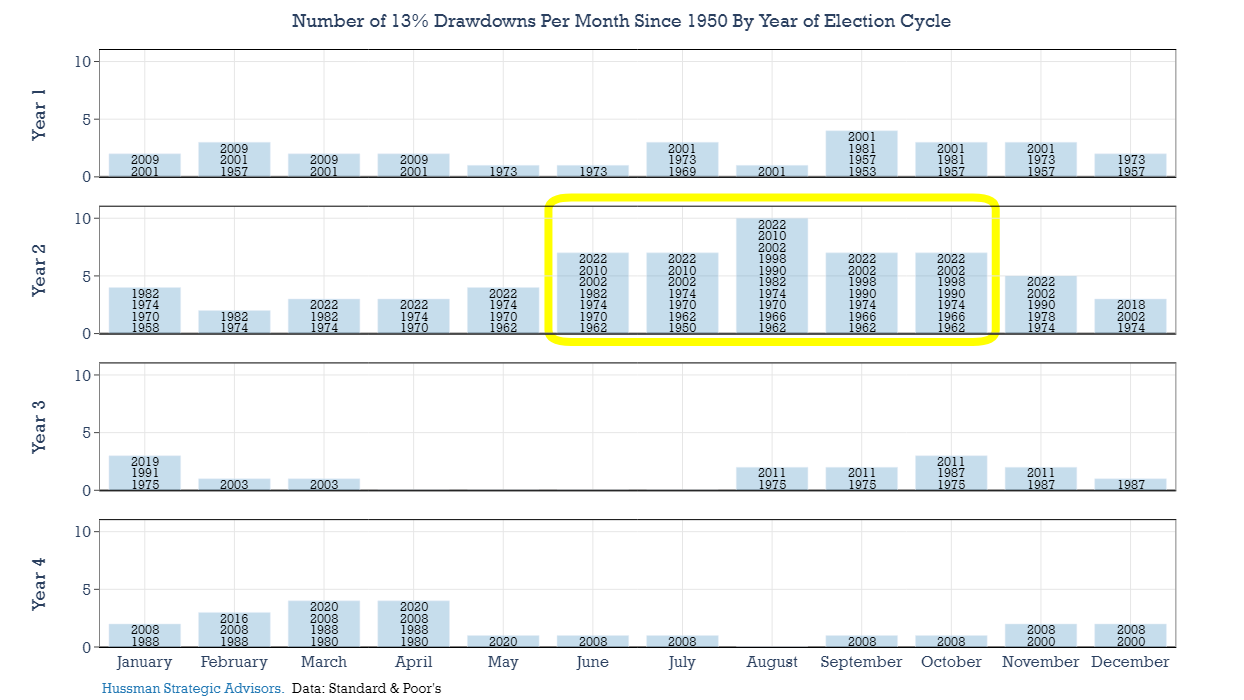
The first characteristic is that the market tends to decline during Year 2, typically between late-summer and late-fall. I’ve pointed out this tendency previously, and the trend has mostly continued, including an intermediate-term trough last October. In the graph below, each row is a year of the Election Cycle. The height of each bar counts the number of years where the S&P 500 Index experienced a drawdown of at least 13 percent from its previous 6-month high. These 6-month selloffs are overwhelmingly found during the June to November period of Year 2. Those declines typically position the market to rebound during the first several months of Year 3 (especially during the first four months of the year), as long as bad economic and corporate profit news doesn’t unexpectedly show up.
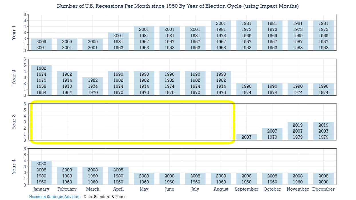
For the most part in data since 1950, it hasn’t. The first eight months of Year 3 have been free of recessions, at least when measured by what I call the “impact window” around recessions. Because the stock market tends to turn lower about 3 months before the start of a recession, our analysis is not only interested in whether a recession was underway, but whether a recession was shortly ahead. I’ve shifted recessions three months ahead of their actual dates in the chart below to capture that dynamic. As in the chart above, the height of each bar is the sum of the number of recessions that have occurred in each month of the Election Cycle. Notice the gaping hole in Year 3, with no recessions impacting the period of time when stock returns have tended to be strongest.
Calendar investors got lucky this year. Based on the recession forecasts of economists in recent decades, the risk of recession has never been as high as it was this year. If the economy had entered into recession, there would almost certainly have been much more market volatility, and probably a broader decline, even among the largest stocks.
In any event, the important point here is that the lucky months of the Election Cycle are now behind us. In all the 38 months ahead – until the next Year 3 comes around again – recessions have been common.
3) As the economy enters recession, data trends are rarely straight down
Soft landing optimism is everywhere. That’s happened before. People are often sure that the economy is going to settle down gently right before it plunges into recession, a reason for caution and humility.
– Jeanna Smialek, New York Times, July 27, 2023
The growing optimism about a soft landing or no-landing can been seen in stock prices over the last year and in economist’s forecasts, where expectations for recession are consistently being revised away. Yet as the New York Times recently pointed out, the hope for a soft landing is common during the later stages of the business cycle. This tendency might be written off as the enduring optimism of Wall Street, but there are repeating characteristics in the historical data that fuel that optimism. One of the most important patterns in the data is that leading and coincident indexes rarely decline in a straight line.
In the graph below, the blue line is the 6-month annualized change in the Conference Board’s Leading Economic Index (LEI). It’s never experienced an uninterrupted decline prior to and during the early part of a traditional recession. There are always periods prior to and during the early portions of a recession where the index either moves sideways or moves higher. The LEI has ten indicators. As the economy moves toward recession, these ten different components are bound to give some mixed signals on the way down, and they regularly do.
It’s worth highlighting which components have been keeping the rate of decline in the LEI from sinking lower in recent months. While the Index has declined sharply since 2021, the pace of the decline is at similar levels to October of last year. In the bar chart at the right of the graphic, I’ve plotted the contribution to changes in the LEI Index over the last 11 months. Notice that the stock market has been the main ballast against the rate of change in the leading index continuing to move lower.
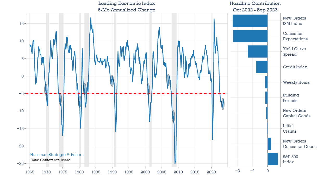
Following an advance in the S&P 500 Index from October 2022 through late-July of this year, the index has moved lower in recent months. If this downtrend continues, the LEI will lose the component that has been the most supportive of it since last October.
4) Watch for the yield curve to uninvert
The yield curve — specifically, the spread between the interest rates on the ten-year Treasury note and the three-month Treasury bill — is a valuable forecasting tool. It is simple to use and significantly outperforms other financial and macroeconomic indicators in predicting recessions two to six quarters ahead.
– Arturo Estrella and Frederic Mishkin, The yield curve as a predictor of U.S. recessions
Normally, long-term interest rates are higher than short-term rates. When short-term rates are higher, we say that the “yield curve” is “inverted.” The idea that the yield curve is a capable recession forecaster seems like it’s always been part of the economist’s toolbox. But it’s actually a newish indicator. Although earlier research exists, the yield curve gained popularity on Wall Street after a 1996 paper out of the Federal Reserve Bank of New York titled The yield curve as a predictor of U.S. recessions. Following the release of that paper, the slope of the yield curve continued to demonstrate its value, helping to forecast the recessions that followed in 2001 and 2008, and cemented its reputation.
The curve even inverted for a few weeks during the summer of 2019, prior to 2020’s Covid-induced recession, keeping its streak alive. Many argue that bond traders got lucky in that instance, since there was no way to forecast the pandemic recession as early as the summer of 2019. But leading indicators were negative through this period, the ISM was below 50, the Conference Board’s Consumer Confidence was down on a year-over-year basis and the global economy was slowing noticeably. So even by late-2019, the economy looked to be slowing to a point where an exogenous shock would likely send it into recession. Our own models indicated that the risk of recession was already “increasing but not decisive.” ECRI’s Lakshman Achuthan likes to call these periods windows of vulnerability for the economy. My own take is that there’s no asterisk needed in the record books for the yield curve’s 2020 recession forecast. The streak should be considered intact.
But even though the initial inversion of the curve typically gets the attention, investors should keep their eye on the curve un-inverting. The inversion of the curve is more useful as a signal to start paying attention to potential economic weakness, because the economy has likely entered into a window of vulnerability.
In contrast, the un-inverting of the curve has been a timelier signal of oncoming trouble. Not only that a recession is approaching, but also the likelihood of upcoming weakness in the stock market. The arrows in the graph below show the occasions where the spread between the 3-month Treasury bill yield and the 10-year Treasury bond yield was inverted, and it either became un-inverted, or the slope of the curve steepened by at least 100 basis points. Although the curve remains inverted, because of the surge in long-term interest rates in recent months the yield curve has now steepened by more than 100 basis points.
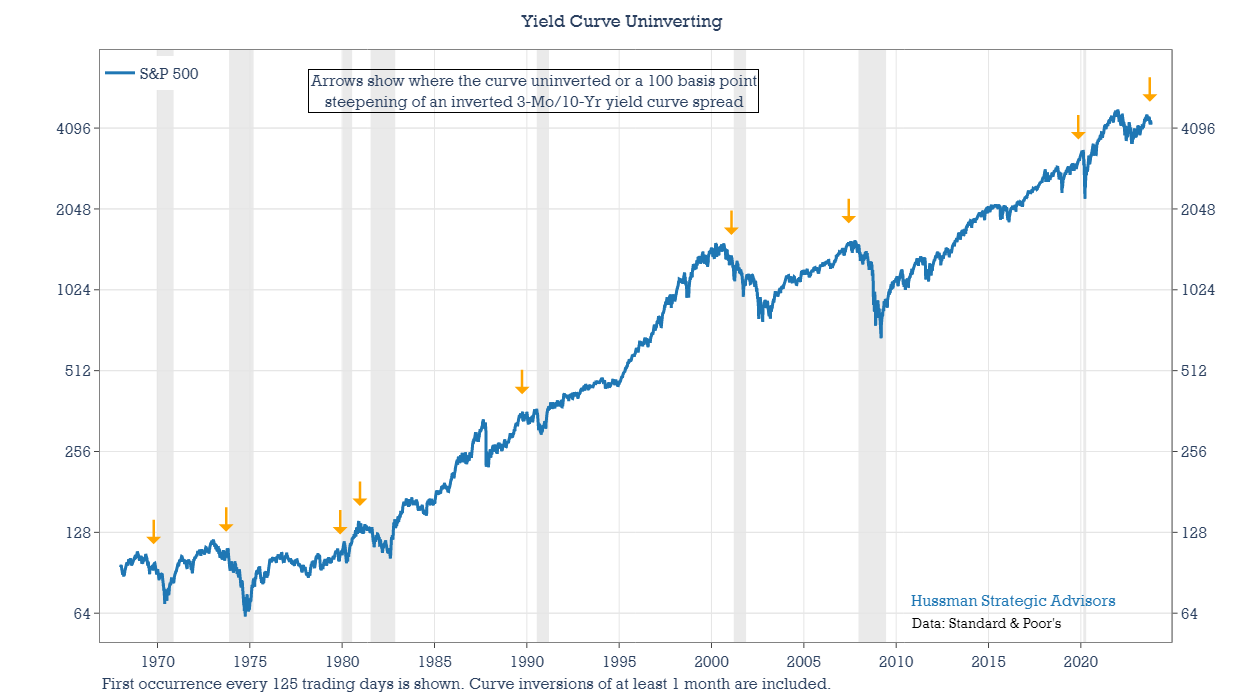
Much of the investment discussion this year has been about how poorly forecasts of recession have fared, because the economy has been resilient. But the actual message from a variety of indicators, including this one, suggests that it would have been strange for the economy to contract before now. Too much focus has been directed at the inversion of the curve, rather than the curve un-inverting or its recent steepening. Considering that the curve only steepened to a sufficient degree in recent weeks, the most reliable clock on recession expectations has only just started.
5) Watch for higher jobless claims coupled with stocks off of their highs
Claims are the most important data for markets in the year ahead.
– Michael Kantrowitz, Piper Sandler, August 4, 2022
One indicator supporting the argument for a “soft landing” – or at least a further “delayed landing” – is the level of Initial Jobless Claims. They’re up from their lows of January, but the 4-week average of the series has been trending lower since early July. Any change in this trend is worth monitoring, especially if stocks continue to slide. This relationship – which Piper Sandler’s Michael Kantrowitz has highlighted in his research – is an important one to watch through the end of the year.
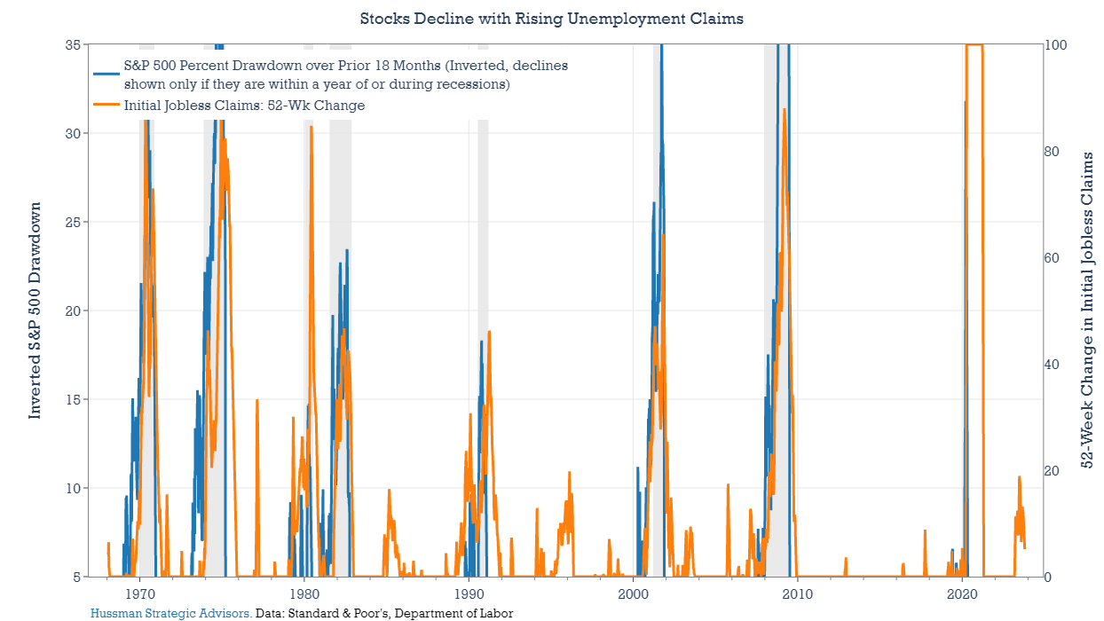
Historically, stock market investors have been very sensitive to rising jobless claims. To highlight this correlation, the blue line in the graph below shows only drawdowns in the S&P 500 that have occurred within a year of, or during, the past eight recessions. The series is inverted, so a rising blue line shows a decline in the S&P 500 Index. The orange line shows the 52-week change in jobless claims (showing positive values only). It’s rare for stock investors to ignore a persistent and substantial rise in jobless claims without sentiment quickly reversing toward bearishness.
Monitoring the combination of jobless claims and market action gives an even stronger signal. Earlier this year, jobless claims were rising, suggesting the labor market might begin to weaken. But the S&P 500 Index moved mostly higher during that period. Since the end of July, stocks have declined, but jobless claims have also been contained. Risk of recession is likely to grow, along with the risk of a deeper market decline, if claims rise and stocks fall in combination.
To get a sense of how the stock market behaves during these periods, the chart below divides the change in the S&P 500 Index into two portions. The blue line shows the cumulative return in periods when the S&P 500 Index was at least 5% from a recent high and the year-over-year change in jobless claims was up by at least 20 percent (re-entering the market after jobless claims fell 10 percent from a recent high). The orange line shows the change in the S&P 500 Index during all other times. Periods when markets are off their highs and jobless claims are rising have historically represented almost pure volatility, with deep potential drawdowns, and very little gain.
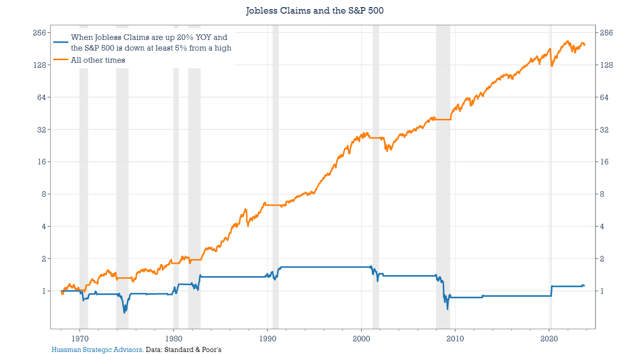
It’s important to note that, as with other recession models, standalone measures like this should not be used to gauge stock market risk, since steep market losses have often occurred without being accompanied by recession warnings. And these models tend to be late in suggesting when to become less risk averse. In the chart above, the gains in the blue line typically came at the end of recessions, prior to any improvement in the economic data.
6) Don’t take solace in forecasts of a “recession with a small r”
In a recent poll of economists, the World Economic Forum found that nearly two-thirds of the respondents believe there will be a recession in 2023. But here’s the good news: Many analysts expect a relatively mild and short recession, or what is sometimes referred to as recession with a small r.
– National Public Radio, January 2023
Even among strategists and economists that are still forecasting recession, the projections are almost always followed by a qualifier: that it will be a modest economic slowdown. In an article earlier this year, NPR referred to this as a “small r” recession. That may indeed turn out to be the case, but it’s important for equity investors to consider that their risks may not diminish all that much, even in the event of a “small r” recession.
Two primary drivers explain the extent of stock market drawdowns during recessions. One is the depth of the decline in the economy. Deeper economic contractions impact profits to a larger degree, and they take more time to recover from. Typically, this puts the longer-term cash flows that equity investors use to value stocks in jeopardy. The other driver is the starting level of valuations. Put simply, price multiples that are further from their longer-term averages have farther to fall.
The scatter graph below captures the relationship between depth of stock market losses during past recession-induced bear markets and a) the size of the contraction in the economy and b) the starting valuation. (I’ve left out the COVID-induced 2020 recession for this analysis because of its unique nature.)
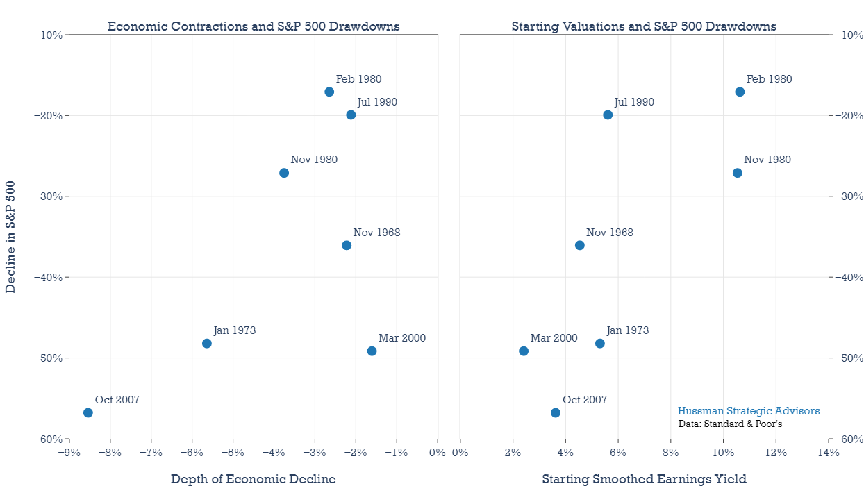
The scatter graph on the left shows the drawdown in stocks versus the contraction in the Conference Board’s Coincident Index during each recession. Thankfully, we don’t have a large sample of recessions during the last 50 years. Still, with the data that’s available, you can see that there has been a fairly good relationship between the depth of the recession and depth of the decline in the stock market. The very important exception is the market collapse that began in 2000. The 2001 recession was one of the mildest on record, but the S&P 500 Index fell nearly 50%. That’s because the market entered that recession at the highest valuations in history.
The scatter graph on the right shows S&P 500 drawdowns along with starting valuations. Notice that starting valuations and drawdowns have a slightly tighter fit than the relationship between drawdowns and the depth of economic declines. This relationship is important to keep in mind considering valuations remain extended. A “small r” recession could still coincide with a major bear market. It’s happened before.
7) Much of the damage to stock prices may come before recession is widely acknowledged
Selling stocks at the onset of a recession has proven profitable 100 percent of the time. The catch is a recession is likely be to be well underway before anybody notices, and economists may be the last to know.
– John Rothchild, The Bear Book
Three generalities are useful when it comes to the stock market and recessions. The first is that the market typically peaks prior to a recession, but how early it peaks and how much it declines prior to the start of the recession can vary greatly. Second, markets typically bottom prior to the end of a recession. There is some variability around the point in the recession when a market low typically occurs, but the window is narrower than it is around the market peak. Finally, by the time a recession is widely recognized, it is common for a large portion of the decline in stock prices to have already occurred.
The next three charts below highlight each one of these generalities. The first shows when the market has peaked in relation to the beginning of each recession. The vertical axis lists each U.S. recession since 1953. The horizontal axis measures the calendar days between the market peak and the beginning of each recession. The number above each circle shows the depth of the decline, in percent, that occurred prior to the onset of each recession. The size of the circle shows the relative extent of each decline.
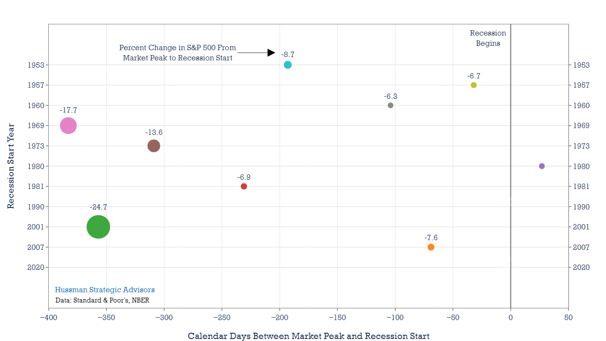
A few of the recessions – including the 1957, 1960, and 2007 had minor stock market losses prior to each start date. In 1990 and 2020 the market peaked essentially at each recession’s start date. The market actually peaked after the 1980 recession had begun. The largest declines occurred prior to the 1969, 1973, and 2001 recessions. These last three share some similarities. In each instance, stock market valuations were either stretched, or at record levels. Compression in valuation multiples kicked off each bear market. Losses caused by declining earnings and other fundamentals would come later. We may be living through something similar now, where last year’s market losses were mostly caused by price-multiple compression. Now investors are waiting for signs of potential recession.
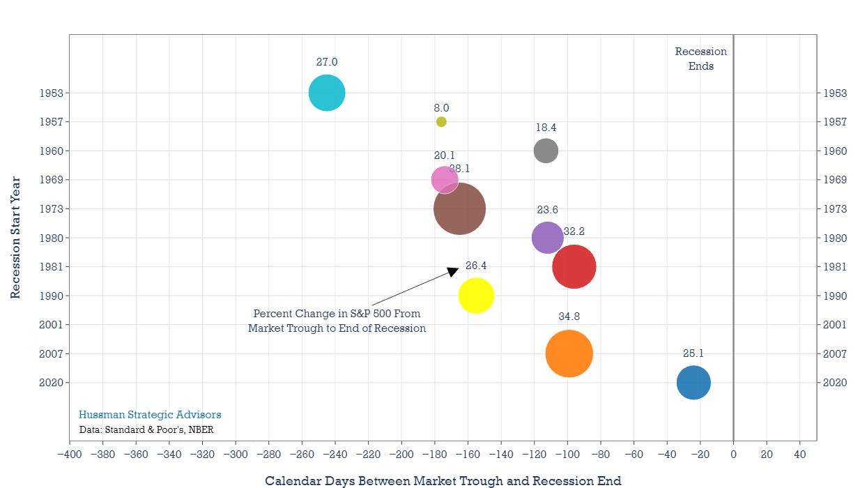
Markets have a much better record of anticipating the end of recession. When the end of a recession is approaching, markets tend to rally about 100 to 180 days prior. But it’s important to keep the 2000-2003 bear market in mind. There’s no dot shown below because the bottom came about a year after the end of the 2001 recession. As I mentioned above, the catalysts for market declines are fueled by both fears of recession and a retreat in the level of market valuations. Considering the extreme level of valuation reached at the peak of the market in early 2022, even a mild recession could spark much deeper market losses.
How certain do you need to be that a recession has started to be able to limit your exposure to the associated stock market losses? The chart below offers one framework for thinking about this question. The important annotations are the two vertical lines on the chart. The first line is set 100 days after each recession started. That’s the average point that economists and strategists forecast become convinced that the economy is falling into recession. I’ve estimated this from the Philadelphia Federal Reserve’s survey question about the likelihood that the economy will enter into recession in the current quarter. It’s a quarterly survey, so I’ve interpolated that probability between survey dates. That may be generous, but it provides an indication of when economists typically become convinced that the economy is falling into recession. More often than not, the recession is already well underway.
The second line is set at 220 days. That’s the average number of days that typically pass until the National Bureau of Economic Research (NBER) dates the beginning of the recession for the historical record. It’s worth noting that the NBER doesn’t try to forecast recessions in real-time. The job of the Dating Committee is strictly to define recessions for the historical chronology. Since the NBER waits until it’s convinced that a recessionary event has occurred, and that its determination would not change even if the economy recovered immediately, we can consider this date to be when a recession has become widely accepted. In truth, the date of when a recession is acknowledged by the majority of investors probably sits between these two dates. We can think of the span between these two lines as a window of time when a recession becomes increasingly recognized.
Another important part of the graphic is that each bear market has either one or two circles. If it has one circle, then that bear market lasted less than 220 days, and the decline listed by the circle is the final drawdown loss in the S&P 500. If a recession has two circles, that means the bear market lasted longer than 220 days. The first circle captures the maximum drawdown prior to the 220-day mark. The second circle captures the final actual drawdown. On the vertical axis, recessions are listed from earliest (1953) at the top to most recent (2020) at bottom.
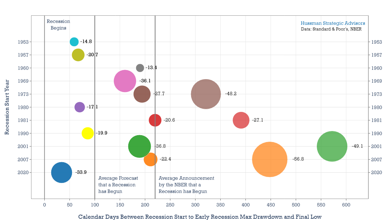
As an example of a bear market that extended past this window of recession recognition, look at 1973, when the S&P 500 Index had lost 27.7 percent prior to the 220-day mark. It would eventually fall 48.2 percent. Beginning in 2000, the market fell 36.8 percent prior to the 220-day mark and would end up falling 49.1 percent. In contrast, the earliest four recessions in the chart – 1953, 1957, 1960, and 1969 – the coinciding bear markets all ended prior to the 220-day mark. The market declines of 1953 and 1957 both ended prior to the 100-day mark.
These results suggest how challenging it is for investors to limit downside risk if they wait for a recession to become common knowledge. In five of the 11 recessions shown – 1953, 1957, 1980, 1990, and 2020 – the accompanying market losses occurred before the 100-day mark. The 1960 and 1969 recessions ended within the recession recognition window. Equally important, even in market declines that had longer durations and steeper drawdowns – like 1973, 1981, 2001, and 2007 – about half or more of the total losses typically emerged prior to the 220-day mark.
The primary drivers of major stock market declines – extended valuations, a sharp rise in interest rates, and growing recession risks – are rarely as elevated, in combination, as they are today. Even a “small r” recession could lead to a deep stock market decline, and the bulk of those losses could occur before the recession is even recognized.
Keep Me Informed
Please enter your email address to be notified of new content, including market commentary and special updates.
Thank you for your interest in the Hussman Funds.
100% Spam-free. No list sharing. No solicitations. Opt-out anytime with one click.
By submitting this form, you consent to receive news and commentary, at no cost, from Hussman Strategic Advisors, News & Commentary, Cincinnati OH, 45246. https://www.hussmanfunds.com. You can revoke your consent to receive emails at any time by clicking the unsubscribe link at the bottom of every email. Emails are serviced by Constant Contact.
The foregoing comments represent the general investment analysis and economic views of the Advisor, and are provided solely for the purpose of information, instruction and discourse.
Prospectuses for the Hussman Strategic Growth Fund, the Hussman Strategic Total Return Fund, the Hussman Strategic International Fund, and the Hussman Strategic Allocation Fund, as well as Fund reports and other information, are available by clicking “The Funds” menu button from any page of this website.
Estimates of prospective return and risk for equities, bonds, and other financial markets are forward-looking statements based the analysis and reasonable beliefs of Hussman Strategic Advisors. They are not a guarantee of future performance, and are not indicative of the prospective returns of any of the Hussman Funds. Actual returns may differ substantially from the estimates provided. Estimates of prospective long-term returns for the S&P 500 reflect our standard valuation methodology, focusing on the relationship between current market prices and earnings, dividends and other fundamentals, adjusted for variability over the economic cycle. Further details relating to MarketCap/GVA (the ratio of nonfinancial market capitalization to gross-value added, including estimated foreign revenues) and our Margin-Adjusted P/E (MAPE) can be found in the Market Comment Archive under the Knowledge Center tab of this website. MarketCap/GVA: Hussman 05/18/15. MAPE: Hussman 05/05/14, Hussman 09/04/17.