

Grasping at the Suds of Yesterday’s Bubble


John P. Hussman, Ph.D.
President, Hussman Investment Trust
June 2023
The desire for more, the fear of missing out, the tendency to compare against others, the influence of the crowd and the dream of the sure thing – these factors are near universal. Thus they have a profound impact on most investors and most markets. The result is mistakes, and those mistakes are frequent, widespread and recurring.
Rather than trying to figure out the future, try to figure out where we are in the market cycle, make adjustments if necessary when close to the extremes, and prepare mentally to avoid behavioral mistakes that plague investors throughout. The key is to watch for investor behavior that typically emerges, especially at the extremes of the cycle.
– Howard Marks, The Most Important Thing
I’ve often noted that asking me whether stocks are in a bull market or a bear market is like asking Christopher Columbus whether he thinks the trees at the edge of the Earth are maples or pines. I just don’t look at the world that way. Bull markets and bear markets can’t be identified in real time – only in hindsight. More importantly, the return/risk profile of a “bull market” or a “bear market” can change dramatically depending on whether valuations are consistent with the beginning of a market cycle or the end of one. The terms bull and bear are inadequate to capture all the variations in observable, measurable conditions that shape the market return/risk profile that investors face at any point.
Phrases like “bull market” and “bear market” can create a false sense of security because they seem to offer investors assurance about extended market direction – witness the constant chatter here about a “new” bull market that has “legs.” Words like that, often dressed up with adjectives like “official” to boost their respectability, quietly encourage investors to think “this thing is going to go up for a very long time.” So shiny.

The problem here is that the S&P 500 now stands just 8% below its 2022 bubble peak. Whether it gets back to that peak, or not, doesn’t really change where we are in the cycle. Our most historically reliable valuation measures stand at or above their 1929 and 2000 extremes, exceeding every level seen in history prior to October 2020, with the exception of a few weeks surrounding the 1929 bubble peak. Meanwhile, our measures of market internals remain unfavorable, interest rates are nowhere near zero, long-term bond yields – as we’ll see – remain inadequate, and recession risk is quickly increasing.
The most important considerations in our investment discipline are 1) valuations – which drive long-term returns and the potential depth of interim market losses over the complete market cycle; 2) market internals across a broad range of individual stocks, industries, sectors, and security-types, which we use to distinguish speculative investor psychology from risk-aversion during shorter segments of the market cycle; and 3) syndromes of conditions that help to identify extremely compressed or overextended market conditions that often define market extremes – although we’ve sharply reduced our reliance on this third element of our discipline in recent years, particularly when market internals are favorable.
If you want my opinion on the bull/bear debate, which will change as market conditions change, my impression is that the current market advance is a narrow and selective speculative blowoff – a bear market rally driven by fear of missing out on the resumption of a bubble that is actually in the early stage of collapse – and that the equity market is likely to suffer profound losses over the completion of the full market cycle. Even so, an improvement in our measures of market internals would temporarily suspend my near-term “bearish” outlook. In contrast, our long-term and full-cycle views are driven by valuations, and a further market advance would only make those long-term expectations more negative.
Let’s begin by reviewing the current condition of our most important and reliable considerations: valuations, and market internals, along with a brief but essential reminder of how we’ve changed our response to speculative “limits” in recent years.
Valuations and red ink
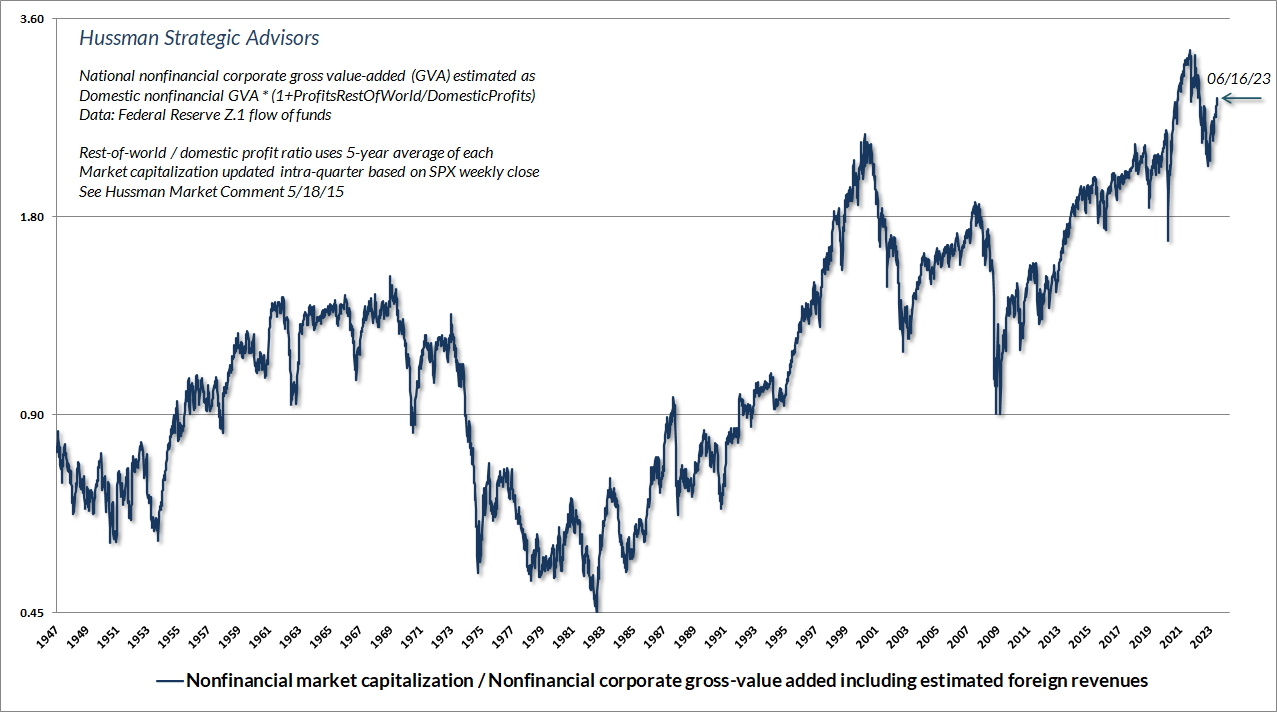
A security is nothing but a claim to a future stream of cash flows that investors expect to be delivered into their hands over time. The long-term returns investors can expect from those cash flows are inseparable from the price investors pay for those cash flows. The chart below shows our most reliable valuation measure – the ratio of nonfinancial market capitalization to corporate value-added, including estimated foreign revenues.
MarketCap/GVA is essentially an economy-wide, apples-to-apples price/revenue ratio, and is more strongly correlated with actual subsequent S&P 500 total returns in market cycles across history than any other measure we’ve studied or introduced over time. These include measures such as price/forward operating earnings, the Shiller CAPE, MarketCap/GDP, and the Shiller-Black-Jirav “Excess CAPE Yield,” and the “Fed Model” that compares the S&P 500 forward operating earnings yield with 10-year Treasury yields.
The chart below shows the relationship between MarketCap/GVA and subsequent 12-year S&P 500 total returns in data since 1928.
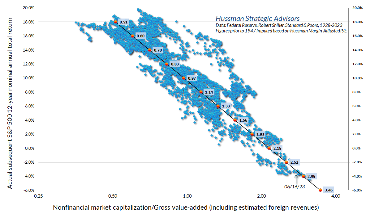
As I detailed in The Structural Drivers of Investment Returns, once we know the starting valuation of the market and dividend yield of the S&P 500, the arithmetic of returns dictates that there are really only two factors that will determine future investment returns: a) the growth rate g of whatever fundamental we’ve chosen, and b) the valuation multiple V at the end of our investment horizon T. That’s true for any fundamental we choose. It’s just arithmetic.
Average annual total return = (1+g) x (V_future / V_today)^(1/T) – 1 + average dividend yield
The more predictability there is around those two factors – long-term growth and ending valuations – the more reliable the valuation measure. That’s exactly why it’s preferable to use fundamentals with smooth and predictable long-term growth rates, and to use a denominator that’s representative and proportional to the very, very, very long-term stream of cash flows that companies will deliver to investors over time.
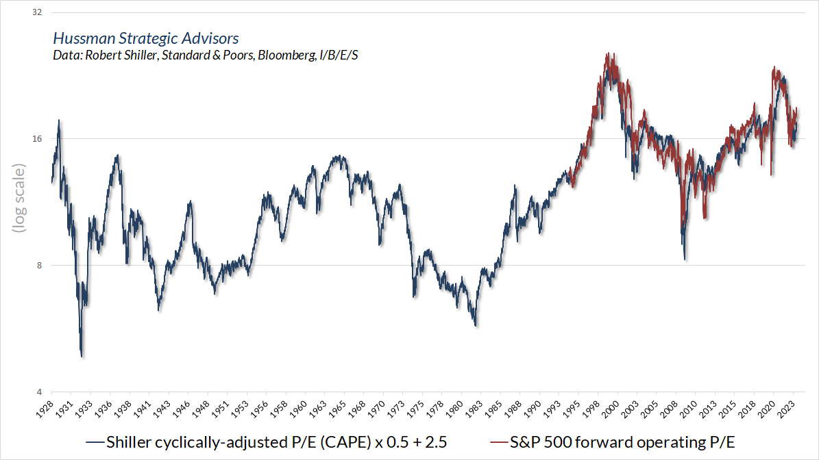
While earnings are essential in generating cash flows, earnings measures are actually poor choices for the denominator of a valuation multiple. That’s mainly because profit margins vary over time in ways that destroy the predictability of both the future growth rate and the future valuation multiple. The Shiller cyclically-adjusted P/E (CAPE) based on 10-year average earnings, and the “forward operating P/E ratio” based on Wall Street estimates of year-ahead earnings, are essentially attempts to reduce the variation.
As a side note, we’re always perplexed at the willingness of investors to accept the valuation arguments of Wall Street without questioning the data. Case in point is the forward operating P/E of the S&P 500. The fact is that “forward operating earnings” only came into widespread use in the 1990’s. The “norms” being cited for the forward P/E are limited to the period since then. Fortunately, there’s enough correlation between the forward operating P/E and the Shiller CAPE that we can get a sense of where the forward P/E (currently 19) stands from a longer-term historical perspective. The picture isn’t encouraging. Even taking current earnings, profit margins, and Wall Street estimates at face value, these are bubble valuations.
Using fundamentals that are smooth and “representative” of long-term economic and corporate cash flows significantly reduces our main sources of uncertainty: a) the future growth rate of fundamentals, and; b) the future valuation multiple. There’s an additional benefit. It turns out for fundamentals that are linked to the economy – for example, corporate revenues, nonfinancial gross-value added, and nominal GDP – future growth rates and future valuation multiples are typically related in a way that significantly reduces the overall uncertainty, regardless of future surprises in either.
Here’s why. Investors have a very strong tendency to “anchor” their expectations for Treasury yields based on average nominal GDP growth over the previous decade. And they also have a strong tendency to value stocks based on prevailing Treasury yields (though they sometimes go way too far). In data since 1947, there’s a correlation of about 0.9 between the prevailing level of 10-year Treasury yields and the growth rate of nominal GDP over the preceding decade. Likewise, there’s a correlation of about -0.8 between the prevailing level of MarketCap/GVA and the growth rate of nonfinancial gross value-added during the preceding decade.
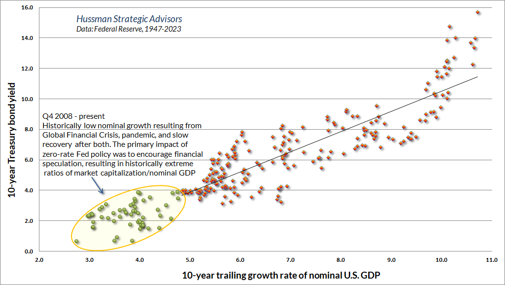
Think about what all this means. In periods when nominal growth is above average – because of persistent inflation for example – long-term interest rates tend to be higher at the end of the period, and equity valuations tend to be lower. The same is true in periods when nominal growth is below average – because of disinflation for example – long-term interest rates tend to be lower at the end of the period, and equity valuations tend to be higher. In both cases, our two main sources of future uncertainty have offsetting effects, leaving current, observable valuations as the primary driver of long-term and full-cycle returns. As I detail more fully in Headed For the Tail (see the “Geek’s Note”), this is neither a modeling error nor a peculiar claim. It’s systematic and unsurprising.
This is also part of the reason our long-term return projections use nominal returns rather than real returns. If you want an estimate of real returns, just estimate nominal returns and then subtract your personal forecast of inflation. Believe me, it doesn’t help to embed theoretical assumptions about inflation (such as the “Fisher effect”) into the model. Moreover, if you spend time with economic data, you’ll discover that the best predictor of future inflation is current inflation, and the second-best predictor is the year-ago inflation rate. Other factors are useful, and U.S. inflation does tend to mean-revert of a period of multiple years, but the predictability of inflation, and its relationship to recession, unemployment, deficits, Fed behavior, and everything else is nowhere near what investors seem to assume.
Presently, the expectations of investors are still focused on the rear-view of the past decade, essentially embedding a quick resumption of zero interest rates and “below target” inflation into asset prices. We can’t and don’t rule that out, but inflation tends to be much “stickier” – even in recessions – than investors seem to assume. As I note in the next section, in the unlikely event that valuations remain permanently elevated, we’ll let an improvement in market internals shift us to a constructive outlook.
I’ve addressed questions relating to profit margins and S&P 500 composition in a broad range of previous comments – see Headed for the Tail for an extensive analysis. For now, suffice it to say that it’s very difficult to wiggle out of the implications of current valuation extremes.
If you want my opinion on the bull/bear debate, which will change as market conditions change, my impression is that the current market advance is a narrow and selective speculative blowoff – a bear market rally driven by fear of missing out on the resumption of a bubble that is actually in the early stage of collapse – and that the equity market is likely to suffer profound losses over the completion of the full market cycle.
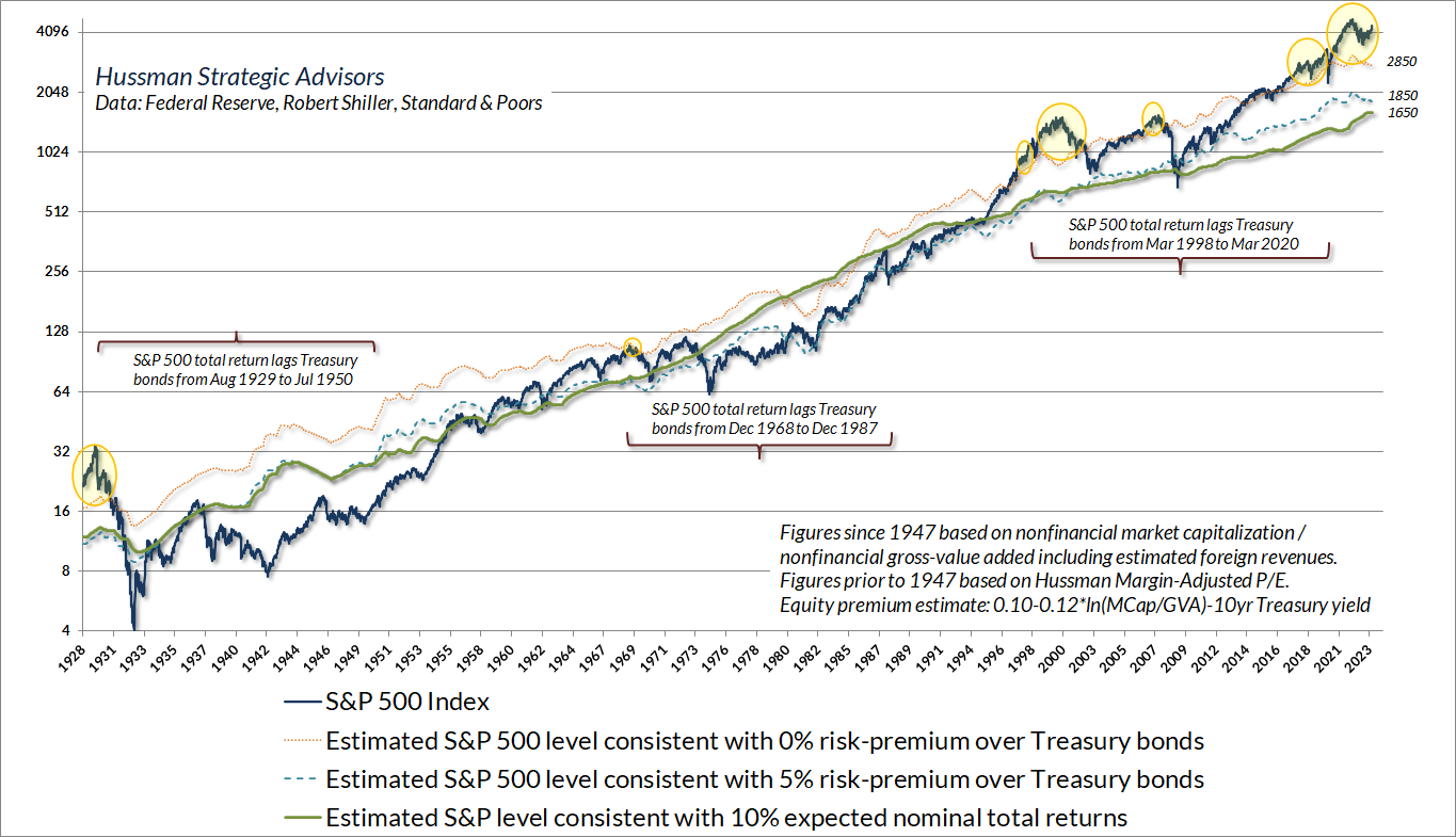
The opening quote from Howard Marks encourages investors to “try to figure out where we are in the market cycle.” The chart below offers a long-term perspective on that question. The solid green line shows the level of the S&P 500 that we associate with average expected nominal returns of 10% annually. At each point in history, the distance between the S&P 500 and that green line mirrors the distance between MarketCap/GVA and its historical norm. The green line presently stands at about 1650 on the S&P 500. For the index to be above that line isn’t to say that the market has to fall, only that expected returns are likely to be less than that 10% historical norm. The depth of the 1929-1932, 2000-2002, and 2007-2009 market collapses suddenly make more sense, don’t they?
The dashed blue line shows the level of the S&P 500 that we would associate with a historically run-of-the-mill 5% “risk premium” over-and-and above Treasury bond yields. That line stands at about 1850 here. Finally, the dotted orange line shows the level of the S&P 500 that we would associate with zero return over and above Treasury bond yields. That line stands at about 2850 here, correctly suggesting that we expect the S&P 500 to sharply lag the return on Treasury bonds over the coming years. Of course, that’s happened before. The yellow bubbles show previous instances when S&P 500 valuations implied total returns below Treasury bond returns. I’ve included several brackets, showing that from 1929-1950, 1968-1987, and 1998-2020, that’s exactly what happened. I don’t expect the current instance to be different.
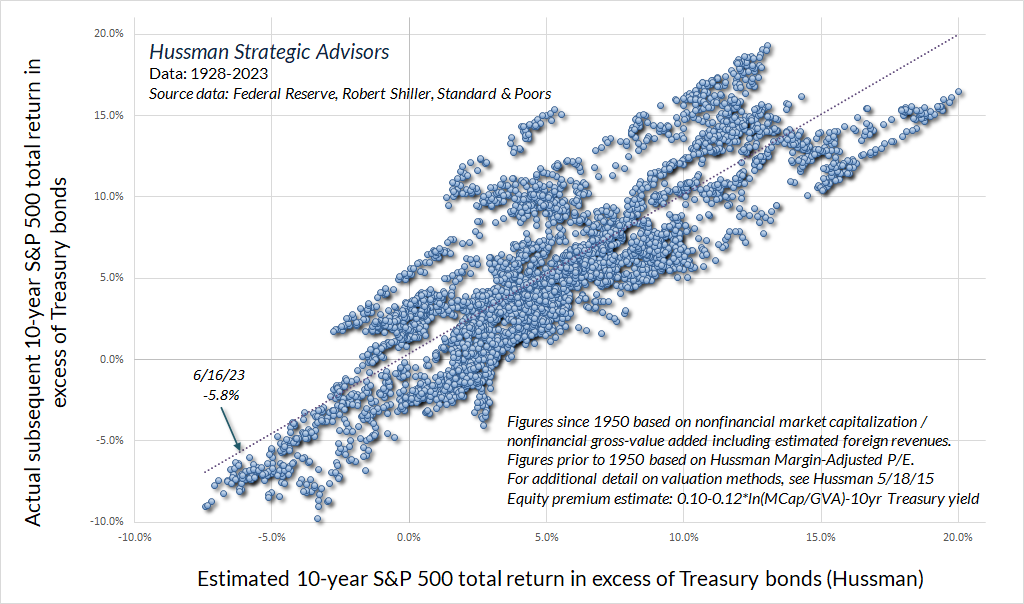
The chart below shows our best estimate of the “equity risk premium” for the S&P 500, in data since 1928. The current estimate is -5.8% annually over the coming decade. We expect stocks to sharply underperform bonds in the coming years. This estimate is far more reliable across history than the Shiller-Black-Jirav model as well as Wall Street’s standard estimate, which is based on the forward earnings yield minus the 10-year bond yield. Emphatically, the chart below isn’t the result of multiple regression, curve-fitting, or data mining. The estimate for the S&P 500 is linear in one variable: MarketCap/GVA. The risk-premium estimate then subtracts the prevailing 10-year Treasury yield. That’s it.
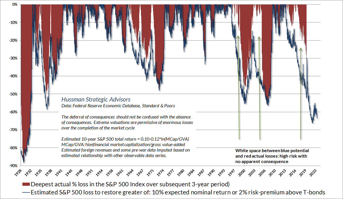
The completion of market cycles across history typically restored S&P 500 expected returns to the higher of a) 10% nominal returns or; b) a 2% risk-premium over-and-above Treasury bond yields. The blue “cups” in the chart below show the market loss required to reach those levels, at each point across history. Notice that overvaluation and the risk of deep losses certainly doesn’t mean market losses will emerge immediately. To the contrary, rich valuations are often followed by a great deal of “white space” where overvaluation can temporarily appear to have no consequences at all. Unfortunately, those blue cups eventually tend to be filled with red ink. At present, that would require a loss on the order of -63% in the S&P 500. That’s the prospect that a decade of zero-interest quantitative easing, yield-seeking speculation, and record equity valuations has created.
Market internals, QE, and speculative “limits”
Of course, there is always a reason for fluctuations, but the tape does not concern itself with the why or wherefore. It doesn’t go into explanations. I didn’t ask the tape why when I was fourteen, and I don’t ask it today at forty.
– Jesse Livermore, Reminiscences of a Stock Operator
The information contained in earnings, balance sheets, and economic releases is only a fraction of what is known by others. The action of prices and trading volume reveals other important information that traders are willing to back with real money. This is why trend uniformity is so crucial to our Market Climate approach. Historically, when trend uniformity has been positive, stocks have generally ignored overvaluation, no matter how extreme. When the market loses that uniformity, valuations often matter suddenly and with a vengeance. This is a lesson best learned before a crash rather than after one.
John P. Hussman, Ph.D., October 3, 2000
One of the best indications of the speculative willingness of investors is the ‘uniformity’ of positive market action across a broad range of internals. Probably the most important aspect of last week’s decline was the decisive negative shift in these measures. Since early October of last year, I have at least generally been able to say in these weekly comments that “market action is favorable on the basis of price trends and other market internals.” Now, it also happens that once the market reaches overvalued, overbought and overbullish conditions, stocks have historically lagged Treasury bills, on average, even when those internals have been positive (a fact which kept us hedged). Still, the favorable market internals did tell us that investors were still willing to speculate, however abruptly that willingness might end. Evidently, it just ended, and the reversal is broad-based.
John P. Hussman, Ph.D., July 30, 2007
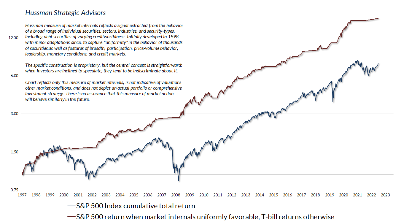
The quotes above convey the essential character of market internals – what I originally described as “trend uniformity” when I introduced this element to our discipline in 1998. I’ve come to prefer the phrase “market internals” because in practice, we extract a signal from prices, volume, uniformity, divergence, sentiment, and risk-premiums based on the market behavior of thousands of individual stocks, industries, sectors, and security types, including debt securities of varying creditworthiness. Market internals are among the only aspects of our discipline that we keep proprietary, largely because shifts are discrete, and one does not want to be shifting investment positions at the same moment as everyone else. Still, we’re very open about the central concept: when investors are inclined to speculate, they tend to be indiscriminate about it.
The chart below presents the cumulative total return of the S&P 500 in periods where our main gauge of market internals has been favorable, accruing Treasury bill interest otherwise. The chart is historical, does not represent any investment portfolio, does not reflect valuations or other features of our investment approach, and is not an assurance of future outcomes.
Data: Hussman Strategic Advisors, Standard & Poors
It’s fair to ask, if market internals have continued to reliably navigate the market during the recent bubble, why did we have so much difficulty in the face of QE? The answer is that, in addition to valuations and market internals, our discipline has always included a third consideration – overextended conditions. Following the global financial crisis, I insisted on stress-testing our methods against Depression era outcomes. Ironically, the methods that emerged from that stress-testing effort strengthened our response to those overextended conditions.
In every other market cycle across history, there was always a “limit” to speculation. Prior to 2008, the S&P 500 had regularly lagged Treasury bills in conditions that we identified as “overvalued, overbought, and overbullish,” even when our measures of market internals were favorable. You’ll see that observation in my July 30, 2007 quote above. Those overextended conditions were often accompanied or quickly followed by deterioration in market internals, and it was best to act preemptively. This sequence unfolded in cycles across history, including 1973-1974, 2000-2002, and 2007-2009, as well as 1929-1932 based on imputed sentiment data.
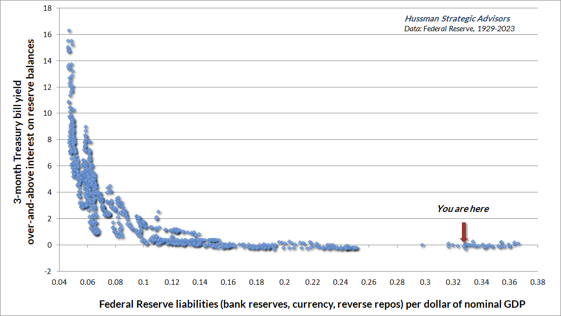
In 2008, the Federal Reserve embarked on its experiment of quantitative easing, driving the amount of zero-interest Fed liquidity (mainly bank reserves) to an unprecedented percentage of GDP. Nobody could actually put those speculative hot potatoes “into” stocks, or bonds, or anything else without the stuff coming right back “out” in the hands of a seller.
The difficulty for our own discipline, particularly between 2012 and 2017, was that 16% of GDP in zero-interest liquidity – eventually peaking above 36% of GDP – made investors lose their minds. They imagined that they had no alternative but to speculate, regardless of the level of valuations. Each successive holder passed the stuff to the next, in a frantic attempt to get rid of it by chasing some asset that offered the hope of something more than zero, removing every historically reliable “limit” to speculation.
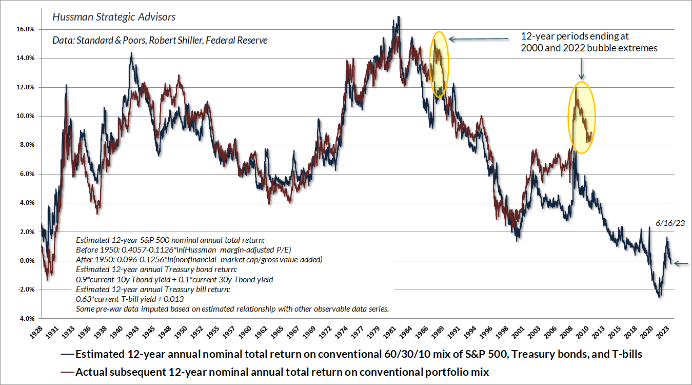
It didn’t matter to investors that they had quietly driven stock and bond prices to levels that implied the lowest prospective future returns in history. All that mattered was that stock and bond prices were going up, and the alternative was “zero.” The chart below shows our estimate of the likely 12-year total return on a conventional portfolio allocation invested 60% in the S&P 500, 30% in Treasury bonds, and 10% in Treasury bills. In late-2021, as the Fed drove the amount of zero-interest liquidity to 36% of GDP, this projection dropped as low as -2.5%. Last week, it dropped back below zero. New bull market indeed.
Amid the zero-interest rate speculation engineered by the Fed, our bearish response to historical “limits” was utterly detrimental. You want the backstory of how someone who admirably navigated complete market cycles for decades became known as a “permabear”? That’s how. It’s best to understand that story, why it happened, and how we’ve adapted (below), because investors who ignore market extremes here, in the absence of favorable valuations, favorable market internals, or zero interest rates, amid all the other elements of historically-informed discipline that remain reliable, they may get their heads handed to them over the completion of this cycle.
How have we adapted to a Federal Reserve that could very well pursue more zero-interest QE in the future? In 2017, amid zero-interest rate quantitative easing that encouraged speculation beyond every historically reliable “limit,” we abandoned our bearish response to overextended conditions when market internals remain favorable. In 2021, we extended that adaptation even further, establishing criteria that Benjamin Graham might describe as “intelligent speculation” – albeit with position limits and safety nets – that will encourage a constructive investment outlook in the majority of periods with favorable market internals, regardless of the level of valuations. There will still be some periods when market conditions encourage a neutral investment outlook even when market internals are favorable, but we no longer adopt or amplify a bearish investment stance in those periods, regardless of how extreme the speculation might become.
It’s worth noting that the “cash on the sidelines” the Fed created is still there, held indirectly as bank deposits far beyond FDIC insurance limits, and as balances in money market funds that get pledged back to the Fed every night so they can earn interest. That cash is there because the Fed put it there. It doesn’t need to “find a home.” It’s always home. It can change hands, but it never turns into anything else. The only question is who holds it. Presently, banks are getting 5.15% interest to hold it. Money market funds are getting the same amount of “interest” through reverse repurchases with the Fed. You’d better think about that very carefully, because the zero-interest aspect that drove speculation during QE is no longer there.
For a deep and comprehensive analysis of Fed liquidity, who holds it, and how it relates to banks, financial markets, and the economy, see our May comment – Money, Banking, and Markets – Connecting the Dots.
In the simplest possible terms, our key adaptation to QE has been to rely far more on our tried-and-true measures of market internals and far less on speculative “limits.” Those “limits” may have been reliable across history, but the lesson of the QE bubble is that we can no longer rely on speculation to have a reliable “limit” when market internals are favorable.
“Don’t fight the tape” beats “Don’t fight the trend”
Even if we can’t know – in real time – whether it’s a bull market or a bear market, what if we proxy bull markets with observable data, for example, by “defining” a bull market by a 20% advance from the low, or by asserting that an S&P 500 above its 40-week moving average is a “bull market”?
Those definitions have become increasingly popular. Unfortunately, the “20%” definition forces one to say that there were 5 separate bull markets for the Dow Industrials in the midst of the 1929-1932 market collapse, 4 separate bull markets for the S&P 500 during the 2000-2002 collapse, and 6 separate bull markets for the Nasdaq 100 during the 83% plunge that followed the tech bubble.
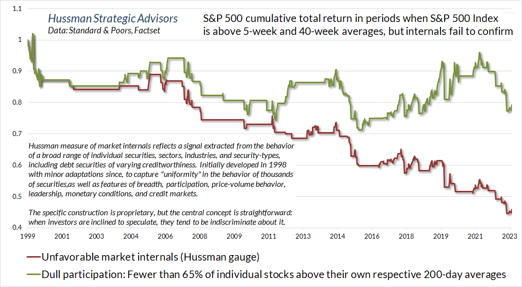
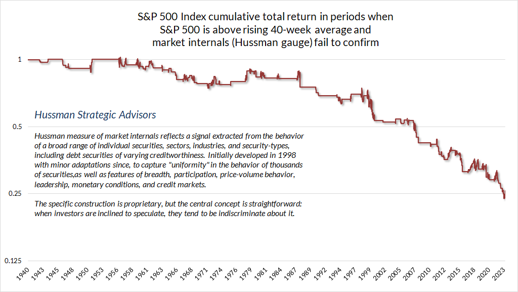
Likewise, defining a bull market as the S&P 500 above its 40-week average may be attractive, but the fact is that the S&P 500 has historically lost ground when such advances occur in the face of tepid participation or unfavorable market internals on our own measures. It’s possible for advances to begin with the S&P 500 and then extend to the broad market, but it tends to happen the other way around. Most often, the market loses value in periods when the S&P 500 is above various trend-following averages but internals fail to confirm.
For that reason, I strongly prefer the phrase “Don’t fight the tape” to the phrase “Don’t fight the trend.” The word “tape” is a reminder that the market loses value, on average, when the troops are out-of-step with the generals. The real information is in uniformity and divergence across securities.
Data: Hussman Strategic Advisors, Standard & Poors
We see the same outcome when we examine market internals in data across history. When the trend of the S&P 500 is unconfirmed by broad market internals, “don’t fight the tape” typically beats “don’t fight the trend.”
 Data: Hussman Strategic Advisors, Standard & Poors
Looking only at the advance in the S&P 500, without the context of still-unfavorable internals, investors have been encouraged to follow the advice of Chuck Prince, the former CEO of Citigroup: “As long as the music is still playing, you’ve got to get up and dance.” The problem is that when Prince made that comment in 2007, the housing bubble had already peaked. Citigroup went on to lose 98% of its value. Be careful what you call “music.” Sometimes it’s just Brünnhilde in a helmet, singing the Götterdämmerung about the end of the world.
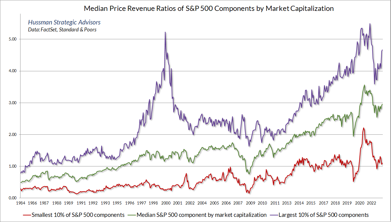
What’s actually happening underneath the surface is that a handful of large glamour stocks, already at rich valuations, are enjoying a speculative blowoff, largely driven by enthusiasm about artificial intelligence. Meanwhile, valuations have retreated for the majority of stocks. Don’t get me wrong – the valuations of smaller S&P 500 components remain well above their 2000 and 2007 peaks even here, but it’s clear that a handful of large cap stocks have made a speculative run for it.
That sort of dispersion typically creates temporary headwinds for hedged equity strategies that hold a diversified portfolio of stocks and hedge market risk using capitalization-weighted indices. Those headwinds can be irritating and uncomfortable on a day-to-day basis, but as our longer-term followers know, two-tier market behavior isn’t unusual during a late-stage speculative blowoff. As Howard Marks advised, “the key is to watch for investor behavior that typically emerges, especially at the extremes of the cycle.”
The chart below shows what’s happening. It presents the median price/revenue ratio of S&P 500 components, the largest 10% of components, and the smallest 10% of components, sorted by market capitalization.
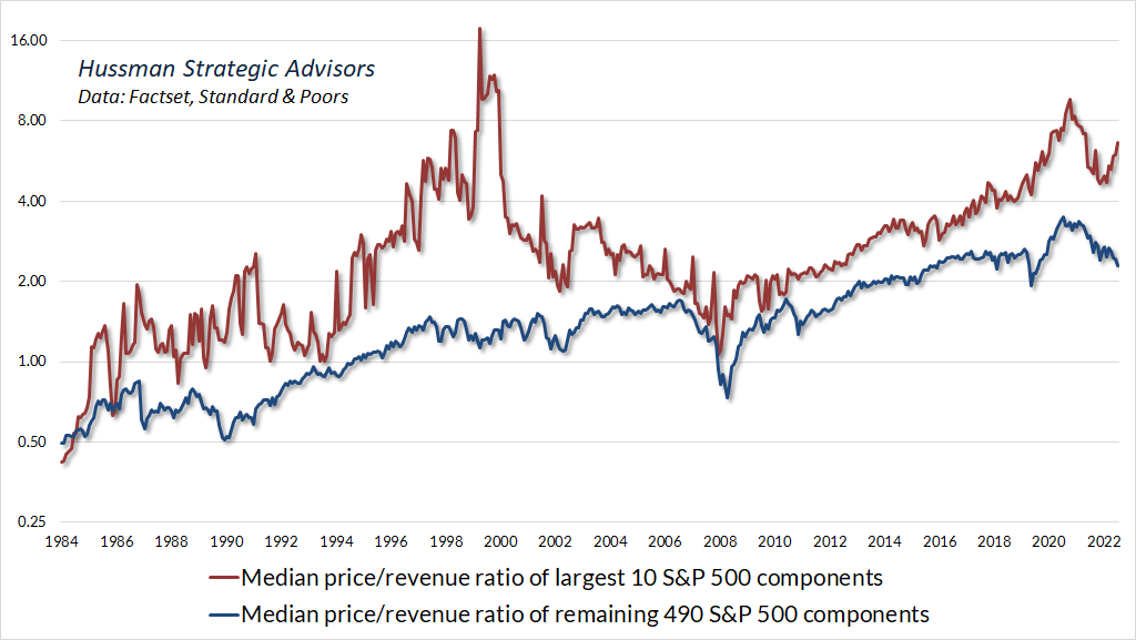
The recent two-tier behavior is even more striking if we narrow our focus to the 10 largest components of the S&P 500, compared with the remaining 490 components.
Meanwhile, the following chart shows the year-over-year revenue growth rate of glamour tech stocks dubbed the “Magnificent Seven” – never mind that most of the Magnificent Seven died by the end of the movie.
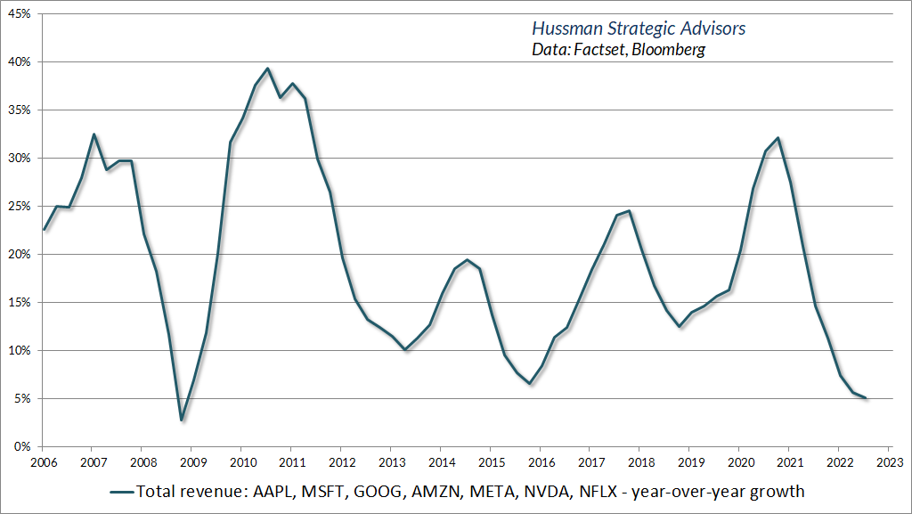
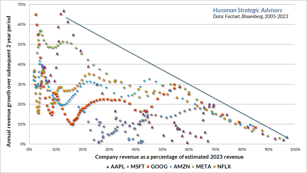
As usual, investors seem to forget that as companies grow to represent a dominant share of their markets, their growth rates inexorably slow. Yet investors tend to pay up for the dominance. This is reminiscent of the “Nifty Fifty” mania that preceded the 1973-74 collapse, the “Onics/Tronics” mania of the Go-Go years that preceded the 1969-70 collapse, and of course, the late-1990’s tech bubble. The chart below is a version of a chart that I presented years ago featuring the glamour stocks of 2000. The names have changed, but the picture is largely the same.
Despite tepid market internals, we can’t entirely rule out a continuation of two-tier behavior for a while. In the meantime, it’s possible for hedged equity strategies to modify the return/risk profile of a portfolio using positions like contingent call option exposure (“anti-hedges”). Ultimately, the gains that glamour stocks enjoy during speculative blowoffs are typically surrendered during periods of unfavorable internals – just not always immediately. I don’t expect the current episode to be different in that regard.
The Nifty Fifty appeared to rise up from the ocean; it was as though all of the U.S. but Nebraska had sunk into the sea. The two-tier market really consisted of one tier and a lot of rubble down below. What held the Nifty Fifty up? The same thing that held up tulip-bulb prices long ago in Holland – popular delusions and the madness of crowds. The delusion was that these companies were so good that it didn’t matter what you paid for them; their inexorable growth would bail you out.
– Forbes Magazine, 1977, The Nifty Fifty Revisited
Economic risks are increasing
With regard to the economy, my impression is that recession risks are increasing but will only become pointed when we observe clear deterioration in the labor market, which is always and everywhere a lagging indicator.
The chart below presents our economic activity composite, based on numerous regional and national purchasing manager and Federal Reserve surveys.
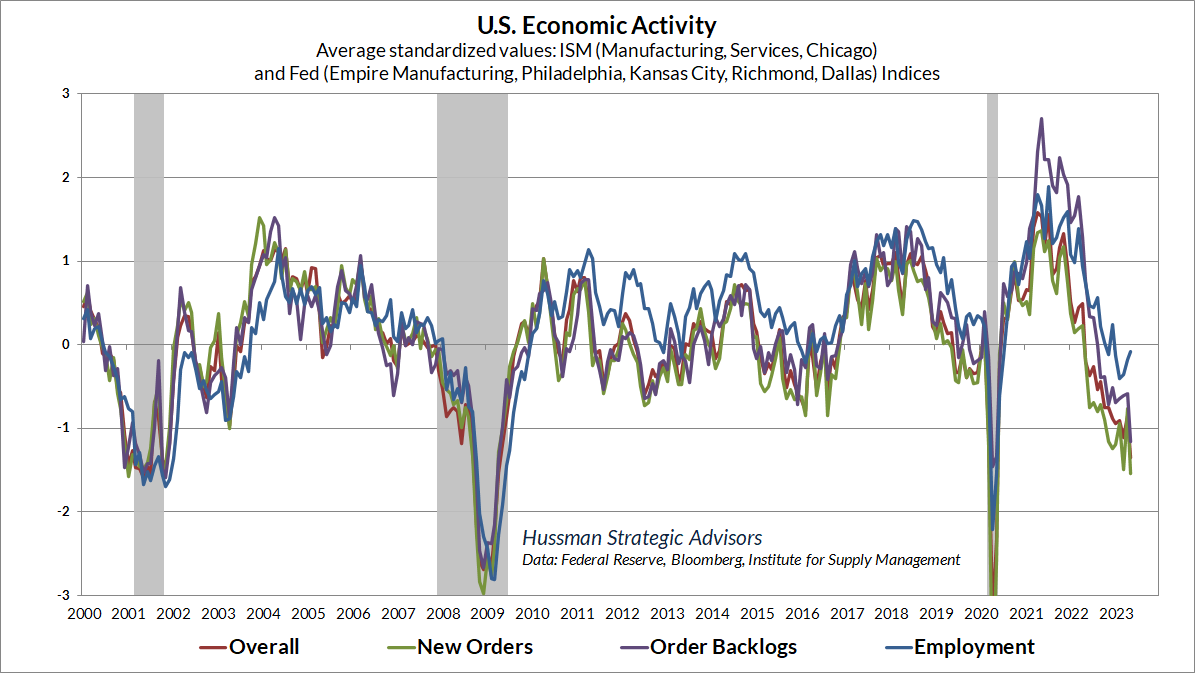
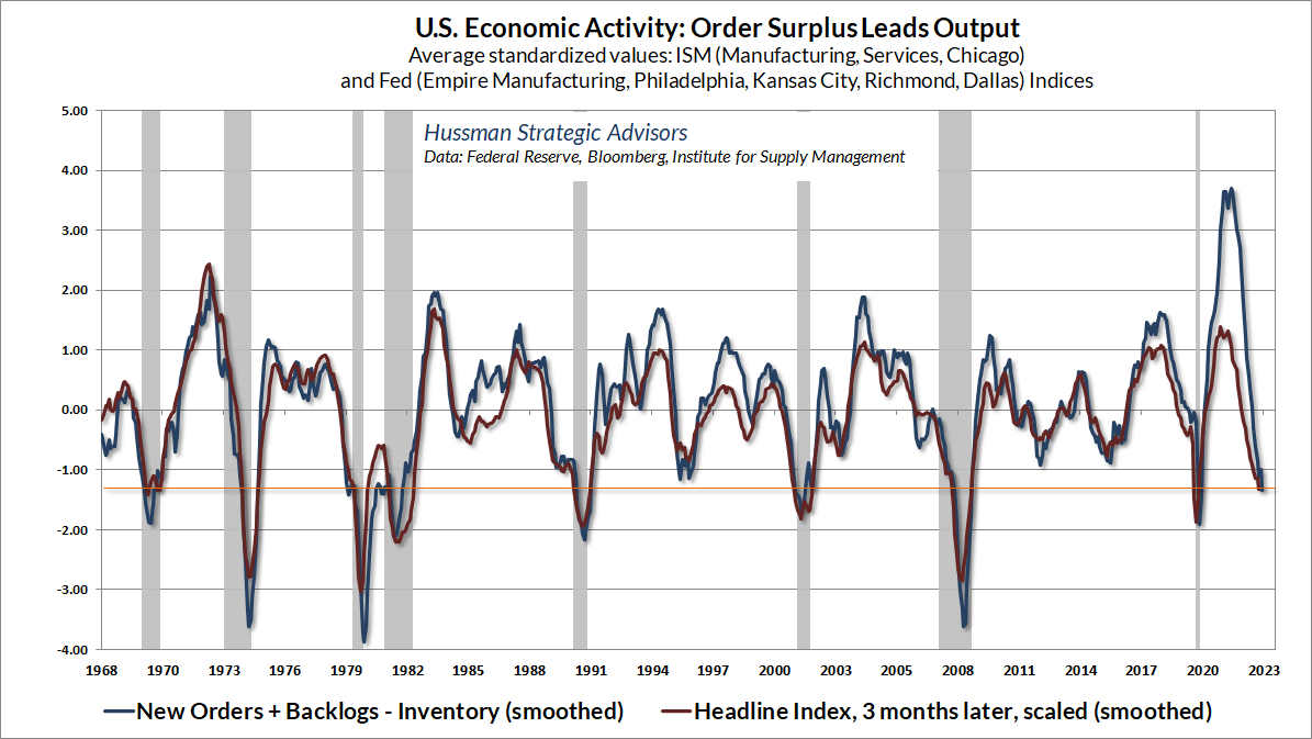
Among the measures we track separately is what we call “order surplus”: new orders, plus order backlogs, minus inventories. This essentially shows the level of pressure on new production, and tends to lead the headline activity figures by several months. This measure is already at levels that have historically been associated with oncoming recession.
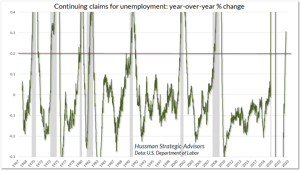
While the growth in nonfarm payroll employment has remained strong, employment tends to lag the order surplus by about 6 months, and the recent jobs numbers have actually been fairly consistent with the order surplus data that we observed last November. It’s employment in the coming six months that we would expect to weaken. Indeed, we’re already seeing deterioration in some of the weekly figures like initial and continuing claims for unemployment insurance. We’ve seen quite a bit of variation in employment figures since the pandemic, so we’re not quite as confident in these figures as we might be otherwise, but historically, we’ve never seen continuing claims rising by more than 20% year-over-year except in a recessionary context.
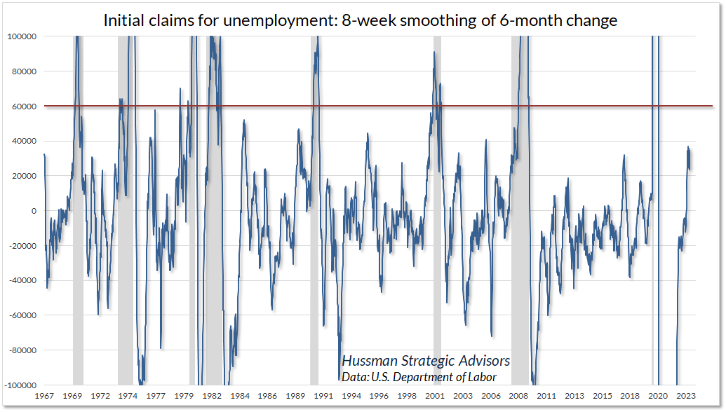
As for initial claims, they’ve increased materially in recent weeks, but we’re still some distance from the typical recessionary threshold. A word of caution though. Typically, initial claims for unemployment only break decisively above that threshold once a recession has begun or is underway. Rising unemployment is typically the last thing that goes “click” as a recession begins.
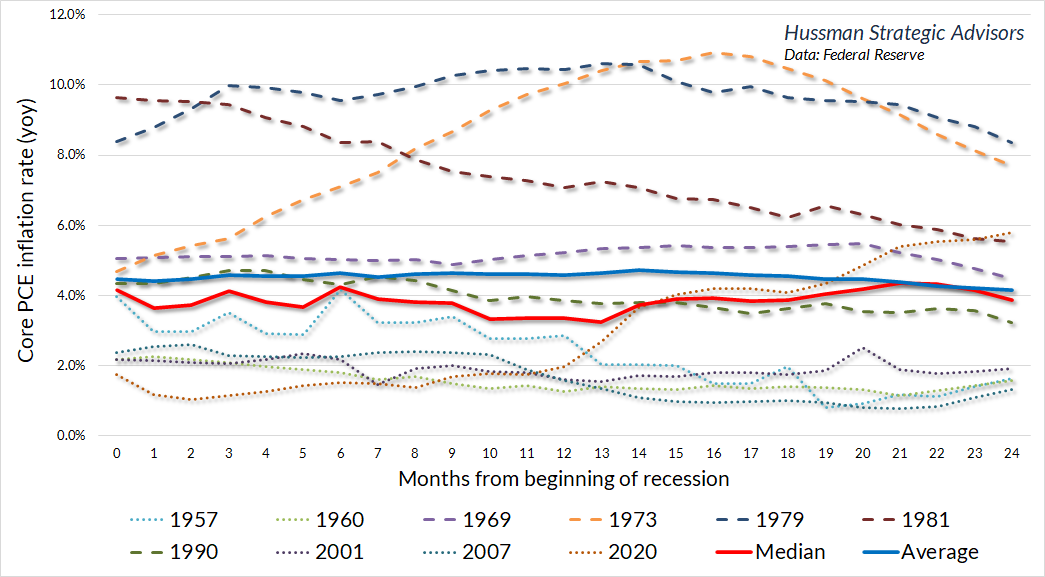
Despite our growing – though still not decisive – expectations of a recession, it’s important to understand that much of what investors believe about the relationship between recessions, inflation, and bond yields is not actually supported by the data. In particular, it’s worth reiterating that core inflation typically does not retreat materially during the first year of a recession. We may see a larger retreat in the event of credit strains, but the median decline in core inflation during the first year of a recession is less than 1%.
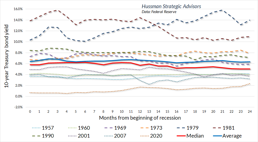
Likewise, it’s tempting to think that the potential for oncoming recession creates an opportunity to buy long-term bonds. The fact, however, is that long-term bond yields tend to be rather flat during recessions. They typically decline modestly a year or more after the recession begins, which is usually during the early stages of a recovery.
Another reason that we’re hesitant to step out into long-duration bonds is that yields remain inadequate. Historically, the weighted average of Treasury bill yields, core inflation, and nominal GDP growth has been something of a lower bound for 10-year Treasury yields. Presently, the 10-year Treasury yield (blue) is well below benchmarks that typically define an “adequate” yield. That’s part of the reason why the yield curve is so inverted. My expectation is that a recession would provoke a flatter yield curve, but part of that flattening may very well be an increase in long-term bond yields.
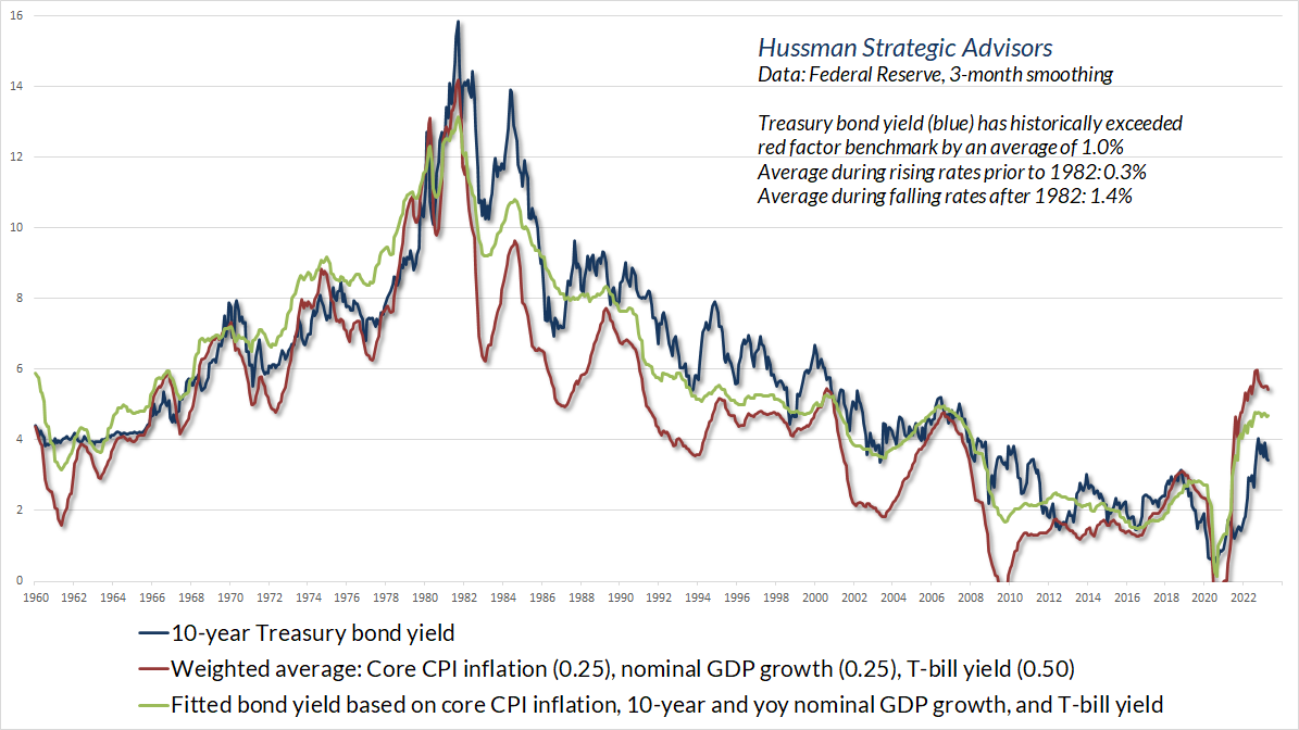
An important aspect of the benchmarks presented above is that the entire historical total return of Treasury bonds, over-and-above Treasury bill returns, has occurred when the Treasury bond yield has been above those benchmarks. If you’re a bond investor, the starting yield when you purchase the bond matters, because what you see is what you get, if you hold that bond to maturity. When you buy bonds at yields that are inadequate relative to the weighted average of Treasury bills, core inflation, and nominal GDP growth, you’re swimming upstream, and you require a lot to go right.
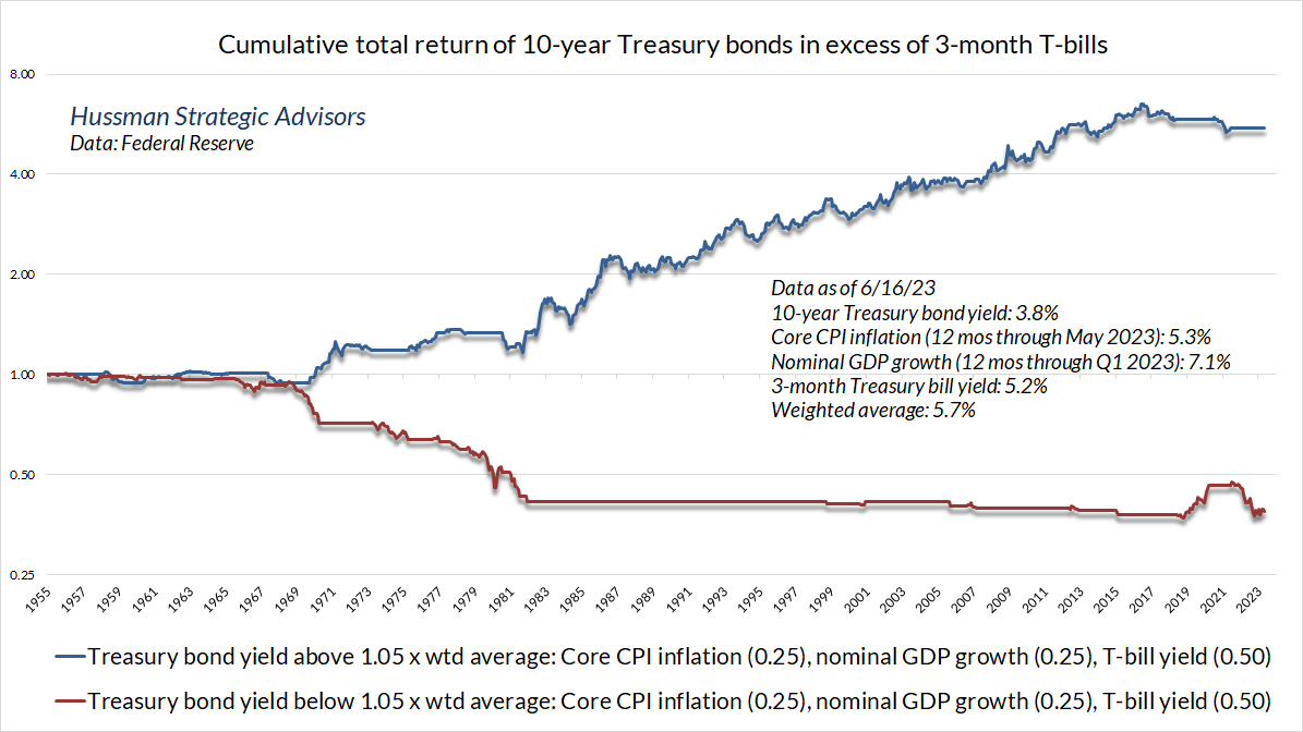
The chart below shows the cumulative excess return of 10-year Treasury bonds based on whether the yield was above or below that weighted average. The most notable period when bonds outperformed Treasury bills despite an “inadequate” starting yield was during the pandemic, and even that return was given back in the months that followed. A recession coupled with some sort of flight-to-safety like a credit crisis can certainly produce good returns for Treasury bonds even from low starting yields. But again, the yield you see is the yield you get if you hold to maturity, so if you get lucky, it’s best not to overstay your welcome.
Finally, a note on gold and precious metals. Historically, the strongest return/risk profile for the Philadelphia Gold & Silver Index (XAU) has occurred when Treasury bond yields are falling, and the ISM Purchasing Managers Index is below 50 as well. Gold stocks can certainly gain during other conditions, but the advances tend to be more selective, and one may be swimming upstream to some extent. Presently, bond yields are somewhat below the highs we observed last October, and the PMI is clearly below 50. Coupled with a broad range of additional considerations, we remain moderately constructive in this sector. Again, however, we’ll be most comfortable with an aggressive outlook on precious metals shares at the point that bond yields are falling more decisively.
Keep Me Informed
Please enter your email address to be notified of new content, including market commentary and special updates.
Thank you for your interest in the Hussman Funds.
100% Spam-free. No list sharing. No solicitations. Opt-out anytime with one click.
By submitting this form, you consent to receive news and commentary, at no cost, from Hussman Strategic Advisors, News & Commentary, Cincinnati OH, 45246. https://www.hussmanfunds.com. You can revoke your consent to receive emails at any time by clicking the unsubscribe link at the bottom of every email. Emails are serviced by Constant Contact.
The foregoing comments represent the general investment analysis and economic views of the Advisor, and are provided solely for the purpose of information, instruction and discourse.
Prospectuses for the Hussman Strategic Growth Fund, the Hussman Strategic Total Return Fund, the Hussman Strategic International Fund, and the Hussman Strategic Allocation Fund, as well as Fund reports and other information, are available by clicking “The Funds” menu button from any page of this website.
Estimates of prospective return and risk for equities, bonds, and other financial markets are forward-looking statements based the analysis and reasonable beliefs of Hussman Strategic Advisors. They are not a guarantee of future performance, and are not indicative of the prospective returns of any of the Hussman Funds. Actual returns may differ substantially from the estimates provided. Estimates of prospective long-term returns for the S&P 500 reflect our standard valuation methodology, focusing on the relationship between current market prices and earnings, dividends and other fundamentals, adjusted for variability over the economic cycle. Further details relating to MarketCap/GVA (the ratio of nonfinancial market capitalization to gross-value added, including estimated foreign revenues) and our Margin-Adjusted P/E (MAPE) can be found in the Market Comment Archive under the Knowledge Center tab of this website. MarketCap/GVA: Hussman 05/18/15. MAPE: Hussman 05/05/14, Hussman 09/04/17.