

How the Bubble Manipulates Time


John P. Hussman, Ph.D.
President, Hussman Investment Trust
January 2026
I’m going to tell you a story. At first, it’s going to sound ridiculous. But the longer I talk, the more rational it’s going to appear… This isn’t the first time we’ve had this conversation, ok? That’s because you’re stubborn. You won’t believe me when I tell you that Dr. Carter was right, that the enemy can manipulate time. The invasion will fail. No matter how many times we have this conversation, you refuse to accept that the enemy breaks through to London tomorrow, and we lose, we lose everything… You’re not mentally equipped to fight this thing, and you never will be.
– Major William Cage (played by Tom Cruise), Edge of Tomorrow
We’ve seen the future. Again and again. Market valuations have reached similar extremes twice before in the U.S. financial markets – in 2000 and 1929 – along with lesser extremes in 2007 and 1972, and sector-specific extremes like the “-onics -tronics” boom ending in 1970. These, joined by numerous speculative episodes across other countries and other markets tell us how the bubble will end. This episode has extended longer than usual – below we’ll examine the specific wrinkles that have contributed.
The defining feature of every bubble is the same: a growing inconsistency between the long-term returns that investors expect in their heads – based on extrapolation of the past, and the long-term returns that properly relate prices to likely future cash flows – based on valuations. Every bubble smuggles the same tragic past into the same tragic future by packaging it with new wrinkles that convince investors that “this time is different.” Ultimately, they still end the same way.
Each speculative episode encourages a certain stubbornness – because humans are adaptive creatures, we base our expectations for the future on the experience of the recent past. We respond far less to those things that are painful but distant in our memory than to those things that are rewarding in real-time.
This feature of investor behavior – what Galbraith called “the extreme brevity of the financial memory” – is complicated by the crowd psychology that accompanies speculation. Independence of thought requires one “to resist two compelling forces: one, the powerful personal interest that develops in the euphoric belief, and the other, the seemingly superior financial opinion that is brought to bear on behalf of such belief. As long as they are in, they have a strong pecuniary commitment to the belief in the unique personal intelligence that tells them there will be yet more. Speculation buys up, in a very practical way, the intelligence of those involved.”
A related, and I think equally challenging complication is that, in the short run, market prices will be whatever the consensus of the crowd chooses them to be. Nothing that we can measure affects market prices – whether earnings, GDP, employment, interest rates, monetary policy, or any other factor – except through the expectations and risk-preferences in the heads of investors at any moment in time. As the Buddha said, “With our thoughts we create our world.”
Prices and discounted cash flows
A financial “security” is nothing more than a claim on some stream of cash flows that investors expect to be delivered into their hands in the future. For any stream of future cash flows, and some long-term rate of expected return, we can always calculate the “present value” of the cash flows expected at each point in the future. Likewise, once we have a reasonable estimate of likely future cash flows, then the moment we know the market price, it’s just arithmetic to calculate the expected long-term rate of return on the investment.
Over the short-run, however, nothing prevents investors from imagining whatever long-term rate of return they like, and paying whatever price they wish, even if the two are mathematically incompatible with likely future cash flows. Even then, we can make everything compatible by imagining whatever future cash flows we like. Only time imposes any discipline on those choices, and sometimes time is unforgiving.
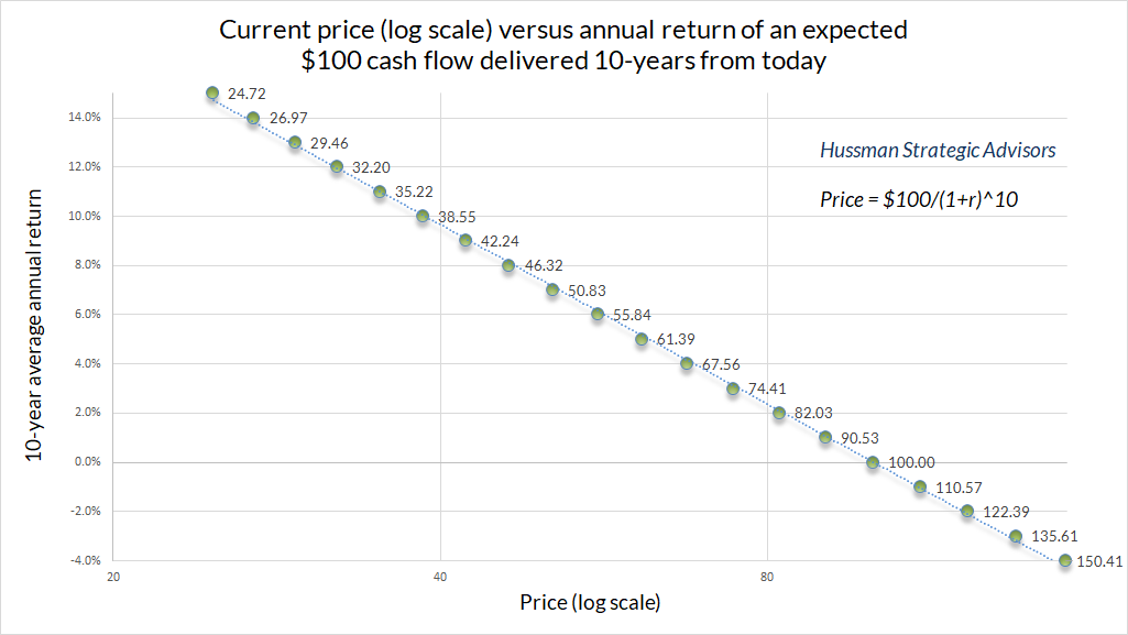
Suppose all three objects – expected future cash flows, expected rate of return, and current price – are all mathematically consistent. If the price we pay today is the same as our “present value,” and the expected future cash flows actually emerge, then by definition, our actual long-term investment return will be exactly the long-term rate of return we used to discount the cash flows.
For example, suppose that an IOU promises to pay a single $100 payment to the holder a decade from today. If you require an 8% annual return on your investment (taking risk into account) you’ll be willing to pay $100/(1.08)^10 = $46.32 for that IOU. If that expected $100 payment actually arrives a decade from today, your actual long-term rate of return is precisely ($100/$46.32)^(1/10)-1 = 8% annually.
The problem, particularly in a speculative bubble, is that nothing ensures that the expected long-term return in the heads of investors is the same long-term return that equates price and discounted future cash flows.
Suppose, for example, that IOUs have historically returned 8% to their investors. Confident in that historical fact, suppose you ignore prices and valuations and pay $82.03 for the IOU, still imagining in your head that you’ll get an 8% annual return on your investment. Well, unfortunately, the cash flows say that over the coming decade, you’ll earn ($100/$82.03)^(1/10)-1 = 0.02 = 2% annually on your investment.
Even so, if you can find a greater fool who will take that IOU off your hands a year from today at $88.59, you’ll get your 8% annual return anyway. It’s just that the poor shlub who buys it will only get 1.36% annually over the remaining 9 years.
Over the short run, all that matters is the return in people’s heads. It’s only over time that the cash flows arrive and reliably teach investors that valuations matter. That’s why Ben Graham wrote “In the short run, the market is a voting machine, but in the long run, it is a weighing machine.”
Valuations, expected returns, and “ergodicity”
From our simple example, it’s already clear that the long-term return one can expect is determined by the price one pays, relative to the future cash flows the security can be expected to deliver over time. Indeed, a reliable valuation ratio is just shorthand for that sort of discounted present value calculation.
A reliable valuation ratio (price divided by some fundamental) has one essential feature: the denominator must be reasonably representative and proportional to the very, very long-term stream of cash flows the security is expected to deliver over time. One can’t just choose denominators arbitrarily. It’s fine to use earnings, revenues, dividends, cash flows, or other fundamentals adjusted for this or that, but only if one believes that the fundamental is representative and proportional to long-term future deliverable cash flows.
Consider our IOU, promising a single $100 payment a decade from today. Suppose we use the symbol “k” for the long-term rate of return on our investment. Then our price today is just
Price = $100/(1+k)^10
We can flip that around and write
(1+k)^10 = $100/Price, or even better, (1+k) = (Price/$100)^(-1/10)
If you’re familiar with logarithms (just read around the math if you’re not), and you remember that for moderate rates of return, ln(1+k) is approximately k, we can write
k ~ -(1/10) ln(Price/$100).
Here’s the payoff: our long-term return moves inversely with the log valuation. The valuation arithmetic gives us a nice linear relationship, and it looks like this.
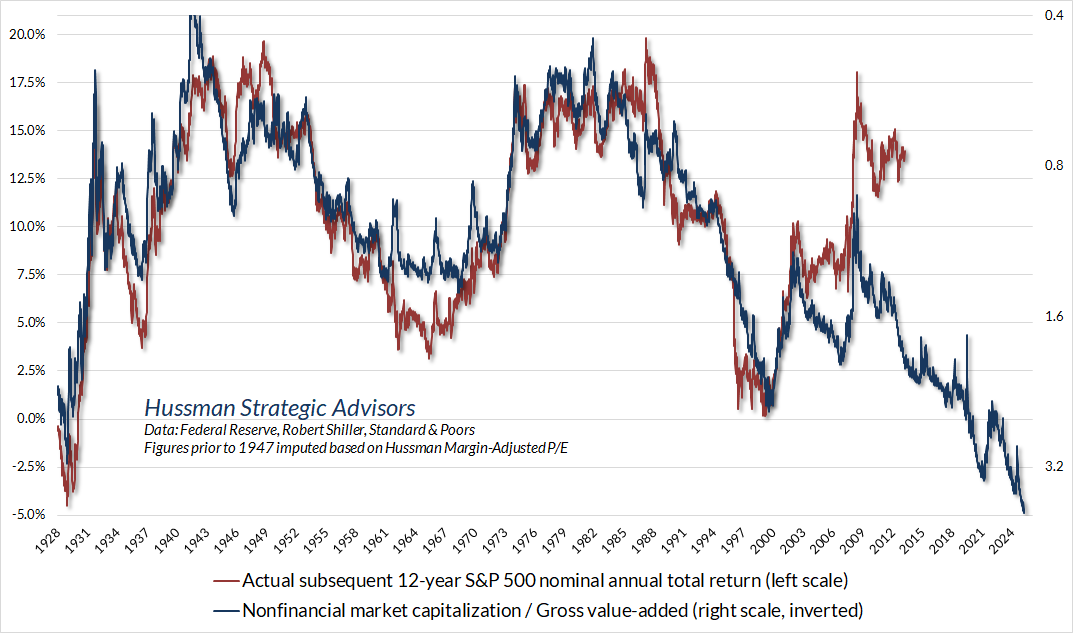
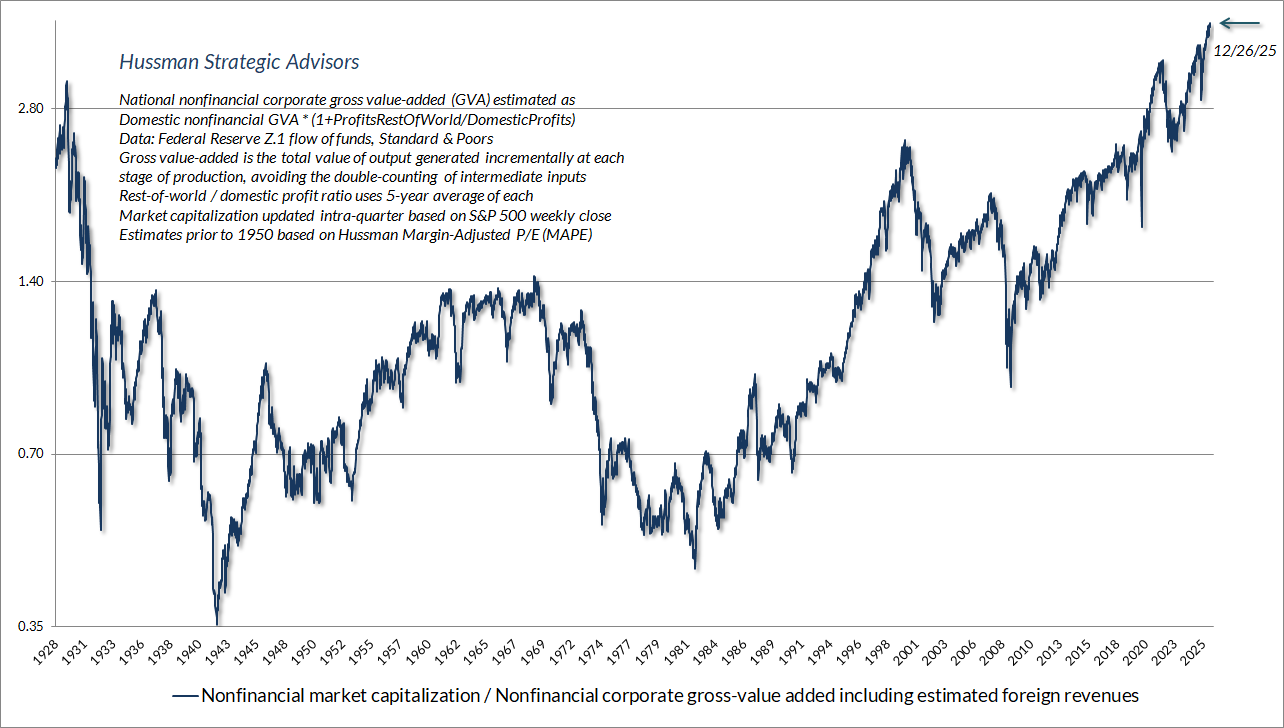
Here’s what this relationship between valuations and subsequent returns looks like in the actual financial markets. The chart uses our most reliable valuation measure in market cycles across history: the ratio of nonfinancial market capitalization to corporate gross value-added (including our estimate of foreign revenues). It’s essentially an economy-wide, apples-to-apples version of a price/revenue ratio.
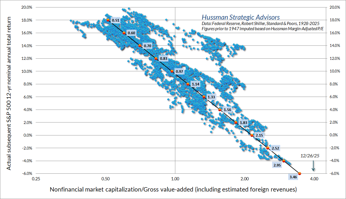
Remember – the central requirement for a reliable valuation ratio is that the denominator has to be representative and proportional to your expected long-term cash flows – decades and decades of them. Over a century of market cycles, we find that price/revenue ratios and margin-adjusted price/earnings ratios are more reliable than raw P/E multiples, because profit margins vary considerably over time. A single year – or even decade – of earnings can be unrepresentative of long-term outcomes.
Unfortunately, investors tend to drive prices to high multiples of elevated earnings at cyclical peaks (which is a historically tragic form of double-counting), and they tend to drive prices to low multiples of depressed earnings at cyclical market lows, which has historically created conditions for outstanding subsequent returns.
Over the past four decades, I’ve introduced so many analytical measures and chart concepts that people often publish versions of them without any attribution. One of those versions circulated last month on social media, plotting the S&P 500 forward P/E versus subsequent 10-year S&P 500 total returns, using data since 1990 as far as I could tell. The two most aggressive criticisms surrounded the notion that a 35-year chart using 10-year returns “only has 3.5 data points.”
This provides a nice opportunity to explain the concept of “ergodicity.”
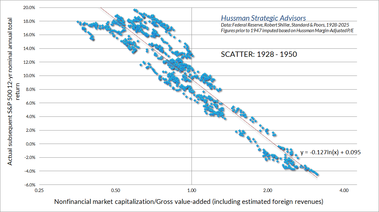
Consider a process where the value today is always identical to the value yesterday. For this process, no matter how many data points you have, you only visit a single “state.” In contrast, consider a process that repeatedly traverses a broad range of states over multiple market cycles over time, often moving from elevated extremes to depressed troughs within a modest number of years. For this process, your “effective sample size,” even for overlapping horizons, is significantly greater than a naïve estimate like Data(N)/Horizon(T).
The naïve N/T calculation assumes that an observation must be wholly independent in order to contribute new information beyond what the previous observation contained. The effective sample size of an ergodic process actually depends on the full correlation structure between your data points, not just N/T. A simple way to see this visually is to consider the very volatile period between 1928 and 1950. The naïve calculation would suggest that the chart below contains only 1.8 observations, which is visibly preposterous.
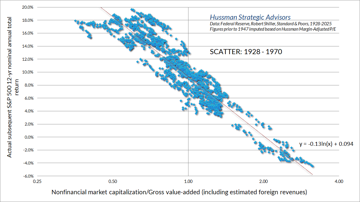
Here’s the same chart from 1928 to 1970
As a side note, our earlier scatter of MarketCap/GVA versus subsequent 12-year S&P 500 average annual nominal total returns covers a 96-year period. We prefer a 12-year horizon because that’s where valuations between one point and another point typically become uncorrelated, so it’s the horizon that best captures any tendency for extremes to normalize.
A related criticism is that the slope of the scatter is somehow not “real” due to the overlapping horizons. This is also a misunderstanding of statistics. While we needn’t estimate a line at all, the simple fact is that serial correlation does not bias an ordinary least-squares (OLS) estimator. Rather, what serial correlation does is to boost the “standard error” of the slope estimate (so one should use Newey West or similar methods if one intends to report t-statistics or other hypothesis tests).
For our purposes, the only thing that serial correlation (overlapping investment horizons) does is to widen the possible range of lines that one might run through the points. But here’s the thing – whatever line one chooses must still run through the points.
We’re perfectly fine running a slightly different line through the scatter of valuations versus subsequent returns. For the full chart relating MarketCap/GVA with subsequent returns in data since 1928, the most likely choice would have a steeper slope than the OLS estimate. In practice, the slope is related to the average period over which extreme valuations can be expected to normalize (for example, the valuation line for our 10-year IOU had a slope of precisely -1/10). In any case, the slope of the scatter is due to the basic arithmetic of valuations, and the OLS estimate is statistically unbiased.
What about record profits?
One of the things we cannot and should not easily dismiss is that fact that corporate earnings and profit margins are at record highs. Now, recall that we can use a given fundamental in a valuation multiple – and take that multiple at face value – only if we believe that the fundamental is representative and proportional to the very, very long-term stream of cash flows that the security can be expected to deliver in the future, possible over decades.
But suppose that we are willing to assume that current extreme profit margins are in fact permanent. In that case – and provided we’re aware of the assumptions we’re making – a P/E ratio is fine. The chart below shows where valuations stand on that measure. While the S&P 500 “forward operating” P/E was not widely used before the mid-1990’s, and it was only created by Wall Street in the 1980’s, it’s well-correlated with Robert Shiller’s “cyclically adjusted P/E” (CAPE). Even though they scale differently, we can easily impute what the forward P/E would have looked like across history.
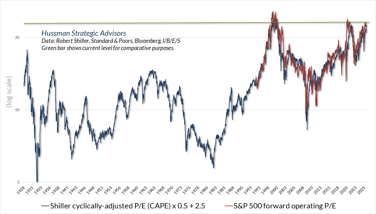
Notice that even if we take current record profits at face value, the S&P 500 is still close to the most extreme valuations in history. I remain convinced that the valuation situation is far worse, because we can show exactly why profits are at record highs, and why this situation is unlikely to be permanent.
Still, as we regularly observe – Nothing in our investment discipline presumes or requires a market collapse, or a reversion of valuations toward their historical norms, ever. Personally, I do expect this bubble to collapse, as prior bubbles have done across history. But our discipline doesn’t require that outcome, and I expect we’ll do just fine without it.
Our discipline clearly does benefit more from two-sided market fluctuation than from a diagonal advance to record valuations – which is unfortunately what we’ve observed since April – but this too shall pass. Particularly with the hedging implementation we introduced in September 2024 (which has been positive for our investment discipline, even with a bearish outlook amid record highs), all we really need is ordinary fluctuation. No forecasts or scenarios are required.
How to “fix” a valuation measure by distorting it
I’ve often discussed the “errors” we observe at bubble peaks – between actual market returns and the returns that we would have expected based on valuations. In the chart below, for example, you’ll notice that the actual total return of the S&P 500 in 12-year period beginning in 1988 (red line) was clearly higher than the return that one would have projected in 1988 based on valuations at that time (blue line). The same is clearly true for 12-year horizons beginning between 2010 and 2013. The reason for these “errors” is that the endpoints of these 12-year horizons occurred at bubble valuations.
It’s possible to “fix” a significant portion of the recent errors. I don’t advise it. See, the “fix” is simple: assume that the massive deficits we presently observe across households and the U.S. government will continue – at their present share of GDP – forever. Later in this comment, we’ll examine this equilibrium in detail, and how it operates in the U.S. economy. For the present discussion, suffice it to say that it’s an accounting identity – true by definition – that the deficits of one sector always emerge as the surplus of another.
The result, at present, is that the record corporate profits we observe are the precise mirror image of historically deep deficits among roughly 90% of American families, combined with the deficit of the U.S. government that bridges the gap between the income of working families and their spending needs. This, in a nutshell, is our version of what Peter Atwater has dubbed the “K-shaped economy.” It’s one of the key wrinkles that extended this particular bubble, because investors have not only driven price/earnings multiples to historically elevated levels, but those price/earnings multiples are based on earnings that have been jacked up by massive sectoral deficits. The equilibrium looks like a set of alligator jaws.

Now, we can only assume that corporate profits will be permanent provided that we are willing to assume that these deficits will also be permanent. My impression is that this is precisely what investors are doing, without knowing they’re doing so.
The chart below shows how taking these profits at face value helps to “fix” valuations. The blue line is just a scaled version of MarketCap/GVA (right scale, inverted). I’ve also added two other lines, which are nearly identical. The light blue line shows MarketCap/GVA divided by the average 10-year profit share (earnings/GVA). This essentially converts it to a price/earnings ratio, and requires, of course, that we believe that these earnings are representative and proportional to decades and decades of future cash flows.
The light green line adjusts MarketCap/GVA by the combined deficit of the U.S. government, households, and foreign trading partners as a percentage of GDP. Why is this light green line nearly identical to the light blue line? Because corporate profits are a mirror image of these deficits.
That, right there, is the fundamental point: what investors observe as record corporate profits are the mirror image of record deficits – driven by the increasing gap between the real income of American households and their consumption needs, and the inadequately-funded government spending that helps families to bridge their income shortfall.
The only way we can assume that these profits will be permanent is to assume that the corresponding deficits will be permanent. We can certainly allow for that possibility, and nothing in our investment discipline relies on a market collapse, but I do suspect that investors are unaware that they rely on this skewed equilibrium to be permanent.
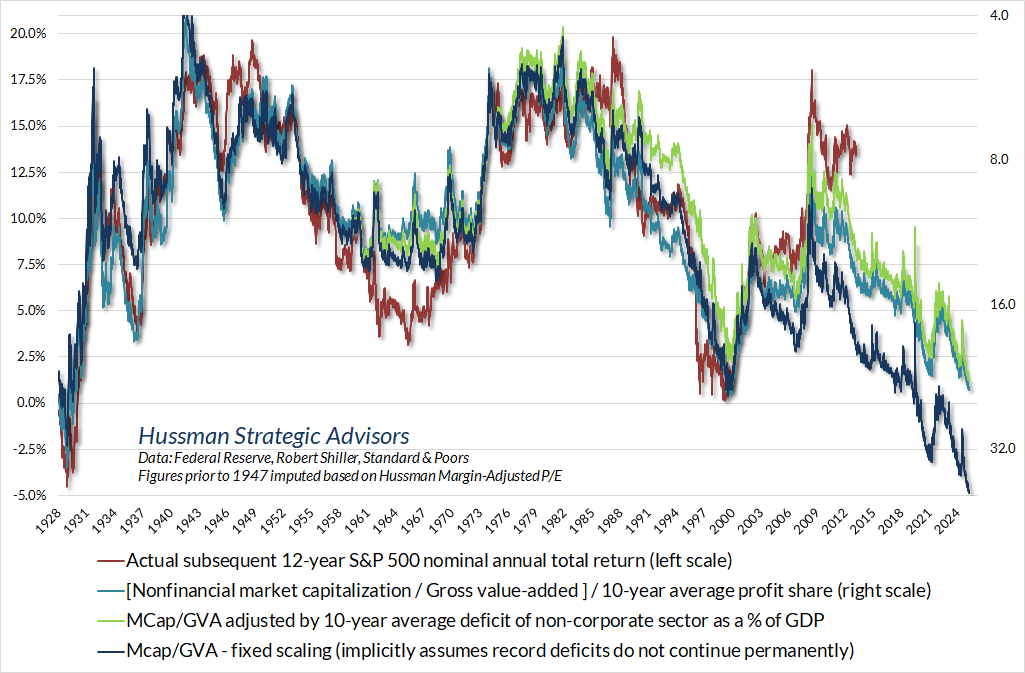
Here’s the accompanying scatter of this questionably “adjusted” valuation measure versus subsequent 12-year S&P 500 total returns. If one assumes that this unstable equilibrium will in fact be permanent, the apparent “valuation errors” of recent years shrink considerably. As for current levels, even the “adjusted” valuation measure is roughly where it stood at the 2000 bubble peak. This still implies estimated 12-year S&P 500 nominal total returns on the order of about 1% annually, but then, the “unadjusted” version suggests estimated annual losses on the order of -5% annually over that same horizon.

Personally, I think it’s dangerous to assume that this massive skew is permanent – deficits on one side and profits on the other. “Adjusting” historically reliable valuations to reflect these deficits would be a distortion rather than a “fix.”
Still, it’s useful to understand that the “error” of valuations in recent years is implicitly driven by investor confidence in corporate profits, and a willingness to apply extreme price/earnings multiples to those profits, without a clear recognition of the enormous government and household deficits that have skewed the equilibrium. This imbalance is a recipe for debt defaults, sustained inflation, and social upheaval.
If persistent deficits of similar size cannot be relied on to persist indefinitely, neither can the mirror-image profits. It may not be wise to value stocks at near-record multiples of those earnings. Doing so effectively places valuations at nearly four times the level that has historically been followed by run-of-the-mill subsequent market returns of 10% annually.
Meanwhile, our key gauge of market internals remains unfavorable. It’s clear that a narrow pocket of speculation in technology and AI has weighed against this more general tone of risk-aversion, but that actually amplifies rather than reduces the risk of a “trap-door” type market break.
As a side note, the expansion of deficits for much of the period since 2000 has been encouraged by falling interest rates, so we also find that profit margins have increased as interest rates have declined. The accounting identity – being an identity – holds sway, but there’s little question that the deficits have been encouraged by easy money. In a recession, both profits and net investment tend to decline, but net investment gets hit harder. Meanwhile, valuations are generally a casualty even as rates decline. As always, we’ll adjust our investment stance as the evidence changes. No forecasts are required.
With respect to other asset classes, we presently view Treasury bond yields as adequate – neither strikingly attractive, nor particularly insufficient. The chart below shows the 10-year Treasury yield versus simple but useful benchmarks that have been historically useful in defining “adequacy.” Presently, we prefer a moderate portfolio duration that balances Treasury bills, intermediate (but not primarily long-term) Treasury notes, and inflation-protected TIPS.

In the precious metals market, I’ve emphasized for decades that precious metals shares can be valuable complement in a fixed-income portfolio. We’ve certainly benefited from using them in that role. It’s useful to know that the entire historical total return of precious metals shares (e.g. the Philiadelphia Gold & Silver Index) has emerged in periods when Treasury yields have been falling – even on measures as simple as a 6-month lookback.
Our own exposure at any given time reflects a much broader range of considerations. In general, those considerations have been quite favorable over the past year, but our view does tend to ease back during heady advances like we saw in October and December. The quick air-pocket in recent days has relieved part of that overextension. Overall, our view remains constructive, but it’s important to consider the volatility of this sector when setting position sizes.
Record profits, bubble valuations, how new “savings” are held
In order to fully understand why corporate profits are at record levels, it’s useful to understand the concept of equilibrium. Nothing exists by itself alone. If one sector of the economy runs a deficit, where their consumption and net investment is greater than their income, some other sector of the economy must run a surplus, where their income is greater than their consumption and net investment. This isn’t a theory. It’s an accounting identity.
The next sections consolidate and expand on several topics relating to corporate profits, “cash on the sidelines” and price-insensitive investor behavior. I’ve shared portions of this analysis in prior comments. Here, my hope is to put a bow on it all, by showing how these elements have contributed to a misleading and dangerous confidence in record profits and historically extreme valuations.
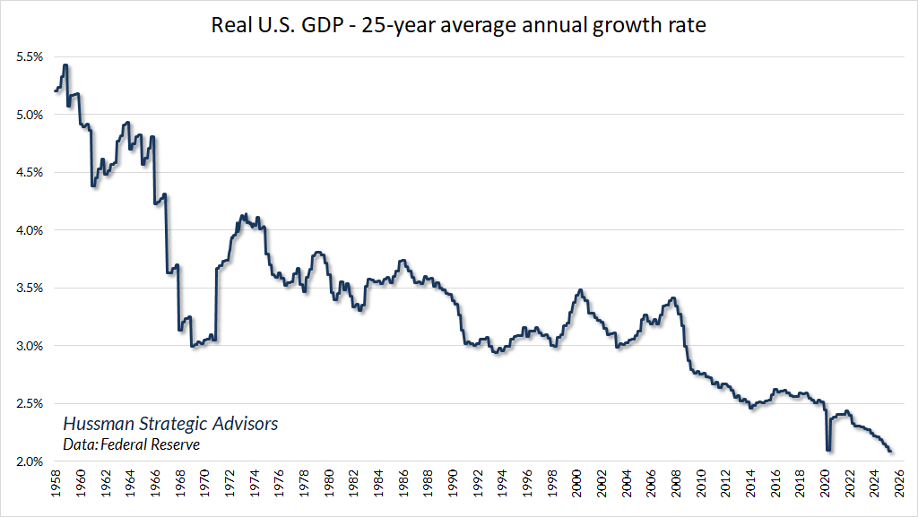
It’s tempting to appeal to “technology-driven economic growth and productivity” as the reason for record corporate profits. Strikingly, this isn’t true at all. Technology – particularly hyperscale technologies that benefit from network effects – does help to explain the distribution of profits between companies, but broad productivity-led economic growth is not part of that story. The chart below is reprinted from our October comment. Since 2000, real U.S. GDP growth has expanded at the slowest 25-year growth rate in U.S. history, despite profound technological change. Given how widely investors appear to assume that technology is automatically growth-enhancing, this chart is an eye-opener.
One of the ways that a bubble manipulates time is by convincing investors – again and again – that new technology creates a “new era” that is somehow discontinuous from the past. The fact is that long-term economic growth is nothing but a constant layering of one “new era” after another. Most of the benefit comes as an increment, like the ring of a tree or a layer of sedimentary rock. Profit margins are gradually eroded by competition and are converted into “consumer surplus.” Every wave of new innovation emerges first as a rapidly growing sector, which then gradually slows to a rate equal to or slower than the overall economy.
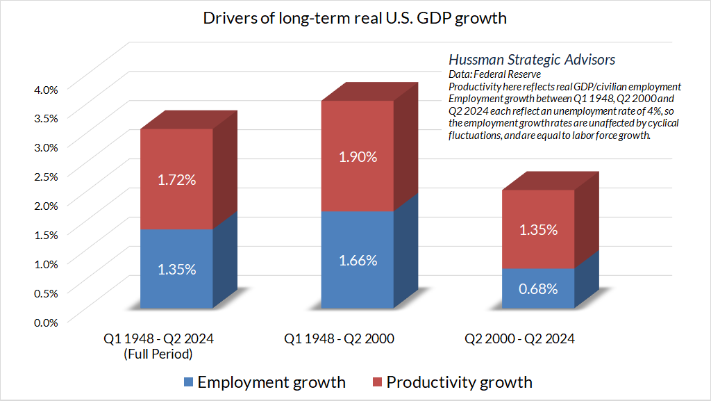
The progressive slowing in real GDP growth in recent decades reflects a combination of slower productivity growth, relative to the 1948-2000 period, along with slower demographic labor force growth as the U.S. population ages.
In short – the impact of technology has not been to durably enhance broad economic growth. Real economic growth has slowed progressively in recent decades. Even the recent burst of investment in artificial intelligence has boosted real GDP growth by only a fraction of a percent since 2023. Gross business investment has been little changed as a share of both GDP and corporate gross value-added. While capital expenditures among companies in the S&P 500 have bumped up to 6.4% of revenues over the past year, this is only slightly higher than the average of 5.7% since 2011.
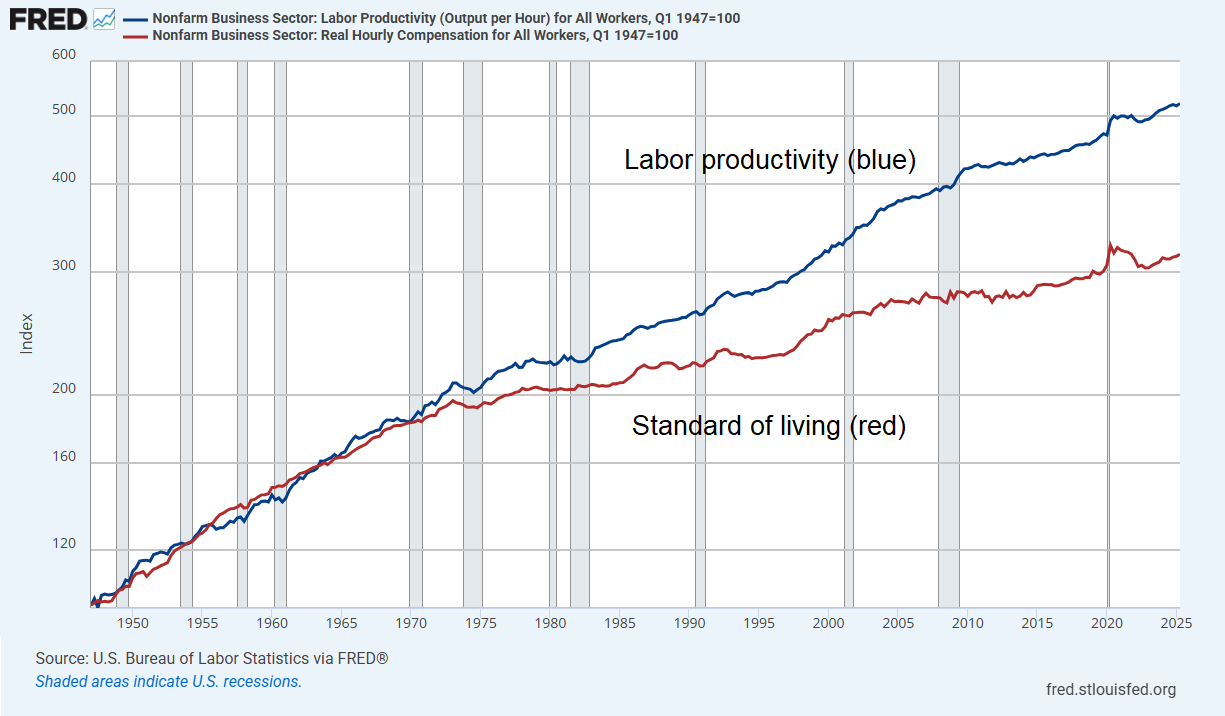
To the extent that technology has had an impact, it has been on the distribution of income. Even as U.S. productivity growth has slowed in recent decades, the additional challenge for most households is that this productivity has been “labor-saving” – enabling companies to increase profits by reducing labor compensation. The result has been a widening gap between labor productivity and the standard of living of most American families.
We run massive deficits because household incomes have not kept pace with even this slower rate of productivity growth. That means, by definition, that more output is created than the wage and salary income of households can afford to purchase.
But if the income of working American families isn’t sufficient to purchase the output that the economy produces, how is it possible for companies to sell the output and earn profits as a result? Simple. Someone goes into debt – either families directly, or the government on their behalf – or they tap into what remains of their saving.
The core structural shift in the economy over recent decades is not “productivity led growth.” Rather, the core shift is the progressively widening gap between labor productivity and real wage and salary gains. Some of this has almost certainly been the result of labor-saving investment, allowing companies to produce the same amount of output with fewer workers, but there’s no single cause. Part of the gap has resulted from offshoring labor input to countries with lower wages, resulting in increased wage competition domestically. Part of the gap has been the acceptance of the sort of “shareholder capitalism” that views employees as commodity inputs rather than stakeholders, along with the erosion of collective bargaining and unionization relative to the earlier postwar decades.
Regardless of the causes, once you understand this equilibrium, it becomes clear that it’s impossible to sustain the profits without sustaining the deficits that finance the corporate revenues. If we reduce the deficits by cutting off the supplements, the corresponding profits will also vanish, most probably with the economy going into recession, requiring either a cut in output or the accumulation of unwanted inventories. If companies increase employee compensation – no objection here – the household deficits would shrink along with the corresponding profits. If tax policies generate greater revenue by reducing lopsided tax preferences that favor deferred financial gains and natural monopoly, the government deficits will shrink, as will lopsided surpluses. It’s an equilibrium. No massive deficits, no massive profits.
From the perspective of equilibrium, we can also see that the vast majority of the accumulated “savings” in the U.S. economy are surpluses that have emerged because households and government have been running massive deficits for decades. The deficits are financed with a pile of IOUs owed to the wealthiest people in the country. The deficits also produce record corporate profits, to which financial markets are presently applying record valuation multiples.
Equilibrium in output and income
Recall our accounting identity. The deficit of one sector (consumption and net investment over-and-above income) always emerges as the surplus of another sector (income over-and-above consumption and net investment).
Let’s study an extremely simplified example of how this works. I can tell you that addition, subtraction, borrowing, lending, interest payments, interest receipts, purchases, sales, and all of the related accounting arithmetic works exactly the same if one adds bank loans, credit cards, stock issuance, investors that trade securities between themselves, and a Federal Reserve that buys Treasury bonds and creates base money (currency and bank reserves) in their place.
The objective for the moment is simply to show, in the least complicated way, what “general equilibrium” looks like in an economy that produces goods and services, has people who earn and spend income, and sectors that transfer or “intermediate” savings from surplus sectors to deficit sectors using financial instruments.
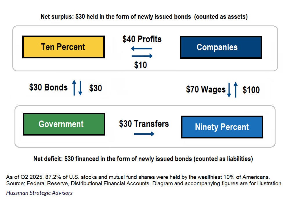
Consider an economy that produces a single composite good we’ll call “Stuff.” This stuff is produced by Companies that are owned by the Ten-percent. Companies employ the Ninety-percent, who earn wages to buy Stuff. For simplicity, assume the Ninety-percent basically live hand-to-mouth, with no savings, and in fact require transfer payments from the Government to supplement their wages. The Ten-Percent get the profits from the Companies, buy Stuff, and are the only people that save. There’s a Federal Reserve that bought Government bonds at some point in the past, and created pieces of paper called cash. It’s a simplified economy for sure, but given that 87% of corporate equities and mutual fund shares are owned by the wealthiest 10%, it’s not terribly far from current reality.
Let’s examine equilibrium in this economy. Suppose the Ninety Percent buy $100 of Stuff from Companies. They pay for this Stuff using $70 in wages they get from Companies, and $30 of transfer payments they get from the Government.
The Ten Percent buy $10 of Stuff from Companies. So Companies get $110 of revenue. Having paid only $70 in wages, the Companies earn $40 in profits, which flow to the Ten Percent. So the Ten Percent get $40 in profits, spend $10 on Stuff, and have a net $30 in savings.
In what form do the Ten Percent hold these $30 in savings? Well, look at the Government. Without tax revenues, it has to borrow the $30 that it spends on transfer payments for the Ninety Percent. So it has to issue $30 in Government bonds. Who is left to buy the bonds? Precisely the people in the sector that saved – the Ten Percent. How much do they buy? Exactly $30 of bonds. Everything has to add up.
What if the Federal Reserve buys the $30 in Government bonds from the Ten Percent? Well, then the Ten Percent simply hold the new savings in a different financial instrument issued by the Government. Namely, new cash that the Federal Reserve has created to pay for the bonds.
What if the Government only provides $20 in transfer payments to the Ninety Percent, but they still need to buy $100 of Stuff? Well, now the Ninety Percent have to write $10 in IOUs to the Ten Percent. The profits of the Company are still the same, but now the Ten Percent accumulate $20 in Government liabilities, and $10 in personal IOUs.
What if the Ninety Percent had $10 of cash under their collective mattresses? Then no personal IOUs would be needed. In this case the Ninety Percent still spend $30 more than their income, and the Ten Percent still have a $30 surplus. They hold that surplus in the form of $20 in new Government liabilities, and $10 that was previously stuffed under mattresses. The deficits of one sector still emerge as surpluses of another, and they still result in an equal and opposite transfer of financial instruments.
When someone (a person, corporation, or government) runs a deficit, they issue – or divest themself of – some piece of paper (cash, debt securities, IOUs, or other financial instruments) in order to obtain the required funds. Deficits and surpluses in the output side of the economy (real goods and services) are always exactly matched by an equal and opposite transfer of financial instruments.
We can complicate things from here to whatever degree we wish, and the result is the same: the deficit of one sector emerges as the surplus of another, and on balance, the new savings in the economy take the form of new liabilities that were issued by the deficit sectors – in order to bridge their spending gap – to obtain funds from the surplus sectors. If the deficit sectors bridge the gap by liquidating assets they accumulated in the past (cash, securities, home equity) there need not be “new” liabilities nor “new” saving. Instead, the “dissaving” of the deficit sectors becomes the “saving” of the surplus sectors.
As I’ve observed previously, there might be a billion individual transactions along the way – child sees a doctor, doctor buys a computer, computer manufacturer builds a data center, data center buys a microchip – but all of the transactions add up to one net result:
In the end, the deficit of one sector emerges as the surplus of other sectors. The liabilities issued by one sector become the new assets of other sectors. The new “savings” of one sector must, in equilibrium, be held precisely in the form of new financial instruments that were issued to finance the deficits. Those new financial instruments must then be held by someone in the economy, at every moment in time, until they are retired by repayment or default. It’s not just a theory. It’s an accounting identity.
Complicating things further doesn’t change the outcome. When an economy produces goods and services, they are either consumed, used as “real” capital investment (housing, equipment, factories, etc.) or are retained as intended or unintended “inventory investment.” So we can allow “Stuff” to be used for net investment, allow Companies to make capital investments and hold inventory investment, and allow households and government to use Stuff for housing investment and infrastructure investment.
If government and households run a deficit where their consumption and net investment use up more goods and services than their income and receipts, it must be true, in equilibrium, that someone else in the economy ran a surplus where they produced more goods and services (and associated income) than they used for consumption and net investment. The surplus sector has “saved,” and those new savings take precisely the form of the financial instruments that were divested or issued by the deficit sectors.
A current deficit in the market for goods and services is matched by an equal and opposite transfer of financial instruments. Either you issue a new liability, which is as easy as swiping your credit card, or you transfer financial instruments you’ve accumulated in the past – “dis-saving” – which is as easy as swiping your debit card.
Here, again, is that what this “equilibrium” looks like for the actual U.S. economy. The blue line shows U.S. corporate profits (including undistributed dividends) minus net investment. The red line shows the combined deficit of households, government, and foreign trading partners. Since our foreign trading partners actually run a surplus on current account, the red line would be even more negative if we restricted it to only U.S. households and government. Since we’ve kept dividends in the blue line, they’re also removed from the red line.
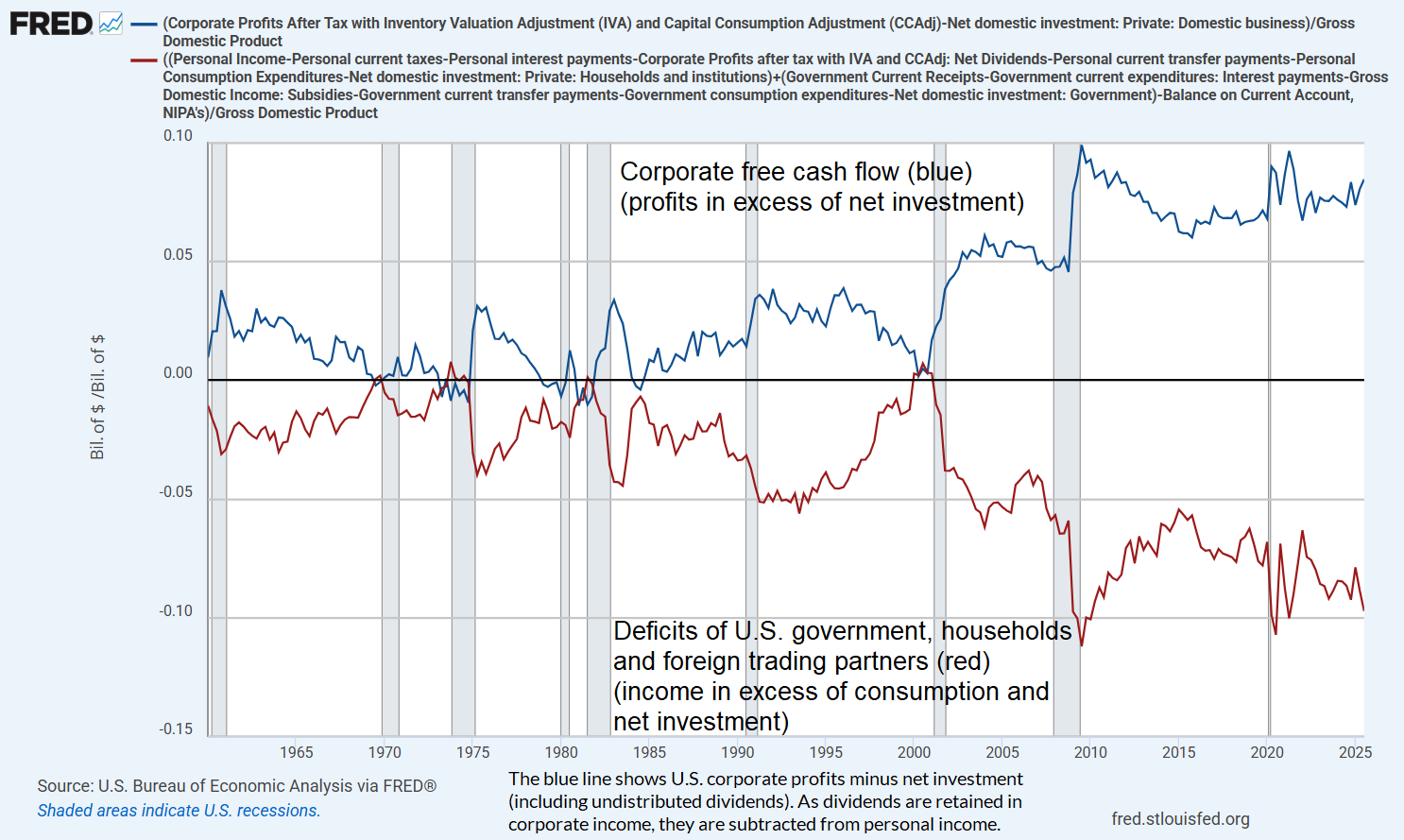
What you’re looking at is simply the income and output definitions of GDP from the national income and product accounts, with items moved around from side to side. I’ve left out some tiny items and the small “statistical discrepancy” between the income and output definitions of GDP, to avoid overcomplicating the graph (FRED limits charts to 15 series).
The chart below shows the same data, with the deficits (income minus consumption and net investment) of households, government, and foreign trading partners inverted. I’ve simply multiplied the red line by -1 so it can be compared more directly.

Presently, about half of U.S. corporate profits are paid out as dividends. The average payout for publicly traded companies is somewhat lower in recent years, largely because profits have been elevated. Dividends as a share of revenues are not far from the historical peak of 4%. These funds flow principally to the wealthiest 10%. The funds are then intermediated primarily to the U.S. government and the remaining 90% of U.S. households in return for IOUs, either by directly purchasing new U.S. Treasury debt, or indirectly by accumulating bank deposits backed by consumer and mortgage loans.
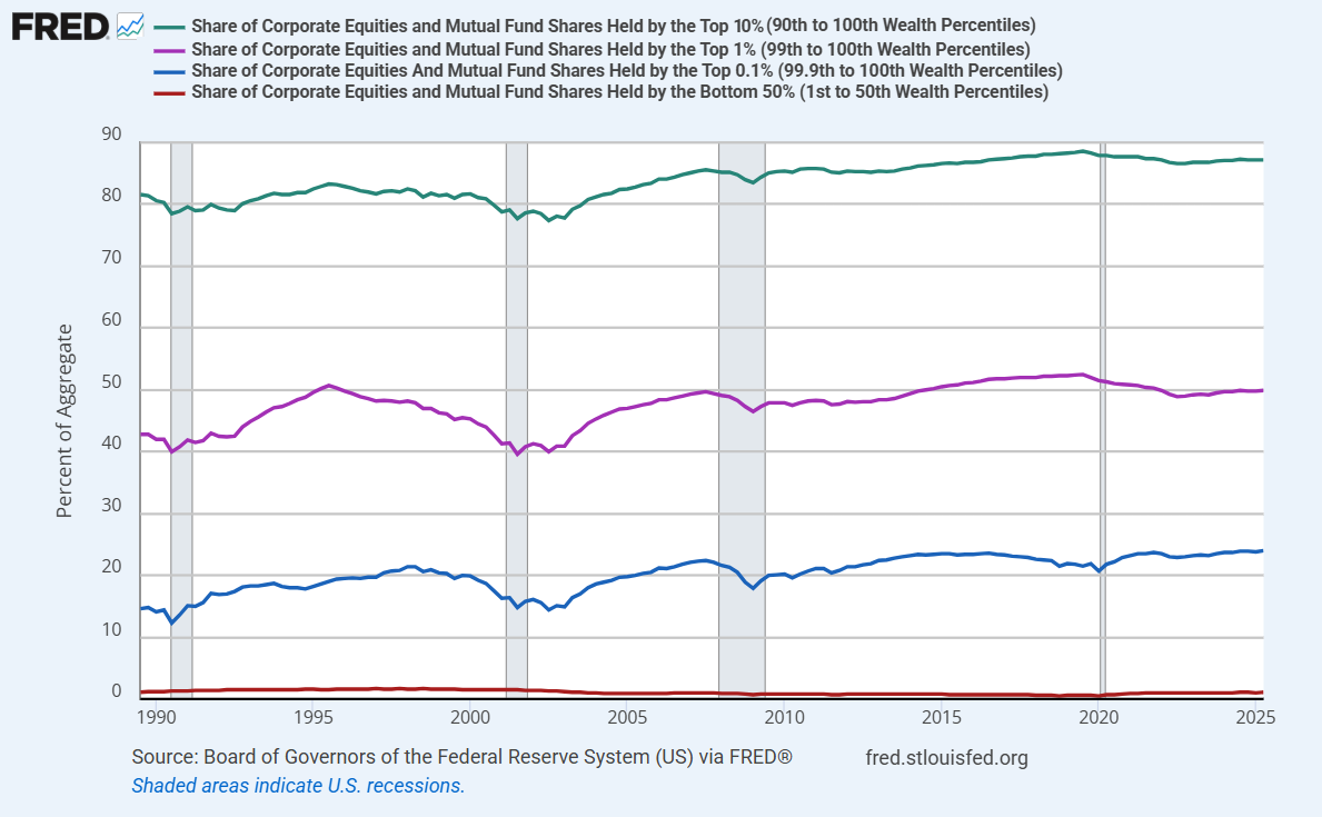
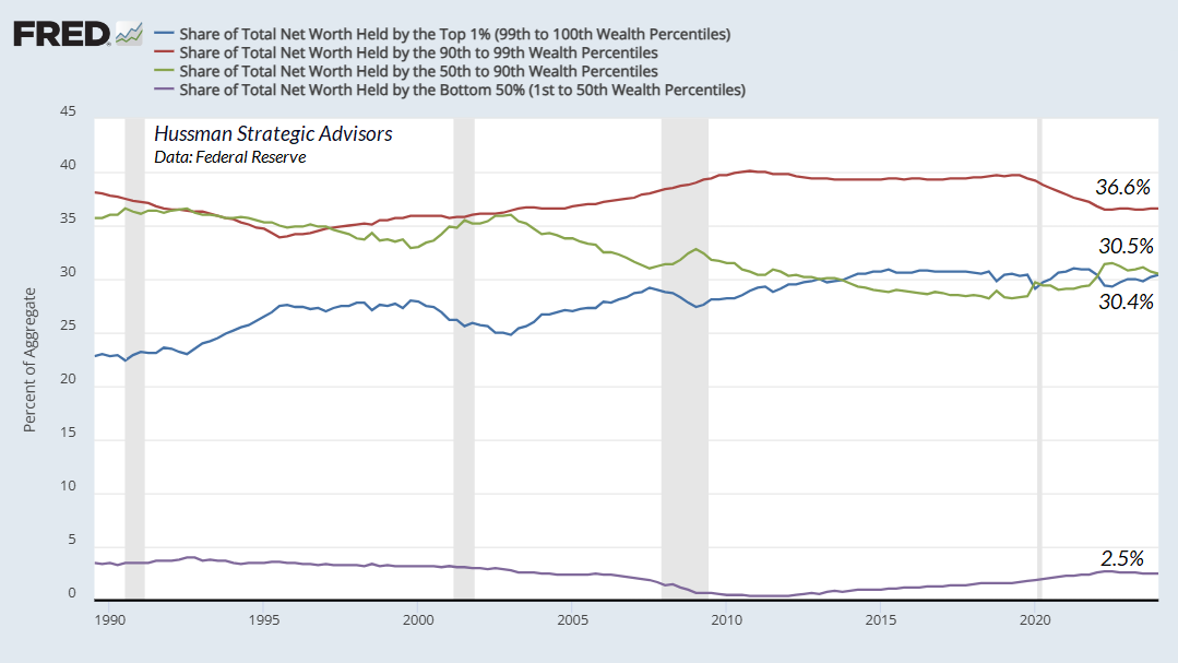
Given that 24% of U.S. corporate equities and mutual fund shares are held by the wealthiest 0.1% of U.S. households, 49.9% of equities and mutual fund shares are held by the wealthiest 1% of households, 87.2% of equities and mutual fund shares are held by the top 10% of households, and just 1.1% of equities and mutual funds shares are held by the bottom 50% of U.S. households, this gaping combination of massive surpluses and massive deficits gives a reasonably accurate view of the unstable equilibrium that’s at the heart of the growing economic insecurity of American families.
As I observed in my October comment:
The deficit of one sector emerges as the surplus of other sectors, and the liabilities issued by one sector become the assets of the other sectors. It’s not just a theory. It’s an accounting identity.
Yes, corporate profits and free cash flow are at record highs. They’re at record highs because government, households and foreign trading partners are running a massive net deficit. The distribution of the corporate profits absolutely reflects scarcity, innovation and – particularly in recent years – “hyperscale” network effects, where single companies operate as dominant providers in their sectors. The level of profits, however, is a sectoral imbalance.
This enormous domestic imbalance between “haves” and “have nots” means that the “haves” accumulate the financial obligations of the “have nots.” That’s how this house of cards keeps standing.
Neither the government nor the average American household is taking in enough income to meet their expenditures. The majority of Federal expenditures are an offset to the fact that U.S. households, in aggregate, don’t earn enough to finance basic needs like healthcare and retirement expenditures. To a large extent, the combined deficit reflects a single underlying dynamic. From an accounting standpoint, record corporate profits are the mirror image of that dynamic.
– John P. Hussman, Ph.D., An Unstable Equilibrium, October 28, 2025
Policy options
Just as this situation has no single cause, it has no single solution. One could choose to do nothing, allowing the debts of government and the 90% to expand without limit, while the remaining 10% accumulate claims without limit, but that story ends with an avalanche of defaults or sustained inflation. One could try to extend the disparity by dropping interest rates to zero, allowing families to finance their shortfalls by “dissaving” out of whatever net worth they’ve accumulated in their home equity, but that strategy only goes so far, and worsens the distribution of wealth.
One might recognize that a dollar of wage and salary income just below the Social Security threshold is taxed a combined rate that’s wildly less favorable than the direct (personal level) and indirect (corporate level) taxes on a dollar of income that a billionaire receives in the form of buyback-boosted capital gains. Because we can’t bring ourselves to call a dollar of increased purchasing power “income,” it escapes income taxes, payroll taxes, and even taxes on capital gains – which can be deferred without limit.
Changing this would require a system that taxes some fraction of accrued unrealized gains annually, raising the basis accordingly – with a very large exemption so it doesn’t apply to ordinary investors. One might tax stock buybacks at the corporate level as a “deemed dividend.” Alternatively, an “imputed return” might be applied to asset holdings above some very large threshold. One wouldn’t pay any imputed tax if the securities lose value in a given year, and would receive credit against capital gains taxes on whatever amounts were previously paid on the imputed returns. Approaches like these would have two objectives – the most important being to eliminate the striking bias that taxes a dollar of wage and salary income at far higher combined rates than the same dollar obtained as investment income (particularly at extremely high wealth tiers), and it would address one of the largest forms of tax escape – the ability of multi-billionaires to defer taxes forever, financing their consumption simply by borrowing against their asset holdings. For now, none of this is anywhere on the political menu.
Faced with a progressively aging population, one might consider the advice of conservative economist Alvin Rabushka to eliminate the cap and lower the tax rate for Social Security. One could both reduce economic distortions and lower the rate further by applying it to all income rather than biasing it against income earned as wages and salaries. We do otherwise, quoting Rabushka, only “to maintain the fiction that Social Security is a retirement insurance program in which contributions are linked to benefits, rather than what it is – a transfer of income from workers and the self-employed to retired people.”
One might also observe that in a world increasingly dominated by network effects and hyperscale technologies that allow one company and even one individual to displace thousands of businesses and even millions of workers, much of the wealth isn’t a reflection of labor or even invention – it’s a gain based on the negative externalities and private monetization of an unrecognized public good – the network effect – with no associated compensation to the public. But again, that idea is nowhere on the political menu.
Full-cycle drawdown risk
While structural change in the economy will require crisis or courage, my impression is that the main adjustment for the stock market will most likely occur in much more conventional ways – recession and contraction in valuation multiples. Even taking the sectoral deficit/surplus structure as durable, I expect we’ll see market losses, both in the S&P 500 and in the technology sector, on the order of -50% to -70% over the completion of this cycle.
That estimate is a consensus of broad top-down market analytics as well as the implications of our stock-by-stock valuation approach, which embeds a very careful discounted cash flow discipline. We’re very open about how we’ve addressed our hedging challenges during the recent bubble, and it’s taken much longer than usual for this cycle to reach half-time. But both in historical data and across decades of actual market cycles, our estimates of potential full cycle downside risk have been strikingly accurate (including our March 2000 projection of -83% downside potential for technology stocks, which the tech-heavy NDX would hit by October 2002).
Emphatically, nothing in our investment discipline requires a collapse in valuations, a reversion to historical norms, or any particular forecast or scenario. Particularly with the hedging implementation we introduced in September 2024, it’s enough simply for the market to fluctuate. Diagonal, uncorrected advances at the highest valuations in history aren’t ideal conditions, but that will change, and massive collapses aren’t required.
Still, investors should understand the market’s vulnerability to such a collapse. Even taking current record profits as permanent, investors are paying valuation multiples that rival those of the 2000 peak – not just on small companies at the beginning of their growth trajectories, but on companies that are already dominant and gigantic. If you know how valuations work, you know that multiples should fall sharply as rapid growth in fundamentals proceeds.
There are numerous companies that enjoy very rapid initial growth rates in revenue that are vastly above GDP growth, and even above a generous long-term rate of return. Label the growth rate over the coming year g and the call the long-term rate of return k. There’s no problem to have g > k for some period of time, as long as it’s not permanent (which would result in an infinite price). Assuming that growth will remain permanently above GDP growth also means that the company eventually becomes the whole economy.
Suppose we’re still in the high growth phase where g > k. For simplicity, we’ll also suppose that the company pays no dividend. Then holding the rate of return k constant, the price/revenue ratio should change over the coming year by a factor of (1+k)/(1+g) < 1, meaning that valuations should be declining as growth proceeds. If valuations don't decline as rapid growth proceeds, it means that investors are resetting their expectations to a fresh, ever higher trajectory with every report.
We presently observe this dynamic in the form of record price/revenue multiples for technology companies with progressively slowing growth rates, including AAPL, which sports a price/revenue multiple of nearly 10 – about three times its 2010-2020 norm – despite 3-year revenue growth of just 2% annually. One has to lean very hard into the idea of ever-rising profit margins in order to make the cash flow arithmetic work. We see the same dynamic writ large across valuations in the S&P 500 information technology sector. This is another way that a bubble manipulates time, and it’s a red flag.
The cash is there because the Fed put it there
Several immediate consequences follow from economic equilibrium, and based on the day-to-day discussions on financial television and among Wall Street analysts, these consequences are not at all understood:
Once the Federal Reserve creates new monetary liabilities (currency and bank reserves), those liabilities must be held by someone in the economy, in exactly the form they were created, until they are retired. The Federal Reserve currently has a balance sheet of $6.5 trillion dollars. That means that the public holds $6.5 trillion of so-called “cash on the sidelines” in the form of currency and bank deposits backed by Fed-created reserves. Of the $18 trillion in commercial bank deposits today, about 20% of them are backed by Fed-created reserves, the rest are backed by bank loans, leases, and other securities. As George Bailey said to his depositors in It’s a Wonderful Life – “You’re thinking of this place all wrong. As if I had the money back in a safe.”
Once a piece of paper is created to finance someone’s deficit – whether it’s an IOU, a Treasury bill, or Fed-created liabilities like bank reserves or currency, those financial instruments continue to exist until they’re retired. For Fed liabilities like currency and bank reserves, this requires the Fed to actively take them out of circulation by shrinking its balance sheet. These pieces of paper aren’t coming “off the sidelines” any other way.
Similarly, once the Treasury issues short-term Treasury bills to fund the Federal debt, those T-bills must be held by someone in the economy, as short-term T-bills, until they are retired. Currently the Treasury has about $5 trillion in T-bills outstanding with maturities of less than 28 days. Much of these are held by money market mutual funds. These T-bills aren’t going “into” stocks or anything else. Someone has to hold them, as T-bills, until they’re paid off.
The stock market isn’t a bucket, a jar, or a balloon
A “stock exchange” is a place where cash and stocks are exchanged. Cash that was held by a buyer of stocks is now held by a seller of stocks. Stock certificates that were held by a seller of stocks are now held by a buyer of stocks. That may seem ridiculously obvious, but it remains a source of deep and abiding confusion among investors, analysts, and financial television anchors. The cash is there because the government put it there. The cash doesn’t magically change into “stocks,” when you buy stocks with it. The cash goes to the seller.
Even when new stock shares are issued by a company, the buyer’s cash doesn’t go into the “market.” It goes to the company. The new share of stock, like any other new financial instrument, memorializes the fact that the savings of one person have been intermediated to someone else. As it happens, only a small portion of the shares purchased by investors represent newly issued equities. The 10-year total for U.S. equity offerings (source Dealogic) is about $2.4 trillion. In a typical year, total gross issuance is well below 1% of total market capitalization.
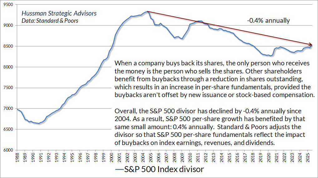
Consider the S&P 500. There has been no such thing as “net purchases” of stock by investors over the past 20 years. To the extent that there have been net purchases at all, the purchases have been by companies in the S&P 500 retiring outstanding stock. We know this because Standard & Poor’s adjusts the divisor of the index to account for new issuance and repurchase of shares by index components. The divisor isn’t a perfect gauge of net share issuance, because the divisor also adjusts for index membership changes and corporate actions. Addition of companies to the S&P 500 Index effectively look like new issuance from divisor’s perspective, and deletions or cash takeovers look like buybacks. The record change in the divisor was 4% in 1999 and 6% in 2000 – partly due to new issuance, but also due to index inclusion of companies like AOL, Yahoo, Qualcomm, JDS Uniphase, Palm, and Qwest at the bubble peak.
Examining the S&P 500 divisor, we can easily calculate that, to a reasonable approximation, net issuance (with index changes and repurchases) has been slightly negative since 2000. Specifically, the divisor has declined modestly, mainly as a result of ongoing stock buybacks, with a net contraction of about 0.4% of outstanding shares annually. If that seems small, remember that while companies have spent a large dollar value on buybacks, the majority of the repurchased shares do little more than offset dilution from stock-based compensation.
Since 2000, the increase in U.S. market capitalization has been driven almost entirely by growth in fundamentals and, far more importantly, by rising valuation multiples, not by the creation of new shares. Who holds those shares has certainly changed, but the number of outstanding shares being priced has not meaningfully increased.
New savings come in exactly the same form as the new liabilities do
In equilibrium, U.S. savers are not “plowing savings into the stock market” month after month. Existing shares change hands quite a bit, but virtually all personal savings in the U.S. since 2000 have accumulated in the form of newly issued government liabilities and household debt, not stock shares, because those are the new liabilities that were issued to finance the corresponding deficits. The surplus of one individual is the mirror image of someone else’s deficit. The way the deficit is financed is by issuing some financial liability in exchange for the surplus.
The fact is that most of the “savings” that have taken place in the U.S. economy over the past two decades represent the accumulation of Treasury securities and bank deposits by the wealthiest 10% of American households. Every deficit of government results in the creation of an equivalent amount of government liabilities. They take the form of pieces of paper (currency, Treasury bonds) or electronic entries (bank reserves). Every single dollar of these government liabilities must be held by someone, at every moment in time, in exactly the form the government issued them, until the government retires them. A buyer can’t put them “into” the stock market without a seller taking them right back “out of” the stock market.
While net stock issuance has actually been very slightly negative since 2000, a mountain of new financial instruments has been issued: debt obligations. The largest sources are the Federal government and ordinary American households, because they’ve run massive deficits. The mountain of new debt instruments accumulated by the top 10% memorialize the fact that the savings of this sector have been intermediated to cover the borrowing of the others.
The bank deposits held by the top 10% are backed by base money – created by the Federal Reserve to finance government deficits – and consumer and mortgage debt – created to finance consumption and net investment by the other 90% of households. That’s how wealthy households intermediate their savings to other American households: via mortgage securities, consumer loans, and revolving credit. These liabilities of families are directly or indirectly owned by the wealthy.
We know all this because 67% of all U.S. net worth is held by the top 10% of households, and just 2.5% of the net worth is held by the bottom 50% of households. In the upper-middle 50-90% group, a key form of net worth is home equity. Among corporations, a small amount of saving also represents net investment in capital goods, but even with the recent pop in AI investment, net capital investment among U.S. businesses amounts to only about 2.6% of GDP. That’s about half the average in the decades prior to 2000.
Very little of the financial intermediation in the U.S. takes the form of changes in the number of shares of corporate stock outstanding. To be clear – market capitalization has obviously increased in recent decades, but that has been a function of growth in fundamentals coupled with a push to unprecedented valuations. Market capitalization fluctuates as investors pay higher or lower prices. This can be the result of new information, changes in the returns expected by the consensus of investors, shifts in the balance between speculation and risk-aversion, or even the way we model the psychology of buyers versus sellers – but it’s incorrect to say that money goes “into” or “out of” the market. In equilibrium, there’s no such thing.
But doesn’t money “pour into the market” every month?
It’s tempting to imagine that we can exist by ourselves alone. We might think that if we put money into our 401k, we’ve put money “into the market.” But in fact, we’ve only transferred our cash to someone else, and we now hold the stock they previously held. Rather than describing this transaction as a “flow,” it’s more accurately described as an exchange: a transfer of share ownership from one investor to another, where the buyer acquires the shares indirectly through a managed investment fund rather than as individual positions in a brokerage account.
On the topic of “passive investing,” I fully agree with the idea that investors are presently insensitive to valuations, and that this insensitivity has an impact on stock prices. My main disagreement with the “money flow” argument is that, in my view, the resulting bubble is a reflection of fragile and temporary speculative psychology rather than a robust and “mechanical” flow-based dynamic. As I’ll detail below, this isn’t just semantics.
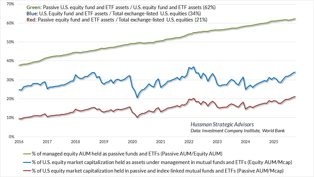
On a typical day, about $600 billion of trading value changes hands on the U.S. stock exchanges. That’s more than half the annual amount of total U.S. personal savings. In the 12 months ended June 2025, investors placed a record $457 billion under the management of passive U.S. mutual funds and ETFs, which then used those funds to buy stock from other investors (the sellers, of course, received those funds). That $457 billion amounts to less than one day of average trading value on U.S. exchanges, less than 1% of outstanding market capitalization, and less than 0.5% of annual trading. Yes, much of this trading is market-making and arbitrage, but every one of these transactions matches a buyer and a seller.
Based on data from the Investment Company Institute, about 62% of assets under management (AUM) by U.S. equity funds and ETFs are held in the form of passively-managed vehicles (though some of these vehicles, like the SPY, QQQ, and IWM, are themselves actively traded). These holdings amounting to just over 21% of total exchange-listed U.S. stock market capitalization.
The idea that the accumulation of outstanding shares by price-insensitive investors can drive “risk-premiums” lower, and therefore drive prices higher, is closely related to my academic research decades ago – particularly a paper with the breezy title “Market efficiency and inefficiency in rational expectations equilibria: dynamic effects of heterogenous information and noise” (Journal of Economic Dynamics & Control, 1993).
The problem is that in order to convert this idea into a theory of bubbles and permanent price impact, one needs to take literally the idea that a progressively increasing fraction of outstanding shares is held by investors who honestly do not care about expected returns or risk-premiums – and remain indifferent even to enormous cumulative reductions in likely future returns.
In effect, you’re assuming that price insensitivity applies not only to the marginal transaction (the order “fill”) but to the entire investment position. Given that assumption, equilibrium implies that valuations are an increasing function of the holdings of passive investors. But this means – equivalently – that the holdings of passive investors progressively increase as their expected future returns decline, and that passive investors are just fine with that. The reason this poses no obstacle to equilibrium is because we’ve assumed that passive investors don’t care about expected returns – durably, and with respect to their entire position.
In the language of my 1993 paper, the “flows” argument implies that an increasing portion of the total float is held by “noise traders.” Expected returns simply don’t enter their “objective function,” so valuations have no impact on their desired holdings. While this is a reasonable specification for, say, an individual “market order,” it’s difficult to extend it to the entire position – to assume that the marginal buyer is someone who keeps adding to their holdings despite increasingly thin return prospects. This sort of equilibrium essentially sees passive investors as pod-people in the Invasion of the Body Snatchers. I don’t believe that for a second.
To be clear, there’s no question that institutional trading and order imbalances can have day-to-day price impact. But that’s different from saying that investors don’t care about prospective returns – that they’re perfectly content with progressively higher valuations and progressively lower expected returns. In my own view, the defining feature of a bubble is that investors come to believe stocks have a persistent “edge” that ensures attractive expected returns regardless of valuations, so prices impose no discipline on their behavior. This is a much more vulnerable equilibrium, because it requires only a psychological realignment of expectations to produce a market collapse.
In this way, my own argument is much more aligned with Graham & Dodd’s 1934 description of the market conditions that preceded the collapse of the Great Depression. They observed that long periods of market advance inspire a dangerous confidence that valuations have nothing to do with long-term returns. Instead, investors come to imagine that long-term return prospects are always positive, and therefore that any price is a good price. This is a dynamic that plays out in every bubble – it’s nothing new. Passive investing always becomes increasingly popular as a bubble proceeds. The wrinkle suggesting that there’s a novel mechanism holding prices up is yet another way that a bubble manipulates time.
This isn’t just semantics. If one views bubbles as Graham & Dodd did – that investors do care about likely future returns, but that their expectations are misaligned, then the idea of “flows” is dispensable because heterogeneity among traders isn’t required. The bubble requires only that consensus expectations about future returns are misaligned with the expected returns implied by fundamentals (see the Geek’s Note in The Bubble Term). Conversely, a collapse requires only that the expected returns in the heads of investors become realigned with prevailing valuations.
In contrast, the idea that the bubble is driven by “price-insensitive money flow” seems to offer the additional assurance that there’s something both mechanical and quantitatively decisive – about particular investors and the investment vehicles they hold – that supports stocks beyond speculative psychology itself. I believe that’s a dangerous notion because it encourages confidence that the bubble is “structural.”
The following quote is from Graham & Dodd’s 1934 classic Security Analysis, published two years after the -89% market collapse of the Great Depression. To understand how a bubble manipulates time, notice how closely their description of the pre-crash bubble matches the sentiments of investors today.
One of the striking features of the past five years has been the domination of the financial scene by purely psychological elements. In previous bull markets the rise in stock prices remained in fairly close relationship with the improvement in business during the greater part of the cycle; it was only in its invariably short-lived culminating phase that quotations were forced to disproportionate heights by the unbridled optimism of the speculative contingent.
But in the 1921-1933 cycle this ‘culminating phase’ lasted for years instead of months, and it drew its support not from a group of speculators but from the entire financial community. The ‘new era’ doctrine – that ‘good’ stocks were sound investments regardless of how high the price paid for them – was at bottom only a means of rationalizing under the title of ‘investment’ the well-nigh universal capitulation to the gambling fever.
Why did the investing public turn its attention from dividends, from asset values, and from average earnings to transfer it almost exclusively to the earnings trend, i.e. to the changes in earnings expected in the future? The answer was, first, that the records of the past were proving an undependable guide to investment; and, second, that the rewards offered by the future had become irresistibly alluring.
Along with this idea as to what constituted the basis for common-stock selection emerged a companion theory that common stocks represented the most profitable and therefore the most desirable media for long-term investment. This gospel was based on a certain amount of research, showing that diversified lists of common stocks had regularly increased in value over stated intervals of time for many years past.
These statements sound innocent and plausible. Yet they concealed two theoretical weaknesses that could and did result in untold mischief. The first of these defects was that they abolished the fundamental distinctions between investment and speculation. The second was that they ignored the price of a stock in determining whether or not it was a desirable purchase.
The notion that the desirability of a common stock was entirely independent of its price seems incredibly absurd. Yet the new-era theory led directly to this thesis. An alluring corollary of this principle was that making money in the stock market was now the easiest thing in the world. It was only necessary to buy ‘good’ stocks, regardless of price, and then to let nature take her upward course. The results of such a doctrine could not fail to be tragic.
That enormous profits should have turned into still more colossal losses, that new theories should have been developed and later discredited, that unlimited optimism should have been succeeded by the deepest despair are all in strict accord with age-old tradition.
– Benjamin Graham & David L. Dodd, Security Analysis, 1934
So here’s where we stand. The U.S. equity markets have reached the most extreme point of valuation in U.S. financial market history. Record deficits in the government and household sectors have produced mirror image surpluses that we observe as record corporate profits. While the distribution of these profits has benefited large technology companies that enjoy enormous network effects (a public good for which the public is not compensated), the level of these profits reflects a “K-shaped” economy, with growing insecurity among American families, coupled with extreme wealth at the top.
Meanwhile, investors are paying top dollar for top dollar – extreme price/earnings multiples on record earnings that are quietly dependent on record deficits.
In my view, there’s nothing mechanical about this bubble apart from extrapolative speculative psychology. That psychology can shift in very short order. If history offers any lesson, it’s that a market collapse is nothing but risk-aversion meeting a market that’s not priced to tolerate risk. My impression is that it all ends badly, but nothing in our discipline relies on that, and no forecasts or scenarios are required.
Keep Me Informed
Please enter your email address to be notified of new content, including market commentary and special updates.
Thank you for your interest in the Hussman Funds.
100% Spam-free. No list sharing. No solicitations. Opt-out anytime with one click.
By submitting this form, you consent to receive news and commentary, at no cost, from Hussman Strategic Advisors, News & Commentary, Cincinnati OH, 45246. https://www.hussmanfunds.com. You can revoke your consent to receive emails at any time by clicking the unsubscribe link at the bottom of every email. Emails are serviced by Constant Contact.
The foregoing comments represent the general investment analysis and economic views of the Advisor, and are provided solely for the purpose of information, instruction and discourse.
Prospectuses for the Hussman Strategic Market Cycle Fund, the Hussman Strategic Total Return Fund, and the Hussman Strategic Allocation Fund, as well as Fund reports and other information, are available by clicking Prospectus & Reports under “The Funds” menu button on any page of this website.
The S&P 500 Index is a commonly recognized, capitalization-weighted index of 500 widely-held equity securities, designed to measure broad U.S. equity performance. The Bloomberg U.S. Aggregate Bond Index is made up of the Bloomberg U.S. Government/Corporate Bond Index, Mortgage-Backed Securities Index, and Asset-Backed Securities Index, including securities that are of investment grade quality or better, have at least one year to maturity, and have an outstanding par value of at least $100 million. The Bloomberg US EQ:FI 60:40 Index is designed to measure cross-asset market performance in the U.S. The index rebalances monthly to 60% equities and 40% fixed income. The equity and fixed income allocation is represented by Bloomberg U.S. Large Cap Index and Bloomberg U.S. Aggregate Index. You cannot invest directly in an index.
Estimates of prospective return and risk for equities, bonds, and other financial markets are forward-looking statements based the analysis and reasonable beliefs of Hussman Strategic Advisors. They are not a guarantee of future performance, and are not indicative of the prospective returns of any of the Hussman Funds. Actual returns may differ substantially from the estimates provided. Estimates of prospective long-term returns for the S&P 500 reflect our standard valuation methodology, focusing on the relationship between current market prices and earnings, dividends and other fundamentals, adjusted for variability over the economic cycle. Further details relating to MarketCap/GVA (the ratio of nonfinancial market capitalization to gross-value added, including estimated foreign revenues) and our Margin-Adjusted P/E (MAPE) can be found in the Market Comment Archive under the Knowledge Center tab of this website. MarketCap/GVA: Hussman 05/18/15. MAPE: Hussman 05/05/14, Hussman 09/04/17.