

Soft Selling a Hard Landing


John P. Hussman, Ph.D.
President, Hussman Investment Trust
November 2023
The stance of policy is restrictive, meaning that tight policy is putting downward pressure on economic activity and inflation, and the full effects of our tightening have yet to be felt. The staff did not put a recession back in. I mean it would be hard to see how you would do that if you look at the activity we’ve seen recently, which is not really indicative of a recession in the near term. The Committee is not thinking about rate cuts right now at all.
– Jerome Powell, Federal Reserve Chair, November 1, 2023
For the better part of two years, investors have been primed with hope of a “Fed pivot” that will presumably restore easy monetary policy and supportive conditions for the financial markets. If anything characterized the first half of November, it was the reflexive release of pent-up “PIVOT!!!!” jubilation, on the belief that the Federal Reserve is finished with rate increases, and that the economy will enjoy a “soft landing.” My impression is that this belief led to a sudden “fear of missing out” (FOMO) and eagerness to get in front of a “Goldilocks” scenario combining continued economic growth with eventual Fed easing.
The S&P 500, Nasdaq 100, and even the Russell 2000 responded with what we often call a “fast, furious, prone-to-failure” clearing rally, eliminating the short-term oversold conditions of late-October by moving from the bottom to the top of their respective Bollinger bands (from -2 to +2 standard deviations around their 20-day averages).

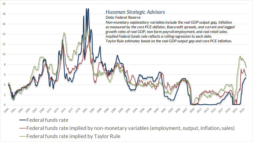
From the standpoint of systematic monetary policy, the Federal Funds rate remains below, not above, levels that have historically been consistent with prevailing core inflation, output, employment, and sales. Still, we’re close enough to systematic benchmarks that pausing further rate hikes is reasonable here. That’s particularly true given that the Fed has drowned the banking system with trillions of dollars of excess, uninsured deposits, which already creates financial stability concerns. As I noted in Fabricated Fairy Tales and Section 2A and Money, Banking, and Markets – Connecting the Dots, the Federal Reserve’s balance sheet remains deranged from the standpoint of systematic policy and the 2A mandate of the Federal Reserve Act.
The Fed still has a lot of work to do. “Quantitative tapering” may seem mysterious, but it involves nothing more than changing the type of assets that the public holds. Quantitative easing involved the Fed buying bonds from the public, and paying them with pebbles chiseled with “Federal Reserve” on them. Quantitative tightening means that the Fed lets some of its bonds mature without replacing them, at which point a) the Treasury refinances its debt by selling new bonds to the public in return for pebbles, and b) The Treasury uses those pebbles to repay the maturing bonds owned by the Federal Reserve. Presently, the public holds trillions of dollars of uninsured deposits, backed by excess bank reserves created by the Fed, on which banks earn interest of 5.4% annually in public funds from the Fed, yet may or may not pass that interest on to depositors. Quantitative tapering simply replaces the excess, uninsured, and most likely low-interest deposits held by the public with interest-bearing Treasury securities that they will hold instead.
Still, at least from an interest rate perspective, the Fed has done an admirable job of improving the alignment between the Federal Funds rate and systematic benchmarks.
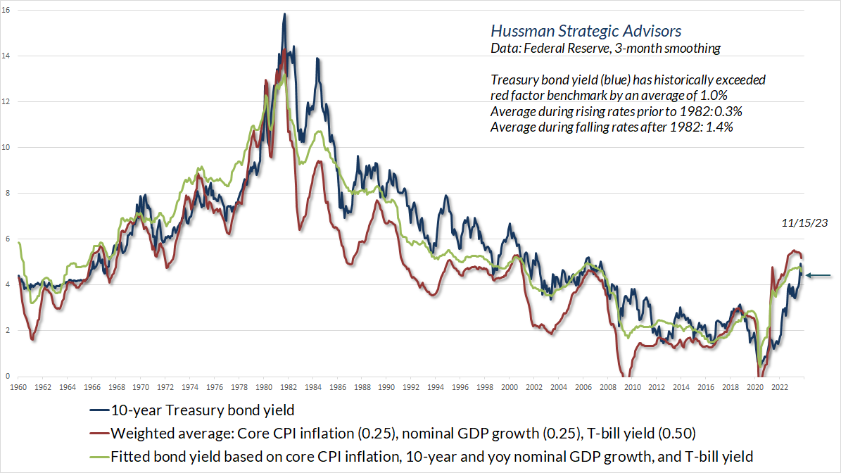
With respect to longer-term interest rates, remember that the entire historical total return of Treasury bonds, in excess of T-bills, has accrued in periods when long-term yields have been above the weighted average of T-bill yields (0.5), nominal GDP growth (0.25) and core CPI inflation (0.25).
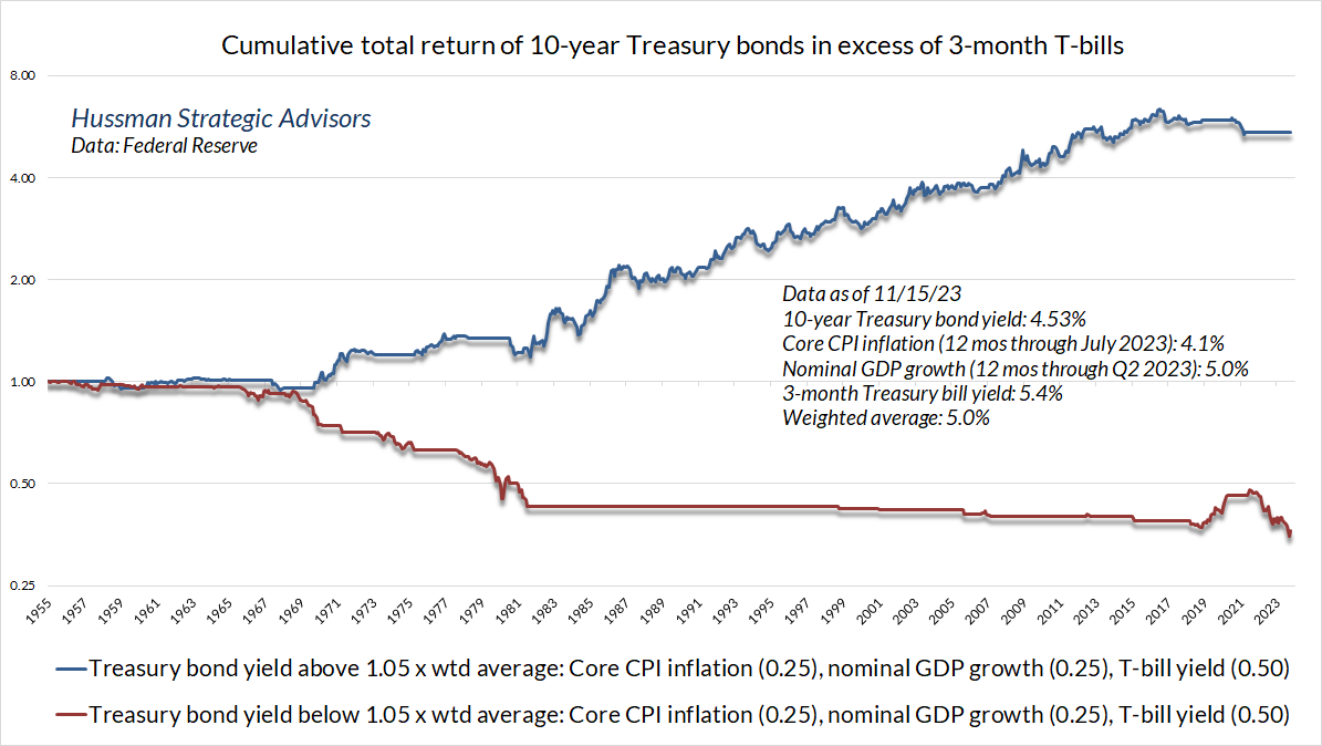
With the recent retreat in 10-year Treasury yields from their highs a few weeks ago, we’re again inclined to characterize bond yields as reasonable but slightly “inadequate.” My expectation is that the “yield curve” – the difference between long-term interest rates and short-term interest rates – is likely to normalize in the coming quarters, but only partly by a retreat in short-term rates, and instead largely by further upward pressure on long-term rates, despite what we view as emerging recession risk.
Wait, what?!? Emerging recession risk? Yes.
Emerging risk of a U.S. recession
I’ve often noted that in every noise-reduction problem, uniformity matters. There is vastly more information in the common signal drawn from multiple sensors than there is in any single measure by itself. While we still don’t have enough data to anticipate a recession with high confidence, my view is that the sudden enthusiasm about a “soft landing” runs exactly opposite to the trend of the data.
When I was a doctoral student at Stanford, one of my mentors was Robert Hall, who chaired the Business Cycle Dating Committee of the National Bureau of Economic Research (NBER). Investors and even journalists often misjudge the role of the NBER. The Committee often dates a recession or recovery well after it is underway, which regularly leads to criticism about the lateness of their “calls.” The problem is that the NBER doesn’t make recession “calls” – their explicit role is to date recessions for the historical record, and they intentionally wait until they have confidence in that dating.
The committee’s approach to determining the dates of turning points is retrospective. In making its peak and trough announcements, it waits until sufficient data are available to avoid the need for major revisions to the business cycle chronology.
– National Bureau of Economic Research, Business Cycle Dating
It’s useful to recognize that the definition of a recession as “two quarters of negative GDP” is a rule-of-thumb, not the actual method by which recessions are dated. Remember, in every noise-reduction problem, uniformity matters. For the NBER, dating a recession is based on the depth, diffusion and duration of retreat across several measures of economic activity: mainly output, income, sales, and employment.
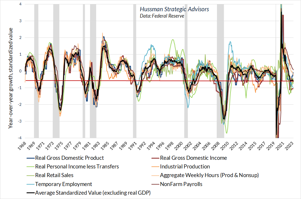
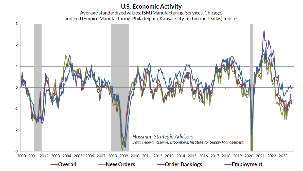
The chart below shows what this sort of “diffusion” looks like. The year-over-year growth in various measures is shown, as usual, as standardized values, so a value below zero doesn’t necessarily mean contraction; it means that growth is below the historical norm. Still, even excluding real GDP, once the average standardized value (black) drops below about -0.5, the economy has typically been in recession. There are no “magic numbers” here, so suffice it to say that current conditions are at the edge, but not enough to declare a recession with confidence. At present, the strongest of these measures, though still on the decline, have been on the employment front: non-farm payrolls, and aggregate weekly hours.
We observe similar behavior in other economic composites that we’ve created over time. The chart below is based on regional and national Fed and purchasing manager surveys. Notice again that the strongest components holding out against recession have been on the employment front.
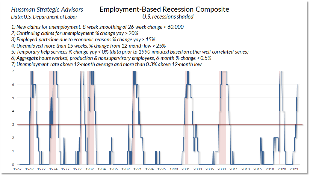
The difficulty here is that employment is among the most lagging of economic indicators. To obtain a sensitive measure of recession risk from employment-based measures, we have to go back to the idea of drawing information from “uniformity.” For employment, the best measures are those that capture subtle shifts in the labor activity: reduced demand for temporary help, increases in initial and continuing jobless claims, changes in the composition of the employed (for example, part-time “for economic reasons” because full-time work is unavailable), changes in the duration of unemployment, and declines in aggregate hours worked.
In every noise-reduction problem, uniformity matters. There is vastly more information in the common signal drawn from multiple sensors than there is in any single measure by itself.
The chart below shows our Employment-Based Recession Composite, which is already consistent with oncoming recession. I’ll emphasize again that I don’t believe we have enough evidence to expect a recession with high confidence, but it should be clear that the data are increasingly leaning away from, not toward, the idea of a “soft landing.”
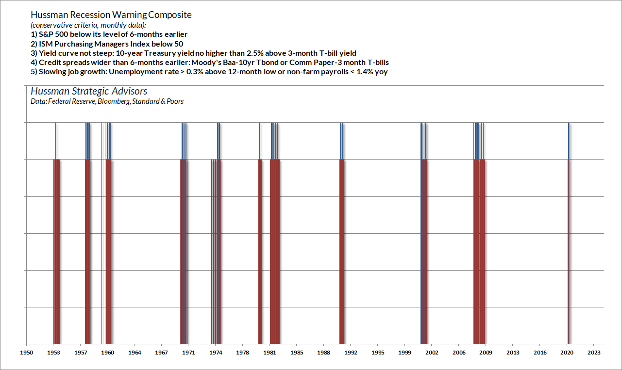
On the subject of recession risk, I’ll note that the most sensitive weekly version of our Recession Warning Composite signaled fresh risk on Friday, October 27, but our more conservative monthly version (below) has yet to shift. The blue bars in the chart below show points when all of the components were in place. The red bars show actual U.S. recessions. As I noted last month, my impression is that a decline in the S&P 500 below about the 4100 level on a monthly close would be the last straw for this measure. For now, I’ll emphasize again that the data are consistent with the U.S. economy at the borderline of recession, but we would require additional data to expect that outcome with high confidence.
Valuations and internals
Emphatically, our investment discipline is to align our investment outlook with prevailing, measurable, observable market conditions, and to shift our outlook as those conditions change. No forecasts are required.
It’s true that valuations have strong implications for long-term, full-cycle market outcomes, but it’s incorrect to view those outcomes as short-term forecasts. Instead, they provide context about where investors stand within the market cycle. Based on prevailing market valuations, we estimate that poor total returns are likely for the S&P 500 in the coming 10-12 years, that equity market returns, relative to bonds, are likely to be among the worst in history, and that a market loss on the order of -63% over the completion of this cycle would be consistent with prevailing valuations and a century of market history.
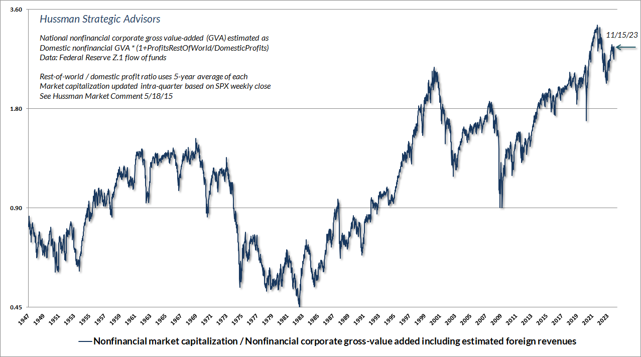
A few quick charts on these long-term, full-cycle risks. The chart below shows the valuation measure that we find best-correlated with actual subsequent S&P 500 total returns in market cycles across history – nonfinancial market capitalization to gross value-added. At present, MarketCap/GVA remains higher than at any point in history prior to November 2020, with the exception of 15 weeks surrounding the 1929 bubble peak.
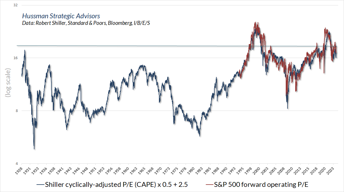
I’ve previously detailed why valuation measures based on smooth or margin-adjusted fundamentals have historically been more reliable than those that take earnings or estimated earnings at face value – see for example, Top Dollar for Top Dollar. Still, given the popularity of the S&P 500 price / forward operating earnings ratio – a measure that only became popular in the 1990’s, it’s worth understanding that a forward P/E of 20 is not cheap by any stretch of the imagination. While the forward P/E is based on the future earnings estimates of Wall Street analysts, and the Shiller cyclically-adjusted P/E (CAPE) is based on the 10-year smoothing of past reported earnings, there is a strong enough relationship that we can overlay the two to get a sense of what a historically “normal” forward P/E would be. That norm is close to 11.
The chart below shows our estimate of likely 12-year S&P 500 total returns, over-and-above the return available on Treasury bonds. I show this chart because the current estimate, at -7.8%, is the worst level in history. It’s true that if the end of a 12-year investment horizon happens to be a bubble peak, actual returns (red) might peel away from our estimates (blue). Yet even then, the worst “error” resulting from end-of-horizon bubble valuations has been about 7.5%. Given that we expect a -7.8% gap (with the S&P 500 losing value over a 12-year horizon while bonds earn positive returns), even a 7.5% error would put stock returns behind bonds. Not that we view bond yields as quite “adequate” either, but I do believe that most of the bond market losses are behind us. Stocks are another matter entirely. That’s what you get after more than a decade of Fed-driven yield-seeking speculation.
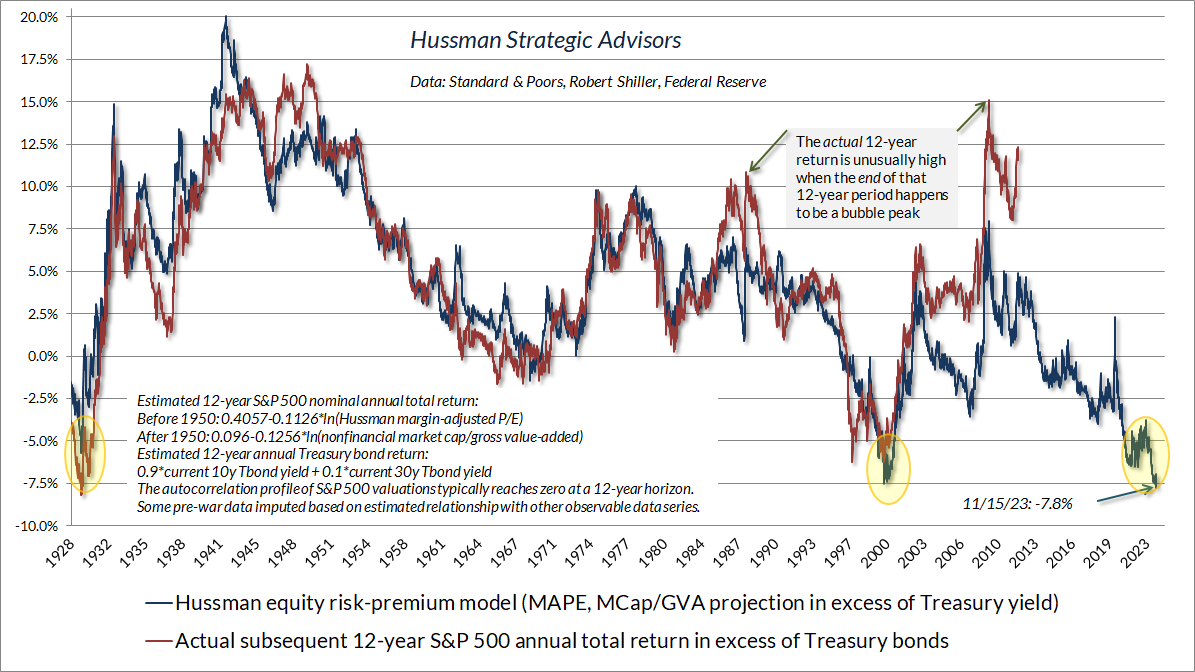
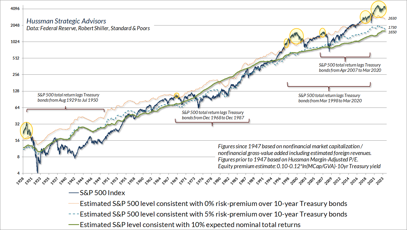
The chart below shows the same data in a different way. The yellow bubbles show points when our estimates of S&P 500 total returns were below prevailing 10-year Treasury yields. The 1929, 1968, 1998, and 2007 instances were indeed followed by very long periods of lagging S&P 500 performance relative to bonds. I don’t expect the current instance to be different.
At present, we estimate that the S&P 500 would have to decline to roughly 2630 for the expected 10-year S&P 500 total return to match the prevailing yield on 10-year Treasury bonds. A loss closer to the 1650-1730 area would restore historically run-of-the-mill expected returns and risk premiums. I know that seems preposterous, but it’s also how market cycles have typically been completed over time. Nothing in our discipline requires this outcome. As usual, we would describe these figures as historically-informed risk estimates rather than “forecasts.”
That said, valuations are long-term and full-cycle objects, and they often have little impact on market outcomes over shorter segments of the market cycle. When investors are sufficiently inclined to speculate, they can even ignore valuations for years – indeed, that’s the only way that speculation can produce a bubble as extreme as we observe at present.
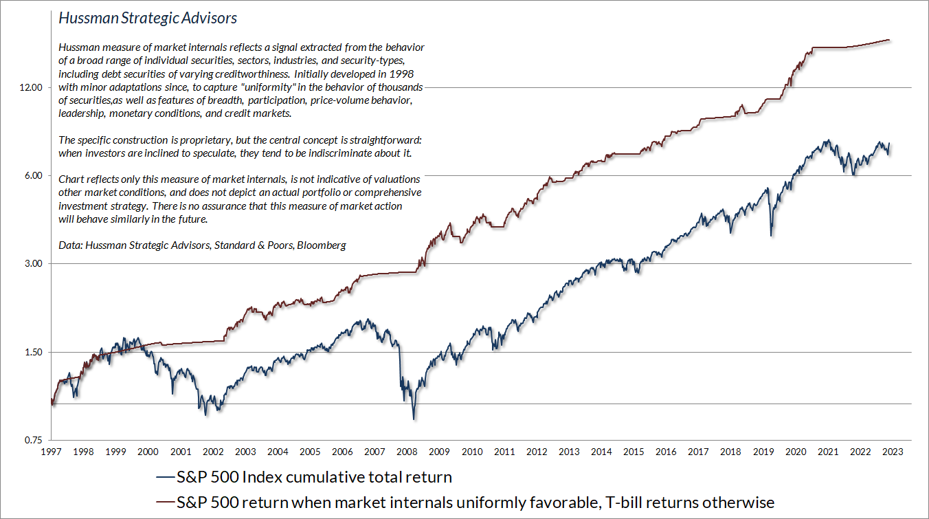
We gauge investor psychology – speculation versus risk-aversion – based on the uniformity of market action across thousands of individual stocks, industries, sectors, and security-types, including debt securities of varying creditworthiness. When investors are inclined to speculate, they tend to be indiscriminate about it. As usual, in every noise-reduction problem, uniformity matters.
The chart below presents the cumulative total return of the S&P 500 in periods where our main gauge of market internals has been favorable, accruing Treasury bill interest otherwise. The chart is historical, does not represent any investment portfolio, does not reflect valuations or other features of our investment approach, and is not an assurance of future outcomes.
Stated as simply as possible, despite the usefulness of various ‘speculative limits’ in other market cycles across history, the very idea of ‘speculative limits’ became detrimental in the face of zero interest rate policies. Our 2017 and 2021 adaptations gave explicit priority to the prevailing condition of market internals, albeit with safety nets and position limits when valuations are extreme.
It’s worth repeating that our admitted difficulty amid zero-interest rates wasn’t about valuations per se, and it wasn’t about market internals. It was our bearish response to overvalued, overbought, overbullish extremes that had historically signaled a “limit” to speculation in market cycles across history. Those “limits” turned out to be not only useless but detrimental in the face of relentless, Fed-driven, yield-seeking speculation. We introduced adaptations in 2017 and 2021 to restore the strategic flexibility that we enjoyed for decades prior to quantitative easing.
Stated as simply as possible, despite the usefulness of various “speculative limits” in other market cycles across history, the very idea of “speculative limits” became detrimental in the face of zero interest rate policies. Our 2017 and 2021 adaptations gave explicit priority to the prevailing condition of market internals, albeit with safety nets and position limits when valuations are extreme.
As I detailed in last month’s market comment (see the section titled Gauging the State of the System), the entire total return of the S&P 500 during periods of monetary easing has accrued when market internals were favorable as well. In contrast, recall that some of the worst market losses on record, including the 2000-2002 and 2007-2009 collapses, occurred amid aggressive and persistent Fed easing. That doesn’t mean that the market can’t advance during periods of unfavorable market internals. It means that those advances tend to plunge through open “trap doors” that abruptly wipe out those advances even without any identifiable catalyst.
At present, despite the breakneck “clearing rally” we’ve seen over the past few weeks, our measures of internals remain clearly unfavorable. Indeed, the narrowness of the market’s favor toward large-cap glamour stocks is itself a measure of risk-averse selectivity more than it is of robust speculation.
Passive and glamorous
The Nifty Fifty appeared to rise up from the ocean; it was as though all of the U.S. but Nebraska had sunk into the sea. The two-tier market really consisted of one tier and a lot of rubble down below. What held the Nifty Fifty up? The same thing that held up tulip-bulb prices long ago in Holland – popular delusions and the madness of crowds. The delusion was that these companies were so good that it didn’t matter what you paid for them; their inexorable growth would bail you out.
– Forbes Magazine, 1977, The Nifty Fifty Revisited
Plus ça change, plus c’est la même chose.
The more things change, the more they remain the same. As I noted in the January 2020 comment, One Tier and Rubble Down Below, one of the striking things about bull markets is that they often end in confident exuberance, while simultaneously deteriorating from the inside. The clearest challenge for hedged equity strategies this year is the same one we observed approaching the 2020 pre-pandemic peak – a narrowing of investor attention to a handful of stocks that investors consider “sure things.”
The chart below shows what’s been going on internally. Notice that the S&P 500, weighting its components by market capitalization, has clearly outperformed the same S&P 500 components, equally weighted. The capitalization-weighted S&P 500 has also outpaced the NYSE Composite and the Russell 2000, as well as stocks characterized by “value” factors.
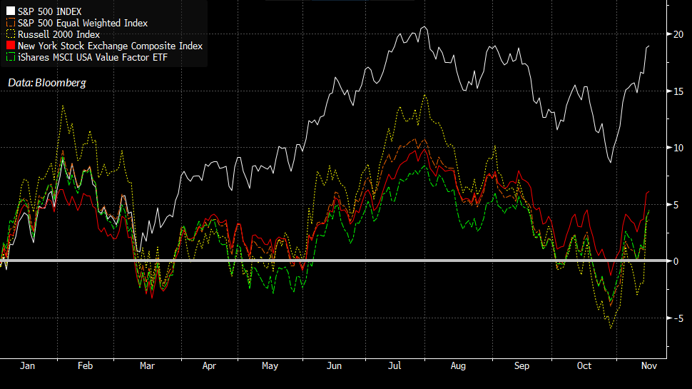
This unusual gap largely reflects narrow attention by investors on stocks dubbed as the “Magnificent Seven”: Apple, Microsoft, Alphabet, Amazon, Meta, NVIDIA, and Tesla.
The average allocator is adding to US growth equities, having been frustrated by inconsistent and lower returning value stocks, Int’l, bonds. They’ve thrown in the towel. One decision stocks. Quality compounders. Free cash flow machines. At any price. I hear it all the time.
– Toronto portfolio manager @thepmoss, November 11, 2023
“At any price.” There’s your trouble. As Forbes wrote about the 1973-74 market collapse that brought many of the Nifty Fifty down by 50-80%, “The delusion was that these companies were so good that it didn’t matter what you paid for them; their inexorable growth would bail you out.”
We observed similar speculation among glamour tech stocks in March 2000, when I estimated a potential -83% loss in technology stocks – the tech-heavy Nasdaq 100 went on to lose an implausibly precise -83%. Alan Abelson of Barron’s Magazine published my projections for Cisco, EMC, Sun Microsystems and Oracle – all in the range of about 15-20% of the prices where they had recently changed hands. Those projections actually turned out to be slightly optimistic.
Among the things that investors forget about mega-cap growth stocks is that both growth rates and operating margins tend to decline as companies become dominant. An emerging growth company with 100% year-over-year growth, sustainable prospects for continued growth, and operating margins of 40% might fetch a price/revenue multiple in the range of 15-20. Two or three years later, year-over-year growth might be down to 50%, operating margins down to 30%, and a proper discounted cash flow calculation might justify a price/revenue multiple in the 5-10 range.
Several years later, the company might be absolutely massive in terms of total revenues and profits, but progressively slowing to growth of less than 10% annually, with operating margins down to 25%. By then, the justified price/revenue multiple might be just 2. Yet investors might still be paying a multiple of 5-10 times revenues because they ignore a central feature of investment analysis: growth rates and operating margins are not fixed numbers, but trajectories. That’s how 80% losses happen.
Growth rates and operating margins are not fixed numbers, but trajectories.
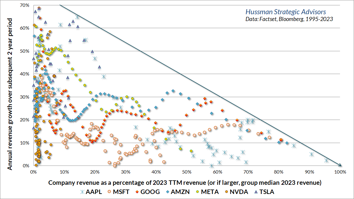
The next few charts offer a reminder of how this works. The horizontal axis of in the chart below tracks 4-quarter revenues of the “Magnificent Seven” in data since 1995 (depending on when each company went public) as a fraction of 2023 4-quarter revenues. Points to the left are earlier in the growth trajectory, while points to the right are closer to the present. The vertical axis shows the subsequent 2-year growth rate of revenues. While there is a great deal of variation, and growth certainly doesn’t follow a straight line, you’ll notice that growth inexorably slows with size. The same was true for the mega-cap companies at the 2000 peak.
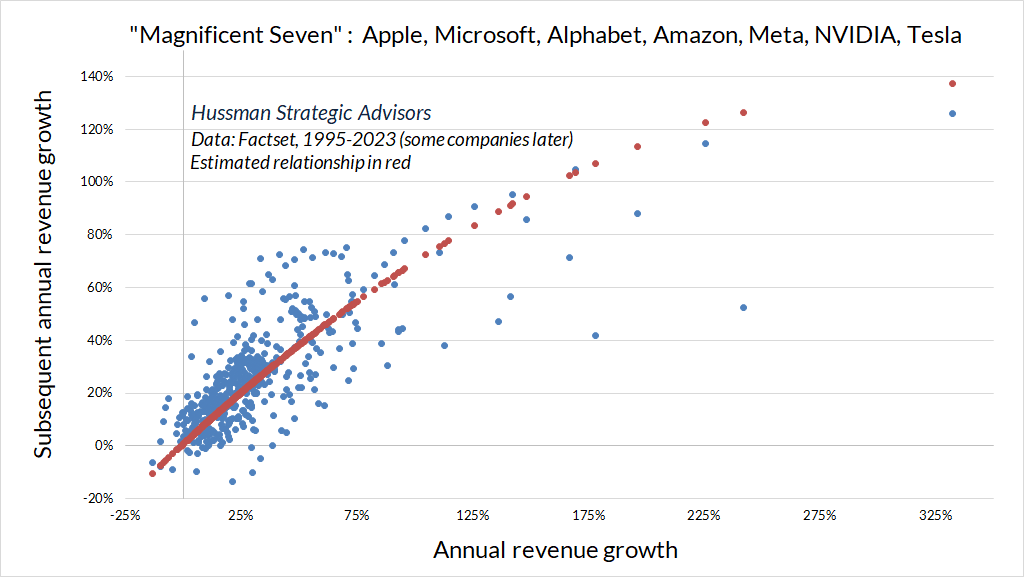
The chart below shows the same process as a scatter plot. The horizontal axis shows annual revenue growth for each of these companies, and the vertical axis shows subsequent annual revenue growth. If growth rates were fixed numbers, the chart would be a diagonal line. Instead, rapid growth rates tend to slow progressively.
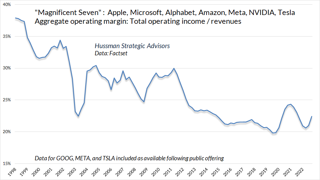
The same sort of erosion is apparent in operating profit margins.
None of this should be a surprise. The emergence and gradual erosion of essentially temporary “excess profits” is exactly how a competitive economy produces long-term growth. The danger is that this process happens slow enough to convince every generation that the current batch of glamour stocks is the permanent batch.
As the rise and decay of industrial fortunes is the essential fact about the social structure of capitalist society, both the emergence of what is, in any single instance, an essentially temporary gain, and the elimination of it through the working of the competitive mechanism, obviously are more than ‘frictional’ phenomena, as is the process of underselling by which industrial progress comes about in a capitalist society and by which its achievements result in higher incomes all around.
– Joseph Schumpeter, The Instability of Capitalism (1928)
With regard to individual stocks, it’s worth keeping in mind that the valuation estimates of companies with very high growth rates are highly sensitive to small changes in growth assumptions, and to disappointments in those assumptions. The consolation is that rapid growth – provided it does materialize – makes it somewhat easier to “grow into” valuation errors within a few years. The greatest danger emerges when valuations are rich despite relatively low growth, making it particularly difficult to grow out of errors. My impression is that investors are likely to learn this lesson from some very, very large companies, not to mention the S&P 500 itself.
Keep Me Informed
Please enter your email address to be notified of new content, including market commentary and special updates.
Thank you for your interest in the Hussman Funds.
100% Spam-free. No list sharing. No solicitations. Opt-out anytime with one click.
By submitting this form, you consent to receive news and commentary, at no cost, from Hussman Strategic Advisors, News & Commentary, Cincinnati OH, 45246. https://www.hussmanfunds.com. You can revoke your consent to receive emails at any time by clicking the unsubscribe link at the bottom of every email. Emails are serviced by Constant Contact.
The foregoing comments represent the general investment analysis and economic views of the Advisor, and are provided solely for the purpose of information, instruction and discourse.
Prospectuses for the Hussman Strategic Growth Fund, the Hussman Strategic Total Return Fund, the Hussman Strategic International Fund, and the Hussman Strategic Allocation Fund, as well as Fund reports and other information, are available by clicking “The Funds” menu button from any page of this website.
Estimates of prospective return and risk for equities, bonds, and other financial markets are forward-looking statements based the analysis and reasonable beliefs of Hussman Strategic Advisors. They are not a guarantee of future performance, and are not indicative of the prospective returns of any of the Hussman Funds. Actual returns may differ substantially from the estimates provided. Estimates of prospective long-term returns for the S&P 500 reflect our standard valuation methodology, focusing on the relationship between current market prices and earnings, dividends and other fundamentals, adjusted for variability over the economic cycle. Further details relating to MarketCap/GVA (the ratio of nonfinancial market capitalization to gross-value added, including estimated foreign revenues) and our Margin-Adjusted P/E (MAPE) can be found in the Market Comment Archive under the Knowledge Center tab of this website. MarketCap/GVA: Hussman 05/18/15. MAPE: Hussman 05/05/14, Hussman 09/04/17.