

Cluster of Woe


John P. Hussman, Ph.D.
President, Hussman Investment Trust
February 2024
By relentlessly depriving investors of risk-free return, the Federal Reserve has spawned an all-asset speculative bubble that we estimate will provide investors little but return-free risk. From a valuation standpoint, there is no ‘tradeoff’ between return and risk. Rather, depressed valuations tend to be followed by both strong long-term returns and modest subsequent losses, while extreme valuations tend to be followed by both poor long-term returns and deep subsequent losses.
Recall that the S&P 500 lagged Treasury bills from 1929-1947, 1966-1985, and 2000-2013. 50 years out of an 84-year period. When the investment horizon begins at extreme valuations, and doesn’t end at the same extremes, the retreat in valuations acts as a headwind that consumes the return that would otherwise be provided by dividends and growth in fundamentals.
– John P. Hussman, Ph.D., Return-Free Risk, January 2022
The total return of the S&P 500 remains behind Treasury bills since its January 2022 peak more than two years ago. Meanwhile, the technology-heavy Nasdaq 100 is only even with Treasury bills since the preponderance of warning flags I noted in our November 2021 comment, Motherlode. As I observed last month, the strongest stock market returns in the coming decade, perhaps longer, are likely to emerge during advances in the S&P 500 that attempt to catch up with the cumulative return of risk-free Treasury bills.
Our most reliable valuation measures are again beyond every extreme in U.S. history prior to March 2021, apart from 5 weeks surrounding the 1929 market peak. Meanwhile, our most reliable gauge of market internals remains unfavorable as the result of persistent divergences across individual securities and sectors. Yet even though the market has lagged Treasury bills for more than two years, my impression is that investors feel an almost excruciating “fear of missing out” amid nominal record highs in the S&P 500 and Nasdaq 100, enthusiasm about an economic “soft landing,” and an expected “pivot” to lower interest rates. In my view, abandoning systematic investment discipline amid the most extreme market conditions in history would be a costly way to buy a fleeting sigh of relief.
We know that valuations are informative about long-term returns and full-cycle losses, but not about short-term outcomes. The only way the market could reach valuations as extreme as today was to advance, unfazed, through every lesser extreme. So it’s not just extreme valuations, but the full combination of extreme valuations, divergent market internals, and a fresh preponderance of warning flags that holds us to a defensive outlook here.
Abandoning systematic investment discipline amid the most extreme market conditions in history would be a costly way to buy a fleeting sigh of relief.
Keep in mind that the entire total return of the S&P 500 in the complete market cycle since 2007 has emerged in periods when market internals were favorable, and the most extreme losses have emerged in periods when they were not. If the market is destined to proceed higher without limit, I expect a shift in market internals to capture that prospect. We adapted our investment discipline in 2017 and more fully in 2021 to prioritize the condition of market internals over other considerations such as valuations and overextended syndromes (see “How I acquired the ‘permabear’ label” for a full discussion). Our investment outlook will shift as those considerations shift.

Cluster of Woe
Based on dozens of measures that include valuations, internals, overextension syndromes, and numerous technical, fundamental, and cyclical gauges we’ve developed over time, we estimate that current market conditions now “cluster” among the worst 0.1% instances in history – more similar to major market peaks and dissimilar to major market lows than 99.9% of all post-war periods.
I call this the “Cluster of Woe” because the handful of similarly extreme instances (most notably in 1972, 1987, 1998, 2000, 2018, 2020, and 2022) were typically followed by abrupt market losses of 10%-30% over the next 6-10 weeks (average -12.5%), with losses at the smaller end of that range often seeing deeper follow-through later. Still, I treat these outcomes as “regularities” rather than “forecasts,” and my impression is that investors don’t accept those regularities anyway.
You may recall that the most recent instance prior to this one was in July 2023 (see Air Pockets, Free-Falls, and More Cowbell). It was followed by a quick 10% air-pocket into late-October, but with no deeper follow-through as yet.
A somewhat less pointed way to think about current conditions is to identify instances in history that were “closest” based on a broad set of key cyclical market indicators (valuations, market internals, overextended syndromes, and various proprietary gauges). The chart below shows these “nearest neighbors” since 1998 as red bars.
These neighbors include a number of less extreme instances than those noted above, and not all of them were followed by steep declines. For example, the 2014 similarity was simply resolved by the S&P 500 going nowhere over the next two years. Without making near-term forecasts, suffice it to say that current conditions are the sort of rare market extremes that tend to resolve badly.
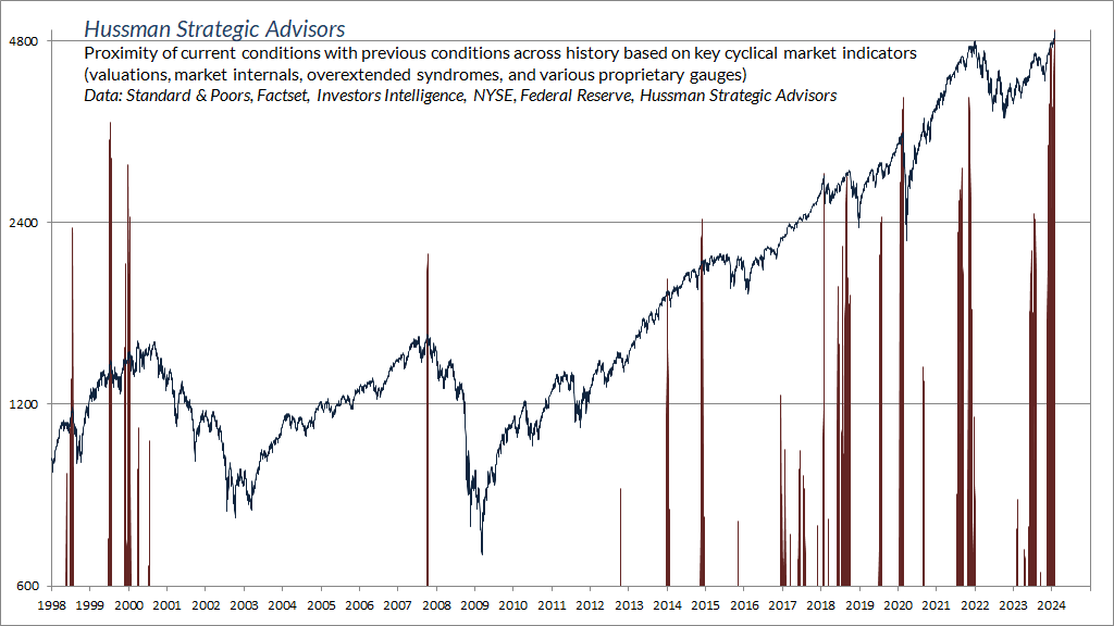
The market losses that resolve extreme overextension are not just short-term events. Combinations of rich valuations, unfavorable internals, and extreme overextension like these often occur at or near important cyclical market peaks. The potential for a near-term ‘air pocket’ or ‘free fall’ isn’t a forecast so much as a regularity that should not be ruled out. Even passive investors should examine their exposures carefully, and rebalance their portfolios to reflect their actual level of risk tolerance.
You’ll notice that none of the foregoing discussion is focused on recession probabilities, employment, inflation, or earnings expectations. The reason is that the consequences of steep overvaluation, unfavorable internals, and extreme overextension seem to be largely indifferent to these considerations. There’s often no identifiable ‘catalyst’ associated with various market peaks, air pockets, and free-falls. Catalysts tend to emerge later, if at all. To some extent, the initial losses are more behavioral than economic – extreme overextension simply tends to become exhausted, followed by concerted attempts by speculators to exit at still-elevated levels.
– John P. Hussman, Ph.D., Air Pockets, Free-Falls, and More Cowbell, July 24, 2023
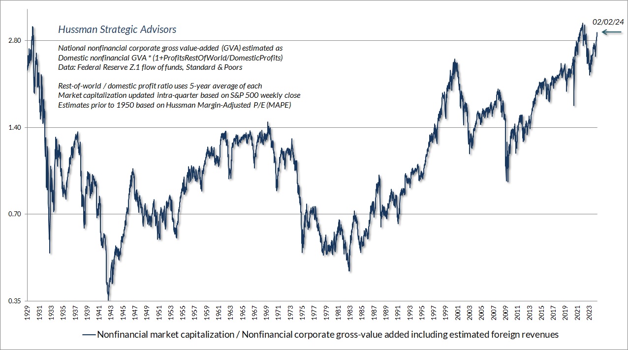
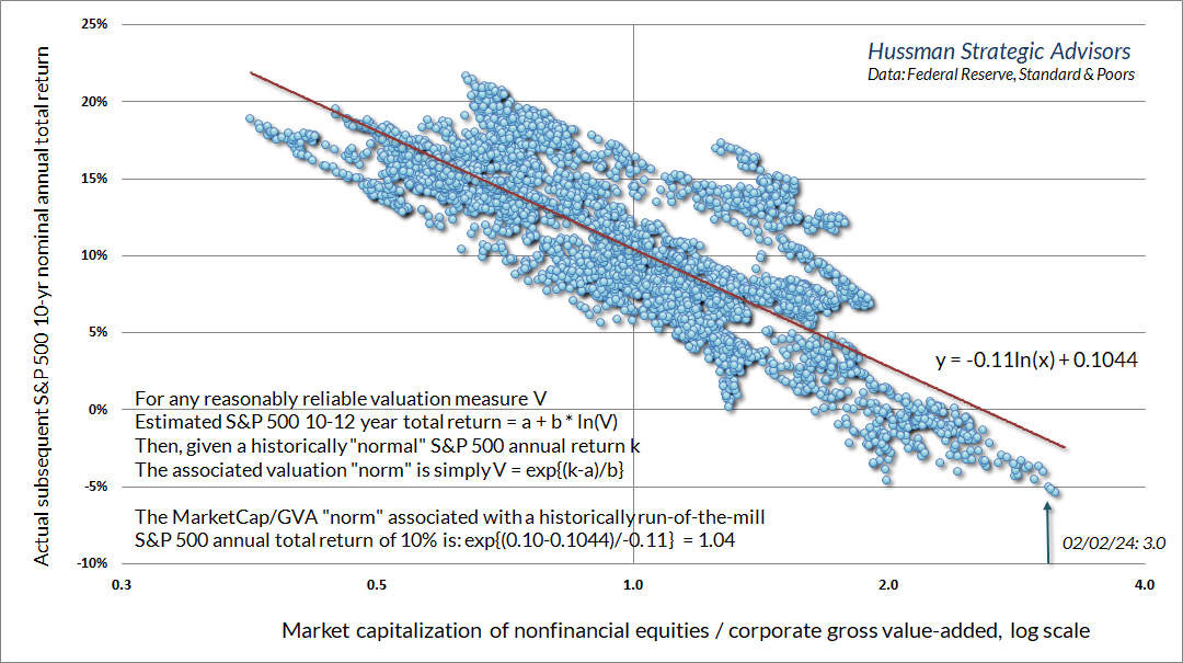
The chart below shows the relationship between MarketCap/GVA and subsequent 10-year average annual nominal S&P 500 total returns, in data since 1928. The only instances more extreme than today were 28 weeks surrounding the 2022 peak, and 5 weeks surrounding the 1929 market peak. The present extreme is about three times the valuation that has historically been associated with run-of-the-mill S&P 500 total returns averaging 10% annually.
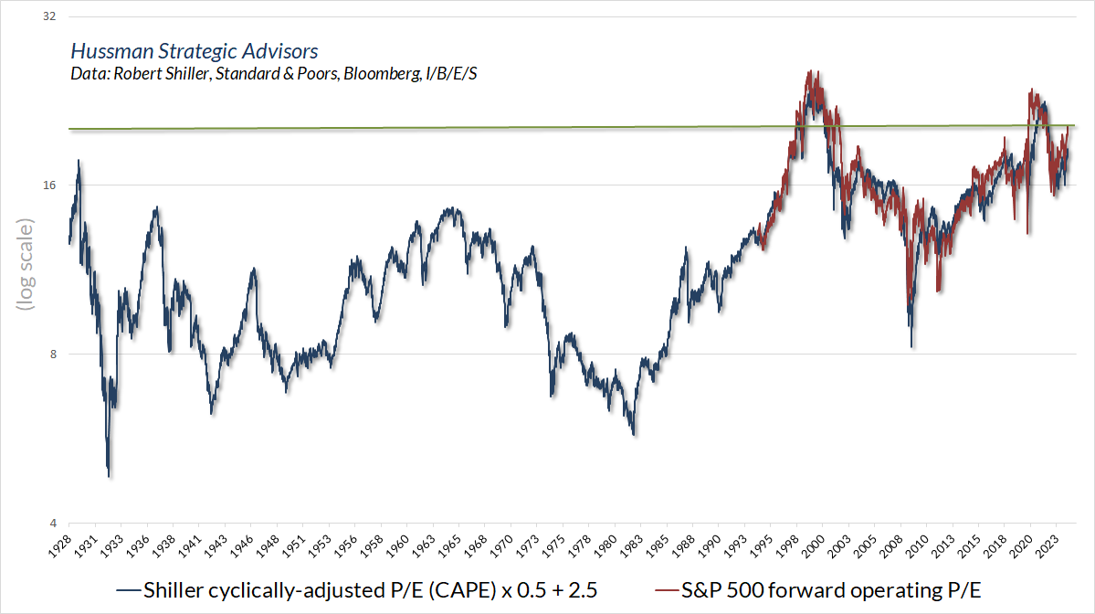
For investors inclined to take current earnings and Wall Street’s “forward operating earnings” estimates at face value, it’s worth noting that earnings-based measures are also extreme from a historical perspective. As I’ve noted before, the S&P 500 “forward operating” P/E only became popular in the late-1990’s, and data hardly exist prior to 1980. Still, there’s a better correlation between the S&P 500 forward operating P/E and the Shiller cyclically-adjusted P/E (CAPE) than investors imagine, so we can use the CAPE to proxy how the forward P/E would have behaved historically.
The chart below offers that perspective. The current level of more than 20 on the forward P/E is beyond every extreme in history except for the periods closely surrounding the 2000 and 2022 market extremes.
On the subject of corporate earnings, it’s worth repeating that the surplus of one sector of the economy (income in excess of consumption and net investment) is always the deficit of other sectors (government, households, and foreign trading partners). That’s not a theory, it’s just an accounting identity. Nothing – not monetary policy, not debt creation, not bank lending – nothing changes the arithmetic. It’s just math.
When investors look at current record profit margins and corporate free cash flow, they should recognize that this apparent prosperity is possible only because of massive deficits in the government sector, and depressed savings in the household sector in recent years. Sustaining one requires sustaining the other. Again, that’s not a theory, it’s just arithmetic.
The chart below is a slight rearrangement of our usual “sectoral deficits” chart. The blue line in the chart below shows U.S. corporate free cash flow (profits less investment). The red line is inverted, and shows the sum of U.S. government and household income in excess of consumption and net investment. There are a few addbacks and deductions to avoid double-counting and I’ve left out the foreign sector for simplicity.
The key point is simple: the “prosperity” of U.S. corporations here is the mirror image of massive government deficits and weak household savings.
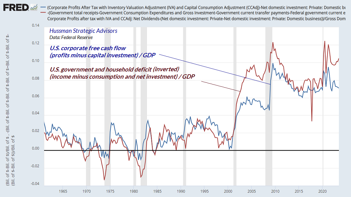
While temporary pandemic subsidies drove a brief push to record profit margins in 2021, the larger structural difficulty for both government and households has been a progressive collapse in their income as a share of GDP, resulting from a combination of aggressive tax cuts and weak growth in wage and salary compensation. Corporations have been the primary beneficiaries of both. The problem for investors is that maintaining deficits of this size is likely to prove unsustainable without a debt crisis.
Be careful what you wish for
On the subject of Federal Reserve rate cuts, it’s worth emphasizing that the entire total return of the S&P 500 during periods of easy monetary policy has accrued in periods when market internals were favorable as well. That’s not to say that the market can’t advance amid a combination of easy money and unfavorable market internals – it’s just that on average, it’s been the single worst combination for investors. Recall that the Fed eased aggressively and persistently throughout the 2000-2002 and 2007-2009 market collapses.
One way to emphasize this point is to examine the losses of the S&P 500 in the context of monetary policy. The red bars in the chart below show points where the fed funds target rate had been reduced by 2% from its 3-year high. The blue line shows the corresponding drawdown of the S&P 500 from its own 3-year high at each point. Notice that by the time the fed funds rate was down by 2%, the S&P 500 had typically either already had, or was just about to have, a steep loss. More often than not, the U.S. economy was also in recession.
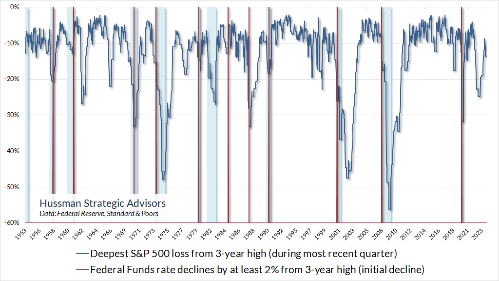
Notice that in most cases, the market was falling as the Fed was cutting rates. That’s the only way you can get the Fed funds rate down by 2% with an S&P 500 drawdown already in place. Again, it’s when rate cuts are joined by improved market internals (particularly if valuations have also improved materially) that all the lights go green. That was equally true amid zero interest policies and quantitative easing – nearly all of the total return of the S&P 500 occurred when in periods when market internals were favorable. Fed easing, in itself, isn’t nearly enough, particularly if recession risk is still present.
Recession risk is still present
Amid the enthusiasm and now nearly unanimous consensus that recession risk is behind us, I’ll reiterate our own view: the data remain consistent with a U.S. economy at the borderline of recession, but we would need more evidence to expect that outcome with confidence.
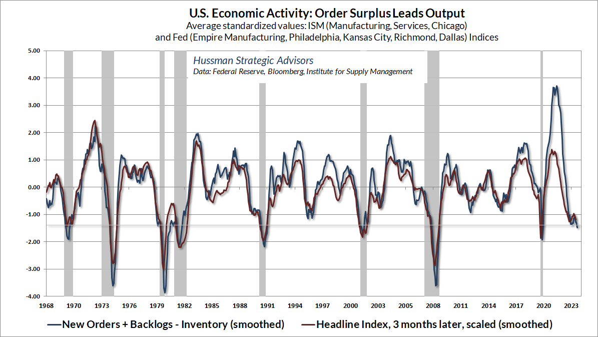
The chart below shows our Economic Activity Composite based on regional and national purchasing managers and Fed surveys. After a brief pop in the fourth quarter, this composite has again turned lower, and is already at levels that have historically been consistent with emerging recession.
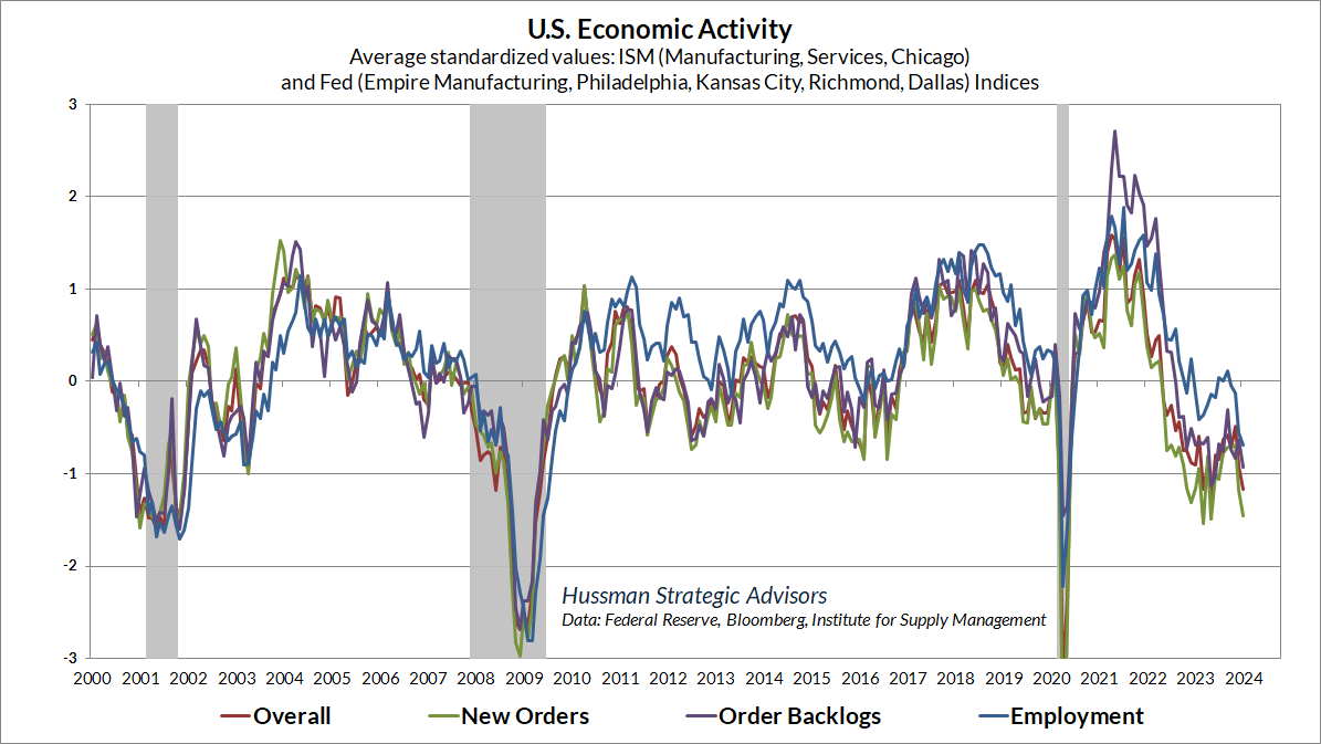
Within these surveys, the “leading” components define what I’ve called “order surplus”: new orders, plus backlogs, minus existing inventories. This measure tends to lead the “headline” index by about 3 months. Again, the current level has dropped to levels that have historically defined the borderline of fresh recessions.
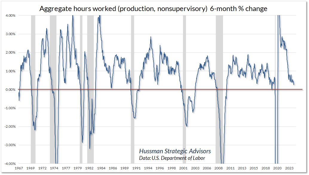
Despite the apparently strong jobs report last week, the “aggregate hours” index actually fell, and is also down quarter-over-quarter. The number of jobs may have increased, but hours have been cut. As my friend Lakshman Achuthan at ECRI notes, this is a symptom of what economists call “labor hoarding” – the attempt to cut labor costs without cutting jobs themselves. It may turn out that this is the correct response to an economy that touches the threshold of recession and doesn’t continue lower. Still, for now, we believe the economy is still at that threshold.
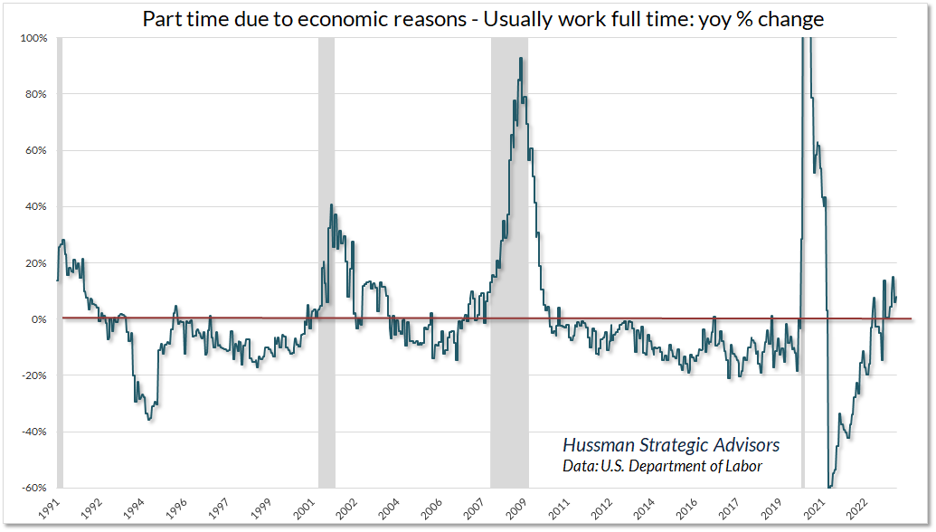
Another way to see this shift in labor composition is to note that the January report featured a drop of 63,000 jobs in the “Employed: Usually Work Full Time” classification, while “Part-Time Due to Economic Reasons” classification grew by 211,000, with “Slack Work or Business Conditions” cited among 34,000 of those workers. As a result, jobs classified as part time due to economic reasons are growing faster than those classified as usually full time. Not surprisingly, that tends to be indicative of an economy at the threshold of recession.
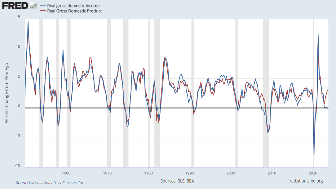
Two additional disparities are worth monitoring. The chart below shows the year-over-year growth of real Gross Domestic Income versus real Gross Domestic Product. Technically, these measure the same thing, just in different ways, and they’re normally identical aside from a small statistical disparity. In a few cases, however, as when the U.S. was rolling into global financial crisis, GDI fell into contraction well before GDP. Currently, GDI is again in contraction year-over-year, making it difficult to take the robust 4th quarter GDP figures at face value. It may be best to allow the possibility that a “soft landing” may not be as sure as it seems.
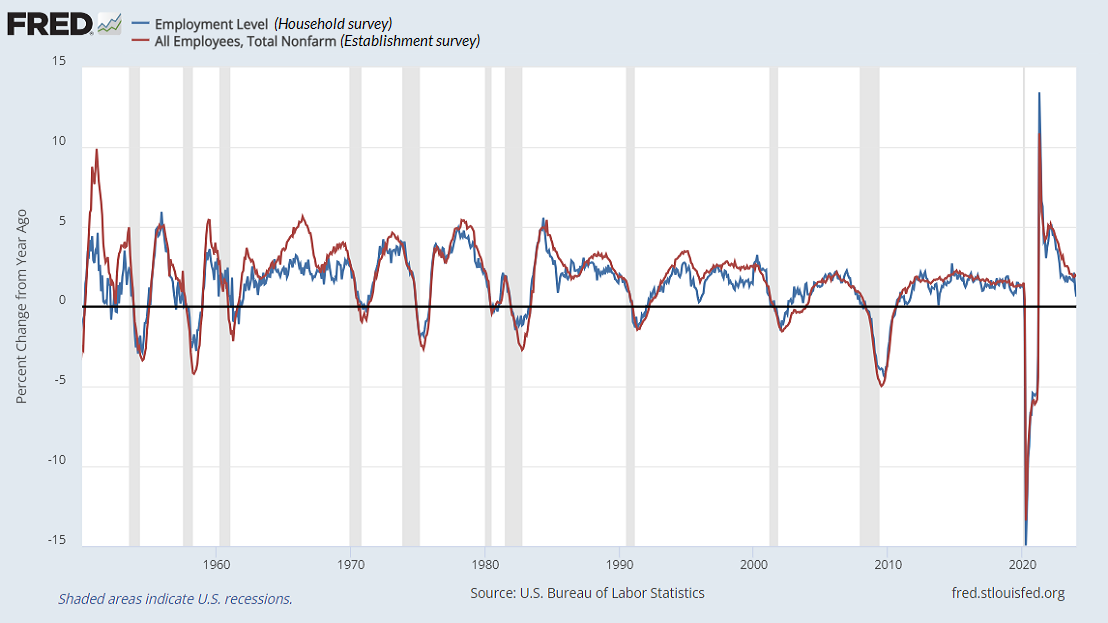
We observe a similar disparity in job surveys that also measure the same thing in different ways. In this case, job growth as measured by the “household survey,” which delivers the unemployment rate, has been markedly weaker than the “establishment survey,” which delivers the “headline” jobs number. Here, the household survey is clearly more volatile. Because it’s not as heavily “smoothed,” quick swings can sometimes be informative about emerging trends, but those swings can also represent noise.
As with all noise reduction problems, it’s best to draw information by combining multiple sensors. In the context of weakening order surplus, employment composition, and GDI, the weak job creation in the household sector contributes to our view that recession concerns shouldn’t be easily dismissed.
In the bond market, we would characterize the prevailing 4.02% yield on 10-year Treasury bonds as “reasonable but inadequate.” The only change to last month’s comment is that our best systematic benchmark (below which 10-year Treasury bonds have historically lagged T-bills) presently stands at about 5.2%. That’s not a forecast, just a benchmark of what we would view as an adequate yield, relative to T-bills. Our view of precious metals shares is generally favorable, but remember they’re more volatile, and that upward pressure on bond yields can be a headwind, as we saw after last week’s employment report.
As for the stock market, the bottom line is this. We estimate that current market conditions now “cluster” among the worst 0.1% instances in history – more similar to major market peaks and dissimilar to major market lows than 99.9% of all post-war periods. Without making forecasts, it’s fair to say that we would not be surprised by a near-term market loss on the order of 10% or more in the S&P 500, nor would we be surprised by a full-cycle market loss on the order of 50-65%, nor a U.S. recession that the consensus seems to have ruled out.
Emphatically – emphatically – our investment outlook will change as market conditions change. A favorable shift in market internals would encourage us to adopt a neutral or constructive outlook (albeit with position limits and safety nets) even amid current overvalued, overbought, overbullish extremes. We made those constructive adaptations to our investment discipline in 2017 and 2021, and we are serious about adhering to that discipline. For now, however, we are equally serious about the downside risk, and frankly, the crash risk, implied by prevailing extremes.
I generally try to avoid near term forecasts of market direction. The predictable amount of market return over a one-week period is overwhelmed by short-term volatility, and forecasts based on longer time horizons implicitly assume that the Market Climate we identify will not change over the forecast period. Given my general avoidance of forecasts, there are very few situations when I would state my views about the market as a ‘warning.’ Unfortunately, in contrast to more general Market Climates that we observe from week to week, the current set of conditions provides no historical examples when stocks have followed with decent returns. Every single instance has been a disaster. We can’t rule out the possibility that investors will adopt a fresh willingness to speculate (which we would observe through an improvement in market internals). Such speculation might prolong the current advance modestly, but even this would not substantially alter the risks that have ultimately been associated with overvalued, overbought, overbullish conditions.
– John P. Hussman, Ph.D., Warning – Examine All Risk Exposures, October 15, 2007
Keep Me Informed
Please enter your email address to be notified of new content, including market commentary and special updates.
Thank you for your interest in the Hussman Funds.
100% Spam-free. No list sharing. No solicitations. Opt-out anytime with one click.
By submitting this form, you consent to receive news and commentary, at no cost, from Hussman Strategic Advisors, News & Commentary, Cincinnati OH, 45246. https://www.hussmanfunds.com. You can revoke your consent to receive emails at any time by clicking the unsubscribe link at the bottom of every email. Emails are serviced by Constant Contact.
The foregoing comments represent the general investment analysis and economic views of the Advisor, and are provided solely for the purpose of information, instruction and discourse.
Prospectuses for the Hussman Strategic Growth Fund, the Hussman Strategic Total Return Fund, and the Hussman Strategic Allocation Fund, as well as Fund reports and other information, are available by clicking “The Funds” menu button from any page of this website.
Estimates of prospective return and risk for equities, bonds, and other financial markets are forward-looking statements based the analysis and reasonable beliefs of Hussman Strategic Advisors. They are not a guarantee of future performance, and are not indicative of the prospective returns of any of the Hussman Funds. Actual returns may differ substantially from the estimates provided. Estimates of prospective long-term returns for the S&P 500 reflect our standard valuation methodology, focusing on the relationship between current market prices and earnings, dividends and other fundamentals, adjusted for variability over the economic cycle. Further details relating to MarketCap/GVA (the ratio of nonfinancial market capitalization to gross-value added, including estimated foreign revenues) and our Margin-Adjusted P/E (MAPE) can be found in the Market Comment Archive under the Knowledge Center tab of this website. MarketCap/GVA: Hussman 05/18/15. MAPE: Hussman 05/05/14, Hussman 09/04/17.